


High Point Market is an excellent moment for trend spotting. Here are the top colour trends we’re seeing for 2024 that appeared at this year’s Spring market.
Many designers who attended High Point Market this year declared that it was the “Return of Pretty”.
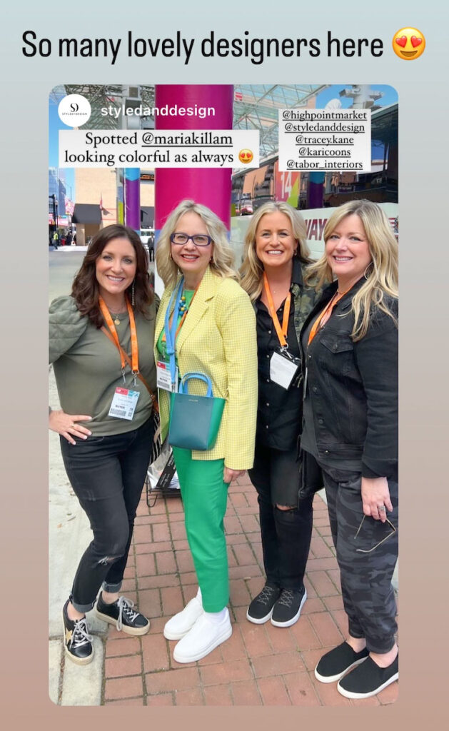
There was very little black. Almost NO gray. But COLOUR? It’s back – in coral, warmer greens than we’ve been seeing for awhile, and SO much yellow! HOORAY!
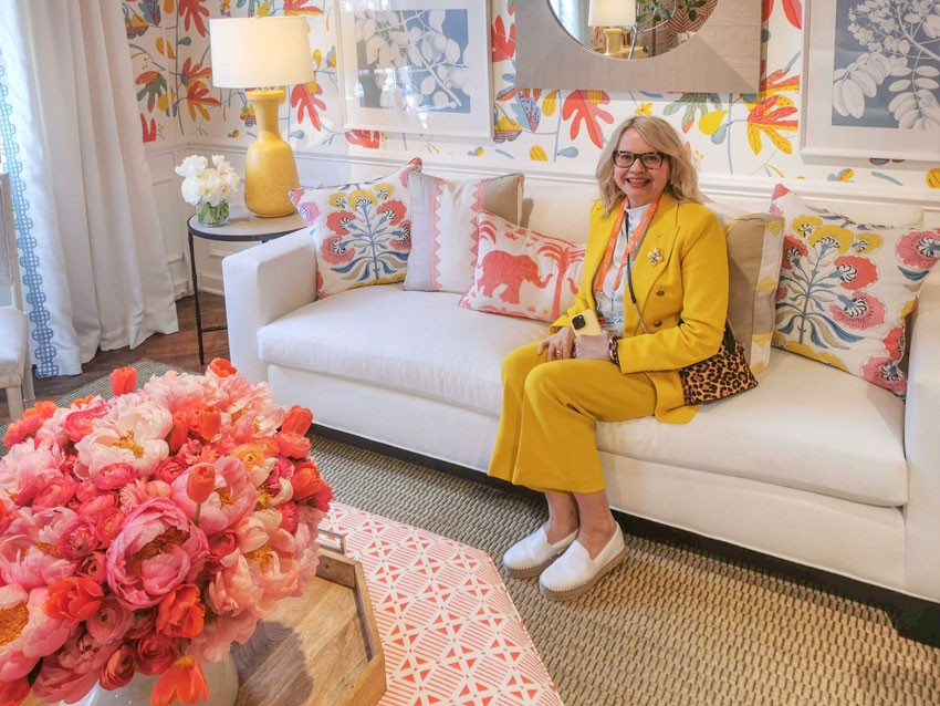
Here I am in the Thibaut showroom, which is always the prettiest. Pattern is the key to decorating well with colour. And no one does pattern as beautifully as this textile brand.
Thibaut
Happy yellow everywhere
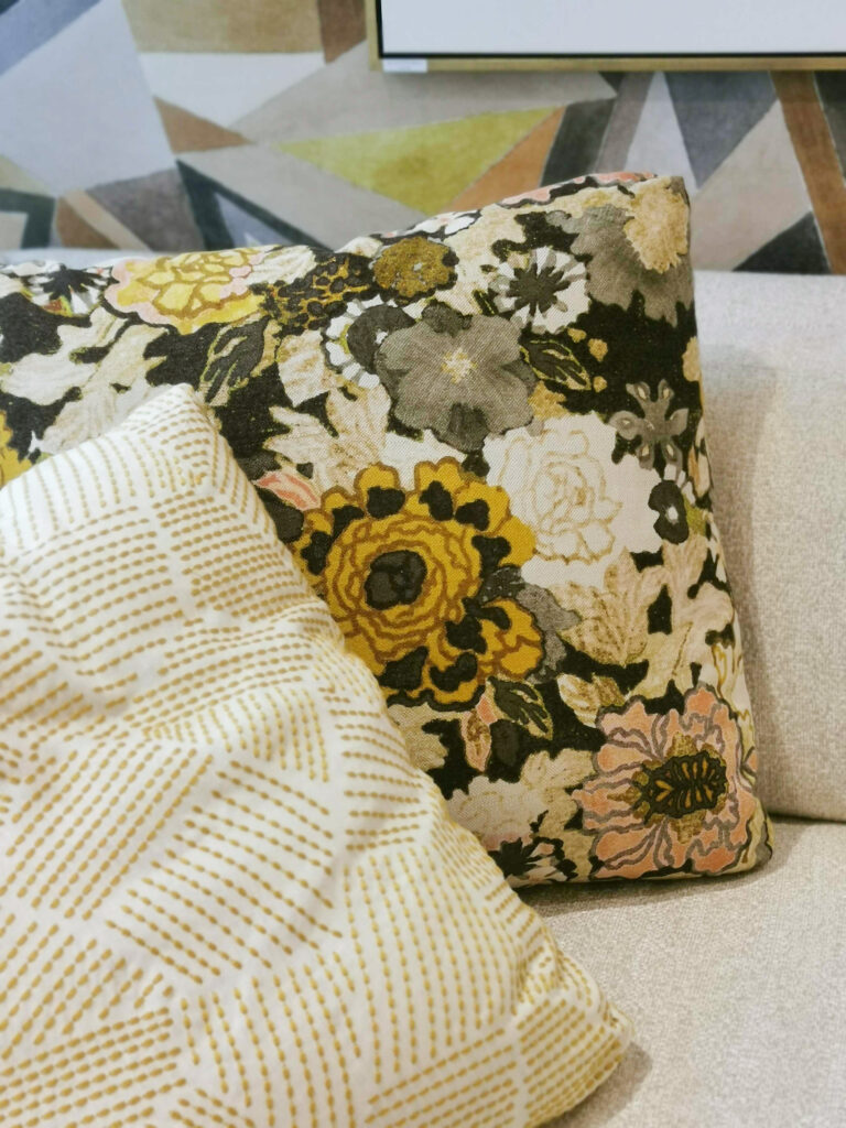
And speaking of pattern, the hot print trend this market is anything block printed. This bedroom vignette with pretty yellow accents below has both paisley and botanical motifs.

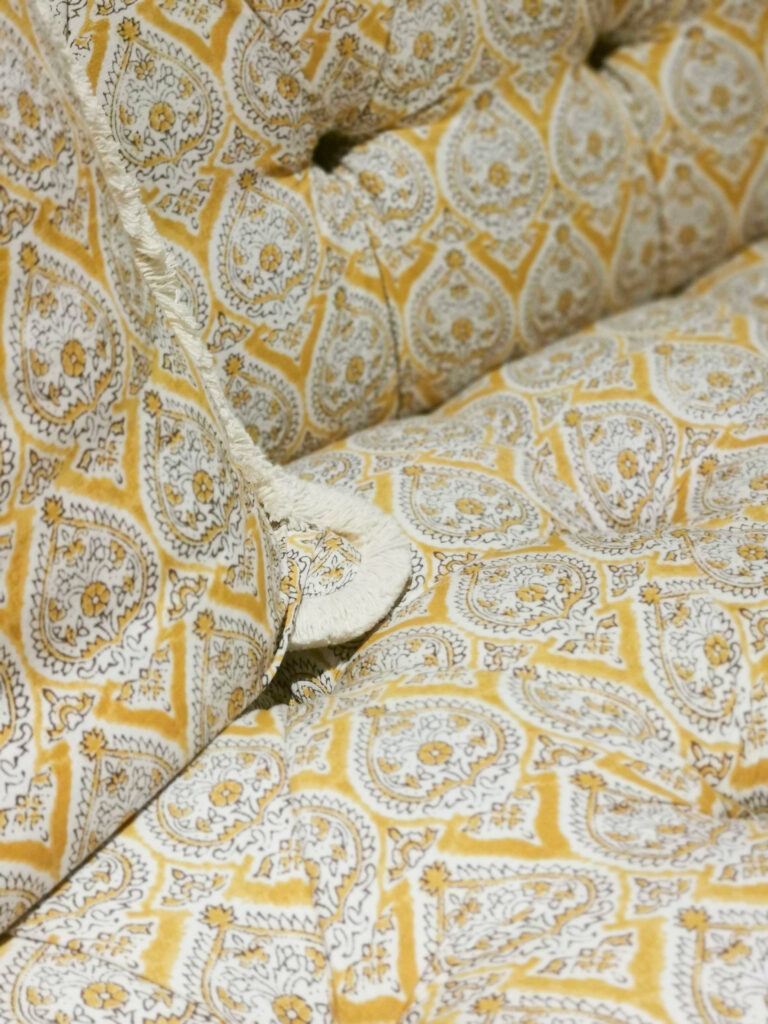
A pretty yellow block print at Highland House
Pretty, layered Modernism?
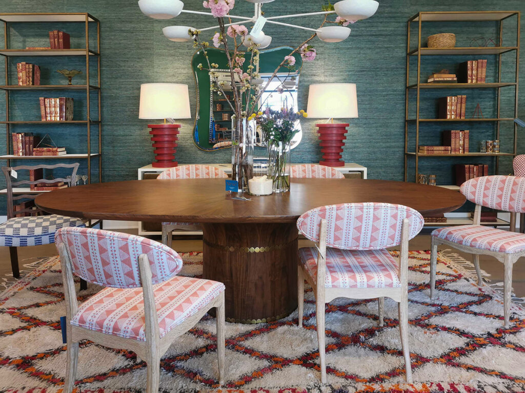
A new eclecticism is everywhere. Julian Chichester’s store had a fresh look going on that mixed a layered traditional approach with vintage modern pieces drenched in colour. And yes, more block style prints. Or at least a similar soft look with geometrics.
Move over Scandi, Japandi and minimal modern and modern farmhouse (read: stark black and white). Because a prettier kind of modern is here.
Pink isn’t going anywhere
Pink has become a decorating staple. Coral, salmon, mauve and rose where peppered throughout the showrooms either as accents, or as the main colour story as in this beautiful vignette below.
BTW, elephants are the new pineapples. This Indian block print friendly-looking motif could be spotted everywhere (note the elephants in the image where I’m sitting on the sofa at the top of this post).

Brown is the new black
You know brown has landed as an official “it” colour when you see it everywhere as an accent colour. We saw several brown lamps like these below.
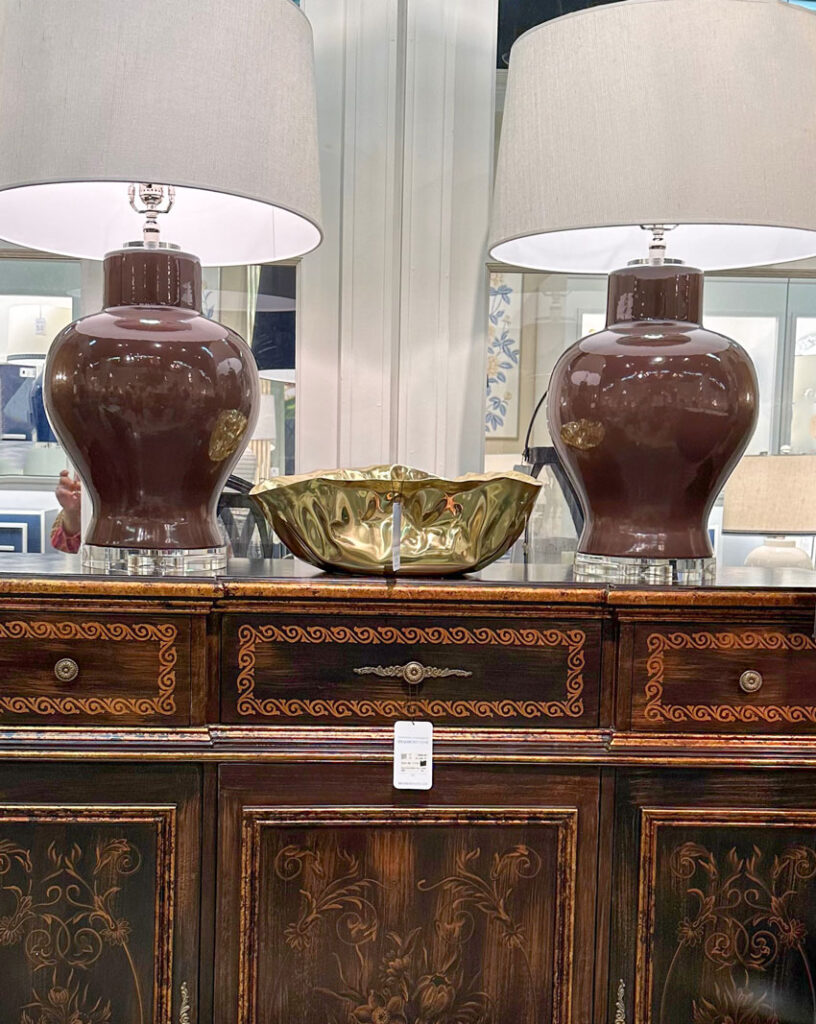
Brown velvet is a hot look for sofas. The luxurious sheen of velvet keeps the understated colour from looking dowdy.
This arrangement below in the Kravet showroom is a clever interpretation of the colours and prints of the 70s. Brown, yellow and orange looking updated and new.
Overall, 70s hues like amber, orange, gold and warm browns were well represented.
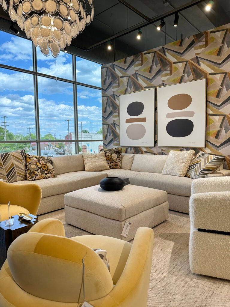
And more yellow
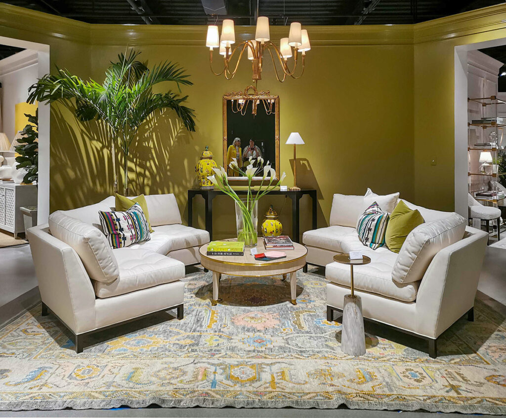
And here’s yellow as the star again in one of my favorite showrooms that never shies away from colour, Highland House. It’s definitely true that you notice what’s on your mind, or what you’re drawn to.
But you couldn’t help but trip over yellow this spring.

And yellow, gold, and gold beige are being used on walls. I’ve been watching gold and gold beige along with orange beige emerging in textiles and accents. But, you know it’s really hit mainstream when you start seeing these warm colours wrapped onto walls.
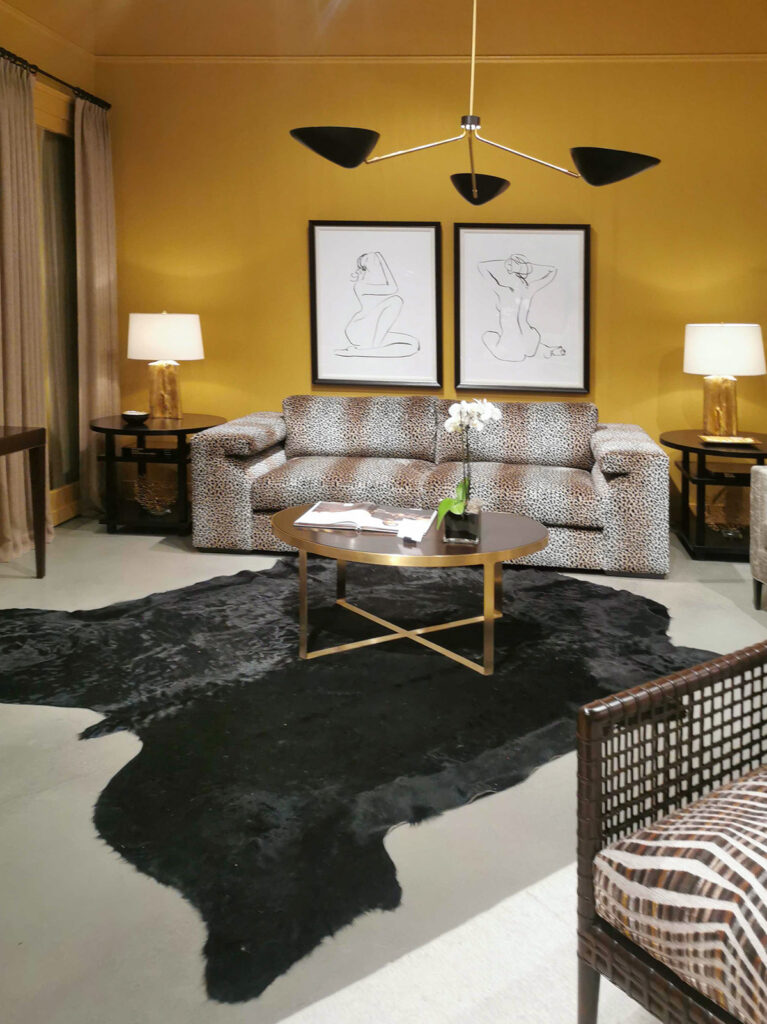
(Can you spot the neutral undertone issue in this gold room above? Comment below with your answer 🙂)
Announcing the arrival of yellow based greens
Also frequently spotted, and again (below) at Highland House, olive and citrine greens leaning much farther into the yellow-based realm of greens than we’ve seen in a good decade at least.
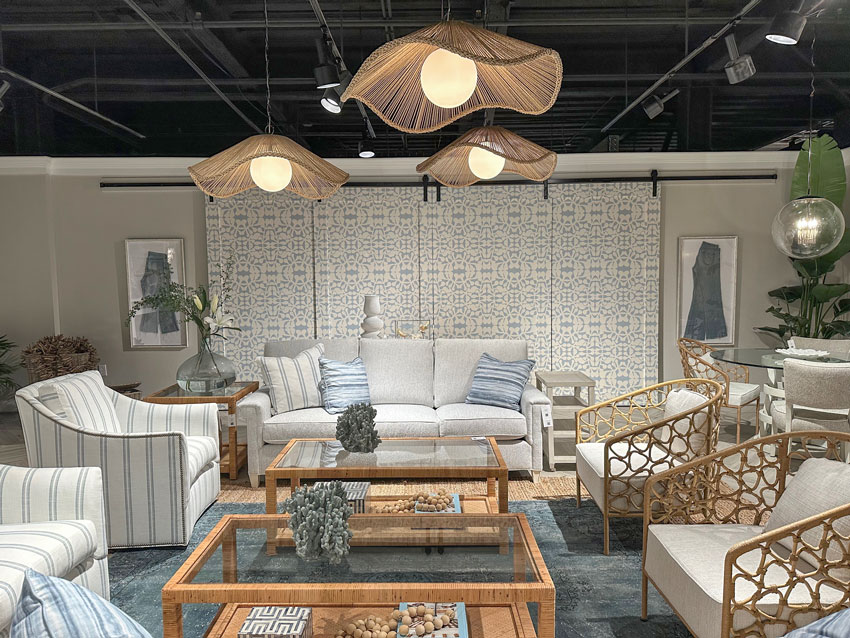
Blue is eternally classic
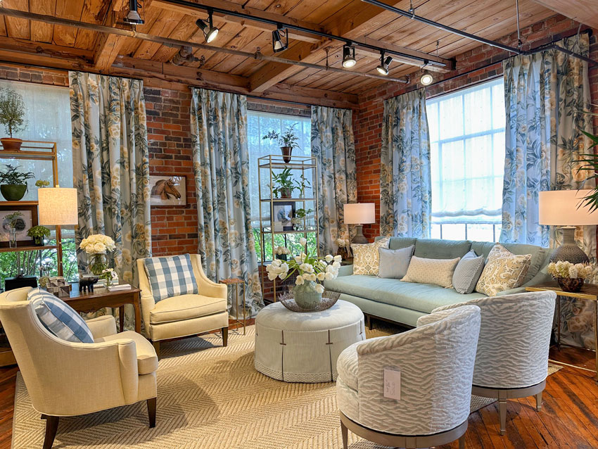
I can’t imagine a spring market without a strong representation of blue and white rooms. And rattan has been at peak saturation in terms of trends for the last five years.
I love the cluster of floral inspired pendants here. Have you ever framed your old jeans as art? Denim and rattan, two trending classics in perfectly pretty, but casual harmony.
And we met so many of you!
Tricia, my Director of eDesign and I had such a fun weekend. We plunked the colour wheel down on endless neutral furnishings to narrow down the undertone.
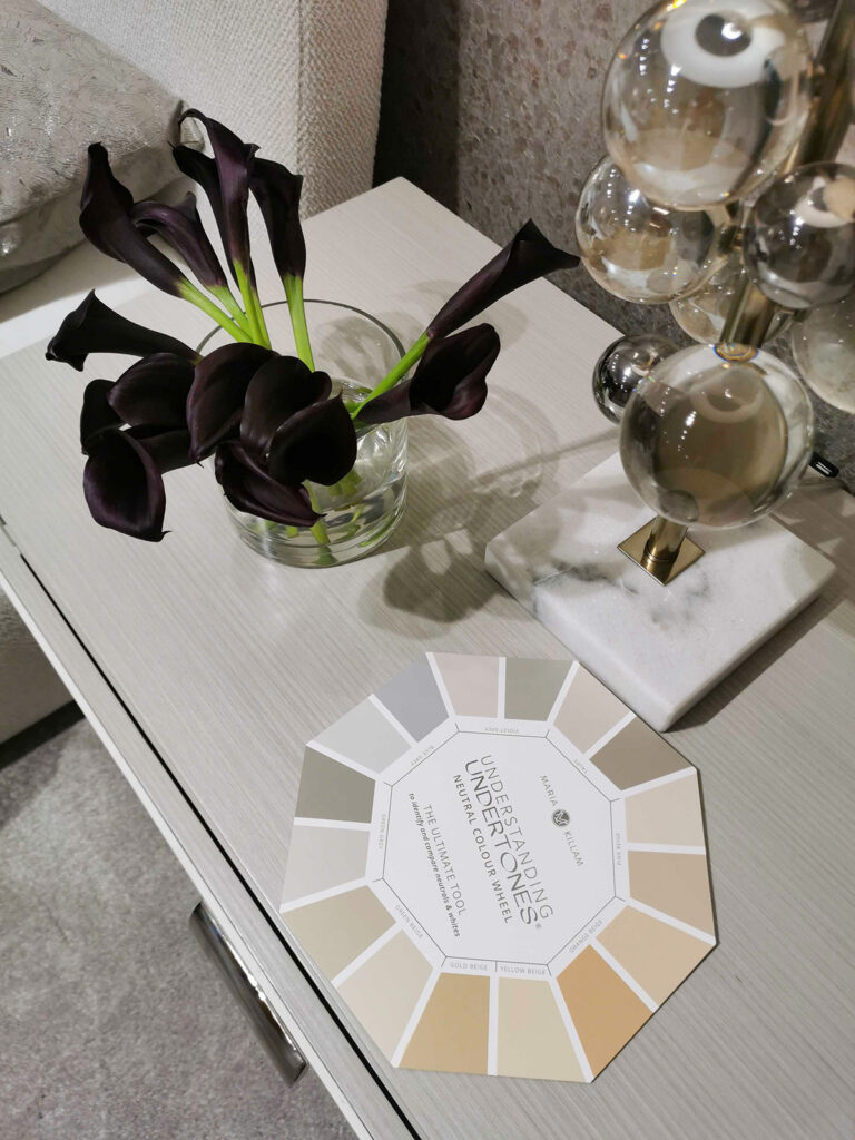
And we handed the wheel out to so many colour loving followers and friends we met.
I also had a conversation with a celebrity designer who, when I mentioned the black world we’re suddenly in with everyone painting ALL THE THINGS black, he looked at me blankly.
That’s the moment I realized that I’m the jaded one because I’m in the business of specifying paint colours and he’s in the business of filling his high-end clients’ homes with colour.
High Point was certainly not a reflection of the black trend that is taking over most homes in America and that was good to see.
Over to you my lovelies, are you loving yellow yet?
Related posts:
Trend Alert: Burgundy or Bordeaux, Yay or Nay?
10 Best Front Door Colours for your House
5 Design Trends to Ditch right Now and What to do Instead

Yay! My home is finally back in style.
I love a cool, clear yellow. What I don’t love is how so many designers are mixing in gold-toned yellows, gold, yellow-beige, mustard, etc. In my home and wardrobe, yellow is a cool tone — it does not mix with warm-toned colors.
Well there are warm yellows.
Yellow is a warm color 🙂
It could be clean (clear) or dirty but it is not cool.
As with all colours there are warm AND cool hues.
I want the yellow block print fabric from Highland House for drapes!
I’ve never stopped loving yellow… it just got hard to find for awhile (and I am not talking about mustard!)! And my warm, off-white walls will be cool again? Yay!
What i don’t understand is that in some of your instagram posts you state that the consumer is the one driving the choice of hot colors. It seems that in announcing these are the hot colors by the design industry, the consumer is not picking the colors. Just like the grey trend, the manufacturers and designers said the grey was the color to have in your house. Before that the Tuscan trend was the rage. I don’t believe that a bunch of consumers independently decided that they wanted grey, or that they wanted these colors that you showed were hot in High Point.
What am i missing?
I think that when you go to High Point for the market, you are exposed to more high-end brands. Those brands have always done more color in the first place than what you see in most middle class houses. They may be pushing brighter colors this year, but they’ve always done color.
Let me add this –
High end brands have never “pushed” the gray trend to the extent mid-tier and lower-tier brands did.
Designers didn’t push it much. I think it was lead more by the consumer. I never really saw it in design publications as much as in real estate listings.
Is the undertone problem in the drapes? Pink beige drapes?
Love the colors! Fan of Yellow with an Orange undertone. Is Pink Beige the undertone?
Its the pink-beige stripe in the couch!
I think the undertone problem is the sofa with pink beige stripes in the animal print. Possibly the drapes as well ,not much showing in the pic.
Hi Maria! Thanks for a great Highpoint Market recap… the color is inspiring to see… thank goodness!!! Looks like you had a fab time… see you in October? 😉
Maria,
I haven’t read this latest blog yet but had to comment on your fashion sense -it is what makes your blog inspiring to me. You are not afraid of wearing happy colors. Every time I see your photos, I feel motivated to dress up brightly and take on the world!
Thank you for that.
The pink beige undertones gotta go in the photo you asked us to comment on.
I spied a little peak of you in the mirror in the highland house. That room was well done.
That sofa and drapes in the other photo are pinky beige for sure but the undertone could be black based on the elements in the room.
Its a miss in my book.
Found a yellow leather couch and love seat 22 years ago and I still love it. Nice classic style. I can’t even imagine anything else.
Love yellow…not mustard! So glad yellow is back and hope to see more design elements in that colour in the stores now and in fabric choices. Great report Maria.
I’ve been looking for pillows and fabrics online over the past month or so, and chose a few block prints. My aesthetic is vaguely English Country style, and I’m inspired by the fabrics I see in rooms in that style. Surprise! It’s going mainstream! Who knew?
Egan, I hate most of these photos almost as much as the burgundy is back post. A lot of the furniture looks dated. The bedroom w yellow is nice. The room you’re sitting in is waaay over the top too much! You’re the only cuteness in that shot. 🙂
To each their own.
I do love the pattern on the large coral and yellow pillows on the sofa you’re sitting on tho.
I understand why the high-end designer was confused when you mentioned the lack of color in many people’s houses.
If you pick up magazines that feature high-end houses, there is color everywhere. Same for web sites and YouTube channels that feature those houses.
It’s mostly the middle class not decorating with color. They used to decorate with color back when people would buy a house and stay in it for life. I have a theory that because middle class people are more often required to move for their jobs than rich people, it has changed the expectation of houses being decorated in a very personal way, to needing easy resale. And so they keep things neutral.
Back in my grandmother’s day, there was beautiful color on the walls and wallpaper in the bath and kitchen. It was decorated in layers over time because no one was leaving in a few years. It was lovely.
Wealthy people move too, they just can afford to decorate each time. Also they entertain more and need their homes to reflect their success.
Sure they move, but usually they are not forced to as much as middles.
They tend to buy or build houses to live in a very long time, and if they need to be somewhere else, they are more likely to just buy a second (or third) house.
Could you give examples of the magazines and websites you’re talking about? I’m just curious. Thanks!
The most fun sources are on YouTube now because it’s like you are walking through the houses.
YouTube Channels: Quintessence, Schumacher1889, Homeworthy
Magazines: Veranda, Traditional Home, Better Homes & Gardens
These are just off the top of my head because there are more. The magazines also have web sites.
That is so true. Most people now are just thinking about resell value and not much about really making a place yours. This is a sad state of affairs within the collective consciousness. I refuse to think like that. Never met other older generations that shied away from color and original decor.
This sentiment may hold some truths but pattern, colour, furniture design, hair cuts, puddled curtains (less fuss then floor length), clothing point to another ‘reason’…one that has little to do with economic, ethnic, national, location/situation. In the ‘current period’ (1980+), most households became time strapped due to work & family obligations and new longer commuting & children rearing/activity pressures. Then in the 1990s, we added technological screen time which only became worse in the past 20 years. Once people came ‘home’ they needed to rest their eyes/brains…hence patterned wallpaper, textiles, tiles, clothing, hair styles, homes, offices, furniture etc. became colour blocked, neutral, easy lines of design, rather simplistic…the human brain could not ‘tolerate’ being overly stimulated constantly. THEN CoVid came….and the rest is history. Many people rejoiced at being able to work from home and hence why patterns, colours, attention to tailored attire (recall slim runway models this year), even a return to furniture that needs waxing and most likely a return to hair styles that require maintenance will return as well as we reduce our work/commute hours and family sizes decrease (see birth trends post 2008). The human brain will slowly enjoy some down time from screens and more in person involvement…thank the silver lining of CoVid….and this is holding true globally. Rejoice!
Some of that could be true, though the only people I’ve heard declare that they needed a neutral palette at home were interior designers who worked with color all day long. There are regular people though who are extremely color-phobic.
It still doesn’t explain why the rich, who are often crazy busy running companies, still decorate with color.
It is also regional. For instance, people in the southeast U.S. have always decorated with more color.
The drapes look pinkish and off kilter with the yellow wall. The couch isn’t fitting into the scheme, I don’t know if it’s the white in the print or what, but it seems to want to float away compared to all the other heavy elements.
Love seeing this update – and man, I bought some fun elephant figures for my house this spring, so now you are making me feel ahead of the trend. Ha ha ha!
Funny that I had been collecting elephants for years. They are timeless to me.
Such a happy post with good news! I love corals, muted golds, yellow greens, warm reds, and browns. My home reflects that. Really glad pretty is back. Although does pretty really ever go away?
The sofa looks like a pink undertone to me, clashing with the lovely yellow walls. Also the drapes.
Thank you for the photos and hearing about market. Love it.
I’ve always loved yellow, a clean, soft, light yellow that is. It’s like sunlight and goes with everything!
Undertones of the drapes do not go with the walls!
Hooray for coral and blue, I’m happy for those who love yellow and yellow/green and brown – it’s your time. But I have to confess I don’t like any of those three. But the rest of you…have fun!
Hi Maria,
are you able to identify the gorgeous rich gold paint colour in the image with the leopard print sofa and the two line drawing nudes behind it? I’d love to know.
Yes, please tell us what color that is 🙏
I guess I’m doing OK. 🙂 I have lots of yellow in my living room, including yummy butter-yellow velvet throw pillows for my purple and orange chairs. And fashion has finally caught up with my ceramic turquoise elephant that has been visiting a yellow ceramic bird in the kitchen for years. It’s fun to see you giving us the High Point scoop, Maria.
At Market, I noticed the various shades of red (pink, fuchsia, burgundy, mauve). I did see brown shades of leather sofas and chairs. Maybe they just stood out to me because of the surroundings colors.
As a blog follower, it was a special treat to see you in person and hear you on the panel Saturday at the High Point Furniture Market. You were just as personable as you appear on your blog and Instagram. (Unfortunately,I missed receiving the new color wheel.) Thank you for always sharing your insights and invaluable knowledge to enrich the homes of your followers making our world a happier place! You are obviously the goddess of color!
I’m here for all the color! I really like the Thibaut room with brick walls–I keep thinking brick wallpaper might work in my dining room to mirror my fireplace. Also, pink through peach has been on my radar and in my home for decades. Yes, to block print as well! Not so much loving true yellow, but gold and mustard definitely “thumbs up”.
In the third photo of the bedroom, there are miniature framed pictures near the end tables. That gives me ideas.
I have several “miniature” paintings my mother did, so I might frame them and use them in that way.
Also, I love the new trends and believe chocolate brown is a great neutral–as you mentioned in the
past a medium brown hardwood floor is as classic as jeans. Thanks. LT
How do you order something from these showrooms? I love that Highland house sofa, but their website doesn’t show dealers in my area. Suggestions welcome!!
One thing I’ve done in the past when an item can not be purchased in the vicinity or even shipped to a location is …. Locate a family member or someone you trust to be the receiving party of the item…their location is one where the item can be purchased or delivered to…doesn’t matter where their location is (the main thing would be someone who you trust to inspect the item)….then engage a moving/transportation company to transport the item…moving companies transport at … prior to CoVid it was around 25 cents per pound….especially if it is along a route they frequent but usually when their trucks are empty. For example, we had a client who resided near NYC and also had a home near Asheville, NC. We frequently used shipping companies to transport goods back to NC after they delivered new furniture to the NYC area. Hope this helps.
There are a couple of ways to get that Highland House sofa.
1) Go to their web site and look for a location near you that sells the brand.
2) You can order Highland House items from the furniture marts in North Carolina. Hickory Furniture Mart is one, but there are others. Just search for “North Carolina Furniture Markets”.
https://www.hickoryfurniture.com/
Thank you for sharing all this – everything is so refreshing & alive now!! ❤️
I have two brown leather chairs on order, for what seems like forever! The brand (high end) just suggested I may want to go to black. The brown leather is on backorder. I really wanted and still want the brown leather. Now you say brawn seems to be the new black! I am going to dig in deeper and wait a bit longer for my first choice, brown!
brown, not brawn.
Yellow has always been my favorite color. My childhood bedroom was yellow and I had a golden-yellow desk and chest in it. My living room has been a sunny yellow for 20 years!
Despite the “excitement” for the return of “colors”, my eye immediately noticed/focused on how every room still kept a “toe in black” by way of artwork, lighting fixtures or ceilings or the flowers! I believe the black is what made each room work.
Yes, I’m a fan of black and hope it stays around for a long time.
I’m always so happy after reading your blog and looking at your photos Maria. I did not get a chance to several of the showrooms you have in this post. I appreciate the photos. That bedroom at Woodbridge and print at Highland House make me giddy. I dig yellow!
It was great meeting you at market Maria and Tricia.
Maybe it’s just me but I saw taupe in the couch that didn’t work in that room.
I bought a throw blanket last Fall that is a browned gold cor which I really liked. But lighter yellows, no. Still like greens and blues.
Hi Maria, looks like this was a very fun event!
I see violet in the carpet of the Taylor King room as the undertone.
Love the first 3 pictures the most, those would be my choices 🙂
I’m no color expert, but to my eye, the color that’s “off” in the room with the animal print sofa is the carpet. Is that a green undertone?
I have had fun bright colors for years, my closet reflects this.
That carpet has a green undertone, doesn’t it?
In my newly remodeled/redecorated French Normandy home I followed my strong intuition and fav colors of soft teals, pinks and whites. Rewallpapered EVERY room, changed backsplash to teal mermaid tail which is fab with my swirled brown granite ( yay for colorful kitchens! ), almond wraparound cabinets with pink/gold/ivory pulls, blush velvet stools/chairs/oversized Anthro floral teal sofa. Antiques mixed with traditional& modern elements , I tucked jeweled trinkets all over for the children to find, draped velvet and lace over shades and chairs, and added Makenzie reindeer in every room. Maximalist, elegant, romantic ,whimsical….and so ME. I get raves and entertain more now.
I am a decorator and have a staging certificate also. The reason that I don’t have much pattern in my house is that I tire of it pretty quickly. I used to have wallpaper and prints in bedding, drapes, upholstery but found that I really didn’t like it after a while so now I mostly use solid neutral colors. I love to decorate seasonally so that’s when my accent colors come in and change several times a year. It is mostly the pillows, china, table mats, pictures, and accents that change which is so easy to do if the walls, floors, and furniture pieces are neutral. I like an updated traditional look with more modern art. By the way, I do love black accents and never ever liked gray.