Recently, I received this question from a reader and it got me thinking about how most people shop. It’s a common mistake that often leaves your room uninspired. So, here’s what you should do before you even begin shopping and how to fix a room that still feels meh.
I have been reading your online advice and you are amazing. I am struggling just to find the right undertone and what will work. Pale oak is on the wall now. Can you guide me?
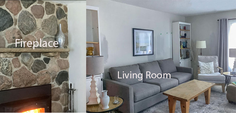
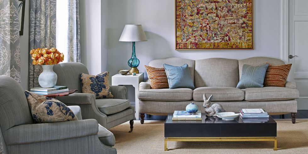
I recently received this email from a reader. Then I scrolled down to see her photos and saw this grey-on-grey living room. And it got me thinking about how these rooms, devoid of any colour are born.
Have you made this first shopping mistake?
I think people end up with colourless rooms because of how most people shop for home decor and furnishings. This is exactly what happens when you buy everything for your room on an as-needed basis. And, here’s how it usually goes.
First, you move in and you need something to sit on, right? So you start furniture shopping and this is what you see, everywhere you go. Neutral upon neutral. Well, I guess that eliminates decision fatigue, or does it?
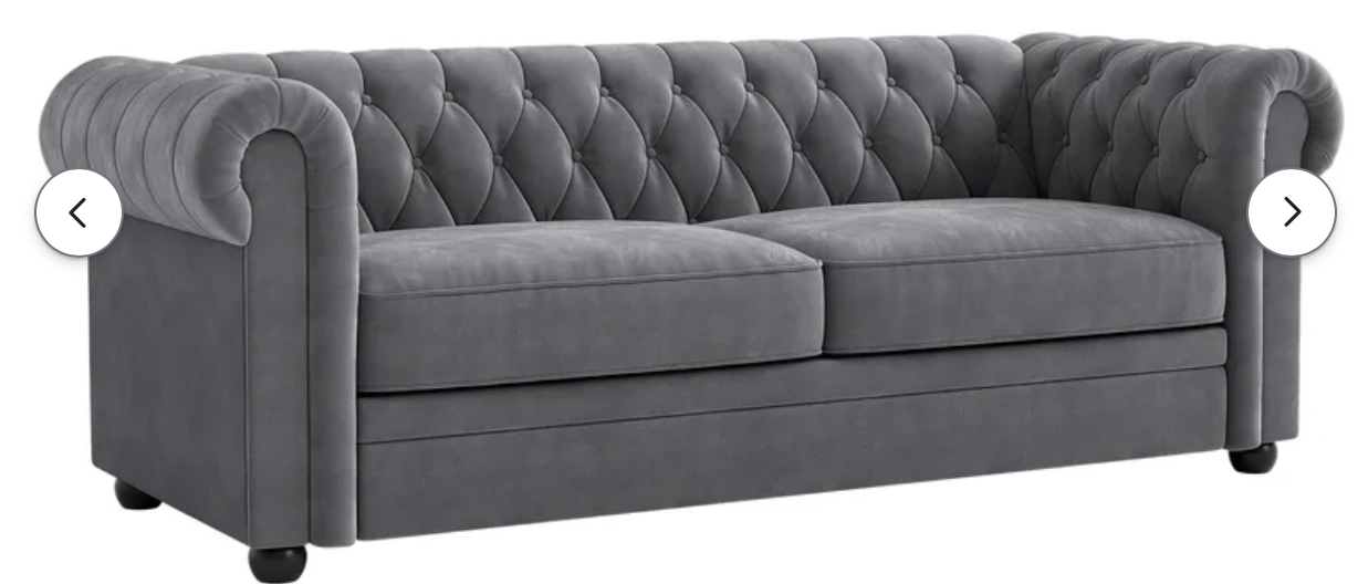
And that’s how you end up with an all-grey (or whatever-the-trendy-neutral-of-the-moment happens to be) sofa.
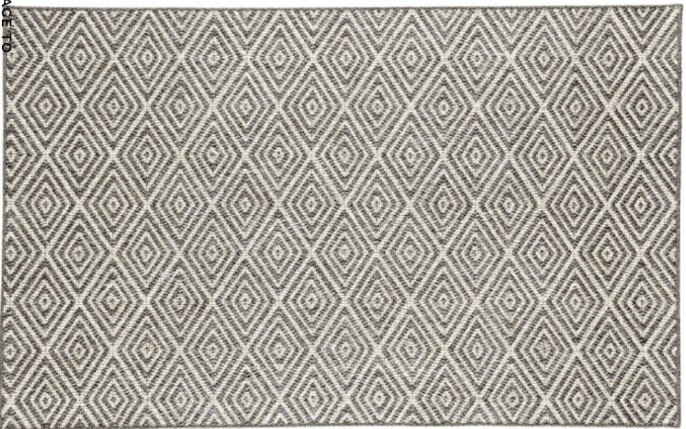
And, the only furniture item you have for a starting point is your new grey sofa. Guess what ends up in your living room? Probably a grey rug to match the sofa.
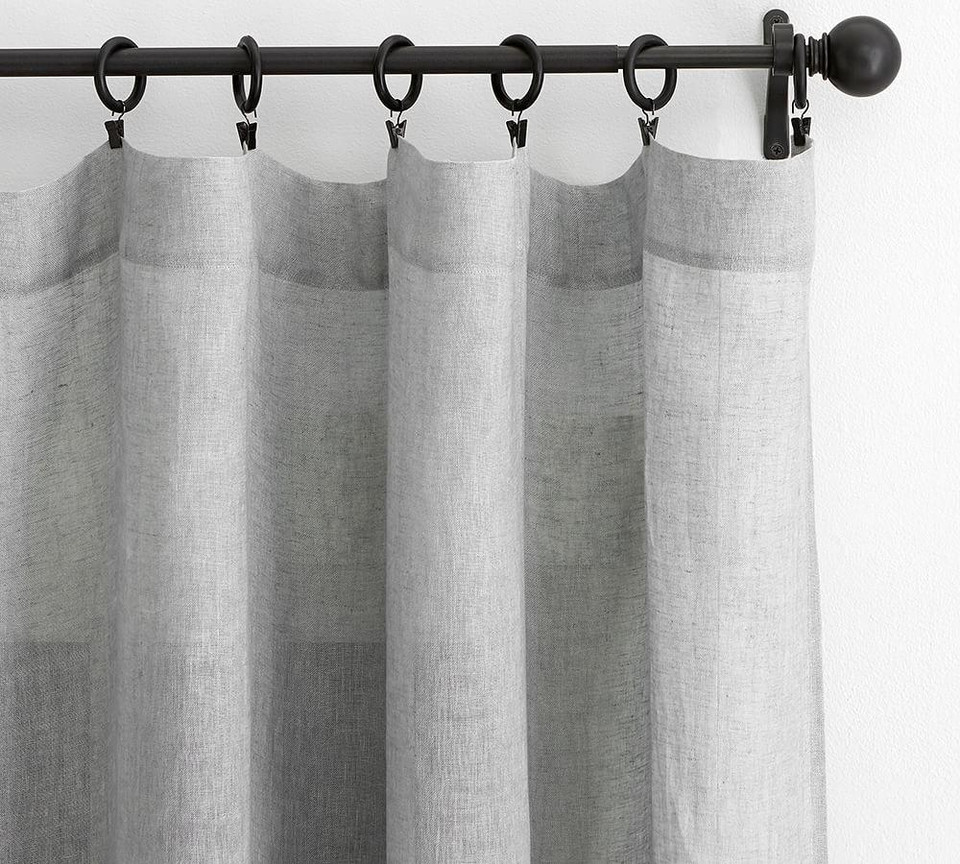
Now you have a grey sofa, grey carpet, and grey curtains (and if you haven’t painted the walls grey already) well, that just seems like the next logical colour choice. That or white, of course, since that’s the default choice these days.
Now you’re looking at the room wondering what’s wrong. It feels so uninspired. Is it the paint colour?
Perhaps. But more likely, it’s because your room lacks any decorating and COLOUR.
While most of us understand that things need to match to have a harmonious room, what’s harder to figure out is when you should depart from safe neutrals and choose colour.
Because once you’ve purchased three main items in grey, you’ve already missed your turn.
You need a design plan first
Let’s go back and look at all three images above. Do they all look like the SAME grey? Would they coordinate if they were all in one room? It’s hard to know when they are all separated like this, right?
The real problem is, you don’t have a plan. So, not only is it impossible to see whether the undertones of the “neutral” grey pieces you’ve just purchased (without comparing) match, but you also haven’t played around with how you want your room to look in the first place.
When you think about it, it’s pretty crazy to make expensive purchases on big-ticket furniture and decor pieces without a solid plan.
Even better, a room design plan that you’re INSPIRED and EXCITED about.
The most beautiful results start with a mood board
I received this note from a lovely reader yesterday:
I discovered your website about 18 months ago, and I want to THANK YOU for all the advice you provide on both the blogs and in your ebooks.
I came from a very modest background. Growing up, no one in my family gave a single thought to decorating, or color, and it showed! I dreamed of a future where I might one day have enough money to have nice things… and then I became an engineer who has money but still no home design talent.
I have struggled to understand color, and undertones, and tried to dissect why some things look good together, why some things are boring or hideous, and why some decor SCREAMS at you. You know how it goes, instinctively you know what’s good, but you can’t explain why. Maria helped me to take the blindfold off my eyes and to see color for what it is, and to be able to explain why some things are hideous together and others are beautiful.
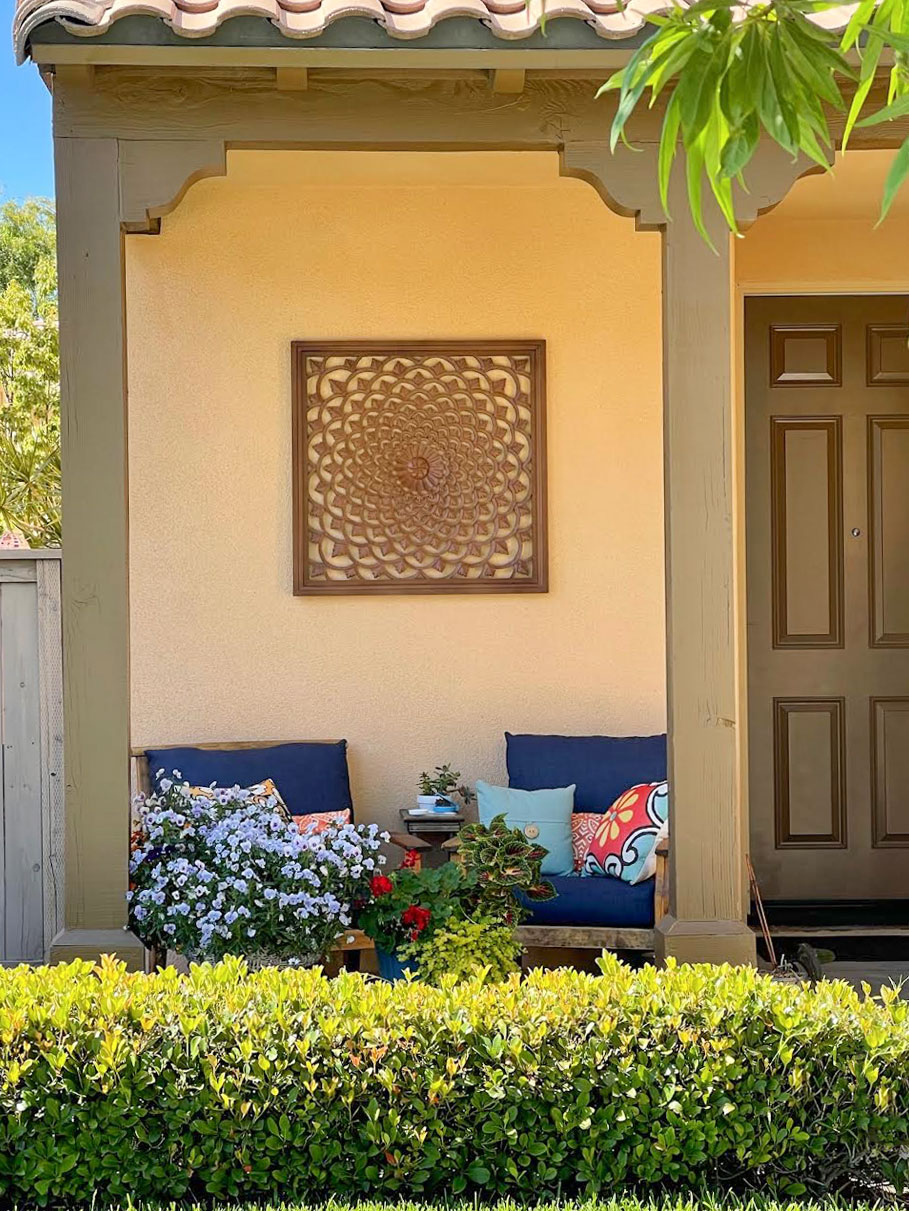
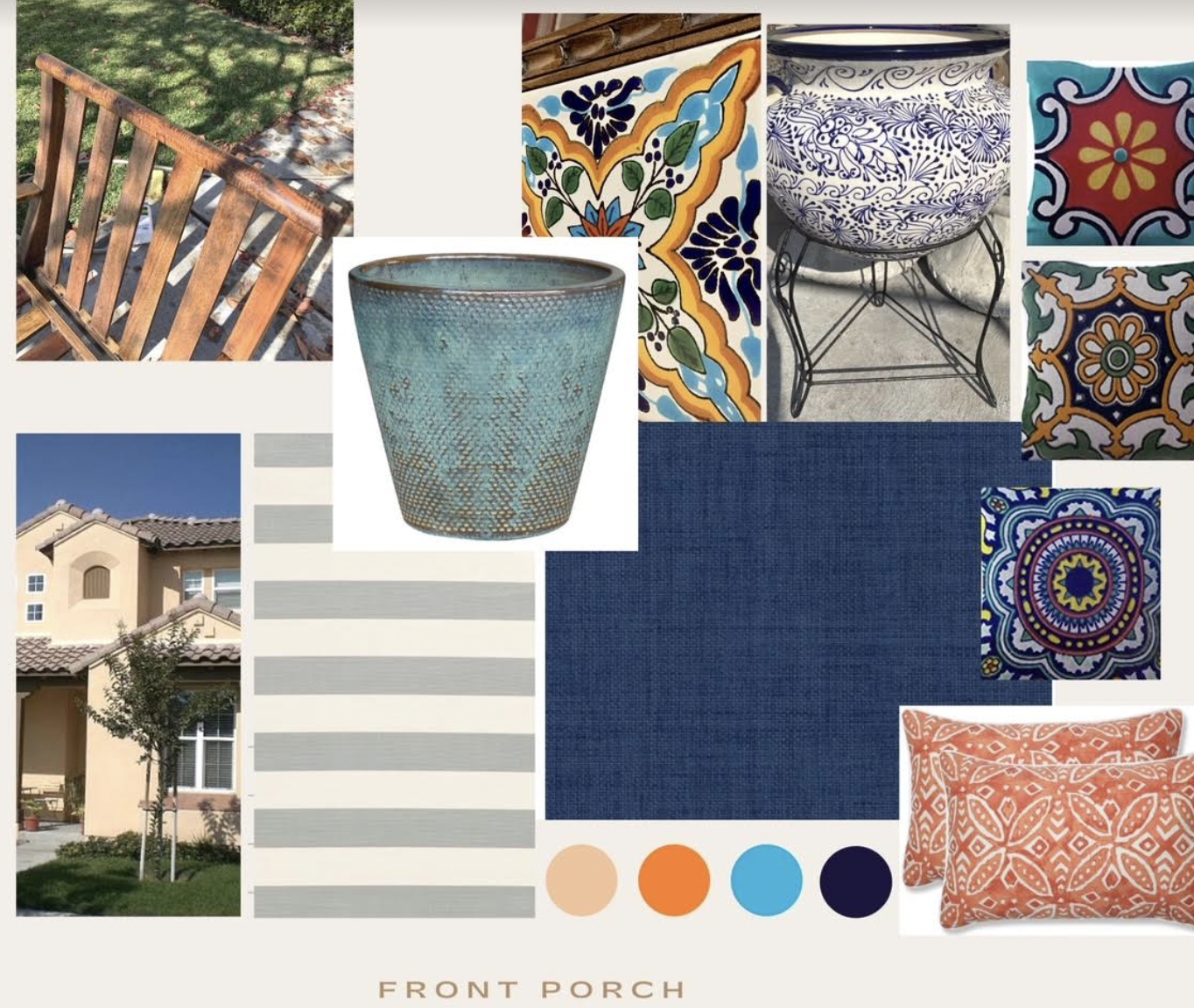
My front porch is my first project after reading Maria’s blogs. I zero’d in on the fact that this boring house color is a golden beige… and used that knowledge to pick a navy (contrasting scheme) to breathe some life into the color palette. I used the clean vs dirty idea to find the best shade of navy from my fabric selection options. I used mood boards/Pinterest to plan purchases and fabric in advance.
To my absolute surprise and delight, everything looked as good together in real life as it did on the computer screen.
Can I say wow?!
All that effort and dollars spent on bringing items home only to be disappointed – now essentially eliminated and replaced by hours of study and careful curation prior to spending the first dime. Life changing. My financial budget thanks you.
I know it’s not perfect – I think the long rectangular pillows are too “clean” in hindsight. And there’s probably other tweaks that could be made to look even better, but my eye isn’t trained enough to see it or explain it. But, can I just say, as someone with no design experience, how absolutely thrilled I am that I was able to apply the color principles and pull together a look I am happy with?!
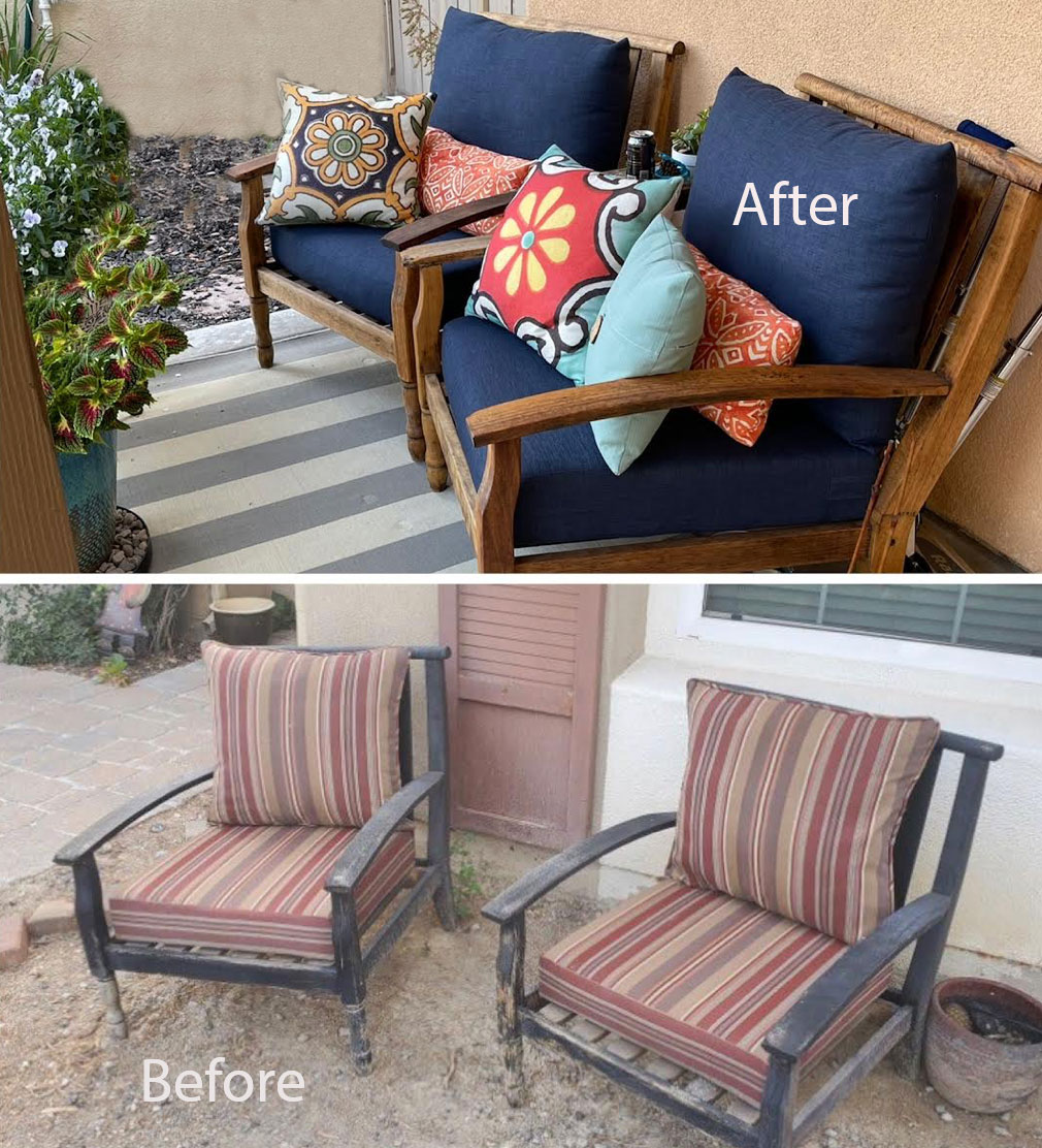
(By the way, this project started with these ratty old $20 chairs from OfferUp that I discovered were teak when I began stripping the old paint off! Score! I handmade all the upholstery besides the talavera style pillow covers.)
THANK YOU THANK YOU THANK YOU!!!
Her pretty mood board translated perfectly into a beautiful result! The pillows look great and they can be switched out easily at any time. I would keep going and add a colourful rug.
And while that result LOOKS effortless – like she just ran to the store and was brilliantly inspired and lucky to find just the right items – the truth is, this is the result of smart planning. And smart planning happens before you hit the stores.
How to fix an uninspired room
You simply CANNOT get it right without previewing everything together and working on a plan.
If you were to put the grey sofa you are considering on a digital mood board (place images on a Google Slides, Powerpoint, etc.), and then added a grey rug and grey drapes, you would immediately see that it’s not fabulous yet. You might even notice that the undertones are off.
It’s really easy to spot a room where this planning process hasn’t happened. And at this point, going back to the grey-on-grey room at the top of this post, it’s too late to just add colourful cushions. We have gone too far with the grey. Something has to shift.
Replacing the area rug with a warmer one along with colourful pillows and paint would be the first step to transform this room from meh to fabulous.
Here’s a great example. Look at this grey room below. The natural fibre area rug, art, pillows and styling add the warmth and interest needed to bring it to life.
You simply can’t have all your large-scale pieces in grey AND end up with a fabulous room.
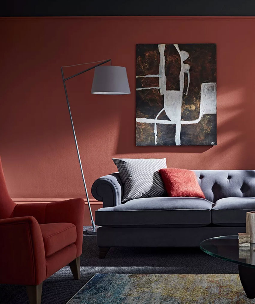
Another strategy when you have too much grey furniture (whoops!), is to paint the walls a strong colour for balance. First though, source something in a colour want to introduce. In the image below, they’ve chosen a rusty red accent chair as their inspiration colour. THEN chose that colour for the wall.
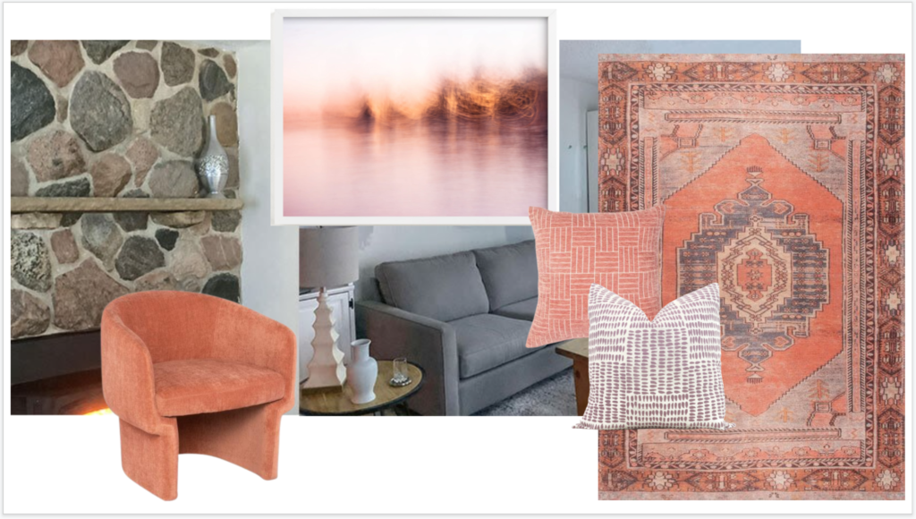
In my reader’s grey room, a more colourful area rug and a coordinating accent chair would be a great start. (It shouldn’t be hard to sell a newish grey rug on Craigslist.) With the warm pink and violet grey stones in the fireplace, I think adding a warm blush, mauve or coral would be an excellent direction to explore.
And she needs to add a more colourful and larger piece of art over the sofa. Here’s a quick mood board visual.
Notice that the area rug relates to the grey sofa while also bringing in a punchy coral and a muted lavender. These colours are then picked up in a larger-scale picture hung over the sofa.
Even if the undertones of grey in this room were an issue, once she adds some pretty colour and pattern, the focus moves away from all the grey. Now we have something prettier to look at instead of analyzing the paint colour. Pale Oak is a versatile taupe greige that does in fact relate nicely to the fireplace.
However, I would NOT spend money on repainting this room another neutral. Maybe someday, with this new plan, she could paint it a pretty peachy blush or muted lavender with this new plan and it would look great. Because now she has something to work with.
So knowing when to turn the corner and incorporate some colour is very important. And it comes much sooner than you think. Ideally, you need to find some colour inspiration before you even go shopping. Definitely NOT after you’ve bought all your main pieces.
Do you struggle with adding or coordinating colour or neutrals to your rooms? Check out my Shop Online with Colour Confidence online training. You’ll get immediate access to the best tricks for getting colour right when shopping online. Plus, it’s also packed with decorating tips and sources for making your room fabulous.
And before you comment that you really do prefer a neutral room anyway, I’m just going to leave this right here…
An all-neutral room needs even MORE planning
Why? Because when colour is not the story, the texture, contrast and details become the star of the show. And they are even trickier to get right. I’ll be posting about that soon!
Your reader did a lovely DIY job with their patio, and I think you have hit something when you say that people buy when they need, or when they can afford, new things. And of course you are right on about defining a mood or an atmosphere as being next-level. I’m saying this from an all brown and tan living/dining room that I realize from reading your blog needs more white or cream added. We have many financial priorities and so after feeling like I overpaid for the wrong furniture earlier on in life, I now have collected second-hand things that are comfotable and quality but not too precious. The furniture shapes match (maybe too much?) the colors are brown and tan, I added more tables and lamps!! And now I am trying to add some inexpensive vintage paintings based on LOVE. One of my dilemmas is — is this space more formal, or more casual? I want both — a little bit dressed up but not fussy. Am I trying too hard by buyiing more formal looking tables? Is my dining table too matchy? Does it need to go (and that would be hard to let go of) And I am still working on furniture placement, do I need a credenza? Getting rid of the wrong rug and too cheap window treatments.
And lord help me, is the carpet that I bought two years ago pink beige when I really tried to avoid it???
Looking for more cream, better curtains and shades, maybe some reupholstery,more styling and getting rid of clutter.
For me it’s all about the brown and I find myself still gravitating to brown and oil rubbed bronze for accesories. I am trying to push myself to blue, cream, and rust and maybe green to add in. I have liked brown,cream and black together in other rooms. But the brown can become so. much. tan. So monotone and you are so right – Not Enough Contrast. Not Enough Texture.
I have fear adding a rug and especially, the Wrong rug! (does this mean I look at brown rugs? yes! And I was looking at brown pillows too – they did have pretty fringe.)
And still — what is the mood? Do I have inspiration photos? Nope. Need to get back to those ideas. It feels like time wasted dreaming because my older house does not have the beautiful windows, high ceilings, amazing trim, etc.
I recently read a post about you not allowing ugly and wrong things into your projects. It is a good read.
But, I’ll keep trying! I still love warm and practical, earthy and natural brown but it’s gotta end somewhere.
Your readers front porch looks fabulous, and I love what you did with your other readers gray living room. Just goes to show that you can turn the gray trend into something else entirely. I didn’t think gray trend at all when I saw Maria’s take on what that room could look like. I saw updated and fresh. Your effortless talent amazes me, Maria. You really do have the color gift. I get so excited and feel inspired when you do posts like this!
Just like your Engineer reader, Maria has been a big help to me, too. YIKES….I have her porch BEFORE chair cushions! Her new blue cushions look fresh and cheery. Good inspiration for me.
Mostly, I buy what I like and then hope it all–eventually–goes together. We are moving to a little (1300 SF) beach cottage, and this time, I wanted to do it right. I knew I needed a plan, but then I fell in love with two coral-red chairs and (with no plan) bought them….Oops! Now what? I didn’t have a clue and was starting to panic.
My best friend came to the rescue. She found an inspiration photo on the cover of a magazine, where a coral-red chair is featured prominently. I love the look and feel of the room pictured. The inspiration photo is my plan. Now I have confidence my room will turn out well. But I realize this was a close call. A plan from the start would have been a better idea. (No panic required!)
Hi June, that’s not a close call at all, the coral-red would be your starting point! Brilliant! Then, as you would have learned in my course, place those on your mood board and keep going with all the sources that are included in the course, etc. etc. Getting an inspiration photo is even better but then you still need a board to make sure everything else arrives in the right colour! Maria
Great article Maria! It’s so true that we buy as we need and our plan starts in the furniture store with little thought or insight on the end result. I love your design plan for the all grey room. The rug is stunning and the flow from there is perfection!
Maria, speaking of couches, (don’t laugh!) can reclining sectionals be fashionable? I have an open concept black and white kitchen, living and dining room. I hate my faux suede espresso brown couch, sofa and loveseat and my mom hates it so much too that she wants to buy us a reclining sectional when she comes home from Florida in the spring so my hubby can relax and watch T.V.!!! Haha! I. am. Not. Kidding. Her suggestion was to get me a gray couch first and I flipped out ans said no, that I already have gray paint on the walls and the rest of my house is painted in soothing blues and blue greens. To be honest I don’t know what the hell color couch to buy anymore other than you couldn’t GIVE me a white or off white couch! Although beautiful, I have 2 dogs and a husband. I rest my case. that being said, I have a cream area rug with navy blue accents and some green gray splashes of color in it (Safavieh navy blue and cream medallion). My walls are painted SW Agreeable Gray to pick up the green gray in the rug and my black pearl granite countertops. Blue and white chinoiserie pots sprinkled throughout. I was thinking of a navy blue leather sectional (can’t type the words without cracking up!) In all seriousness though, will a navy blue couch be blah flowing into a black and white kitchen? Aany suggestions would be wonderful because I’m just about ready to haul my couch out of this place and put throw pillows on the floor! Although, I did buy some off white gourd lamps, cream throw pillows and navy blue and straw herringbone patterned pillows to freshen up my couch. I think I would’ve done you proud with it, but I’m seriously over this freaking espresso couch!
Not sure it would work in your space, but you might want to consider a cognac leather sectional. We have one in our family room and it goes with so many colors. Also, it’s trending right now, so will probably be easy to find one. It’s not a recliner, but we have a padded ottoman (that is also our coffee table, with a tray on top) in front of it, so we can put our feet up. It’s super comfortable! I’m not an expert, but my initial thought is that a navy blue sofa wouldn’t play well with the black & white, but maybe a brighter blue would? Or green. But if doing a color, my opinion is to probably not do it in leather, but maybe a performance fabric. I hope you find something you love, Holly!
The first thing I considered was a cognac leather sofa, but I’m worried about the orange tones clashing with my new plank LVP floors, (LL flooring Loire Valley Oak) which are not golden in tone. My kitchen table has orange tones, and it clashes clash badly with these floors so I’m thinking a cognac sofa may not be my friend in this situation as well. Maybe it’s different for sofa’s than it is furniture. I was actually hoping Maria would do a post about cognac sofas and wood floors, when it works and when it doesn’t. That’s funny you mentioned green because I have a nature painting with navy blue, grays, greens and browns, (my jumping off point because my furniture is only 5 years old and I thought I was going to have this set for at least another 5 years) and I was going to incorporate green into my decorating as well but unfortunately, it’s a lighter green in the painting and I wanted to do a forest green. Boy do I love black, white and forest green! I was also thinking I could always get a new rug to go with a different color sofa, but it would of course have to have navy in it because I already have a color theme flowing throughout my home in blues and greens. Thank you for your opinion, Sheree! I’m definitely taking my time in the search for a new sofa, and it will be a well thought out purchase when it does happen.
Holly,
You should definitely make a mood board. Use google slides and the snipping tool, just snip, copy, and paste into the slide. Start with your paint color on the background, see if you can find an online picture of your rug, your flooring, maybe even a little black and white kitchen section. Then go to a site like One Kings Lane or Interior Define, or Pottery Barn or Ballard, or wherever you like and start putting sofas in different colors on your mood board. THEN, after you do that and find your favorites, order swatches!! To make sure you love it. You can even sometimes bring swatches from a furniture store if you’ll be shopping local. Hold your swatches up to everything in your room and see if it makes you happy or crazy. If you don’t like the color with something that you can’t change (flooring, kitchen cabs, etc.) then don’t buy it, keep looking. It’s way easier to do all that though than it is to try to return a giant sofa, especially if you ordered a custom upholstered one. I didn’t want gray and so I ended up with a medium blue velvet sofa that I ADORE. And so far the dogs, kids, and husband have not been able to destroy it. So don’t be afraid to think outside the box! Maybe you need navy or forest velvet! Lol Good luck!
I am so honored to be featured on your blog as an example of mood board success! Thank you Maria, and to all the commenters who have left compliments on my front porch. It was a huge learning experience, your comments are so validating that I’m finally “getting” color.
Yay! Kudos to your reader and beautiful front porch! I hope people aren’t intimidated by making a “mood board”, I use old photo-editing software in the collage mode and switch fabric swatches, artwork, furniture in and out. Even if you have to open several tabs in your browser and pull them next to each other, that works, too–where there’s a will, there’s a way!
I am a Realtor, and I usually stage my listings with my own items prior to photos BECAUSE of this “all we did is bought gray and painted gray” problem (before that was the “everything in Tuscan beige” problem, same effect.) I purchase pretty much only coral/ terra cotta/ vivid orange-red accent items, and have LOTS of hip fake-greenery, which I liberally sprinkle everywhere throughout their home before photos. To differentiate bathrooms in photos I also have a set of vivid aqua and lighter aqua towels, shower curtain and bathroom bric-a-brac. This does the trick – my listings attracted a ton of attention long before the real estate feeding frenzy began. Bringing life into everyone’s boring gray homes is critical to making them feel like home.
Thank you for this article. I hear what you are saying about planning and the mood board. But for those of us that like to shop at Home Goods, Marshalls & TJ Maxx, what do you suggest…create a mood board using items online, and then look for items close to that in the stores?
Hi Christy, I shop at HomeSense probably more than the average person but I generally am not finding major upholstered pieces there, you get what you pay for in terms of quality of foam, etc which means I would only buy something upholstered at one of those places if it was strictly a decorative chair used to fill a corner. However, even if you do, take a photo of it and add it to your board and keep going. Maria
Thanks Maria! Yes I agree, about the major upholstered pieces at those stores. I should have clarified. I meant the purchase of the accessories like lamps, toss pillows, wall art, etc. But if I’m understanding correctly, if I see one of the previously mentioned accessories at Home Sense, then are you saying that I should take a picture and add it to the mood board? Or do you typically just purchase the accessory, knowing you can easily return it? Versus an accent chair from Home Sense, where you would take a picture first and add it to the mood board, prior to purchasing?
Thanks Maria! Yes I agree, about the major upholstered pieces at those stores. I should have clarified. I meant the purchase of the accessories like lamps, toss pillows, wall art, etc. But if I’m understanding correctly, if I see one of the previously mentioned accessories at Home Sense, then are you saying that I should take a picture and add it to the mood board? Or do you typically just purchase the accessory, knowing you can easily return it? Versus an accent chair from Home Sense, where you would take a picture first and add it to the mood board, prior to purchasing?


Your reader did a lovely DIY job with their patio, and I think you have hit something when you say that people buy when they need, or when they can afford, new things. And of course you are right on about defining a mood or an atmosphere as being next-level. I’m saying this from an all brown and tan living/dining room that I realize from reading your blog needs more white or cream added. We have many financial priorities and so after feeling like I overpaid for the wrong furniture earlier on in life, I now have collected second-hand things that are comfotable and quality but not too precious. The furniture shapes match (maybe too much?) the colors are brown and tan, I added more tables and lamps!! And now I am trying to add some inexpensive vintage paintings based on LOVE. One of my dilemmas is — is this space more formal, or more casual? I want both — a little bit dressed up but not fussy. Am I trying too hard by buyiing more formal looking tables? Is my dining table too matchy? Does it need to go (and that would be hard to let go of) And I am still working on furniture placement, do I need a credenza? Getting rid of the wrong rug and too cheap window treatments.
And lord help me, is the carpet that I bought two years ago pink beige when I really tried to avoid it???
Looking for more cream, better curtains and shades, maybe some reupholstery,more styling and getting rid of clutter.
For me it’s all about the brown and I find myself still gravitating to brown and oil rubbed bronze for accesories. I am trying to push myself to blue, cream, and rust and maybe green to add in. I have liked brown,cream and black together in other rooms. But the brown can become so. much. tan. So monotone and you are so right – Not Enough Contrast. Not Enough Texture.
I have fear adding a rug and especially, the Wrong rug! (does this mean I look at brown rugs? yes! And I was looking at brown pillows too – they did have pretty fringe.)
And still — what is the mood? Do I have inspiration photos? Nope. Need to get back to those ideas. It feels like time wasted dreaming because my older house does not have the beautiful windows, high ceilings, amazing trim, etc.
I recently read a post about you not allowing ugly and wrong things into your projects. It is a good read.
But, I’ll keep trying! I still love warm and practical, earthy and natural brown but it’s gotta end somewhere.
Your readers front porch looks fabulous, and I love what you did with your other readers gray living room. Just goes to show that you can turn the gray trend into something else entirely. I didn’t think gray trend at all when I saw Maria’s take on what that room could look like. I saw updated and fresh. Your effortless talent amazes me, Maria. You really do have the color gift. I get so excited and feel inspired when you do posts like this!
Just like your Engineer reader, Maria has been a big help to me, too. YIKES….I have her porch BEFORE chair cushions! Her new blue cushions look fresh and cheery. Good inspiration for me.
Mostly, I buy what I like and then hope it all–eventually–goes together. We are moving to a little (1300 SF) beach cottage, and this time, I wanted to do it right. I knew I needed a plan, but then I fell in love with two coral-red chairs and (with no plan) bought them….Oops! Now what? I didn’t have a clue and was starting to panic.
My best friend came to the rescue. She found an inspiration photo on the cover of a magazine, where a coral-red chair is featured prominently. I love the look and feel of the room pictured. The inspiration photo is my plan. Now I have confidence my room will turn out well. But I realize this was a close call. A plan from the start would have been a better idea. (No panic required!)
Hi June, that’s not a close call at all, the coral-red would be your starting point! Brilliant! Then, as you would have learned in my course, place those on your mood board and keep going with all the sources that are included in the course, etc. etc. Getting an inspiration photo is even better but then you still need a board to make sure everything else arrives in the right colour! Maria
Great article Maria! It’s so true that we buy as we need and our plan starts in the furniture store with little thought or insight on the end result. I love your design plan for the all grey room. The rug is stunning and the flow from there is perfection!
Maria, speaking of couches, (don’t laugh!) can reclining sectionals be fashionable? I have an open concept black and white kitchen, living and dining room. I hate my faux suede espresso brown couch, sofa and loveseat and my mom hates it so much too that she wants to buy us a reclining sectional when she comes home from Florida in the spring so my hubby can relax and watch T.V.!!! Haha! I. am. Not. Kidding. Her suggestion was to get me a gray couch first and I flipped out ans said no, that I already have gray paint on the walls and the rest of my house is painted in soothing blues and blue greens. To be honest I don’t know what the hell color couch to buy anymore other than you couldn’t GIVE me a white or off white couch! Although beautiful, I have 2 dogs and a husband. I rest my case. that being said, I have a cream area rug with navy blue accents and some green gray splashes of color in it (Safavieh navy blue and cream medallion). My walls are painted SW Agreeable Gray to pick up the green gray in the rug and my black pearl granite countertops. Blue and white chinoiserie pots sprinkled throughout. I was thinking of a navy blue leather sectional (can’t type the words without cracking up!) In all seriousness though, will a navy blue couch be blah flowing into a black and white kitchen? Aany suggestions would be wonderful because I’m just about ready to haul my couch out of this place and put throw pillows on the floor! Although, I did buy some off white gourd lamps, cream throw pillows and navy blue and straw herringbone patterned pillows to freshen up my couch. I think I would’ve done you proud with it, but I’m seriously over this freaking espresso couch!
Not sure it would work in your space, but you might want to consider a cognac leather sectional. We have one in our family room and it goes with so many colors. Also, it’s trending right now, so will probably be easy to find one. It’s not a recliner, but we have a padded ottoman (that is also our coffee table, with a tray on top) in front of it, so we can put our feet up. It’s super comfortable! I’m not an expert, but my initial thought is that a navy blue sofa wouldn’t play well with the black & white, but maybe a brighter blue would? Or green. But if doing a color, my opinion is to probably not do it in leather, but maybe a performance fabric. I hope you find something you love, Holly!
The first thing I considered was a cognac leather sofa, but I’m worried about the orange tones clashing with my new plank LVP floors, (LL flooring Loire Valley Oak) which are not golden in tone. My kitchen table has orange tones, and it clashes clash badly with these floors so I’m thinking a cognac sofa may not be my friend in this situation as well. Maybe it’s different for sofa’s than it is furniture. I was actually hoping Maria would do a post about cognac sofas and wood floors, when it works and when it doesn’t. That’s funny you mentioned green because I have a nature painting with navy blue, grays, greens and browns, (my jumping off point because my furniture is only 5 years old and I thought I was going to have this set for at least another 5 years) and I was going to incorporate green into my decorating as well but unfortunately, it’s a lighter green in the painting and I wanted to do a forest green. Boy do I love black, white and forest green! I was also thinking I could always get a new rug to go with a different color sofa, but it would of course have to have navy in it because I already have a color theme flowing throughout my home in blues and greens. Thank you for your opinion, Sheree! I’m definitely taking my time in the search for a new sofa, and it will be a well thought out purchase when it does happen.
Holly,
You should definitely make a mood board. Use google slides and the snipping tool, just snip, copy, and paste into the slide. Start with your paint color on the background, see if you can find an online picture of your rug, your flooring, maybe even a little black and white kitchen section. Then go to a site like One Kings Lane or Interior Define, or Pottery Barn or Ballard, or wherever you like and start putting sofas in different colors on your mood board. THEN, after you do that and find your favorites, order swatches!! To make sure you love it. You can even sometimes bring swatches from a furniture store if you’ll be shopping local. Hold your swatches up to everything in your room and see if it makes you happy or crazy. If you don’t like the color with something that you can’t change (flooring, kitchen cabs, etc.) then don’t buy it, keep looking. It’s way easier to do all that though than it is to try to return a giant sofa, especially if you ordered a custom upholstered one. I didn’t want gray and so I ended up with a medium blue velvet sofa that I ADORE. And so far the dogs, kids, and husband have not been able to destroy it. So don’t be afraid to think outside the box! Maybe you need navy or forest velvet! Lol Good luck!
I am so honored to be featured on your blog as an example of mood board success! Thank you Maria, and to all the commenters who have left compliments on my front porch. It was a huge learning experience, your comments are so validating that I’m finally “getting” color.
What a great job you did, Angela! I’m so impressed! Plus, you are a kindred spirit who loves to find bargains and do some DIY projects :]
Yes! I love it so much!! Thank you! ❤️
The porch is a perfect success story for the Color me Happy blog. I immediately wanted to be in that pretty spot!
Yay! Kudos to your reader and beautiful front porch! I hope people aren’t intimidated by making a “mood board”, I use old photo-editing software in the collage mode and switch fabric swatches, artwork, furniture in and out. Even if you have to open several tabs in your browser and pull them next to each other, that works, too–where there’s a will, there’s a way!
I am a Realtor, and I usually stage my listings with my own items prior to photos BECAUSE of this “all we did is bought gray and painted gray” problem (before that was the “everything in Tuscan beige” problem, same effect.) I purchase pretty much only coral/ terra cotta/ vivid orange-red accent items, and have LOTS of hip fake-greenery, which I liberally sprinkle everywhere throughout their home before photos. To differentiate bathrooms in photos I also have a set of vivid aqua and lighter aqua towels, shower curtain and bathroom bric-a-brac. This does the trick – my listings attracted a ton of attention long before the real estate feeding frenzy began. Bringing life into everyone’s boring gray homes is critical to making them feel like home.
Thank you for this article. I hear what you are saying about planning and the mood board. But for those of us that like to shop at Home Goods, Marshalls & TJ Maxx, what do you suggest…create a mood board using items online, and then look for items close to that in the stores?
Hi Christy, I shop at HomeSense probably more than the average person but I generally am not finding major upholstered pieces there, you get what you pay for in terms of quality of foam, etc which means I would only buy something upholstered at one of those places if it was strictly a decorative chair used to fill a corner. However, even if you do, take a photo of it and add it to your board and keep going. Maria
Thanks Maria! Yes I agree, about the major upholstered pieces at those stores. I should have clarified. I meant the purchase of the accessories like lamps, toss pillows, wall art, etc. But if I’m understanding correctly, if I see one of the previously mentioned accessories at Home Sense, then are you saying that I should take a picture and add it to the mood board? Or do you typically just purchase the accessory, knowing you can easily return it? Versus an accent chair from Home Sense, where you would take a picture first and add it to the mood board, prior to purchasing?
Thanks Maria! Yes I agree, about the major upholstered pieces at those stores. I should have clarified. I meant the purchase of the accessories like lamps, toss pillows, wall art, etc. But if I’m understanding correctly, if I see one of the previously mentioned accessories at Home Sense, then are you saying that I should take a picture and add it to the mood board? Or do you typically just purchase the accessory, knowing you can easily return it? Versus an accent chair from Home Sense, where you would take a picture first and add it to the mood board, prior to purchasing?