I’ve talked a lot about trends lately, and I know many people out there are confused. When it comes to grey, specifically, we are all eager to know: Is it in? is it out?
I‘ve figured out an easier way to explain it:
I’m going to stop calling it The Grey Trend and start calling it The Colour Trend instead.
Why? I want this discussion to be less about the colour grey itself, and more about the fact that there has always been and will always be a colour trend of some kind. And as long as there are trends, there will be people eager to be the first to declare them in or out.
The real scoop is that we’re currently in the middle of a 10-year neutral trend cycle with grey. Before grey, we were all about brown, and before that, maybe you remember sage green. Many of us can even recall the forest green trend of the 80s.
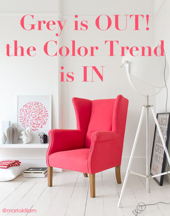
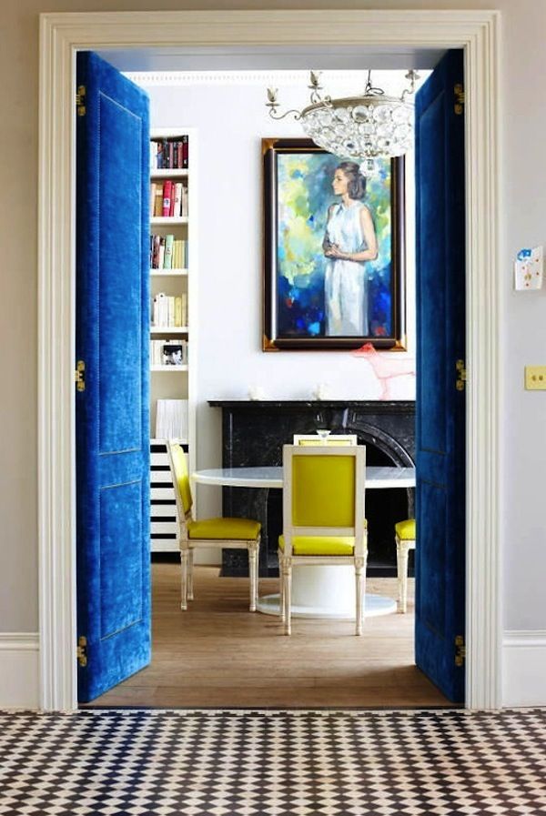
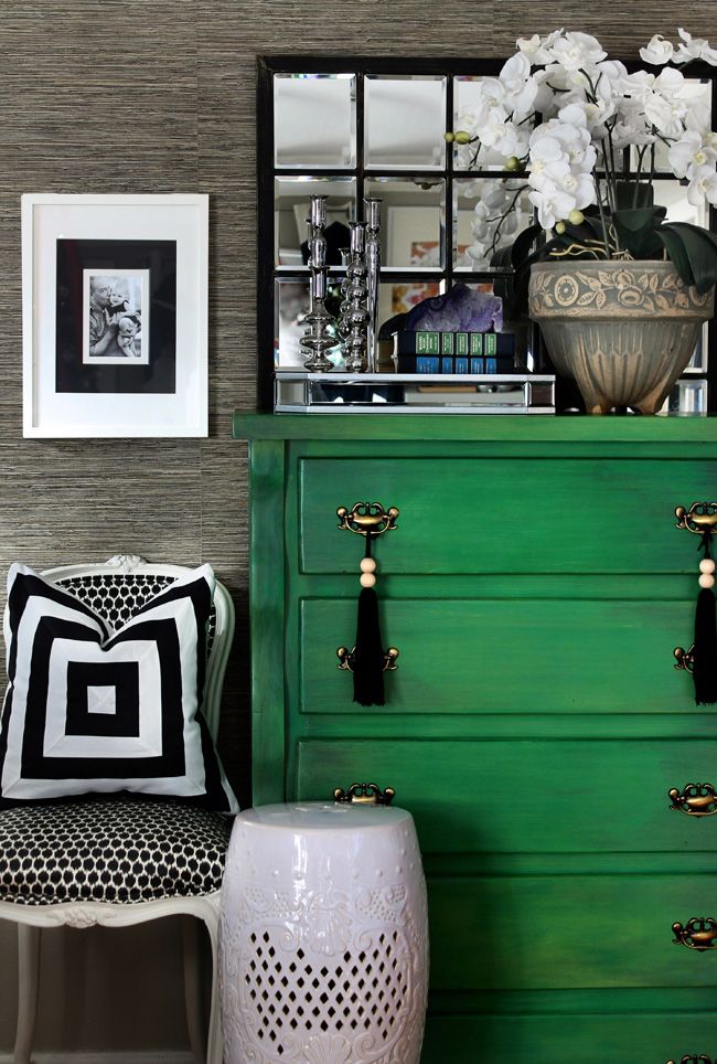
The reason grey is trendy right now is that it provides a crisp backdrop to the bold, clean and colourful hues we’re all decorating with now. The media focuses on grey and whether it’s in or out, but the real news is that bright and happy colour is here to stay. Those happy colours need grey as a backdrop because the beiges we were using as part of the brown trend generally die when combined with clean colours. Pale beiges are allowed, but the darker ones mostly look dirty.
GET MORE MILEAGE OUT OF GREY
Used as a neutral backdrop, grey will be on trend for a long time yet. (Exactly how long depends on where you live.)
Use grey to decorate your space from top to bottom, though, and it’ll not only be trying too hard to be trendy, it’ll also be just bad. Grey by itself is debilitating; it works best when used as a crisp backdrop for colour.
One of my lovely readers recently posted this comment:
“I went to my dentist and was horrified to see that they had re-done the office in dark gray on gray on gray! No color whatsoever, but a gray plaid fabric on some of the walls, and a frenetic-patterned gray carpet.
When I talked with the dentist about it, she commented that they had used an interior designer, and that gray was on trend. It made my heart sink, and I sometimes get discouraged when I hear stuff like this. How much longer do you think the gray trend is going to last?”
If you walk into a room and the first thing you notice is GREY, that’s a room decorated entirely in a trendy neutral. It’s too much, and will date very quickly.
The same goes for brown. One year ago, a restaurant in our neighbourhood was purchased and re-painted by the new owners. They painted all the wainscotting and the ceiling a dark, oppressive brown. The colour was obviously chosen by someone who had no idea where the trends are and mostly no idea how to work with brown so that it would at least be attractive. The last time I had breakfast there, I vowed never to return. The atmosphere is so bad! Their food quality has gone down because their customers are dwindling, and my prediction is that they’ll get through summer with the tourists and then it’ll be over after that.
Whatever colour you’re using, you need to know what you’re doing and why.
Every single decade has its own trendy neutral that most people will use as the foundation neutral for tile, countertops, millwork, etc. Some think brown is still that trendy neutral. If a consumer has been coveting the look of rich brown cabinets and she finally has the money to renovate but doesn’t realize brown is out, she will still install a brown kitchen without knowing that it will instantly look over 10 years old, and really, probably closer to 15.
But does that mean we shouldn’t use brown at all anymore? No. Brown has always been the colour of dining room tables, consoles, end tables, and coffee tables, and there’s no reason to throw all of that out. Lighter (instead of mid-tone dark) beiges will still work with the greys and brighter colours we’re seeing everywhere today, but if your home is filled top to bottom with matching espresso brown furniture, or if you’re using exclusively distressed, grey-washed wood furniture, that’s trendy.
HOW TO USE THE COLOUR TREND IN YOUR HOME
Most likely, your home has some brown in it, and maybe some of the trendy neutrals from previous decades, too. And now you want to introduce grey without going overboard.
You don’t have to change everything just to be able to use grey, but you DO have to understand how clean and dirty colours work together before you do anything drastic. Grey dies when paired with dull, earthy, muddy colours. You can’t suddenly paint your walls charcoal if you have a sage green sofa from the 90s, and you shouldn’t buy a charcoal sofa if your carpet is a muted 80s blue. You can’t just throw some grey in any room and expect it to look instantly transformed.
What you can do is find a fabric or an area rug that will introduce some fresh colour while still relating to your old colours.
I have curated tons of different colours on my Etsy boards, and I have one board full of pillows with earthy colours that’ll also bring in some brights. Start there when creating a new inspiration center for your house. If grey fits in somewhere, you’ll know when you find the pillow (or area rug) that brings in the new and the old.
To make it even more confusing, can you deliberately mix beige and grey?
Yes. Here’s proof:
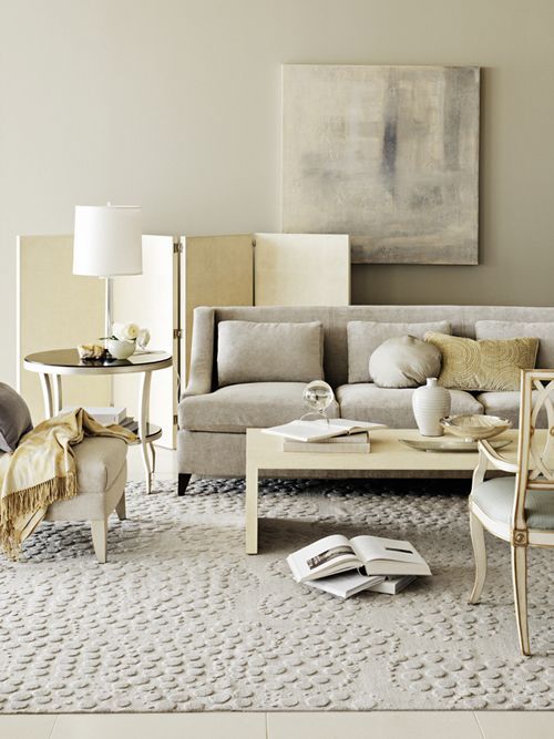
When you already have earth tones and you want to introduce grey, you’d better know what you’re doing. When you already have beige and you want to add some clean and bright colours, you can’t do it without some serious advance planning. But you CAN do it.
Just don’t let me catch you with a can of grey paint or charcoal fabric unless you can tell me exactly why it’ll work. ; )
PS. I’m on this panel at High Point coming up in April! Will you be there?
If you would like to transform the way you see colour, become a True Colour Expert.
Related posts:
3 Ways to Use Fresh to Sell Design




Great post Maria! I’ve been waiting for this post to help guide us through the “gray is in or out” dilemma. My region is very slow to adopt colour trends but I am starting to see dark gray walls with black leather furniture and no colour! Can you imagine anything more depressing? Thanks as always for your expert guidance!
I always tell my clients if everyone has it and everyone including the chain stores is featuring a finish like espresso, its already over its appeal. Hot is already “not”.
I’m enjoying the fresh pops of colour in simple classic backgrounds.
Super insights & excellent examples in this article
Love that slogan, “Hot is already “not”!
I want to get better at colours, decorating my own home – I don’t want to pick paint colours for myself, I have an interior designer that helps me with that. But I want to continue to shop the rest of my home with confidence. I think your 1 week colour course would be helpful but much more in depth and money than necessary. Do you think you could put together some basic for us regular folk? who don’t want to make this a living but want to feel more comfortable??
This is a really good idea, Maria. Your books are very helpful, but a class tailored to amateurs with no professional aspirations would be fabulous. I’ll bet you’d have more people clamoring for such a class than you could accommodate.
Oh yes! I’d clamor, too!
A one day class for homeowners who want a bit more color confidence? Yes, please!!!!
we are in a neighborhood that the deed restrictions are Tuscan homes with tile roof. So the colors are warm. (SW Nantucket dune on stucco with neutral rock that blends with neutral tile roof) We stayed as neutral as we could. I have a very white kitchen with wood floors. Can we go gray or is better to go with a griege like SW Accessible Beige? Does the inside decor need to match the outside?
Maria, this is such a great article and I am going to share it on my FB page. Everyone needs to read this one!! YOU are spot on and you explained it thoroughly and very well,Thankyou,
Kathysue
Whew, your headline scared me! I began a love affair with grey in the nineties and still love it. I wish it wasn’t a “trend” but am glad it’s not over. Lol. Great post. As usual.
Maria, As usual this is a very valuable post! The “fresh” look is so refreshing. The Tuscan look now looks drab and tired. It is a problem however to make a very Tuscan home on the outside look fresh and bright on the inside. I think your explanation of how to incorporate some of the beige with fresh “pops” of color is an excellent remedy.
Thanks for your expertise!
Having just had an entire house painted, I’m glad I resisted the suggestion (supported by the designer who was helping me choose furniture) to use a lot of deep, dark greys on the walls. I’m also glad you’re keeping your finger on the pulse of these things for us, Maria. I may not incorporate every trend into my house, but I still want to know what the trends are.
My husband helped one of our friends paint their living room recently. He came home later in the day & gave me the scoop on their decorating plans. (He knows I love that kind of stuff.)
They painted the walls the same color it’s been for the last 30 years…beige! The furniture is all brown leather pieces & dark brown end tables. Not a stitch of color anywhere. My husband said it looks like old people live there.
I guess we equate colors with young & fresh.
Maria,
This is a wonderful post. You’ve put into words what I’ve felt about the gray trend. I loved gray long before the gray trend started and redid my bathroom with a mixture of gray and white tile, but in the rest of my house gray is not a dominant color: even soft gray walls don’t work well for me. Yet I will wear gray from top to toe! My heart sinks when I see an all-gray interior because it looks so dreary. I have a similar feeling when I see too much brown. For me, there has to be the right mix of colors and neutrals, and when that happens, a room becomes timeless.
I agree. Sometimes I find all this fuss over what is in or out rather tiresome and just another way to market more stuff. But we can’t escape the design aesthetic of our times, even if we wanted to. Each era and style has its aesthetic, and I truly believe that understanding and relating the new to the old is the way to go, unless you have the big bucks to start from scratch. Done well, it looks either classic or fun and funky, and respects the original architecture.
Very well said!!!!!
Great post Maria, right on! I’m going to share this on my FB page. I love using grey in my designs, but living in the North with our long dreary days, we need that shot of bold color to raise our spirits!
I would be willing to bet the brutal winter–read that too many grey days–has helped put the grey trend to rest. As with all trends, it was overkill and often poorly utilized. Like the clothes you wore two seasons ago that were all the rage and you never want to wear again. Should be some lessons in color trends here. Understand the basics of how to put together a space that your customer can live with for more than a few years and can freshen easily. Unless, of course, they are in the top 1% and can afford to redecorate or move on when the look becomes tired. The Barbara Barry room is a stand-out. The painting is the key and she has played all the other colors in the room off that. Barry is a master at this.
Hmm, I don’t care for grey in my own home and I also don’t care for dark earth tones. There is a third way to work with color without having to use grey as the base. I’m no expert on this at all–but warm whites, light woods, creams, very soft light yellows, white again, blue, light oak floors, the various light medium browns in baskets. Anyway-people who have never liked the darker brown tones have been using color long before the mausoleum grey trend showed up.
Agreed! Which is why I mentioned light beige tones. Thanks for your comment! maria
Yes, perfectly explained! All over brown or gray is blah and depressing. Adding as much, or little, color as you are comfortable with freshens up the space!
I’ve noticed that Sarah Richardson often mixes gray and beige with beautiful results.
I am one who loves neutrals and grey is at the top of that list. I have seen many fabulous grey spaces. Neutral rooms need texture to make them come alive. But you so nailed it when you called trends about color. Excellent information in this post well done.
I think I need to print out some of your articles, like this one, to give to customers who come in to the “flooring and décor” dept. of the big box store where I work! Here is a good illustration of what I mean: the other day a couple came in, looking for floor and wall tiles for a bathroom. They said, “Where are all your grey tiles? I thought grey was the most popular color right now!” Then she proceeded to tell me that she personally “hated” grey, but felt that she needed to follow the trend.
It is funny, but our store only carries a few tiles that are truly primarily grey. The ones that are mimicking Carrera type marble actually don’t really have a true grey veining–it is more of a “greige” or greeny-gold veining! The tiles mimicking other types of greyish stone also have lots of warmer beige or gold tones running throughout. I get the impression that the corporate buyers couldn’t quite decide if grey was going to “take off” or not and couldn’t fully commit yet to gray! By the time they do, it will probably be “out” in the higher-end design world, LOL!
Maria, as always, you are spot on. This weekend, I noticed so many dead trees, mainly those afflicted with Oak Wilt disease. I thought to myself that grey connotes death. Colors pop out in grey surroundings.
Maria, I had the exact same reaction to the renovations at the restaurant you mentioned. I also vowed to never go back…
It’s too bad; it used to be one of our favourites. The decor was nothing fancy, but it was warm and inviting and suited the neighborhood. The decor and colours are completely uncohesive now and unfortunately that affects my appetite!
I think there will always be ways to use gray in a way that looks modern and up to date.
For me, greige is the color that is going to start losing steam. But, I’m just guessing.
I love decorating with gray and your advice to use it as a crisp backdrop for other colorful additions is so very wise!
xo. Leslie
Segreto Finishes
A one-day class would be great but we can learn so much now from reading your posts, Maria. Almost every post you do lists three related posts and I very frequently check them out and learn even more about the subject, and just googling “Maria Killam on grey”, for example, can bring up a wealth of info. For designers, it’s a challenge, I think, to combine trends which go in and out with what will make your client happy for years to come. For those of us who are do-it-yourselfers, I say let’s draw on Maria’s consulting tagline and do what makes us happy first and take from a trend anything that works for us and ignore what doesn’t.
And, Cathy with the Tuscan home asking whether the inside needs to match the outside – better not have to. I live in an HOA of 30-year old homes where most have mostly stucco exteriors in some shade of beige which coordinates with their varying shades of brown shingle roofs. Five of our 23 duplexes have sun-bleached grey shingle roofs (20 years on 30-year roofs) and are painted white. Unfortunately, in 2009 the Paint Committee Chairman who is an artist had my house painted a cold, stark white with very cold, dark grey trim on the brickwork – UGH!. The other four homes got a soft creamy white and no trim which looks great with the roofs and helps the homes fit in with the others in the neighborhood. Can’t wait for repainting in 2019 when I’ll have a choice. But for now, if the HOA were to tell me I had to match my interior to my exterior, I’d shoot myself. If a designer told me the same, I’d shoot the designer.
Maria, thanks again for a great post! I’m thrilled that you replied to my comments about my dentist’s office, and we’re basically on the same wavelength. Since I (personally) am not a gray fan, I appreciate the recognition that it has its limitations, and needs to be used in a certain way.
I get that we will always have color trends, but it seems to me that people tend to go overboard with gray, more than other colors. Think Restoration Hardware…
Several years ago, a wealthy woman, who lived on a lovely lake, hired me to “gray out” her house. She had tons of gray-washed, faded furniture too. I complied, but inside felt regret since her house would be so devoid of life and color. It didn’t relate at all to the natural setting outdoors.
And when I saw my dentist’s office, dull and dark, with no colors to brighten it up, it made me sad that she was a “design victim”.
I also appreciate how you talk about the ins and outs of adding gray into a brown space. That’s what I come across since many people in the Midwest have warm, earthy interiors. Then, they want to update their homes, and I do my best to pick the right grays, and use them appropriately, thanks to your help.
I am glad you brought up Restoration Hardware, I love all of their items,I even love their paint and paint colors, but I hate going into their gloomy stores, it is so dark and uninviting,they don’t believe in putting some dashes of bright colors in.I only order from their catalog now, I skip going into the store, too dang depressing.
Back in the late 80’s, I was managing an art gallery and the common thing was for customers to try and integrate their art with the forest green and burgundy color trend. And I’m sure they came to loathe it once that trend ended. It’s best to frame expensive or heirloom art in white matting (the expensive kind that doesn’t yellow). The art doesn’t date so much like the colors do.
So can light beiges go with clean colors? Or do they still need earthy?
I have manchester tan…does that fall in the category of light beige? Oh that would be exciting new if I could do clean colors! Can you combine the clean and dirty colors if they are in different rooms of the same house, or better to stick with one throughout?
I completely agree, Maria! I make custom order blankets to coordinate with clients’ home décor and I see this firsthand. My of them use grey, brown or faux fur as a neutral for their main bright color – and it works beautifully!! The bright & fresh colors really take center stage
http://www.BundleMeBaby.etsy.com
Do trends really matter? Isn’t it more important to decorate what fits your style rather than being concerned with following the crowd? We’re in the process of renovation my parents house. In choosing faucets, lighting, flooring, etc. we’re choosing what we like (school house lighting, classic mosaic white/black tile, subway tile, repurposing my dad’s stainless bar sink for the laundry tub, etc.) without a care about trends. I actually have no idea what trends are in or out … ever! lol We’re doing white cabinets in the kitchen with either soapstone or Virginia Mist granite (leaning towards the soapstone), with a glass gray/blue subway tile backsplash. Is that trendy? Don’t know, don’t care! 🙂 We love the look and it’s a nod to my mom, who always did like a white and blue kitchen. In the vast scheme of things … do trends really matter? (sorry if that’s a dopey question!)
HI Jo, Well since you’re asking, everything you are choosing is completely trendy right now and mostly classic in my opinion.
I write about trends and how to work with them correctly because most people are installing trendy finishes and I am committed that they get them right!
Maria
You may not “know” the trends, but they will sink in subconsciously simply by being part of the culture, watching movies/tv, seeing your friends homes, etc. So to me, it is slightly important to be aware of the trends, that way I don’t accidentally end up buying them and regretting it (subconsciously what’s in style screams “buy me!” for some reason)… I have to take a step back and think “Do I like this because it’s in style at the moment, or do I like this because the idea of living with it day in and day out feels right and comfortable and happy?” So for me, yes, trends matter:)
We have friends who painted all their rooms a dark charcoal grey. She has hung many colourful pieces of art which really stand out against the charcoal walls, and her rooms looks elegant & beautiful. But without the art work, it would not have worked. It certainly gives her home an art gallery look that would not be everyone’s cup of tea, but they obviously love it. I don’t know if she’ll care when the grey trend is over. But if she does, at least she has the money to repaint.
Hi Maria,
I’ve commented about our dreaded on-going church redecorating project: a project done by committee is a nightmare! One of our biggest argument is trendy vs classic. The decorator wants to paint the 100 yr old dark oak wainscoting & trim…its impressive trim, in order to freshen & lighten things up. I say no, the trim isa classic. It’s hard to choose “classic” when every store is filled with trend.
I recently had surgery at a brand new hospital… It was done in blues , grey, drab, dark colors… I felt as though I had already died… Soooo depressing and dull, and sad… Life is too short and serious to be done in beige and grey…
But the beige and grey are merely neutral backdrops to the world of color created by art work, throws, pillows. rugs etc. That is where you incorporate vibrant colors.
So true! Grey is not what it used to be
Lol. I love brown. I love gray. Loved them for twenty years before they became IT. Tobacco Brown makes my green eyes pop. Charcoal gray (warm) with cognac or emerald is damn elegant. Charcoal is fun with ridiculous colors like chartreuse or pink or yellow. It’s sedate with light blue. I have a loud Chinese red lacquered secretary hanging out with my furniture and some fairly serious art in serious gold frames that makes it all work. I have blue wedgewood, orange, green red pink gold, terracotta black blue in my art. I paint my walls warmish whites. Hang some nice art, clear the furniture out, then boom, house sells first showing every time. Nothing matches. I move too often to buy all new stuff. Pack it up and take with. ( I move every 4-6 years). My homes have never been in-style, but they’re faairly stylish. And classic. Buy some non-generic art, put it in an expensive frame, hang it on the walls, sit on the floor if you hafta. Decorate to that, not a trend. Personally I’m looking forward to acquiring some of that nice “brown” antique case goods that “nobody” wants while it’s on clearance because it’s unfashionable. My art is definitely my identity and my house supports that, not the other way round.