
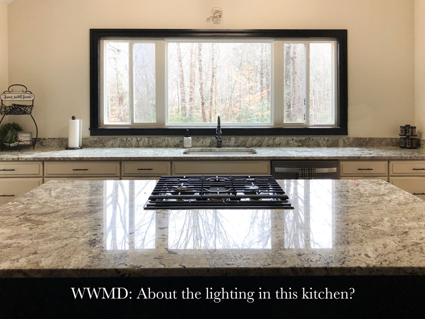
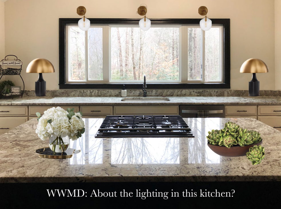
“I’m writing with the hope you can take one look at this photo and tell me what type of light would work above the window. This is my sister’s new kitchen and her husband wants to install a bathroom vanity bar light here and I am about to DIE at the very thought of that!The island is in the Espresso Maple finish, contrasting with the cream perimeter cabinets. The light for the island (not shown in kitchen pic) is this Kichler Barrington one. My sister’s home is on 3 wooded acres and her style is rustic/industrial, sort of. The previous homeowner already had that one electrical box above the window area. I’ve been in this kitchen at night and with the island light, you can see just fine without a wall light.”
Help me choose a stylish light for above the kitchen window.
First of all, I love the oversize window and what a luxury to have no uppers on this feature wall. It feels very spacious. I love that kitchen design is moving towards this room feeling more like a living space and less like a functional ‘get in, get out’ kind of space.
What would Maria do?
The answer to this question seemed so obvious to me, I thought it would be good to post it here. This way if you have a design question you’re not quite sure how to handle, this might be helpful.
Here’s what I mean by obvious.
Twenty years ago, when I was a new designer, if I had a question like this, I couldn’t just go into Pinterest or google and start searching ‘kitchens with no uppers’, ‘vaulted ceilings’, or ‘kitchen sconces above windows’.
By the way, if you’re not following my Pinterest board, you can do that here.
Because if you do that, images that look very similar to your kitchen will appear and then you can easily see that not a single one has a bathroom bar light.
I would also paint the black trim around the window back to white. Random accents like this rarely look good.
I feel the same way about hood fans that are an accent colour. My reader said there are espresso wood beams in this kitchen that relate to the espresso island. That’s enough. Accenting the trim is unnecessary and in this case looks a little like, “We really wanted the window to be black but this is the next best thing”.
Stylish Lighting Ideas for the Kitchen
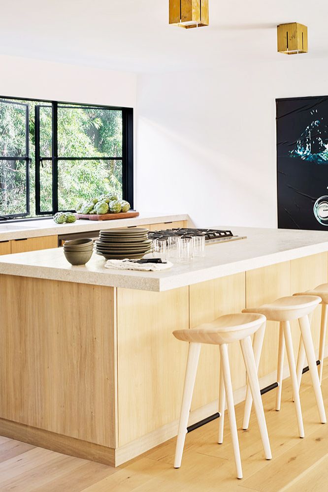
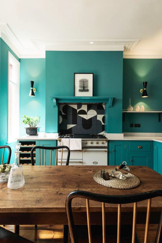
This kitchen has a black window (which is the same effect as the above kitchen) but notice the black has been repeated in the art and hardware. That’s enough.
Black is dramatic and dark and very quickly gets harsh, flat and predictable if you make every choice black. The lighting in this kitchen is brass which visually repeats the warm, stained wood cabinets and counter stools. Very well done.
Read more: The Perils of Decorating with (TOO MUCH) Black
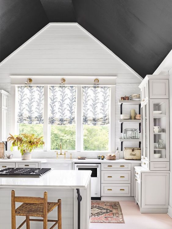
I’m showing this kitchen so you can see the three sconce lights above the window (which is what my reader needs), NOT to suggest you should paint your ceiling black. Here I personally think it’s too much, but it is only paint. Easy to change if you decide it feels too much like a stormy day.
This light is called an articulating sconce light. It also adds light exactly where you need it in a kitchen.
The great thing about this kitchen lighting trend is that it adds task lighting to a kitchen in a much more attractive way than the traditional recessed light in the ceiling.
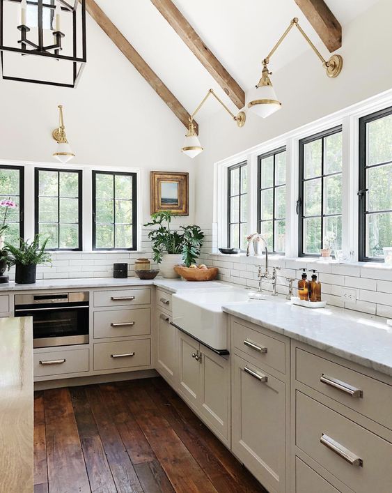
Here’s a slightly different light (below) that repeats the black in the accent tile perfectly.
Devol Kitchens via House Beautiful
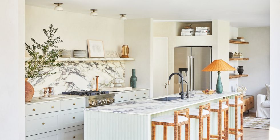
Here this designer (above) installed three surface mount lights (again, avoiding the cheese light look) which perfectly repeats the white and gold in this pretty kitchen. Love the lamp on the island too.
Which brings me back to my readers kitchen, here’s what I added to style it.
This kitchen can EASILY manage two lamps on either side of this window. Of course I would add lamps. No one EVER and I mean NEVER has enough of them.
And of course a bowl with fruit or fake fruit, or fake artichokes, and a vase of flowers in a kitchen this large is an absolute must!
Get This Look
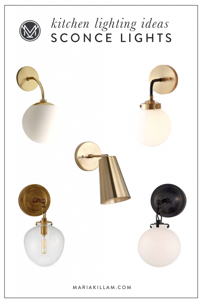
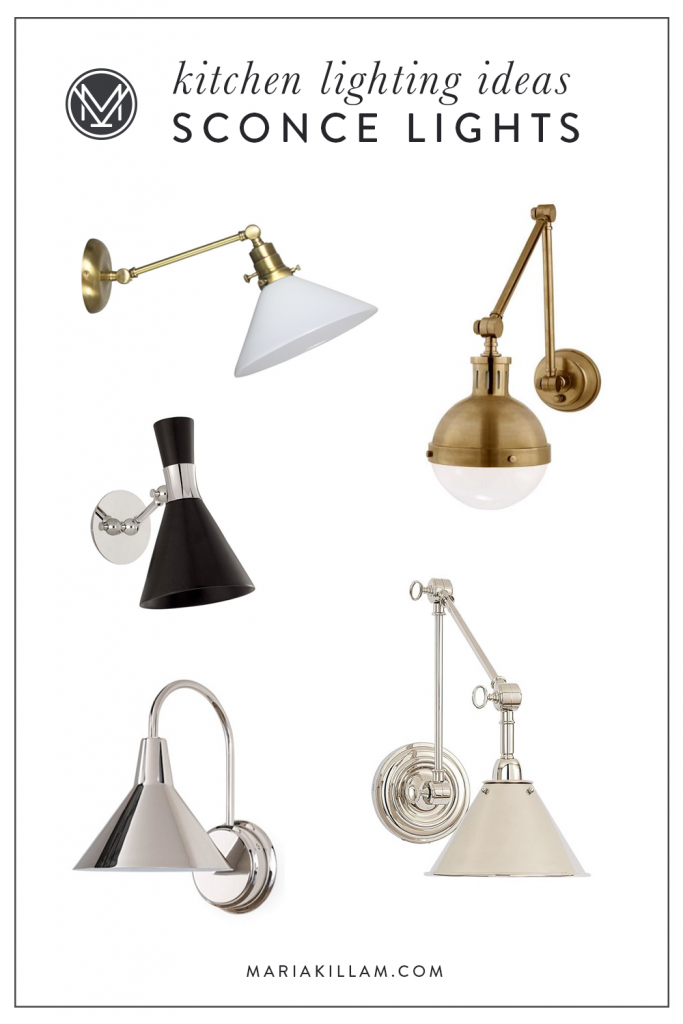
Here are links to some of the stylish kitchen lights shown in the designer kitchens above.
You’ll notice I tend to selected frosted glass because bare bulbs (even though they are sexier) tend to cast unattractive shadows, not to mention they hit you directly in the eyeballs.
Shop these lights:
(L to R) One | Two | Three | Four | Five
Shop these lights:
(L to R) One | Two | Three | Four | Five
If you need help choosing colours and finishes for your classic kitchen this season, buy my virtual eDesign kitchen package here.
If you need help choosing white, download my White is Complicated eBook here.
If you have a question for my WWMD column, email me here. Remember photos taken in good natural light with the room cleaned up will have a MUCH HIGHER chance of being considered.
Related posts:
One More Reason to Skip Recessed Lighting Altogether
Do this Before you Choose a Cabinet Colour
Magazine Worthy Kitchen Designs Cannot be Easily Copied
Disclosure: Some affiliate links used








Your choices are beautiful. However, I’d love to see you address the current electrical situation — a single wall box over the sink. What could be done with the existing wiring, other than the dreaded bathroom vanity light bar?
Yup!! Though I was hoping your mock-up would have the trim painted white like you recommended. We have a single width window at our sink with a similar single sconce over it- it’s close to the wall, white frosted glass shade, open bottom. It does not shine in my eyes with the open end even though I’m short! I think if it projected further from the wall it might.
In a similar situation we used he central light box and just ‘fished’ off it to create two more lights – absolutely NO reason to do the bar light … onceI started to work with a great electrician I was amazed that all the situations that used to be a problem were no longer a big deal.
Yes well said, it’s easier than it seems! And another solution could be to add a valance above the window to cover up the light box. Maria
Hi Maria! f she does a valance above the sink (to hide a light box), should the fabric match, say for example curtains on a sliding door in the kitchen? I can’t see what else she has going on in the kitchen, but in our area most kitchens come with a window above the sink and either a sliding glass door or french doors to the back patio. So I’m assuming that the fabric on the back door should be the same as the window?
No, no, no! I disagree absolutely with this solution. A) unshaded sconce lights like this will shine out into the room and people’s eyes, making the area above the sink glare-y. You need light that will shine DOWN onto the work area, not out into the main room. B) why add brass to a setting that has no brass??? Black would be MY choice, but I could see nickel if you don’t want too much black; silver/nickel would echo the handle on the dishwasher and pick up the whitish tones in the countertop. But gold/brass? That’s adding another tone that is really uncalled for.
So agree about bare bulbs. True Edison lightbulbs are the only ones that don’t stab your eyes. We have four small antique lights hanging from the slanted ceiling over our sink, staggered and at different heights, with Edison bulbs. They look lovely and provide perfect light; when they alone are on, the light is very atmospheric. It’s another way of approaching this design issue.
I am the one to keep my kitchen clean. At 67 years old and 5′ 1″, I’d would have difficulty keeping these kitchen light fixtures clean. This would drive me crazy. I don’t want to drag out a ladder to clean them and risk falling as I age. LED recessed lights may not look ideal, but they stay clean. On a dimmer, they provide excellent task lighting for aging eyes as well as ambient general lighting. Everyone has to make choices for their personal situation.
I have a single light box above my kitchen window and I used a triple fixture that just has a central box and arms that have lights hanging off them. It’s not bad at all! Shades of LIght under Vanity Lighting. They have a great selection of totally updated looking lights. I’d attach a pic but I don’t know how!
I totally agree and think the black sconce light with swinging arm that Maria suggested would be a lovely choice because it would provide a touch of dark at mid-level (in addition to the espresso base cabinet and ceiling beams).
love the articulated sconce lights, Maria…
Your design assessment is right on.
the husband’s idea of a bar light reflects on his total lack of exposure to lighting fixtures of any kind other than bar lights
(hotels? their bathroom?) – very common…
Very informative and interesting post to start the new year… thanks !
I loved all your suggestions Maria!What would we do without Pinterest, right?
I especially like the 3 gold articulated arm scones with the frosted shades which would utilize the middle electrical box. Also, the touches of gold/bronze add elements of warmth and of course the additional lamps! Too many? Never…..
Thank you for the post! It’s fun to see what you would do.
I love your suggestions for lighting, Maria. And for styling (big “yes” on lamps and some greenery). Because of your love of lamps, I added a lamp to our kitchen counter, and I love it so much! I don’t know anything about how hard it would be to turn one electrical box into three. If that doesn’t work for this person, could they use some lighting like you show in this post: https://mariakillam.com/evolution-of-the-ugly-bar-light/ ?
Would you consider softening the window with some type of valence? With a sconce on each side of the window? The big black window feels really strong to me. I love your comment about the one photo with the black ceiling feeling like a stormy day! It was making me cringe 😬
These are all pretty choices for a kitchen. My experience is that kitchen light fixtures with clear globes ALWAYS look greasy/dirty. So unless you are willing to wash them very, very frequently, I would definitely go with a frosted globe. I am waiting to replace my clear-globe fixture when mu husband forgets how expensive they were.
Lisa P, use spray paint (Rustoleum Frosted Glass) to change your clear glass to frosted glass. It is removable too, with a razor blade. Ask your husband if he would prefer to do that or replace the lights. I know my husband would be spray painting in no time.
https://www.rustoleum.com/en/product-catalog/consumer-brands/specialty/frosted-glass-spray
Very timely post for me as I’m mid-remodel. We’ve had our contractor AND our electrician both say they do not recommend wiring for a fixture directly above the window. The electrical was FULLY AGAINST it, but the contractor did say it COULD be done – but would be quite laborious and involves (aka expensive). So, something to consider. In this case I will probably just do a single surface mount over the sink area sort of between the flanking wall cabinets and hope for the best. I do have the perfect spot for a lamp tho!
Agree Maria, I don’t like seeing light bulbs either. For that reason I likely would have picked the last nickel swing arm light; even though your choice of an Edison bulb is not as glaring, I can still see the bulb. Also, one light is not enough in that great expanse. I would install two or three lights depending on the size of the silver shade.
The lamps might be more useful on the island if there isn’t any/enough overhead lighting.
Am I the only one that is totally against the cooktop in the island? And, why would you put the sink and cooktop directly across from each other?? So, if you have someone that is cleaning while you are cooking in that large space, you are working within 2′ of each other??
Beautiful! The more lights the better when preparing food and cleaning up! If I could design a kitchen, the department of health and the electrician’s union would love me. I’d have wall outlets and easy to tap wiring behind every wall.
Just installed these in a cottage, above a styled bookcase and they are fab
https://www.circalighting.com/boston-functional-single-arm-library-light-sl2922/
The choices and especially the lamps don’t say “rustic industrial” to me. I dont know if they are particularly classic either. I like the 3 light fixtures idea, but what if the owners don’t want to fuss with the extra wiring?
Yay! Thank you so much for using my WWMD submission, Maria. Since I sent this to you, my sister has persuaded her husband that they do NOT need a light above that large window and they are going to drywall and paint over the electrical box. The large island light not shown in the pic above provides a ton of light in the evening and the kitchen is very bright throughout the day. The cabinet hardware is ORB, as is the faucet. She won’t be adding brass anywhere because she dislikes it. Thanks for the styling suggestions as well as the lighting advice.
I love using articulating lights in these instances because they add lighting in just the right place AND they claim height in an attractive way.
My bathroom sink, mirror and sconce are off center. I wonder if they make an articulating sconce that swivels right to left. I’m off to search. Thanks, Maria!
Although the lights are beautiful I know they will not be good lighting for applying makeup. I am currently undergoing a master bath renovation so I have to decide on lights mirrors hardware etc