


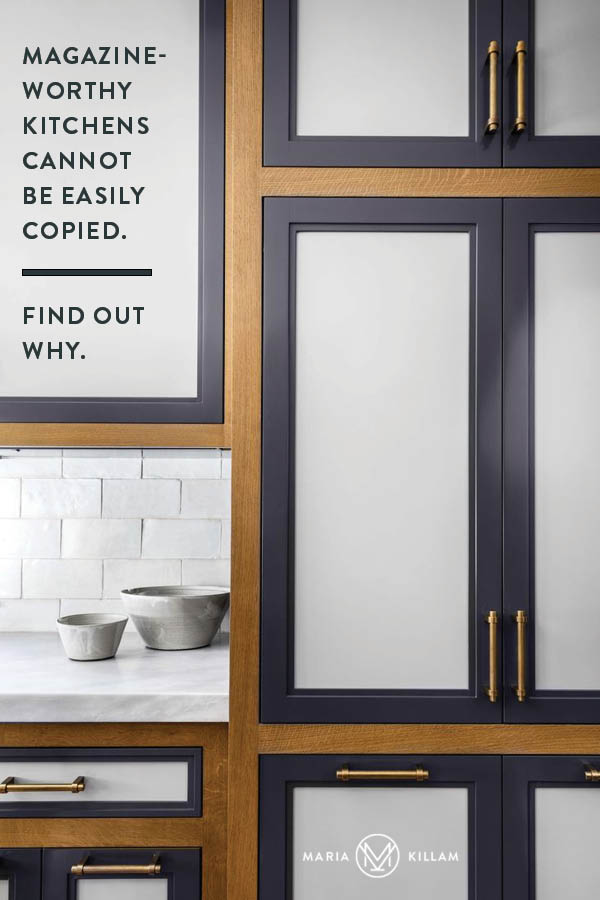
Cherry picking your favorite details from professionally-designed kitchens will not make your kitchen design better and can end up falling flat. Magazine-worthy kitchen designs cannot be easily copied. Let me explain why.
House Beautiful | Interior Design by Nina Farmer
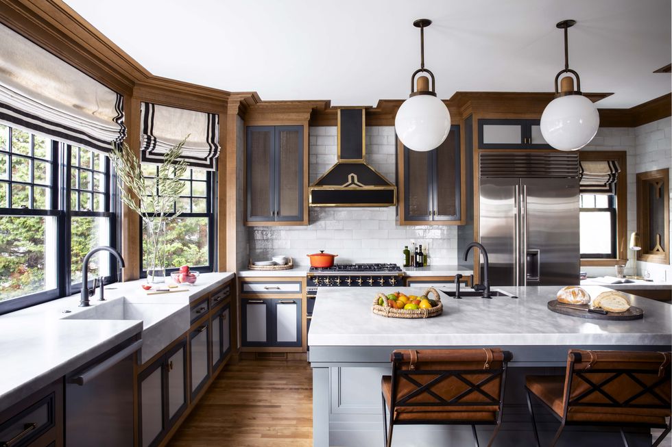
A beautifully designed kitchen.
When I opened up my House Beautiful issue this month and saw this kitchen I gasped! So I looked it up online and ended up keeping that tab open for days because I just kept admiring all the beautiful details that made this kitchen so pretty!
Just look at the pendant lighting and how it perfectly matches, down to the stained wood detail above the globe. Then you have the contrast banding–not one but two rows of it–on the roman shades. And then the white and blue grey marble countertops repeated in the white hand-glazed backsplash tile.
Plus, the blue grey island that was intentionally chosen to coordinate with the blue grey marble and is also repeated in the cabinet inserts. Top it all off with cognac and black counter stools with x’s to repeat the contrasting elements – just enough to make it all gorgeous without going too far.
Absolute perfection I say. A kitchen to inspire a thousand kitchens.
This kind of kitchen is so stunning, it should definitely come with a disclaimer: Do not try this at home.
Now before you get upset, hear me out!
Magazine-Worthy Kitchen Designs Cannot Be Easily Copied
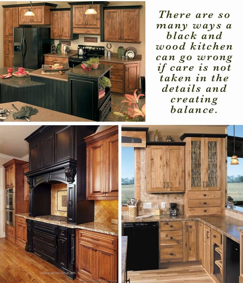
This combination, two-toned black and wood kitchen is definitely a hot trend! And it makes sense because an all-black kitchen can get dark and heavy fast. The espresso brown kitchen from the brown trend, after all, is not that far behind us, so this is a good way to do a richer look with wood and make it look fresh and now.
However, as I mentioned in this video, it’s hard to cherry pick the details you like from an inspiration kitchen or bathroom and be happy in the end.
If that worked, there would be a lot more pretty kitchens and bathrooms on a real estate site than what you can find currently.
Let’s Breakdown Some of the Details
The reason this kitchen is so successful is that there is mastery in balance and details. The kind that takes skill and experience.
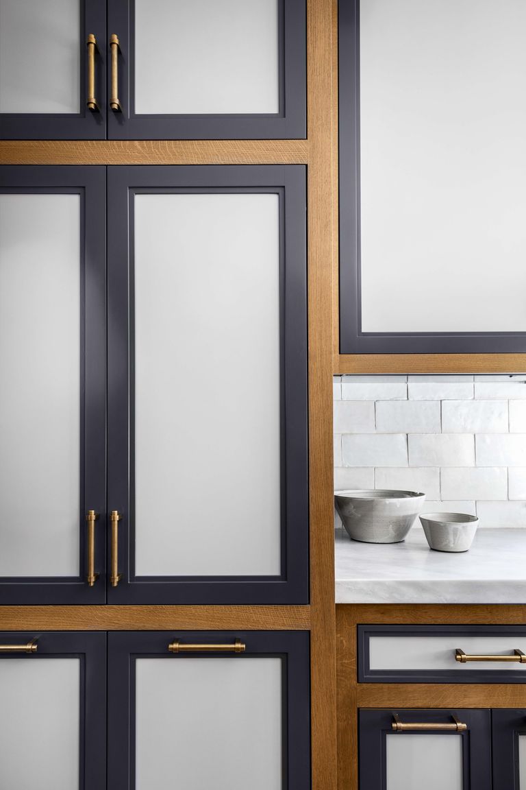
The weight and thickness of the black and wood elements is just right.
The repetition of elements is almost obsessive, yet doesn’t come off overdone. (This is what impresses me the most personally, the way the black border on the roman blind looks just right and sweeps the pattern of the contrasting black bands of the cabinets and frames of the windows perfectly without looking heavy handed or stiff)
The blue greys of the cabinetry, marble and island all relate seamlessly, there are no rogue grey undertones here. And the coolness of them is perfectly balanced by the drama of the black and the warmth of the natural wood tones.
Even the way the colour of the wood and the moldings makes this kitchen fit seamlessly with the wood craftsman trim of the rest of the house is carefully considered.
Will this kitchen inspire copycats? You bet it will. It manages to be both of the moment and timeless. But again, the success of this space is in the designer’s obsessive attention to detail. And that cannot be easily copied.
What Could Possibly Go Wrong?
With the wrong balance of elements, this two toned cabinet style could easily look jarring, too linear, stark, and even busy. Without just the right amount of white and pale grey, it could get heavy and stuffy fast.
Plunk this kitchen in a house where all the trim and cabinetry throughout is white or cream and it will look completely awkward and alien.
All those linear details rely on the beauty and balance of the careful and symmetrical layout of the cabinetry and windows. With a less optimally balanced layout, the linear contrasting bands everywhere would only draw attention to less than perfect bones.
What Makes a Great Layout?
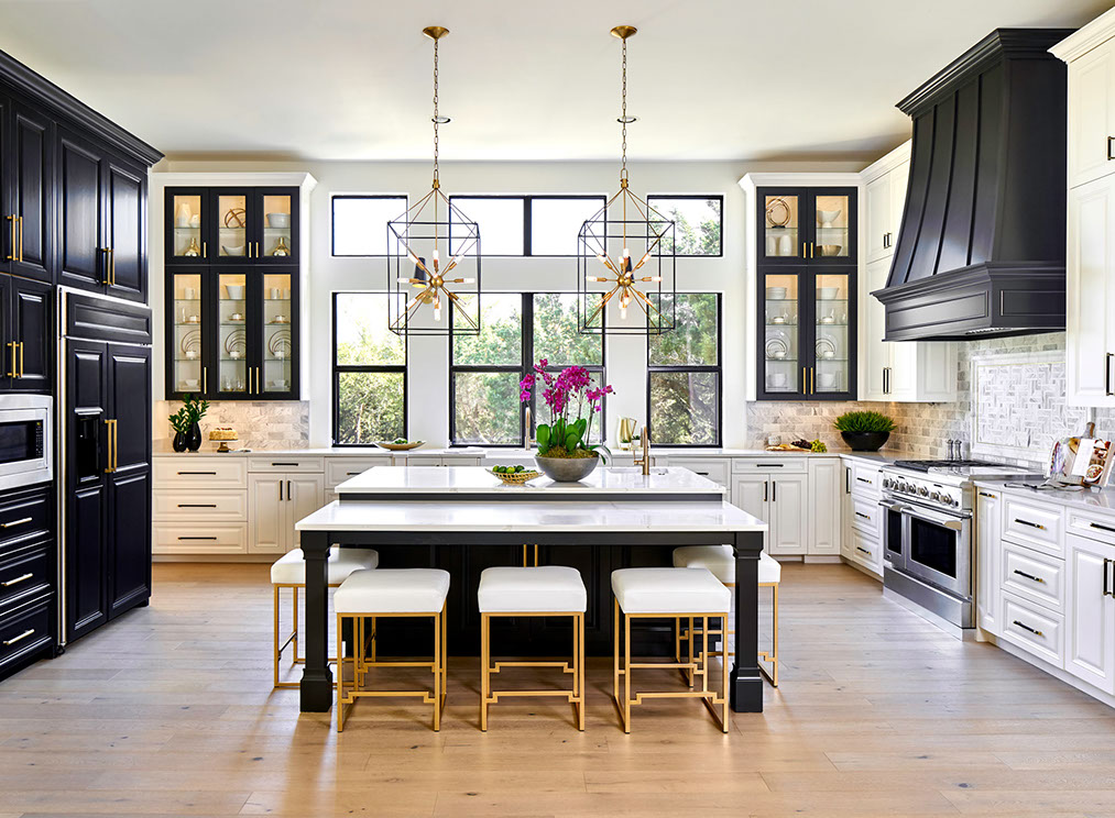
Haven Design and Construction | Painting by Paper Moon, San Antonio, True Colour Expert
Gorgeous layout and symmetry are working for the kitchen shown above too. Look at those incredible windows! They make the perfect focal point, bookended by the contrasting black and white display cabinets. The black door frames repeat the pattern of the windows and create a connection with the heavier black hood fan cover and the dark pantry cabinets on the other side.
If the windows and cabinetry were not so beautifully laid out, and the black was not well proportioned and balanced, this black and white kitchen idea could easily fall flat.
Even the white stools play a vital role in breaking up the black island and keeping it from looking like a black hole in the centre.
Pros Make it Look Easy
Ever notice how a true professional makes what she does seem effortless? The athletes and performers that seem completely at ease, the ones we are not clenching our teeth for as we watch, but instead getting caught up in the aesthetic thrill of it all? Magazines, Instagram and Pinterest are the stage for design pros. And they make it look so deceptively easy.
So the non-professional homeowner, who has never designed a kitchen before, sees this black island, hood and windows and thinks, “I’m going for it!” And they are not at all aware of the tens of thousands of hours of work and experience it takes to be able to pull off the details of a kitchen like this seamlessly.
It is Not Elitist to Say that Interior Design takes Skill
This is not to sound like a snob, it’s just to say that spending tens of thousands of dollars without the help of a pro might not be the wisest of ideas. And if you are going to flex your DIY design muscles, do it wisely and keep it simple.
That’s the reason why my classic and timeless white kitchen wins. Because it’s easier to pull off than this latest trendy kitchen.
All of the above kitchens feel heavy and oppressive because they lack balance and contrast. The concept got lost in the details.
Keep it Simple, a Little Goes a Long Way
The old cliches are cliches because the are fundamentally true. Keeping things simple is the foolproof way of creating a beautiful kitchen.
I recommend that any black you introduce is slim in profile. A honed black or soapstone countertop is a great way to introduce a little black. As is refined black hardware. And lighting is another place some black metal detail can be just right.
Beautiful wood cabinets with black countertops and lots of white by Sarah Gibson of Room for Tuesday
Tread lightly with a black island and avoid black appliances. Big blocks of black ruin the coherent look of a nice bright kitchen.
And if you do install black windows on your interior, make sure your windows have good scale and placement. And make sure the profiles are slim. More about black windows here.
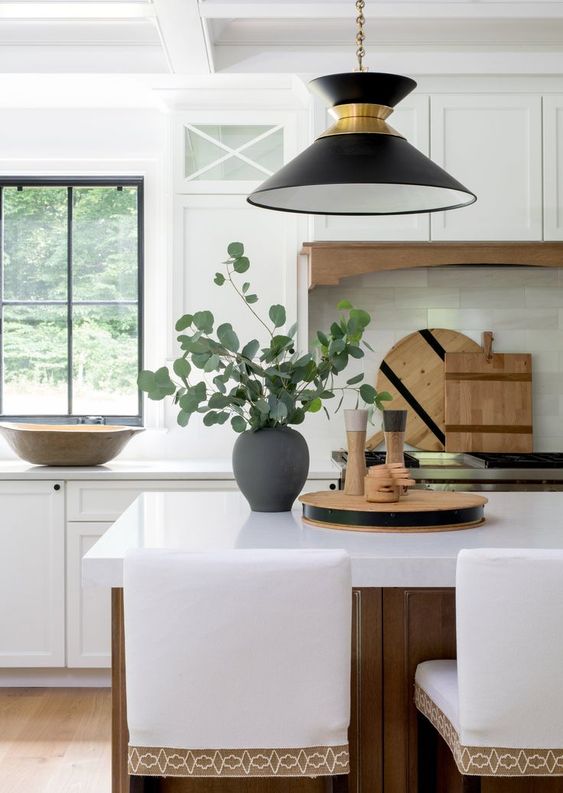
How to Introduce More Wood while Keeping the Look Fresh
If you’re considering wood cabinets, make sure you balance them with a a crisp white backsplash and countertops. A little black can work too, as long as there is also ample white.
Notice how this kitchen above has a warm feel with lots of wood. However, really, just the floor, island and hood trim are wood toned, the rest is decorating and styling. From the pretty custom trim on the stools to the wood cutting boards and bowls on the counters. The striking black pendant light brings in just enough black to repeat the black windows without being too much.
So those are my tips for getting the look in a more simplified and goof proof way.
If you would like help choosing finishes, colours and important details like lighting and hardware for your new or updated kitchen, you can find my Create a Classic Kitchen Online Colour Design package here.
Related Posts
Are Black Windows the Best Choice for your New Build?

I too stared at this kitchen in the magazine. So unique and perfectly executed. Your take on it is spot on and so effectively communicated in the post.
I would love to see a similar post on painting the trim/doors (and sometimes cabinetry) the same color (a color other than white) as the walls. What makes this work vs fail? Is this a timeless look? I am considering doing this in my mudroom bc the off-white trim and doors are always dirty in there living in the country with young boys, but not sure the room has the bones to pull it off.
Thank you for the lovely post.
And that is why we have so many styles, because that kitchen does absolutely nothing for me. I don’t like the inset. I don’t think the hood goes in that kitchen. I don’t think the stove goes in that kitchen. I don’t like the screen on the doors. I look at that and think “What were they thinking?”
What a fascinating post, Maria! I love the way you disassembled the design elements and details to show us that it would take a pro to assemble them properly. That further confirms why a classic white kitchen is much simpler to pull off for an amateur…but I would still consult you to get it just right! 🙂
Maria guess I’m strange cause I didn’t care for that kitchen to much going on .
Felt like the cabinet insets painted like that would
Very quickly look outdated …
Had me thinking of the white with oak cabinets .
When I seen that my eyes didn’t know where to rest .
I can appreciate the work that went in to it .
And it’s okay that it’s not for every one .
Cause we wouldn’t want all our kitchens to look alike nor our homes .
Thank you for sharing
I loved reading your deconstruction of the first kitchen. And agree that a lay person could not pull it off. But…I don’t like the kitchen. It would depress me.
The second kitchen is just not a kitchen to cook in. It’s a show kitchen. Look at the distance between fridge, sink and stove. You’d run a mile to just make an omelet. I’ve had a kitchen as large and shaped just like this..and I always avoided cooking. It’s just not real.
I first looked at this kitchen and thought , that’s much too BUSY and DREARY for my taste!! The second thing I thought was, I could never cook or bake in there ! The stove is far too far from the sink and also from the refrigerator! The space is looking like it’s just for SHOW , and will look outdated soon enough!!
Find I agree with some of the other posters – I didn’t care for the kitchen much either. Apart from the hood, which also didn’t grab me, I could have taken a lot less of that crown moulding round the ceiling, it just looked oppressive and made me think of homes my old aunts used to live in back in the 50’s! It was all just too heavy for me. (I normally love other rooms you feature!)
Wow! That first kitchen just had way too much going on for my liking, especially the area where the range hood is positioned between the two cabinets. My eye didn’t know what to focus on. Sorry, I guess we can’t all like the same things.
I must admit I can’t find anything to like about that kitchen. Most of the “magazine-worthy” kitchens impress me as being designed for the main purpose of appearing in a design magazine. I much prefer “pretty” kitchens that are designed to do the job for which they are intended.
One thing I notice about the splendid designer kitchens is their size. Compared to the kitchen in a normal house, they are immense. The sheer amount of space allows them to carry details that would look awful in the confined space of an ordinary kitchen.
Yes that is really true. And whether anyone likes this kitchen or not is besides my point. This is exactly why incorporating and cherry picking trends don’t work in the average home to create a classic and timeless kitchen because of the attention to detail that is evident in the kitchens in this post! Thanks for your comment Kay! Maria
Maria, you did a marvelous job of noting all the balancing details. I agree that some designer worked really hard to find so many “matching” elements. But I just don’t care for it at all. I have to agree with the others who find it too busy. I cannot imagine how messy this room will feel once you get dishes and cooking utensils laid out for cooking and eating. There is no place for the eye to rest. I’m sure it looks better in real life, but it would be a deal breaker if I were looking at buying that house. I’m sure that many would find my calmer and slightly elegant kitchen boring…but it can easily be jazzed up or down. Variety. That’s what makes the world go round. Thank you for your insight and keeping us on our toes.
I love this kitchen. I’d already had it downloaded for future reference. The reason why I love it is because it is sympathetic to the house style which is a craftsman. The house was built with attention to detail in quality and materials so of course the kitchen must follow on in style. In comparison to a modern kitchen it may seem overly fussy and dark but to me I see carefully curated elements, a style that is comfortable and timeless. It enhances the narrative of the whole and that’s what great design should do.
Wow yes at first glance this kitchen IS a showstopper! Upon further inspection, there is a lot going on with the use of mixed materials – a current trend, yes? With the word mixed it can seem busy. Almost too busy. Like we aren’t sure what to rest our eyes on because there is a lot to absorb. Broken down, as you so beautifully did, we can see how it all WORKS. And it does. Interesting with all the mixed materials in Kitchen design these days….like we are sashaying up to a buffet and choosing some of this and some of that. Bottom line: Love your design and for goodness sakes, use your kitchen! ;-P
I think this is the first time I ha e completely disagreed. This kitchen is horrific.
I really appreciate that you show photos where it doesn’t work, and clearly explain why. So many design blogs just show beautiful photos, and it doesn’t help me learn the fundamentals. Thank you!
Absolute agree with you. Too much going on and I get a headache looking at all those hard and heavy grid lines, repeated over and over.
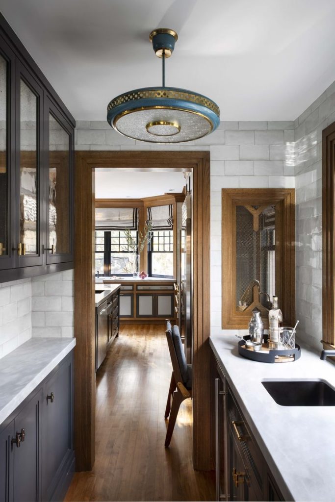
This kitchen will date so quickly. I did like the butlers kitchen though.
For me the takeaway message, in addition to Maria’s sub heading of ‘Keep it simple, A little goes a long way’ is ‘just because you can do everything (or afford everything) doesn’t mean you should’.
I did get the main point of this post though and understand the value a professional brings in terms of achieving the best balance, repetition, scale and proportion etc which DIYers might not have a good grasp of.
Maria , you mentioned to tread lightly with big blocks of black in a light airy white kitchen Would that apply to adding a black dining table to a adjoining dining room ? Just curious of your thoughts.
Thank you Amy
That’s fine as long as you repeat it again in much smaller doses! Maria
I’ve definitely been reading this blog for a very long time because the first thing I thought about when seeing that kitchen was, “Thankfully they used a “white” backsplash tile and non-bossy countertop. If I had to move in tomorrow, all I would have to do is paint the cabinets white and I’d have the perfect kitchen.”
So smart Christina! xo Maria
Nope. That kitchen is way too busy looking. I don’t think it would appeal to very many at all. Yes, the designer must have spent a lot of time, but she/he should have stopped a lot earlier.
I do really like the pendant lights. Swedish globes cast a really nice light especially in a kitchen and the extra detail is very attractive.
Without the large bay window, think about how busy (or for some.. how much busier) the kitchen would read! I imagine that’s what Maria means …. professional designers know how to pull off two-toned cabinets because of the existence of window. Most people “in real life” have so many more upper cabinets and only a tiny window and the proportions would be off.
Yes good point Laura! Maria
Like or dislike, this is a really interesting post because you highlight the way the same elements in Wood, black, white look in different contexts and photos. Your post illustrates so clearly that it’s a) about a designed space with balance and b) great photography. I so appreciate this post because I can e.g. pick apart beauty/hair/make-up in the same way you can unpack design so I never run into problems in the beauty realm (thinking I should get a certain haircut when clearly it’s the styling making the difference- and I have saved a bunch of friends from making the same mistake) but I do get irrationally irritated that I can’t seem to make the transition to design in the same way 🙂
I just don’t see the patterns – which I guess brings us back to 1).
so this is tremendously helpful! If you need a look critique here’s my offer lol
I do like most of the details from the House Beautiful kitchen. I’ve always loved Craftsman style kitchens, especially the heavy moldings.
But, I don’t like the light grey inset panels. To me, that is one detail too far and the contrast detracts from the rest of the kitchen.
Same true in Garden Design. Clients hire me, often, after copying a magazine idea/s.
What went wrong? Layer/s they copied, were not the ‘structural’ layer/s. Instead, the cherry-on-top/s. Plus, improper siting.
Without proper ‘structure’ Garden Design presents as; Feckless Mush. Too often, zero in winter, everything deciduous or herbacious.
Good news, most everything already done can be kept, and proper layers added.
My clients taught me how to get things done. Need to renovate my kitchen? I hired someone to choose colors, lighting, everything. More importantly, I did everything I was told to do.
When I hired someone to update my furniture placement, art, etc. I told her, “If you say to hammer sofa to ceiling, I WILL.”
Garden & Be Well, XOT
You’re so right, Maria, cherry-picking elements of this kitchen wouldn’t work for most. I agree with many of the posters that it’s far from perfect, but I do recognize that many people enjoy perfection in design. My own perception is that it’s too large, a poor work plan, and just too matchy-matchy, which in the end equals boring. No matter where your eye rests, there is something there that you have seen before in the kitchen, and the person prefers this look will find themselves working to match, match, match everything, including accessories…notice the two flat basket trays.. they are exactly the same. Unity in design is pleasant, but for me, this is excessively overdone.
Do not like that first kitchen. Too much going on. 3 finishes on the cabinets. And then if you have an open floor plan, I yai yai.
I echo other readers….not sure how this kitchen is swoon worthy. The inserts are horrible! I did enjoy the rest of the post.
Great post Maria! I love how in the Haven Design Layout photo, the pink orchids are the bright focal point…just a touch that brings the room to life. If you cover them the room loses its zip. When looking at a photo of a room you love, it’s interesting to cover different elements to see what makes that particular room sing!
For myself, i see this kitchen screaming – money. Some nice elements but a bit over the top for my tastes. The homeowner/owners can most likely afford to do a complete remodel in 10 years when it becomes outdated.
You did presented us with a nice example of what picking and choosing elements entails.
I agree, that kitchen is stunning! The designer thought of and coordinated every last detail. I loved how you dissected the elements and why it works. As others have said, it wouldn’t be for me but I appreciate the beautiful way it comes together and effort it took to get there.
But for regular people with orange maple cabinets throughout the house 😀 if we can only afford to update master bath (complete remodel), should we try to work with the maple cabinet for a cohesive look throughout house or paint white to update just that one room (will be selling within year too)?
I would treat each room like you’re moving forward but not introduce something that makes it look like “New floor, old bathroom”. Hope that helps! Maria
Well sadly I have to agree with many who have pointed out too matchy matchy. The first thing that I noticed is the layout. It certainly does not have a proper work triangle. I think it is a little contrived. As they say “beauty is in the eye of the beholder”!
You did do a great job of pointing out all of the matching elements however but I like your original lesson of “less is more”. Keeping it simple is the best look for longevity!
All I can focus on when I look at the first kitchen is all the folds in the white roman shades! They are going to collect grease (if the kitchen is used and not just a “show ‘kitchen’) and dust. Once or twice a year, someone has to climb up a ladder or climb up on the gorgeous counters (OMG! Is that too much weight on them?) to take them down, dry clean them, and rehang them. A huge amount of time and effort, big expense, even bigger if you hire people to take them down & reinstall them!
And the screen window inserts in the cabinets right next to the stove! Imagine cleaning those and everything that gets dirty behind them? Of course, people who can afford such an enormous kitchen can afford cleaning help, but these are unnecessary time-consuming extra jobs. Good design should allow for easy functioning. Maria, the kitchens you design are much more functional as well as beautiful.
I actually don’t like those cabinets at all, and the whole kitchen is too busy for me. I’m not seeing the “Maria classic style”. But your point is good. I’m glad you showed really bad examples. The only one on the page that looks good to me is the second one.
There is nothing classic and timeless about this kitchen however it doesn’t matter how many times I say it, people will still try and copy this kitchen and fail at it which is why I wrote this post!
Thanks for your comment!
Maria
Oh my, I LOVE the light fixture in the 3rd picture. I agree and thanks for breaking down the design as to why it works and the other pictures showing why it doesn’t. Its a lot of money to spend on a kitchen only to have it redone years later when it looks dated. I liked it but would not want it.
I really love this kitchen with the exception of the lower cabinets. I think the natural congac-colored wood trim looks great with the large window over-looking the woods. I love the molding extending to the ceiling! I love the balance of cools,( white counters, blue-gray paint) with the warms (wood trim and brass). I think it has just the right amount of black, which is so hard for us amateurs to get right. That tipping point comes quickly. I think the lowers would have looked better as all wood or with matching blue-gray paint. I think the all white, minimalist (boring) kitchens are on their way out. This kitchen is so much more interesting and full of character,IMO. Thanks for sharing and for your analysis, Maria!
I really enjoy your blog and it’s good when we all don’t agree.
This Kitchen reminds me of homeowners who didn’t hire a designer. The cabinets looks old and tired and they went crazy with the paint because hubby wanted the wood to show and the wife wanted painted cabinets and they came to the edge of the cliff and jumped over.
They don’t need the overhead cabinets as this room has plenty of storage.
The island lights I love.
I guess my words are “overdone and not a good choice of products.”
But that is why we have hundreds of spices as we all don’t enjoy the same thing.