Often a bathroom renovation means some finishes stay and some finishes go. Before you choose any new hard finishes or paint colours, you cannot ignore what is staying and simply install “white” anything – countertops, tile, wall colour, etc. Keep reading to see what I mean.
How to Refresh Your Bathroom Without Replacing the Tile
Want to know how to refresh your bathroom? If you have old tile that is staying, but you are replacing the countertop (whether you’re in a kitchen or bathroom), often the new countertop is chosen without taking the tile into consideration. Don’t do this!
Choose your countertop colour with caution and carefully consider it with the existing hard finishes (in this case floor and wall tile) in mind. Because if you pretend your old tile is not there, you will end up with the look of yesterday and today, or in other words, “old tile, new countertop.” And this is not a look you will be happy with in the end.
Okay, I have one more transformation to show you from this interior design project last year! I revealed the master bedroom from my lovely client Deborah’s home last week, and here is the ensuite bathroom design.
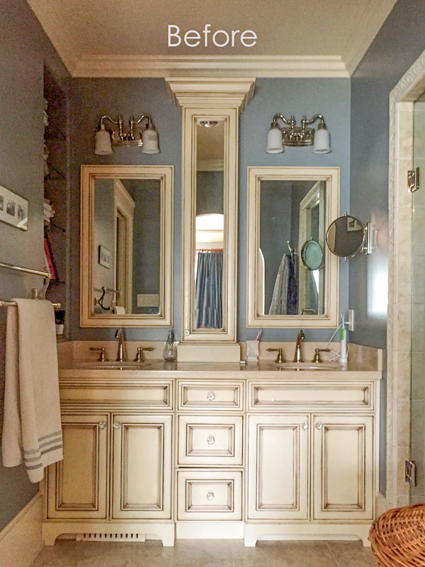
The bathroom before.
The old countertops were Crema Marfil marble. And the vanity was glazed, which was the trend around 10 years ago when this bathroom renovation was designed.
What hard finishes were staying? The client wanted to keep her floor and shower tile, but update her countertop, vanity and wall colour.
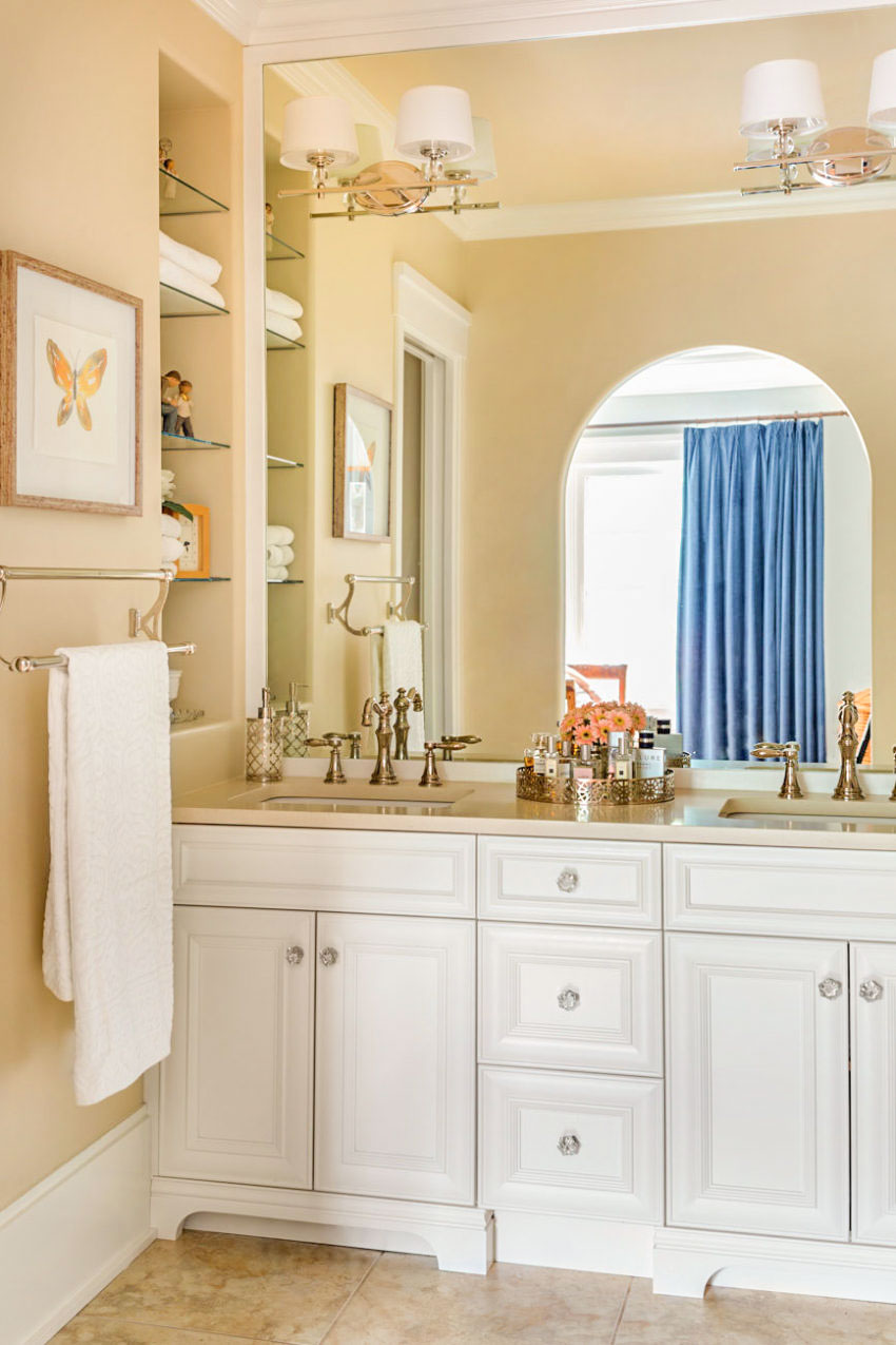
The bathroom after.
We did a similar refresh here as we did to her Tuscan powder room. We replaced the countertop, then added new faucets and lighting. We even added a new mirror that spanned the wall from countertop to ceiling. It’s too narrow in here for wall sconces on either side of the sink so to give this vanity and cleaner look, we removed the skinny tower cabinet and installed a large mirror instead. Don’t you just love how the sconces are installed seamlessly with the mirror.
The floor and wall tile from the Tuscan (or earthy brown) trend stayed but we managed to add a new fresh off-white paint colour on the cabinets and trim. With just these changes, it’s a whole new bathroom!
Read more: What countertop looks good with Carrara Marble tile?
Wall Colour: BM OC-6 Feather Down, Countertops: Caesarstone Buttermilk quartz, Vanity Colour: BM Cloud White
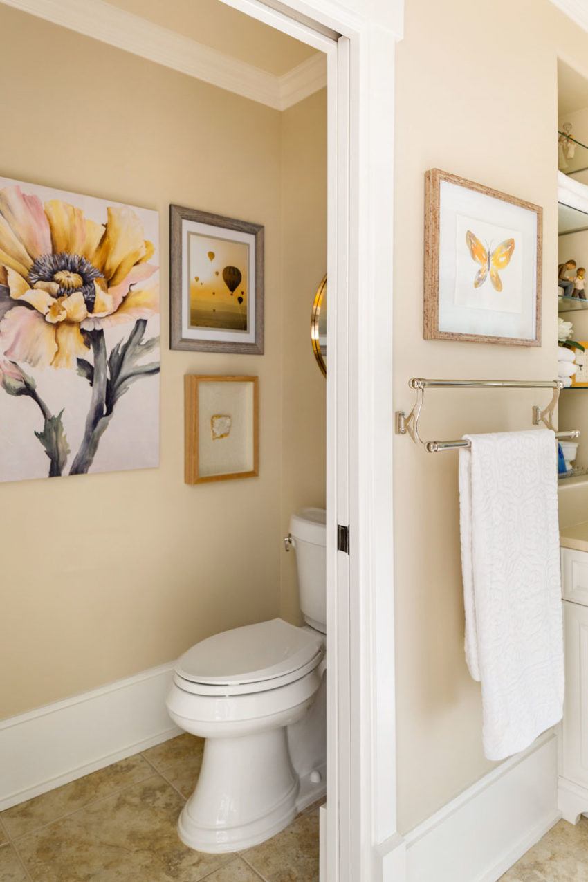
We picked up some fun artwork from HomeSense to give the toilet room a little atmosphere! It’s a great way to distract the eye from the old tile and make it feel fresh and updated!
Photography by Barry Calhoun
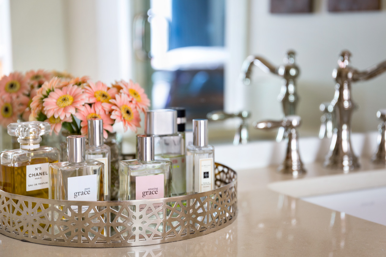
Lastly, don’t forget the styling. Once you have your hard finishes in place and the right paint colour, you are only just beginning to decorate your bathroom. This is the fun part! Find a pretty area or bath rug that repeats the colours in your master bedroom decor and add some fresh flowers for a beautiful new look.
Here are some of my favorite bathroom styling ideas curated for you on Pinterest.
After
Let’s review, shall we?
So, did you get that? If you are NOT replacing your earthy tile or floor, you cannot simply ignore it and install a white countertop, for example. I’ve said this before but lately we’ve been getting so many requests for white countertops regardless of what’s happening with the flooring that I thought it was time to talk about it again. Ignoring a hard finish that you are not changing will not lead to a fresher look overall.
If you have a patterned tile similar to this, the other countertop that will NOT WORK is a marble countertop. Typically it doesn’t work to introduce two patterns in your hard finishes, and is the reason why most bathrooms you see in real estate listing are just bad. I hope this post helped to teach you how to refresh your bathroom.
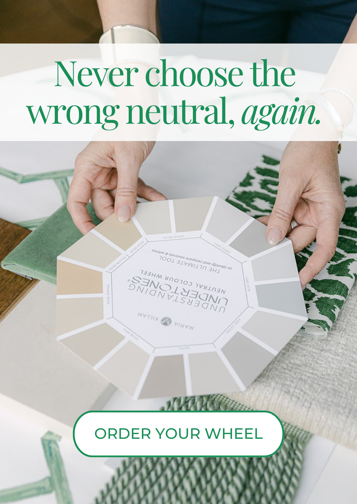
NOTE: If you’re reading this and you don’t see what I’m talking about with the neutral undertones, you’ll want to grab my first eBook, How to Choose Paint Colours — It’s All in the Undertones.
Terreeia and I are in Dallas for a meeting this weekend. Happy belated Valentines Day! Thanks so much to all of you for your love and support over the years, I am in year 10 of writing this blog and I couldn’t have done it without you!
xoxo Maria
Related posts:
Ask Maria; Which Countertop Should I Choose? (What Were they thinking?)










Very pretty as usual, Maria :>
Dying here, waiting to see the reveal on your bathroom renovations!!!! (But this one is really, really nice! I love it!)
Yes, Brenda, me too. I’ve really been looking forward to seeing the end result. I’m sure it will be fabulous!
I really like the color of this bathroom the Featherdown it’s soft warm I’m not a very white white personality ! Really pretty love the art .
Love all your posts, learning all the time. Thank you ?
The re-do looks nice. Quite similar to what I put in 16 years ago. I didn’t like the framed mirrors (don’t think they were quite “in” at the time, so I went for a counter to almost ceiling one. Glad of that!
The wall colour suits a nice beachy (as in sand) theme, same as mine.
My tile! Oh, my gosh, someone else is dealing with the same tile! Lovely outcome, Maria & crew. I don’t know the ballpark figures for replacing counter top and painting cabinets for a bathroom this size with the materials you chose. Does anyone have a guess? I am deciding if I simply paint walls (picking up the taupe color in the busy bossy tile) or if I spend more to do it even better by painting cabinets and investing in counter top/labor. It’s great seeing successful Tuscan Transformations, Maria, with your tips shared. It gives me hope and direction. Thank you!
Looks good now and looked nice enough before. Nice to work with what’s EASY to demo and not make a giant mess o’dust from tile demo.
Love the new colors chosen. But getting rid of the tower & mirrors really opened up the space. I bet the room feels like a breath of fresh air.
An excellent compromise.
You’ve given this bathroom a whole new life. To say it’s freshened up is an understatement as everything looks 100% intentional. This post and your advice to not ignore the tile is so timely for me. While I know better than to think I can ignore tile, I needed to hear it again. I have a bathroom I was set to take apart and because of a more urgent and costly project that just reared it’s head yesterday morning, we aren’t going to be able to take apart this bathroom until the fall. So last night I was wringing my hands over how I’m going to live with this until fall and I decided that this weekend I was just going to paint it white and live with it for now. My tile is yellow with turquoise sawtooth borders. Painting the walls and trim white would probably be a big mistake and probably make me more miserable with it. I’m thinking I need a soft buttery yellow and artwork that brings in the turquoise. I’m not a fan of yellow but I realize I need to look at this as a whole. Thank you for setting me straight! 🙂
Hi Maria (and readers,)
The colors look so pretty together and look intentional and timeless. I have always loved the color combination of white and tan/golden beige (or whatever you would call those colors in the tile, wall, and counter!) Just a quick question though: The old crema marfil countertop looks so similar in color to the new quartz countertop (at least on my monitor), that I am wondering why you replaced it. Was the undertone of the crema marfil too pink? Just a guess–I know that crema marfil can really vary, of course, being a natural stone.
It is amazing how the large mirror visually expands the room!
Yes it was quite pink in here and the floor really isn’t pink, also it looks better with the backsplash as well. Thanks Phyllis! Maria
Oddly enough I like the before look better.
Great job! Boy, does the new color on the walls look good. It’s fresh and modern with the lighter color on the cabinets. And still relates to the floor and counters. I also love the new mirror. You are so talented!
Such a timely post! What about choosing a new countertop in a bathroom with old shower/tub tile? As we can often afford to redo the floor but not to rip out shower and separate tub. Would love more posts about 80’s tile clashing with trendy granite or marble (real or look-alike) counters. And will the Carrara marble look seem as tacky and over-done in 15 years as the speckled sparkly granite look is now? (The more upscale hotel bathrooms I see with a particular countertop, the more trendy then tacky it becomes in my mind.) Help!
Marble is a much more classic look in a bathroom than earthy granite. And yes it will look bad if it doesn’t relate to the finishes that are staying in your bathroom.
If your bathroom is 80s I recommend a laminate countertop that relates to what’s in there right now. If you need more specific help, you can purchase an eDesign consultation, hope that helps, Maria
This is fantastic.
This is such a common situation! It takes careful thought to incorporate what’s there without getting that hodgepodge look. A few years ago we purchased a 1969 house that still had the original bathrooms. The main bath tub (white cast iron) was OK but the toilet and sink/vanity were in horrible condition. The pale beige tile (yellow undertone) was still in great shape, though, and we couldn’t afford to replace it. Fortunately, the tile has no texture at all—totally flat and one color (a nice retro look). We had white/gray/black speckled granite left over from the kitchen counters and used that for the vanity countertop, with a white linen curtain to block the view of the pipes underneath. We added white sink and toilet, bright white paint (like the rest of the house) and decorated with items based on white/gray/black/beige. It fits perfectly with our Scandinavian, somewhat retro style in the rest of the house. We love it!
Pure magic. That’s what you do, Maria. Beautiful magic. with lots of love.
The tile looks similar to my kitchen floor tiles. I like the Featherdown walls and Cloud White cabinets. I’ve been trying to find a quartz to replace my boss brown speckled granite. Would Ceasarstone Buttermilk work well for kitchen countertops too.
If it relates to your floors, yes. Maria
Wow, it looks fresh and clean with “dated” colors on the floor, wall, and counter top. Everything looks amazing. I’m just wondering how you coordinated all the whites, is the off white toilet new, it looks very new and pretty. And is the white in the artwork off white or is it just far enough away from the baseboard and toilet that you can’t tell. I didn’t think it was possible to make a bathroom look good with a floor like that, but now I am inspired.
What a lovely solution! I know your client must be thrilled. What would have been done if they had a white tub/shower in this bathroom with the same tiles on the tub/shower walls? Would you use white subway tiles on the walls to match the tub or used an off subway tile to match the floor? I have seen this situation several times.
After years of reading Maria’s blog advice, I updated our tiny 1940s powder room. The floor is original black and white tile – which looks beautiful. I did not want a pedestal sink (storage!) and could not find a shallow enough new vanity that was only 18″ deep, so I just painted the old orangey oak a light grey. We painted the tile wainscotting and the walls white. Yes – you can paint wall tile!!
I got a lovely Carrera marble remnant for the 22 inch countertop, with a small undermount porcelain sink. New white window cellular shade, new faucet and hardware knobs and the powder room looks completely gorgeous and totally different. We spent about $750 and it is completely transformed. Maria – thank you for the inspiration to transform rooms – even without spending a fortune!
Thanks Annie, I really appreciate your comment! It sounds so pretty! Maria
I never thought before about it. I think it’s a amazing idea to refresh bathroom. I too excited and i am going to apply it on my bathroom as soon as possible. Hope so it will be going to be something magical. Thank you so much for your helpful information.