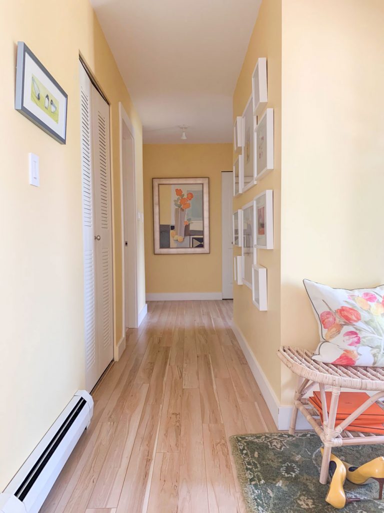
Entry hall
Now that my house is completely renovated from the inside and out, I thought it would be fun to post ALL the photos in one place.
Watch and learn, as this is a great example of how to create flow! The colours are fresh, you’re not walking from the yellow laundry room into a sage green powder room (for example).
First we renovated the exterior
Let’s start with the exterior, because it was simply so hideous and the transformation was so beautiful.
And let me just say AGAIN. It would never have been so beautiful without my Landscape Designer MaryAnne White. She lives in New York and we did it ALL long distance. I have never met her in person.
I specify lots of exterior colour in my eDesign department, especially at this time of year when everyone is planning their new builds. The advice we constantly give to people who want to add too much stone or too many different siding elements (because they are afraid it’s going to be boring) to their home is ‘Don’t forget about the landscaping’!!
It’s the same as if you spent all your money on the most expensive finishes for your new build and then you run out of money to install the look and the feel. Which is created with artwork, area rugs, accessories, AND no-one-ever-has-enough, table lamps.
Spread your money around PLEASE. My motto is ‘Have it all’. Instead of waiting forever to have the most expensive EVERYTHING.
Expensive does not automatically equal beautiful
High and low is a very good way to decorate. Spend more money on the furniture you sit on every day and less on the decorative stuff.
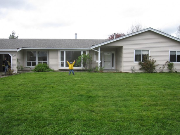
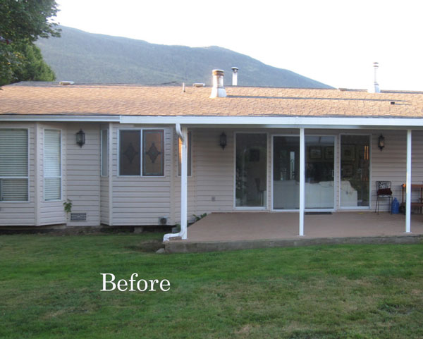
Anyway, here was what the exterior of the house looked like when we took possession:
Related post: 10 Steps to Planning your New Build
(before) My nephew, so excited that we moved from the city!
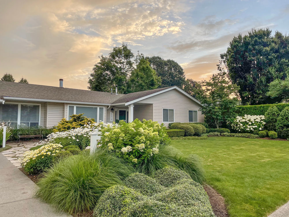
After in 2017 | Can we just pause for a moment and admire my new 10″ column without the downspout attached to it!
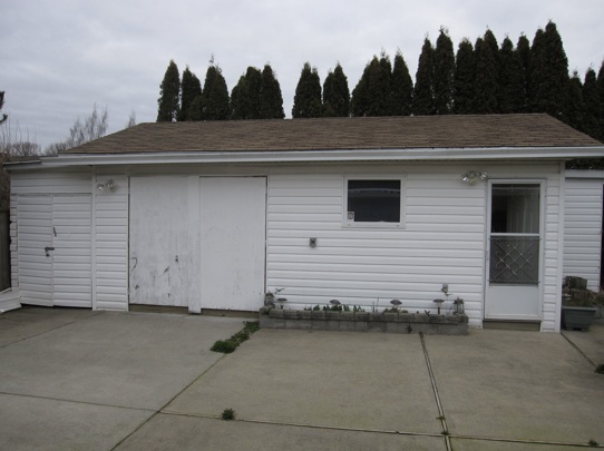
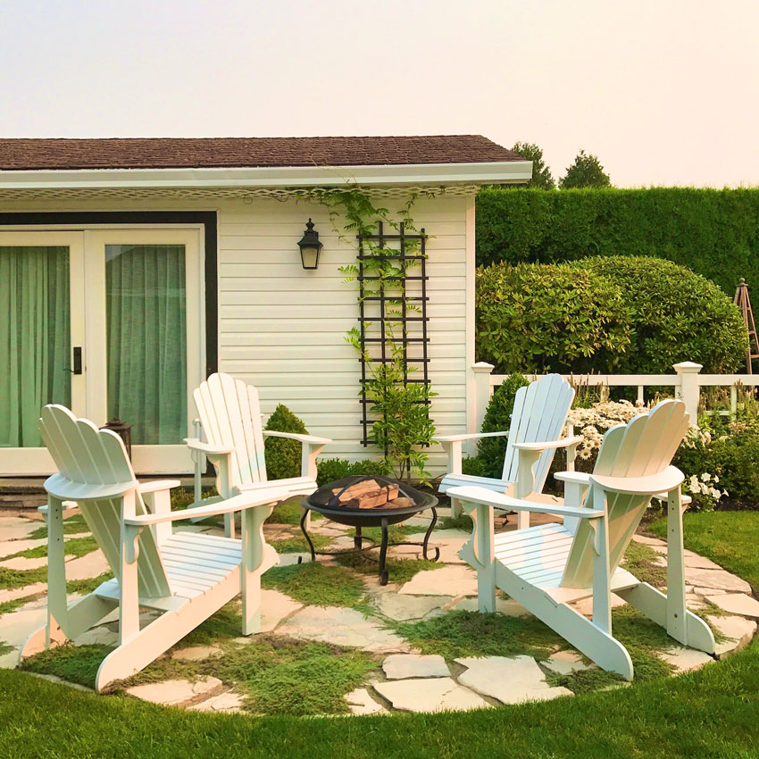
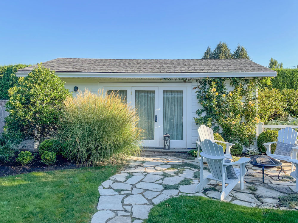
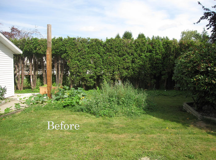
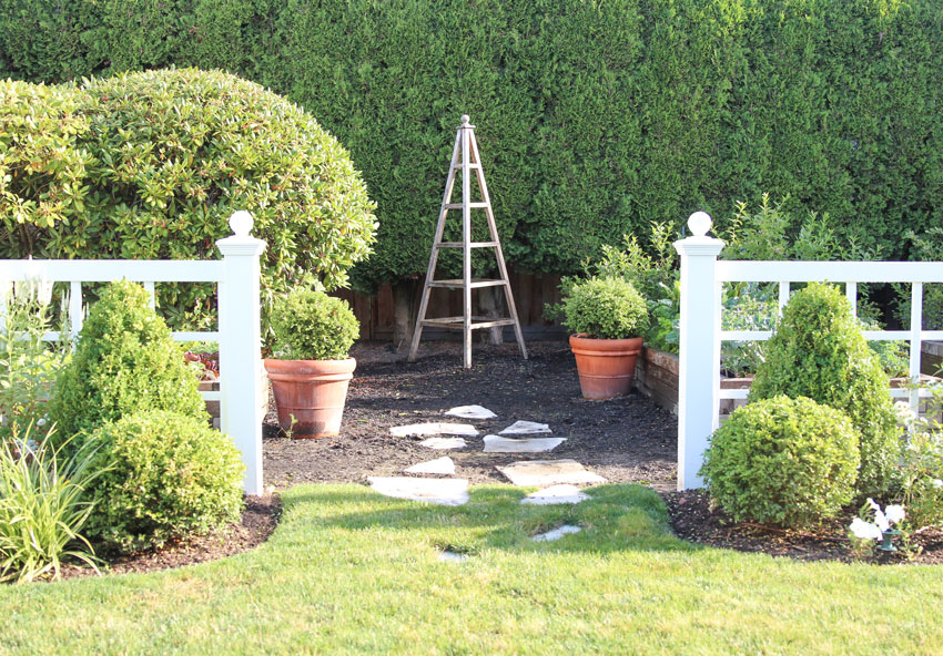
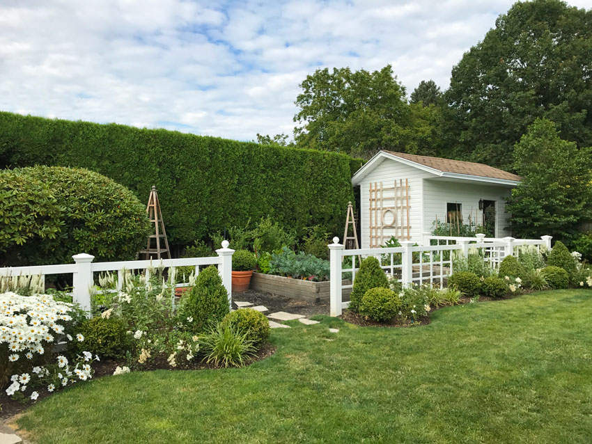
And then the transformation of my design studio in the backyard
Before (look at the cedar hedges that had not been trimmed for years, above)
After
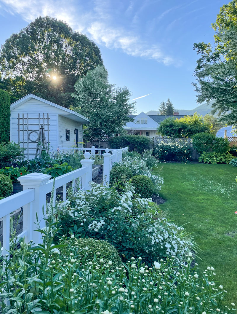
Update in 2022:
I took this photo when the sun was setting and the light in the garden was so pretty!
When we took possession there was a gazebo here which we posted on Craigslist and someone came with a big flatbed truck, cut the roof in half and took it away!
After (love my english garden Tutears)
After (Full post here)
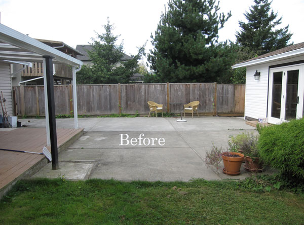
There was A LOT of concrete in the original backyard.
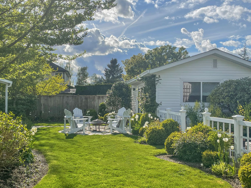
After | I love all the curvy beds MaryAnne specified
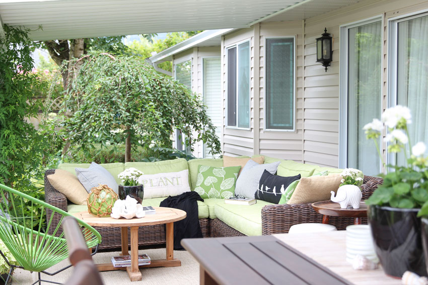
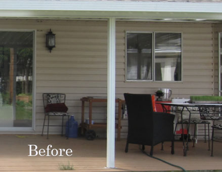
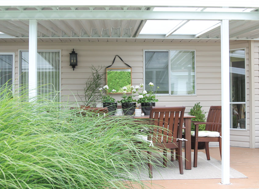
I really disliked the tiny metal posts but we couldn’t replace them without replacing the deck (because there would be no support for new posts) so instead I decorated it (below):
Related post: Two Questions to Ask Before you Renovate vs. Decorate
My motto is, if all else fails, decorate!
After
After
Let’s see the inside next!
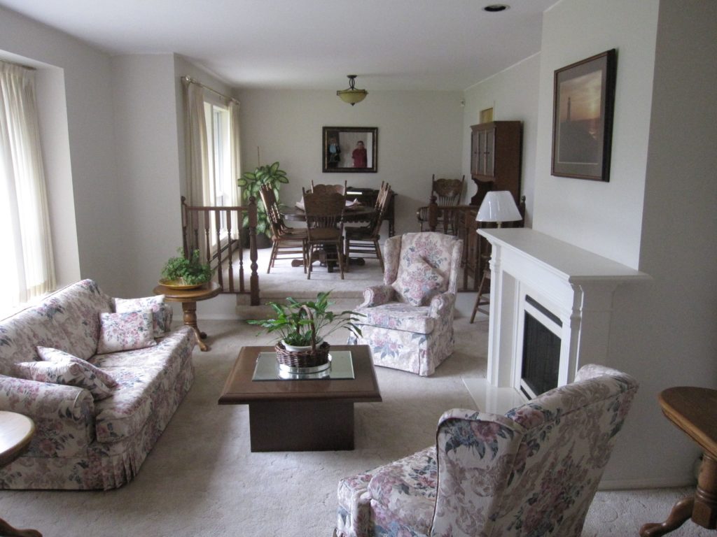
Here is the living room in the real estate photo:
Before | the real estate photo
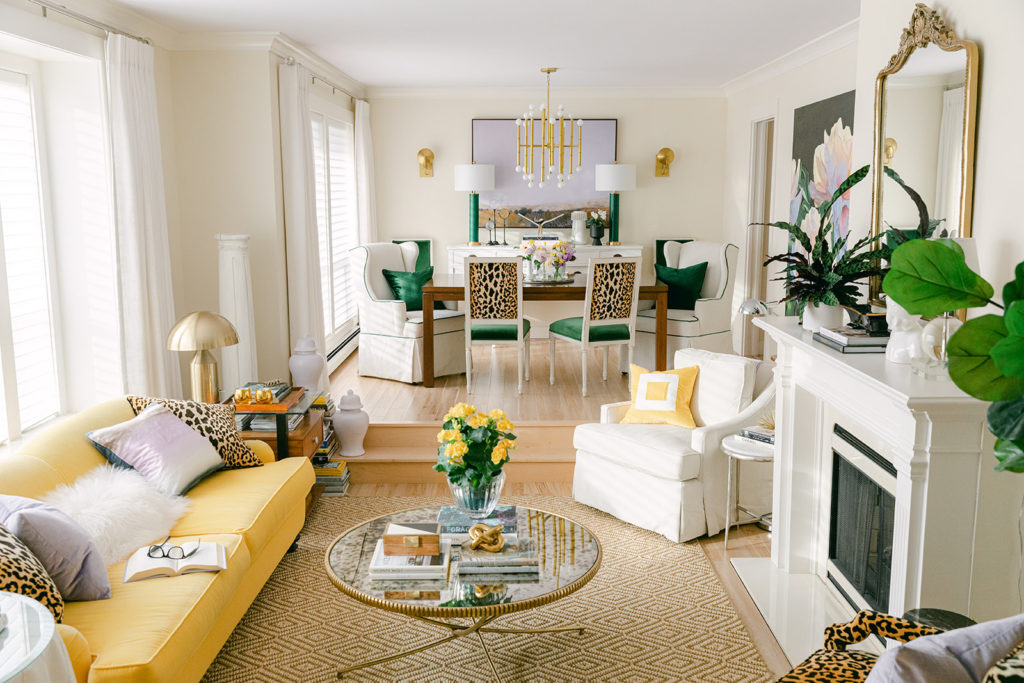
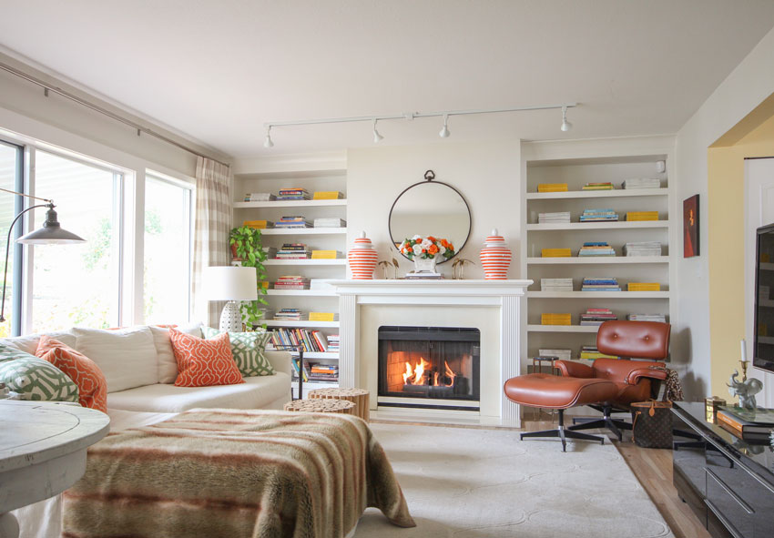
After
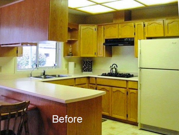
This was the first renovation of the kitchen which we completed before we moved in May 2012 (below):
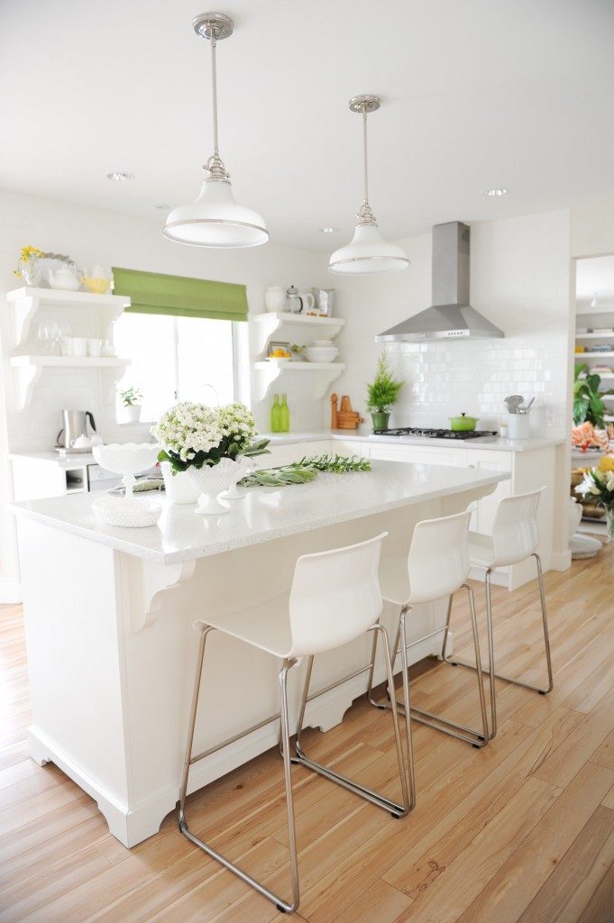
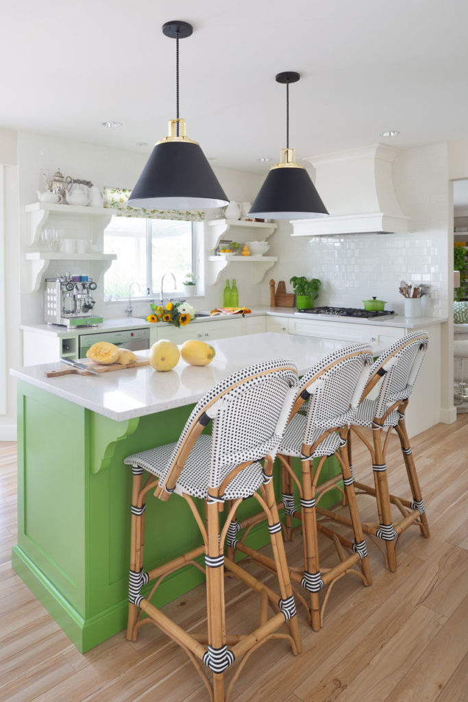
After | Photo by Tracey Ayton
The island always bothered me because it was done on a budget at the time. So, when I renovated my bathrooms in the summer of 2017, I added panels and a solid moulding around the bottom.
My good friend Jan Romanuk helped me with the kitchen and bathroom designs!
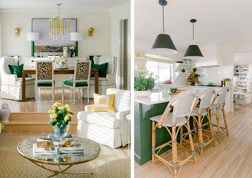
Then after the Ballard Designs refresh I painted the island again so it flowed with my dining room:
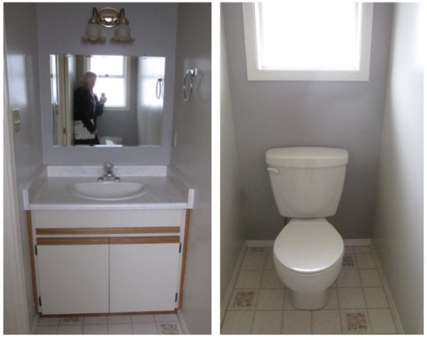
Powder room before
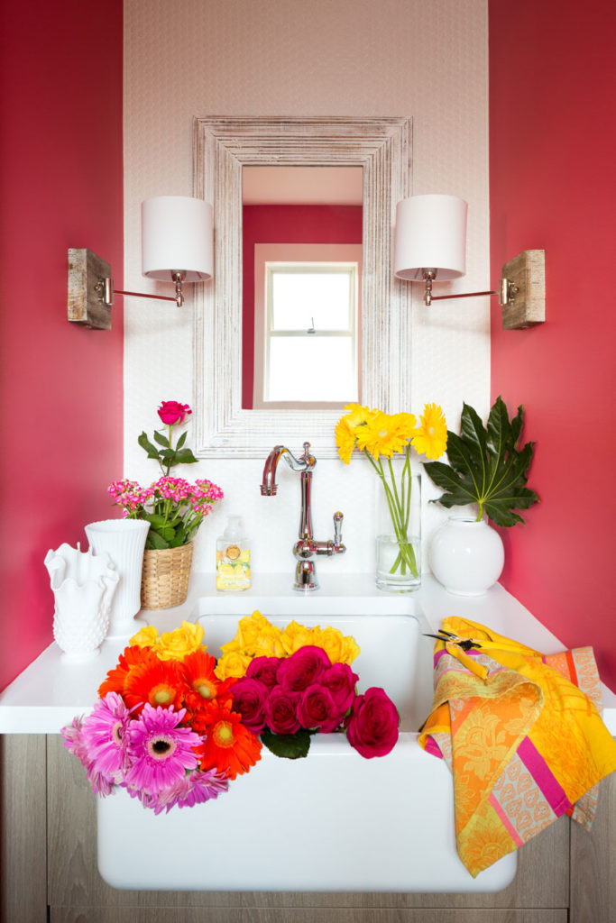
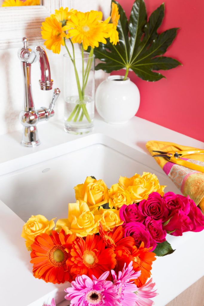
Powder Room | After
The powder room is located close to the back door beside the laundry room. I wanted a large sink in here so it could also be a laundry sink and a garden sink.
I’m always arranging flowers and in Terreeia’s way when she’s cooking in the kitchen so this is a real luxury to have!
Related post: Maria Killam’s Garden Powder Room
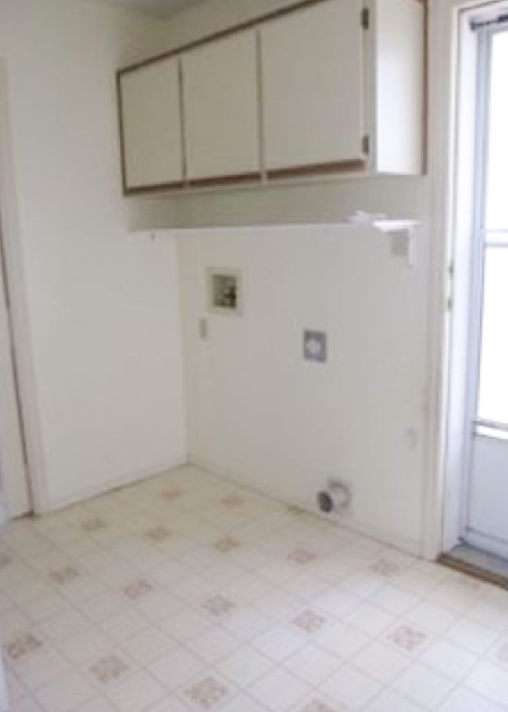
Here’s the laundry room before:
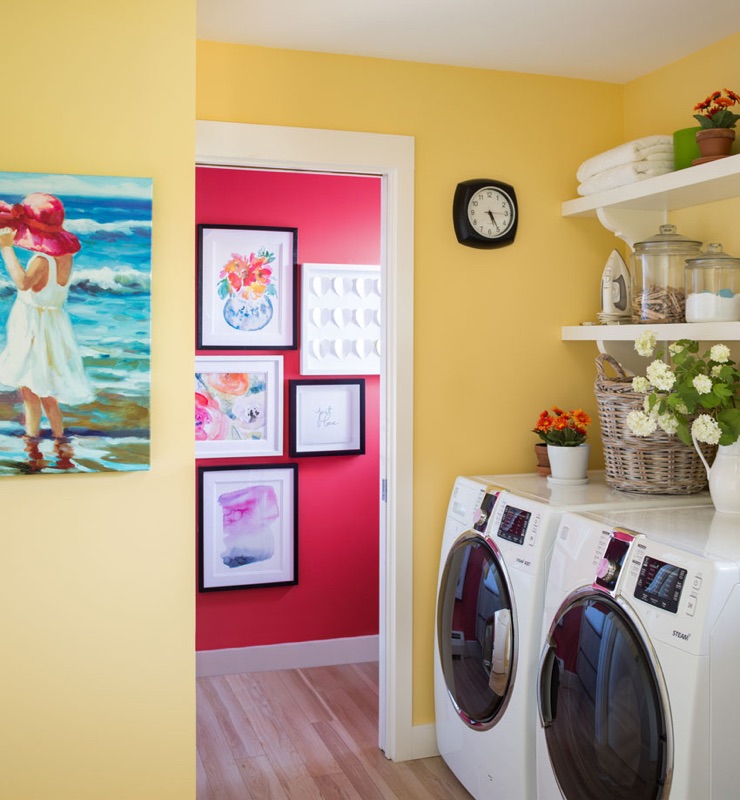
And here it is, after. I painted it the same yellow as my hallway and the powder room repeats the accent colour in the living room.
Laundry Room | After
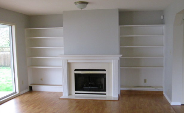
The family room millwork needed some upgrading:
Here’s what it looks like now (below):
Family room | After
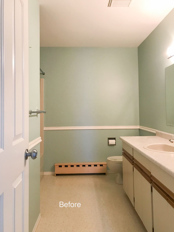
This was our main bathroom
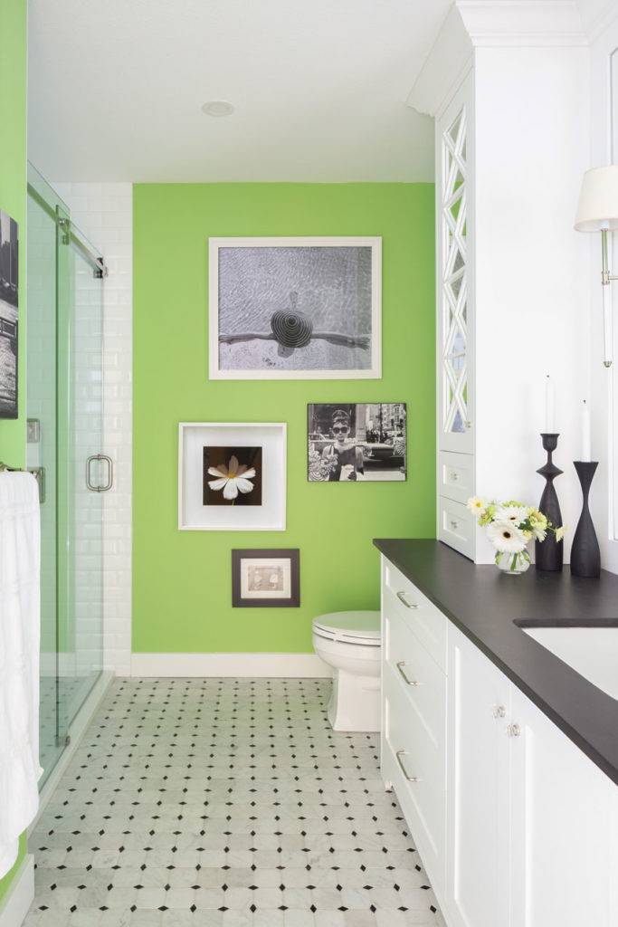
Main Bathroom | (after) See all the photos here
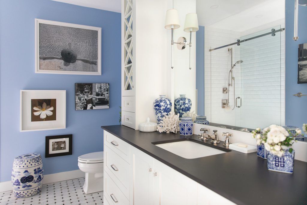
Then in 2021, I painted it blue:
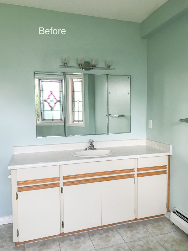
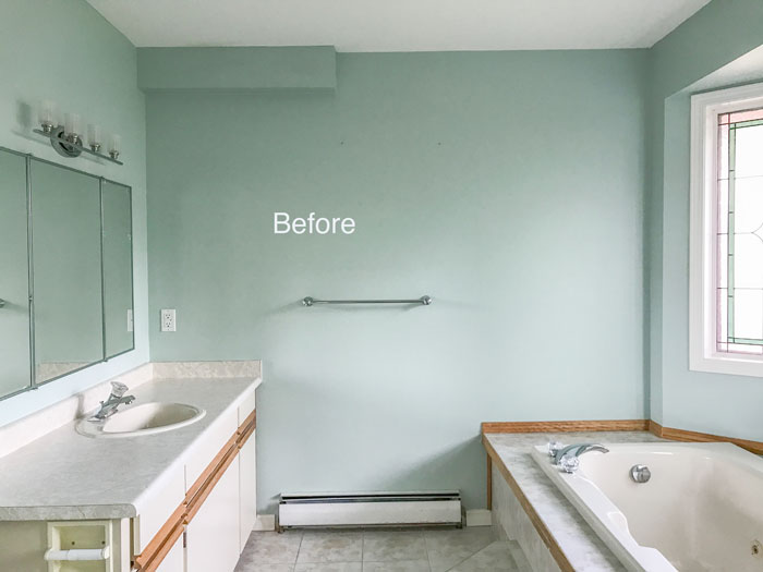
This was the master bathroom, before:
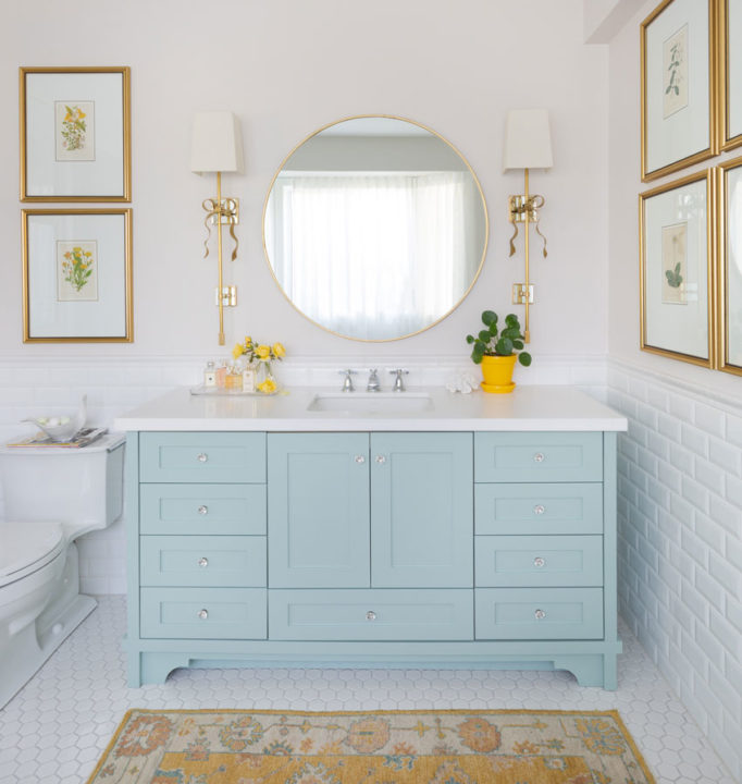
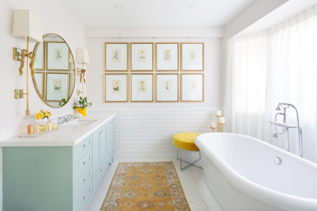
My favourite room in the house now is the master bathroom because of all the fabulous framed botanicals and the bathtub!
Master bathroom After | See all the photos here
Before
This bathroom did not have a shower and it woud have killed the pretty layout to add one so I chose to renovate it with the same footprint.
Master bathroom | After
This was the real estate photo (above).
After
After
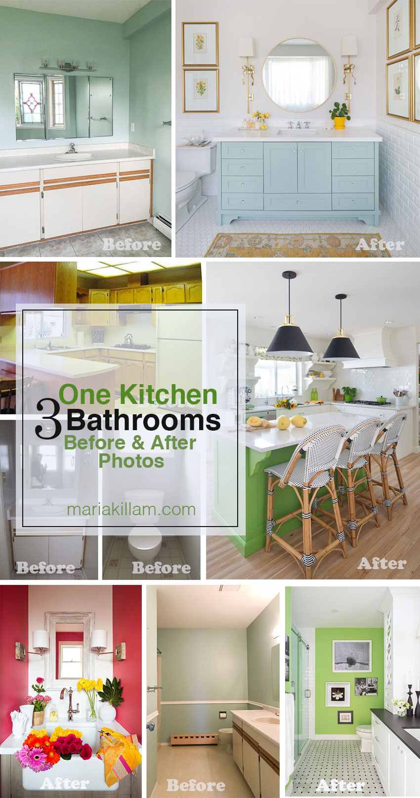
And here are the kitchen and bathrooms all together:
Hope you enjoyed the tour!
Which room do you like the most?
Related posts:
Easter Time and my 500 White Tulips are Blooming








Thank you for this! I live in the PNW in the U.S. and my home is very similar to your before picture! It was so helpful to see what you’ve done. So often inspiration pictures on the internet or in magazines just don’t feel relevant to real life. Although I don’t have the money to do such an extensive renovation, it’s given me lots of ideas for what can be done. Beautiful!
You are so incredibly talented! Your home is beautiful.
WOW an inspiring transformation. Thanks so much for sharing.
Love the color yellow–what paint color is that?
Beautiful!!!!
How fun to see it all together! My favorite is the kitchen, the latest refresh is so lovely.
So beautiful! I love seeing the changes. It’s hard to pick a favorite but my favorite is the probably the master bath.
Oh, your home is just perfect! The colors are so happy and inviting!
Love, love, LOVE your house! Pick a favorite room? All. the. rooms. You must just love coming home/staying home/never leaving home (except for Palm Springs!) Beautiful and inspiring.
That’s lovely! So happy, and a beautiful flow. I really enjoyed seeing everything all together at last – Congrats on a totally spruced up home!
Maria,
What amazes me is that you chose such an unprepossessing house in the first place. You have completely transformed it, it’s gorgeous, but did you visualize these changes when you bought it?
I immediately loved the rancher style floor plan, having the bedrooms in one wing, etc. We would like more property but the houses out here are just awful. There is no character, we would have to build. So this house had lovely bones to work with. Thanks Kay! Maria
Love the transformation of your studio from the outside with its charming patio and I think the landscaping in general is spectacular! The exterior color of the house is so much nicer than the original. All the rooms have a freshness and charm that the original photos lacked. I particularly liked the color of the walls in the living and dining area. I would love to know which off-white you used.
The main wall colour is Rice Paper by Cloverdale Paint, or the closest to that is SW Shoji White. Thanks Laurel! Maria
Well Done Maria! It is just lovely. Is there any better feeling coming through the front door, knowing the house is finished?
Yes for sure, I love that the powder room sink is so much more functional now than it was, so nice to have the bad pink beige insert out of the main bathroom and the tub in the master is my new favourite spot to be every morning! Thanks Roz! Maria
Hi, Maria,
What a beautiful transformation! My favorite room is the living room. It is bright, beautiful, and happy. It says, “Come in; relax!” not “Hands off!”
Maria, your aesthetic is such a breath of fresh air. LOVE your work!
My word, you are one talented lady. I LOVE your home. It just looks so happy and cheerful and welcoming. Brava! (And thanks for that e-design landscaper rec… I just might contact her for a problem corner in our yard!)
What a difference color makes.
Oh Maria, what a wonderful home! It is warm and lovely. You mentioned picking high/low so that you don’t have to wait too long to get things done. Do you think you could write a blog or even just tell us where you saved and where you splurged? For example, I remember reading once that you had chosen laminate floors. They look like gorgeous classic hardware. Thanks!
That is a great idea thanks Michelle! Maria
Beautiful! No other words needed! What a happy home…inside and out!
Powder room is so wonderful but EVERYTHING is charming
Be proud!!!!
So happy for ya’ll. CONGRATULATIONS.
Garden & Be Well, XO T
Maria –
Wow now that’s a transformation.
Is that the same house , I know it is but such a difference .
It all looks great but love the exterior.
That little studio area!!! The flower areas the
Outside living spaces !!!!
Great job inside and out !!!
May you and your family enjoy for many years !!!
Amazing transformations in every case, partly because your colors are lavish and vibrant. The laundry yellow especially resonates with me. I’ve looked through my large samples but don’t think I see that yellow. Would you share what it is? BTW, totally agree with you on the power of landscaping, and your photos are proof. It’s a mystery why so few people attend to it.
It was a Cloverdale paint colour, 7928! Thanks Carol! Maria
The front yard landscaping is so beautiful!! It softens the house wonderfully. And i LOOOOVE that buttery wall color. I wish my house could look like this one!!! What a great place to live
Your home inside and out is beautiful and amazing! Great work.
Beautiful Maria!! I love everything inside and out. I do have a question though – what did you do with the hot water heat pipes in the bathroom? They were there in the before and not there in the after 🙂
We installed Nuheat flooring instead so the heat is in the tile floors! Much better since the contractor obviously discarded the ends of the hot water heaters during the renovation so they needed to be replaced anyway! Maria
Thanks Maria, that’s genius!
fresh, springy and beautiful.
I may be wrong but I think you live in Canada? It was lovely to see such a happy, pretty, springy color palette used in the north as traditionally, the farther north, the heavier and darker colors seem to be used.
Yes I live a one hour drive East of downtown Vancouver. Our weather is the same as Seattle. A lot of people think we live in the tundra but it’s actually quite mild. Thanks for your comment! Maria
Your kitchen is my favorite kitchen makeover of all time, in the history of ever.
Loved being part of your renovation design team. Your use of colour is so exciting and ‘brave’, I wish my clients would agree to use more colour.
Love your fearless use of color – You have such a happy house!
I always find your blog super inspirational. Thanks for the share.
Beautiful Maria, just luscious! The color combinations are outstandingly happy! I cannot decide which room to choose because every element that you chose is perfection in every way. The landscaping certainly is the frosting on the cake. This is such an educational show and tell. You are amazing!
Love all the rooms but your bathroom with the blue vanity and lovely sconces is the prettiest ever!
I love the way the rooms flow together; there isn’t any choppiness. The outside is beautiful and feels like an extension of the inside as well with the green and whites. My favorite room is your updated kitchen. I really like the way you extended the green to the island, the new chairs, touches of black, and millwork over the stove. Your kitchen was already beautiful, however, I feel it has more warmth and a little more charm now. Great job!
The home you and Terreeia have created is just beautiful. I love your amazing choice of colors with not a trendy gray in sight!
I am enthralled with you front room but love it all
Let’s call this “The Happy House”. 😉
It’s too hard to pick a favorite! All the color is gorgeous! I am so done with muted colors. Next house, I am going clean 🙂
Beautiful job Maria!!
I’m amazed that you were able to see the potential when viewing this house. You have turned it into a beautiful, elegant home. I think your master bath is my favourite. It looks very ladylike & elegant. The colours just burst in your home. Happy is the word that comes to mind when viewing. Thank you for sharing!
Very lovely, livable, fresh, and a great showcase for your talents. I’ve wondered if the previous owners have seen your transformation photos.
It’s all so pretty, Maria, but your kitchen (especially with those sexy new black fixtures over the island) is my favorite room, followed closely by the master bath. The landscaping is also gorgeous. An amazing transformation!
Amazing transformation. ❤️❤️❤️ Everything!
It’s fun to see all the changes in one post! That raspberry powder room is my favorite!
I’ve followed your blog since your townhouse (2011?), so watching you transform this average house into a beautiful home has been inspiring. It’s a treat to see the change in one post. Although I love it all, your laundry room transformation is my favorite. To quote Marie Kondo, it “sparks joy.” Congratulations Maria!
YOU are amazing!
My favorite is the master bath with the kitchen falling shortly behind. The new sconces and the green island really pop against the white kitchen.
Love, love, love! Putting all of the before and afters on the same page was genius – it’s so satisfying for us readers!. I’m bookmarking this post so that I can come back and really take it all in. Congratulations on an amazing end result.
Maria, I love your master bath. Beautiful! I’m going to try to duplicate the look in a house we will market soon—but on a much smaller budget. I smile when I look at your photos. Thank you for sharing.
No wonder you walk though your house singing “I love my house” !! It’s a happy, personal, welcoming, lovely space. Congrats. I’m most impressed with the outside changes to be honest. It is truly inspiring.
Beautiful renovation—-inside and out!!! Congratulations!
Love, love, love your bright fresh colors!
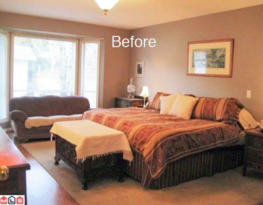
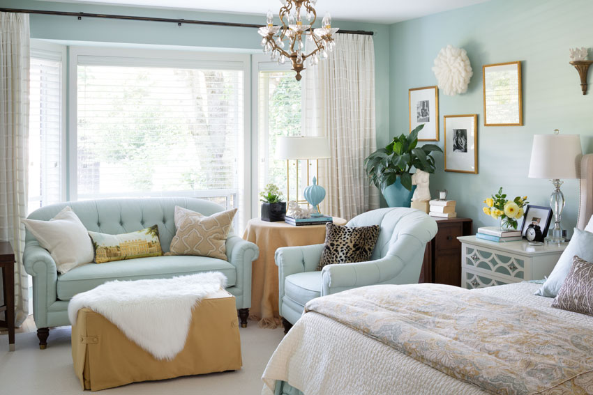
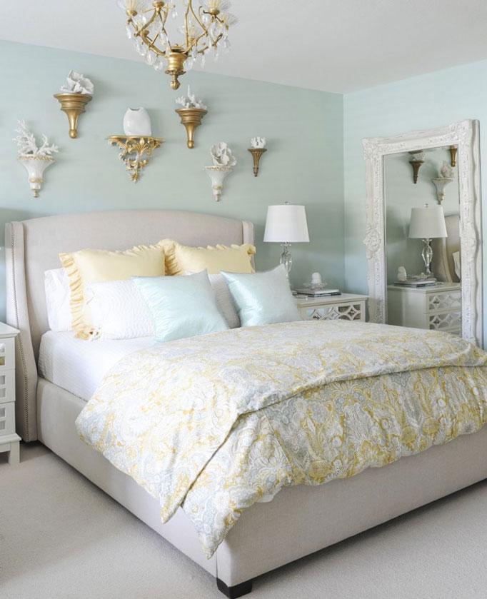
I would love to know the color of your master bedroom walls. I loved it all but the peaceful feeling that room has is amazing.
It’s BM Palladian Blue! Thanks Alicia! Maria
Hi Maria,
I’m sorry I’m just getting to read your latest post. Doing my own home-improvement currently & it’s time consuming.
Everything you’ve done is beautiful. Now that you’re done you can relax & enjoy the fruits of your labor. I know you’ve tweaked your kitchen but are there any other spaces you would do differently?
It feels like you updated & decorated your home quickly. How long did it actually take from the time you moved in until you called it “done”?
When we moved in, in 2012 we replaced the kitchen, floors and mouldings. Then in 2013 we ripped out the front and backyard and of course that project was pretty much installed that year, then in the summer of 2017 we renovated all 3 bathrooms together.
Thanks for your comment Mary! xo
It’s so difficult to choose! However, since I am copying the “mood” of the living room, then I guess that would be my fav! My living room is eclectic and when friends would visit someone always mentioned that it looked like it was torn from a page of a magazine. Unfortunately, not a magazine I like! So when I saw Maria’s beautiful room, I knew immediately that I was missing was COLOR! Color that evokes joy! Thank you Maria!
WOW!
Gorgeous!!! I just found your site looking for a way to counteract the drabness in the lower level guest room in my new house. Lots of eye candy here! I think the master bathroom is my favorite, but I also found the transformation of your kitchen so impressive—that was the most “educational” room for me on the power of paint and accessories. Lots of inspiration as I start to decorate my new house!
Such a beautiful transformation, Maria! I think I’d spend all day in that adorable yet elegant master bathroom. Love the subtle touches of French Country around the place, too. Adds that extra layer of charm! Soooo… when are you renting it out? 😉
I love the softness and how crisp it all feels. The hallway is a wonderful invitation of happy color and interest!
It’s a hard call but I’d have to say that the kitchen transformation is the most amazing!
The flow of color is exciting and beautiful. One of my favorite posts. I would like a list of your wall colors used if available. I have learned how much timeless interiors add to the value of our homes. Thanks for your educational blog.
This home is happy for sure, Maria! I am so glad to see color used fearlessly, it definitely paid off! I bet you are receiving the healing vibes of color every day!
My favorite ‘room’ is the outdoors. What an incredible transformation. WOW.
May I ask what the wall color is in your family room?
It’s SW Shoji White! Maria
Hi Maria- I’m sorry, but I read all of your beautiful and informative posts, and then when I want to find them again, I have the hardest time trying to locate them! You posted before and after pictures of your sidewalk where you replaced the dandelions with hostas :). I can’t find that post now. Could you kindly send me the link to it?
Kind regards,
Charlotte
The entire house and landscaping is exquisite! I especially love the Master Bedroom and Bath (that
blue color is lovely. Also love the Powder Room decor and that sink!
The kitchen make-over is remarkable. The original kitchen is one you see over and over again and it’s boring!!
I love what you did. I’m curious if losing the overhead cabinet space presented a problem if it impacted needed
storage. Also curious where the refrigerator is.
I’d love to see a blog post, like another reader mentioned, about where/how you saved and where you splurged and why.
There’s a pantry wall in this kitchen where the fridge and oven are located, it’s hard to get a good photo of it which is why it wasn’t included in the pics. My kitchen is certainly not high end, the splurge in this case would definitely have been the new millwork hood fan which I love and fits that space so much better! Thanks for your comment! Maria
So pretty. Nice and sunny. Lovely!
So beautiful. What us the master bedroom color? And the cabinet color in the master bathroom?
I love your bathroom vanity! Can you share the color?