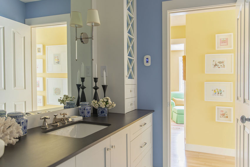
I’m sharing my newly painted blue main bathroom. Because I choose timeless finishes when I renovated it a few years ago, it was easy to choose a new wall colour. Keep reading for the full colourful reveal.
Lately, I’m loving the combination of blue and white so I thought I’d paint our main bathroom a fabulous shade of blue! Now I need to introduce it to my undecorated guest room to create some flow 🙂
Choosing classic and timeless finishes that are basically in the world of white, black and white, or cream, give you a palette that’s easy to change up anytime.
New Blue Main Bathroom
Here’s the after:
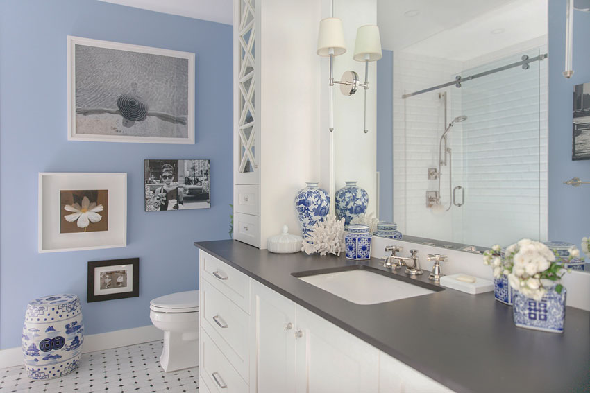
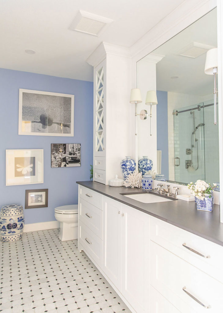
Wall Colour: Benjamin Moore Riviera Azure (Photos by Macy Yap Photography)
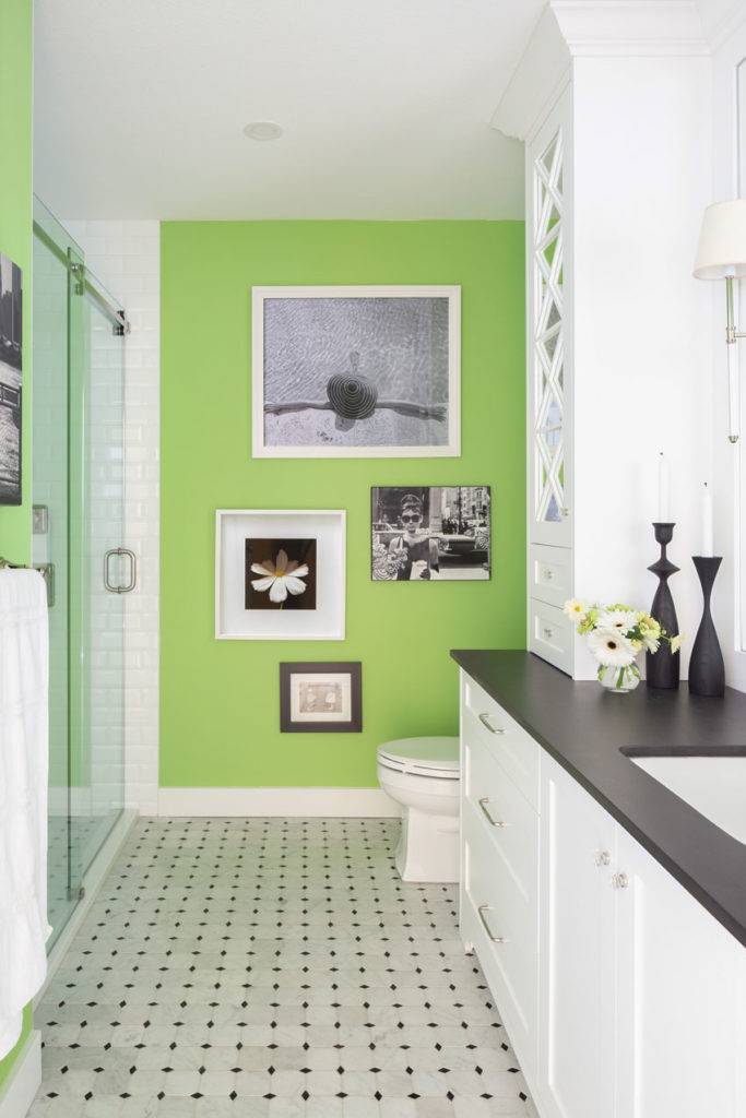
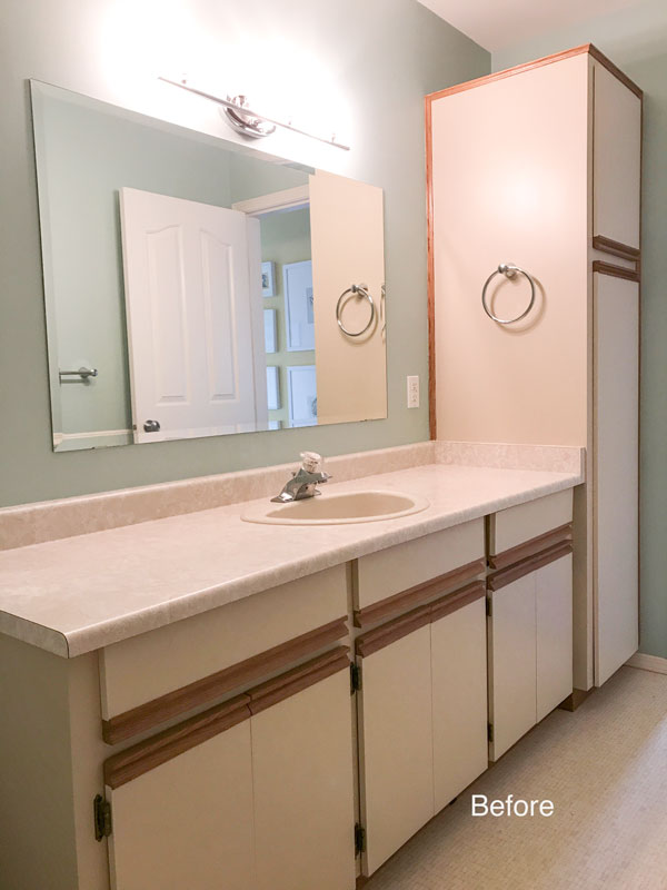
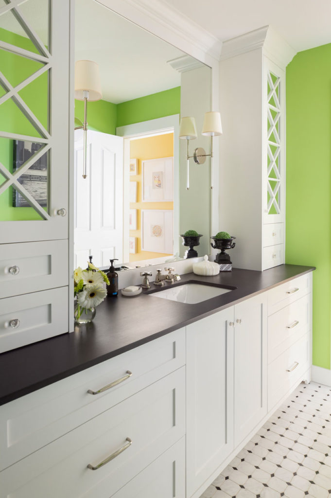
And here it is before in green:
And even before the green, in turquoise (We renovated this bathroom three years ago)
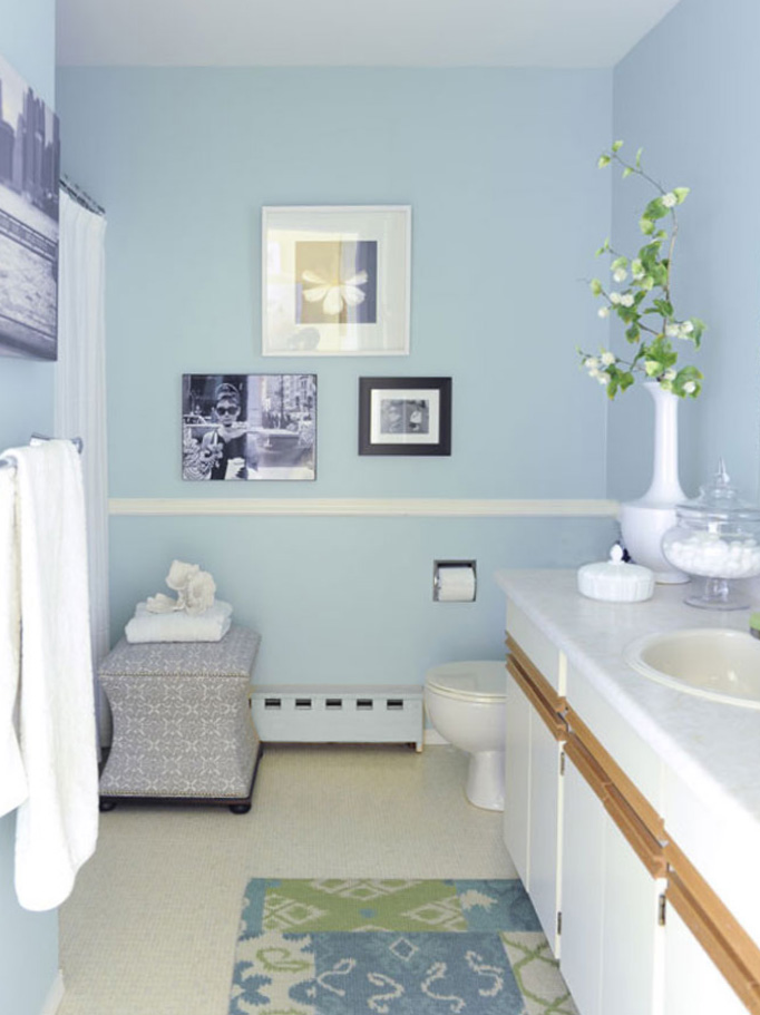
Before the renovation
Shop this powder room:

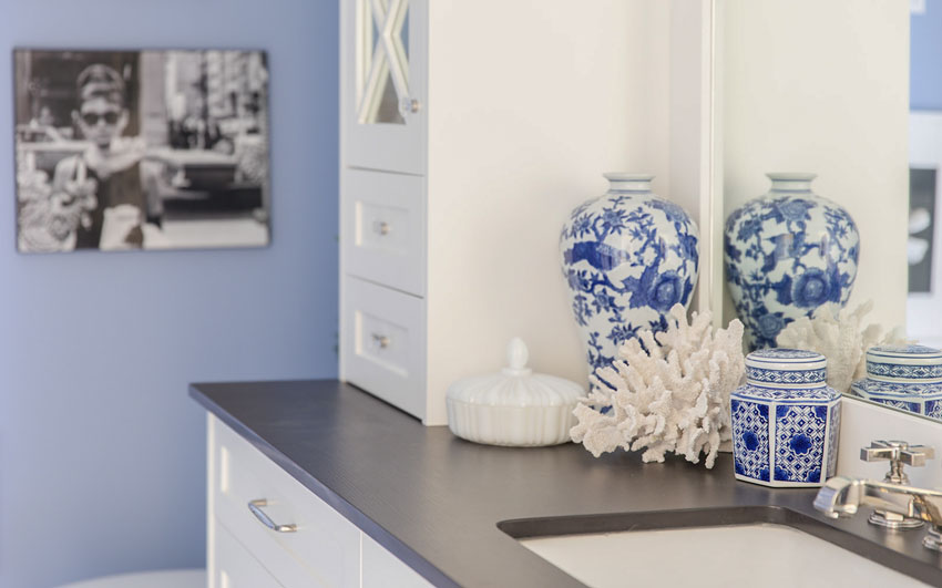
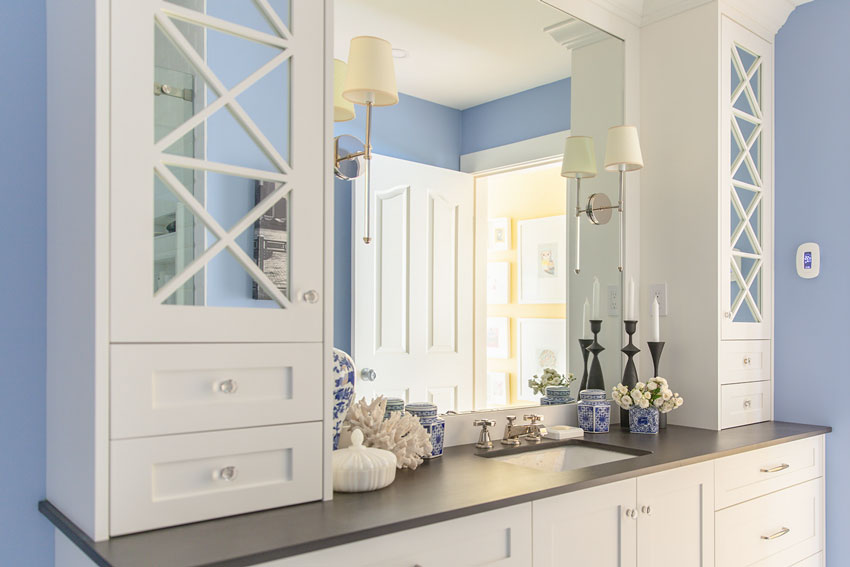
Blue and white porcelain always looks so good with any shade of blue truly! And I buy a good faux seashell – because there are so many authentic looking ones out there now – anytime I see them because they are not always easy to find (where I live, anyway).
You may have noticed that I love decorating with coral and oversized shells. You can see them on my patio, here in the windowsill of this kitchen, and even in my tips for how to style a vignette here.
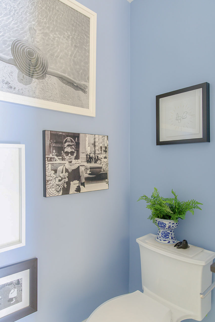
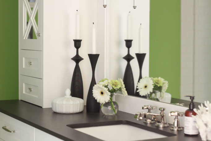
Love this faux fern! I ended up buying every one she had in a local shop. The little black ceramic seal is something I painted in ceramics when I was in grade 4.
Get the Look
Decorate your powder room with timeless blue accents like these:
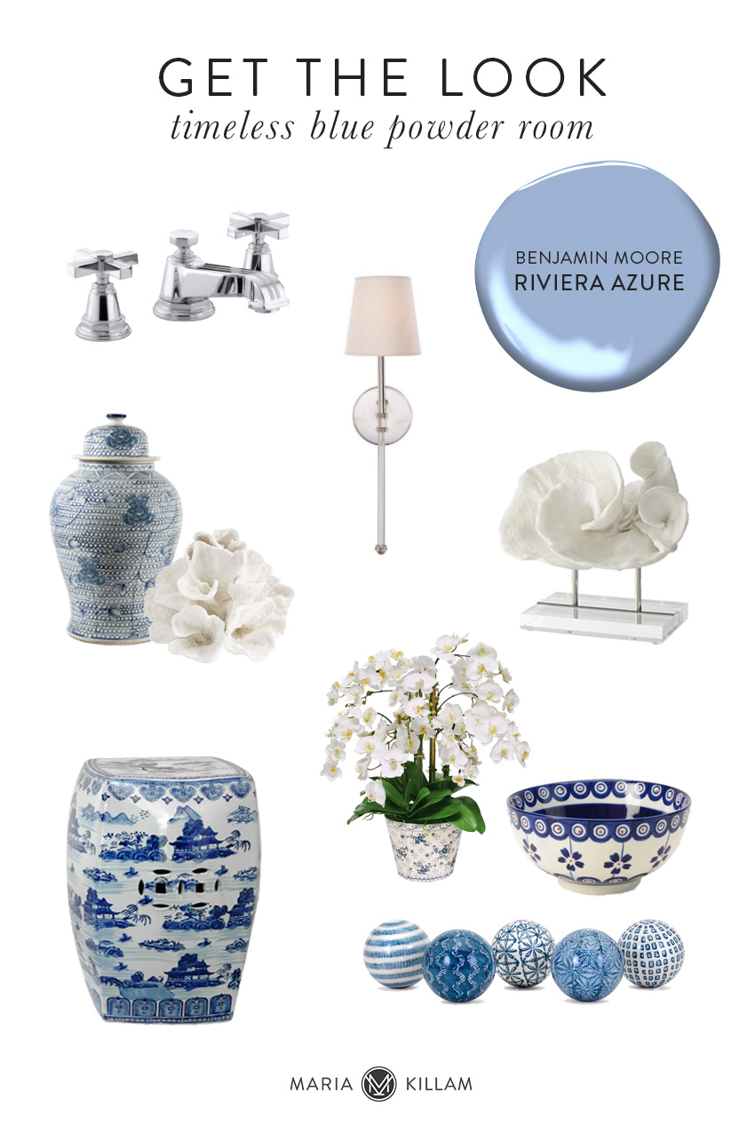
Faucet | Sconce | Hand-painted Jar | Wave Coral | Coral on Stand
Garden Stool | Orchid Vase | Bowl | Decorative Balls
Which one do you like best? Blue or green?
If you’d like help choosing classic and timeless finishes and colours for your bathroom, check out our ‘Create a classic bathroom package’ here.
Related posts:
The Best Cream Bathrooms to Copy
Tricia’s Classic Bathroom Makeover; Before & After


Maria
I’m
Not sure which I like best the green or the blue .
Like both !!!
Blue is always nice, but that green is marvelous! But that is the nice thing about paint, easy to change to suit yourself!
Blue! It’s lovely. Thank you for linking everything. The fundraiser looks like fun!
Maria….since I have been a blue/white fan for years, this, in my opinion, is one of the prettiest rooms you’ve ever done. I have never ever tired of blue/white porcelains and find they can freshen almost any color scheme. Therefore, I totally agree with using “timeless” fixed elements so I can easily change color schemes and let my blue/white obsession shine.
Gorgeous! Lovely shade of blue. I always thought a powder room was half bath – with just a sink and a toilet. This looks like it has a tub/shower and is full size. Is it a Canadian thing to call it a powder room? Just curious.
I love it! I also love the yellow in the hallway and room beyond…may I ask color that is? Gorgeous!
Love them both, but I would imagine the blue would be more flattering for most people.
Oh, the title of the post has changed and is now “New Blue Main Bathroom.” Either way, it’s gorgeous.
Hi Maria, I love the blue!
Love the blue! Last time I tried to paint my bathroom blue, I was aiming for a Wedgewood blue. Chose my colour carefully at the paint store, and away we went (old house — bathroom 5 1/2 ft x6.5 ft; 11 foot ceilings). Paint colour didn’t look right from the beginning & we were only doing the top half above the wood panelling. We stood back, shuddered & thought we’d give it till morning & look in the light of day.
Long story short, middle of the night trip to the throne & there was an ungodly glow coming from the bath. Didn’t have the nerve to flip the light switch.
Got up in the morning, and realized we had a “Zestfully” blue green bath, thanks to an error in mixing the paint formula at the store!
We never had the nerve to try blue again. 🤣🤣🤣
I like both colors. Nice to be able to change the look with paint. It looks like your counter goes to the wall without an extra piece of the counter material. I prefer that look.
Love the blue! And it’s especially elegant with your blue and white porcelain. Well done!
I am a fan of the blue! I sigh at how serene it is in that bathroom. 💗 Maria, would you mind sharing the length of your vanity and also the length and depth of the counter cabinets flanking the sink? My husband and I are fully renovating and thankfully are going through the process with your exterior and interior package advice in hand. We would literally be lost without your help. Thank you! We are soon to begin testing colors. So excited! You are a gift, Maria!
Hi Maria,
I lobe the blue!! And thank you for sharing the color name and brand.
The blue and white pottery pieces are scrumptious!!
And how sweet that you painted the seal in realistic colors even in grade 4. That’s precious and so good to celebrate those memories and artwork.
Each of the iterations is exquisite, but the blue is my favorite.
We have a blue powder room next to our media room and it’s painted a similar color but by Sherwin Williams. I tried to pull out a shade from the blue granite countertop.
I love your white cabinets. Gorgeous!!
Thank you for the inspiration.
Sincerely,
Tara
Normally I favor green but your blue is lovely so I’d say it wins this time.
I was sad that you were going to paint and do away with the green because it looked so spa like but the blue is just scrumptious! Good job!
Hi Maria, I think the blue is more beautiful, but I think I’d feel better in the green bathroom. I’m curious if you think the different colors make one look more or less better when looking in the mirror.
Hi Maria,
I prefer the blue. It’s a beautiful blue, almost like a periwinkle which I love. Could you tell me what the countertop material is please?
Thanks
You are amazing!!!!!! What a fabulous example of timeless and classic finishes, with the possibility of a fun color and mood change. I personally love the blue, the green was very fresh.
Keep going Maria! We love your posts!
The blue! Really beautiful. Thank you for all the time you spend teaching on IG and your blog. I would have loved to have taken your classes a few years ago but mostly now I work for friends (i.e. free :/), I ‘m 80 and really slowing down so it’s kind of late: not for my interest but for my investment. I’m truly sorry.
Actually I have wanted to ask you a question about blue and if this isn’t appropriate i totally understand.
I am in the midst of renovating a bedroom. We have done the long back bedroom bed wall in rough sawn wood, painted Solitude by SW, along with the baseboards and crown. My client/friend loves the farmhouse look (though I am trying to steer it a little more modern since “farmhouse ” is kind of on it’s way out, I think. The ceiling is a soft sky blue, I don’t have the name right now, but is is much paler and not so gray tone as the Solitude. The adjoining bathroom is done in a grey patterned Meadow Charcoal Animals wallpaper and white shiplap and it is stunning and will be loved, I think for a long time.
So i continued the pure white on the walls in the bedroom but I think it is a miss. I thought about the blue reflecting on the white but it is much more than i imagined. My client’s are happy and I haven’t said anything. If I was getting paid the normal ( or anything) I would just advise them that I was going to pay for the repaint. i suspect you might say a cream…and that is what I’m saying. Do you feel like sharing any thoughts? I don’t have pictures. It is dual aspect. A 5 foot french door on the North and a West 6 x 6 window on the west. Any thoughts would be appreciated. BTW I am grateful and astonished that you reply to any mentions I have made to you on IG. That is a lot of answers you give to people. Thank you for your generosity.
Hi Maria: The green was fun, but the blue is divine! I absolutely love blue and white, especially with the porcelain accent pieces. This is exactly perfect!
I don’t like all the adds you’ve added! They really detract from your article. A few is fine, I get that you are seeking another revenue stream, but 4 of the same guy with the gray moustache selling the same thing?? Too too much.
Stop complaining about ads when the content is free!
Maria, I love the new blue bathroom. The green was nice but the blue feels softer and more feminine, which appeals to me. Your seal caught my eye immediately; so cute. The blue and white porcelain pieces look gorgeous in there. Well done! This is a great example of how having timeless and classic hard finishes make it so easy to switch things up with a fresh coat of paint and different accessories.
Thank you for posting about the fundraiser Maria! I am echoing Cynthia that these photos illustrate that timeless and classic gives you many options for updating your space. I think the blue really highlights the black and white artwork on the wall. Cheers!
I really like this blue over the bright green. I usually prefer green, but not that shade. Beautiful powder room!
Real estate agents say blue is the most popular color for bathrooms. I like it better than the green, in the bathroom, because I find green an unflattering color. It looks very cheerful, of course. Darker greens don’t seem to cast the same unflattering shadows, but I still would never paint a bathroom green. Or a bedroom. And I love green, of course, because how can you not?
Love it, but loved the green too so I can’t choose. Perfect example of how you can easily change it up by keeping the floor, cabs, tile, countertops etc, neutral and timeless.
And what’s this I’m reading…there is an undecorated room in the MK home? Oooooh be still my heart. Can’t wait for that big reveal, or at least a before pic with some chat about what you may have in store for that space. And when?!
As usual, thanks for sharing.
Both are lovely, but I’m really digging that blue! Especially with the blue and white chinoiserie pieces. Your bathroom is perfection, Maria!
Both the blue and the green are very pretty! I love the yellow in the hallway! What color is that?
I loved the green… until I saw that first picture with the blue. I love the blue even more, but I’m not sure if it’s because it’s new and therefore feels fresher. I’m always a fan of blue and green – those plus neutrals are the color palette for our house. Beautiful update, thanks for sharing!! It makes me long for the day that we will get around to updating our “builder beige” bathroom tile to “Maria timeless” selections, and then I can play with color like you do!!
I love both the blue and the green. Thank you for continuing to decorate with beautiful colors while so many others are creating black, white and sepia rooms. Texture and contrast are wonderful, but nothing makes me feel happy and alive quite like color.
What a stunning update!! I’m looking for all the inspo I can get and this is fab!
I think there’s a vibrancy to the green which would bring me alive each time I stepped into it. Whereas the blu is more subdued and relaxing. But my fave is the green. Excellent example of why we should choose classic, neutral fixtures.
You definitely proved your point about choosing neutral, timeless finishes. !
I love the blue! That color and your original teal were my teenage dream bedroom colours. I would spend hours staring at catalouges- unfortunately, i had parents who only liked WHITE paint. I was very tired of white paint long before this current trend started. Give me COLOUR.
Speaking of parental obsession with white – any tricks for dealing with bossy whites? My mother decided to paint the dim, small upstairs bedrooms a white from the trim calalogue which reads blue or violet or grey depending on the light, and then used the same yellow white trim paint as downstairs where the walls are a light taupe…. now all of her green-blue and blue grey and wood furnishings look sallow. Better than the dingy yellow beige there before, but still… The linen drapes repeat the trim colour nicely, but the walls seem hopeless.
She wants me to help chose colours for repainting the furniture and honestly, i am stuck lying in the guest bedroom, staring at the walls thinking “OMG nothing works”. Any tricks for working around these awkward colours?
I’m obsessed, what is this floor tile pattern called?