Wood cabinets are having a moment right now. And they can absolutely be timeless, if you make them look current and fresh. Here are the results of an eDesign rustic kitchen makeover with must-see before and after photos.
My eDesign consultations create happy endings. And, I love happy endings… Happy endings with well-styled after photos are especially nice!
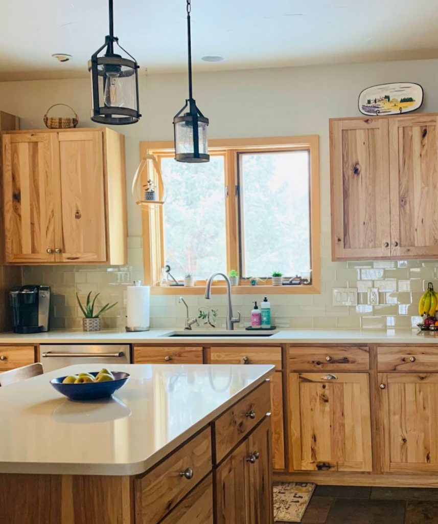
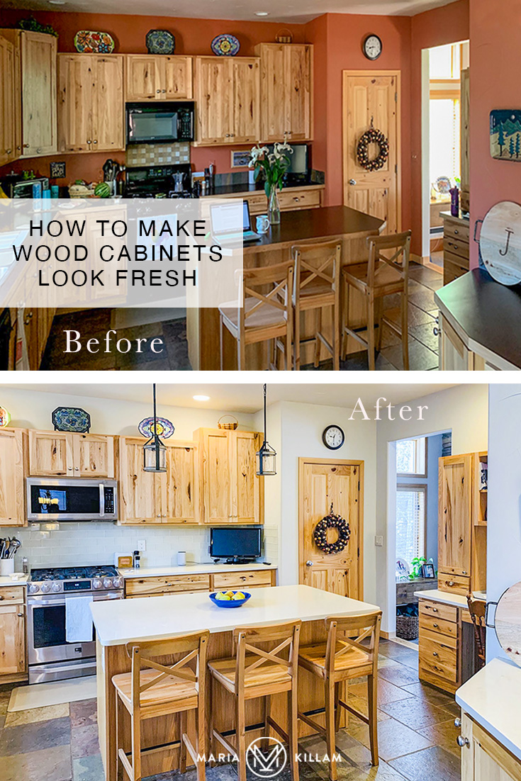
After | please note, this client purchased only colour help for this kitchen (no hardware or lighting)
Recently some really pretty “after” eDesign consultation photos landed in my inbox along with a heartwarming note and I just had to share.
My lovely client consulted with me via my eDesign consultations on a fresh new paint colour and the right direction for her new countertops in her kitchen.
Here is her note regarding her eDesign Rustic Kitchen Makeover:
Hi Maria,
I just wanted to write and thank you for your e-design consultation and advice this summer on my mountain home kitchen! We absolutely love how it turned out. As I mentioned in my questionnaire, we live in the mountains of Colorado at almost 9000 feet elevation, surrounded by natural beauty. We purchased our house in 2015 as a vacation destination, and quickly came to realize that we wanted to live here year-round.
We purchased the home furnished, and it had been decorated in a typical Colorado mountain theme. When we moved here full time, we wanted to retain some of the rustic feel, but lose some of the moose and other woodland critter decorations!
The kitchen was in particular needed a refresh. It is north-facing, and the dark floors, countertops, and walls made it feel much smaller and darker than it is.
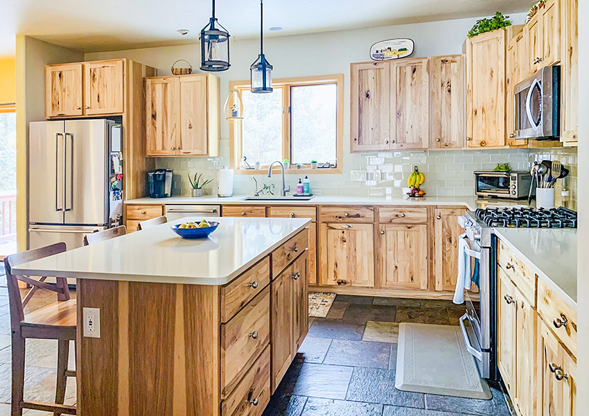
We kept the beautiful knotty alder cabinets, but installed light cream quartz countertops (Pental Taj Majal, which is a lovely creamy color with flecks of light grey and cream, as well as light brown that ties in perfectly with the color of my cabinets), a new single basin sink and faucet, stainless steel appliances, a light subway tile backsplash, and painted the walls to match. It made such a huge difference and now I absolutely love it!
I know that white cabinets are timeless, but natural wood can be too, as you have mentioned in your blog. I wanted to share a “success story” for those of us with natural wood cabinets! Thanks again!! Becky
Thank YOU Becky!
Absolutely, Wood Stained Cabinets can be Timeless
Wood cabinets can absolutely be timeless, and they are certainly trending at the moment too. The trick is to make them look current and fresh. In the Tuscan trend, too many wood stained kitchens were installed with countertops that were dark and blended with the wood tones instead of providing the contrast they need to look their best.
The standard ways that wood kitchens don’t live up to their potential
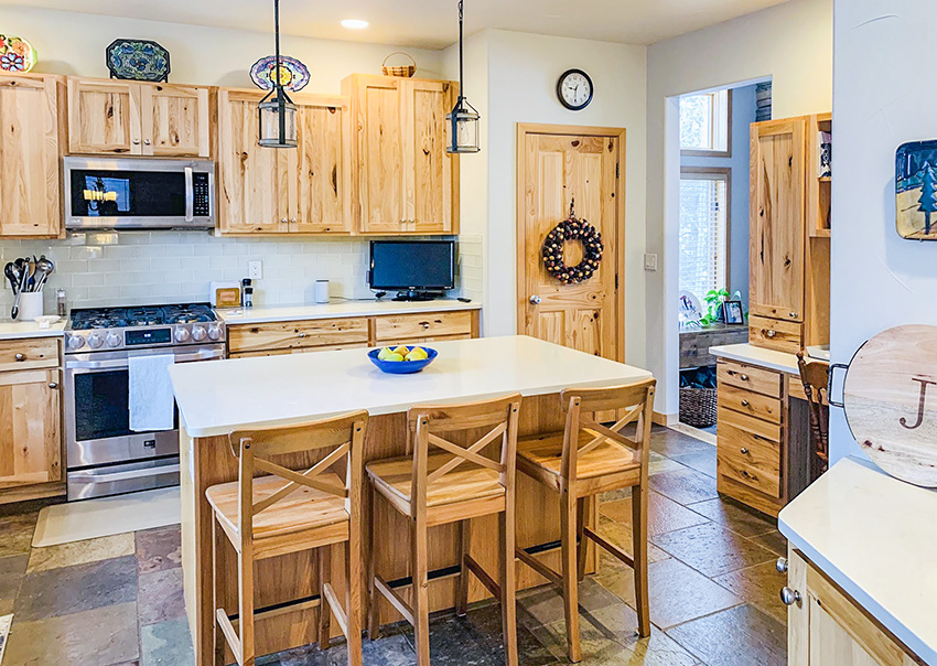
Here is Becky’s mountain rustic kitchen below. You can see that the warmth and beauty of the knotty alder cabinets was being drowned out by the heavy orange wall colour.
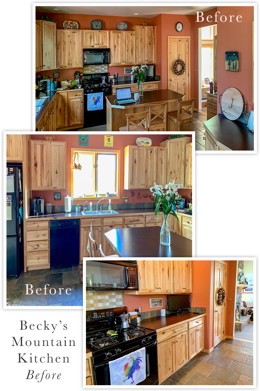
The previous owners had installed dark countertops, slate floors and heavy black appliances. This kitchen was being weighed down by too many hot, heavy and dark colours.
Contrast is Key
It is absolutely magical what can be done when contrast is managed well. Getting contrast right is one of the key skills any designer worth their fee has to have flat. Because even if the colours technically relate, they will not be amazing unless the contrasting relationships of light and dark, and cool and warm are perfectly balanced. I teach this in my live workshops.
Becky knew she wanted to bring a lighter, more current feel to her kitchen while keeping the wood cabinets and slate floors that completely suit the style of her new mountain home.
When introducing wood stained cabinets, keep all the other finishes light
I advised her that a very light green beige countertop would be perfect. Light enough to bring in freshness and not too stark to work with the earthy slate floors.
I gave her a versatile complex cream with green beige undertone for the walls to brighten things up, again without being too stark. And voila!
Becky’s Mountain Rustic Kitchen After!
Isn’t it a thing of beauty? The creamy walls, backsplash and countertops provide a fresh and pretty canvas that allows the wood cabinets to shine.
Can you spot the two true white items in this kitchen? Imagine if the entire kitchen was stark white with the earthy floor? That’s why this kitchen needed to be in the world of creams but with a green undertone because that also works the best with the tile floor!
More proof that a stark ‘art gallery white’ is not a good white for most homes!
Here’s another look
The new stainless appliances also made a huge difference. Black appliances rarely work well in any kitchen, they are just too heavy and dark.
Thank you Becky for sharing your amazing after photos! You did such a great job bringing out the beauty in your kitchen!
If you need help making your wood kitchen cabinets look fresh or choosing the right white, colour or neutral for your home, check out my eDesign packages here.
When Complex Cream is your friend
When you want to freshen up a space with earthy finishes like this, complex cream (in other words, very light beige) is your friend. I’ve identified some of the prettiest and most useful ones by undertone. And they are now included in my collections of large painted colour boards! Get yours here.
And I’ve added my all new for 2020 The White Workshop (on Day 2) to my Specify Colour with Confidence events! This is where you will learn all about choosing the perfect white, when white is right, and when it’s a better idea to consider a very pale greige or complex cream to create the fresh look we are all looking for now. Register here to attend one of my spring courses.
Related posts:
4 Reasons Your White Paint Looks BAD (FYI White is NOT Sunlight)
The New Look of Wood Kitchens; Timeless or Trendy
Maria Killam’s Trend Forecast for 2020


Reaching out to you for professional help saved her a ton of headaches and money! I had a consultation with a woman who was overjoyed when I pulled out your large paint boards. I love how your influence is saving homes all over the world!
Hooray, Thanks Erika 🙂 xo Maria
I’m curious .. what color paint is on the walls?
WOW!! Love it! I am contemplating a move to Colorado and in touring homes am seeing every most house is styled like the “before”. So happy to see how I (well acutally it will Maria since I have no aptitude for color and would do a consult with Maria) can tranform it into something light and bright!
Love those cabinets! Great job on the update. It looks fresh and current while still maintaining a bit of the rustic mountain feel.
This is great! I love an after that has actually refreshed without simply obliterating every element that was there before. The kitchen now manages to be both airy & light as well as earthy & warm.
Fabulous!!! What a great result. Congratulations to the e-design team and the happy homeowner.
Good job Maia! I don’t care for slate floors but the counter top that you chose takes your eye away from the floor. The wall color is soft and compliments the orange tone of the cabinets. Styling also makes a difference. It sure did make a happy ending! Love it!
Beautiful! The paper towels and utensil canister are the only true whites I see. 🙂 I especially like what appear to be extra high gloss backsplash tiles. Instead of going rustic matte, they add a touch of surprise “bling” and reflect light so well. Well done!
Gorgeous! Love all if it. Maria, you are a genius. What is the wall color? Would you share, please? Thank you!
Clock face
Dish towel maybe (I don’t trust colors on my tablet, but next to the counter top it looks that way)
Canister
Little white jar-like item to the left of the monitor
A lovely “after!”
Maria, Can you do a refresh like this where there are cherry kitchen cabinets? I’d love to update with paint color selection and new countertops) and maybe new back splash. But, no budget to buy new cabinets and painting them cream or white is equally expensive. I’d love to update and lighten the look in my kitchen as you’ve done here.
Love how this kitchen has been updated and refreshed!
And looks like the canister is white as is the face of the clock as well.
Hi Minda, the same principles apply to a cherry kitchen. . . there’s nothing different that I would do than here! Hope that helps! Maria
Super helpful to see a post about how to make old and new elements work together rather than an all-new complete whiteout. So often mixing old and new is presented as a bad idea. But there was no reason to change the cabinets and slate floor, especially in the context of a mountain home. It’s not environmentally or financially sustainable to rip out everything just because the colour trends change, and the new version often ends up just as trendy as the old, aka destined to be ripped out again.
I definitely prefer this look to all-over refrigerator white kitchens which have been done to death and can look sterile. This is so refreshingly different and fitting for the location. Beautiful and timeless.
Love it. I see more than 2 true whites. Napkins & paper towels, clock face, electric outlet cover, utensil canister.
Are you going to reveal the wall color? We all want to know.
What a transformation! This is lovely. Great job, Maria!
I love Becky’s new kitchen! The colours are fabulous and I love the tile! Beautiful!
Yes on the lamps in front of artwork
Daylight in my kitchen during the day
Warm lighting in the evening
Wow, Wow, WOW! What a stunning transformation. The power of texture alone to transform is perfectly illustrated as the tile flows into the smooth wall above it.
I too, join Linda, Carol, and Debra asking in their comments above: “What’s the wall color?”
Wow, that was a toughie, having to tie in those floors and the wood cabinets, looks soooo great!
What a timely post! I also live in Colorado at 9000 ft, with wood cabinets that look great in our log home. I don’t understand people’s fascination with white-painted MDF. You can never get MDF/particle board to look like real wood, all you can do is paint it. And nothing beats the durability and longevity of solid oak. I wonder if Becky is a neighbor here in Mountain Village? We could get together and toast the merits of real wood cabinets.
I’m feeling a bit confused. I’m seeing more and more of these kitchens with wood cabinets and white counters and backsplash. So basically most of these cabinets are some shade of brown as they are wood. So why is it OK to put white counters and backsplash with brown cabinets? Maria, I thought you always said creams go with brown and whites with blacks and gray? I feel like I’m missing something here. In some of the kitchens I’ve seen, the white just looks too stark and clean next to wood cabinets. I need help in understanding this. Am I the only one thinking this?
Hi Denise, the countertop is a green beige greige as is the wall colour! If you look for the stark white pieces in the kitchen, you’ll see what I mean. Stark white or even off-white or cream would have been wrong with that slate floor without a stitch of white in it at all! Hope that helps, Maria
Hi Maria,
I can’t agree more with your selection of colors for this kitchen! I am fond of contrasts and create them all the time in my outfit ☺️????
I think wood does not match terracotta colors, but it perfectly matches leafy or blue colors, which associate with trees and leaves or water.. The kitchen now realy feels like in the woods, great job .. And white is properly used as an accent, I would add white flowers as well.. ????
Love this update. You and the homeowner did a wonderful job. The wall color looks an awful lot like SW Neutral Ground (7568). Gorgeous.
What a huge difference! It’s amazing the small -ish things that can be done, that truly update the kitchen without painting the cabinets!