The black and white trend is becoming so ubiquitous, that I’m afraid many homeowners will be filled with regret in the years to come. Not only do I want to make colour easy for you, I want to save you from falling too hard for a trend that’s becoming overused very quickly.
**Warning: This post is NOT for you if you have just built a home or painted one in black and white.
Just go ahead and skip this post because you can’t unsee what you’re about to see and I don’t want anyone to feel bad. We all make the same mistakes until we learn, so this post is for those of you who can still make a change to your colours because you’ll want to after you read this.
We are officially only about 4 years into this trend so it will get much, much worse all over the country before it gets better. Trends last about 10 years (or much less for those in-the-know). It’s like the grey trend which started in 2009. It’s 2022 and those who don’t know are still installing grey floors.
For the record I’m sad to see what’s happening. I too thought this look seemed so fresh and new after decades of beige and then grey. But black and white are both so stark and quickly look so wrong when they are used in the extreme.
There are so many who still don’t realize that there is more than one shade of white and who also don’t know that the expression ‘Every room needs a hit of black’ is a REAL thing.
Let me repeat –just a hit– not an overdose of black. Because too much black immediately feels so incredibly heavy after it goes up or gets installed. Usually that’s when you instantly realize you’ve made a mistake. But then you look at more inspiration photos of influencers raving about their newly painted all-black homes so you feel a little better.
What’s wrong with the black and white trend?
You might be reading this right now thinking, “Wow I totally disagree with her. I love white/black. I’ve always loved it. She is so wrong.” And I wish I was. But since I’m in this business, I’m going to notice the trend going bad way before you do. And, I feel I wouldn’t be doing my job if I didn’t tell you about it.
As I said recently when I announced I added an update to my Masterclass for Exterior Colour Selection, at this point in the trend (and I didn’t feel this way in the beginning) it’s become so widespread and overused, I would tread very carefully when buying or specifying most items in black and stark white.
Someone just sent me this photo of new townhouses that have just gone up in her neighbourhood.
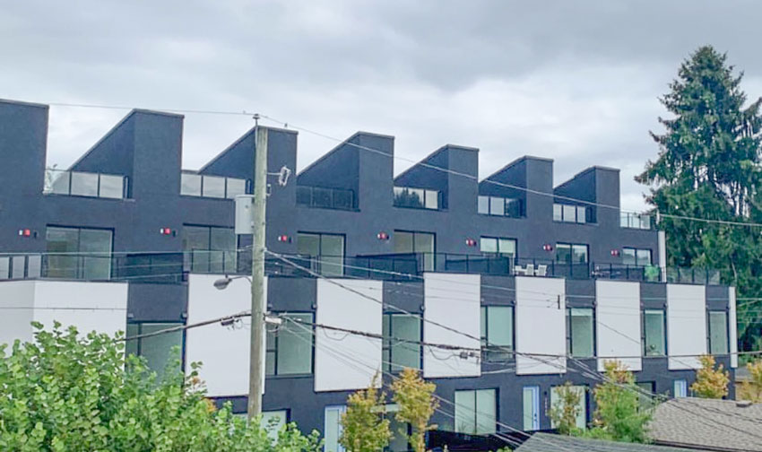
Help me understand how anyone could ever think that this was a good idea? Have we landed on another planet?
HARSH
FLAT
PREDICTABLE
MASCULINE
This is the look and feel the black and white trend is leaving in its wake.
When a trend comes along that everyone embraces this hard, it seems so easy at first.
Like you don’t need to think at all.
Can’t go wrong with white right? Goes with everything. Looks so fresh and new.
And black? Well, same idea right?
I mean you just point. Black, white, black, white… when you’re making colour decisions and then you’re done right?
WRONG.
Black becomes all of the above so fast, you will instantly regret that you took no time at all to make more considerate colour decisions as soon as everything starts getting installed.
Not to mention, you may REGRET that you had time to make all the right decisions BEFORE your renovation or new build commenced, but you just relaxed thinking black and white would always be the correct answer.
Ugly costs the same as pretty, don’t forget.
And stark white looks just as wrong when overused and applied in earthy environments where it has no business ever being in the first place (see the new build below).
Another reader just sent me a video driving down the street where every single complex (nine in total) went black and white. (I took a few screenshots).
And since the architecture of these buildings was unremarkable to begin with, now that they are all a monochromatic shade of white and black they look kind of like a row of detention centers. Notice how your eye is immediately drawn to the small black windows.
A lot of lamps would be needed in these buildings.
Read more: 5 Lamps Everyone Should Have in Their Home
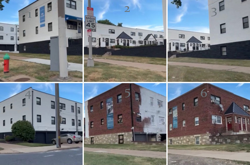
Sad because even though the stone they added at some point was not an improvement, these buildings could have been a lot more interesting had a colour designer been engaged to come up with a thoughtful colour palette.
Let’s look at the Saguaro hotels for a moment shall we?
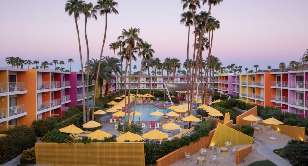
Now this kind of colour scheme takes a lot more effort, foresight, planning, and most definitely a colour professional to pull off correctly.
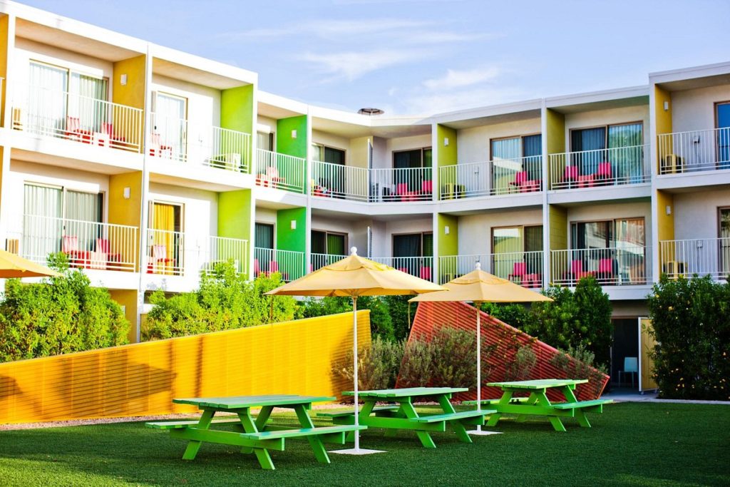
And so worth it. It’s one of the most instagrammed hotels out there. And for good reason.
In the 80s when black was last trending, we saw a lot of black, masculine leather sofas and black millwork . We also saw a lot of powder rooms decorated with black sinks and toilets.
This time around, it’s much, much worse.
We learned how to make black plumbing fixtures and black hardware, ergo, even if someone has no black in their kitchen or bathroom, black lighting, hardware and plumbing still reign, instantly placing your otherwise timeless home, squarely inside this trend.
On Instagram where my “5 Ways to Ruin your Black and White Exterior’ videos have just begun, followers are sending me photos on where the black trend is going next:
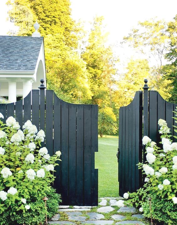
Have you seen the all-black metal fence?
Black does work on fencing in a custom situation because greenery pops beautifully against it. But most people will slap this fence up and paint everything else black too. This will start going up around already stark black and white or grey homes (as shown here) adding even more darkness and bleakness to an already trendy home.
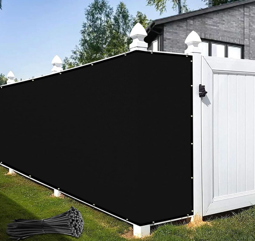
And it will mostly sit there alone, with no plant material to bring it to life (like in the image below).
Read more: Dos & Don’ts for Choosing the Right Fence Colour
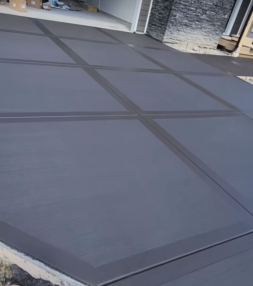
What about black concrete?
Here’s another image a reader sent. Black concrete. It looks slightly better than black asphalt but why add such a large swath of black to your already black, grey and white home? It’s like you’re paying more just to have a driveway that looks slightly better than the cheaper black asphalt alternative.
Not to mention your driveway will now stick out on the street if your neighbours are not doing the same thing.
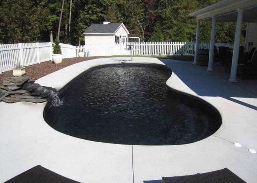
Black swimming pools?
I suppose a turquoise or blue pool sticks out in the black and white world of most new builds?
A few people messaged me and said they remembered black pools from the 80s. Since I wasn’t a designer then, this is the first time I’ve seen black in a pool.
Commercial exteriors are turning up black and white too
Last week I spent a few days in Vernon. I was so dismayed at how many strip malls had been painted the exact same bleak shade of charcoal. Over and over and over again.
Grey comes in warmer shades kids. Get the curated list of all the best neutrals listed from light to dark by undertone in either of my ebooks here.
And now Starbucks and even McDonalds is embracing this trend. Along with the same bleak shade of charcoal I might add.
On a side note, notice how the stone here has a violet grey undertone.
Violet grey and taupe is MOST often found in stone, as you would have learned in video lesson #4 of my Exterior Masterclass here.
I would have AT LEAST chosen the correct neutral here and it would have lost the bleakness that now prevails.

Here’s another commercial building in *SURPRISE* black and grey with a little tiny hit of white trim.

Did you know there is only ONE style of home that works in black. You can also find those details in my Exterior masterclass. This style of home is not one of them.
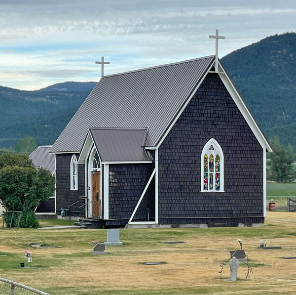
When I was driving home from Vernon, I even saw a church painted black:
Read more: My 3 Favourite Colours for a Pretty Church Exterior
After I posted the black church on my Instagram stories, a follower sent me this:
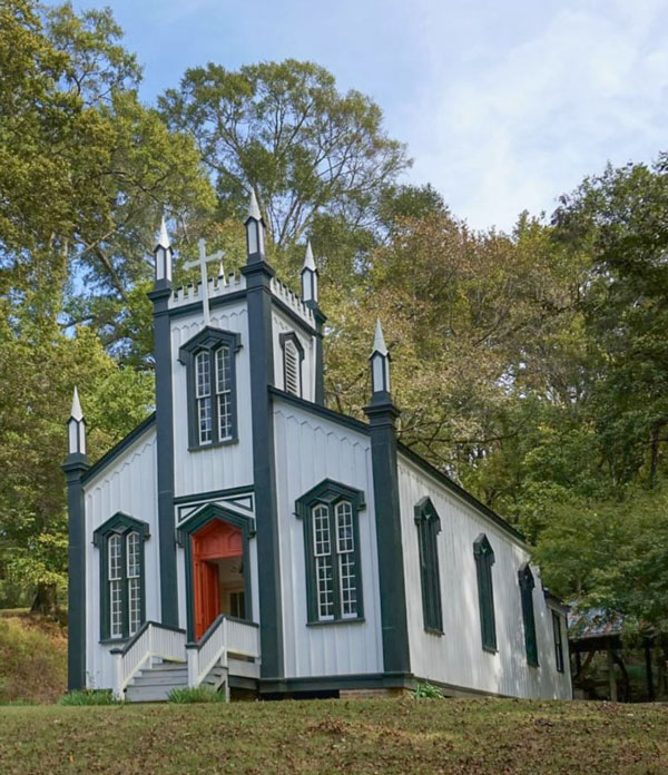
This time we have a red door? How is this a better colour scheme? The addition of the red makes me cringe because of that association.
Adding eyeliner to a white building to help the heritage features (below) pop is no better.
My Mom sent me this photo she snapped on her way home from our trip.
How lovely. Such a nice reprieve from the black and white world.
More black and white houses we can’t ignore
Moving on to another photo sent to me by a follower. This homeowner (below) added brown window coverings inside to coordinate with the warmer wood stained elements they added to their black exterior but it was too late to make a difference. Plus in order to get the full effect of the colour inside the windows, you have to have your blinds closed at all times.
Also, this just in:
Where we were using stone on our stark white homes in the last few years to try and differentiate our stark white house from our neighbours stark white homes, now (as an alternative to stone) we’re slapping up BLACK accent walls ON EXTERIORS!??!?!?!
We’ve moved from simply painting the garage door black (still a bad idea), to random areas elsewhere.
And I’m here to tell you, this is not a good look.
Notice, AGAIN, this black and white exterior in no way relates to the much warmer, earthy stone (below). Not to mention we painted the gables in black?
Another accent wall moment I suppose.
I think there’s enough going on here, we did not need to go there. I talk at length in my masterclass how worried so many people are about their exterior being BORING and the BEST SOLUTION to address this.
Because this accent-walls-on-exteriors trend is happening on black and white homes, it’s now moving to colour as well. And, it doesn’t look any better. Thanks to another reader who sent me these homes last week.
So, please. Take advice from a colour expert.
Take the time to create a mood board if you are building or renovating. You should have one for each room minimum including your exterior. Everything should be in front of you visually BEFORE the house is painted so you can see the end result. I talked about this here when I helped my Mom with her front porch addition last year.
Learn the easiest way to create a mood board here.
Read more: Even Minor Alterations Need Drawings; Before & After
If you’re choosing exteriors colours, take the time to watch all 17 modules of my Exterior masterclass and please, do us all a favour and choose ANYTHING other than stark white and black or the SAME bleak shade of charcoal that is hitting every commercial exterior strip mall as we speak.
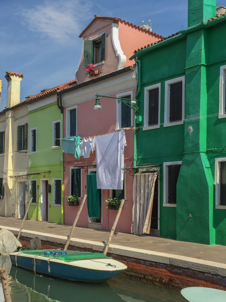
PS. Let’s just take one last look at a world where colour still reigns and that is Europe.
This is a photo I snapped when I was in Burano, Italy a few years ago. This colourful town is a short boat ride from Venice. Would tourists flock to this little town if it was black and white?
I’m saying NO.
I just received a message from an eDesign Classic Kitchen client who said she recently built an outbuilding that was white with black trim because they were going to make some minor updates to their heritage black and white exterior after the fact. But now that the trend has gone completely viral on every exterior, she doesn’t want to keep going with that scheme.
As I said in the beginning of this post, I too thought white with black was so fresh in the beginning, but now that it’s being done soooo badly and en masse EVERYWHERE, it’s time for those in the know to do better.
My prediction is that the next colour trend will in fact be COLOUR itself. And this means colour consultants will be more in demand than ever. If that’s you, register into one of the three Virtual Specify Colour with Confidence events happening this fall here.
So please, if you haven’t painted your home yet but it’s due, don’t paint it white or black even if it works. We need to save North America from this trend one home at a time.
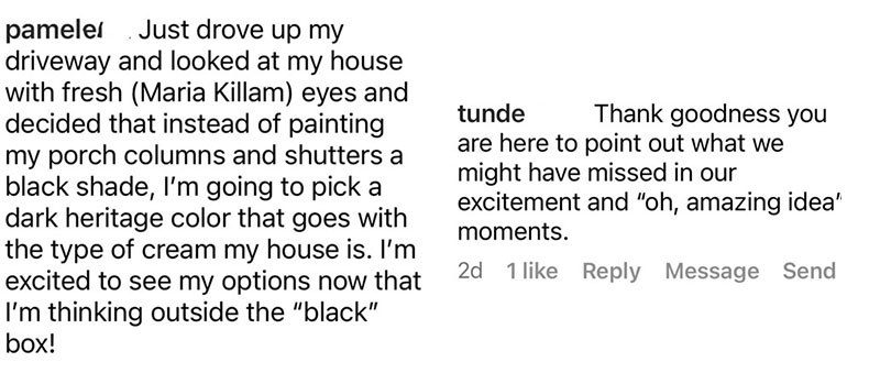
Here’s a couple comments from Instagram:
Check out my 2022 update to this trend (and what to do instead) inside my Exterior masterclass here.
If you need help with a timeless exterior colour palette, see my eDesign packages here.
Related posts:
The House with a Hug; Before & After


Curious. Why has the black/white exterior trend died so quickly, compared to previous color trends of past 40 years?
Hope the disasters of black/white, currently, do not remain as long as other color choices in previous eras. AKA, cannot afford to repaint sooner. What is your prediction on this? Some of what you showed, black/white disasters seem to already be a new cause for mental illness, others seem to already be lowering property value.
Those apartments going black/white from the gorgeous original brick; what a mistake. Worse, people paying for privilege of living in a penal colony movie set. Would be interesting, a psych evaluation for residents living in the colorful hotel/Italy or the black/white apartment fiasco. Of course reality only cares about property value. A study on property value due to color would be interesting.
Off topic…………..
CONGRATUALTIONS TO YOU BOTH……………….M & T…………………YOUR NEW HOME !!!!!!!!!!!!!!!!!
Garden & Be Well, Tara
Sadly it has not died, it is just picking up momentum which is why it’s starting to be so badly done. Thanks for your comment. Maria
I think you have a year error in 1st paragraph. States 2012, shouldn’t it be 2022? Sorry, Didn’t know how to reply quietly.
I agree with everything you have written too, but I always do.
HELLO ALL:
Please research DOROTHY DRAPER and then opine on Black and White.
B/W is a timeless combo- scene throughout history of design- don’t confuse that with a current overdone/badly interpreted trend.
Maria only shows bad examples and ignores all the glorious black and white rooms and homes.
Black should always be an accent color- not the star….really Maria??
INFURIATING as a fellow design professional.
Pandas, Cows, Zebras…..certainly just a trendy color comb not found in nature. Insert eye roll.
I recall seeing several beautiful, but unusual, black swimming pools in the late 70’s into the 80’s, many of them in the Hamptons or elsewhere on Long Island, NY. And they weren’t necessarily pure black but a very dark gray or even a midnight blue. All of the pools were set into beautiful, lush garden landscapes, with a darker material such as flagstone as the small pool deck or a seat in the pool wall. The intention was for it to be more subtle than a traditional turquoise-bottomed pool and blend into the landscape, like a secret pool stumbled across in nature. None of them were large, nor intended for lap swimming, but rather to cool off or relax in. The example in the photo in your post of the large black pool set into the stark, flat white concrete pool deck covering the entire back yard was unappeallingly stark and severe. I might also add that swimming in a dark-bottomed pool can be disconcerting for some as opposed to a more traditional pool color, as it’s harder to see the pool bottom.
Dark blue or dark turquoise pools are definitely a thing and they are gorgeous. But I’ve never seen or heard of a black pool until seeing one here.
I could never jump into a black pool where you can’t even see the bottom. Looks like a place for monsters to dwell. 😉
Black bottom pools are common here in CA. In the 80’s all of my classmate’s parents chose black pools for their yards. I can’t think of any new residential pools that were being built in the early 80’s that weren’t dark. Their ability to retain heat is what made them so popular. It extended the months we could swim in them.
A black pool is the stuff of my nightmares. No thanks!
And because it’s hard to see the pool bottom or sides in a black pool, it would be extremely dangerous for small children or pets. You wouldn’t be able to see if they’ve fallen in accidentally.
Agreed.
Wow, Maria, this is BAD. Thanks for showing us the way regarding the misuse of black and white! I would personally never do an all-black and white color scheme and the church photos floored me! A black/charcoal church? Heh? the red door to boot… Someone please Jesus them a color consultant lol!
I noticed a few months ago that they painted our local Walmart charcoal with black trim! What the heck happened?!?
^^and I forgot to add above, that I actually liked the church in the photo. It was rather monastic in tone, like the severity of a priest’s cassock or a nun’s habit. The black sides, while a bit austere, did frame the stained glass windows. White might be more traditional for a wood-shingled church but this didn’t bother me, except that the combination of the all-black roof with the all-black walls, did seem visually heavy.
E.H.
Black churches are actually traditional in harsh climates. Iceland has several, including one that’s rather famous. The black color comes from pitch, which helps to protect the facade from the elements.
That’s very interesting and I hadn’t heard of that before. Thank you for posting.
I don’t think the black church is painted. To me it looks like unpainted aged natural cedar, which eventually turns a very deep color. There were several houses with this kind of siding in St. Louis, and I’m told was very popular up in New England too, precisely because no painting is needed. The shingles do require patch replacements over time, so for awhile the fresh wood patch is very obvious.
Homes in New England and on eastern Long Island, NY, clad in natural unpainted Eastern White Cedar, turn a silver gray over time, not dark. But I believe Western Red Cedar ages a dark color so perhaps that’s what’s commonly used in St. Louis? There may also be other cedars I’m unfamiliar with.
Could be. The particular house I’m remembering was so dark it looked black. My cousin from NY spent a fair amount of time waxing poetic about that house and how the cedar shingles worked. It reminded her of home. In STL, most houses are brick because of the termites. BTW, in the church picture, you can see an aging patch just to the right of the front door. It isn’t quite as dark as the original shingles yet, but it won’t be too long until it blends in.
This did give me a laugh. 4 years ago we moved from a huge yet gorgeous house because it was just too big for the three of us. It was a 90’s built brick home that was so beautiful. The former owner really had an eye for decor and color. While she did update from beige she was also careful not to do gray heavily. So I left it mostly as is only using decor because it had lovely, timeless, and expensive details. We moved to a smaller house in the same neighborhood and I drive by my old house daily.
We sold it to self professed DIY-ers who stripped all the color, added flat looking gray paint and carpet everywhere- even over the wood staircase which had an oriental runner when I had it. They also took out about 50k of landscaping including mature hydrangeas- but that’s neither here nor there.
Then they sold it (at a loss) to someone I know and don’t particularly like. This lady and her husband took out all the wood windows (that would have lasted another 30 years) and installed black windows with no mullions. Like they think they live in a downtown industrial loft rather than a suburb.
The windows are huge- so when you drive by it -the windows look like black holes. I am sure she will paint the gorgeous brick stark white soon.
Even though I live close to my old house, luckily, it sits back a long drive so in order to see it, I have to be a Gladys Kravitz about it; slow down and look down the driveway. So I just zip on by so I don’t gasp and roll my eyes back into my head like when I saw it the first time after the changes.
I can’t even drive down my old street in the once gracious area of Memorial, in HouTX.
Those wonderful sprawling ranch style homes with gorgeous trees and big lots have been replaced by the most tasteless, ginormous, ugly houses imaginable. I will never drive down that once beautiful street again.
And continuing into the area, lovely brick homes are being painted white w black trim…‼️Black+White=BLIGHT‼️
One after another..it is horrible!
It’s so sad when people do this. I was considering purchasing a 1920’s Sears bungalow several years ago. It was a fixer upper to be sure, but all the original features(original wood windows and siding) were still intact and could be restored. I was single at the time and passed on it as it would have been an overwhelming project to take on myself. Sure enough, a flipper purchased it, replaced all the originals windows with cheap replacements and the siding with vinyl and in the process stripped it of all of its charm and personality. I can only imagine what the inside look like. I feel so sad every time I drive by.
The two newest high end homes in my community (which has long been almost fully built out, so not much new construction going on) are white with black windows, trim, doors. They don’t fit in with the majority brick and stone of the rest of the neighborhoods. On first glance they look modern and “cool” but I can definitely see how they won’t age well and will continue to stick out – not in a good way – in the years to come.
Same situation in our little 13-home development. The last two builds are black and white and do not go with anything. Our ADR couldn’t do a thing because we do not have a specific color code; we had no idea we would need one. Hindsight.
I saw a video a YouTuber did standing in the driveway of her traditional neighborhood. There’s a remodeled white house across the street with black windows. They look like giant black holes. So expensive and so ugly.
We are seeing so many black and white houses here in Australia and they look so dismal. I find that the ones that are just black or a very dark grey with no contrasting colour are even worse. There are units a short distance away that are a brown brick but instead of adding a cream paint they used.a terrible drab grey and they look so tacky. If only builders would employ a professional to choose the right colours they would look so much better. It seems we will now have to look at ugly dark homes for years to come. Unbearable.
Yes! Here is Sydney there are a lot of small older fibro homes that were repainted in dark cold grey with no contrast in the roof or windows and trims and they just look so depressing. And so so many people who panicked in the grey trend and painted parts of their exterior in grey with a purple or blue undertone and wondered why it looks so bad against the rest of their house which is obviously yellow/orange beige or pink beige/brown bricks.
I agree with all of this, except the red door on the church. I don’t think it looks good with the black and white, but it also wasn’t made as a color decisions. Anglicans, Episcopalians almost always and Lutherans, Methodists, and Catholics often paint doors red because it is a color of sanctuary and of the Holy Spirit. It used to be common to paint doors at four points red (making a bird eye sign of the cross, just like cathedral architecture) over the building. I’m not sure how common it is out of the United States and folks who don’t know of the tradition (like lay folks on building committees) will often paint over the doors, but even now there are “red door” ministries so named because of this tradition.
Never heard of it here on the Westcoast of Canada, but many would consider me a heathen since I have never attended church.
Never heard of this in the United States. If it exists here, it’s not common.
List of reasons here: https://www.unitedchurchofsoro.org/why-is-the-door-red/
Thank you Maria for this! I was recently in a gorgeous area of new, multi-million $ homes and they were all that farmhouse black/white. Even if the trend looked good (and I kinda thought it did, until you enlightened me), I don’t want to see it on every, single house! What is that neighborhood going to look like in x years when the next trend comes along?
I have a few friends who live in older suburban neighborhoods where those red brick monstrosities were on trend in the 1990’s. They know the red brick was outdated so they painted the brick…you guessed it, white. Have you written an article about how to update those kind of homes w/out falling into the black/white trap? I’m sure you’d have some brilliant ideas.
I grew up in the Midwest, where all the (real) farm houses were white with window trim painted one of two colors, hunter green or black. Colored houses were for towns. I still think the classic farmhouse needs to be white with a dark trim, but now I see it on houses “in town” and it doesn’t work for suburban bungalows or even modern houses. Painting large surfaces black (fences, walls, porches) means that it will look faded in a minimum of time and need repainting again. Who wants a faded out black house?
Maybe modern media is at fault for jumping “on the bandwagon” so that all feel like the best choice is what is currently seen everywhere. To me, gray says penal colony and black is Elvira territory. Keep preaching, Maria! The world needs it.
I think the red door on the church also signals something about whether the building still has a mortgage on it or something. When it is paid off, the door is painted a more neutral color…black possibly? (loll)
The hotel is so lovely but it seems like the Palm Springs location is key for something like this to be so appealing.
You are spot on and brave Maria. Thank you! If I could, I would pass this post on to every developer and paint store!
OMG. The first photos — of the townhomes you correctly called HARSH, FLAT, PREDICTABLE, and MASCULINE — remind me of missile launchers. That image is further worsened, if possible, by all those telephone poles and wires. UGH.
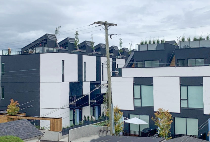
I know those condos!! Awful, and they’ve already had to add paint layers as it was discoloured, though perhaps that was the primer coat??? Anyway, the pic with the wires and hydro poles is from the lane way in the back, I’m not sure but I think the building looks equally bad, front and back!!
The townhouses look like they have a dumpster on the roof in the second photo!
I had to chuckle at the typo….
The text reads: It’s like the grey trend which started in 2009. It’s 2012 and those who don’t know are still installing grey floors.
I think that should be 2022, not 2012.
Probably.
I think I’m allergic to black & white and also gray. My eye was twitching at some of these photos. LOVE the colorful hotel photos from Italy.
Agree, it’s out of control. And the default to what I call “primer white” is making it far worse. If people would at least choose the correct shade of white, it wouldn’t be so bad. I just found a search site that returns the oldest google result first (after a chunk of ads) and found it interesting when searching for things related to various design trends. https://www.oldestsearch.com/
We have black on the larger pillars of our deck and some fencing (picket). The main body colour of our house however is a lovely earthy green with a soft yellow window accent. The combination is stunning and I haven’t tired of it in more than 15 years. Colour is always the right choice Maria, just like you said. We used a colour consultant and it was the best decision.
May I ask, what green and yellow did you use, Glenda? Sounds lovely.
Om gosh! It should be law, all churches should be white as snow!! That white & black church with the red door is AWFUL! Looks eerie…
All the black, white, and grey buildings are just damn depressing to me. I LOVE the pics of the Saguaro Hotel though! And the homes in Italy. The new builds with exterior statement walls are awful.
I have never been on board with the white and black trend for exteriors. It started when everyone started painting their beautiful variegated bricks white. I rest my case.
As far as a black bottom swimming pool: WHAT?? This should be a building and safety code violation. God forbid, someone needs help or to be rescued.
“North American penal colony” aesthetic. Seems appropriate. Ha!
Thank you for skewering this trend.
Note: I’m not opposed to the white farmhouse trend when done right.
P.S. I had a client who’s home exterior was painted a mid-tone gray amid a neighborhood of all earth tones. I ran across an earlier photo and it, too, had been a beautiful variegated brick with Kelly green trim. Now, it’s just pseudo modern blah.
Thanks for letting me opine.
And, I second Tara’s well wishes above: Congratulations on your new home!!
Warm regards,
Tara Imani
Houston, TX
*I can’t wait for the turquoise teal trend! 🙂
Yes, I’ve seen a renovated McDonald’s with one of those bleak charcoal exteriors. Simply awful. So uninviting–and it’s a tourist area!
I think people use black and white because they think it’s somehow more sophisticated than color–and because they’re afraid of making a mistake. Those first townhouse images you show have gone way beyond “masculine” into storm trooper territory. I’m imagining how grim all of this will feel on rainy days. Home as a prison rather than a sanctuary.
Those black & white townhouses look like something out of a dytopian novel! Yuck! And those color-blocked homes…it’s weird to me that people actually think these look good. Oh, if only we could get the world to read your blog, Maria! Between the gray trend and this black & white trend, the world is looking very bleak. I do hope the next trend is a lot of color! Thank you, Maria, for this service you are providing. If it saves one person from making a mistake, then your efforts are worth it!
I’m looking at real estate listings and dreaming of (uh, RESEARCHING) our next home which is a couple of years away and I see the gray trend and now the black trend and it’s driving me nuts. All the brand new flooring I’d have to rip out. Everything grey, or all black kitchens! Yikes. I’m a “winter” in colors but I need warmth around me!
Couldn’t agree more. And It’s like a black car, absorbs heat and shows all the dirt and dust. TV home makeover shows are some of the influencer/culprits here. Thanks.
That black pool looks like a toxic sludge pit! Very unappealing.
I thought gray was bad and depressing, but the white and black trend is maybe worse. It is way too stark for exteriors.
I am not a decorator or a designer. I am, however, one who is very interested in fine art,
ancient cultures and enjoy learning from experts like you, Maria. I had always known about
undertones but didn’t have the vocabulary to explain it. Now I do, thanks to you. Like you, Maria,
I am into timeless and classic. I don’t like trends of any kind. Black with white is too stark a
contrast. I prefer charcoal or some sort of grey. Black, to me, is good for punctuation, not
unlike the punctuation used in written language. I think this love affair with all white, blown-out
interiors is also a bad idea. What I do like is grey and didn’t mind the trend for the most part.
We renovated recently using a limited palette of brushed stainless, grey and white. Our desire
was that the artwork would pop and provide the colour. Our one colour “extravagance” was
having our new front door painted Toyota Orange and we LOVE it. And we found 2 red leather
chairs for our home office. They look great against the mid-grey (Stone by BM) walls. Our muted
interior is so restful and soothing. In 2015, I didn’t know we were in the middle of a grey trend, I just loved
that I could find a lot of furniture, decor and materials that were NOT BROWN. Now, brown
I hate! And I’ve never liked the Tuscan thing nor the dark brown kitchen cabinet thing either.
Give me grey any day!
I agree we can’t throw the baby out with the bathwater. Sometimes gray or black or white is perfect. With gray, adding color is the key!
“A row of detention centres”! Yes! At best black and white townhouses look like an industrial complex. The trend has hit here in suburban Australia and it will be interesting to see how far it goes. I am pleased to see that there is a suburb near me that has mostly homes built in the 1980s and early 90s in the brown trend, and most of these homeowners have thankfully, not slapped them with cool grey paint but left them as they are. Maybe they are smart and know to ride out the trends.
Our neighborhood is constantly growing with new sections that have opened through the years. The first part of the neighborhood is full of brown and beige homes–even a few with red brick. Further into the neighborhood it switches to different variations of gray and a few navy homes, then the final most-recent section is full of all white homes. It’s amazing how you can tell from the exterior color when a section was built!
Great post and I’m glad I’ve been following for a while so did not fall in to the trap lol
When overused, black and grey are depressing, cold and unimaginative. Sadly, so many homeowners in our area are now slapping black on everything from garage doors to fences. Awful! Thanks, as always, for your insightful comments. And congrats to you and Terreeia on the new house!
I so agree, Maria! Maybe it does reflect the times we are living in! Every time I see this B&W trend, I think….prisons! I’m ready for color again! Congratulations on the purchase of your new house!
My husband has a cousin who recently bought a 6000 square foot McMansion in a small town on 44 acres. With all that square footage, there is a LOT of exterior. When they bought it it had brown roof. They re-shingled it in black and painted the entire brick exterior bright, harsh white. I was at a house nearby and could see it, even though it’s a good distance from where I was. In a sea of all the green grass and trees, it is retina-scorching. Absolutely awful. I haven’t done the masterclass but even without it, I can tell you the one kind of house that should be white and black is NOT a mid-90s traditional brick mansion.
I just had to vent to someone who understands.
I don’t get it. I live in a high end mountain town and I admit I’m sick to death of brown, which everything is/was. But the past few years everything is being re-done in gray (lots of concrete), and now black, and it’s awful. Just yesterday a big gorgeous log cabin on my street turned black. OMG! And the interior remodels were grey on grey on grey for a few years, which gave modern design a bad name as they were cold and also furnished entirely from a Restoration Hardware catalog without a spec of color or personality. Now suddenly every listing photo has black window shades or black cabinets. Often just in a room or two when the rest of the house is normal. BTW we’re talking about homes which are many millions of dollars, where the architect and interior designer budgets are over $500k. People really are lemmings and have no creativity.
I had always planned to have no grey on the inside of my home, but I’m so glad I switched the exterior to color, and stuck with all the color sample testing when the going got tough. My new house is green and cream, with bronze windows and accents, and as far as I’m concerned it’s a breath of fresh air. I’m read all your e-books and am glad I understand undertones even if I can’t always figure them out. But your exterior color class was the best thing I ever did.
I realize we are talking about exteriors, but do you think dark navy or charcoal office cabinets fall into this current trend? I have always loved dark cabinets in an office and now my husband is building cabinets for me, so I’ve had my heart set on Benjamin Moore’s Iron Mountain or Cheating Heart. I know we will be selling in a few years and I don’t want to be caught trying to sell what everyone else may be tired of by that time. Wondering if office cabinets are possibly an exception.
This is long so sorry in advance.
I am so happy I found you on tiktok. I’ve watched all your tiktoks and now subscribed to your blog, and bought your color wheel and other products. I am getting ready to start a home renovation and have been so stressed about exterior color choices. I love color and have tended to do bright fun spaces in my primary home which I am getting ready to sell (so need to tone down some of the color for resale – my living room is pink – think maximalism before I knew what that was). We will move to the renovated house once it is finished. Your color wheel and the way you look at color has helped me think through future choices, especially TIMELESSNESS.
For the renovation we are redoing the exterior and adding on two new additions. It is a rather boring ranch house so excited to build in some character with the reno but staying with one story. It’s hard to get a lot of character in a one story home, IMHO. We have an architect for the design and for the exterior, he said it should be white. White siding white trim. White is classic, and timeless, I get it but wanted something UNIQUE as like I said before I like color (but not crazy unique – see I DO listen to you). Then I got worried about all your timeless reno tiktok videos and thought that maybe what I was thinking was wrong I should stay with white.
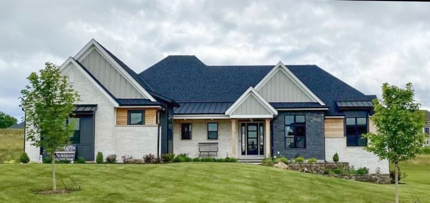
We plan to use using James Hardie siding, and I was really taken with the Cobblestone (taupe) for the horizontal siding on base and shake in gables, with Arctic White trim. The only picture I found with that color combo that resonated has black windows, and I prefer white trim as I am worried about the black trim being fadish, plus black is more expensive.
Anyway, read this article and thought YES, I need to do a mood board and perhaps take your exterior Master Class. I go to your MasterClass website and the first picture (after you standing in your doorway) is MY MOOD BOARD – you had already built it! These are the colors I plan to use. The second picture is the exact COLOR COMBINATION for my renovation – looks ike the Hardie Cobblestone and Artic white trim with a grayblack roof. I almost cried. It looks so fabulous, and now I can envision our renovation.
Thank you thank you thank you. I guess I need to get signed up for that class pronto – can’t wait!
I’ve been following your blog for a decade or more, Maria, but haven’t felt the need to comment before now. While I agree wholeheartedly that the black trend is out of control – your examples are shocking proof of that – I think I could add something to the conversation with regard to the small dark church.
It looks like this could be the church at O’Keefe Ranch (you mentioned you had been in Vernon) and I am familiar with this building. The cedar shingle siding is actually a very dark brown, most likely BM Manor Brown, and has been this colour for at least the 40 plus years that I have been aware of it. There are a number of these small wooden churches in rural or small town British Columbia. Three others that come to mind are in Nelson, Balfour, and Queen’s Bay. Built in the late 1800s or early 1900s as Church of England, they are easily recognizable. The look is iconic. The architecture of each is similar tho’ not identical and the colour is dark brown shingles with white window trim. Probably has been since the beginning. Timeless, really.
THANK YOU!! I have been horrified to see all the black and white, as well as commercial buildings, where black and white has been used to be extreme. This stark color scheme does not work on most buildings as you have pointed out. I’m glad you’re spreading the word, since so many people read your posts. This particular track has spread like wild fire, and I can only hope we have enough color consultants in the know to stop it in its tracks!
The colours are being taken out of our lives, all over the world. It’s as if the powers that be don’t want anything happy or colourful, everything’s becoming as drab and gloomy as a communist bloc country. It’s very depressing.
Hey Maria……..ever heard of Dorothy Draper???……….a Panda? ….. now tell me how B/W is merely an ugly trend and not a timeless design combo.
B/W can be glorious, you do your readers a major injustice by not showing examples and only focusing on the bad usage in the current hideous trend. Shameful from a color professional.
You discuss white in your blog to no end…but black is only permissible as an accent color and never the star?
Sincerely,
no longer a fan
Good lord Gary, relax.
I agree.. we have duplexes down the street and the colors are all close to black and white… I told them of my distaste when they were building and the sales guy told me each duplex was going to be a different color which soothed my nerves… but then they were all built and painted exactly like the model… it looks like a horror neighborhood, so depressing, literal squares of black… like a communist block of drab sadness. Very similar to your top picture, but I think it looks worse. Thanks for helping validate my upset over it.
I am on board with the general theme and content here. Your observations are 100% accurate. You lost me however when you listed “masculine” as a negative thing. I’m sorry, but suggesting the traits of half the population are negative traits is incredibly insulting. There is nothing wrong with being masculine. But other than that, you’re 100% correct. I would love your insight on a townhouse community being constructed in my area with ever unit consisting of a miss mash of accent walls and everything is in various shades of black, grey, and white. It looks like a scene from a black and white movie. Just depressingly dreadful.
Stop having your boarders move! It was a hard and irritating read! Couldn’t even finish the article!