This is thrilling! Thank you! I read through it once and everything is crystal clear. I may have questions further down the road, but right now I’m just thrilled.It makes me so grateful that the first money I invested in my new house was for your color consult. It’s like you gave me the picture on the top of the puzzle box, and now all I have to do is assemble stuff. Wow! The relief!!!!When I put the deposit on the windows a couple weeks ago, I was very sober and the guy was like, “Aren’t you happy?” To be honest, the fear I had that I was going to f**k up $60,000 of the wrong colors of shingles and windows and paint sucked all the fun out of everything. I realize now how much pressure it actually was. I’m not a “meh” kind of person. I always want everything I do to be excellent. And if I’m spending that much money, shouldn’t I be having a ball?Plus, even though the realtor told me I should change the locks when I took possession, I didn’t because I was so worried about the finish of the locks — and not wanting to waste money on anything that I would have to re-do. It is a huge relief to get this document. It has everything I hoped it would have, and what you’ve done has exceeded my expectations. Thank you so much for including so many exterior color options. I appreciate your generosity with that.Not to mention the value of this document if I ever decide to sell the house. How amazing will it be to provide that document to future home-owners and say, “If you want to change the house color, here are some other palettes that have already been vetted to look great with the hard finishes that you won’t want to invest in changing.” Hello resale value!This is the first time that I’m actually excited about my house!
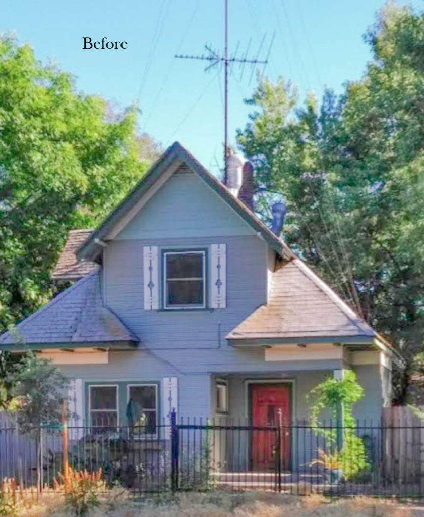
We recommended removing the fussy shutters and painting it a bold, happy colour with plenty of crisp white trim, and a higher contrast black roof.
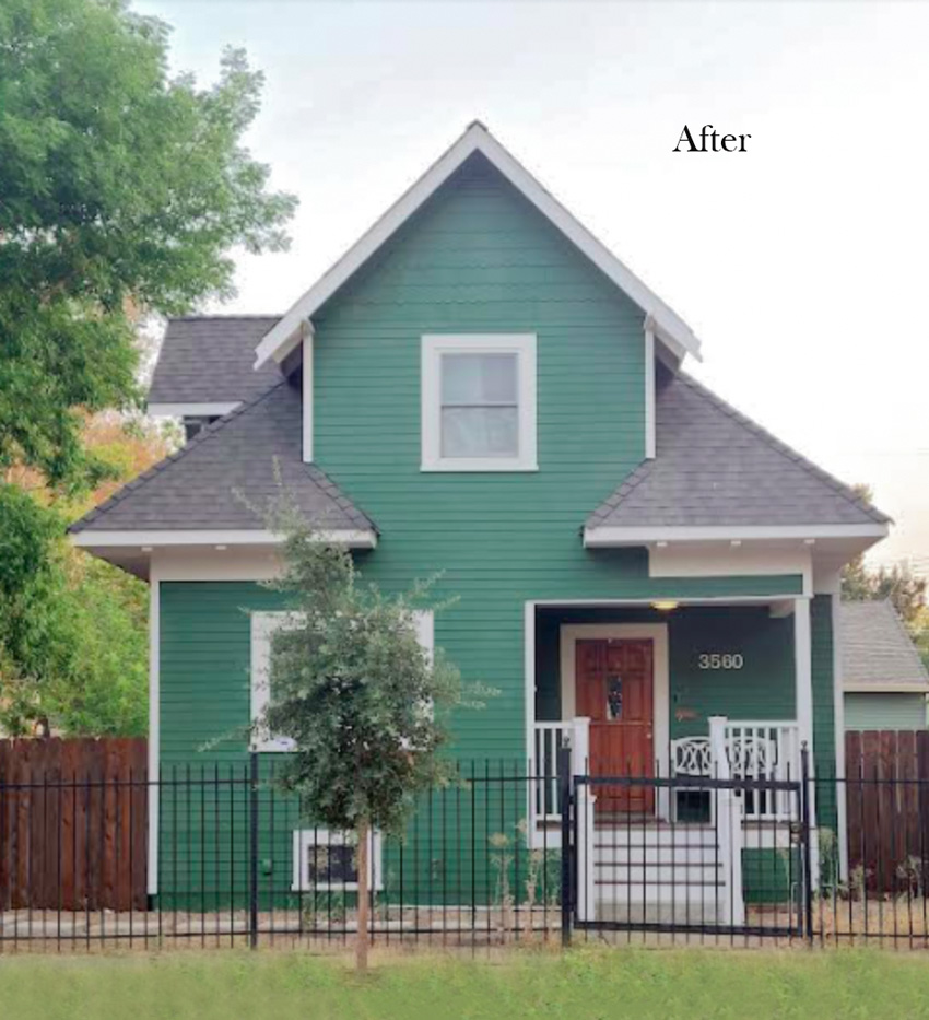
Below is the pretty after image. It’s like the house was given a huge confidence boost! The deep green and crisp white combo is just full of fun and love. And Carly, one of my amazing eDesign team members said, “it looks like the roof is giving the house a hug!”
Sometimes the power of paint on exteriors still amazes us! Even with the new landscaping still to come, this house simply looks fabulous.
Read more: The Best Colour Advice for Painting Your Exterior
More colourful home exteriors
We create colour palettes for adorable historical and cottage homes like this all the time. And it never ceases to amaze me how often clients ask for extra “safe” neutral colour palettes.
We ALWAYS offer them at least one or two fresh colourful options to inspire them or gently nudge just a bit more colour into the world. Sometimes, you just need some permission and reassurance to go bold.
And if you know you want to go pretty bold, like my client here did, it’s nice to have the reassurance that the colour you’re considering isn’t going to be a tacky neon eyesore, but rather the most perfect shade of green.
A house with white windows and without any bossy fixed elements like stone or brick can really be painted almost ANY COLOUR that you love. So it’s a shame really to reach for a safe grey or beige.
Read More: Trending Mediterranean Exterior Paint Colours
I found some pretty, charming colourful cottages (below) to inspire you in various hues.
More subtle green exterior paint colours
If a more subtle green is your thing, soft pistachio to sage greens always make a pretty backdrop for a cottage garden.
Beachy blue exterior paint colours
Blue is statistically the world’s favourite colour. And your favourite colour is the perfect colour to paint your cottage.
Read More: 6 Best Exterior Colours for a Lake or Beach House
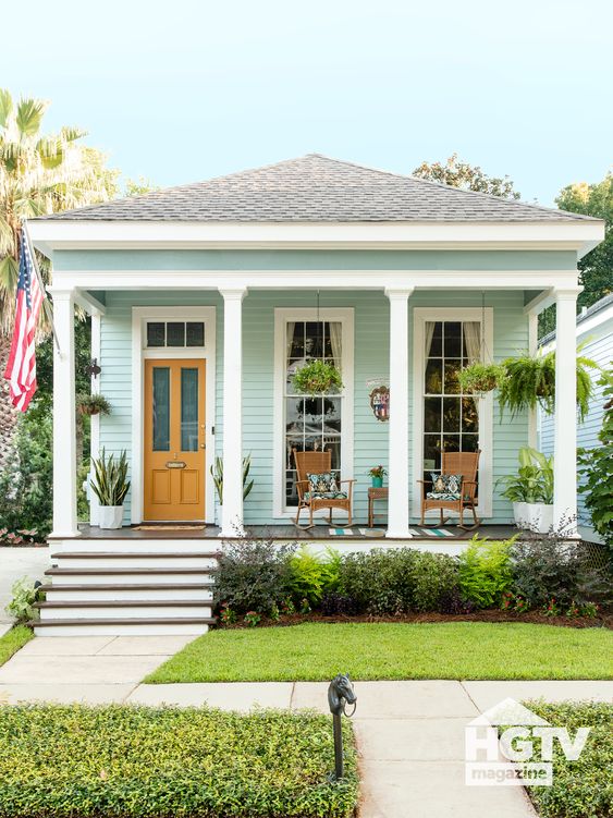
A whimsical blue-green is a very pretty backdrop for a lush green landscape and pairs well with white trim. The rich gold door is the perfect accent on this shotgun house below.
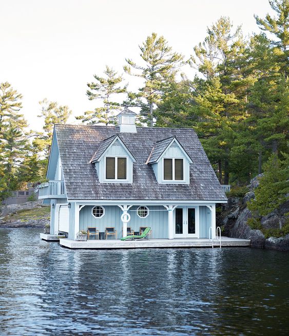
What could be more perfect right on the water than a watery blue?
Sunny yellow exterior paint colours
And on to my personal favourite, warm sunny yellow.
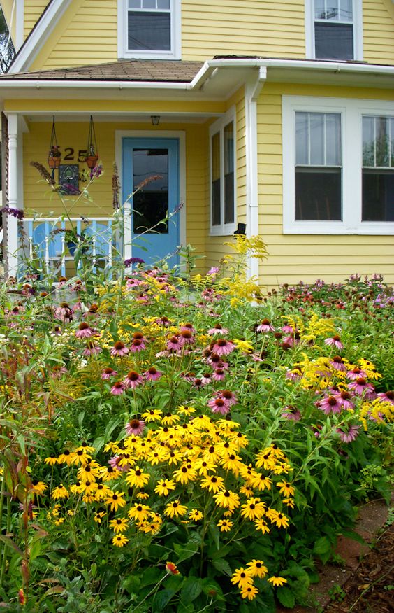
Yellow is such a happy colour and it is so easy to repeat in a proper wild cottage garden as they’ve done with this pretty mix of rudbeckia, echinacea and goldenrod.
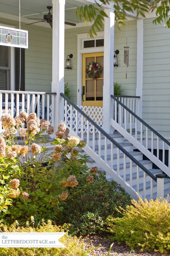
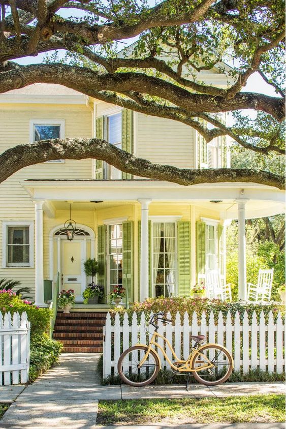
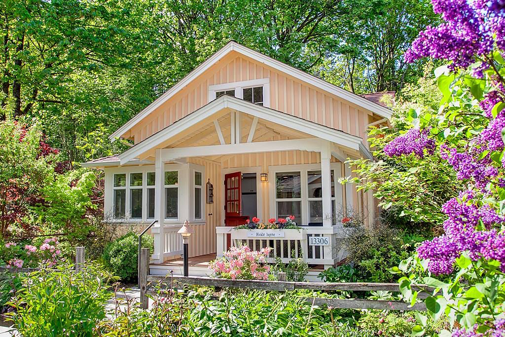
A paler buttery yellow is lovely too. According to the article in Southern Living, the homeowner chose this colour scheme of pale yellow and fresh green is actually from 60 years ago and they haven’t changed it. Now that’s WAY more timeless than grey, isn’t it?
Peach can be a pretty exterior colour choice, too
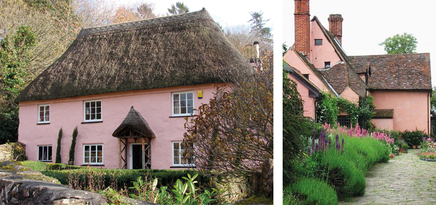
A less travelled path to warm and happy that is surprisingly beautiful and versatile is to try a yummy hue in the peachy pink realm. Worried it’s not a classic choice?
Look what this salmon pink hue does for this English cottage below.
The fresh apricot hue looks so unexpected and current on this charming cottage, such a pretty backdrop for the garden and strong red door.
** If you want to know specific exterior paint colours (brand names and paint numbers) for this eDesign project and each of the houses shown here, I only share those details exclusively with my Exterior Colour Selection Masterclass students! One of the most valuable lessons I teach is how to narrow down your choices to a select and optimal few – empowering you to make the RIGHT colour choices (AND avoid expensive mistakes).
Already enrolled in my Exterior masterclass? Head to the private Facebook group for details.
More exterior colour advice
Does your cottage need a fresh coat of paint and you don’t have any bossy stone or brick to coordinate with? Great, try your favourite colour! Need help? Click here!
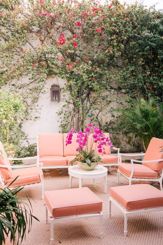
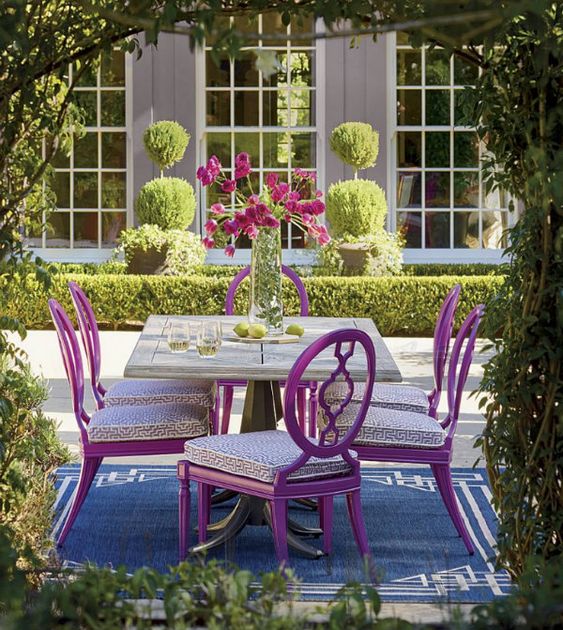
If you’ve already chosen a relatively safe greige, creamy white or grey, that’s ok! You can still add some colour in your garden and patio decor. Here are a few ideas below.
Look at this gorgeous pink and peach palette. Aperol spritz anyone?
Ciao Newport Beach
This intimate blue and violet moment just pulls you in surrounded by fresh greens, you hardly notice the violet grey house at all.
For more colour inspiration see how I recently created a colourful sunroom for my mom’s carriage.
Related posts:
6 Best Exterior Colours for a Lake House or a Beach House
Exterior Accent Colours Change Everything; Before & After
The Best Kept Secret for Dramatically Improving Your Curb Appeal



Can someone please tell this woman that changing the locks means getting a locksmith to come and reconfigure the internal tumblers and getting new keys made? It doesn’t necessarily need to involve replacing the handles and plates, etc.
First off, Congratulations, Margo! I bet you’re trilled! 🙂
I’m loving that green house with black and white! I want to intoduce green in my kitchen. maybe paint a few chairs a darker green… I’ve been thinking about it all day and then I see your post. Haha!
I love the wooden door and how it’s repeated in the fence (and possible stair streads and decking?) Could you have gone with black to match the roof? (and the black and white trend) I feel like that was an was unexpected touch. Beautiful!
What a beautiful, lively, colourful post! That’s what colour does – it injects energy into everything. Thanks
I agree with you….I loved this post and all the wonderful pictures! Colour’s endless possibilities leaves us soooo many wonderful, pleasing opportunities!
Congratulations, Margo!
Wow! It’s lovely — also, it’s interesting that the proportions of the home look so different in the before and after photos (‘thinner’ and taller in the after) – is it more than lens distortion on one of the cameras?
Just perfect!
I love the color! I have orange bricks on parts of my exterior and think this might be a perfect balance for them. Can you share the color or is it a trade secret?
Hi Emily, did you managed to get the color code? It’s just beautiful!…thank you:)
What an amazing transformation! You really hit it out of the ball park! 🙂
I feel like it’s the removal of all the eyesores (2 whirlybird roof vents, power lines, unstained fence, large tree looming in the background) that really improved the house more than the new paint. The new paint works, but somehow it is still boring despite being vibrant. I prefer the character of the old shutters and found the old paint colours bounced my eye around in a pleasing way.
Loved them all! Such inspiration!
I agree re shutters. I would have liked to seen them on the upper window.
I can’t seem to find the exterior paint color for the light blue house with the gold door. I have been searching everywhere! Any help??