Even if you can’t afford a complete exterior renovation, adding the right exterior accent colours change everything on your home. That’s because all the little details make a big impact. Keep reading to see what I mean.
The owners of this lovely home (below) purchased the trim/accent online colour consultation . Despite the home’s classic bones, this brick house was just not living up to its potential. It was feeling a bit tired and boring.
We wanted to address a few issues including a unifying colour for the trim, which will be painted next season.
Exterior Accent Colours Change Everything
In the mean time, they put our recommendations for accent colours for the front door and shutters immediately into action since these were quick and easy fixes.
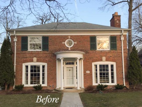
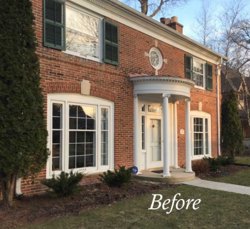
See how the shutters are a faded and dated dark green (above and below)? It’s amazing but a small detail like that gives us a visual cue about how current an exterior is.
It really can make or break it sometimes. As they say, a truly beautiful exterior is all in the details.
The downspouts on this house were distracting in bright white. They need to sit back or blend in, so we suggested that they paint them a dark warm metal colour. The homeowner opted to paint them a colour to blend in with the brick.
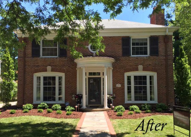
Take a look at the dramatic difference painting the shutters and front door have made on this house (above)!
It is so pretty now that we barely notice that the trim needs freshening up. All we see is it’s beautiful symmetry, and a dramatic, inviting entrance, perfectly balanced by freshly painted shutters.
So, even if you can’t afford a full exterior renovation, it’s worth refreshing your front door and accents to give your house a lift and distract from it’s less-than-lovely elements.
More Exterior Accent Colour Ideas
Here are a few fun examples of using accent colours to create a look and feel. These colourful details add a sense of life to otherwise plain (and a few not so plain) exteriors.
Front Door | Sherwin-Williams 6923 Festival Green
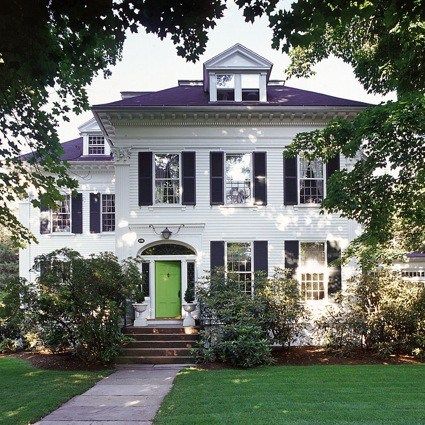
This is another classic house (above) where freshly painted shutters and a well designated accent colour really pops and says, “Welcome to our happy house!”
Would black work here too? Yes, of course, but since this house has black shutters on the lower windows as well as the upper, a black door is not necessary for balance. The bright splash of green colour creates a strong focal point instead.
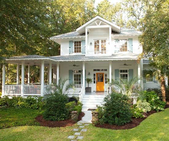
Shutters | Sherwin-Williams 6458 Restful, Front Door | Sherwin-Williams 6892 Carnival
Here is another classic white house where the shutters and doors tell a fresh story. Wouldn’t you just love to hang out on this porch? It’s so inviting and spacious.
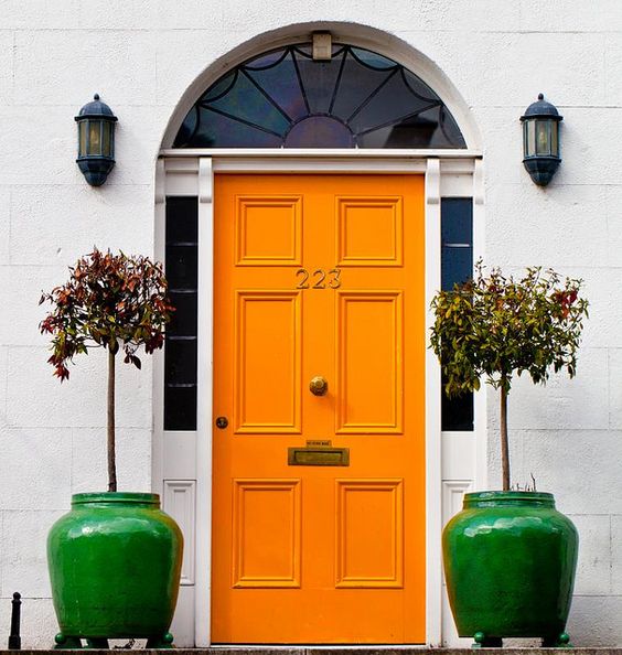
Front Door | Sherwin-Williams 6887 Navel
Here’s another bright orange door that I just love. With this happy combo of fresh green and orange, would you even notice if the rest of the house was crumbling to the ground? Accent colour can direct all the focus to where you want it to be.
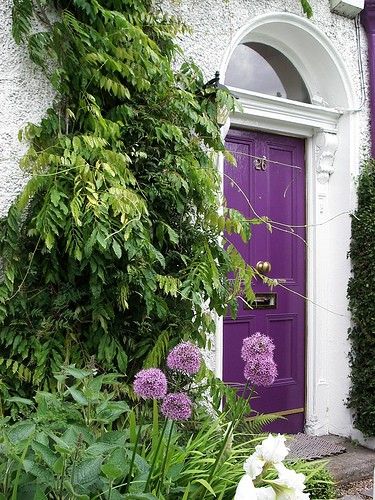
Here are a few examples of how bright front door colours look fabulous with fresh white and gobs of greenery? Of course you could go this bold with any colour of house as long as you pick the right shade.
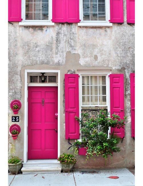
The house below is probably in Paris or something where they understand that things don’t have to be shiny and new to be beautiful. Would you go this bold? This fresh coat of hot pink sure makes this crumbling house look lived in and loved.
Front Door | Sherwin-Williams 6980 Gutsy Grape
Front Door and Shutters | Sherwin-Williams 6840 Exuberant Pink
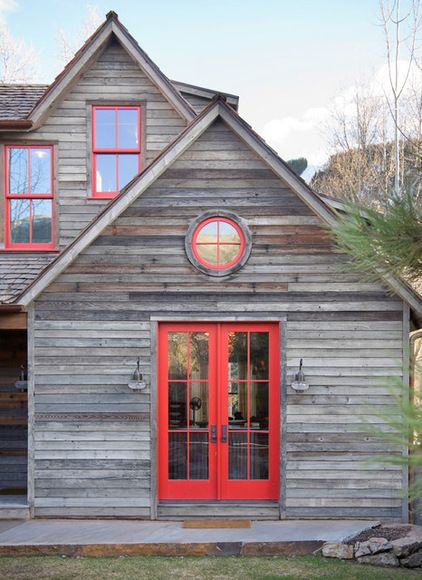
This weathered wood cladding below could end up looking both hyper trendy and drab if it wasn’t for the bold red trim. Sometimes all you need to face a rainy day is a fresh coat of red lipstick!
It’s interesting, you’ll note that sometimes an accent can be cleaner than the body colour and it still works.
From Houzz
Windows and Doors | Sherwin-Williams 6869 Stop
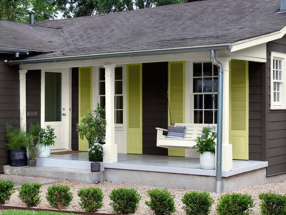
And I’ve blogged about this exterior below. These citrine shutters are perfect here to take a trendy dark colour scheme from blah to yay!
So, if your home’s facade is looking tired, and you are just not ready to tackle the whole thing, consider adding a punch of colour to freshen things up. A fresh accent colour can go a long way to creating interest and curb appeal on a dull or dated exterior, even if your house is not blessed with beautiful and classic bones like my lovely client’s home.
If you would like help creating a beautiful and classic exterior, we have exterior consultation packages available here.
Or you can learn how to choose your exterior colours with my Exterior Masterclass here.
Have a wonderful weekend everyone! xoxo Maria
PS. If you have an after photo you’d like to share, email us here.
Related posts:
The One Thing you Must Do Before Choosing Exterior Colours



The pink door and shutters are my favorite, but I have to say I love the purple roof of the 2nd house. Maybe the color was my imagination?
Looks purple to me also and I love, love it! In combination with that green door is perfection. That said I would never have the nerve to install a purple roof. I also feel the love for the pink shutters and door. That would be much less of a $$ investment and if a buyer hated it would be a fairly easy fix.
I wonder if it’s not really navy? It looks great regardless!
Loving these cheery clean colors on exteriors. Tastefully done, these homes seem to say “happy, fun people live here!”
Love how the accent colors make dramatic changes, all very tastefully done.
So if shutters are black green and the door is Benjamin Moore Wythe blue, are the colors not the same value? Door too pale? House is white.
Nothing is better than a good before & after.
Thanks for showing us again the power of paint.
The only difference I could see was the downspout. Everything else was in the shade.
The house with the fuchsia shutters is obviously in Charleston, SC (the ironwork at the window is a dead giveaway) BUT…someone has Photoshopped the color in because there is no WAY the local Board of Architectural Review would allow that bright color! It does look great, though!
I thought the biggest change is the landscaping… in the BEFORE they have ratty looking old shrubs in a straight line inside narrow bare dirt beds… in the AFTER they have totally redone the landscaping with a grouping of lovely shrubs of different sizes in a pretty new curved garden bed with proper mulch that matches the color of the brick.
The new garden beds extend out onto the lawn, plus they’ve added bricks along both sides of the cement sidewalk that frame it in and again compliment the brick on house… they also added nice black urns with cheerful flowering plants at the entrance.
It draws your eye towards the front door and welcomes you to stroll up and ring the bell.
What color did you have them paint the shutters and front door?
The photos don’t really provide accurate color capture–looks the same to me xcept downspouts…
But agree the landscaping works wonders for accenting front door and enhancing appearance.
Most extra photos are attractive but not really practical for most homeowners.
Maria,
Another variable your readers should think about when choosing trim colors is the age and type of windows they have. We just did energy saver replacement sashes and some of the beautiful colors shown in your examples would void the warranty on our new windows. High tech windows cannot have dark colors painted on the sashes because it makes the windows too hot, causing the glass seals to blow. Here in Memphis, where we had a heat index of 108F yesterday, seal failure is a common problem. Up in Canada, maybe not so much. The LRV maximum for paint is stated in extra large boldface type on our new window instructions. What do you think about a lighter trim color on the sashes and a darker color on other trim parts? Do you think this is too fussy on anything besides a Victorian house? Thank you for your wonderful blog!
Did you remove the storm door or paint it black? I tried to enlarge the pics to see but couldn’t do it on my phone.
On the first red brick house, what color did you use for the shutters and downspouts? I have this exact same color house.
One more thing…on the first picture, was the trim color white or off white? Which is right? Thank you Maria!
The last picture may have white vinyl windows and white trim. Does anyone know which Sherwin williams white most closely matches the white vinyl?
I enjoyed seeing some of those bright colors! If I lived in the right area and the house could handle it – I would go for turquoise. We will be changing the exterior color at some point (and no not a fun scheme ). Our first step was to remove all the overgrown evergreen type shrubs that surrounded the foundation and it already looks better!
What are the new shutter, door, and downspout paint colors for the before and after house? The images are taken in different lighting, so the trim in the after pics looks more creamy to me than the befores and thus much better. What would be recommendation for the future trim color? Also, am I crazy or were the tall accent trees on the corners of the house moved in the after pics. There are still trees there, but definitely not hugging the corners anymore. I agree that the after photos look so much better because of the landscaping and lighting of the photo. Very pretty!
I didn’t post them because my client paid for the colours using this service https://mariakillam.com/shop-landing-page/#exterior-solutions
The trim looks creamier because of the light but in actual fact it will be creamier when they paint it all with the colour I specified. Maria
I have a red brick Edwardian home that had dark green window trim and a slightly lighter green porch. We matched to our Anderson Window trim color “Flagstone.” Sherwin-Williams has their colors on file and will do a color match.
I wish I could post a photo of the creamy white porch and window trim. It really perked up the exterior of our house!
What is the Citrine colour in the last photo? My favourite combination..
I Love those big older classic homes!!! They have
so much character and it seems each house has a
story to tell……if only the walls could talk!!! I think
the Gutsy grape color door looks fabulous on that
house…makes me want to see the rest of it!!!
The possessive of “it” is “its”, not “it’s.” And the possessive of “you” is “your”, not “you’re.”
“It’s” and “you’re” are contractions ONLY. (For “it is” and “you are.”)