


When it comes to home projects, there is nothing more important than having a plan. I can’t stress the power of mood boards enough! And creating mood boards is much easier than you think! Read on for my thoughts on Pantone’s 2024 Colour of the Year!
I recently received this question from a reader who said:
“I’m currently renovating our house, the builder wants to know paint colors. I wasn’t planning on purchasing a new sofa and rug until the flooring is installed and refinished, and the cabinets and kitchen counters are installed. If the rule is to coordinate paint with the largest element in the room, then that’s the floor. I want to choose the paint color last, but my order of operations based on the builder’s need is taking priority.”
This is such a great question and I’m here to tell you that the sooner you have a decorating plan that you can refer to when making colour decisions, the more beautiful and colour coordinated your house will be.
Because it’s true that it’s best to choose your paint colours last to relate to your decor. But it’s also true that your builder will want those colour codes very early on in the project!
In other words, creating the plan isn’t the same as carrying out the plan. They have very different order of operations!
I’m here to tell you that if you can it’s much better to reverse engineer your home from the decorating plan first!
Most often, your main neutral wall colour will look best if it relates to any large neutral upholstery in the room such as the sofa. (And actually NOT the natural wood toned floors which are just like a pair of jeans).
And the right neutral for the sofa is the one that’s in the beautiful are rug you chose.
And so on.
Start with a decorating plan
When you start with the end in mind, ie. a decorating plan, when you’re builder asks for the main neutral paint colour to flow throughout the main spaces you’ll determine the undertone of the large sectional you’re planning, refer to my Bonus Book of Colours (available in either of my ebooks) and choose the right pale greige or complex cream.
Next she wants the colour for your powder room vanity. You can refer to the wallpaper you’ve already chosen, and then give her the right one. If the navy in the wallpaper has a purple undertone, you might select BM Kensington Blue from my curated collection of large painted colour boards which has a purple undertone (for example).
And so on. To be this smart you’ll need to have all your choices on a mood board. And it’s much easier than you think! This course will teach you all about how to make one with templates and worksheets, etc.

Whether you’re planning a new build, renovation, redecorate, or even just decorating for the holidays! A mood board is the perfect place to start.
Mood boards make decorating easy
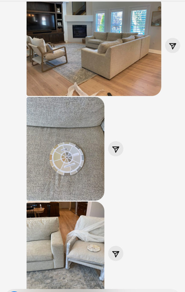
Here’s what one of of my followers rooms started out with before she bought my mood board course:
“I love to learn how to put things together correctly. I have wasted sooo much time wandering stores and buying the wrong things with no “vision” or concept of the complete project!”
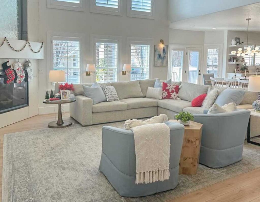
And here’s what her living room looks like now, decorated AND all decked out for the holidays!
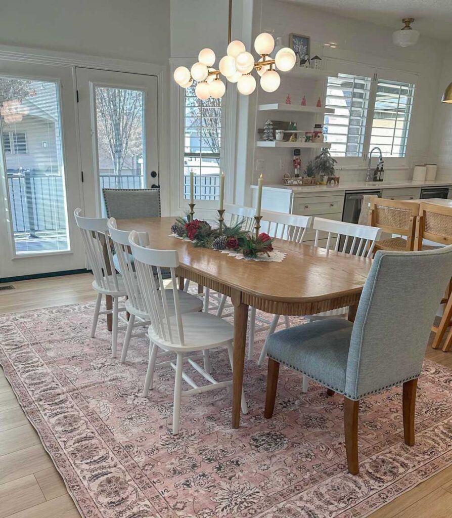
I love the collected look she created in her dining room.
Here’s another testimonial (we have a total of 456 to date) ,
“It is very easy to get lost in the amount of information and data available online, especially when it comes to shopping+making design/decoration/styling choices, and…getting it right! As a newbee stylist (I can hardly call myself that yet), the process from creating a design concept solid enough to be presented to a client can be confusing and intimidating. The Mood Board course was able to provide the direction I needed in a concise, practical, useful and friendly way. Thank you Maria. You made me smile many times through the 3 videos.” Marie N.
I always start my decorating plan with a mood board
Before I chose any paint for our new house, I had several mood boards. This is how I was able to quickly choose the perfect custom colours for my ceilings for example.
Imagining the possibilities for your home can be so much fun! And it’s easier than you think! Once you see all the pieces you’re considering together on a mood board, you’ll know whether it’s going to work and what else the room will need to pull it together.
You can paste paint dots right on there too to see which colours you should be testing.
Another note from a happy customer!
“I am currently renting a furnished home, but plan to buy a home in the next year. I have been refining my style over the last 5 years as I have read Maria’s blog, and I just took her online True Color Expert training and purchased the Moodboards class and neutrals and whites color boards as part of that training. I have a background in kitchen and cabinetry design, and I am so excited to put all of this into practice in my own home. I already redecorate others’ homes in my head and on Pinterest, so having some better tools as to how this could be presented to and coordinated with a client is so helpful. I just can’t wait to put into practice what I’m learning and see it take shape!” Noelle
“I am building a new house with a designer, but I have been able to do some much work on my own and really get the look I want not just what the designer thinks I will like.” Jessica H.
If you don’t have a decorating plan
But if that’s all too overwhelming, and your or painter is breathing down your neck for answers, don’t worry! In my eDesign packages, we will help you create the most versatile possible backdrop for decorating. And we’ll even throw in some bonus decor suggestions to get the ball rolling on pretty colour for your home! You can find the help you need here.
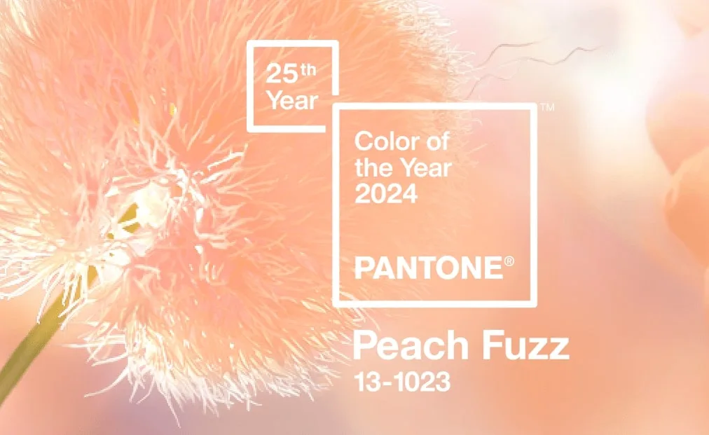
A peachy new year
And speaking of colour, Pantone has released it’s 2024 colour of the year and it’s Peach Fuzz.
I don’t know about you, but I’m much less enthralled year over year by the colour of the year announcements. The Pantone ones in particular seem to be grasping for lofty cultural zeitgeist moments that are so abstract they are meaningless.
Anyway, a peach tone does make some sense. We’ve been in a warming trend in interiors for a few years now. And I’ve observed that orange wood tones and orange beiges have been coming in hot along with the ubiquitous cognac sofa to warm up black, white and grey spaces everywhere.
Pantone says Peach Fuzz is about nurture and connection. Well we can all use a bit of that can’t we? After all, it’s that warm fuzzy feeling isn’t coming from all the linear black light fixtures with glaring bare bulbs and black accent walls is it? Or the builder-art-gallery-white boxes?
What do you think of this colour?
If you still don’t know where to start decorating
My eDesign department is very busy helping everyone warm up their homes with the perfect neutrals and colour. And by the way, if you don’t have any mood boards for your house yet, don’t worry! When you’re too overwhelmed to create that direction before the decisions you need to make are upon you, we like to throw in a bonus area rug suggestion to get the ball rolling! It’s never the wrong time to dive in and get help with your project!
Want to learn more?
Whether you want to explore my new virtual course tailored to home projects coming this spring (stay tuned! I’m announcing dates and details very soon!). Or you want to wipe all the overwhelm right off your plate with my help via eDesign. Or again, you’d like to play around making some mood boards to hone in on your vision. I’ve got you!
Let’s look forward to the coming year together full of successful projects and cozy colour!
Related posts:
Confident Online Shopping Created This
4 Steps to Shopping Online like a Boss
Ever make a Mistake with an Online Purchase?

Hi Maria❣️. I’m so very grateful for your advice!! We are nearing completion of our new home project in TN. Thankfully, I’ve been reading your blog for years, so although I didn’t have my selections on a board, I did carry around in a bag samples of tile, paint colors, wood floor & cabinet finishes.
I’ve carefully followed your recommendation to choose “boring” in the big choices, although I don’t find creamy travertine boring at all!! I’m trying for a rustic Italian farmhouse look. I carefully studied your ebooks on understanding undertones & whites. I did, however, choose to use some hand-painted Italian tiles in the backsplash behind our bathroom sinks, but only one row so that if it ever needs to be changed, it won’t be a huge deal.
Actually I LOVE this new color of the year!! Hopefully it will make accessories easier to find in my color way. My color choices have been based on some paintings (Italian) that have all those peachy/terra cotta tones in them. It was a challenge finding elements for the house when everything at Lowe’s, Home Depot & Floor & Decor is still black/white/grey slick & polished surfaces. I bucked the trends😆
With gratitude & respect
Janet
I love the colour of the year! It’s very close to the colour I’ll be painting my guest bedroom and it makes me very happy!
I also love that peach is back: finally!
After my husband died last year, I painted my bedroom SW Peach Blossom. It has had both a comforting and strengthening impact on me in my adjustment to being alone.
Very pretty color! I can see that being comforting for you.
That is a very soft, pretty, nurturing colour. What colours will you use with it?
I’m sorry to hear about your loss, Rebecca. The color you chose for your bedroom is lovely! I’m glad it has helped comfort and strengthen you :]
I love what your client did with her living room and dining room – great job! And I like the Pantone Peach Fuzz color!
I love the new colour of the year. I’ll soon be painting my kitchen in an orange beige complex cream, and I think SW Irish Cream will do the trick. I’ll be looking for some peachy accessories so it should be easy to do next year. I also like peachy paint because it’s like a less feminine pink. But I would ensconce myself in a pinky peach if I could.