Looking for Tudor style home ideas? Creating an exterior look that is as timeless as possible, inevitably means keeping it simple. See how we gave this Historic Tudor an elegant makeover.
If you have a Tudor style home, you should also check out this post: Tudor Style Home Ideas: Exterior Colour Before and After
I think I’ve received more exterior after pics this year than ever! I’m so thrilled because I don’t usually get to see them unless I’m around to take the photo myself and that’s hard to do with long distance design.
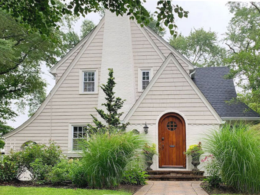
Creating an exterior look that is as timeless as possible, inevitably means keeping it simple. But, that doesn’t mean you can’t also have a lovely transformation that’s both elegant and historically accurate with a fresh neutral colour palette.
How we gave this historic Tudor an elegant exterior makeover.
My client Anna Bradshaw (a psychotherapist for women in Madison, NJ at feelbettergroup.com) loved her century-old Tudor home but she wanted an update to the existing colour.
She bought my All Inclusive Exterior Colour consultation for advice on updating the body colour of her home as well as the roof, door, gutters and trim.
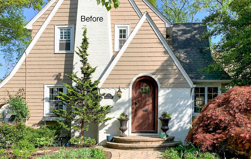
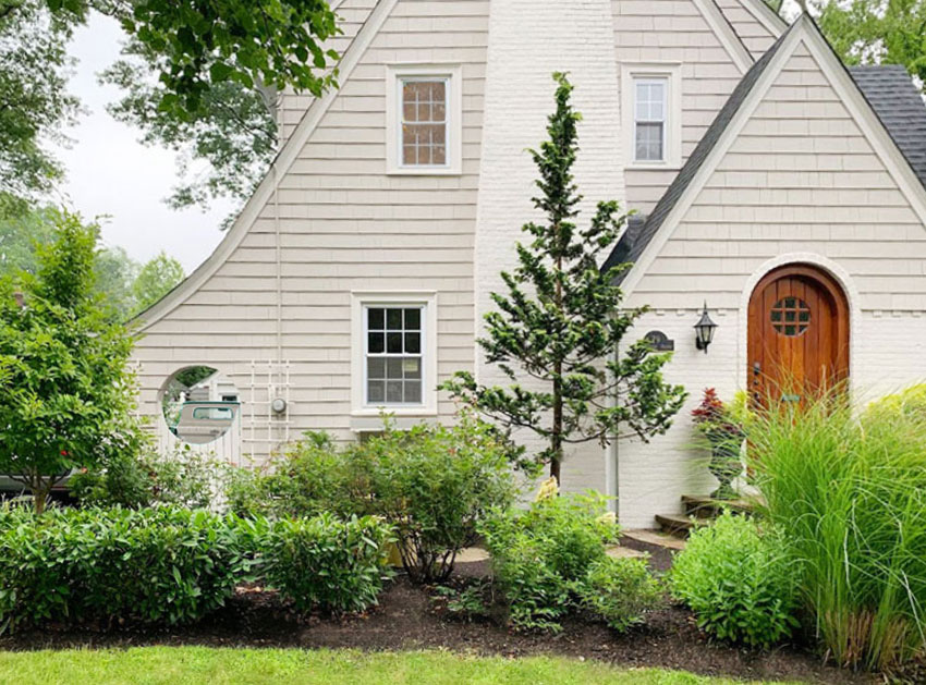
I love Anna’s curvy cedar growing in front of her chimney! Landscaping is so important for the curb appeal of your home.
Instead of opting for a trendy gray (and unintentionally turning her house into something it wasn’t) Anna knew she wanted a fresher colour palette that also stayed loyal to the period of her home and highlighted its classic and traditional beauty.
I wholeheartedly agreed.
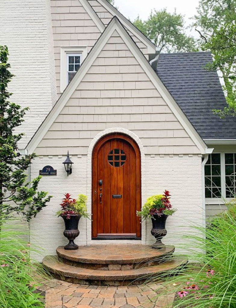
Notice the peachy-taupe tones in the pavers above? I recommended that we introduce some neutrals in the taupe range to relate and a soft white for the brick skirting and trim.
Tudors are rarely painted anything but neutrals, so if you’re looking for a classic look, keep it neutral. A lighter neutral color like SW Anew Gray for the siding would be a more current choice and in keeping with the historical Tudor architecture. And, a higher contrast charcoal roof would highlight the angular and pretty roof lines.
Isn’t the transformation beautiful?
After
Anna was undecided about how to update her front door. Her eDesign solution included considerations for painting it a rich forest green for a more stately look or a deep violet colour to relate to her burgundy leaf shrub near her entrance.
I also advised that a medium brown wood-stained front door would be a pretty look for all of the colour palettes options in her eDesign solution.
In the end, I love that she decided not to paint it. And because everything surrounding it is now so light, her wood-stained front door looks fabulous as a focal point on this vintage Tudor and the orange colour relates to the stone on her steps and walkway.
There was no need to change her existing light fixture. The exaggerated shape works well with the steep pitch of her roof.
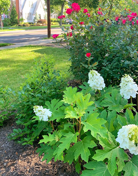
Don’t forget that well designed landscaping goes a long way to creating curb appeal and should not be overlooked when you are updating your exterior. Anna is an avid gardener who’s cultivated a beautiful yard from scratch over the last decade.
Not sure where to begin your landscaping plans? Check out this post.
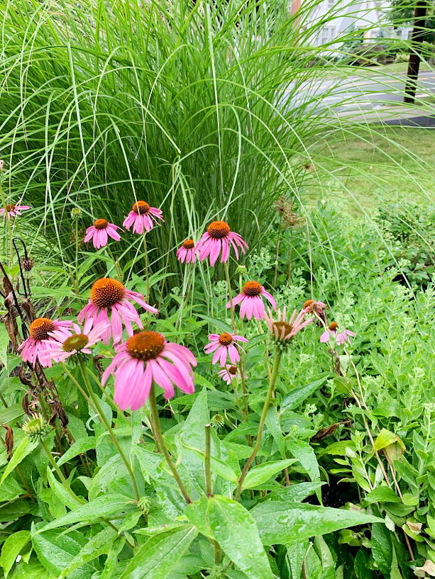
Here are a few photos she’s shared with me. Now that the exterior of the house is more balanced, her landscaping has a bigger impact overall.
Here’s the before and after again:
And the after:
After
Thank you so much Anna for sharing your beautiful transformation with us!
If you’d like to transform your exterior, check out our exterior packages here.
If you’d like to learn how to see and specify colour online and add eDesign to your list of services, become a True Colour Expert this Fall in Vancouver, Chicago, Boston and Orlando.
PS. Yesterday I was on the list of Ballards 100th Podcast Anniversary Awards where they called me the Queen of Colour, hooray! I was episode 38 approximately two years ago, you can listen to that podcast here.
Related posts:
The Shortcut for Testing Exterior Colour; Before & After











It looks amazing! Is the entire structure Anew gray? Or is the brick/trim a different color? Thanks!
Awesome transformation with just Paint and plantings
Beautiful love the new look ..
It just looks connected and peaceful !!!
Amazing !!!
Absolutely beautiful!!!! Maria, would you ever recommend painting over old (20 year old) stucco? Not nice, flat acrylic stucco, but the more rustic hand applied stucco. In a year or two I think I will inquire about an exterior re-do, but am curious as to whether the stucco would be painted or if we should have siding applied over top instead… Painting would be more cost-effective but I kind of think that doing so would be like putting lipstick on a pig. But with the right colour choice maybe it would work. Just curious as to what we would be in for.
I love this Tudor home. It looks like it was plucked right out of a fairy tale! Beautiful color transformation. Perfection really!
FABULOUS! Just FABULOUS!!
Stunning result!
Makes the look more expensive even. Amazing what colour can do.
I love a podcast. We l’ll be sure to listen.
Is the same color SW Anew Grey used on both the shingles and brick? It looks so much lighter on the brick.
Beautiful! That amazing front door pops out now and looks so warm and inviting.
Looks great!
The change is remarkable. Just beautiful. What colors are they?
WOW! Love that transformation!
Was that a Japanese Maple on the right of the front door? I thought it repeated the color of the door. In the updated photos, the tree is gone :(, please tell me that isn’t true.
The before pic was a wintertime photo, now she has two grasses that grew in on either side so the Maple missed the photo. Maria
Just perfect. The only suggestion I have is to keep the bush cut away from the charming look-through on the left side of the house. It’s too charming to cover up. LOVE the door!!!
great house and the new colors work very well – although I would have like to have seen them keep the dwarf maple. Oh well, it’s gone now.
It’s not gone, the tall grass flanking the sidewalk grew in so it’s not in the after photo. Maria
Absolutely stunning and I love the stained front door!
Hi Maria,
Why am I not surprised you didn’t suggest the house be painted white with black windows? ??
Wonderful !!!!
Believe that’s a Hinoki cypress to the left of the door (rather than a cedar)–a favorite of mine, very sculptural, almost structural, in the garden. Comes in a slender variety that can work fairly close to the home; however, probably not this close. Someone has thinned it rather aggressively from the Before to the After…hmm…would’ve moved it instead. It’s harder to appreciate its unique form, in silhouette against the beautiful new house colors, with so much of its structure removed. That may not come back.
Looks terrific!! Is the brick painted with Anew Gray also?
Thanks for updating your comments re the “missing” plant/s from the before pictures. Love the new colors of the update.
What a gorgeous house. You let its true beauty show through.
I love the whole makeover! The front door really pops now. The landscaping is lovely, and I’m so glad to hear they were able to keep the Japanese maple; it will be distinctive note of color in spring before the grasses shoot up.
One small but important point-the left grass plant now hides her house number. It’s very important that house numbers are easily visible for first responders. If it were moved to the other side of the door it would be visible and add some symmetry to the light fixture
I am most curious to know which colors were actually used on this house? Light & photography (I know) somewhat distort the image. My home is sadly not this style but I love the effect made with the two toned blended colors.
Hi Lyn,
We would be happy to help you with your paint colours, check out our Exterior eDesign packages for which one would suit your home. This client paid for her colours which is why we are not divulging all of them. https://mariakillam.com/shop/#exterior-solutions
Warmly, Maria
Beautiful! That amazing front door pops out now and looks so warm and inviting.
What color is the existing white? Anew grey is beautiful with it.
I really like the change in the front steps. Getting rid of the curves strengthens the look of the entry.
Nice job. Ann
What color is the brick and trim?