


Let’s spring clean those boring neutrals. Here are a few places to start if you want to add some colour into your decorating and on your walls.
Spring is the perfect time for a colourful refresh!
I live by a pretty simple formula:
COLOUR = JOY
And truly, we can always use some joy. Especially after a long winter.
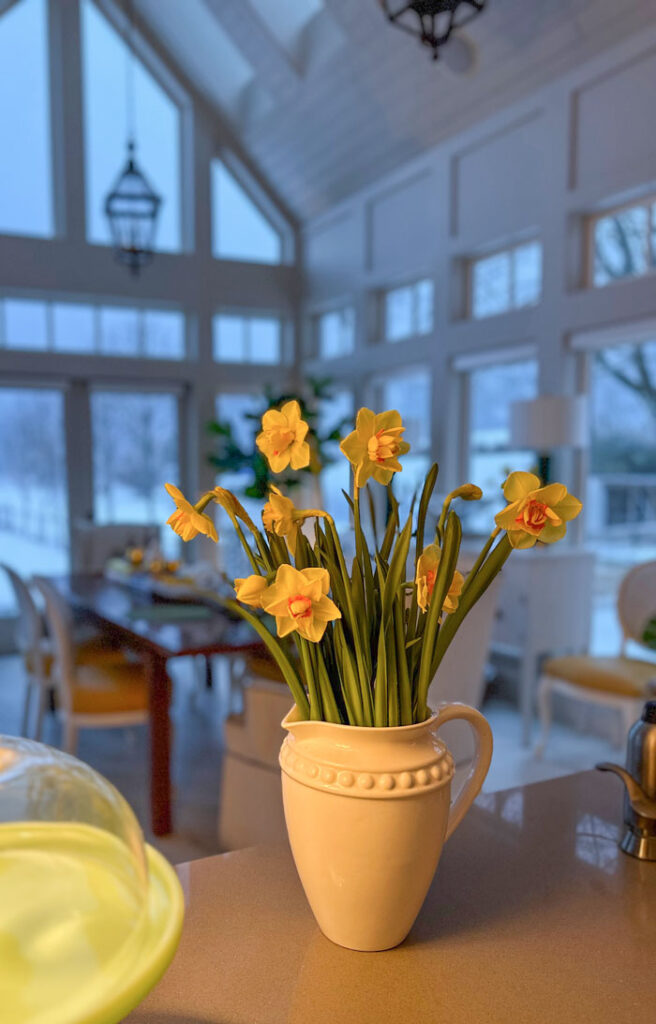
There may be snow on the ground, but my daffodils bring some spring to my home!
Not sure how to bring a neutral room to life?
Those of you that are dedicated neutral lovers, this post might not be for you. But if you’re feeling like your room is falling a bit flat, and you’re not sure what the fix is, read on!
I’m giving you my best tips for adding some COLOUR as you freshen up your spaces this spring.
I promise, it’s not as complicated as you might think. All you need is ONE happy accent colour to begin with.
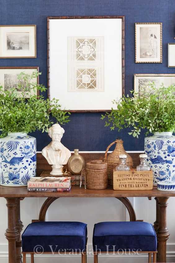
Blue and white is often a fail proof choice. It works very well whether your space is predominantly white, taupe, grey or beige. It’s a great way to freshen up a space with lots of wood too!
Even if what’s bothering you is more of a renovation situation, like dated countertops, tile or flooring you don’t love, the power of adding even one new accent colour can be a happy distraction from the less-loved features of your home.
Neutrals can be sophisticated. But did you know that shaded neutrals like taupe and grey deliberately sit back and look faded so that showier colours can create the drama. And, when you forget to add the show to the stage, that’s when you might find yourself in the land of BORING.
By the way, for my neutral loving peeps, the drama in a strictly neutral colour scheme comes from contrast, shape and texture. The truth is it can be much trickier to pull off a completely neutral colour palette that looks good. That’s because it is the subtle details (again: contrast, shape or texture) that make all the difference.
I take a deep dive on how to create contrast in my Create Your Dream Home virtual workshops, learn more.
Ditch boring by decorating with colour
Decorating with colour, on the other hand offers instant payoff.
When we took possession of the house a few short months ago. EVERYTHING was heavy mid-toned taupe and grey. The walls, floor tile and the exterior. Luckily the cabinets were a pretty complex cream and the trim a versatile off white.
Without delay, I had every wall and ceiling painted throughout.
There is nothing technically wrong with taupe. Pale taupe greige is, and will continue to be, a fresh and versatile backdrop for many spaces. This is also what makes it easier to add an accent colour.
In the grey trend, taupe was the go-to choice for everything from tile to countertops to paint and furnishings. Meaning that, taupe is simply everywhere for sale. And it looks so SAFE. Warmer than grey, cooler than beige.
So everyone got carried away without knowing where to stop choosing taupe (or grey) for EVERY item in their rooms rather than adding the COLOUR they need to make their spaces come alive.
Read more: What Everyone Should Know About Taupe

And the problem is, nothing will date your room faster than choosing everything in the same trendy neutral of the moment. Grey-on-grey and brown-on-brown rooms will ALWAYS feel immediately dated when a new trending neutral comes to town.
But COLOUR is magical.
My new house is completely transformed by fresh yellow, green and lavender. Again, you don’t have to dive in with a combination of several colours like I did. Start by falling in love with just one! And since I’m still working on the furnishings, at the moment I’ve mostly just indulged in PAINT colour.
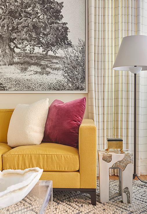
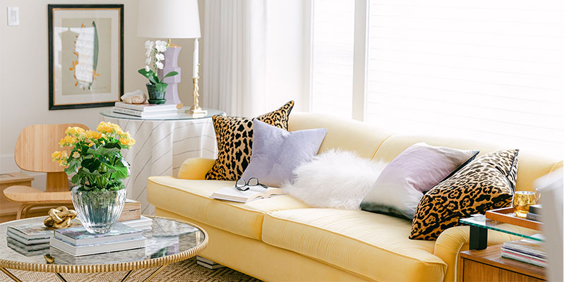
And my yellow sofa? It still looks current and I can work with it. Because it’s a colour and not a neutral.
But I didn’t just pull colours out of the sky. Well ok, I did paint some ceilings sky blue, a fab trick for adding colour to your world by the way. Instead, I selected a jump off point for colour for each space in my house.
But Maria, what do you mean by a jump off point?
What’s the best place to start for adding a pop of colour?
Here’s how to find your exit ramp from boring.
When you’re starting to decorate and so far the room is all white, or all grey, beige or greige, it’s hard to know how to take an exit from the neutral freeway, into COLOUR. It’s like being in cruise control and choosing everything in the same neutral.
I see these rooms all the time in my eDesign consultations. Rooms where the foundation is perfectly well-conceived but they fall short of fabulous without the addition of some colour.
This is, by far one of the most common problems for homeowners and novice decorators. Having no idea when to add some colour. Or how.
The first rooms I did as a new decorator were neutral tone-on-tone. It’s a comfort level. You get into “matching” mode and get stuck there.
My favourite exit from neutral cruise control is choosing a sofa in a colour rather than a neutral. But if you missed that exit, don’t miss the next one. Choose an area rug with some colour (not just another shade of the same neutral). If you already have a neutral sofa, you probably need a rug with colour.
How to choose an accent colour
How do you decide which accent colour to introduce? Well, you can consider your favourite colour just like I did. Or you can look for some inspiration pretty much anywhere.
The easiest way to start adding colour to your room is to choose a some decor with a colour that you love.
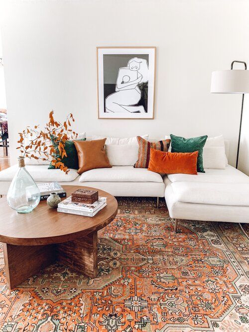
Often this could be a piece of art, pottery, a fabric, pillow or new bedding. Or, one of my favorite places to start: an area rug. This room below would be pretty boring without the rich, orange-toned area rug that has then been repeated in a few toss pillows.
This colour palette also works nicely with the warm wood tones.
Repeat the colour you love
When you find the piece that speaks to you, experiment with adding more of the dominant colour to your room in a bold and deliberate way.
Next, you’ll want to find the paint chips that match the colour in your inspiration piece. Keep it/them in your purse or digitally on your desktop. This will make it easier to find some more simple accessories to match.
Compare any item you’re considering for your room directly to the sample colour chips. The bigger the chips, the better. Learn how to source decor online here.
HOT COLOUR Tip #1: Play close attention to the relative saturation of the accent colour you want to use. Make sure that it doesn’t look too CLEAN or too DIRTY. If the colour is too saturated or CLEAN (not often an issue in a grey, white or cream room, but sometimes an issue in the context of earthy colours like beige, brown and gold) it will look jarring and neon compared to the neutrals in the room.
Look for a more muted version of the colour you like. If the accent piece is too muddy or DIRTY for your room, it will look just like that. Like it needs to be washed. Not sure what it means when a colour is clean or dirty? Enroll here.
Commit to the colour
Here’s the part that can trigger some commitment phobia. When introducing an accent colour into a room, the key to pulling it off is to be committed. It’s never enough to get a pair of colourful pillows for your neutral sofa and call it a day.
It’s only going to look intentional if you choose at least one BIG element in your accent colour. It could be the sofa, an accent chair or two, an area rug, or an oversized piece of artwork for example.
HOT COLOUR tip #2: If you can find a piece with a bit of the neutral undertone in your sofa or wall colour as well as the accent colour you want to use it will be even easier to pull it all together.
Consider painting your walls a different colour
That said, one of the easiest way to get colour impact on a larger scale is to consider painting your walls.
If you have relatively neutral furnishings, it can be surprisingly easy to introduce a more saturated colour with paint.
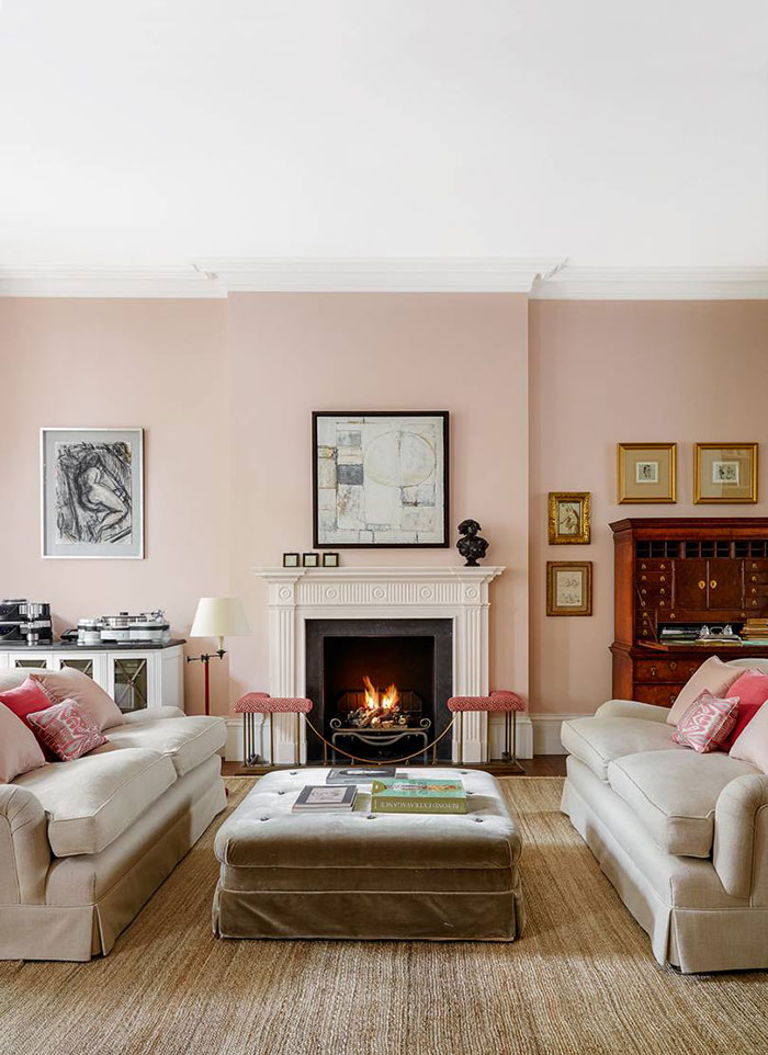
Lucy Williams via House and Garden
This blue is just so happy with the classic cognac sofa and marble fireplace.
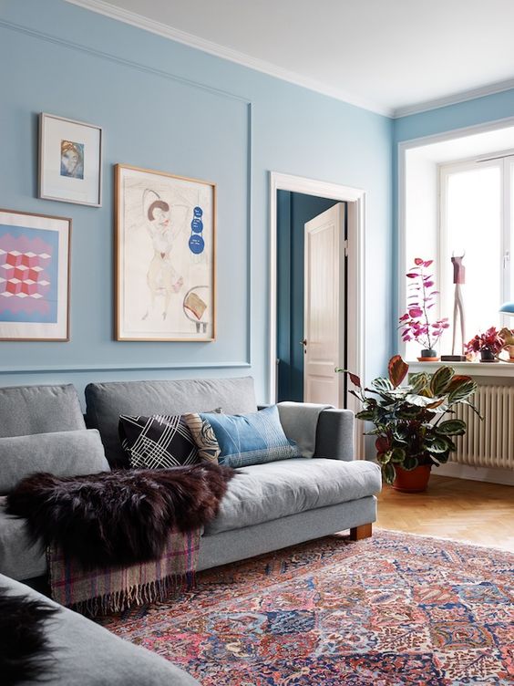
Virginia Howard via This is Glamorous
Maybe you can paint the cabinetry, built-ins, ceiling or some other architectural feature of your space in a version of the accent colour you’ve established with your new area rug.
Maybe you can even drench the walls in the colour you are decorating with for maximum drama and transformation.
Just remember, once you’ve committed to colour on the walls, be sure your have smaller pillows or other decorating accents that repeat this colour in your room as well.
Need a nudge to ditch boring? Try eDesign.
It’s only paint! Get playful and curious. The best way to become a better decorator is to be willing to experiment.
But if you would like some reassurance and guidance to take the plunge, I’m here for you! My paint colour eDesign consultations are quick and one of the easiest ways to get a few Maria-approved options to help you transform a room with colour.
Click here if you want my advice on a new wall colour for your single room (a single room bound by walls), click here for an open layout, and here for help with more than one room.
How do I add colour in my open layout home?
I hear you! It can be much less practical to go bold on the walls with colour when you have a large open layout space and few opportunities to transition paint colours. I can help with that too.
Maybe your space can handle a more current main neutral wall colour to give you that refresh you’re looking for. Or maybe there is a colour for your open layout that offers just a bit more intense on the walls than a neutral. With an Open Layout eDesign consultation, I’ll take everything in your space into consideration and let you know what your best options are.
I’d love to hear about what you’ve learned when you’ve tried to add more colour to a room. Did you pull it off? Did it not come off right and you’re not sure why? What did you learn?
Related posts:
The Key to Great Design is Contrast

I love the blue color in the Lucy Williams photo! It’s similar to a color I’m considering for my shared family room/dining space that has a neutral sectional in a similar color (either green beige or gold beige undertone I think), cream chairs and wood planked and beam ceiling and floors in a cherry/red undertone. Given the red undertones of the wood for the ceiling and floors, that blue color seems like it would freshen up the space.
Does the rug always have to be the starting off point or have the wall color for it to work? I have fabric for the dining chair cushions and pillow colors and art that would work well with the color I’m considering. For the rug, I’m considering a black/white stripe rug to add some contrast and be the “medium” black element in the room, since the dining table/chairs are black (large element), as well as the curtain rod and the floor lamps have black/bronze (small element). I’ve mocked it up in my mood board, but still nervous to put it all into action given the time and resources required. Thanks for continuing to provide inspiration and education every day!
Maria, I love your statement that COLOUR = JOY! I feel that way, too. Whenever I see rooms like that all gray one you posted, I just cringe. This is a wonderful tutorial on how to get started adding color. I would like to add that I love a room that has different tones of the accent color(s). I think this helps elevate the room and keep it from looking “blah.” So instead of all the same shade of navy blue, for example, bring in some teal or cobalt, etc. Thank you for the examples you shared. And your new home is looking so fabulous!
Thanks Maria! If we do choose to go with a color for the sofa (and it’s a solid color – such as blue, not a print), should we then use a neutral rug under it or a rug that has a hint of the color of the sofa, or a rug that has a lot of the same color as the sofa?
Maria, we recently bought a country property near some tourism and it has 5 mini cabins to rent out. They came each painted 2-3 shades of rich tonal Colors inside!! Needed some fresh paint but I’m not deviating massively from what was there and it’s so fun. I’ve never in my life chosen any paint more daring than soft butter yellow. Now I get to play with a moody blue cabin, an egg yolk yellow one, rich velvet browns, etc.
We have a teal blue/green leather couch and loveseat, soft beige leather recliner and painted our walls a soft cream, BM Natural Wicker. We found a jute carpet from Crate & Barrel with big squares of soft red, green, beige, brown & black that really sets off the couch and sits on our newly refinished 1960s hardwood floor. The biggest impact are our pillows that I change with the seasons – they are also bright and colourful. Pillows make a big difference but nice, interesting ones are hard to find these days as I like pattern – you can find a pillow shop on-line in Toronto that sells colourful ones. My teal & cream colours are repeated around the room in pictures and various pieces of pottery with lots of plants and small lamps scattered around the room. I LOVE all the colours as they make me happy!
Great post Maria….What about draperies for adding colour? I recall your raspberry draperies- so fun! But most rooms that I see have neutral drapes to blend with the wall colour. Maybe this is a whole other topic though!
I’d love more drapery posts as well!
Definitely love and appreciate how you are a teacher in this. So, so helpful!!! I am about to pull the trigger on switching a poorly done neutral space to one that is colorful and I have read and re read so many of your posts on color to help me. Can’t wait for it to be revived. Thank you so much.