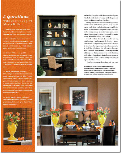
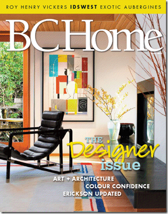
As promised, here is the actually story on my project featured this month in BC Home by Tiffany Sloan. If you missed the ‘before’ pictures from my last post, click here to see them.
“We’ve always said we wanted our house to look impressive when people walk in,” says Laura Wong. “We wanted the ‘wow’ factor.”
Laura, her husband Edmund and their two kids moved into a brand-new house in White Rock last fall, and although they knew they wanted it to make a statement, they weren’t exactly sure how. A survey of local interior designers brought them to Maria Killam, a colour designer whose brightly hued online portfolio jived with their own design sensibilities.
“Right away Maria knew what she wanted to do,” says Laura. “We’d just moved into our house and it was pretty much empty, but she walked in and had this vision of what she could get our house to look like.”
Yet when Killam began introducing swatches and paint samples, Laura admits she was apprehensive. Edmund, too, raised a skeptical eyebrow – particularly the day he was greeted by bold green walls in the library. “I was intimidated, uncomfortable about these – what for me were – strong colours. I think most homeowners go for the comfort of beiges and other ‘easy stuff,’” says Laura. “You do it a little on faith – you trust that she’s the expert and knows what to do.”
In the end, Laura says she wouldn’t change it for the world. Although the colours are bolder than what she would have felt comfortable picking out on her own, they aren’t at all overbearing in context, she says. “When you walk in, there’s flow. Everything goes together. It doesn’t mean everything is matchy-matchy, but it’s just natural as you walk from room to room.”
“When you’re creating flow – and certainly in the main areas of the home – it’s really important to repeat the colour,” explains Killam. “One way is to have it on the floor in one room, on the furniture in another room, and then have it as the wall colour in another. It’s a unifying element that way.”
For the Wongs’ home, Killam began with the fresh green of the dining room rug – a bargain find at HomeSense that inspired the entire colour scheme – and repeated it in the living room furniture, on the library walls, and in accessory pieces throughout the main floor. The four pullout ottomans of the living room coffee table – a piece Killam had custom designed for the family of four – are a bold complementary orange that draw the eye and make the coffee table the focal point of the room. Similarly bold shades of orange in the drapery and throw cushions round out the effect.
“Just like I used to think sophisticated dressing was about wearing beige, black, white and brown, what I learned about wearing colour – and I think it works the same for interiors – is if I have a fabulous orange sweater, having the matching orange shoes is what really pulls the outfit together,” says Killam. “And it works for the same for your house.”
Orange also makes a more muted appearance on the library chairs and on the walls of the vaulted-ceiling entry and living room: “Laura didn’t want green everywhere, nor a really strong orange in such a large space, so we chose a butterscotch colour that would be a nice warm, neutral backdrop,” says Killam.
Clearly, Killam doesn’t shy away from using bright, bold colours – and surprisingly, less isn’t necessarily more. Using a bold colour once will make it stand out, but repeating that colour can make it look like it belongs. She references the commonly touted “rule of three,” pointing out that although the dining room seems bursting with colour, the colour palette is limited to green, orange and sunshine yellow (not including neutrals), all repeated at least twice.
“You have to repeat the colour, and you want to use colour in gradations of scale,” she explains. “When you’ve got an accent colour like orange, you want to have a small orange, a big orange, and an even bigger orange if possible.” Taking the living room as an example, the throw pillows and decorative papered books on the bookshelf are the “small orange,” the ottoman coffee table serves as the “medium orange,” and the butterscotch-orange undertone of the wall colour works as the “bigger orange.”
The same technique is applied in the library – orange echoes from the framed artwork on the walls to the bold fabric of the curtains to the elegant upholstery of the chairs. And although this room’s green walls once sparked misgivings in Edmund, he quickly fell in love with the finished product, says Laura. In fact, the once-awkward unclosed space off the entry went from being “the one room we didn’t know what to do with” to the one that receives some of the most compliments from family and friends.
Bookcases in living room and library – custom made by Quality Cabinet Manufacturing, Vancouver, Green sofas, dark green chair and wing chairs – Van Gogh Designs. Round coffee table – Bowring, Square coffee table – custom made at Omega Furniture in North Vancouver, Two end tables in living room – Paramount, Dining table and chairs – Pier 1, Bird figurines on coffee table – client, Heron – Chintz & Co., Decorative moss balls – Chintz & Co., Orange shade lamps and yellow vases –˙HomeSense, Glass food display dishes – little: Pottery Barn, big: HomeSense, Dish and table holding pears – table: Paramount, dish: HomeSense, Paint colours from Benjamin Moore: Library: 2145-30 Brookside Moss; Living room: CC-304 Sisal; Dining room: HC-74 Valley Forge Brown
If you would like your home to fill you with happiness every time you walk in, contact me for on-line or in-person decorating and colour.
Related posts:
BC Home Article; Before & After
Style at Home mention
BC Home Interview with Colour Expert Maria Killam
New to this Blog? Click here ; Subscribe to my free Monthly Newsletter; Become a True Colour Expert


Beautiful photography and demonstration of your expertise — kudos, Maria! happy for you! I hope you are dancing today, as you decorate your new place.
One observation on balance and how you styled these rooms. I noticed the console in the dining room with the two lamps; the double bookcases and chairs in the library. I also noticed that you bought a sofa table for your own home and shared a photo of that piece, with one lamp and large vase on top. I have a question for you on balance, form and function for sofa tables:
I will have a sofa table behind the sofa soon and am wondering if I should have 1 or 2 lamps. I am currently asking a local ironworker to make a steel based parson's table with a glass top for me. Once it's done, the question–one or two lamps for a long (48 or 54 inches), narrow (15-18, haven't decided yet) table? If one, like you have, it would seem I would need to balance the height of the one lamp with a large pitcher or decor item of similar height, like you have here. would you say that's a general good idea? Symmetry with two lamps is appealing too. The console table in the magazine article looks grand with two! This would be a sofa table in a great room and all furniture is moved away from the walls. The entryway leads rt into the great room so you would see the sofa table straight off.
Any suggestions would be helpful. Thanks again for sharing this article with us!
Wonderful article, congratulations. The home turned out stunning and I love the way you used the color. Very informative also on how to distribute color around the room. Thank you so much for sharing. I really enjoyed this post and learned a lot. Hugs, Marty
Great article and the room images are a perfect example of how you made it all flow so seamlessly.You are great at your job, No doubt about that!!! Bravo, Kathysue
Congrats, Maria, on a fantastic article that matches the warm, practical teaching style of your blog.
Can we get this magazine in the states?
Fondly,
Glenda
Cherie,
The reason I did not do 2 lamps on my console table was because the left side of the table puts it basically in the middle of the room and I wanted that space used for flowers or branches or whatever else strikes my fancy.
Wether you use 2 lamps or one would strictly depend on where your sofa table ended up in the middle of the room. IN my case the left side is also the FOCAL POINT of the room, NOT the yellow sofa, you don't see the sofa properly until you are in the living room.
In this dining room I used 2 lamps because it's a dark room and needed extra light and the symmetrical balance with the art really worked as well.
It's a really great question, I've been thinking of a post talking about consoles in the middle of the room which many times are required when the sofa is not against the wall.
Glenda, BC Home is a provincial publication so as far as I know that's the only place to get it!
Maria
Congrats! Wonderful work!
I love the idea of a post on console tables.
Congratulations, Maria! Such beautiful work. You should be very proud of yourself. Have a great weekend.
Have you come off cloud 9 yet? I'd live there, if I were you! Fantastic stuff! Glad you are sharing it all.
Absolutely fabulous Daw-ling. You deserve it! You hustle like a color designing rockstar! Great job!
amanda
A wonderful article- go Maria!
You know, I think the ottoman coffee table is just the most clever idea. Growing up in a large family, I wish we would have had one! Can we purchase them anywhere?
-Ann @ Rose et Lis
Beautiful work! I too love orange and can't fathom why people are so scared of using it!
You transformed a huge space with no personality to a cozy home. I love the library. The chairs and green on the walls is so beautiful.
As always, beautiful. your blog is one of the first that I read every day because everything you do is so lovely. Hope I do get to meet you in High Point!
Stunning work Maria! Congratulations!
You made this house WOW, just like the client wanted! It's so cheery and happy!! Love the colors you used. Congratulations, I want to be you when I grow up!
Hi Ann,
The coffee table with the ottomans was custom made.
It's certainly exists but not anywhere in Vancouver and I wanted the orange anyway so even if I could find it off the shelf it probably would have been cheaper to get it made then buy it and recover the ottomans.
Thanks for your comment!
Maria
Hi Maria! Congrats on the feature!! The project looks amazing!
well done maria! it is not an easy feat to take these homes with large rooms and soaring ceiling and turn them into a cozy human scale room.
sheer brilliance
debra
CONGRATS, Maria! What a great article, and I love, love, love that space!! It's so beautiful – you did an amazing job.
Great work, Maria. Just got your monthly and this is a beautiful project. I love the orange and greens. I can see how it may have gave the homeowners pause in the beginning, but is all in how you pull together a space and what accompanies the color in form and texture. Like most designers, I have to be more trusting in color myself. The dining room pops with unexpected color, yet the color works so well with the rest of the home. Very livable and not artificially staged. BC Home did a great job, too.
Fantastic job, Maria! I'm not a designer but I learn so much from your blog. Can't afford your seminar but if you write a book, I'll be among the first to purchase it.
Thanks for sharing some of your knowledge and design sense with us.
Monique
hi! i love the color in the living room but when i went to the benjamin moore fan deck it didn't have cc-304 or the name sisal.
what am i doing wrong? or it that a different company?
thanks,
donna
Hi Anonymous,
Sisal is in the Canadian fan deck, the US BM store can still make it but they don't have a colour quite like it.
Maria