


Are you familiar with the allure behind TikTok’s “unexpected red theory”? I was asked to weigh in along with some other colour experts you might know. See what I had to say about this colour mystery…
But first, learn to Create Your Dream Home with me in April!
Wow, I just finished up my first two-day Create Your Dream Home course with 120 homeowners from all over the world. What a fantastic group!
If you’re still on the fence about joining the next class in April, I’d love to share what some of my students had to say about spending the last two days with me.
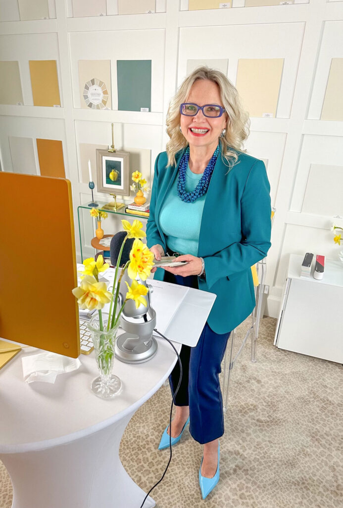
Biggest takeaways from some of the participants!
⭐️ ⭐️ ⭐️ ⭐️ ⭐️
“My favorite takeaway is having somewhat of a system and a process. I kept looking for answers on “how to do this” and I was coming up short. But this class helped solidify the process I was looking for. I’m not fully an artistic person, so I need this kind of system to help me move my vision forward.” ~ Katie
“We’re in the middle of this complete house renovation and I’ve been collecting ideas and looking at pinterest and listening to friends and family. But I finally realized I’ve been putting aside the things that make me happy. Now, I feel like if I love green, I can decorate with green. Because now I know how to incorporate the colours I love. I’m so excited for this.” ~ Lisa
“The repetition was so powerful for me in this class. And now, every room I walk into, I’m seeing the undertones in every piece of carpet, pillow, bedding, etc. And now I have the confidence to make decisions for myself.” ~ Andra
“I’ve taken all of Maria’s courses and purchased her colour boards. Every time I do, I realize that Maria updates her courses so it’s super helpful to review over again. This won’t just be transforming your home, you’re going to start noticing the clothes you aren’t wearing in your wardrobe and now you’ll know why.” ~ Barbara
“So many times I’ve recognized that something is wrong, but I didn’t know why. I’m so happy to have an explanation. Thank you so much for that!” ~ Heidi
“I’m a colour scientist and have also worked as an interior designer, so I was very interested in a very different approach to colour. You’re exactly right, nobody teaches it the way you do and no one has it in such a pragmatic way. It bridges the gap from theory into practice!” ~Brady J.
“I used to have a red couch and switched to neutral furniture and it didn’t make me happy. Now I know how to apply your principles, find a piece of art or a pillow with colors I love. I’m so looking forward to adding a piece of furniture with a pop of colour. I’ve had your colour wheel for awhile and it helped me determine the undertone of my current kitchen counters. It was so rewarding.” ~ Samantha
But Maria, I don’t have a reno or new build project? Is this course for me? YES!!
You guys… it’s my passion to help everyone create a beautiful home that brings you JOY every time you walk in the door. 💛 I even got a little teary-eyed sharing this with the group yesterday. 🥺 #IYKYK
But, when I shared a few clips on Instagram, some of you mentioned to me that you didn’t think the Create Your Dream Home course was for you since you aren’t currently renovating or building… That makes me sad. Because, you know what we never stop doing – Decorating!!!
And this course is FULL of decorating tips and tricks that ANYONE can use in their home!
Let me say this again for the folks in the back: This course is so much more than choosing the right finishes for your project!!
Because, every decorating decision is also a colour decision. And understanding HOW colour works will help you get it right, whether you’re choosing a countertop or a paint colour or a even a new area rug for your living room.
Homeowners: Sign Up Here
Design Professionals: Meet Me in Chicago
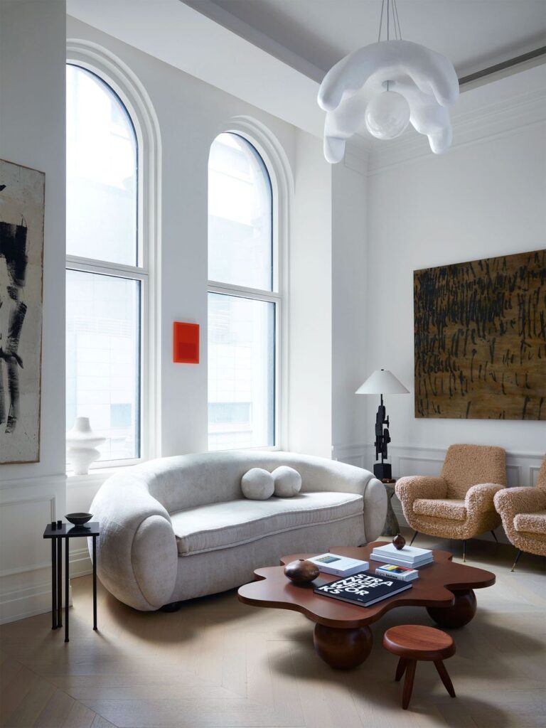
PS. Elle Decor USA reached out to see what I think of the viral ‘unexpected red theory’ TikTok video. Have you guys seen this?
Unexpected Red Theory on TikTok
Here’s what I told them…
Here’s what Elle Decor included of my quote alongside a few other names you might know :
Also, as I mentioned in my last post, the price of our colour boards can’t stay at what it is anymore all our costs have gone up and we haven’t raised the price since the beginning of the Pandemic, the prices will go up in the middle of March so if you have been looking at them, now is the time!
If you don’t have any of the boards I recommend the Killam Colour System to start which are the neutrals in either collection you can see them all here.
Related posts:
2024 Colour Trends to Try in Your Home
Top 5 Design Trends for 2024 (Should you try them?)
Decorating with an Accent Colour (no paint required): Before & After

Interesting read thank you! As the article stated any color can be used. Kate Watson-Smyth calls it a disruptor color.
Red??? It’s my favorite color for a car, my iPhone/ iPad case ( so I can easily find them) , and I have little smatterings of red throughput my kitchen to compliment the red knobs on my Wolf range ( we are talking oven mitts , an olive oil ceramic dispenser on my counter etc…) But I would avoid venturing any further.
Red is the only color I can find irritating depending on how it’s used – except for pink-red, which I LOVE.
I once tagged along with a friend to tour a new apartment development. They had several gathering rooms for the tenants. It was decorated in a style I’d call “Traditional Southern” just because of the bold use of color. One room had white wainscotting around the lower half, while the walls were painted in a vibrant pink-red.
It was SO BEAUTIFUL that I’ve never been able to forget that room.
Oh goody! I wanted a black coffee maker sitting on our kitchen counter, but my husband begged to have the red one. It makes him very happy, and now I can [sort of] feel good about it, too…!
I think it’s a repeat (probably unintentional) from past painting movements. Check out turn-of-the-20th century work for a dash of red that draws the eye as an accent to the compositional elements.
I love many different colors including hot pink, but I have an aversion to red. I almost feel nauseated, when it is used as a solid color without being tempered by other coordinating colors..
WOWZERS! In my not-so-humble opinion, anyone looking for “advice” or reliable information on TikTok deserves what they get. Nothing important. Complete waste of time. These kinds of posts are put there by people who don’t have any education or training in colour theory or anything else that would qualify them to weigh in on interior decorating or any other profession. I am so sick and tired of the mis and disinformation we are drowning in. My advice is to consult an expert. And, for the record, that article in Elle isn’t much better. Lots of people have opinions but few have knowledge. The article is shallow and doesn’t go very far to explain what it is about the colour red. There IS colour theory and every student artist is introduced to the concept and it is rooted in good science. But of course the TikTok generation doesn’t appear to be interested in science. I fear for our society’s future.
I agree. There is an Old House group on Facebook, and people are always posting pics of their houses, asking for color advice. The advice is almost always horrendous!! Sometimes I post a blurb about undertones, but mostly I just link Maria’s web site and encourage them to read her advice.
Thanks Rhonda! xoxo
Sorry for my rant. I LOVE red. I agree that it is a VERY strong colour and needs to be handled with great care. Ask any good decorator. Ask Maria.
I agree. I love red and have used it in previous homes I’ve lived in – for curtains, for cushion covers, even the Axminster carpet had red in it. When used correctly it can give a house a warm, homely, cosy vibe like no other colour can. My visitors obviously never felt overwhelmed by it as they would settle in and I had trouble getting them to leave!😂
Way before these kids were born haha… I loved a *bit* of red. But those were in sun-drenched Florida condos with very pale walls and tile floors, mostly white and cream…
And then I moved to a darker house with cherry stained floors and it was warmth overload. A decorator told me “the floors are ON FIRE.” 🔥 😂 She wasn’t being insulting, just explaining that I needed to seek balance when choosing other colors for the room. And she was right.
I realize I still add a tiny bit of red to some rooms. A lampshade. A piece of art. Sometimes a rose arrangement. Nothing heavy. Maybe it’s just that I’m an ‘80s kid after all. Bring on the Nagel prints.
I agree with Maria’s take on red, of course, and I wasn’t that impressed with their examples. The Christian Siriano room was wonderful, because his work always is, but that first bathroom is a hot mess. That designer needs Maria’s course.
50 years ago I was taught to put a little red piece in every foto. A red mug or flower in a landscape. But I find the two examples above ugly. Mixing warm and cold, dirty and clean.
In the photo above, I can’t even tell what that little red thing is so my first instinct is that it is a fire alarm — or something that is trying to stand out so it can’t be missed. If it is a picture or other decorative element, it should tie in with something else in the room and it does not. Every time I look at that photo, all I see is the red rectangle — I have to force myself to look around at the rest of the room and then my eye is drawn to the red thing again. Not good design IMO!
I love red! I love to wear it and have small touches of it in almost every room in my house. Have had for years. It adds a warm coziness – especially during a long dreary winter.