Remember that photo shoot I talked about way back in March? Well I can finally share this house with you because September’s BC Home issue has arrived! Thank you so much to everyone at BC Home for featuring this project! I’m honoured to be in this magazine again this September, here is last years post when I made the cover.

I’ll share the magazine article with you when I get it (I still don’t have it myself but it’s out on the newstands). I thought I’d start just with the before and after images. I had the best clients, a couple with teenage twin boys. This family took adventure trips instead of beach vacations and were in Costa Rica this year during spring break! I started this project last September and finished in early January.

Here is the library which desperately needed Millwork to fill in the gaps flanking the fireplace. We decided to move the 2 oversize upholstered chairs to the games room as here they were taking up this entire small room which I suggested we turn into a library.
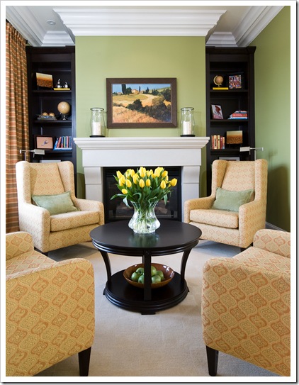 After – Interior Design by Maria Killam
 Living room – Before
I am so used to taking interior photos without a flash I do it even with befores which is not good because it’s too dark! They had just moved in when I arrived and didn’t plan on keeping the room like this of course. I advised moving the plaid sofa downstairs as it was pinky beige. It had originally been chosen to go with the chairs in the library in their previous home. Laura said she had always known there was something not quite right about the undertones but didn’t know what it was until she read my blog.
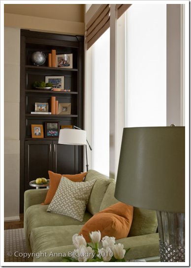
 After
After Before
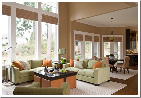
Here’s another view of the living room. It has double story windows and a fabulous, contemporary limestone fireplace!
 After
After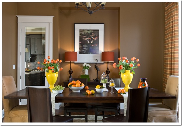 After
After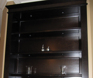 Before
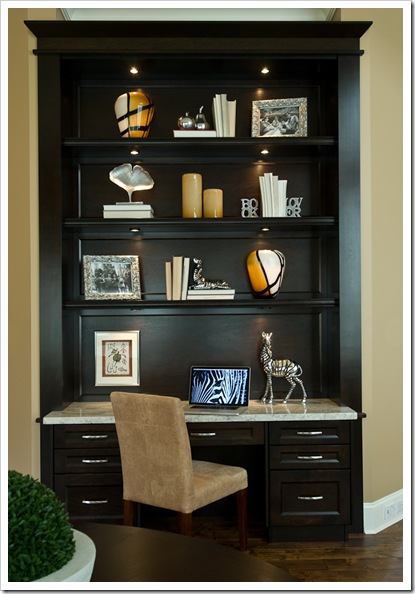

It’s all in the Undertones, download my ebook here.
If you would like your home to fill you with happiness every time you walk in, contact me.
To make sure the undertones in your home are right, get some large samples!
If you would like to learn to how choose the right colours for your home or for your clients, become a True Colour Expert.
If you would like your home to fill you with happiness every time you walk in, contact me for on-line or in-person decorating and colour.
What every Designer should know about Photography
ew to this Blog? Click here ; Subscribe to my free Monthly Newsletter; Become a True Colour Expert


An exceptional job on this home. I am sure the family is so happy with this transformation.
http://kathleenjackson.blogspot.com/
Maria, your work is absolutely stunning! Love all the pops of color and the added millwork make the home look even more custom. It's all so picture perfect after you colored it happy!
It looks amazing! Great job!
This is an extraordinary transformation, Maria. I love those ottomans under the table, very clever. Great pictures too.
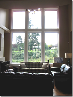
The Vanishing Threshold view from the living room, ugh, straight into their neighbor's homes.
Properly sited understory trees, 1-2, would obscure the neighbors; Leaving the golf course & sky exposed.
Their view must be as gorgeous as your interior design.
CONGRATULATIONS !!!!
Gardn & Be Well, XO Tara
Beautiful transformation(s). Love the colours, the furniture choices, the very clean, fresh look – well…everything about it. 🙂 Congratulations on your spot in the magazine!
* Maria, SUZANNE "took the words right off my computer" (smiles!)!!! I SOOOO "DITTO" her comments… just STUNNING!!!
Many congrats~ on EVERYTHING!!!
Warmest,
Linda in AZ *
[email protected]
Maria, amazing what you have done! I love the mix of that soft green, orange and brown! Fantastid! Congratulations!
xx
Greet
What a lovely transformation, Maria! You inspire me every time I open a post.
Please provide your source for the Book Lover bookends … would be a special gift for a special person in my life. Thanks!
Jane in Ohio
You are amazing! I love, love, love how you transferred this home. You are such a pro- you should be sooo proud of yourself!
This post is a keeper!
Maria–
Is it possible to provide sources for the furnishings and the names of the colors you chose?
Noticing how you combined different tones of wood, fabric, finishes on the lamps. So many layered choices and the overall effect is so pleasing to the eye.
Maria,
These rooms are fabulous. You did a great job!
Teresa
What I like best about your work is the masterful use of colours, and skilled spatial planning.
Just beautiful, Maria! I love the lay-out of the house, too. Did you find it easier or more difficult to work with this lay-out?
Looks awesome. Photos came out beautiful, and your color knowledge really shows beyond the walls. I think this is valuable for people wanting to hire you for design. Great job!
Xo
Amanda
I just love the color you infused into that library! So cheerful but still cozy. The browns are getting me down, but you popped in the yellow and orange in the dining room and presto! it looks wonderful, too.
That is simply stunning! You outdid yourself and congrats on the magazine feature! You deserve it!
The rooms are beautiful! And congrats on your work being published. I bet this brings you so many new clients. You deserve it.
Maria,
Wonderful project: great clients, home location, millwork additions, colors, flow and magazine article to add to the mix how perfect. Life is Good!
Bette
I'm in the mood for fall! Love your color choices especially in the Dining Room.
Re the sources,
I'll include them in the post when I share the magazine article with you, which will most likely be the next one.
Maria
Nice! Very soothing color pallet yet lively as well. I love the pops of orange and yellow.
Wow Maria….what a great transformation. It's never ceases to amaze my clients what paint and millwork can do for a room…it just gives off a totally new personality for the room. Can't wait to read the article. Have a great day!!
Christine aka GlamaMama on twitter!
Looks great, Maria! I especially like that dining room shot. Your styling skills are superb.
Amazing. I'm inspired. Can you please share with us the green color in the living room?
Absolutely beautiful, Maria! Thanks for sharing it with us!
The millwork really finishes out the rooms. So may builders leave the big seemingly useless corners.
What a difference!
Brilliant!! Really lovely palette, Maria. WOW!
I remember this from your original photo shoot and this update certainly reflects your amazing ability to turn what could very easily have been an "average" space into a spectacular space, warm and inviting, stylish and comfortable. Just beautiful.
You've done simply stellar work here Maria… absolutely fantastic and totally creative with your colour, fabric, furnishings & accessories choices!! Fabulous!! And congrats on another BC Home feature 🙂
Victoria @ DesignTies
Congratulations on the publication and great work on the transformation! Beautiful!
When you write the post regarding the article, I would love more information on how you came up with the wall colours and accent colours, i.e. orange in the living room and yellow vases in the dining room. I love what you've done and I'm very interested to learn how you went about choosing everything – right down to the lamp shade colours. Enquiring minds want to know. 🙂
Beautiful makeover, Maria 🙂 I love the colour palette, and the custom coffee able is a great idea for extra seating. And the hardwood flooring (which I assume was already there) — gorgeous!!
Congrats on making it into the pages of BC Home again 🙂
Kelly
Wow! Wow! Wow!! You continue to inspire! Congratulations. I can only imagine how excited your are. I'd be losing my mind! You deserve the attention, this is just gorgeous.
Brookside Moss – lovely! I just love that library.
I love it! Congrats! The built-ins make a huge difference. The rooms now flow. Love the way you styled the accessories too. Yeah!
xo,
cristin
Congratultions on being in the magazine again.
The green/orange living room ~ I would enjoy living there.
Strong work, Maria.
Fondly,
Glenda
Great job Maria and congrats on being published again!
WOW!Totally worth the wait here, I am in love all your works! What a fabulous space to get creative in!
As others have said,congratulations! this looks simply stunning!you really outdid yourself here for sure! great, great post indeed!very inspiring. 🙂
These photos really show the dramatic difference that the trained eyes of an experienced designer can impart! The rooms are barely recognizable when you are finished with them… what FABULOUS work! Absolutely beautiful. Congrats on your accomplishments… well-deserved!
I love the transformation, Maria, and the soft colors. A lovely color combo.
You should be proud! How exciting to be featured in BC Home.
-Ann @ Rose et Lis
Wow!!! What a difference Maria.
BC Home did a wonderful job capturing your beautiful work. You should be very proud.
Your clients must be so happy.
Bravo.
xo
Brooke
Happily colorful ever after!
pve
What a transformation! You really did a wonderful job of maintaining the flow of the home. Great choice of colors, too!
OMG-that house is absolutely phenom! BM Brookside Moss is my favorite colour (you may recall I've commented on your blog before that my kitchen island is BM BM) and now my goal is to find something as amazing as those yellow vases to add the WOW factor to my dining room/living room! Even if I have to spray paint myself! I am in awe of your work!!
Wow Maria! I love what you did! The transformation with the paint is amazing. But I have to say that the accents you chose..the pillows and objects..were so fantastic! I love the bright sparks of color in an otherwise ordinary room.
I just don't know how you do it!
Donna @ Comin' Home
Maria, do you know where I can find information on how to chose a lampshade color in a living room? If furniture is gray tweed and brown leather and black stained wood and linen chaise, does that mean I need a white or black lamp shade? Also, what rules do you follow for a fireplace color surround? A bookcase color? Thanks!