
I have seen rooms like this so many times and heard this question so often that when I received this Ask Maria question the other day, I decided to post it. Not everyone has the luxury of having every single spare room or office look like it belongs in a magazine right?
So here’s the question:
I recently bought an office desk, cherry wood in color. I’m still working on putting it together. I notice it made my South facing room a bit dark. I’m wondering if I should change the color. Right now the color is Harvest Brown. I’m thinking of doing something like Kilim beige. What are your suggestions on this color? Also what colors could I use for the accent art picture? I want to keep the room contemporary yet cozy. I don’t want the room to be too dark.
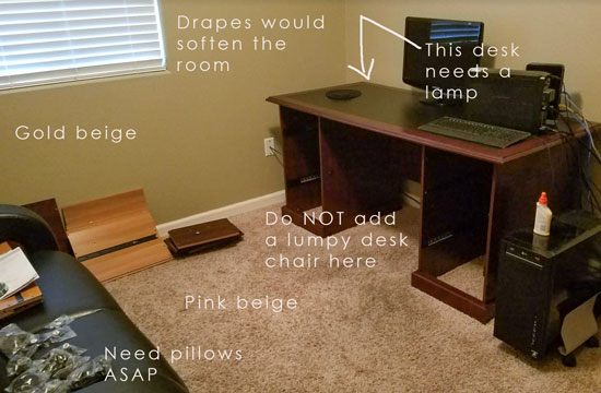
Before
This is what happens too often. You have an empty room and then you start to furnish it.
Everything you bring into your new room immediately changes the feeling.
If you’re a decorator, or you have a creative eye, it starts to look and feel better. You get happier every time you add something new.
If you were not born with the decorator gene, the more stuff you add, well, it all starts feeling less than awesome.
We immediately think that perhaps a new paint colour will help.
If the paint colour is really bad, then yes it will help somewhat.
If you have a room that feels dark, buy some more lamps. And don’t add too much black. I’ve talked about this before. There’s a tipping point with black where you can feel it when there’s too much. And the room immediately feels very masculine as well.
So let’s talk about the paint colour first shall we?
If you’ve completed my colour training or read my blog for a long time, you’ll already know that the reason the paint colour looks so wrong is because gold beige and pink beige don’t work together.
So, should we paint the room SW Killim Beige? It’s a pink beige and the carpet is pink beige so let’s see what that looks like:
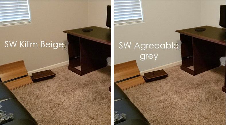
Better right?
But what if we don’t want beige? Can we paint it grey? It works too (above).
If there are no plans to spend more money in this office other than paint, then Kilim Beige is a better choice than Agreeable Grey because it relates to the existing carpet.
If we want the room to feel more fresh and updated, and we don’t want to paint the walls pink beige, then we need to decorate. Otherwise, it will look odd to have a black leather sofa, pink beige carpet and grey walls.
Kind of like you just painted the room and are totally ignoring the carpet.
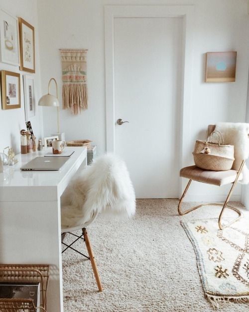
Here this decorator had a lighter pink beige carpet in her office so she chose to paint her walls white. However, the white desk makes it work. If the desk in this office was black and cherry, the white walls would not look as good as they do here.
Notice pink beige has been repeated consistently, even down to the macrame to the left of the door. It makes the old carpet disappear.
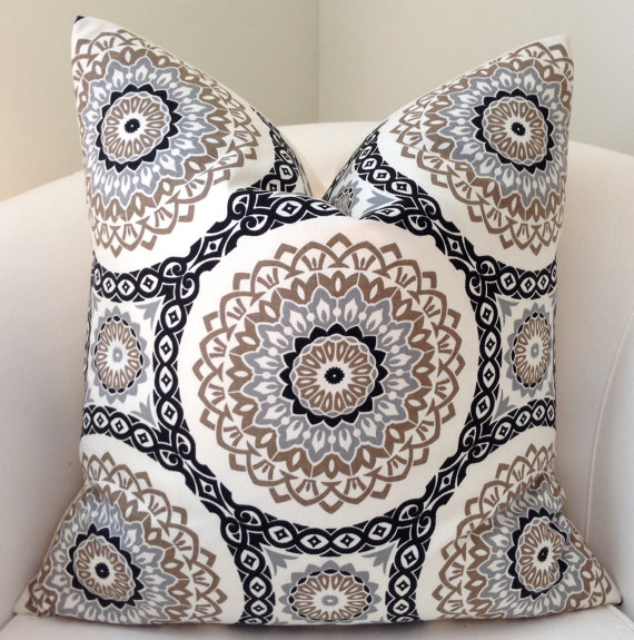
The easiest way to bring a colour from YESTERDAY into TODAY is to find a few items that relate to the offending colour (whatever it is) and the NEW FRESH COLOUR and repeat them both in the room.
Etsy (coordinating Colour blocked pillow)
Here we have a pillow that happily picks up all three neutrals.

And this horse print works too!
Then add some inexpensive IKEA drapes, a white office chair, a lamp and suddenly, your office is a place you want to get some work done!

Check out our Get me Started eDesign package if you need help with decorating.
If you have a room that just feels sad and you’re thinking all you need is paint? As you can see, paint can’t do all the heavy lifting.
Choosing the RIGHT colour for everything else you add is the key!
If you have a question for my Ask Maria column, email me here. To qualify, please send me PHOTOS taken in good natural light, and you’ll have a better chance of it getting in a post if you CLEAN IT UP. Also a generic colour question that has been answered on this blog (like which colour countertops should I buy, or what colour paint will look good in this room) will not be considered.
If you’d like to learn how to choose the right neutral or colour for everything in your home, attend one of my Specify Colour with Confidence Workshops. Register here.
Related posts:
How Much Heavy Lifting can a Paint Colour Handle?
How to Work with Bedroom Carpet You Don’t Like


Great suggestions. Adding some white always helps.
Thank you. I love this post. It is very helpful. The decorating points are illustrated very well. Everything falls into place for a lovely room.
I love how you explained this in a way that non-decorators like me can understand. The visual at the end is so helpful! Thank you!
Oh Maria, you are so good! I wish you had an on-line seminar for people like me who aren’t in the business and can’t afford the cost of the in-person seminars. 😉 I just got new flooring and now my daughter says, It’ll look great if you buy new furniture! An overwhelming decision making process for me, not gifted with the colour gene!
Love, love your thoughts here. I wish it was more natural for me to pick up on the offending undertone in art, etc. without highlighting it. Alas, maybe someday I will be able to join your seminar, but until then I will admire from afar (and pray I don’t make expensive mistakes!). Thank you for your classic and beautiful design posts.
Sarah, I just wanted to tell you that Maria’s course is truly life changing. I literally never saw color the same way again. It has transformed my eye and was the best seminar I’ve taken in 20 years!
Right on Maria! Like the pillows (in fact I used that pillow recently) The horse picture is adorable and certainly works with the colors in this room. Hope this person takes your advice!
I understand your point of why Kilim Beige is a better choice if there’s no other decor to pull the gray wall color and pink beige floor colors together, so my question is… do wall color and flooring (carpet or tile) need to match in a room (such as a small hallway) when there is no other decor to pull the wall and flooring colors together? Would this also be true in a small kitchen – does wall color need to match tile floor and granite if there’s no other decor to bring the different undertones together?
I would say that it’s especially important in a kitchen where you have flooring AND countertops AND a backsplash. Unless your kitchen is primarily white, your ONLY choice is to coordinate with your existing finishes.
In a hallway? I would need a photo to help you there, if you need help, you can purchase a single paint colour or a bundle on our eDesign page.
Thanks for your comment,
Maria
Another great before and after. I really enjoy seeing these. I love looking at heavily styled magazine shoots but not many people seem to show ‘good’ before and afters of rooms that are the reality of what many people are living with.
I’m amazing at how you can sift through a sea of fabrics and art and find ones that work together, I imagine, fairly quickly.
Maria, fabulous post!! I laughed out loud at the note on the before photo “do NOT add clunky office chair here”. You explained the right thing to do perfectly.
Nice post, Maria. ~Miranda
I think they spelled Killam beige wrong.
🙂
Love this, Maria! Thanks so much for including our metallic gold stripe pillow!