If you had seen as many DIY designed houses as I have over the years, you’d understand why this post turned into a bit of a rant.
WARNING: If YOU have built a new house with stone or brick, or both and are unhappy with the result, I recommend that you just skip this one. I don’t want to leave anyone feeling bad.
This post will only be useful to those of you at the beginning of the design stage where you are still questioning all your choices INCLUDING your architects placement of everything on your elevations.
And if you are a designer who specifies exteriors, don’t miss this one either!
Builders and buyers seem to be convinced that when it comes to exterior colours and claddings, more is more. And that’s too bad, because if you want to create a classic exterior, simplicity is key.
Just like any design project nowadays, the options are endless, and it’s really hard to pick just one. So in an effort to be “interesting”, the general consensus seems to be, why not pick three? Or more?
JUST BECAUSE YOU HAVE OPTIONS, DOESN’T MEAN YOU SHOULD INDULGE
I think it’s interesting to consider that until only recently, traditional stone houses would have been built out of whichever stone happened to come out of the local quarry, and that’s it.
The whole village would have looked charmingly unified by this limitation. The modest stone houses and shops would be similar, but differentiated by details like shutter colours, awnings, railings and plants.
Related post: First Rule of Design. Boring Now Equals Timeless Later

French Village (Source)
Developers of contemporary subdivisions on the other hand, tend to shoot for variety, not only on each individual house, but also from house to house creating an irritating jumbled effect, just think of your poor tummy after one of those all-you-can eat buffets!
While you understandably might not want a “cookie cutter house”, consider that if you opt for a simpler, more classic look for your exterior, ironically, your house might not only be the prettiest and most classic on the block, but also the most unique.
QUESTION YOUR ELEVATIONS, DON’T JUST APPROVE THEM
So when your builder or architect draws up a fascinating plan with a riot of interesting colours and claddings, don’t feel pressured into it. It’s totally fine to dial it back and choose JUST ONE stone or brick. You will be happier with the look in the end and your house will not only look like it could have been there for ever, it will always be pretty.

I love how this house (above) is simply one variety of stone and fresh cream millwork. I also love how symmetrical and balanced this traditional colonial design is.
Why have classic and simple plans like this fallen out of favor?
The rooms inside houses like this are lovely to decorate as well with their symmetrical windows, balanced proportions and human scale rooms (ie. no double story echo chamber foyers that feel cold and uninviting, and too tall windows in random shapes that don’t look good dressed or undressed). I’ll bet there are lovely french doors into the dining room and sitting room in this house, sigh.
I think builders are feeding a demand for “French Country” these days, which on this side of the ocean tends to be badly interpreted as a random mishmash of arches and peaks that are then adorned with a “variety” of different claddings, because, hey, they can.
Have you all come across the wonderfully entertaining blog McMansion Hell yet? It’s a fun and educational take down of some of the more insipid current trends in higher end housing. Well worth the read.

Here’s a lovely pool house in classic stone and cream with black shutters (above). If it can look stunning on a little pool house with only one window, it can look good on a modestly sized house too, like this little bungalow below.

However, if you don’t have the budget to do the whole facade of your house in stone or brick, don’t add a decorative strip along the bottom third with siding or stucco above.
While I think this is meant to emulate a traditional stone foundation, in reality, it just looks cheap, and worse, it dissects your facade into an awkward pair of horizontal bands that just won’t ever look happy together.
It would be much better to do simple siding or stucco that is unified and paintable and add interest with millwork and a portico for example.
CONSIDER A SMALLER HOUSE WITH HIGHER END MATERIALS
Which brings me to my next point, if you can’t afford stone for your entire facade, maybe consider a smaller house built with higher end materials, rather than adding a smattering of brick or stone that “symbolizes” quality along with endless yards of stucco.
Or, just go all siding or stucco if you need more space. Nothing wrong with that, some very pretty and classic designs can be achieved without any phony “upgrade” claddings at all. Okay, okay, you’re thinking right about now, but my HOA requires it? If that’s the case you’ll need to read this post (below).
Related post: 7 Steps to Choosing Brick AND Stone for Your Exterior

Even though this house above has the stone only on the bottom (above), it works because it covers the entire porch area and is defined by the overhang so it looks intentional and correct.
Keeping the all the siding unified with the creamy trim colour keeps things looking sophisticated. It might have been tempting to add another colour for the siding to relate to the brick, but here again, less is more. Notice again the lovely symmetry.

Here’s another colonial style house (ok, bonafide mansion) (above) with a single stone on the entire facade and fresh, creamy trim. So classy. The combination of arched and squared windows here don’t bother me because they are symmetrical, balanced and repeated. I would be very happy coming home to this every day.
This house (below) is very roof heavy (a common feature of larger builder houses these days). Without the extra wide creamy trim, especially on the well proportioned dormers and portico, it could have ended up looking pretty bleak.

Aside from choosing a good well balanced layout, and limiting the amount of colours and claddings on your facade, the key to achieving a pretty stone house is to make sure that there is ample, broad, paintable trim to balance the weight of the stone.
Generous trim is rarely a part of the design in new stone and brick homes, you end up with skinny window casings butting right up against the stone. If you have very dark windows and very pale stone, this can be a good look because there is sufficient contrast.

Skinny profile black windows, light stone (Source)
MAKE SURE YOU CHOOSE COLOURS THAT GIVE YOU CONTRAST
But if you put on a darker, earthy stone and/or brick, dark windows will get lost, mid tone beige or taupe windows will wash out and blend, and white or cream will be too skinny or stark to do the job of creating balance through contrast.
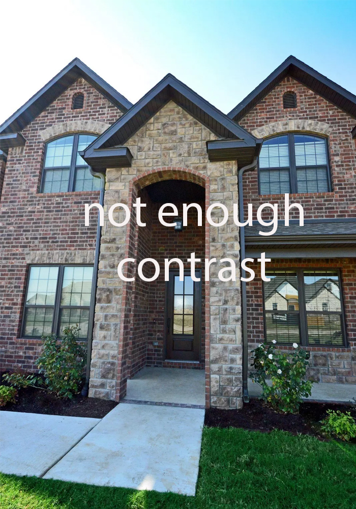
This house above is a typical combination of earthy brick and stone with bronze windows and no millwork or trim to add any contrast for balance. The double story portico is particularly terrible. Did it really need more stone and brick all the way up? And really? The downspouts need to adorn the focal point of the house? Even the symmetry doesn’t save this house.
Unfortunately, without the help of a good designer, and without being able to visualize the final product, or even know what the alternatives are, this is the road many and most will go down when putting together a builder grade stone and brick combo house.
Which leads me to my last point:
DON’T WAIT TO GET PROFESSIONAL HELP
It kills me that most often, clients come to us AFTER some of the most critical decisions are made, bought, drawn up and approved (and therefore unchangeable) and not BEFORE the most critical elements are chosen.
A really bad combination or placement of stone and brick cannot be fixed with the right trim or stucco colour, it can only be made to look the best it can.
But I think most people figure “I’ve got this” until the decisions pile up and they realize that they don’t. Or they trust whoever is on staff doing colour and layouts until they see the drawings and other houses in the division and go, hmmm?
I just can’t understand why people can be so casual with the colour and design choices on the most significant and expensive purchase of their lives?
I think this bothers me so much because so many people assume they can put on a designer hat for the day and successfully design an entire exterior that they and their neighbors will look at every day for years to come.
AND pull it off like a pro?
You would expect a less than perfect first pancake wouldn’t you? Just because when you look at art, “you know what you like when you see it”, doesn’t mean you know how to paint a good picture, right? Tricia Firmaniuk, Artist, TCE & Virtual Assistant
Certainly, simple titillating variety does not make a pretty design, as the vast majority of new subdivisions can attest, nor is it enough to simply have good taste.
Especially because my fee has been SAVED many times over because I have questioned the bad placement of exterior finishes and changed it completely, and FOR THE BETTER I might add.
Good design involves being able to visualize relationships and keep the entire outcome in mind.
Here’s what I’ve learned about ‘hiring a professional’ even in my own bathroom renovation. I don’t renovate bathrooms, this is NOT what I do, so I hired my dear friend Jan Romanuk, who has been doing this for over 30 years.
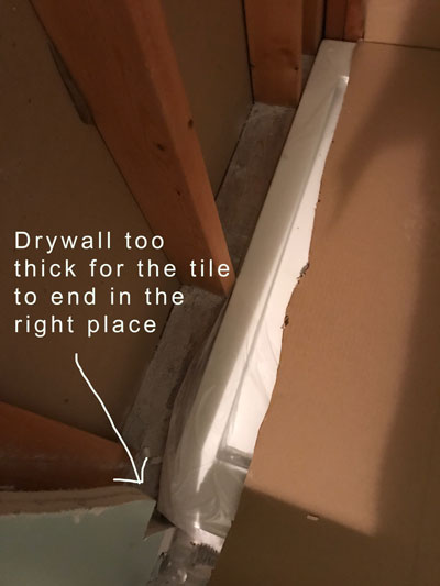
When the tiler had installed my shower base and we realized there were two layers of drywall on one side of the base which would make where the tile ends on the left side, uneven with the other two sides, I was insecure about telling him to remove it. I wasn’t sure if that was the right decision. Can I just tell him to take it out? I wondered in the moment? I called Jan, and she immediately said, “Yes, take it out”.
If you DON’T KNOW the right answer, on every single decision, you won’t be bossy with your trades like a designer will be.
Trades aren’t generally standing around, waiting for you to decide. Time is money, so if you’re not bossy with them, they will be VERY BOSSY with you. And you may assume that the right decision has been made, until you see the result.
There are many moving parts and details to manage, including colour, contrast, balance and composition because there is nothing more detailed than the business of interior design. So get professional help at the beginning of the design process so you can realize a vision possibly even prettier than your wildest imagination.
What’s the biggest mistake you made with your exterior that you wish were different? It’ll be a contribution to everyone! We’ve all made them and professionals make mistakes too, especially if you don’t hire one that doesn’t match your aesthetic.
If you would like your exterior to fill you with happiness every time you see it, check out our exterior eDesign services here.
See our entire range of Interior eDesign services here.
Related post:
Is Hiring a Designer a Luxury or a Necessity?
What it Takes to Have a Classic House
Can you Mix Brick and Stone on your Exterior? Before & After
Exterior Consultation with Orange Stone & Brick; Before & After


After reading the first few sentences, I thought about forwarding this post to the clever “McMansion Hell” – and then you referenced her!!! Too funny! Many thanks for another excellent post!
I didn’t hire someone to help me pick windows and it was before I took Maria’s class. The front of my house was built with nicer windows than the rest. And I replaced those correctly by choosing aluminum that looks like wood in a creamy color that ties in with my mortar. Then I found gutters that matched and had the trim for the entire house made by matching the gutter chip. But I did not question using screaming white vynil windows on the rest of the house. The previous owners had already put in some white replacements and so I continued. I wish now that we had gone slower and done the aluminum outside/wood inside windows all over the house, instead of just the front.
Biggest mistake was picking a vinyl window trim colour without thinking ahead and checking the fan deck colours of the aluminum eavestrough/soffit material (different company) at the same time. A few months after choosing a vinyl colour we had to choose an aluminum trough/soffit colour. I struggled with it because it was never an ‘ah ha’ moment where I felt great about the combination. The colours are close but the slight difference (created by a slight pink-ish tone in the vinyl that is more pronounced in the sunlight) really bothers me. If I’d chosen everything together I would’ve realized that there wasn’t an aluminum colour that worked really well with the vinyl colour I’d chosen and I would’ve changed my choice of vinyl colour. I think the best thing to do would’ve been to choose a cream or brown with the least undertone, making it simpler to find coordinating colours in all remaining materials. Also, vinyl frames are not really successfully paintable, as far as I know, so choose carefully!
Lesson Learned: Make ALL choices before beginning any construction. Each decision
Wow Maria/Tricia this post is so perfectly timed. I am about to order stone for the back of our walkout home that backs the park. I have waited several years to have a little of this european flavour stone involved in the deck area that will match the front house stone. It doesn’t make sense cost wise to do the entire back of the house on both levels so I had only planned on doing an indented area of both the upper and lower deck – then use same stone on deck walls and pillars. (stone is Fond du lac blend and similiar to the above picture of poolhouse) I’ve been a bit nervous about placement of this stone and now even more so. Ladies any thoughts would be appreciated..
Oh my goodness what a great post!!! I have to say that your posts are the most informative that I have ever read. It is so obvious that keeping things simple is the best way to go. Love all of the examples of the facades. The first home is so elegant! I just finished reading “McMansion Hell”. It was so informative. Just loved it. My husbands’ family lived in a rowhouse in England before coming to the states. We were able to go there and see where his father grew up. The rowhouses looked just like the ones in the McMansion article. I often wondered how anyone could find their way home because they all looked alike. If you did not read McMansion Hell, do yourself a favor and read it. It is such a good history lesson!!
Great post, Maria. I hate to see so many new homes going up with four or five different materials on the exteriors. What a hodge-podge! I love the McMansion Hell blog and often find myself laughing out loud while reading it.
I don’t know why classic exteriors have fallen out of favor either! People seem to think right angles are boring, I believe, and mcmansion angles and niches are “exciting” and “new”. Instead of chaotic and impossible to work with aka ugly and frustrating. But then I definitely gravitate toward peaceful, balanced, low key decorating so I love a good rectangle-based house.
We looked at half a dozen homes this spring and there is not much happening architecturally with mid-low priced homes east of San Diego but there was one built by a Southern gentleman in Southern style, two story brick with flanking wings, and the most gracious proportions inside that I’ve ever seen in this part of the country. It felt so good to be in there and since it was only 85% finished none of the hard finishes were chosen yet, I was so excited! He didn’t really want to sell so we had to move on from the property, but I’ve filed it away for when we someday build our own. We ended up with a 70’s contemporary. Thank goodness for Lauren Liess whose similar home I’ll be imitating as we renovate and decorate, love her look.
Julie, I think you can find more builders in the South that are still doing balanced and graceful architecture. Perhaps it’s the influence of the historical houses in the area. Not that we don’t have ugly houses too! 😉
Check out this beautiful traditional development in South Carolina. http://www.ionvillage.com/index.html
Since I live in a townhouse, I didn’t get to pick any of my home’s exterior elements. But the information you have provided will make viewing other people’s homes more interesting. Normally it’s just the landscaping I noticed. Not I can start criticizing facades also. Ha!
#themoreyouknow
Forgetting everything else you have said, the best is “if you’re not bossy with them, they will be very bossy with you” – remember this very valuable mantra. Thanks, Maria
You mention the symmetry of the stone house marked “Followill” but it drives me crazy. Does that not bother you? Is it just symmetrical enough to be okay. I can understand balanced but it seems to me that this house should have had the front door centered on the center gable, both in the center of the house. And the second story windows should have been evenly spaced. I can imagine the front door being off centered but it would take some other differences to make it work. It’s a loser to me.
Also, I agree that the business of interior design is very detailed but I’m finding out that planning a wedding is even more detailed, even hair raising. It reminds me of putting on a Broadway show (with dinner and dancing)…but for only one night.
my daughter’s summer job has been babysitting in an expensive neighborhood. Nearly every day she comments on how she would prefer a small house built with character over a cookie cutter home that’s big. I was offended (assuming she was talking about the home we are currently building which is neither big nor cookie cutter). Then I went to an estate sale in the neighborhood where she works and saw exactly what she was talking about. Plain McMansions (some actually quite ugly) sitting on huge, flat lots with no decent landscaping. All had pools, of course. I guess it must work for some people, but I would certainly prefer something different. There was nothing I wanted at the estate sale — it was all Tuscan design that the homeowners were dumping before moving.
Maria, this post goes in the Color Me Happy Hall of Fame.
I’ve been following the work of a couple of good builders in my area for years. Because I’m in the mountains, there are no tract home builders. Houses are custom built whether they’re modest or expensive. Both builders have extensive showrooms full of cabinetry, flooring, tiles, hardware, moldings, and interior/exterior finishes, so there is a wide range of choices. There is also the choice to go outside of what they offer.
When looking at their portfolios online, it never ceases to amaze me at how you can tell which houses were done by either a designer or someone with an eye for design, and which ones were not. All had access to the same choice of materials, but there is such a wide range of results.
One house in particular especially stands out, and the builder featured it on their Home Page. It only takes one second to realize that a designer had their hand in choosing all the finishes and furniture. I bet that house has been instrumental in gaining that builder more customers.
Oh, do I agree with this post! I live in the Midwest, in an affluent county where they have money, but NOT good design sense. I could go on and on about the busy facades I’ve seen. As a color consultant, I’ve been hired AFTER the client has stupidly added fake stone (in a horrible color combo) to “update” the house. Then, I’m supposed to come up with a great exterior color scheme.
I was hired by a retired couple who moved back to their college home town. When I got there, they showed me a complete color scheme with sample materials laid out on the dining room table. This included adding fake stone to the facade! The wife was a maniac, truly crazy, it was one of the most difficult jobs I’ve ever done. I had to explain/convince/cajole them into NOT putting fake stone on a plain suburban ranch! Also, that the colors the husband had chosen were too bright. Finally, the husband got it, while the wife bitched in the background, but I did my duty.
I love this post on how to choose stone! I love the gray/beige stone with the cream trim! Awesome! Even small cottages done the same way would be gorgeous! Thanks for your tips – even though I don’t have a stone house! 🙂 But would love to have one in those colors! 🙂
I agree with previous replies. I love this post. And love the gray/beige/stone/cream trim combination. Lovely. The picture of the ‘old’ street in Europe is so classic. One of your most interesting and informative posts, Maria! Thanks always!
Love this post. So informative and the pictures are gorgeous and help make the point so well! I think there is so much ugly new construction out there that people are just so used to seeing it at this point and have come to expect that is what a house should look like. Sigh.
I am building a modern house and those tend to be either all one color and material (like concrete, which I don’t like), or have a variety of different siding materials and colors. I tend to prefer the latter, but without overdoing it.
But I was interested to read your comment about not putting a stone border at the bottom of the house. That is super common in mountain areas, and I would like to do that for low maintenance. When your house is under many feet of snow half the year, it seems like a good idea. And in my case, my home will be elevated 3 feet to ensure there are no flooding issues from the nearby river, so I thought I would at least cover the foundation walls with stone. My main thoughts have been how to choose a stone that is classic enough it won’t go out of style, but still fit with a modern style. Can you elaborate on why do you think stone at the bottom looks bad, and if there are ways to make it look better?
Cindi, I live in the mountains also, though we don’t get many feet of snow. They use a lot of HardiPlank here and it’s considered low-maintenance.
Some of the houses have stone trim and some have HardiPlank right down to the bottom, and then the foundation might be in stone.
Maria- this post saved my hide this morning! Thank you! I am not a designer, and I have a designer coming in to help with some interior stuff, but we are already in progress with pouring the foundation for our addition. Well- long story short- the comment “You may assume the right decision has been made until you see the final result” and thus BE BOSSY stuck with me from reading this yesterday. So when my GC called me today and told me that it wouldn’t be a problem to move a post 12 inches to the right- I had the gumption to push back and say: I am not ok with that because it will affect this other thing- We need to figure out a good work around! Thank you for being bossy in your posts. It emboldens me to be bossy where it counts!
A bit of trivia regarding pics in the McMansion Hell blog, with this caption “18th century Georgian style terraced houses in London are examples of the direct forerunner to the American rowhouse. The popularity of neoclassicism at the time of their construction resulted in a unified and mathematically proportioned edifice”…
Did you know that some of London’s centuries-old buildings actually have fake windows for symmetry? The interiors of some spaces weren’t conducive to windows, so the architects designed windows for the exterior, with the building painted black or dark behind it.
Thank you for yet another informative, useful post, Maria!
You wrote, “don’t add a decorative strip along the bottom third with siding or stucco above.
While I think this is meant to emulate a traditional stone foundation, in reality, it just looks cheap, and worse, it dissects your facade into an awkward pair of horizontal bands that just won’t ever look happy together.”
While the examples you have shown prove your point, please don’t make a blanket statement about all homes!
For example, if one is building a traditional craftsman house, then doing a stone look “foundation” is absolutely the correct way to go. The whole idea of a craftsman house is to have a more horizontal look and feel like it’s low to the ground and feels like it’s part of the land.
However, please continue to sing the praises of simplifying. I’m so tired of seeing overdone lipstick on pig houses. 🙂
Thanks for adding this comment Arlene, it contributes to everyone! Maria
I’ve seen many homes with the awful exterior you depicted and wish builders would just hire someone to help them prevent such mistakes. But most see absolutely nothing wrong with what they build. In fact, they’d be horribly insulted if someone even slightly suggested their choices had flaws. A good builder is open to critique, which is rare.
One thing I’ve been curious about is the future of having solar tiles for roofing. I don’t know if it’ll catch on, or how quickly. But I do foresee design issues with those should they become more ubiquitous. Have you or anyone you know started considering what would work well with them?
I would like for Maria and her readers to comment on the symmetry of the house photo shown under the heading – Question your elevations, don’t just approve them.
I made a comment about this house two days ago and was hoping for some feedback.
What Maria wrote is – I also love how symmetrical and balanced this traditional colonial design is.
Is this house symmetrical or just symmetrical enough? Is it balanced? I would have really questioned that elevation and not approved it. It seems to me that the front door and the top floor middle gable should line up and both be in the horizontal center of the house. And it seems that if all the windows on the second floor are the same, then they should be evenly spaced.
Maybe I just don’t understand what symmetrical means. And I can’t see how this house is balanced. Can anyone help me? I’m here to learn. Thanks
The top right window is perfectly centered over the large lower right window. The house is “balanced” visually. Symmetry in this instance does not always mean a right and left mirror image.
Thanks for your responses Amber and Maria.
I conclude that the house is not symmetrical (by definition) but it is balanced. ?. It definitely and immediately felt akimbo to my artist eye – it didn’t take any thinking to feel how “off” it was. And, if I were painting this as a work of art, I wouldn’t call it balanced either….. but … architects and home builders aren’t artists!
I still believe that the person who signed off on this elevation, that being the point Maria was making, did a real disservice to what could have been a lovely house. It looks amateur to me.
What I have learned is that we have different definitions of symmetry and balance. You have challenged me. Thanks
It’s not perfectly symmetrical I agree, but it’s pretty close. Maria
Thanks for the great post! The colors and the contrast are really important. It’s a pitty when I see a house which is obviously made with bigger budget but the colors are not bright enough or do not have any contrast….no matter the high end materials nothing looks good.
If existing brick (multi colored brick) and stone (random earth tone flagstone) elevation is too busy, can both brick and stone be painted? Or does painted stone look odd?
Painted stone on exterior generally does but I would need photos to know for sure! Maria