I am thrilled that so many of you are using my neutral colour wheel now that it is an accurate visual guide for the most common neutral undertones. But, I want to make sure that you understand the two best ways this neutral colour wheel can help you.
Did you know that some of the best marketing tag lines and explanations I have found to explain my products have come directly from my readers? In my early blogging days, another blogger wrote a post about me and was the first to refer to me as a True Expert.
And, that’s how True Colour Expert® was born. Since those days, I have trained almost 2,000 Certified True Colour Experts both in-person and virtually.
![]()
In my last blog post, I answered a reader question that I’m betting many other readers also had based on the fact that my colour wheel is neutral, after all. This reader wondered if a neutral wall colour was the ONLY option.
As a result of this post, one of my readers posted two comments that were so smart and succinct, I’m sharing them with you today.
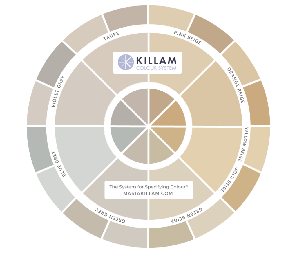
The new neutral colour wheel 3.0
If you’ve been following me for a while, you’ll already know that this (shown above) is the third version of my colour wheel. It’s been under development for many years. You can catch a glimpse of earlier versions on my About Me page (scroll toward the bottom).
Because I don’t actually need the wheel myself, the hardest part for me has been learning the best way to articulate exactly how it works and how it doesn’t work. My team is always telling me that I spend too much time focused on exactly “what it doesn’t do” in my attempt to explain it more clearly.
For example, I receive a lot of feedback from people who want this wheel to give them every possible colour option there is. No colour wheel is ever going to do that. This isn’t magic 😉
Additionally, anyone who understands how colour works would never consult a primary colour wheel to make colour choices.
The neutral colour wheel is a TOOL to find a … NEUTRAL
Ok ready? Thanks, Michelle for spelling it out better than anyone else so far:
THE COLOR WHEEL IS NOT THE ANSWER BUT A TOOL USED TO FIND THE ANSWER.
- The primary purpose of the colour wheel, is to identify the undertones in your existing neutrals, not to show you which paint colour to choose unless you are matching [the neutrals].
- Or if you are choosing new finishes – bring the colour wheel with you to determine the undertone of anything new you’re adding to your palette to make sure you’re not inadvertently choosing a conflicting undertone.
Let’s talk about the first point today in the most simplistic way possible.
80% of the time you are looking for a neutral in beige, grey or white. This wheel is a tool to help you with those choices.
If you are trying to find a saturated colour, you don’t need this neutral colour wheel.
Let’s take a closer look through the lens of my primary bedroom. You can see that my headboard is upholstered in natural linen, which is pink beige.
And, although my carpet looks like a cream in this image, it’s also pink beige. And that’s the way it should look, in this case. If I had chosen a carpet that was green or yellow beige, for example, you would then notice the difference in the undertones immediately.
Read more: How to Choose the right Carpet Colour for your Bedroom; Before & After
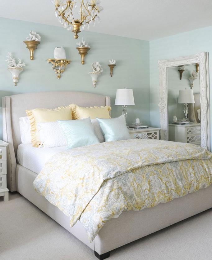
Let’s say this room wasn’t already painted. Looking at my existing colours in the room, some possible options are: yellow, gold beige, turquoise and pink beige.
So, if you want to paint this bedroom a colour (like I did) the neutral wheel isn’t going to help you make a colour choice.
You simply bring a fan deck home from the paint store. Use the fan deck to find and match colours to your room, then follow up with larger test samples.
Or you could take a pillow or your bedding to the paint store and have a clerk match the colour that you want (and then test those samples).
The #1 way to use the neutral colour wheel
But, if you want this room to be neutral, THIS is the best way to use the neutral colour wheel. Start by placing in on the existing neutrals in the room that you are trying to work with.
Here, I’m placing the colour wheel on my headboard. Because we are comparing the painted colour wheel to a textured fabric, you might still wonder, “hmmm. . . is it really pink beige?”
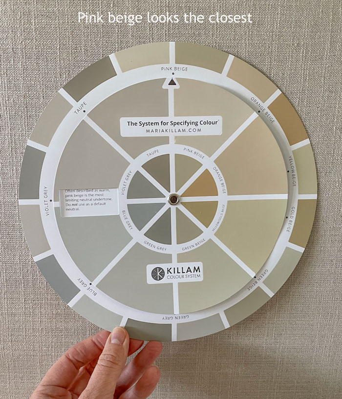
It certainly looks like it could be. And that’s because you’ve just eliminated all the other undertones that don’t look like a match at all. Use the neutral colour wheel to help you eliminate most of the undertones.
If you want to be really sure (and confident) there’s only one way to find out if it is pink beige. And, that is to compare large paint samples in known undertones (find a list of paint colours categorized by undertones in my eBooks).
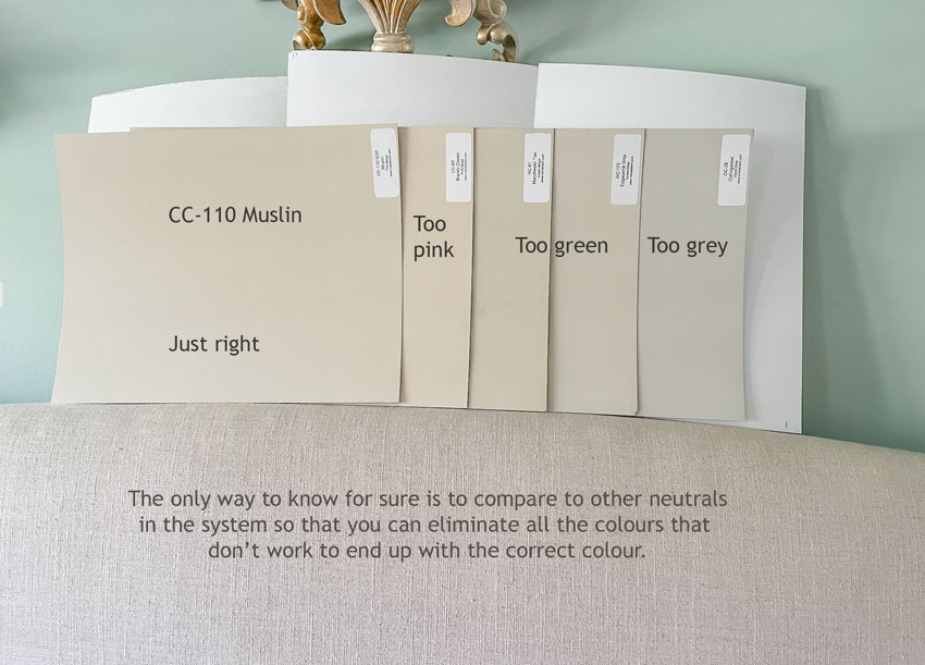
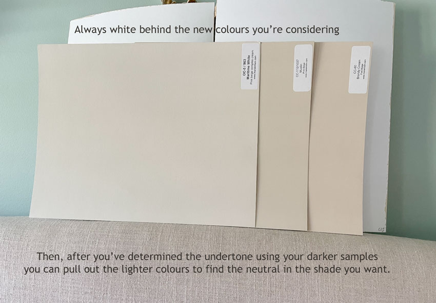
Don’t forget to include white behind the colours you are considering or testing.
The #2 best way to use the neutral colour wheel
And then the second-best way to use the neutral wheel is as a handy guide while shopping. If you are renovating or building a new home, you can use this wheel to help you shop for the right neutral finishes.
For example, if you have a taupe tile floor and you need a countertop, obviously you’ll want the undertone of the countertop to look like it’s happily married to the floor. That means you’ll need to bring home countertops that have taupe in them.
Don’t have a neutral colour wheel yet? Get yours here.
How would you describe the neutral colour wheel?
Okay my lovelies, if you see anything else that makes this even more clear, I would love your feedback! I so appreciate my community and all the ways you contribute to me! Thank you so much!
The prices my large colour samples are going up April 1, as all our expenses have gone up, so if you’ve been thinking about them, get them here now.
Related posts:
The New Understanding Undertones Colour Wheel is Here


I would just add to Michelle’s answer: 3) Then choose (palette,paint,finish) following the dirty vs clean rule.
(to make sure you’re not inadvertently choosing a conflicting undertone)
The question left unanswered is what neutral do I choose to go with the saturated colors in my room? If I have no neutrals to take into account because my floor is a standard mid-value warm oak, what neutral do I choose? Or, if I can paint my floor, then I really don’t have any neutrals to consider, just my colorful pillow or such. I might have a beautiful brightly colored rug with no neutrals in it, and want a neutral sofa. I have no idea how to choose the neutral color for the sofa or wood trim on the doors and windows. Help!
Nell – I must have the same house! All oak woods, no neutrals. The wood is the bossiest thing/ biggest visual item so I will use it to determine which neutral to paint my walls. My oak is more of a gold beige so my paints will be a complex cream- from Maria’s lists. The remaining furniture I hope to keep are greens and as long as they don’t clash as a clean/dirty I’m good. I take the wheel and paint board with me shopping to help make sure throw pillows/ etc will as work nicely together. I would really recommend her ebooks and shopping class and keep reading and listening. Together with her instagram stories/posts/blog I have learned a ton – 😉
Thanks for telling about your situation. I have learned a ton also but still don’t know how to choose a neutral when I’m looking at saturated colors. My deep red and indigo blue rug has no neutral colors in it. I can’t guess what fabric to choose for a sofa, or paint to choose for the door and window trim. I understood from Maria that a standard mid value wood floor doesn’t count as a neutral that I need to coordinate with. So, I overlook the floor undertone. I see you do the opposite. I’m hoping Maria will speak to our questions.
No looking at your hardwood floors will not help you. And yes if you don’t have a neutral already in the room then you don’t have an obvious choice. Just like my living room before it’s current makeover was greige because I had a lot of colour in there, and because I didn’t have a neutral in the room other than black and white, it could have been any of the 3 greiges in my system. My best advice if anyone is asking questions like this is to hire someone to help you with a plan. Or learn how to create one with my Shop online course here: https://mariakillam.com/shop-online-with-colour-confidence/
Are you sure you really need a neutral? Maybe a colour, either matching or complementing the colour already in the room, is the way to go.
Maria’s neutral colour wheel helps you easily determine the undertone of an existing finish. Once you know the undertone, you can refer to Maria’s eBooks to find out which colours work with certain neutrals 🙂
Maybe it’s just my monitor, but for me the color wheel looks like violet gray is a perfect match to her bed frame and taupe seem a close second.
I thought the taupe, too!
I could have pulled the taupe out as well but my bed is definitely pink beige, however if you eliminated all undertones except pink beige and taupe, those are the large colour samples you’d pull out to compare until you find the right one! That’s exactly how it works. Maria
Yes I can see that as well, I should have shown a taupe sample as well, however if you are in the same situation and you see taupe, pull out a taupe sample, that’s how you’re going to know. A tiny paint chip as well as a tiny slice of the colour wheel WILL STILL NOT HELP ANYONE CHOOSE A PAINT COLOUR WITHOUT THE LARGE SAMPLE TO CONFIRM, I DON’T KNOW HOW MANY TIMES I NEED TO SAY THIS. The Wheel alone will NOT HELP YA’LL. Hope that helps, Maria
Thank you, for me as well.
I think of it as a neutral identifier, not a color wheel. Or a neutral analyzer. Somehow color wheel implies selection, choice.
Neutral analyzer = brilliant
I used my new wheel from the floor up. Redoing all finishes in bathroom, but one-by-one. Primed walls white and got new lighting. Picked floor that is a mixture of neutrals. THEN I used the wheel to identify undertone of floor. That helped me pick which greige I wanted for walls. That solidified I want white vanity/cabinets. I will use wheel to pick my vanity top. Then I will add my COLORS to put “my” stamp on the room. Wheel was priceless in identifying undertone of new floor!
Need to make sure the white cabinets marry with the undertones of floor, countertops and paint too. Or they stick out like a sore thumb. IMO. So many different white finishes for cabinets.
It will be my first go at white cabinets, so I will definitely be shopping with my envelope of bits and chips. Fingers crossed! Thank you for your thoughts!
As far as the COLORS, I am a believer in the color wheel. Love how my teal sofa and rust-orange accents worked out in my living room. “Opposites” do compliment! AND, another of my mantras I picked up from someone along the way; a good contrast is MUCH better than a bad match! It was referring to fashion, but applies to all.
Yes the colour wheel is a good tool for general guidance, however what I was trying to say, and perhaps not clearly enough, is that no one consults the colour wheel to find paint colours. If you have a teal sofa and decide you want to add orange to your scheme, it would be best to find a rug or pillows that have that orange in it. . . otherwise it makes no sense to have a teal sofa with an orange wall and no other orange in the room. That’s the only point I was trying to make, thanks for your comment, it helps everyone! Maria
Got it! Yes, the walls compliment the undertones in the woodwork in the room as well as floor and ceiling (yup). The teal sofa pops, and the rust pillows are a great contrast and also compliment the brick fireplace wall. You have been SUCH a help with decorating my new home! I am loving HAPPY colors. AND, recommend you to EVERYONE! THANK YOU!
I used color wheel 2.0 this past spring as Maria stated in her #2 way to use the wheel: to select fixed finishes. We are building a new home, and I wanted a serene, neutral color palette, so I started with a rock I found in the area to start as a base reference and inspiration point. Our new home is a traditional style native to the region, and I wanted the finishes to reflect the natural surroundings and traditional building materials, so “the rock” was a very good tool to use since once can easily get lost and confused in a tile store! The rock (which is limestone) is predominantly green-grey (the wheel told me so). I found that all the old houses built of stone and stucco are also in the green-grey family. The fixed elements of the house we cannot change (exposed wood ceilings and stone elements) have gold or green undertones. Every single finish in the house is now based around the rock, and the undertone verified with Maria’s wheel. I also took samples for each room and put them all together (in natural light), in their installed position (horizontal vs vertical) – as Maria suggests – to ensure harmony within each room and across the entire house. The finishes won’t be installed for another month or so, but I am very confident that they all play well together and that the final color palette will harmonize beautifully.
Would love to see your finished product!
Maria, I’m in the process of decorating (not renovating) our bedroom based on your wonderful teachings. I’ve identified the undertones of the carpet and bed frame, and am deciding whether to incorporate a clean colour or muted cream (based on the undertones). If I go with a colour, do you recommend using your linens as a starting point OR wall colour and then bedding?
Thanks!
Always the bedding first, it’s impossible to land on a colour otherwise. Maria
I have both your e-books. Can you direct me to where to find a list of paint colours for each undertone.
There’s two downloads with each book, one is the bonus book of colours. If you don’t have it email [email protected]. Maria
I “accidentally” bought a house on Mar13 (actually a really lovely view w a house attached!)
The floor plan is unusual but an impossible to find one-level, looking out at that view & v near both sons & their families…it’s “a unicorn.”
(Hmmm- Do I want to live this close to 5 grands, ages 7-1🤦♀️😂)
The seller had everything painted the same white w grayish undertones..a
very clean/cool..which I hate.
The bedroom is more of a blueish/white..
also too cool & also 👎🏼.
What I REALLY dislike is the WAY too-shiny finish of the paint. It’s probably semi-gloss? Its a bright house and reflects light..👎🏼👎🏼
I’ll change to a muddier Taupeish-beige, prob the SW color I have now…Colony Buff…
a SW “color specialist” dredged it up from discontinued colors.. An elegant color & I was ahead of the trend, as this was 4-5 yrs ago.😉 Never gray in my home. I even hate the brushed nickel handles, knobs, pulls everywhere. Always have.
The finish will be an Eggshell(?) ..I believe that’s one level up from flat-out flat.
Maria, have you addressed correct paint finishes for walls/trim?..I’m sure you have!
Nothing reflective IMO.
In this red hot sellers market, the buyer is over a barrel. We discovered the entire house has V shoddy, V poorly installed wood floors. Lucky my son was once in the flooring biz.
Have to change those first..then paint.
Haven fallen out of love w this house but will limp down the aisle anyway. 🤦♀️🤷♀️
The lessons I’ve learned from you have mostly sunken in; let’s hope I choose the right paint!
Sorry..this turned out to be off topic!!
*Nothing reflective excepts wood trim!
I hear ya! Our new house had very shiny walls everywhere! Not sure if it is a regional preference …. It took me many hours of de-glossing with Liquid Sandpaper (works great!), priming, and re-painting, nut it was completely worth it! So much better. All the best with the new place. Sound like you are ready to make it work!
Hi Maria, what if you have mixed undertones? Can decorating “fix” this or at least minimize it? I have very light pink beige travertine floors in my Florida home. We brought our gold undertoned sofas with us when we moved in. I have added a lot of blue and white and rattan/wicker, which picks up the gold. It seems to be looking much better. I would like to paint the walls something very light but with a slight blueish undertone. Would that be a mistake? Thank you for all your educating posts!
It’s hard for me to say without photos, I would just paint up some large samples in pink beige and blue grey and move them around! Hope that helps, Maria
Hi – I there is a typo
But, if you want this room to be neutral, THIS is the best way to use the neutral colour wheel. Start by placing in on the existing neutrals in the room that you are trying to work with.
should it be …”placing it on the existing”
Maria, I have a feeling you are a perfectionist – and would like to know…
I *think there is a typo –
I made a typo myself!!
Love your blog!!
…now off to search for carpet that is not pink beige for my bedrooms….
Thanks Shelley! Maria
An immediate reaction… “she must not live in an earthquake zone” — when I saw what’s above your headboard. Lol
LOL! Always my reaction, as much as I love that bedroom. The entire PacIfic Northwest, including coastal British Columbia, is an earthquake zone. “The Big One” will even effect those of us who are a bit inland as Maria and I are. One hopes that museum putty has been used, at least. 🙂