Update to this post: Hey ya’ll, the reason why Courtney’s walls are blue is because she chose a blue. That’s the reason why choosing paint colours is not as easy as you think. I’m getting emails and comments saying ‘Hey, I had this problem too, my walls turned blue as well’. Your walls are blue because you choose a blue paint colour. The end. Keep reading. . .

How are you during these unusual times? It feels strange to pretend that everything is normal when it’s not! I hope to teach and entertain you for a moment anyway! Here’s an email I recently received from my lovely reader Courtney:
Help! My Light Grey Walls Look Baby Blue!
“I just moved into my home in NC and desperately wanted to start painting as every room in the house is beige with off white molding. The living room has a beautiful stone fireplace and I really wanted to make it stand out as it’s the first thing you see when you walk in the front door through the foyer. I love white in general and soft grey, the room can be a little dimly lit so I wanted something brighter to keep it light and airy. I went to my local Sherwin Williams paint store and started picking a bunch of swatches I liked to bring home and tape on the wall to see what they looked like throughout the day and night.
Ultimately I decided on Olympus White, which now looks baby blue on my walls. The room only has light coming in through the two doors on either side of the fireplace which are north facing and some from the glass front door in the foyer which is south facing. I still have A LOT of decorating to do and I’m not sure if I should hold off trying another paint color until I add my decor or change it now before I get started?”

I always teach the first thing to do when you want to choose the perfect paint colour is to identify the “boss” of the room. In Courtney’s room, it is clearly the fireplace stone. (Wait, maybe it’s her sweet Yorkie? Good thing he appears to coordinate with the stone, no conflict here ;))
Light Blue Greys Often Look Blue
In my system, I’ve identified 3 main neutral undertones of greys: Blue Grey, Green Grey, and Violet Grey. Of these three, blue grey is the coolest and will most often simply look “blue” on the walls. This is what makes blues and blue greys especially tricky. If you want a more neutral, putty grey, you need to consider a green grey (the undertone of concrete and natural limestone), or sometimes a violet grey.
On the other hand, if you are looking for a pretty blue for your walls that doesn’t scream nursery, the blues you want to look at are the ones that will give you that perfect sophisticated and grown up blue. These blues will look grey on the chip. SW 6253 Olympus White is just such a colour. It is a lovely fresh blue that, on the strip in the Sherwin Williams deck, looks like battleship grey.
The reason it is looking “baby blue” on the walls in Courtney’s room is because it is technically a bit too clean with the fireplace stone. It is more blue than the blue greys in my system. And it sounds like Courtney was looking for a more neutral light grey.
Proper Testing is Key
I’m guessing that if she stuck the paint chips directly on her pink beige walls, the one that bounced out and caught her eye was the cleanest and coolest of the options. This is the reason I recommend painting up a larger test board instead and moving it around to compare to the furnishings and fixed elements (the fireplace stone), and to isolate it from the old paint colour that’s going with a larger white board behind.
Colour testing should look like this:
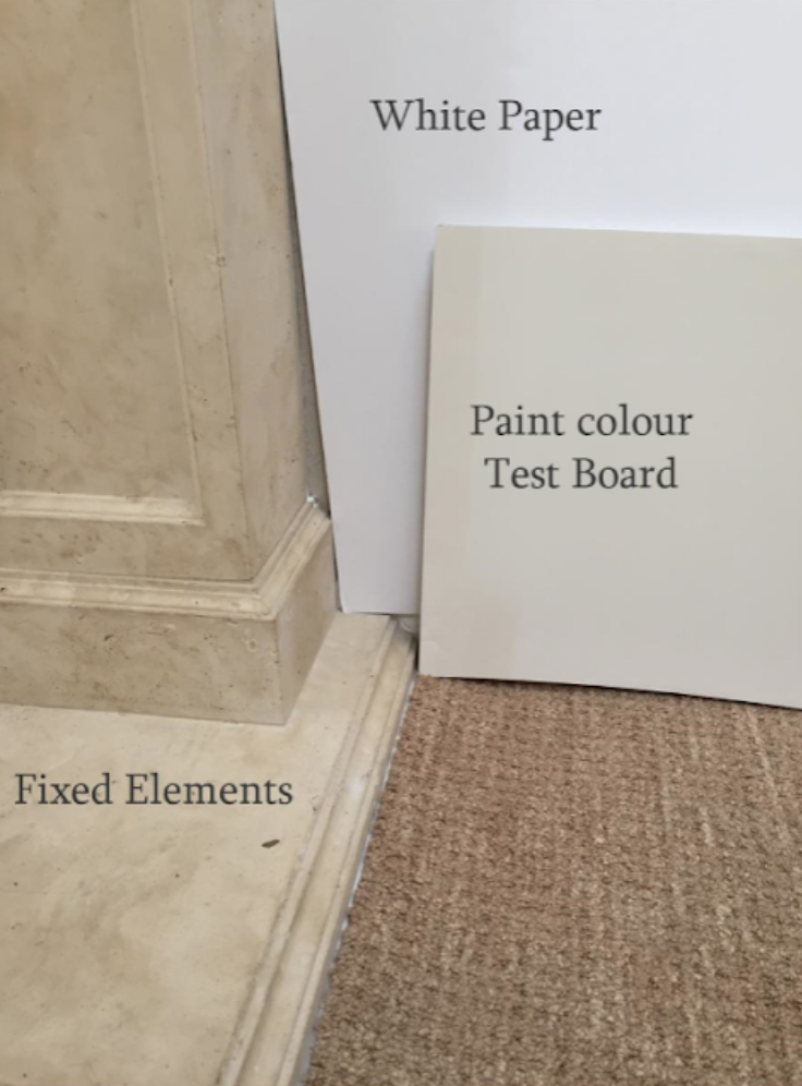
This way you can be sure you are not comparing the colour to the old paint colour instead of the elements you need it to relate to.
A More Neutral Blue Grey
Back to blues, a slightly more “neutral” blue grey in my system (available in my large painted boards) is SW 7064 Passive. You can see them in a side by side comparison below.

SW Passive would have given her a more neutral blue grey look rather than a blue.
However, first we need to consider whether a blue grey is even the right undertone of grey for this room?
More Options to Relate to the Stone
Stone will most often have a number of different neutral undertones and the wall colour should relate to one of the most dominant ones for the room to look pulled together.
Aside from the warmer gold and cognac tones in the fireplace stone, the grey undertones are mostly green grey with some blue grey, and I see blue green grey as well (blue green grey is a secondary undertone of grey, most French greys are blue green greys).
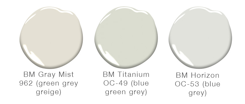
So yes, a more neutral blue grey like SW Passive, or BM Horizon OC-53 could be tested with the stone. I would also suggest trying a pale green grey like SW 6070 Heron Plume, or BM Grey Mist 962 , or a blue green grey like BM OC-49 Titanium.
 A pretty greige and some pale greys found in my BM Core Collection of large painted boards
And her area rug looks like a blue grey, so she can certainly use a blue undertone on the walls.
The trim looks a bit creamy, so she may need to go a bit deeper on the walls than these pale shades if she’s not planning to paint the trim.
Clean vs. Dirty
If you combine a pale green grey greige with trim that is too creamy, it can make the trim look “dirty”. I would paint the trim and crown a cleaner off white colour like SW 7004 Snowbound.
How to Work with the Light Blue Walls
On the other hand, Olympus White is a pretty blue and could work with a bit of clever decorating. While it is technically a bit too clean with the stone fireplace, if she repeats the earthier colours of the stone, as well as the clean light blue deliberately in her decor, it could come together beautifully.
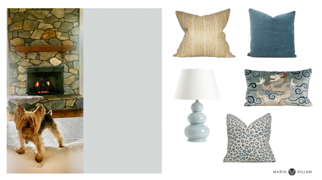 Cognac Pillow | Solid Blue Pillow | Dragon Pillow | Leopard Print Pillow | Blue Gourd Lamp
The earthy tones of the fireplace and the blues create enough of a varied palette for this room. I would move the painting with the strong yellows and reds to another room. And repeat the blue in paler and richer tones, along with the cognac brown from the stone and lots of white.
I love Courtney’s fresh, natural “white” furnishings, they balance the earthy stone nicely and help the fresher wall colour relate. I would also introduce some warmer wood tones to repeat the browns in the stone.
Here is a pretty warm wood coffee table that would look lovely (below).
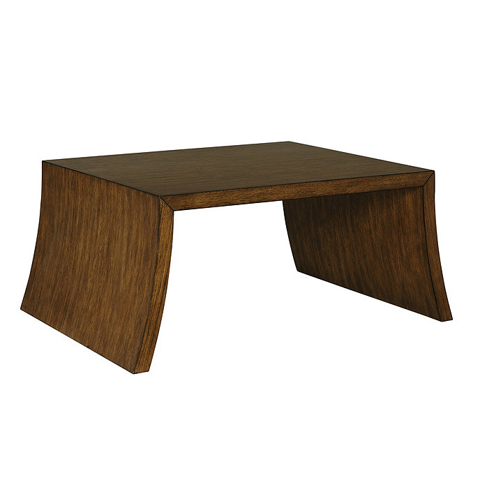 Trebby Coffee Table | Ballard Designs
Or she could add a couple of stylish cognac leather sling chairs (below).

I hope that gives you some ideas for moving forward with your light grey walls that look blue Courtney, thanks for sharing your colour conundrum.
Do you have an Ask Maria question?
If you have a room that’s bothering you, send me a photo here. Clean it up to be considered for a blog post and take your photo in natural light with no flash (flash kills the ability to see the colour accurately).
If you would like help bringing your room to life with a new paint colour, pillows and a new area rug, select any of our Paint Colour consultations and then select the Combination Add On for my recommendations for a new area rug and coordinating toss pillows to enhance your new paint colour.
Or get help with all the furnishings, area rug, toss pillows, lamps and tables in your room as well as paint colours with a Get Me Started package here.
PS. Like everyone else, I have moved my DC and Toronto course from April to September, check out the new dates here.
Related Posts:
What Top Gun can Teach you about Battleship Grey
5 Reasons Your Paint Colour Looks Wrong (It’s NOT the Lighting)


I’d love to see another post updating us when the room has been re-worked. I imagine once the wall colour has been corrected and with some matching accent accessories it will look stunning.
Hi Maria! Courtney’s room is beautiful! I’m sure with your help it will all come together!
I had the exact same thing happen to me! In our previous house, we painted our living/dining areas revere pewter (a green gray I think), and after we were finished, we were left with baby blue walls! It was the trim! It was yellow! After we painted our trim an off white, the wall paint looked gray. I will email you a picture of the room while the trim was being painted to show you the difference. It was so weird. But, I notice that Courtney’s trim is yellowish, so maybe that’s what’s causing her walls to look blue. That being said, with her stone fireplace I don’t think she should paint her trim white. I think it looks nice as is! I hope you and your family are staying safe and well! These are indeed strange times.
Maria, it sounds as though, if she wants to keep the walls as they are and work with them, she needs to paint the trim white. Is that right?
That stone is really a gift, with both green and blue undertones. She can still have a bright and fresh looking room with the earthy colors incorporated. I would love to see the room again when it’s finished.
By the way, we need as much normalcy as possible during this time, so carry on!
I was thinking she would definitely need to repaint to get the color she wanted. But when you showed the accessories to add to the room — Wow, that would really make the paint color work. Love the accessories you chose. That makes all the difference. That’s why you are the expert!
Would you suggest that she paint the chair rail the same colour as the wall?
I don’t see the new DC dates on the training page you linked.
Sorry about that! We’ve updated the dates now. DC has been moved to September 16 – 18, 2020.
Perfect styling ideas…love the dragon pillow, cognac chairs and coffee table to make all that stone look intentional!
Wouldn’t that fireplace look lovely with a Romabio limewash? The stone would peek through, and just be softer. I like the blue walls with her furniture and accessories Maria picked, but the trim does look dirty with it. Trim is such a pain to paint yourself, so I would probably choose to repaint the room, and then decide if I want to go the extra step with the fireplace. Maria’s accessories trick the magic bullet.
Two awesome solutions 👍🏻👍🏻👍🏻
Great post. I’m a big fan of SW Crushed Ice as a warm but fresh putty coloured grey.- not blue. I tried SW First Star also – thought it was similar to Crushed Ice from the paint chip but it definitely reads blue on the walls. (Learning to love it though!)
This is a great teaching post!! It is an all too common example of what happens to many of us. Courtney moved into a beautiful home in NC, wanted to get rid of the beige/tan (I can see it in the adjoining room) and replace with a fresh, crisp color scheme. At the same time, there is a dramatic stone fireplace that doesn’t fit that vision. I know some people will want to beat me senseless, but the idea of painting the fireplace keeps intruding into my thoughts – if you really want a fresh and clean room. I can immediately see the downsides, and so you are left with trying to bring together both visions – something Maria does better than anyone! I think the paint has to complement the fireplace or else it will always look less like a focal point and more like a distraction. I understand your dilemma, I continue to grapple with exterior brick that doesn’t match the vision of my house. With Maria’s help, however, I am sure you can create a beautiful room!
The one off white stone on the fireplace bothers me the most.
Like the color choices but I would choose a color that would compliment the earthy tones of the river rock knowing her space is mostly cool I would tone it down just a bit to make it more warm and inviting.
Hi Maria. Love your posts. Below and when I click on your new dates link still lists April and May for DC and Ontario workshops….
Sorry about that! We’ve updated the dates now. DC has been moved to September 16 – 18, 2020. Ontario has been moved to September 23 – 25, 2020.
Oops. Below has Ontario workshop changed but it’s May when I click the new dates link in this post.
Sorry about that! We’ve updated the dates now. DC has been moved to September 16 – 18, 2020. Ontario has been moved to September 23 – 25, 2020.
Really great post, Maria! You hit every pertinent point.
When I walk clients through these nuances and possible solutions, I can see their eyes glaze over 😂. That’s about when I realize they have called me in to do a quick fix….a paint color that will unite all the elements in their room with one professional opinion. I carry a paint deck in my bag, but that becomes the only thing they THINK will work to bring it all together.
The blue and cognac accents you showed would absolutely resolve her problem, but paint is her done-in-a-day comfort zone. On the plus side, once her living room is complete, she’ll be longing to hire you for the rest of the house! 😉
PS – Could you kindly convince her to move all her seating ONTO her rug? It feels a bit chilly and not ready for conversation.
Yes Maria! If you can keep your posts coming, we need normal in “the new normal”. I woke up feeling off-kilter (as I am sure most other people have too), so it was awesome to read something that excites me. That puppy is definitely the cutest part of the post, I hope once she is able to finish the room that she sends photos so we can see the “after”. I just love all your advice. Thank you!
Maria this post is outstanding! I love these teaching posts that you do. You give such great advice and reasoning behind it. It’s so great that you share your extraordinary talent and knowledge with the world!
Good advice as usual! I wish she would have used Gray Mist because that wold have pulled everything together. She then could have gone in several directions with accessories. As long as she didn’t your suggestions were spot on. It is amazing what styling and lighting can do for a room! You are such a good teacher!
If the warm trim color is the same throughout the house, wouldn’t she keep it the same in the family room, and just change the wall color? I like your thoughts about a slightly deeper shade of gray on the walls vs the initial paler shade selected. What about SW Worldly Gray? A warm gray, LRV is 58. Would that be OK or too dark for her north facing room?
Nevertheless, I do love your ideas of balancing with accessories to bring in the current wall color.
What a great post/article, a fun, informative read. Thanks!
I love the accessories you chose to help her make it work. Hope you are staying well. Things are changing almost hourly it seems.
Hi Maria,
I feel like there is too much yellow in the stone, that is why it contradicts with the blue walls. Because of this yellow tones the room needs warmer walls, and especially those that suit the style of chalet. It’s a matter of style here as well, to my mind. I would definitely made the walls green greige and the trim – crisp white to add colours. However, I would love this baby blue walls in a room made in a French style, I mostly saw such walls in French movies .. 😍
I too, had the same problem with Olympus White. I picked this color for a light gray color. My husband and I bought a new home and had a painter, paint, several rooms in this color. When i saw the completed job, i cried. My beautiful gray, was light blue. After days of wondering what to do, i realized i paid too much to repaint. Once i put my furniture in the room and objects on the wall, i was so surprised. This color may not have been what i thought it was but it ended up being a perfect choice.
Hi S Love! Do you mind sharing a photo of your Olympus White walls with decor / objects. I’m having the same experience – just moved into new home, picked Olympus White for the walls throughout majority of home only to see a disheartening baby blue. :/ We paid too much to paint only to consider dishing out more to repaint. Would love to get a visual idea of how you made it work so you could live w the color. Thank you in advance.
The same thing happened to me with SW Revere Pewter. Perfect in the sunroom then turned blue in living room. Same paint, same can. I researched and found the off white woodwork would do this. I painted the woodwork a beautiful white and voila!, the walls look greige as I intended. Hope this helps