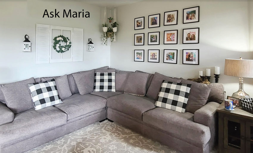
Ready to change your farmhouse look into something fresher? This reader wants help creating a moody living room with more colour. Here are my best decorating tips to help her transition from a bland farmhouse look into something more layered and chic.

‘I really need help with my living room. It’s open to the dining and kitchen. It’s very blah and I don’t know how to make it work. I’m liking more dark, moody looks and can’t figure it out. I’m over the farmhouse look and want to bring color and life to the room.’
Help Me Change My Farmhouse Style Living Room
My dear reader, here’s my decorating advice to help you create a moodier and more colourful living room that fills you with joy.
First, let’s talk about your walls. When you have two walls in a corner that looks like this, both walls visually read as one wall. Therefore, whatever you hang needs to read as one curated space.
Here’s what I mean. In the photo below, the gorgeously rich and varied gallery wall wraps the corner seamlessly and totally makes this room.
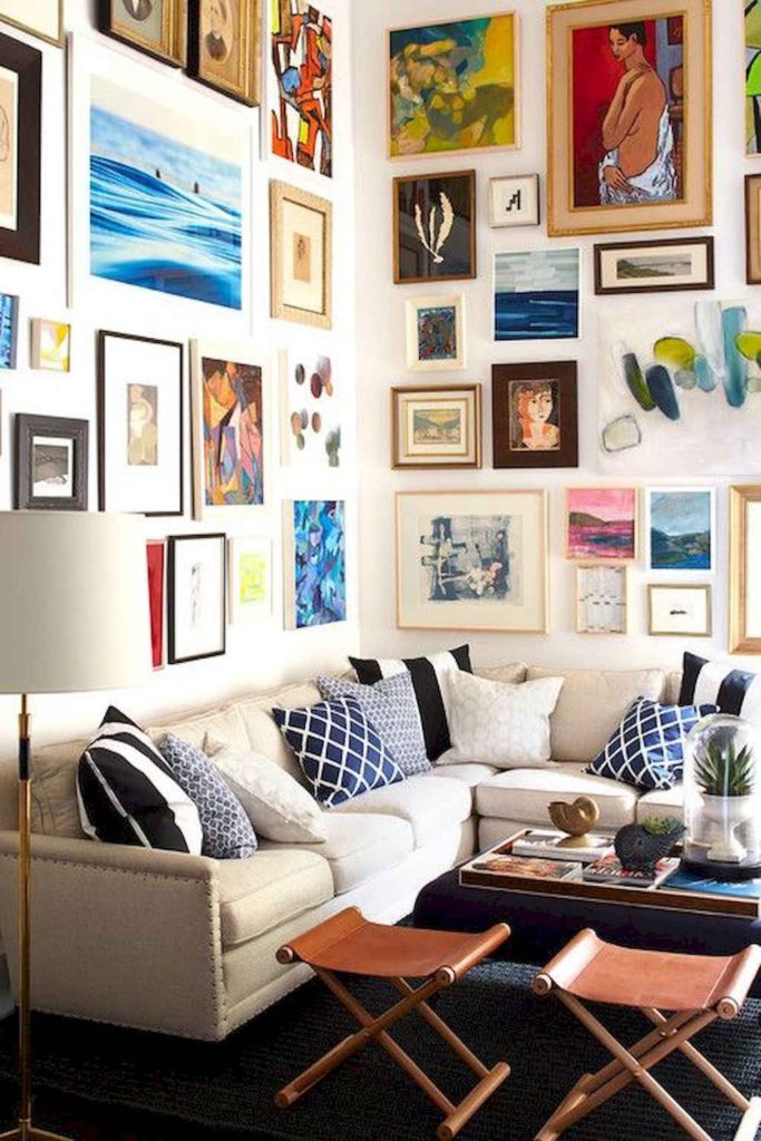
Create a more interesting gallery wall of colour
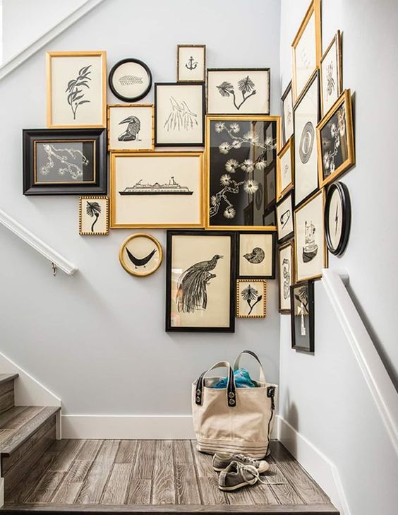
This kind of look takes some collecting, sure. Don’t be afraid to start at flea markets or art print sites like Society6. Or even try framing images torn from old art books. The basic idea is to fill your gallery wall with colour.
Notice too, the softer, warm-toned frames in varied shapes. This creates interest so that you’re not looking at a black grid, which is not very visually dynamic. A well-curated gallery wall is a great solution for more depth if you’re keeping pale, almost white walls.
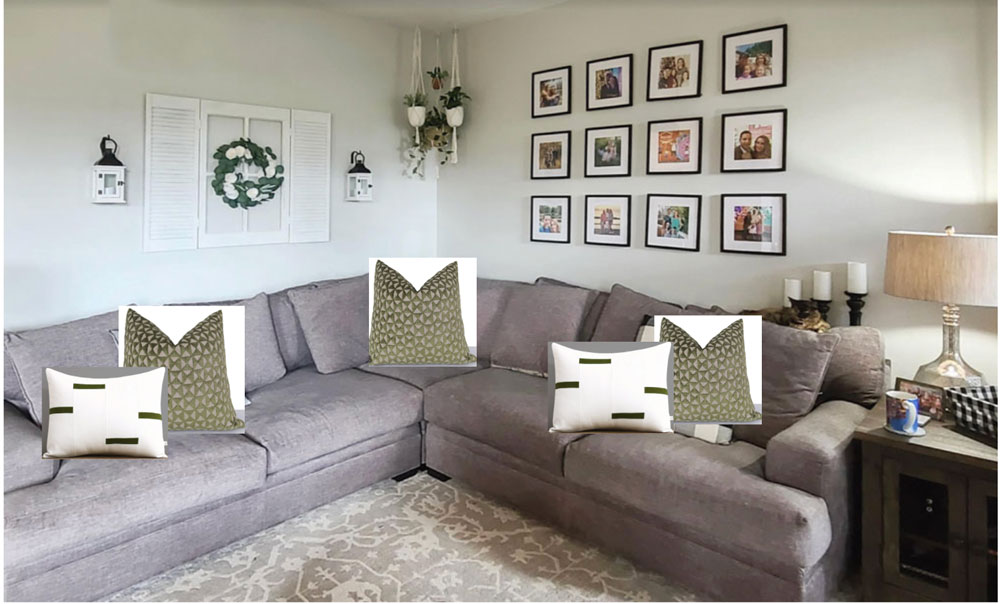
When I look at your room, I don’t see any black. (the picture frames don’t count). This is likely why the black and white buffalo check pillows are not working. And again, the sofa needs MORE – more layering, more interest and more texture.
Read more: A Shocking Way to Get the Art that You Want
Be prepared to let go
But the main thing holding you hostage here is that your sofa is violet grey and the carpet has a green undertone. Unfortunately, once you’ve chosen two unrelated neutrals, there’s often no way to bring them both together in a way that will look amazing.
Below I’ve quickly added some olive pillows to pull in the area rug. It’s not fabulous yet, is it?
BUT – there’s a lesson here we don’t want to miss.
The reason you can SEE that the green pillows work better on this sofa than the black and white ones is because we added them to our ‘mood board’ by literally placing them on top of our sofa in this photo. Using mood boards helps you identify the right colour palette and also make sure that what you order online will end up arriving the colour you are looking for.
Learn how to create mood boards and make sure all the colours come together in my shop online course here.
So, when I say the conflicting undertones are holding you hostage, I really mean it. It looks like a pretty rug, and probably you’re attached to it. And it sounds like you’re not replacing the sofa anytime soon. But one of these things has to go.
You’ve stared at this living room and it isn’t making you happy. And it can be hard to put your finger on what is wrong. Do you know the saying where you can’t see the forest for the trees?
But, once you recognize that these two neutrals don’t relate and that the look you are trying to achieve simply won’t work, it can be very liberating to decide to let something go.
Find colour inspiration
Let’s say that the area rug can be shifted into the bedroom or family room. This allows you to begin your redesign with a bigger element to play with. It also eliminates the conflicting neutrals in the base of your room design.
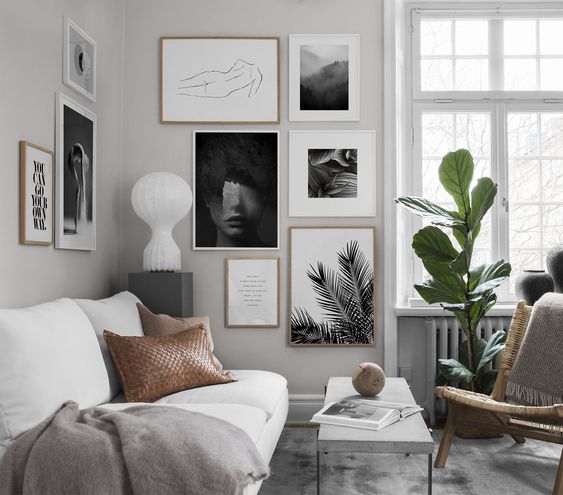
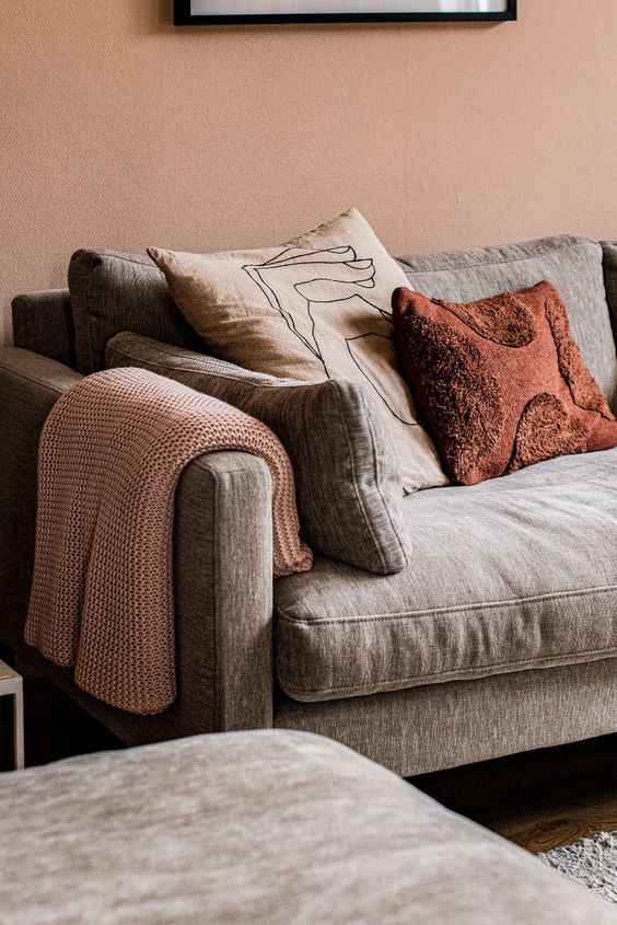
Then, let’s gather some inspiration. Violet greys look lovely with warm on-trend peachy pinks, terracotta, or rust as in this vignette below.
Based on this colour inspiration, we could start with a burnt orange area rug and some matching pillows. And choose some pieces for the gallery wall that also pick up the colour palette, like this below.
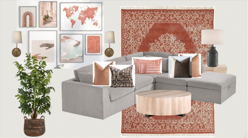
Area Rug | Blush Pillow | Bird Pillow | Lumbar Pillow
Colour-Blocked Pillow | Coffee Table | Lamp | Sconces | Faux Plant
Add more lighting
You probably already know I’m going to mention some lamps. 😉
I love incorporating sconces into gallery walls, especially behind sectionals like this where there’s no other way to install a lamp. They don’t have to be wired in. Plug-in sconces with cord covers work beautifully as well. And don’t forget lamps. Lamps add more atmosphere, which creates MOOD.
Now for that moody look you are wanting… With very light walls, it might be harder to achieve “moody” but you can certainly get a much warmer and layered look.
If you have a room stuck in the farmhouse trend or a bland grey, black or white room, bring your room to life by adding rust, gold, peach, cognac or muted plum.
When you’re done, see if you can add MORE LAYERS and interest by repeating the warm tones in your new colour palette. Then repeat the new palette in the adjoining rooms to help create flow.
Is your home decorated in grey, black and white – a la modern farmhouse – and are you looking for ways to shift into the new warmer trend? I’d love to hear your thoughts!
Ready to become a True Colour Expert? Enroll Now!
Related posts:
My Best Decorating Advice for Your Living Room


I love when you answer questions like this! I would have thought to change out the pillows and wall decor but the mood board with the burnt orange looks fabulous!!
Great post! So many good ideas in here. Calendars are also a great place to find inexpensive, often coordinating, art.
I’m hoping this reader sends an “after” photo — I’d love to see what she does with the room. I had not thought of wrapping a gallery wall. That could be because I don’t have a good place to do that here in a small condo where some of the walls are cement.
Sandy, you can hang art with 3M Velcro hangers. The package will tell you the weight limit. It also makes it easy to rearrange your artwork and no damaged walls!
Calendars! I hadn’t thought of that. SwissAir used to have amazing panorama photos on their calendars and I think I still have one that I kept.
For low cost pictures, get some fabric scraps or even buy some pretty fabric. Then wrap a canvas or just frame it in addition to other pictures with coordinating colors. You can also get greeting cards and frame the front–or even better, if you keep cards that are sent to you, frame the front and inside of one of those! Framed letters are also such a nostalgic idea. I have no trouble thinking of neat things to frame–my problem is not enough wall to put them all up! Another fun thing to hang and add texture is straw hats. Conveniently, they are also typically warm, natural tones. I just framed two puzzles using modge podge. And of course, frame your children’s art.
Since she said the room is open to the kitchen and DR, how can we change up the room w/o seeing it in context? Regardless, I would get rid of that (I assume) fake window, fake shutters, and fake wall lights, along with the fake plants in their macrame holders. Immediate improvement. The pillows match the gallery wall — checks and checks — but IMO both look out of place. I love your color suggestions, provided they work with the surrounding two rooms.
When I write an Ask Maria post, I write it usually based on the email I receive. Yes of course in a consultation, other rooms would be considered, but this answers the general question in a way that helps everyone see why the room was bothering my reader. Thanks for your comment! Maria
Go to your local art center when they have a student show. The prices are very reasonable, you have an original art piece and an artist is encouraged and happy.
Alternatively, keep the rug, paint the walls dark olive (instant moody) and get a new cream and wood sofa (make sure the cream works with the rug pattern TBS). Take everything off the walls and add a line of art that wraps around both walls, get some standing plants, maybe add a plug-in wall sconce like the cool kids do!
This sounds like my vision for my dining room! Just painted it Farrow & Ball bancha and it is a MOOD. Going to keep the rest of your suggestions in mind!
I suppose in cutting up art, especially into 3rds, you could call it a “tyryptych”..depending on the value..It’s yours..do what you want. However, my friend is a patron of young artists in Houston..he’d never do that bec the artists would know!😱
So interesting! I loved seeing the gallery walls ..will forward to my kids, starting from scratch, after Hurricane Harvey!
Fantastic post Maria!
The room doesn’t even look farmhouse. Just a little uncoordinated, uninspired and bland. I feel like the owner might have tried for a look. But, Maria’s ideas are great.
Your gift for using color is in full display in this post, Maria! What a difference your suggestions make, as the photographs show. I really enjoyed the transformation you suggested.
I agree about picture frames. Often they are too dark and become the focal point rather than the painting/photo/print inside.
ETSY is a fabulous source for prints, photography, and even paintings. Lots of original stuff.
The prints can be particularly inexpensive because they can be downloaded and printed at home or at a printer, and then framed.
First, so courageous of the the homeowner to share her space!
Not only were your responses very informative and impressive, but your ability to convey a very positive response is absolutely amazing! (Not sure if that’s included in your courses but definitely is a necessity if one wants to be successful in this industry!)
You’re the best!
Thank you Maria
Why can’t she mix what she has, using lots of dark olive and then bringing in a couple of dark purple throws and some deep purple art?
She totally could! Maria
Your mood board is fabulous, Maria! Oh, how I love these posts where your lovely readers share a situation, and you create possible solutions. And you take us along, explaining everything so well. Thank you, Maria, and thank you to your reader who shared with us! Like others, I hope she will share an “after” photo with us.
My comment may not relate at all but here goes. I hate anything gray! I went shopping for a rug at some stores plus on line and gray is in everything! I want nothing to do with gray. So what I suggest is get a different sofa to begin with, like a cognac leather sofa. They are timeless! Or even a white sofa. And changing up the gallery wall is a very good idea like Maria suggested incorporating colors from the rug and then using pillows and a throw to soften things up. I love the one photo showing the terracotta pillow. That gray is more of a taupe color so I would like that color. Love always to see how Maria would solve problems with decorating.
I love these types of posts – seeing a real life space and getting ideas for how to achieve a certain look. It’s a wonderful example.
I love this tip about the corner acting as one wall. I haven’t heard that articulated and what a revelation! To me the main problem is that her space looks indecisive. Which makes me think she miiiiight be able to make this green and violet thing work if she overwhelmed the space with some stronger color choices that included kelly green and lavender (maybe even some straight up royal purple, real red, and lime) and avoided the more muted olives and eggplants. Same with the black and white elements – like, bring in fat black and white stripes rather than the buffalo check. Also moody is a bigger scale, whereas farmhouse is cuter, smaller scale.(Not sure that’s right, but that is my sense). So instead of the small vases of flowers and small planters, a large round coffee table with an oversized centerpiece of greenery or flowers.
Maria I have a question regarding art. Can you mix frameless canvas art with framed pictures or do you need to stay with a theme with either all framed or all frameless throughout a home?