


Here it is! Another exciting episode of “Colour Rescue”! I’m filled with joy that I had the privilege of helping our very own Customer Service Manager, Marla, to transform her space with decorating and styling magic!
There’s something truly magical about transforming a space, and I firmly believe that you don’t need to break the bank to make it happen.
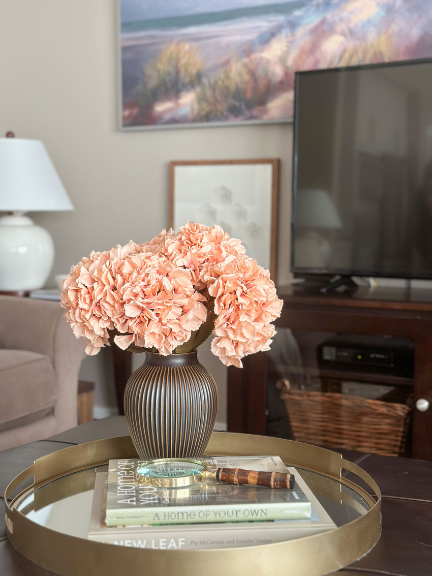
Sneak peek!
See my styling process step-by-step
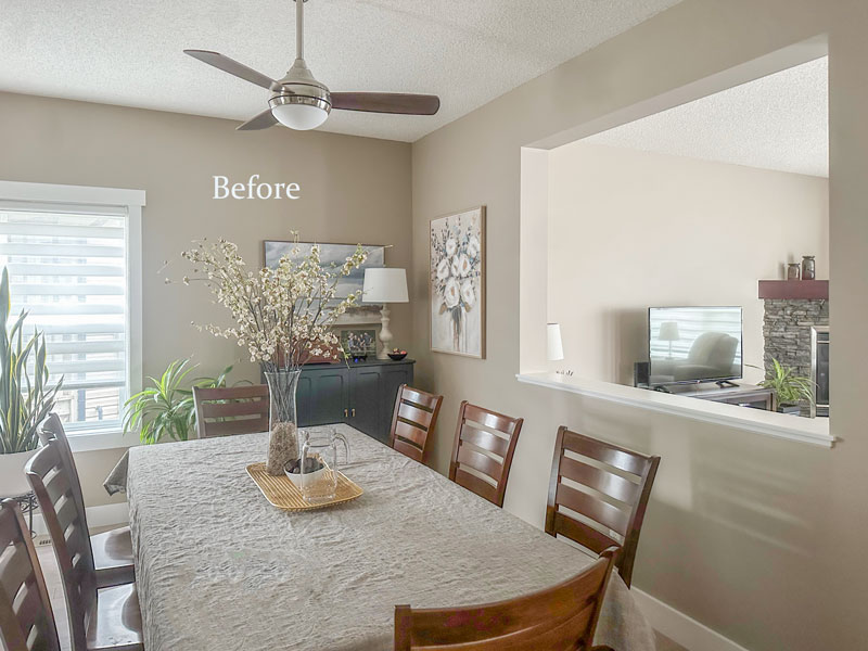
This week’s Colour Rescue demonstrates the different stages of styling a decorating a living room – working with the existing furniture.
- First you’ll see the new area rug.
- Then the throw pillows.
- Then the artwork.
- Then finally the accessories.
Because once you add styling, it’s like waving a fairy wand of decorating magic in your room!
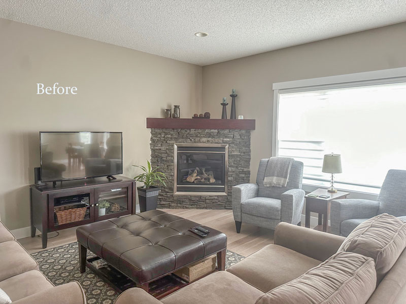
Distract and Decorate
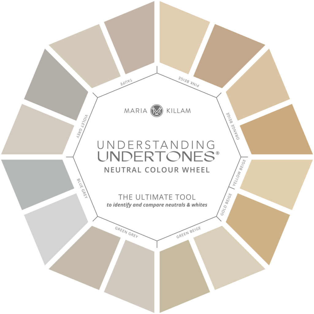
Marla’s sofas are taupe but a pinker taupe than the one you normally see everywhere including my colour wheel, even though they look quite pink beige here.
The reason they look pink-er here is because the walls are not as pink as the sofas.
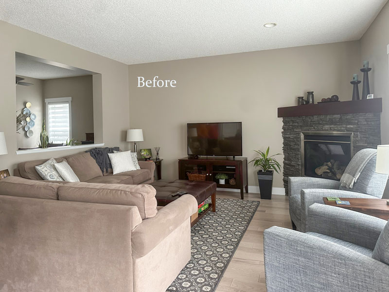
However, we fixed that with the rug and the artwork. This weeks makeover cost $2088. So for less than the cost of a new sofa and love seat that wouldn’t have given us half as much joy, we instead have a room we don’t want to leave!
Styling: decorating a room step-by-step
Marla was thrilled! She said before we arrived that she had been in a conversation with her husband about replacing the sofas. But now because the room is styled, we’ve extended the life of the sofas by probably another five years!
The lack of styling in most homes cause a lot of unnecessary painting, replacing and renovating in my opinion.
Tricia and I made an amazing team last week just like we do helping clients all around the country with their renovations, new builds, bathrooms and kitchens!
#distractanddecorate is our motto, as you’ll see with this weeks colour rescue!
And be sure to watch the designer Q&A at the end. Comment below if you had similar questions as Marla!
How to add colour to your neutral room
You’ll notice that we were able to add colour by pushing the blue grey of her chairs into a happier, brighter blue with the art and throw pillows we chose. Another interesting thing you’ll notice is that the room feels a lot more sophisticated with the new colour palette and decor.
And adding colour doesn’t mean it suddenly has to be bright RED! I think that’s where people get confused when they think about adding colour. It simply has to be balanced.
There are 3 more Colour Rescue makeovers coming up!
Last week I was in Edmonton where Marla lives. She manages our customer service department. When I was in Calgary doing the last makeover she messaged me and said “Hey I’m only 3 hours away, come to my house!”
So a few weeks later when I was here, Tricia Firmaniuk (my Director of eDesign who also lives in Edmonton) joined me for what ended up being three makeovers last week!
If you would like to apply for a Colour Rescue one day makeover click here.
Related posts:
Transform your Home with One Trip to the Store

Love this!
This is the sort of thing that is SO exciting and freeing for ‘normal’ people. I very much appreciate that you understand that we cannot start from the ground up on every room. THANK you for showing us how to make a room look finished and beautiful while still working within our means… with design that has major longevity.
Love this episode. So well done. I love how all of your content makes decorating accessible to non-designers. And Maria, you look fabulous in coral!
Gathering Traditional and Abstract art for a gallery display is such an innovative idea!!! I like the idea, too, of not thinking too much about the art. Can you give some additional advice on how to select pieces? My home has gray furnishings and natural choice wall paint.
AMAZING!!!! I love these real life, save money, use what you have make overs!!!!!! You give joy and save the environment 😀. Thank you Maria🥰
This was so fun to watch!! That living room hey! Beautiful, cozy and so pretty. The dining room was also elevated. Loved watching how it all was done – step by step. Marla must be thrilled. So inspiring.
Maria, I really enjoyed your color rescue of Linda’s living room and dining room. You definitely worked some magic there. I hope to see more of these – so informative and fun to watch. Well done.
Amazing! Anyone old enough to remember when shows like Design on a Dime ruled HGTV? Before sledge hammers and 6 or 7 figure renovations took over? This is what people need! Because even if she had painted and replaced her furniture, she still wouldn’t love it because it wouldn’t be decorated with a “look and feel” that brings happiness.
I love how adding the the right colours, and repeating colours makes such an immediate difference!
I think the gallery wall would look much better if the large abstract were lower – maybe bring the top of it in line with the top of the art on the mantel to start with and see how it looks. The round mirror can be left where it is because that side looks good but the abstract is unbalanced imo.
or maybe the bottom edge of the abstract in line with the top edge of the framed white print on the left