


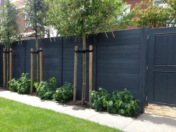
Fence colour is so important to your home’s overall curb appeal. Did you know that fence colour should relate to the exterior colours on your house? Here’s how to choose the right fence colour by looking at lighter and darker options rather than trying to match.
Gretec Landscape
I am currently creating module 15 for my Exterior Masterclass all about What Would Maria do with THIS Fence, Porch, Patio or Deck. Because it makes no sense to get the exterior of your house just perfect and then just put up a random orange stained fence that doesn’t relate. Or a deck or porch that in no way relates to the house colours.
Here is a great example.
Add Instant Curb Appeal with the Right Fence Colour
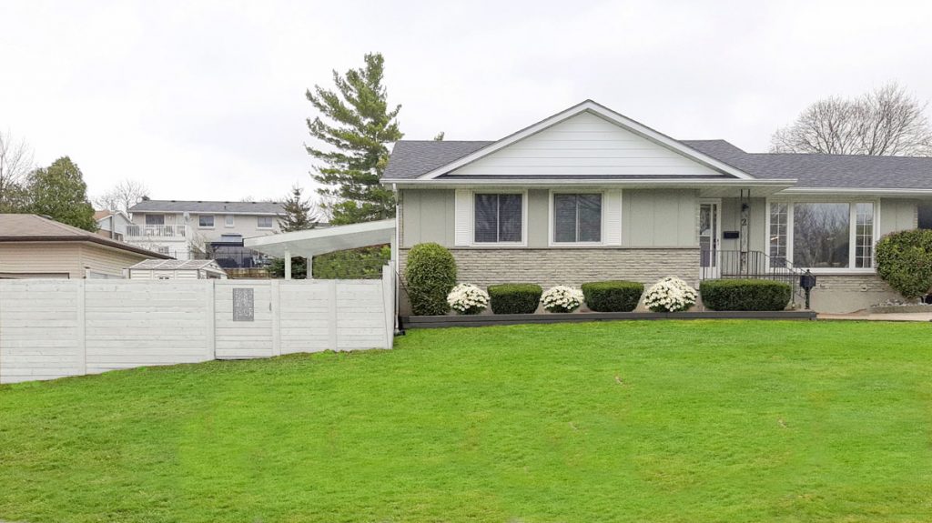
My lovely follower Stella wants to refresh her fence with a stain to make it relate better to her house. Right now, it is a faded warm wood tone. It’s not as bright orange as some examples I have seen, but it doesn’t connect at all to her house.
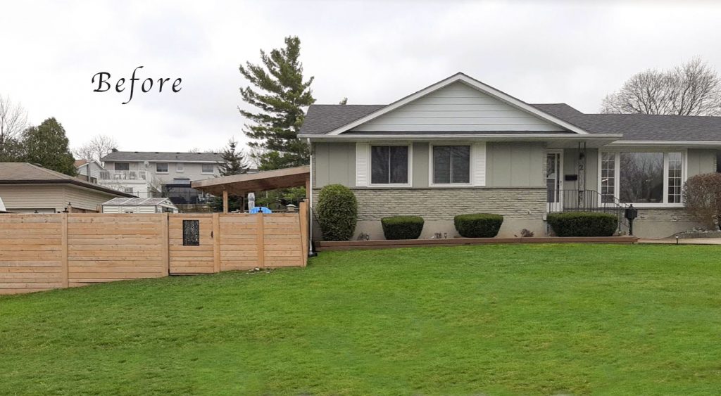
She’s wondering if the colour of weathered wood and stone, a green grey like Fawn Brindle, would work best but she’s not sure.
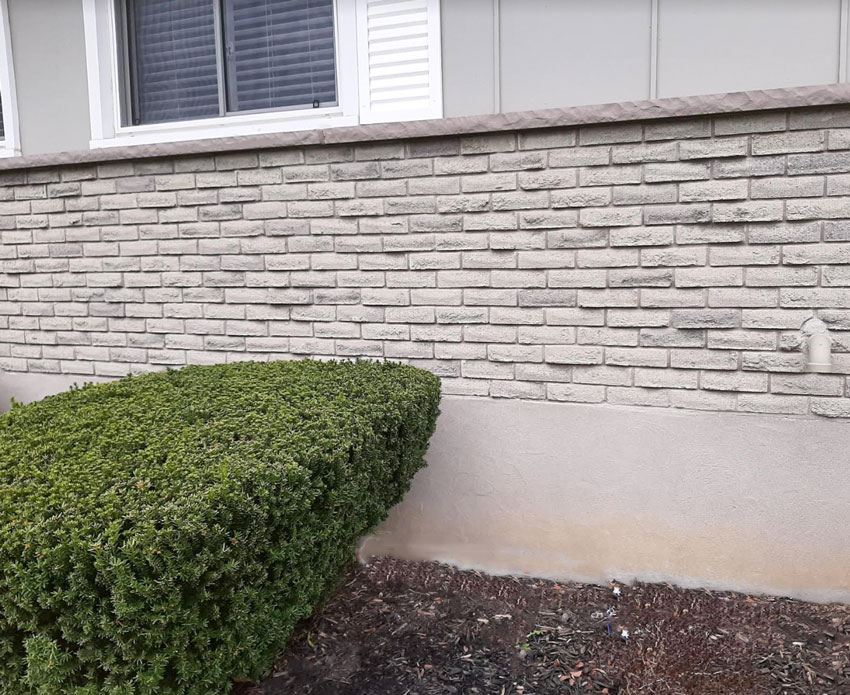
Well the ONLY way to know is by painting up a large test board. In my curated collection of large painted samples, you can find Fawn Brindle in my SW Foundation Collection here.
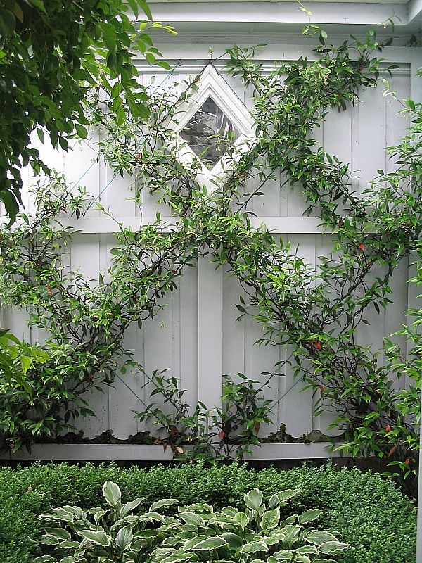
She could also leave it alone and let it weather naturally (here’s mine, below), and it would end up very close to the same colour.
There is no shortcut for proper paint colour testing when choosing colour for your exterior. Even it it’s just a fence. Look at how MUCH fence she has in the above photos. It’s such a bit mistake not to give it due consideration.
A large painted test board of the colour needs to be compared directly to the stone to see if it will relate well, like this testing example (below).
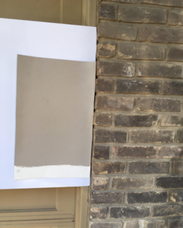
ALWAYS properly test your colours using a large painted sample with white behind it. It’s the ONLY way to see if the colour is right. Notice the above sample is also BESIDE the brick, not plunked directly on top of it.
Here is her house below again. Can we guess here if Fawn Brindle is the right answer for her fence? No, not without proper colour testing.

Sherwin-Williams 7640 Fawn Brindle
However, there is another important angle here. You can see that her siding is painted a similarly mid-toned grey with a green undertone that looks like it leans more towards a French Gray (a green gray that is a bit cooler and more blue. SW 7016 Mindful Gray is a good example).

Sherwin-Williams 7016 Mindful Gray
The stone appears to have a range of green greys and violet greys. But, the foundation is especially violet. So, we have quite a lot going on within a very tight tonal range. And, it’s when colours are tonally similar that they really need to relate perfectly so they don’t look off.
Unless we are repeating her exact siding colour on the fence, adding yet another, slightly different, mid toned warm green grey here would be a mistake.
The foundation paint actually looks more violet than the siding. To eliminate some conflict here, I would paint the foundation the same colour as the siding.
And there is another reason Fawn Brindle would not be my first choice. It would lack CONTRAST. Everything will blend and that will create a DRAB look. And that’s not what we’re after, is it?
>> Trying to find the right exterior colour to match stone on your house? Read this post.
So what would I suggest then?
There are two good options, as I see it.
Fence Colour Lighter Option 1: Paint the Fence White to Match the Trim
Painting a fence white can create connection with a house with white trim and creates a fresh, cottage look in the yard and garden. Here is what her fence would look like painted white to match the trim.
Much better right? I love the decorative white fence that encloses my vegetable garden in the backyard. It looks fresh with greenery and lots of white flowers. We added some clumps of daisies here since it’s early in the season and her plants haven’t filled in yet.
The timbers retaining the foundation planting looked too distracting in white so we made photoshopped them the dark grey from option two to help them settle down.
Fence Colour Darker Option 2: A Dark Grey Fence for Contrast
My white fence is vinyl, so I won’t have to upkeep a white stain. And I can understand that for that reason, white may not be the top choice. So there is also the option of creating contrast by going dark. In this case, a warm dark grey ties in with the roof colour.
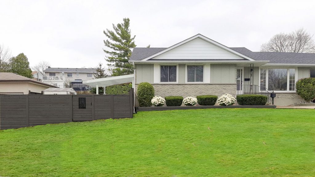
Fence stained Sherwin-Williams 7048 Urbane Bronze
I like this look too. It offsets the green in the landscape beautifully and makes the house look fresh. Contrast creates a sense of lightness.
You’ll notice that we also made the pergola or shade structure in the backyard white to match the trim in both options. I think Urbane Bronze would get a bit heavy overhead. And really, that structure looks more like an extension of the house.
Stella, you will need to test Sherwin-Williams Urbane Bronze if you want to try it. Paint up a large test board and look at it with your house. Pay attention to how it looks with your roof. And if you want to try option one, for a white look for one that matches your trim colour as closely as possible, again you’ll need to compare a test board to samples to your trim.
Don’t forget to coordinate landscaping with your fence colour.
The next step is to integrate your fence with your landscaping by adding plantings to soften it. Hiring a good garden designer is the best money you will ever spend on your exterior. MaryAnne White is my go-to landscape designer because her aesthetic matches mine.
Did you notice that I added some daisies to the fence colour pics – little landscaping details make such a difference overall.
Someone who has been doing design for over 30 years KNOWS what works and what doesn’t. That’s the person who will save you money everywhere! She can design your garden online via eDesign. It’s how she did mine!
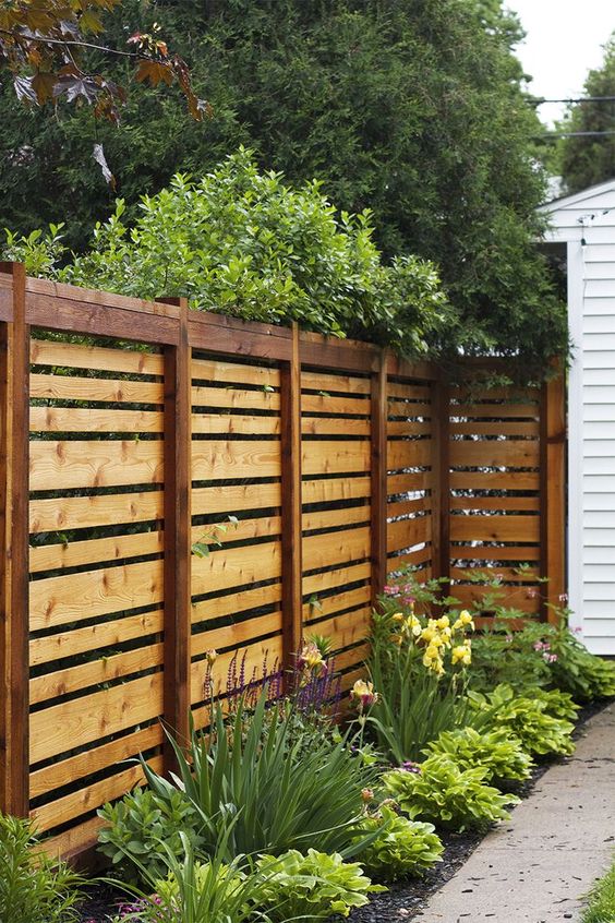
Image above and below from renoguide
In the end, we ended up with three colour options, the same colour and options for both lighter or darker.
Which one would you choose?
If you have any questions about fence and patio colours that you would like to see featured on the next module, please take some photos of your house and yard, tidied up and in even light to be considered.
Here’s one that will appear in the upcoming module below for example:
Stay tuned for the new module to see what I’m suggesting for this house. Hint: it will NOT be grey.
Another reader wants to paint her porch, she knows the reddish brown isn’t right:
These are the real-life examples I’ll be covering in the 15th Module of my Exterior Masterclass; What Would Maria Do with THIS Patio/Porch/Fence/Deck. If you want to learn how to choose the right colours for your clients or for your own home, you can purchase the online class here.
If you have a dilemma like this, please clean up the area (you’ll have a higher chance of being considered) and send photos to my Ask Maria email here.
And if you need help choosing exterior colours this Spring, see my Exterior eDesign packages here.
Related Posts
The Best Kept Secret to Dramatically Improving your Curb Appeal

So love the photoshopped choices. Nothing better then a visual. I would paint the fence and backyard overhang white to match the siding and add plants.
Darker. It will be far less maintenance than white, especially on raw wood. The wood underneath that darker paint will eventually darken itself, lending a nice longevity to the darker paint color, even as it fades and wears. A white painted wood fence looks good for about a year. The only low-maintenance white fence is a vinyl white fence. They are lovely with green espalier vines, like in the first photo. If that’s a white painted wood fence in the first photo, it’s beautiful but it will be very high maintenance. The vines will make the wood look grungy in very little time, then you have to tear down the vines to paint again. That beautiful green espalier will need a haircut more frequently than my husband! It’s absolutely lovely, but no thank you. I would never paint a raw wood fence white. Sprinkler over-spray, backsplash from rainstorms, expanding and shrinking wood cracks will will make a white painted wood fence look unintentionally low-end in no time. White painted PICKET fences are different. I’m not talking about those. Just Google “estate home with white fence” and you’ll see exactly what I’m talking about. You’ll never see an estate home with anything but a white vinyl or white picket fence. I know a lot about fences. We just replaced 500+ feet of 30 year old perimeter fence on our half-acre lot. Yes, we did all of it ourselves. It’s taken about six months. It currently looks very similar to the good reader’s photo, except our boards run vertical. All of it new board-on-board cedar, left natural to age into a nice driftwood grey. If I want to speed up the greying process, I’m going to use a medium grey stain (not paint) diluted half-strength with a power sprayer and a good face mask.
Love these posts! We can focus on one element as it relates to the space – in this case the exterior – and see the options and why they may or may not work. Frankly, I really like the weathered option the best. I realize that choice takes patience, but it would eventually be a subtle, natural look.
These are great posts, Maria. I think we all like seeing before and after pix. We can see the before picture is not working and try to imagine what would look better and then when we see what you have suggested it’s like Magic has happened.
Just love these posts.
I vote for the darker option. Urbane Bronze relates to the shingle color nicely and creates a nice sense of balance. Urbane Bronze also relates to the siding color well, which also has a green undertone.
Good luck, Stella! Beautiful home, by the way!
Adore the look of the white, but agree with other comments that the maintenance would be prohibitive.
I’ll submit another vote for Urbane Bronze, which appears to tie in nicely and would be a lovely backdrop for landscaping.
Thank you, Maria, for these interesting and informative posts!
I think Urbane Bronze is the answer, only because the fence is a more contemporary looking horizontal board design. If the fence design had been a more cottage-type look, white might have been the answer. In addition to relating to the roof, Urbane Bronze also relates to the handrail and the mailbox at the entry.
However, even if the contemporary looking fence was painted/stained white, landscaping could soften it up and make it look right.
But my answer is still Urbane Bronze, with some landscaping to relieve it 🙂
For our new cypress fence, an oil based “white wash” was recommended. The mill said a white wash would be a one and done and not need yearly painting in our hot southern sun. We made the formula with the house paint (SW Tony Taupe) instead of white and did the posts showing in accent color (SW Black Fox). It is soft and stunning and blends and pops at the same time. This might be an option here. but if no contrast wanted, the white wash is still an option.
I love your website and color wisdom! I have noticed, like with the fence options above, the same/light/dark seems to also be a matter of perspective? Do you want to highlight the fence (which I feel the light color does) or minimize the fence (same color or dark could do)? I know I have chosen colors to highlight, minimize, and sometimes neutralize a given area depending on what my goal or needs were.
That’s a good way to look at it too Lisa! I’m so visual and I know immediately what works and what doesn’t so it doesn’t occur to me to teach that way. Thanks for adding this comment, it helps everyone! Maria
I like option 2. The contrast is attractive, and the darker color makes the large fence seem less prominent. Another advantage is that as the fence weathers, the grayish tone that emerges on the natural wood will not look striking against the fading paint: this is a perfect option if Stella doesn’t mind a more naturalistic look.
What would transform the fence is, as you say, landscaping. A varied border including even two or three small trees or large bushes would distract from the height and long lines of the fence. Doing this would work especially well with the dark color because Stella wouldn’t have to have the fence repainted regularly, as she would with a white fence. Painting fences does a lot of damage to a beautiful border.
I vote for the white fence! I am quite tired of the grey phenomenon. Give it a good pre-coat of protection and it should last for quite some time. As always I enjoy the advise and knowledge presented in your blogs Maria.
The shutters are non functional unnecessary ornamentation.
I debated whether to say take them off but in the end, I like the additional white it adds to the house so that’s why I didn’t give that advice! However, I agree, they certainly don’t look like they could close which is how they should look so they could go, especially if the fence goes darker, then you won’t visually be looking for more white on the house.
What a timely post. I stained my new cedar fence with Ready Seal semi-transparent ‘Natural – Live Oak’ yesterday. The fence itself looks great – the cedar with that stain made for a really pretty outcome. The sad news is that the fence now seems like a vibrant jewel-tone flanking a blah and washed-out orange-brick house. ‘Test a small area’ they said … whoops. It was hard to image I could go wrong with a basic stain, but I’m learning there is no end to the havoc non-designers can create.
Hi Mindi, thanks for posting this comment, even though that’s not fun for you–it helps everyone! I love my readers 🙂 Maria
My answer is, it depends….on the answer to the landscaping question. If they are going to add landscaping to the front of the fence I would go with the dark fence, if they are not interested in adding a nice big border in front of the fence I would go with the white fence. I think the dark fence is too heavy by itself. I might even go with the same color fence if there isn’t any additional landscaping added. I think the white on the house will bring the eye to the house instead of the fence being the first thing you see. But the real answer is that ANY of the colors with be much better than the existing color.
Thanks Maria..these ‘before and afters’ are both interesting and informative!!
Maria, where can I find the large concrete planter that is in front of your home’s window? I live in US. Thank you
Hi Susan, I bought it from a local company called Fraser Valley Cement Gardens. I seem to remember that it was Less than $500 including delivery. It definitely wasn’t more than that. Hope that helps, Maria
Hi Maria,
You always say medium brown stained wood floors are like jeans.. It’s classic and looks good with anything. So I guess this principle doesn’t apply to fencing colors then?
No it does not. A fence is vertical and depending on how visual it is beside your house, should, in most cases, relate to your house. Maria
On the sample where the reader wants to “paint her porch, she knows the reddish brown isn’t right”, I’m not clear on why the current one isn’t right. Seems like it matches the brick perfectly. I’d make no change in this situation, especially as it appears to fit in her wooded setting.
It’s too red. But it’s not terrible! Maria
[…] Customizable privacy fencing options to boost curb appeal […]
Beautiful results. Do you provide fence paint color suggestions and window frame suggestions without it the exterior paint consult package?
Have already painted the exterior sw creamy and door sw meditative and iron gates Benjamin Moore wrought iron.