I’ve updated my collection of paint colours to include new, on-trend colours. If you haven’t purchased my large painted colour boards before, now is a great time to get started. Plus, I’m sharing my best tips for testing paint colours with large colour boards.
The last time I updated my VIP collection, I switched out 30 colours. Because our supplier could barely keep up with our regular orders from the site, I wasn’t able to offer everyone who already had the boards an opportunity to buy the update. At the time, we were only able to offer the first updated boards to True Colour Experts.
But let’s go back one step for just a second.
Which collection of colour boards do I need?
If you don’t have any of my large painted colour boards and you’re thinking, “Maybe it’s time to branch out from specifying one white over and over again,” or you’re working on a renovation or new build and you’re completely overwhelmed by the whites and neutrals.
AND, you already know from following me that a stark, art gallery white isn’t going to work.
Then, you need to START with my Benjamin Moore Core Collection or Sherwin Williams Foundation Collection. Both of these are colours are from my newly renamed Killam Colour System.
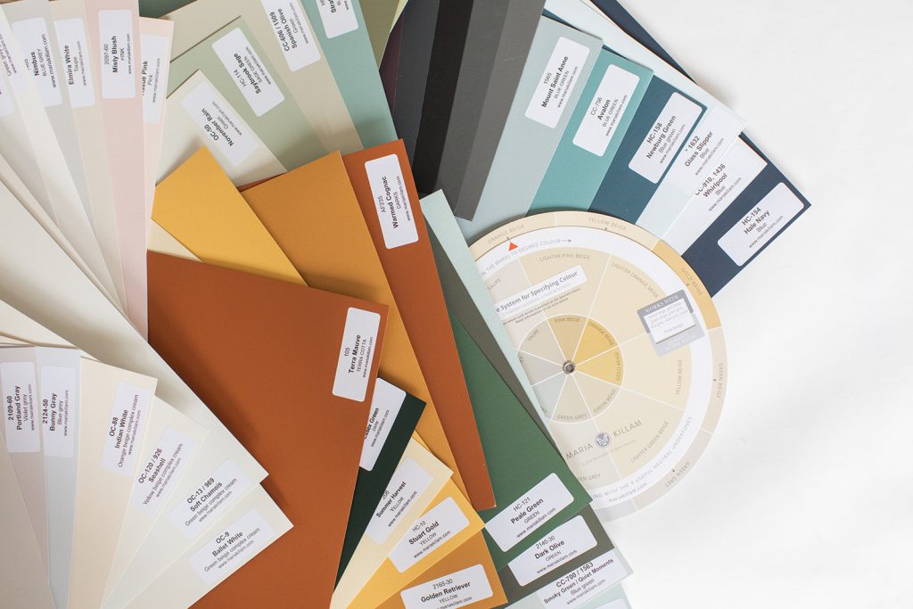
![]()
Because these colours are the best neutrals and whites out there, they are also classic colours that don’t need to change.
What’s different about the VIP Collection?
The VIP Collection of large painted colour boards include trendier colours.
Colour is always more timeless than the trendy neutrals of the moment, but even colours have their moment in the spotlight.
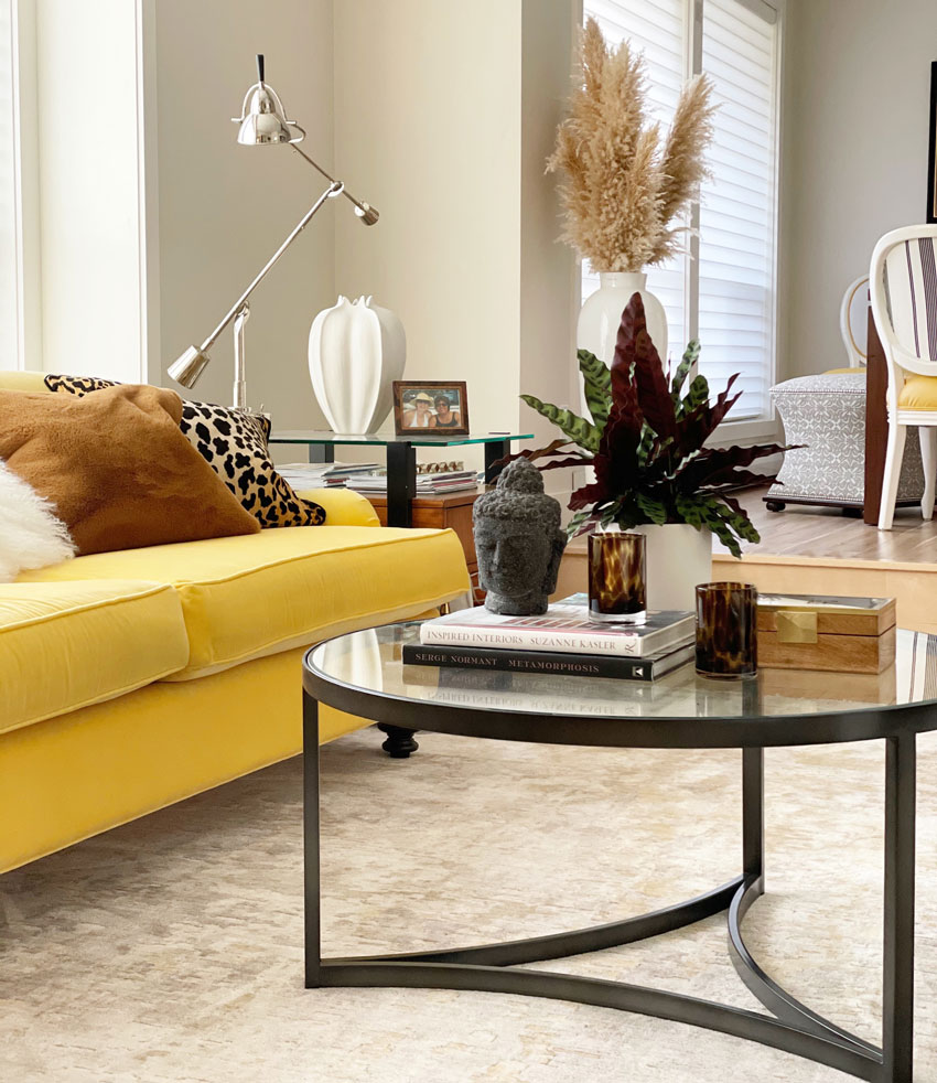
I’ve had my yellow sofa (below) for 12 years and it’s only now become trendy because yellow is officially back on-trend.
Yellow hasn’t been on trend since the 90s when entire homes were painted yellow like it was a neutral.
However, you still wouldn’t know when I installed my yellow sofa, because it’s a COLOUR not a TRENDY NEUTRAL, and that’s the point of my point.
Read more: Ask Maria: What is the Most Timeless Colour?
This room is getting a makeover, this is the in-between look
Green kitchens are also trending, therefore, you’ll notice I’ve included a fabulous new selection of greens.
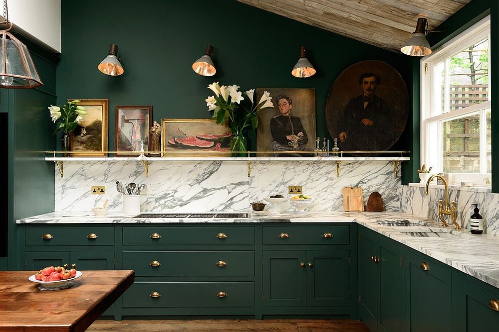
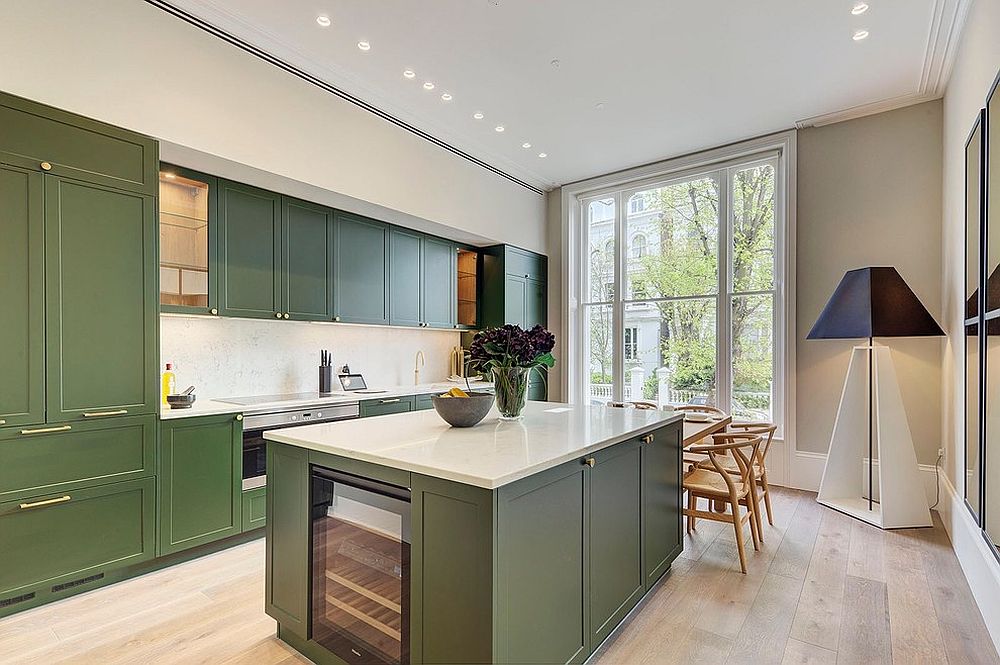 Image via Decorist
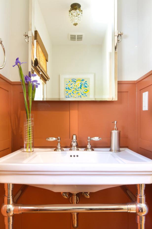
Adding earth tones to warm up stark white walls is also trending. Rust is back, but this time it’s being paired with white (below):
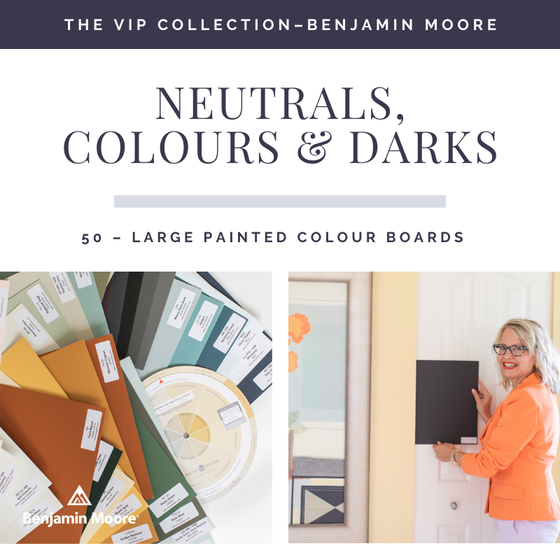
The large paint boards are so great because they are thick enough to prop up on furniture, mantels, or behind stone fireplaces (and light enough to carry around). I PROMISE: you’ll use them over and over again. And, if you take care of them, they’ll last for years!
Each collection comes with 50 large colour boards, painted on a heavy poster board.
Here are my BEST TIPS on how to use my large painted colour boards:
- Turn a few around so that you are ALWAYS creating a white backdrop behind the new paint colour you’re looking at.
- This way you won’t be visually comparing the new colour to the old colour.
- Move it all around your room to make sure it looks correct.
- If you are matching a rug, for example, prop the new colour up on top of the mantel and stand back.
- Always position the paint colour WHERE it will be when it’s painted.
Watch me use the colour boards in action here!
Don’t skip this step when testing paint colours!
Designers will often create a flat lay to present their colours. While this looks pretty, don’t rely ONLY on the flat lay to ensure that the colours you have chosen are correct. You need to see the colour in the orientation it will be painted.
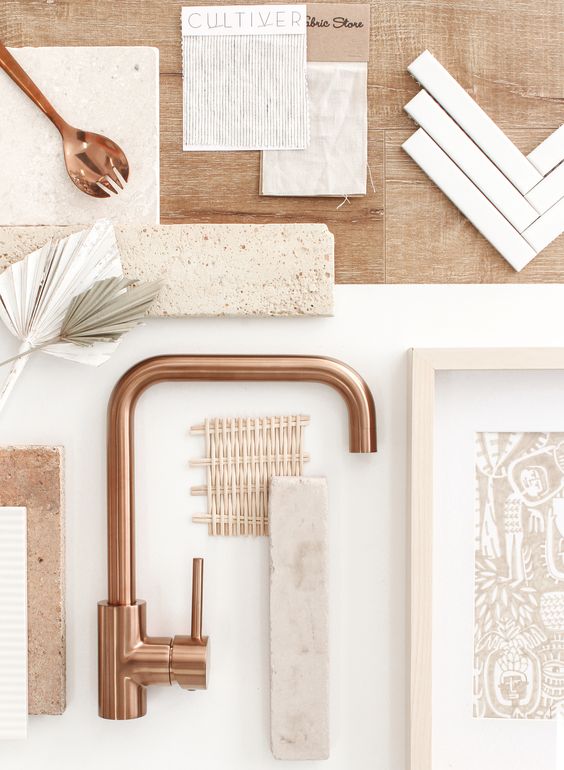
Don’t rely on a flat lay when testing colours
My advice is the same for hard finishes (below). Place white paper behind everything, AND display your samples in the same position that they’ll be when they are installed.
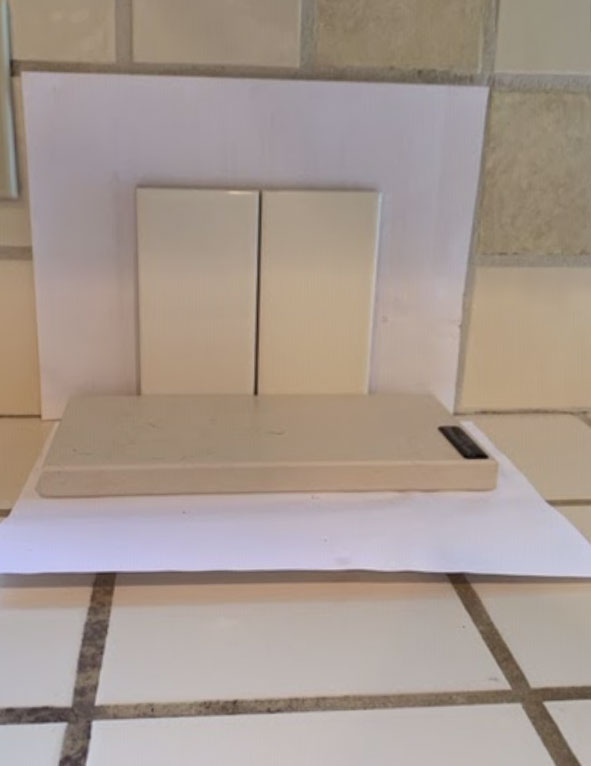
How to test backsplash and countertop colours
New On-Trend Paint Colours in my VIP Collection
If you previously purchased my VIP Collection, please note, we sent out emails a few weeks ago to everyone who had purchased the boards before February 2021 to give you an opportunity to purchase the 20 new colours separately. If you didn’t receive the email, check your promotions or junk folder and/or email [email protected] to receive a link to purchase the update. The first shipment sold out immediately and the next order will be ready at the end of May.
The supplement of 20 new boards is ONLY available to those who already have the original set.
Here’s a list of the new colours included in this supplementary collection:
Halo OC-46
Nimbus 1465
Misty Blush 2097-60
Terra Mauve 105
Summer Harvest CC-190, 206
Stuart Gold HC-10
Golden Retriever 2165-30
Saybrook Sage HC-114
Tate Olive HC-112
Caldwell Green HC-124
Peale Green HC-121
Dark Olive 2140-30
Essex Green HC-188
Mount Saint Anne 1565
Stratton Blue HC-142
Avalon CC-756
Vintage Wine 2116-20
Warmed Cognac AF-235
Dragon’s Breath 1547
If you don’t have the VIP Collection, you’ll find the complete list of colours that are in all three collections can be found in my bonus book of colours in either my How to Choose Paint Colours; It’s all in the Undertones or White is Complicated; a Decorators Guide to Choosing the Right White.
Get the new collection here.
All boards come with my current Understanding Undertones Colour Wheel. The new wheel was delayed by COVID, we hope to see them this summer.
Please note, my boards ONLY go on sale on Black Friday every year. We sell them at the best price we can, there are people out there copying me and their boards are a lot more.
If you want to try to make your own, I show you how here… NOTE: the cost of each sample in my collection works out to approximately $6.00 each. To paint your own costs $12.00 each. A paint tester sample costs $9.99 or more, never mind the time and cost of poster boards, rollers etc. to make up your own. It took me 2 hours to paint 8 samples.
Related posts:
Are you a Victim of your Client’s Design Ideas?
Never Pick a Neutral without Large Colour Boards; Psssst: They Do it For You!
Overheard: I Don’t Have Any Go-to Colours (For Designers Only)


Wonderful photos and article. Love my color boards and got the new collection. Cant wait for delivery.
How did you decide on a rug? I get confused when looking at all the online options🤷🏻♀️ The rug you selected is so pretty and I love the timeless look that you still have, just refreshed.
Yes I have written a course no how to show online, it will be launching on the site shortly! Maria
Maria, I ordered the supplemental color boards for the Benjamin Moore VIP Collection immediately and I’m really looking forward to receiving them. But I am confused. In this wonderfully illustrated post, you say that Whirlpool Blue is an added color. It’s not on the list of additional colors posted above, however, and it looks like a very useful color to have. What am I missing?
Hi Kay you’re right, that was a mistake. It got mixed up with the boards I was curing in my office but it was one I had in the collection already. Sorry about that. If you don’t have it in your current collection, I would paint up a sample to add to your set! Maria
I really like the first green kitchen. I have the cognac colour in my African room but on one wall only and the remainder and the decor is light. As much as I love colour, I can not see myself ever going back to the dark paint colours of yesteryears, particularly living on the drab gray of the Wetcoast in winter. I yearn for light at that time of year. Those darker colours would look fabulous in rooms with a lot of natural light.
BM Halo is OC-46 (not OC-42 as listed above). Minor error but we know how precise you like to be!