Interior Design by Maria Killam
The world of colour specifying seems to fall in to two camps. Designers who specify their exact same go-to colour for every single project and designers who take pride in NEVER doing so.
The other day I was having a conversation with a designer friend about choosing colours for a project she was working on.
She had bought my both my ebooks and read the White is Complicated one first. She sent me a note
“OMG you’re brilliant, I already knew that, but seriously. These paint books are fabulous. Read the white one, delving into colours next.”
Then we had a little back and forth exchange about her project. She was working on choosing finishes and fabrics to freshen up a house with dated Tuscan elements.
We spend a lot of time helping clients with the transition from the Tuscan trend to something more current in our eDesign department.
Anyway, since she was going back and forth about which neutral to choose for her clients home, I asked her to tell me which were the last three neutrals she had specified for other clients.
She replied “I don’t have go-to colours”.
That statement is the reason for this post.
On Facebook threads for designers only, I have seen many designers who often state that they never specify the same colour twice.
So first, there’s nothing wrong with that, if that works for you, that’s great. But let me tell you why you might be working too hard to be ‘original’.
To be clear, this conversation is about NEUTRALS, not COLOURS.
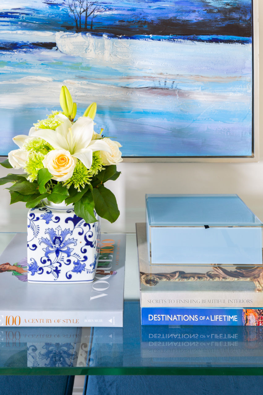
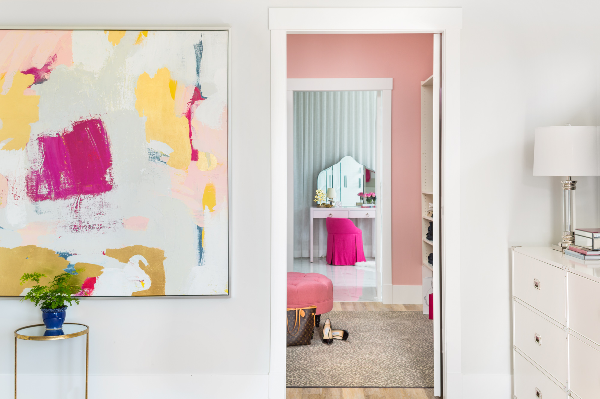
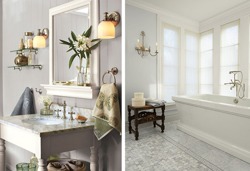
You would choose a colour for your house or for a client generally if you are considering a dining room, powder room, bedroom or even a closet, for example (below).
Related post: Tour my House, Learn the 6 Best Ways to Transition Colour
Interior Design by Maria Killam
Or you might be someone who prefers COLOURS over NEUTRALS for every room in your home. And if that was the case, I would be the first to help you choose them.
However, most people choose some kind of neutral for the main areas of their home.
Let me explain:
If you look at my Understanding Undertones colour wheel below, you’ll see that there are 9 important neutrals undertones in the world:
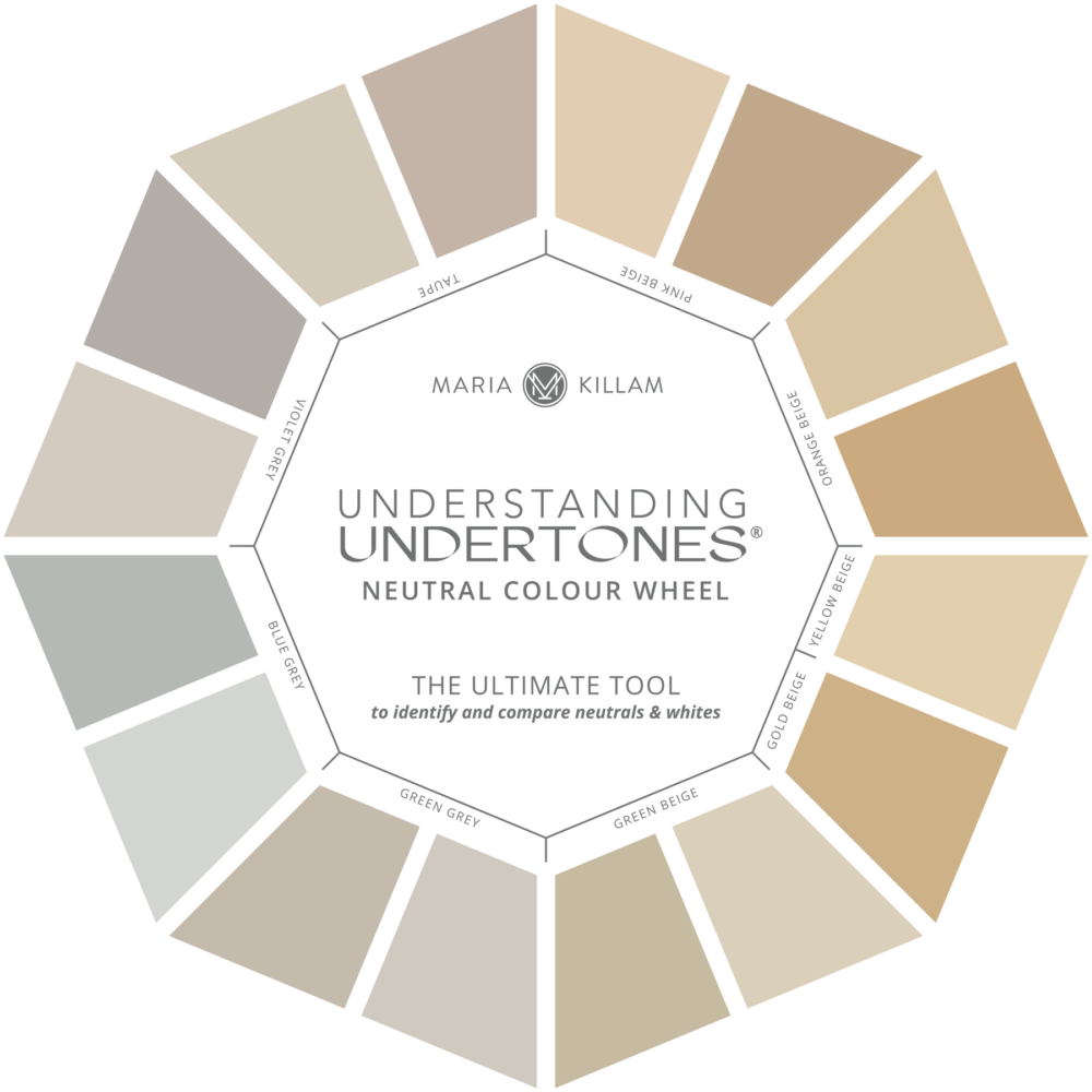
If you had a room with the neutrals in these throws and pillows, for example, what undertones do you see here?
I’ll wait, while you figure it out. . .
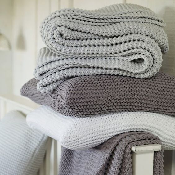
So blue grey and violet grey right?
If both of these were the neutral undertones in your living room, for example and you needed to choose the correct neutral, you would basically have two options. . . blue grey or violet grey.
Right now, because the Tuscan trend left our homes with dark gold beige and orange tones on the walls, most people are choosing the opposite (very pale) for their new colours.
Therefore, if we were to match the two undertones in your living room, we would come up with a pale blue grey (BM Horizon) or a Violet Grey (Abalone) – Both can be found in my curated collection of large colour samples here.
I also threw in a taupe for comparison (below).
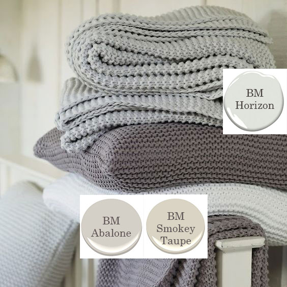
I added the taupe colour paint dot so you could notice that the grey with a purple undertone is the obvious choice. Taupe can also have a purple undertone, but it leans more towards beige, so you can see it’s not quite right here.
Related post: What Everyone Should Know About Taupe
You can go lighter or darker, but after you’ve nailed the undertone, how many colours do you have left?
Not many.
So let me be even clearer, if you go back to the colour wheel, we’ve already eliminated seven other undertones and we’re left with blue grey or violet grey.
Since most people are looking for ‘light and fresh’, after you’ve chosen the correct undertone, you have two choices left in either category.
Light or lighter.
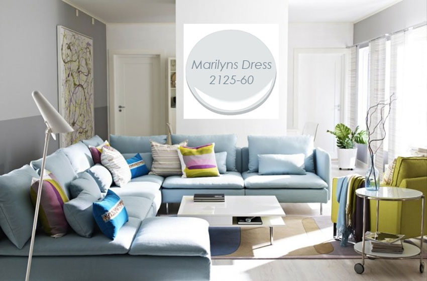
In this example below, we have a blue sofa with purple and chartreuse accents.
The walls appear to be a violet grey but the purple in the cushions is much more vibrant making blue a much better choice if we were to repaint the walls. The violet grey doesn’t relate to anything in this room.
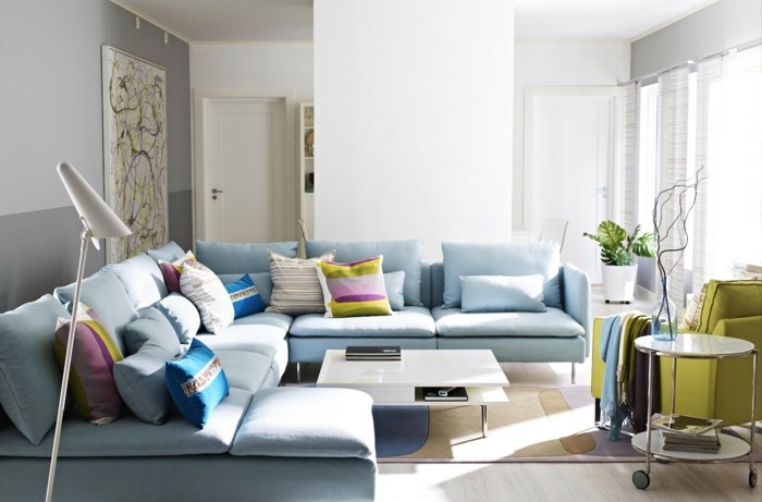
image source
So here’s the thing. You don’t need to assess your originality as a designer based on whether you can pull out a custom paint colour unique to each client.
Paint is only a backdrop for decorating.
You can create a vastly different look and feel each time with the very same versatile greige on the walls. My advice is, don’t over think it. Put your energy into choosing fabulous fabrics instead.
The truth is, to make sure our clients get what they are looking for, the same greiges and pale neutrals are called on again and again to save the day.
Just like in the Tuscan trend when everyone wanted more dramatic walls, golds and browns, well there aren’t that many perfect shades of either colour which makes being ‘different’ over and over, much harder.
And that’s where the 80/20 rule applies.
Over to you, let’s hear about your favourite colours, or neutrals!
Get my curated collection of large paint samples here.
Transform the way you see and choose colour for everything including paint colours, hard and soft finishes in a Specify Colour with Confidence workshop this Fall. I’ll be in Vancouver, Dallas and Charlston. Vancouver will be the first to sell out so don’t delay.
Related posts:
Are you a Victim of your Client’s Design Ideas?
Look You Need to Know how to Have this Conversation (For Designers Only)


I still like that she said “ I don’t have any go to colors.”. Because a lot of designers do, and they are the ones who for example: use White Dove in every situation that calls for white. Even on the private FB page we have people coming on and asking for “go-to’s”. And every time I think to myself, “No! You need to pick the paint for the individual situation!!!”. I get what you mean in this article, but I wanted to point out that having go-to’s can very much go against your teaching.
Hi Nichole, thanks for this comment because this post is by no means teaching that we should choose one go-to colour and give it to every client. However, neutrals are still limited so if on the other side of the spectrum you say “I never choose the same colour for my clients” that also heavily limits your options because that is not a reason to choose a colour or discard another one. Maria
I don’t have go-to colors, but I did use your color boards this afternoon to tone down the too-bright-now-yellow on the walls of a home I’m doing for a client after we basically did a top to bottom remodel after a master bathroom flood. She asked me if she should get paint samples before we met and I said “no, not until after we pick colors. It’ll be a really obvious choice.” There were two, light and lighter, lol! I had told her Friday that the one thing I had wanted to do was tone the 5-year-new yellow down, and after her birthday party celebration last night, her celebrants came over, oohed and ahhed about the in-progress changes, and she found more budget money. She said last week, “I should have never doubted you!”
Hi Maria,
I am quickly realizing I need your books and class!!! I found your information last week, as I was researching an upcoming consult with a client. I have yet to visit her home, but she has the tumbled tuscan stone, as well as “golden” floors, in a good portion of her new home. She hates it because it reads yellow, gold, brown. When she and her husband toured the home, it was beautifully staged, but now her furnishings only emphasize the yellow-gold. My instinct is to “cool-off” the warm colors, I but am at a loss. I am purchasing your e-books, but any quick advice you can lend would be great! Below are pictures of the home before they bought it, just so you can get an idea of the floor dilemma. Thank you in advance for your guidance!
https://photos.zillowstatic.com/p_f/ISu4n9oqeml1e91000000000.jpg
https://photos.zillowstatic.com/p_f/ISesilnd6657e91000000000.jpg
I know Horizon is the right “neutral” for my north facing kitchen/eat in area on the walls (cabinetry & moldings are mountain peak white) but afraid it will turn green just like paper white has! And I can’t stand that! Am I going in the wrong direction and need a “cream”? I don’t want to make that mistake again. Your blog has been a lifesaver to me, especially confirming so many things that “others” were telling me otherwise! Thanks so much! BTW I have your earlier ebook on undertones and recently purchased your exterior workbook, as that is my next project on my house.
Maria thank you so much for all your insight and guidance! All of your posts are so thought provoking. After taking your course I could never understand how designers have a “go to” color for everything. It’s like a one size fits all. If you don’t look at the fixed elements to tell you the appropriate colors then I would say that your not a very good color expert. There are so many things involved in choosing color and you have broken it down to make it easy with your system. I am so thankful for you every day!
Have I missed something or are your color wheels for sale now? I would love to buy one!
Always love reading your color advice. This is a great read, As an Interior Designer and decor blogger, I agree with you that being original with a color to live with your home is daunting for many. The most popular question I get in the field, is what color? Then they say they just want white! Maybe it feels safe. Our world is very visual, and many of these conversations need images and sometimes a little trust for the professional. Either way, I appreciate your conversation and method for color conversations.
Marilyn’s dress is blue grey, you just chose another neutral? I was thinking you were going to choose a blue color?