
Here’s a note I received recently from a reader:What’s wrong with this yellow paint colour?
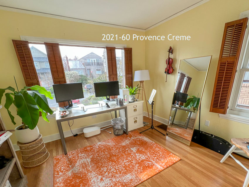
“We just bought our first house about a year ago and I was excited to paint my office. It was a grayish white color and it just looked TOO dreary for me, especially since we live in Seattle.I wanted to paint my office a bright and cheery color, so I decided on a beautiful pale, buttery yellow color, Benjamin Moore’s Provence Crème after testing out several yellows on small parts of the wall. I painted the trim chantilly lace.Now I feel like the yellow looks kinda green in most lights. And perhaps a bit cold. I thought it could be the plants I have in here, but I’m not so sure. I’m also thinking that perhaps I approached picking a color the wrong way— I should have designed the room holistically at once so that I could get a whole cohesive look.What do you think? I could just be overthinking it, but this didn’t happen when I painted our living room “Simply White” by Ben Moore. That looks fantastic.”
How to choose a yellow paint colour
First can I just say that I’m delighted people are bringing the joy of yellow back into their homes!
And yes, she’s absolutely right. It would have been much easier to pick the perfect yellow for the walls if she had chosen some decor with yellow to inspire the colour FIRST.
A decorating plan makes choosing ANY paint colour SO EASY
It’s too easy to worry about whether or not the yellow looks right if there is nothing in the room that relates to it directly. That’s when you start to get critical about whether it’s looking too bright or dull, cool or warm. Is it soft enough? Is it leaning green? Does it make me happy? You are simply staring at a wall colour by itself.
In this Martha Stewart room below, the drapes and area rug were clearly chosen BEFORE the paint colour. And that’s what makes this room look so polished and pulled together.
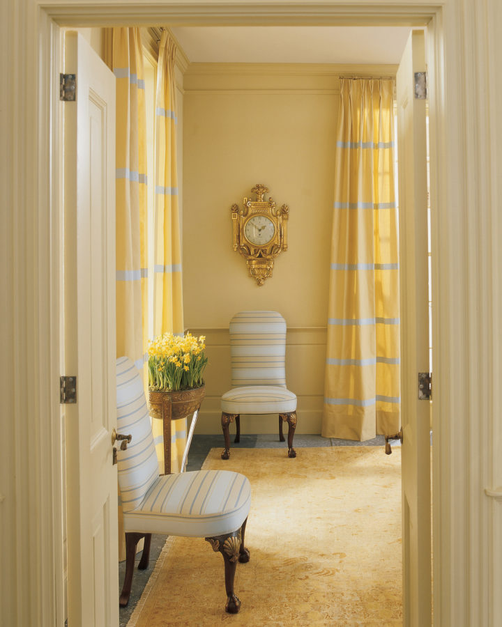
In a room like this, no one is critical about the paint colour. Because it clearly relates beautifully to the area rug, drapes and chairs. This is a room that was created with a decorating plan in place FIRST.
You don’t have to be Martha Stewart or work with high end custom drapes and one of a kind antique rugs to get a room to look amazing. All you need to do is choose a piece of decor or furniture in the colour direction you want to go and then pull the paint colour from that item.
That’s because your options for the perfect piece of artwork, accent chair, or drapes that you LOVE are MUCH more limited than paint colours.
Paint is often the least expensive part of a room. And since it comes in nearly endless versions of any given colour, it makes it super easy to choose the wrong colour if you aren’t getting inspiration from your decorating.
🔥 HOT TIP: Choose the decor first and then find the paint colour to match. And, you’ll find this narrows down your options considerably.
Yellow is complicated
Yellow is the hardest colour to get right. That’s because the sunny yellows that look pretty in the fan deck are MUCH too clean and saturated when you put them up on the walls, where the colour gets amplified. Think about how much bigger the surface area of your wall is than the pretty little chip in your hands!
Learn how to identify and compare clean paint colours in my two-day colour workshop.
The best yellows look downright dowdy and drab when you compare them next to the vibrant ones. They even lean into yellow beige. And you may have a hard time thinking this dowdy yellow will look pretty on the walls, so you lean into the too saturated and bright yellows instead.
Because CLEAN will always trump DIRTY in a side-by-side, out-of-context comparison. But here’s what you need to remember about yellow. The colour you want will look dull compared to the cleaner versions in any paint brand.
Here’s another hot tip: When choosing a yellow from the Benjamin Moore collection, avoid all the yellows in the 2019-10 to 2023-70 range.
The yellows in this range are too clean and only good for traffic signs–not something you want on your walls.
The yellow in my reader’s room does fall into this range. It’s a very pale yellow so it’s not as obviously wrong as if it were a deeper hue. But going paler on a yellow like this one, which is too-saturated and way-too-clean is not the answer either. This is another common mistake.
And yellows that are too clean do tend to look a bit green and cold. That is, unless they lean into orange, and then they look pretty unappealing as well.
What you need to look for is a DIRTIER version of the yellow paint colour you want. You’re looking for a yellow that looks very plain and muddy compared to the exciting, more vibrant one in the deck.
Learn how to identify and compare dirty paint colours in my two-day colour workshop.
A yellow paint colour by any other name
And sometimes, I might add, it’s all too easy to fall in love with a romantic paint colour name. I mean, “Provence Creme” sounds like the perfect French country-inspired, happy, buttery yellow, right?
A much prettier wall colour would be something like BM Summer Harvest CC-190. I know this because it’s part of my tried and true paint colour collection here.
But FIRST, my dear reader needs to find a pretty accent chair or large piece of art with the perfect yellow she loves to guide her yellow paint colour selection.

Have you ever painted your walls yellow? What was the result?
Three more colour workshops this Spring
Join me this Spring for one of my two-day colour workshops. This is where you’ll discover how clean or dirty a colour needs to be. And you’ll learn a few other ways to compare colour that will make decorating a breeze, like where to begin creating a colour palette for your room–and why it’s backwards to choose the paint colour first.
Knowing how to compare colour in these ways will help you make more CONFIDENT colour decisions for your home or your client’s home.
Hurry! Spots are filling up fast!
I’m going to High Point!
Are any of you going to High Point this weekend? Because I’ve love to connect! I’ll be speaking at this event.
Plus, my director of eDesign and I will be handing out free neutral colour wheels and special coupons for my courses, so be sure to say hi!

Related posts:
Kelly’s Happy Yellow Powder Room; Before & After
Grey with no Undertone + Yellow?
Can Grey by Dirty? Before & After


I learn something new with every post! I tried for YEARS to recreate the pale yellow wall color of my childhood, never could. Thanks for the help!
My favorite yellow is Soleil BM Aura. It’s in my living room, dining room and entryway. It makes me so happy.
I just looked it up and it is very close to Summer Harvest!
Surprisingly, since i am not particularly drawn to yellow, my upstairs common area and laundry are Summer Harvest and my downstairs family room and kitchen are Monroe Bisque. They have been these colours for 18 years and i have actually repainted the walls the same colour as they work so well.
With yellow it is also very important to consider the direction the room is facing ie north, south, east, west. This will affect the way the colour is perceived. The orange tones of the wood floor also affect the perception of the yellow walls in this photo and the floor seems to overpower the paint on the wall. Maria is right of course, the overall decor of the room was not considered. I have lovely yellow kitchen which faces north. It took quite a bit of swatching and sample painting on the walls to narrow down the right yellow.
Benjamin Moore Barley. With Khaki undertones it is warm and enveloping.
Isn’t the problem also that she doesn’t have anything to tie in to the yellow on the walls? Shouldn’t she have picked a rug that had yellow in it, or a picture that had yellow in it? Her rug is orange!
Quick, inexpensive, easy solution for your reader: Paint the brown wood shutters white. Add a rug that has yellow in it. Voila.
First thing I thought too!
Before I read your response, my thoughts were, “the yellow’s not repeated anywhere in the room!” Great minds think alike! Ha!
One of the hardest sells is convincing clients that the paint color needs to be the LAST choice, not the first!
Enjoy High Point! Welcome back to the South!
Many years ago I was forced to make a snap decision for a paint color in the laundry room. The painters were here and I hadn’t expected this. It was a remodel. Not much but a vinyl floor at the time to relate to. I hated the paint I selected for many many years! I also hated the floor! The paint was a garish ( now I know) yellow but I thought it would brighten this windowless small laundry room.
It’s very hard to repaint once a washer and dryer are in place. I lived with that horrible room for 22 years. Finally got a new gray classic porcelain tile floor and a lovely shade of blue for the walls.
I am happy just to stand in it and remember what used to be!
Oooh this explains my conundrum last week when I was trying to pick a yellow for my breakfast room. It’s mostly windows with no window treatments (we’re secluded and it’s the back corner of our house). The only furniture is a rattan table and chairs with a bright royal blue embroidered fabric. There’s very little other decorating except for wall cabinets I installed as a faux sideboard to save on depth, and two prints above it. No yellow for the wall color to relate to and I went too clean – it read as “Liver Disease.” I ended up going with Farrow and Ball Pink Ground which looks perfect. But now I know for the next time I try yellow! I hope that as more people embrace color you write more posts on how to use specific colors like this!
Our recent house was already painted yellow when we moved, both downstairs (living , dining and family room) and upstairs(master bedroom only). I loved it downstairs, because the rooms got a very good bright light(maybe too bright-I think I’d have to wear sunglasses if the walls were white.). As much as I loved this amazing yellow downstairs-I hated it in the master bedroom, where we usually kept shutters closed at almost all times. It was the first room I repainted, because I really didn’t feel well surrounded with that same exact yellow in the shadowed room.
Great point about going “drabbier” than it seems when picking a color sample, when one paints walls.
I painted the entire main area of my house Ambience by BM. I loved it for a while, it’s pale and soft but dirty. But then I tried Downy by Behr, it’s also pale and soft, but not heavy, and cleaner which I love as long as the color is soft and pale, unsaturated. In my house it just looks like sunlight, LOVE!
I don’t know if it’s a difference in screens or what, but on mine her yellow doesn’t look bad at all.
It just looks like there’s nothing in the room to go with it.
The orangey woods floors aren’t great with it, but a large area rug would help.
I tried painting a north facing room Benjamin Moore CC-244 French Toast. On the paint stir stick, it looked like a warm, soft tan. On the wall, it screamed I AM YELLOW. That experience scared me off choosing any paint colors for years. I never even repainted the wall for fear of failing again.
It wasn’t until our new home and your blog that my confidence grew.
The new house came with some sage and olive colored walls. I would not have picked the colors, but they look absolutely fantastic with the honey oak. So we are keeping them and decorating with lots of greens.
Technically, it’s backward— the paint color chosen first. 😉 But the pretty walls are just what we needed to get inspiration and start repeating the colors.
Over 30 years ago, and long before becoming an interior designer, I wanted to paint my bedroom of a historic bungalow a soft yellow. The room had a south/southwest exposure so lots of light. I had found a comforter I loved and wanted to pull a paint color from the fabric. I tried several before landing on one that worked. My first choices were so gaudy and too bright. I don’t remember the paint brand but the one I settled on I think was named Cashew. If you looked at the paint swatch against white it looked dirty and almost brown but looked absolutely perfect on the walls. I realize now I did it the right way 😀 – found the comforter with yellows that I loved, then found the paint color to match.
I want to paint my outside stucco home yellow. It has always been my dream to live in a yellow home…with white trim and green shutters. Well, I finely moved to a cottage style home and this one will work. Any posts or ideas how to pick that yellow?
When trying to choose the right yellow for our cottage I finally began driving around with a bunch of yellow color paint cards. I saw some homes that looked too much like a school bus. But when I saw a home that looked pretty and the color might be a contender, I got out and went to the door to tell the owner why I stopped. Usually I got no answer so I just put my cards up to get an idea of the color. Doing that a couple of times really helped narrow down the yellows. I really lucked out when I came across a house that was getting touch up paint in a lovely yellow. The owner was flattered that I liked it and painted a bit of of color on some paper for me as the can was old and we couldn’t find the color info. The paint store matched the color and I ended out with an attractive, cheerful (but not in your face) yellow home.
Agree with comment about painting shutters and an area rug. I don’t think this is a paint problem but a decorating opportunity. I have never been a fan of yellow, but stumbled upon BM Seashell several years ago. I now have it in several rooms of my house as well as all rooms in a small beach cottage. It’s soft and goes with everything.
Most of my ceilings are a tulip yellow. Never regretted it for a moment!
I may be remembering the number incorrectly, but was 2019 called Chinese Yellow in the old fan deck from almost 30 years ago? I think that’s the one I had in the kitchen of my previous house and I loved it! It did not look like a stop sign or a school bus. I also think 2023 might have been one of the guest bedroom colors and it was also very pretty. I am wondering if the light is just different parts of the country. You are correct in that it is probably the most difficult color to get right. Also one of the hardest to get even coverage with no matter how good the paint. It also reflects foliage from the out doors which can also make it look green. I am retired now but I always enjoy reading your clarifications on all the various eccentricities with color.
Here’s a question for you Maria, but not speciffically yellow. I’m a casual reader/paint enthusiast, not a professional paint expert. I have a “day job” I enjoy but I would love to do more with interior design, or even paint consulting. (I will be an empty nester in a few short years and will need to find a new passion to keep me from chasing my child to college, as well, haha!)
Gosh knows I”ve read enough and tested enough to know I have an enduring interest and have built some skills. You ask if anyone is going to High Point. What would qualify someone to go, or to feel comfortable meeting up with you? Enthusiasts? Paint experts? Obviously interior designers. And what would one want to get started doing to get to a point where one didn’t feel like and imposter, but felt ready to go to High Point. It sounds much more exciting than anything I’m doing this weekend, lol.
Thanks in advance for a reply!
“High Point Market is open to the Trade Only. Individual exhibitors determine access to their showroom. Children under 15 years old are not allowed at High Point Market. Service dogs are the only animals permitted. No photography unless permission is granted by building or exhibitor.” https://www.highpointmarket.org/register
Maybe it looks worse in real life, but I like the wall color in the photos. This seems more like a decorating problem. The brown shutters are jarring in the first photo, and as others have said, a multi-colored area rug with yellow in it would be much better. I would also add some breezy curtains in a white-on-white tonal print for some texture.
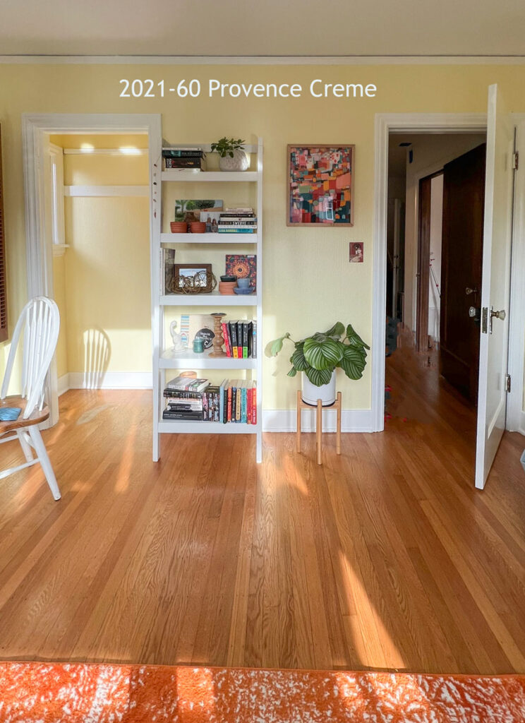
In the second photo, the color looks lovely because of the colorfully decorated shelving unit, plant, and colorful photo. The other side of the room is just lacking the same cohesive design and necessary color to tie it all together.
I like this yellow but think the trim is too white. Look at the “good” example. Trim and walls work together. There doesn’t need to be any more yellow in the room if you get this right.
I did it, I painted almost our whole house in a light yellow. During the day, it was butter, at night, Crayola. I never did figure out how to decorate with it, honestly I probably went all wrong about it. I tried to detract from the yellow instead of leaning into it. I repainted with Benjamin Moore Classic Grey and five years later, am still in love with it – which how often I change colors, is a shock. CG is so versatile that it has let me introduce several different color schemes to fit my fickle whims.
About 20 years ago, I wallpapered above our wainscoting and found the dreamiest, creamiest yellow ever at Ace (which, in those days had the best paint around) for the wainscoting. Thick, one-coat, affordable…It had “moon” in its name and I tried to keep some on hand, so I could use it again…but it was discontinued. It was pretty close to what B Moore sells as Cream Yellow but a bit more like whipped butter…Cream Yellow has some drops of orange; I think if you took those down by a third to a half, you’d have my dreamy yellow again…obviously, it’s a lost love and I mourn it! I’ve searched for it at paint websites the way separated lovers roam the streets of Paris, or their memories, seeking one another. (Cries into tissue.)
Maria, your advice is always excellent. But I did something different with yellow and have been happy with it for 15 years. Maybe because it’s a full-spectrum yellow? It’s an Ellen Kennon color, Honeysuckle. There is no yellow anywhere in my furnishings: the room is essentially green. And I have art and some big pieces of furniture on the walls. And good sized windows, facing north and west. The yellow makes the most marvelous backdrop for everything. I carried it into the hall as well, which is lined with paintings. Everything looks good against that color.
Similar here Kay, the yellow isn’t repeated in any of my rooms except the bedroom where I have my Maria-inspired yellow couch!
Hi Maria, I love yellow and after attempting to paint my lounge yellow in several clear tones I gave up. I can see now that a muddier tone would be perfect. In the readers photo the orangey rug is bringing out the orange tones in the shutters and floor; I do like her paint choice😊. Suggest painting the chair and lampshade in different shades of yellow and switch out the rug. Gold / yellow art piece or gold mirror.
Best yellow hands down is BM Elephant Tusk! Followed by BM Vellum for a deeper tone.
Thanks for this post, Maria. My whole house, well except for the washrooms, is painted Tawny Beige which is an ACE stock colour we bought because it was on sale and we were house-poor, HA! However, it is a lovely yellow beige that is very versatile. The only place it didn’t work was in my somewhat dark kitchen which we (re)painted the same white as the cabinets.
Incidentally the exterior of my house is also a yellow … that probably veers into yellow-orange territory. I still love it, almost 10 years later.
My husband painted our kitchen the yellow I had picked out years before I knew anything about color. When I came back from my errands I took one look at the color and said “Oh, No! We have to paint it again. This looks terrible! It looked green against my dark orange cabinets. My poor husband almost fell over! I picked another yellow that was grayer with a drop of orange and he was kind enough to help me repaint the kitchen. I loved that color for years!!!!
I honestly never really even thought about having the color yellow as a color for my house! looking at this point I’m so glad it wasn’t! The more I think about it the more I see how difficult it can be to decorate around it. There are not many colors that can pair so well with yellow other than black possibly!
Yellow and black sounds like a bumble bee! 🙂 How about…Purple? Blue? Green? Orange?…with yellow. The colors of a garden!
Actually a lot of colors are lovely with yellow. Yellow and gray. Yellow and blue. Yellow and green. I have soft yellow walls in my den, a bedroom, and the laundry alcove of my house in Hawaii. No other yellow around, it just makes a nice colorful but non-jarring backdrop. I also put yellow in most of my paintings.
In our last house in Alberta, Canada, the studio (north window) and mudroom (east) were painted in vellum – gold to almost orange. Those rooms always felt warm and welcoming, never startlingly bright, despite the intensity of the paint. The right colour can be wonderful
Thank you! All of my friends are telling me to go with the cleaner yellow, but my gut is telling me to go with a more complex hue, especially since my builder grade home has a lot of yellow beige. Validation!
Yes! When I had yellow in my previous home I found two drab looking yellows in the fan deck that turned out just right: SW Ivoire and SW Antique White!
Go for the drab to get the look you’re looking for!
We used SW Ivoire with SW Alabaster trim in a small bathroom with a small window, white fixtures, and white wall cabinet above the toilet.
The tenants love it. It reads bright and cheery, and is one of two rooms in that house that get the most complimentary comments when showing to prospective renters.
After fighting my way through 4 actual paint color changes over 10 years in my north facing Seattle living room, along with about 10 sample pots of color in the following 5 years. I gave up, and finally went way outside what I thought I wanted – heading for a warm cream color (yawn). I chose Country White, BM 898. Lo and behold, a perfect creamy, warm, pale yellow with very warm undertones that is both cozy and bright in this northern room. I have lots of pink and red in the room and this color is perfect.
Maria solved this exact problem for me several years ago. The yellow in my rooms was too bright. She recommended Summer Harvest and it pulled the room together so nicely, tying together the yellows in my artwork and rug.
I painted my dining room BM Straw in what I hoped was my forever home. Wasn’t to be. So in our next house, I painted the dining room and kitchen BM Straw. Loved the color then and still love it now. My son and d-i-l live in the house. I’m sure they’ll repaint. She is very much into everything being grey (walls, artwork (decor art), bedding, sofa, baby’s bedding, crib, dresser). sigh. I keep sending her Maria’s blog posts. Hoping to guide her away from grey.
Have I ever…? Absolutely! Our house had a lot of yellow when we bought it and I can say from that experience and other encounters with yellow that everything you’ve said is 100% reflective of my experience with yellow. Also, I would say that greenish light or surroundings can make a yellow unpleasant, furthering your reference. Finally, our paint is a line no longer sold here and getting a good match is impossible. But a good yellow is such a wonderful wall color, even for me, whose favorite was never yellow; let alone a softer one.
I’m so happy you mentioned BM Summer Harvest CC-190. I painted that in my living room and dining room when I lived on a wooded lot and it was the best, sunny, and happy choice! Summer Harvest was chosen based on a beautiful Sanderson chintz fabric in the rooms (Fiorella) that they no longer make. When I moved after many years I wrote a note to the new owners cautioning that repainting the rooms would be best in the summer when there was a tinge of green in the rooms from the trees and that would affect the colour choice, but I found Summer Harvest was well up to the job.
I love BM Creme Brulee, soft yellow, yes, with a greenish undertone which looks like spring to me.
First time commenting but long time fan!
In my first house, I had a room painted BM Hawthorne Yellow and loved that color! It was an office/nursery. That was a long time ago and I’m ready for another yellow room, this time in a dining room. This time something moodier/dirtier (I live in a brick house now…it seems to want those moodier colors:) I’m sampling BM French Horn, Blair Gold, and a few others. I reupholstered my sofa in a velvet that is pretty close to French Horn, and I could use it on the dining room chairs as well. The wainscoting will be Linen White so I’m feeling like I can go bold with the little bit of wall to be painted above the wainscoting.
Farrow and Ball “New White”. Have had this color of yellow, that looks like butter, in most of my house for over 20 years. Love it!
I used to always tell clients who wanted a yellow room that the colors they were drawn to would look three times yellower than they were imagining. Same with blues looking much bluer and colder. (Not blue greens.)
My sitting area — southern exposure— is a soft creamy yellow – I love it. Paintings on the walls have yellow & purple, yellow & green, yellow and blue. In a recent refresh I used purple as the accent color. Visitors always comment on how cozy and welcoming it is.
My kitchen is a warm sunny respite from our cold Arctic winters. It is 30 years old, but I still prefer it to any Iv sen in a magazine– in part because of its warm and friendly color. Its beadboard walls and the kitchen cabinets are painted BM Philadelphia Cream, a soft friendly yellow, and the perimeter countertops are simple white Corian. The ceiling and window trim (there’s a wall of windows) is warm too– BM Linen White. The highlight of the room is my big old Viking gas range, which is a deep blue, which is surrounded by some simple blue and white Portuguese tiles. The rest of the backsplash is just some more yellow painted headboard . About five years ago, my island, where the sink is, flooded and I had to replace the island cabinets, so I made the new ones blue to match the stove. The countertop on the new island cabinets and adjacent bar is now a soft gray marble. I have touches of maple wood on the architect designed cabinets’ that matches my kitchen table and benches. . .
Yellow can be hard on the eyes and affect emotions. The color can makes me feel nauseous As an apartment dweller, my last three apartments paint choice was butter yellow. The color wears you down when used on a large scale. My landlords would not let me paint. The color had me squinting alot and bright lights were no more. I love sunflowers, butter and lemonaide, yet I never want an apartment in the future with these colors of yellow on the walls.
Thanks for the great article! We settled on Ben. Moore 303 (CC-216) Old World Romance in our living room (gets a lot of early sunlight, lots of greenery when you look thru the windows highlights on leaves seem to match 303). Looks great with warm wood, warm orange.