Here’s another lovely renovation by my design assistant. Today I’m taking you inside her happy yellow powder room. She aptly turned the retro bathroom she inherited into a timeless classic. Take a look!

So true, there is no end to what a smile can fix. And the new happy yellow powder room Kelly Parkinson (my Design Assistant currently on Maternity Leave) created in her home puts a smile on my face.
Have I mentioned I love yellow?
Before: A retro powder room
There is definitely charm to a retro turquoise bathroom. Can we bring back a time when people were fine with a sweet floral on their countertops?
Here’s a look at Kelly’s bathroom before:
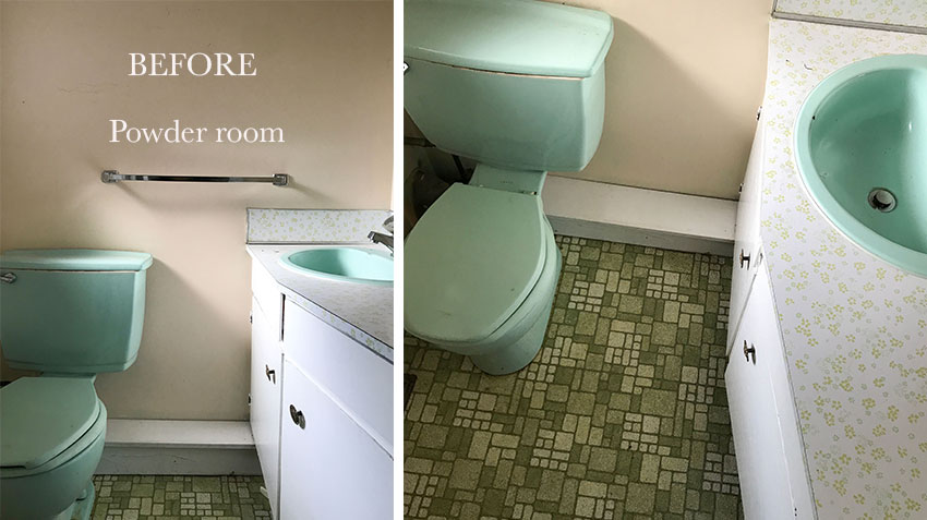
Apparently it’s a thing… refurbishing or even recreating retro salmon pink, lavender and green bathrooms from the 60s. But that’s a commitment that takes hunting down restored versions of the fixtures, tile and countertops that are authentic to that time. And honestly, it can end up feeling a bit campy.
Kelly has done such a beautiful job updating their mid century rancher. She’s created a fresh and timeless look throughout (more photos coming soon!). Her powder room renovation fits right in.
Happy Yellow Powder Room Design
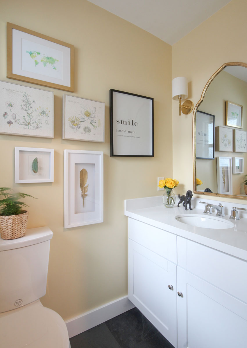
Tada! Here is the happy after:
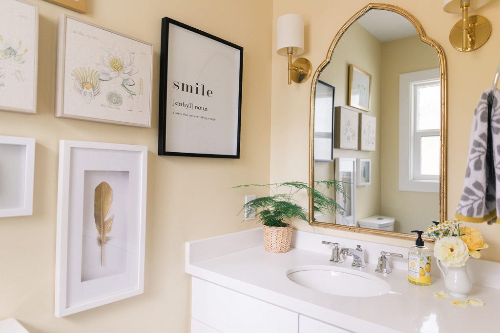
A versatile white vanity
With a crisp new white vanity, she can pull any colour from her decor and change up the look of this room with paint, accessories and art whenever she wants. That’s one of the reasons I believe all bathroom countertops should be white. I love the combination of gold accents and the soft yellow wall colour. It manages to be both warm and airy, casual and refined all at once.
Shop this happy yellow bathroom:

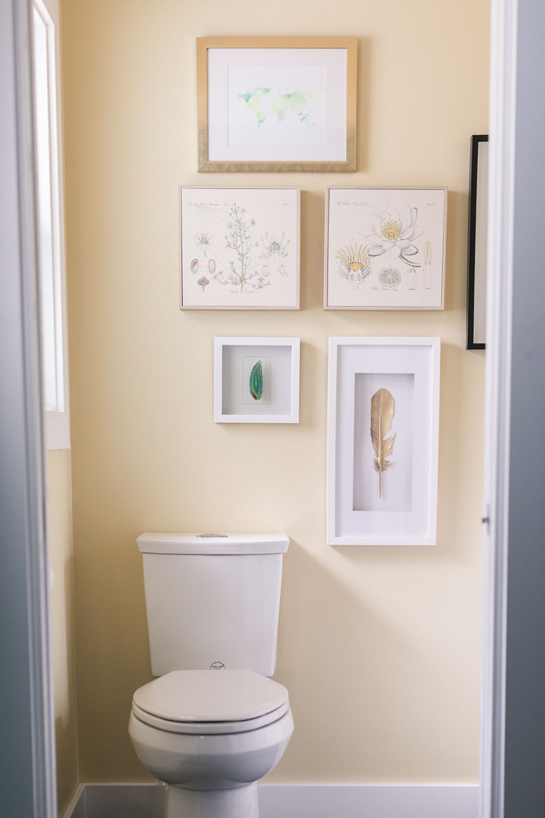
Don’t forget to add art to a powder room to give a small space personality. Pretty vintage botanicals are easy to find and add a delicate element to any pretty gallery wall.
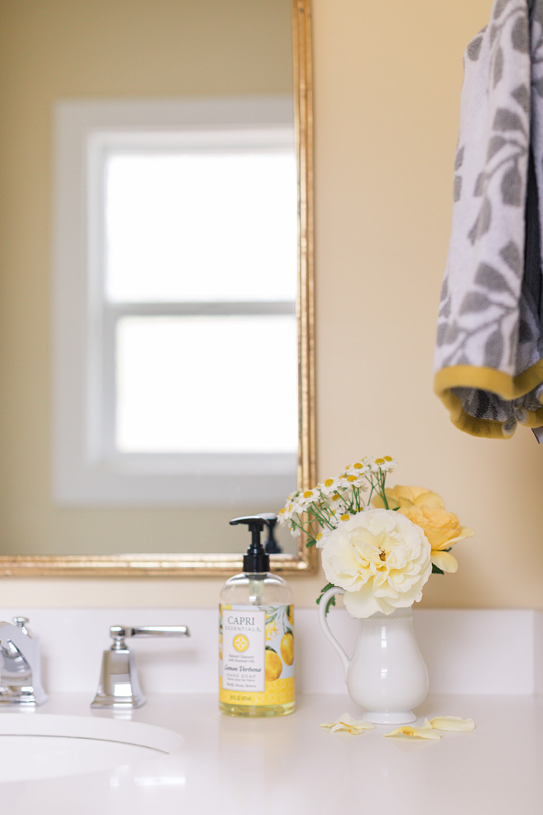
Greenery and flowers are a must for any bathroom (kitchens too!).
Getting yellow wall colour right
Soft yellow – the colour of flowers, lemons and sunshine – how can you go wrong?
Well actually, you easily can go sideways with yellow. It’s a common mistake to choose too saturated a yellow that is alarmingly neon when it goes up on the walls. The best yellows tend to look quiet and unassuming in the colour deck. They lean towards yellow beige.
Kelly got it just right with Benjamin Moore Weston Flax, a soft yellow that can be found in my VIP Collection of large painted colour boards.
Here’s the floor (added later) taken by me so the room is not styled the same. It’s 12″ x 24″ charcoal flooring that continues into the laundry room outside of this powder room.
Here’s how to mix metals
Repeat them once. Here you can see that the mirror and the sconces are gold and the faucet and hardware is chrome!
How to Get the Look
Here are some essentials to creating a happy yellow powder room in your home.
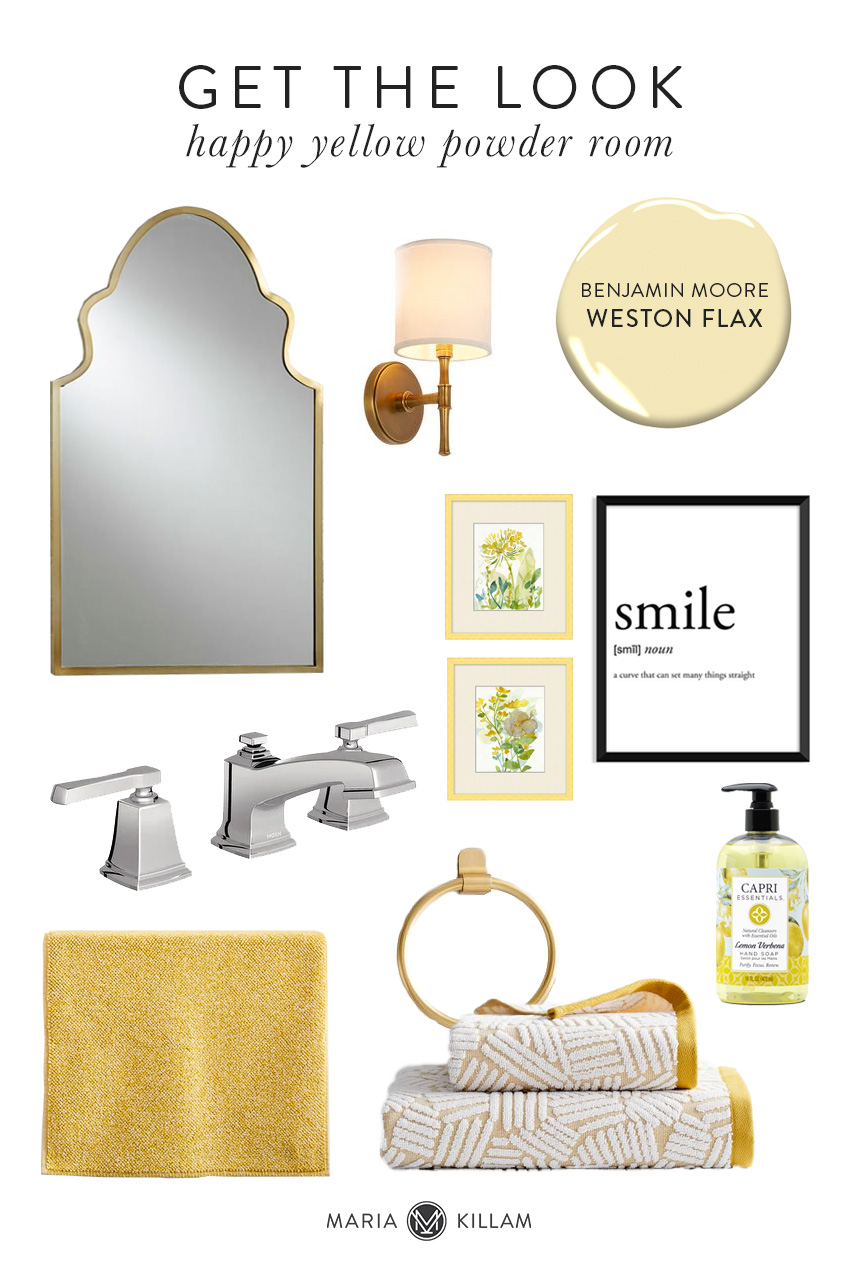
Mirror | Wall Sconce | Faucet | Botanical Prints | Smile Art Print
Bath Mat | Towel Ring | Lemon Hand Soap | Towels
If you’re working on a bathroom renovation, get all your colours and finishes right with our Create a Classic Bathroom package here.
I know so many of you are asking when we are opening up the rest of my smaller packages and I’m hoping we’ll be able to in less than a month.
Hope you are enjoying the last days of summer, this is what’s happening in my backyard. I’m renovating my office and turning it into more of a recording studio so I can properly do lots more video (because no matter how much practice you might want to do to get good at video, there’s no other way to get better except just doing it) as well as start creating some online courses.
If you look closely you can see there’s a grid being installed on my focal point wall. My dear friend Jan Romanuk (Kitchen designer and project manager in North Vancouver) has designed the new look and here is one of her fabulous contractors Kylen who is making it all happen!

And in other news, Terreeia has recently re-activated her Instagram account so you can follow her health journey there. And she’s also sharing some good tips on eating colourful food on my stories today here where you can see her dancing because I informed her that her shorts were way too big for her 🙂 To date she has lost 38 pounds since June 21 and her chronic pain is down to 20%. So inspiring. And by the way it’s true that a happy wife is a happy life!!
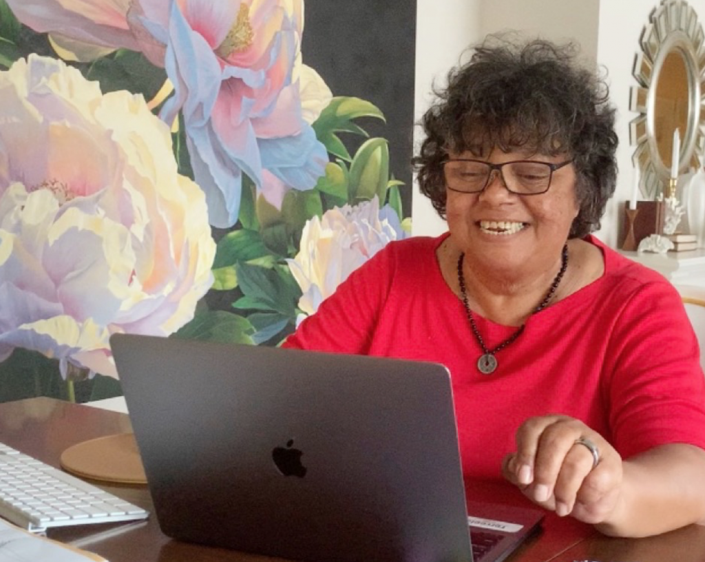
Terreeia Rauffman, CEO of Maria Killam Inc.
Related posts:
The Best Countertops for your Laundry Room; Before & After


Very nice article and photo essay on Kelly’s Happy Yellow Powder Room. (8/28/2020)
But, what was the re-do solution for the ugly old green floor tile?
The floor jumps out in the “Before” but is not included in any of the “After.”
You can see a glance of the floor in the 4th picture
I’ll echo the other reviewer — what’s the floor look like? I know those older tile floors often include 6-8 inches of concrete, so perhaps it wasn’t changed?
Ditto! We need to see if the floor stayed!
So cheery! I’m curious, what does the vanity look like and does it have knobs or pulls in chrome or gold?
Beautiful bathroom redo. She must have replaced the green floor, right? 🙂
Often when I submit my comment I get this message:
Error: You have entered an incorrect reCAPTCHA value.
Click the BACK button on your browser and try again.
Ugh thanks Liz for that notification. And yes she did replace the floor tile, this bathroom connects to the laundry room and she did 12 x 24 charcoal tile! It was hard to photograph this teeny tiny bathroom! Thanks for your comment! Maria
Do you think that yellow is too much for great room walls? I’m toying with yellow instead of creamy white.me too
It really depends on how strong the yellow is you’re talking about. I have been in homes in the 90s when yellow was really popular and the entire home was painted yellow and my clients would say “I like yellow, but I find this to be too much so I want to keep it, just not ALL of it. Anyway a great room is not an entire house so a pale yellow sounds wonderful! Hope that helps, Maria
Thanks for the reply. I actually meant this specific yellow. But you gave me a great, broader answer!
I ALWAYS have the same problem as Liz in Oregon with the error message. When I’m on my Macbook, I just click the back button and resubmit my comment. But I was on my Android phone once and when I went back, it lost my comment completely (and it was a long comment)! I was pretty sad 🙁
I LOVE how Kelly used the soft yellow tone to allow the rest of the yellows to blend beautifully! Well done!! I can’t wait to see your new studio, Maria. It looks like you’ve got a lot going on. And Terreeia, kudos to you! I will start keeping track of you on Instagram. XOXO
Very pretty! I see she mixed finishes by going with a chrome faucet rather than brass. I inherited ORB fixtures in my bathrooms. I can’t afford to replace every fixture but considered brushed nickel faucet on new vanities. Do those 2 finishes mix well; do I need to look at undertone in metals? Is there a trick to adeptly mixing finishes so it looks intentional/cohesive? Thank you!
Yes I think those two would blend nicely. Just repeat them once at least, so if you introduce brushed nickel faucets, repeat it on the towel holder or vanity? Hope that helps, Maria
The mirror and the sconces are gorgeous together, and just what I’ve been looking for.
Would you mind providing the sources, product numbers and/or manufacturers for both? I’d love to track them down!
Thanks!
Yes they are both linked in the post! Maria
Thanks, Maria. But I clicked on the links, and while they feature similar products, they’re not the same. I like the silhouette of Kelly’s mirror so much more than the one that’s linked to on Pottery Barn’s website. Likewise, the first link to the sconce on Rejuvenation is only available in dark bronze; the second link to Wayfair has a cone shade instead of a straight shade; and the third link to Anthropologie has a swing arm and a white backplate. I’m not trying to be too picky. But Kelly’s pieces are exactly what I’ve been looking for and I’d love to replicate exactly what she has.
Try the Darnetta Mirror on Lulu & Georgia. I found this using the “visually similar” search function in Pinterest, easy peasy. It may take a moment poking around at the shoppable links Pinterest provides, but hopefully you can find the perfect mirror for your bathroom. You can do the same thing for the sconces.
Oh, the Darnetta Mirror is it! I didn’t know about the “visually similar” tool on Pinterest, either. Thanks so much, Kj. You made my day!!!
It looks like 70s vinyl to me, not a mudset tile floor. Hope they found a retro-renovator who liked the old turquoise fixtures.
I love your blog so much!! Been following and learning about a year. Hope you and Terreeia stay safe. ❤️
What a cheery and peaceful bathroom! Can you provide the source for the countertop? It looks quite like what I am trying to find for my bathroom reno!
Yes, I agree with other poster’s! Can we see the floor and vanity…
Also, PLEASE do a post about mixing metal’s Maria!!! 😉
I added a photo I had taken 🙂 Maria
So happy to hear Terreeia’s good health news!!!
Thanks Fran, we are too 🙂 Maria
Maria
Very nice love the new bathroom .
Looks awesome
Ya I got through !!!
Oh my goodness, I learned that lesson about yellow in my first house. I wanted yellow for my small powder bath, so I carefully sampled colors and tested them (or so I thought), chose one pretty easily, and scheduled the painter. He arrived while I was heading out to work. I got home that evening to find a powder bathroom that felt like the center of the sun. It was blinding. I lived with it for a couple of years until getting ready to sell the house, when I had it painted a cream which turned out looking like the yellow I originally wanted for the space. I’m now VERY careful with yellow.
I LOVE that shade of yellow paint – I have been wanting to do something like that in my bedroom.
Congratulations to Terreeia on her weight loss and especially on her pain reduction!
I often get the same message that Liz in Oregon mentioned. Most of the time, in fact.
I have been looking for beautiful large pictures of flowers like the one beside Terreeia. Do you have a link to it? Or know the artist so I can find it? Thanks so much.
I remember when Maria did a blog post about it: https://mariakillam.com/james-wiens-artist/
In the 1980’s, I moved into a new apartment and decided to decorate one room and picked the hall bathroom. I went to Sears and bought the Cornflower Yellow matching bathroom things: towels, shower curtain & hooks, plastic sink accessories, fuzzy toilet tank & lid cover, 2 bath mats, AND the matching carpet that covers the whole floor. All in solid bright yellow. I loved it because it was cheerful and all new and matched and stayed cleaned. if you opened the door, it looked like it had it’s own sun in there. By the time I moved, I had better decorating tastes and have never repeated that.
I’m a big fan… I want to send you a photo of a Halloween/Fall pillow I thought you might like…the words are
COME IN, My Pretties
It is sold at Big Lots. I am a dual citizen. I live in Buffalo, NY, but have a house in Fort Erie, Ontario.
Have you ever been to Niagara on the Lake? I thought it would be a great place to hold a session of your courses.
I love this and I’m wondering if this color would look good in my very small powder room (no windows and cherry flooring). I’m currently trying to narrow down colors and am torn between blue or yellow. It’s just a beautiful transformation!
Bleh! I hate white on most surfaces, especially countertops. They stain too easily and too hard on the eyes. That green yellow bathroom was a missed opportunity to stay pretty and retro but I guess the majority of people just like generic, everybody has it decor now and cannot appreciate most vintage things. That yellow is pretty though.
It can be very hard to find towels and accessories when there is a fixed color. My tile has some blue-green accents – a color I love. In the ten or so years I have worked with the tile, the accessory manufacturers shift the color every year for several years then slide back to the one I need. So I stock up a little bit and ponder how and when I will redo the room (since the other color is a very pale pink that I will not use).