Choosing the best floor tile is hard – choosing a tile for a small entryway seems an even bigger challenge for this reader. Here’s my advice and some inspiration for pretty (and timeless) floor tile options for a small entryway.
Ask Maria…
Recently, I received this question from a reader Barbara (names have been changed to protect the innocent):
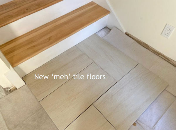
“I have searched for a first floor entryway tile many months now. Under pressure to make a decision, I chose a 12″ x 24″ beige tile. I am not liking it and would prefer to make another selection, however, I am still stumped. Luckily, fate intervened and our tile installer will not be able to do the job until August. I cannot return the tile but would be willing to donate it to Habitat for Humanity if I can come up with something more appealing.”
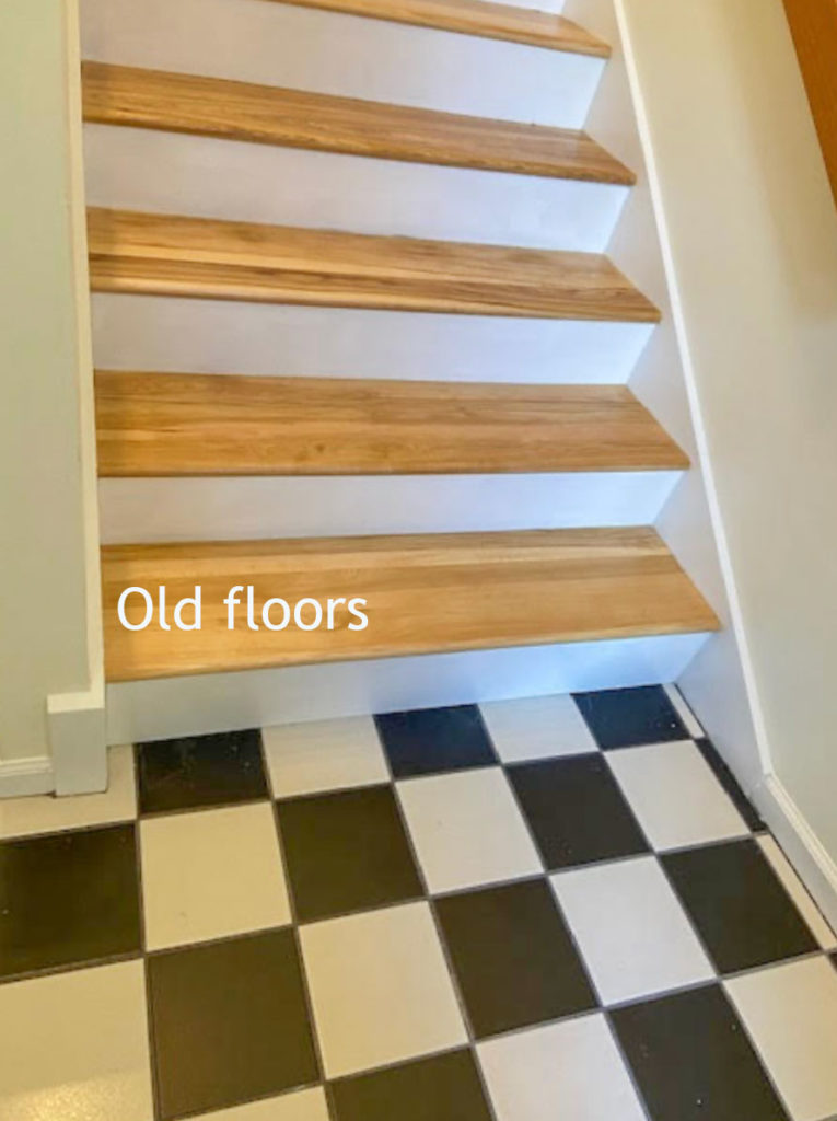
“Here are photos of the hickory stairway, the stairway with the old black and white checkerboard tile (above), and the beige tile set up at the foot of the stairway (below). Any suggestions on what will look better with the hickory stairway?”
“By the way, I have not yet bought furniture nor has the condo been painted. I have had the two bathrooms renovated according to your Timeless and Classic guidelines with much success!”
What is the best floor tile for a small entry?
So first, I have a question for you, my lovely reader.
Barbara mentioned she searched for ‘months’ to find a tile, however, I did one little search online for “best tile for small entry” and came up with dozens and dozens of blog posts with all kinds of “timeless options” <GASP> even-I-was-surprised.
Even if she ended up coming home with something more ‘trendy’ as I would call it, almost anything would be better than what she did find. (And Barb, please don’t be offended, because we have ALL done this 🙋♀️) Choosing the right floor tile is hard as I have said many times – read more here & here.
So I’d love to hear from you.
What are you searching online that made you end up coming home with generic 12″ x 24″ tile? Or did you not search online and instead just walked into the tile store and came home with something that seemed ‘neutral?’ Please post your thoughts below.
I posted this question on Instagram today and received this comment from a follower:
“First, there is nothing wrong with repeating what she originally had. A black and white checkerboard floor is still a timeless choice. What she was reacting to about the original tile she had, was the really bad installation with the tiny 2″ strip running long the most visual part of the entry tile.”
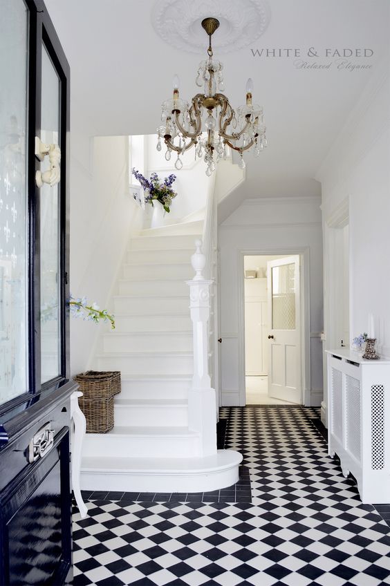
A black and white tile floor could be timeless, but the installation isn’t the best, I agree. The floor below would have been better. Smaller tile, installed on the diagonal.
Read more: What Everyone Should Know About Porcelain Tile
Via Loombrand
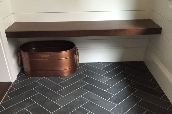
Here’s another good option for a small entryway. Also great for a mudroom, we specify this often in my eDesign department for new builds and renovations.
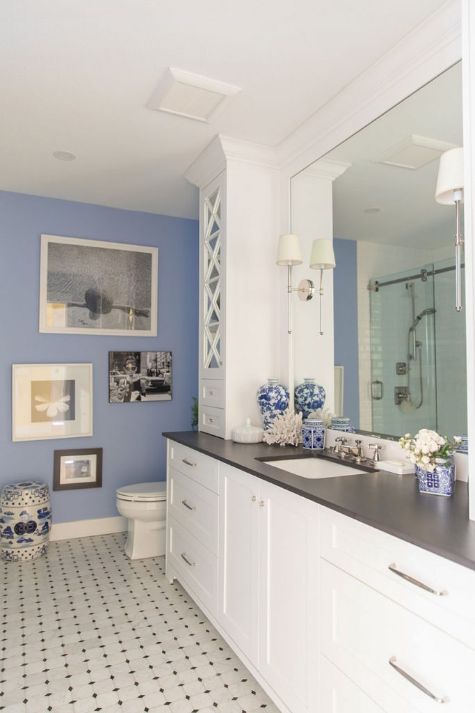
Something similar to the black and white small-scale tile in my main bathroom would also be a good option:
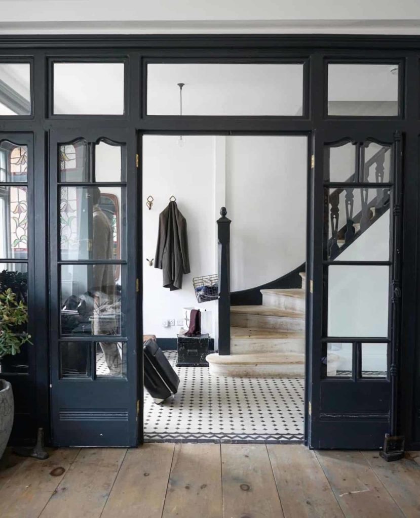
Here’s another beautifully styled entryway with perfect, timeless tile. Remember, it’s important to consider the flooring transition when working with existing wood floors.
design by the spaceologists | photo by paul massey | via living etc
You could even choose a trendy tile as long as you keep it black and white. Then you’re not married to a particular colour scheme forever.
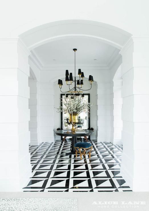
My least favourite trendy tile is anything that gets pointy looking with triangles or geometric shapes, like this one:
It’s just personal preference but I believe it might have something to do with how humans react to pointy vs. round. I wrote about that here.
Over to you my lovelies, I’d love to hear how you get so stumped even though there’s so much good inspiration online? Is it just too much? Let me know!
PS. Are you following along on my series on Instagram or Tik tok? The next one is ’10 Ways to Screw up your Renovation.’
Guide to Timeless Wood Flooring
Also, since I have received many requests for my curated list of timeless flooring choices in hardwood, engineered, LVP and wood look tile I’ve created this handy printable guide for YOU! It includes my favourite wood flooring options that we frequently specify to my eDesign clients.
Related posts:
What Everyone Should Know About Joy
Is your Black Accent Tile Perfect or Perfectly Nice?
A 10 Year Review of Accent Tile; Should you Install the Current Trend?











I like the herringbone, but even though it’s classic I feel like it’s kind of trendy now so I’m not sure how we’ll look back on it.
I realized last minute that I couldn’t take my light white oak wood floors all the way to the front door (because the door flange is too low to allow any type of rug and live in snow country). I am not a fan of gray, but we do have a very dark gray floor in the adjacent laundry room, the entry door is black and the steel stairs are black. So I’m thinking of just doing 24×24 dark gray tiles in a 3 x 3 grid. Hopefully that will be timeless and blend away. It’s a modern house with the focus on art.
I tested the “modern limestone” tile from the master bedroom thinking it might look good (and we have extra) and it looked horrible. Lol. Nothing like having the real thing to lay down and see what looks good compared to what you think will look good.
Maria, I have been following your blog since you first started! It continues to amaze me that you have fresh content all the time and continue to be so generous with your passion and expertise. I prefer not to use instagram or tiktok, so I will miss out on what you post on those venues.
Your question of what search arguments are used when trying to decorate a space is a good one. I frequently come up short with my searches, but I know the info must be out there and you always seem to find great sources – not sure what I do wrong….
I really like the simplicity of the grey herringbone floor. Although I like the classic black and white patterns, I think they could look busy in a small space.
When I did the same online search you suggested, my eye was drawn to the dark gray herringbone tiles. But here’s my suggestion to Barbara (and I learned it from you, Maria!): take a photo (or several from different angles) of the area and create a “mood board” online. There are easy-to-use, free options online (I’ve used Canva before). And you can find YouTube videos tutorials to help you if needed. This can help Barbara actually see what the tile will look like in her space. Wishing Barbara the best!
What about keeping the tile and removing that weird cut on the right side and filling in with quarter round shoe molding or something? Or, even just painting the black tiles white? I think, as Maria always says, it’ll look better once it’s decorated.
I like the dark herringbone tile in the Amy Vermillion Interiors photos because it provides contrast. From the photo you shared, it doesn’t look like the hallway can pull off a black and white tile entryway.
Frankly, I like as few different types of flooring as possible. I would do wood that matches the stair treads, and a rug.
Agree! There is too much going on in this small space and the warm toned hickory treads look too rustic against the stark and polished black and white tiles. I don’t like that option at all. But can’t go wrong matching the existing pretty wood.
If tile is preferred, I vote for a stone-look tile that complements the hickory’s beautiful warm tones. There are so many gorgeous faux stone and concrete tiles in both rustic and modern styles and shapes that could pull the paint and wood tones together-regardless of the home’s style.
I wonder if Barbara thought the tile looked like wood/wood flooring and therefore would go with anyway she decided to decorate. She might have been remembering you saying wood flooring is like jeans…goes with many things.
Another fabulous post & example, Maria.
I think there can be too much of a good thing i.e inspiration via Pinterest or Instagram. We get paralyzed by all the beautiful images out there & feel stuck when it comes time to actually make decisions.
I agree that her old checkerboard flooring was timeless but that awkward strip near the baseboard killed it. I would opt for a larger scale checkerboard in a white/black or white/grey scheme.
I would simply match the wood on the stairs. Simple, beautiful, timeless.
I would want more information from “Barb” such as what general feeling or style does she want her condo to provide?
As we’ve all read a million times, the entry can be the 1st impression of your style. It also appears that there is tile that extends to the next room. What is the flooring plan and style for that space?
Will the trade remain the same yellow/ fold tone?
Wall colors?
The black and white against the gold treads and optic white paint appears stark to me. I might look for something where the undertones work with the wood treads as they seem to be the first thing one sees when you come through the door. As it’s a small space, maybe you can spend more per SF and not blow the budget?
Maria, what a great post! In the photo you posted by the Spaceologists, I could envision myself sitting in the big porcelain white tub sipping on a glass of dandelion wine staring at the classic and timeless white hex or basketweave tile floor they probably have. Ugh, I want to live in that house!
After seeing my newly renovated home, my friend’s asked me to go to Lowes with them and help them pick out paint colors for their home and tile for their bathroom floor and tub surround. I said I will only pick out what I’ve learned is classic and timeless according to Maria Killam because I happen to agree with her opinion, so you’re getting hex tile for your flooring and white subway tile for the walls above your tub. Nothing trendy! Now I can show them this post, and they can see what I was talking about. 🙂
She mentioned already renovating her bathrooms. If there is a laundry room, that also might have existing tile. Repeating a tile that has already been used in the home would be a consideration.
Yes all of those things should be considered, however I didn’t have those images so I just focused on the photo she sent. Everyone should go out of their way to avoid 12″ x 24″ tile (unless your house is modern and then that is still not the right colour) for the most part. Thanks for your comment! Maria
How did she search for months and end up with generic tile? Maybe it’s a commitment issue. A designer like Maria has done so many renovations that 1) she knows what she’s doing and is confident, and 2) it’s not her home so she doesn’t have to live with the decision. I’m a novice and renovated one home. I now regret that I didn’t take bigger risks and commit to bolder choices. I played it safe and now wish I had gone with my gut. One more reason I follow Maria is to gain the confidence to commit to what I really want.
I find myself wanting to know a bit more about Barbara’s space (adjacent areas) to determine best options and consider how she might tailor search terms to identify more appealing options.
The classic black and white inspiration photos are lovely, but I’m not as crazy about that with the hickory staircase.
I like the simplicity of the herringbone patterned tile, but I think the color for that should depend on color scheme and design elements in neighboring rooms / spaces. I don’t like the gray with the tone of the hickory.
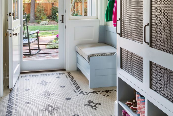
If Barbara’s space really is an entryway only and doesn’t open up to other areas with lots going on, perhaps something more patterned like the Tim Barber mud room at the top of the post would be a nice choice. (still selecting a classic colorway that relates to the hickory stairs..with some bit of warmth)
I also agree with the comments suggesting the option of hardwood flooring stained to match the stair treads paired with a rug.
Thanks for the post Maris
Re your question of why we don’t use Pinterest more? I have a very middle-class, suburban, builder grade home, built in 1997. One thing I dislike about inspo photos is most of them are pictures of homes I cannot relate to whatsoever. I will never have a home that looks like that. So the photos in some ways feel irrelevant to me. Sure that photo looks incredible in that incredible home. Does that translate to my own simple home? Often it doesn’t feel like it.
One of the reasons I follow you, Maria, and do not follow other designers is your design lessons are relatable. You often show examples of “regular” homes. You don’t only show amazing multi-million dollar homes. I call them real people homes. I gain wayyyy more knowledge from your blog and posts than what I can possibly get from Pinterest.
I would switch to hard wood but if that’s not practical then tile it is, and I would stick with the classic square tile, but always lay it on a 45 degree angle when it’s in a small area to make the floor look more expansive. And it prevents those ugly cuts along the walls.
My 12×24 light gray woven linen-like tile is ordered and it does go with the countertop and shower tile, so there is no going back! Would you recommend putting it in a pattern and/or using a certain grout to creat contrast or should I match the grout to the tile? The large tile was a compromise I made with the husband, so I now must figure out how to live with it.
Check the boxes the tile comes in. Often large ceramic or porcelain tiles like that have to be laid in a staggered (brick) pattern because they warp a little and the staggering hides that. Ours were suggested to be laid with a 1/3 stagger and it indeed helped. Plus the tiler insisted on following that mandate.
Also consider whether or not the entryway is on a fixed slab or wooden framing with a basement or crawlspace below. If the latter, that big tile is likely to crack as the floor flexes. As I think about it some more, I’m wondering if a thin brick entryway is more rustic and keeping with the hickory steps. Do you have any brick on the outside of your house you could coordinate with? It could form a nice transition between the inside and outside. Even if you’ve ordered the tile already, the tile is a much smaller cost than the labor which hasn’t been done yet.
All of the suggested options are black and white floor tile. I find black-and-white tile to be too high contrast, and I personally particularly dislike the checkerboard tile, even with good installation. It would have been nice to see some options other than stark black-and-white for this area.
A few months? That’s nothing! I have been trying to find stair replacement floors for a couple of years now! Yes, not consistently during the school work year, mostly in the summers. But my huge challenge has been the light gray ‘wood’ laminate throughout majority of the house is not made any more. However, the entrance staircase is in that–I have to replace the long, other part of the staircase. Perhaps I will just make a new post with photos and beg for help! I don’t find a whole lot of what I’m looking for online–they are just basic, all the same, and nothing like what I have. In person is where I spent most time, at nearly every store here. Just now trying yet again, including searching online about entryways (as I might now change that to the new stairs, when I find it.)
(Btw, interesting about the 12×24 tiles–I do have those upstairs in bathroom, stone tiles, that complement the laminate. I love them!
Also, in regards to the search, it’s partly because Google sucks! I put in ‘white tile for entryway, with gray walls’ and not 1 single image showed me white tiles.