


Planning to use black accent tile in your bathroom design?
Black accents can easily go from just a hint (which is timeless) to a combination that is dominated by black – and that’ll quickly date your bathroom design. Find out how to create a bathroom design that’s perfect, not just perfectly nice.
The perfect black and white bathroom
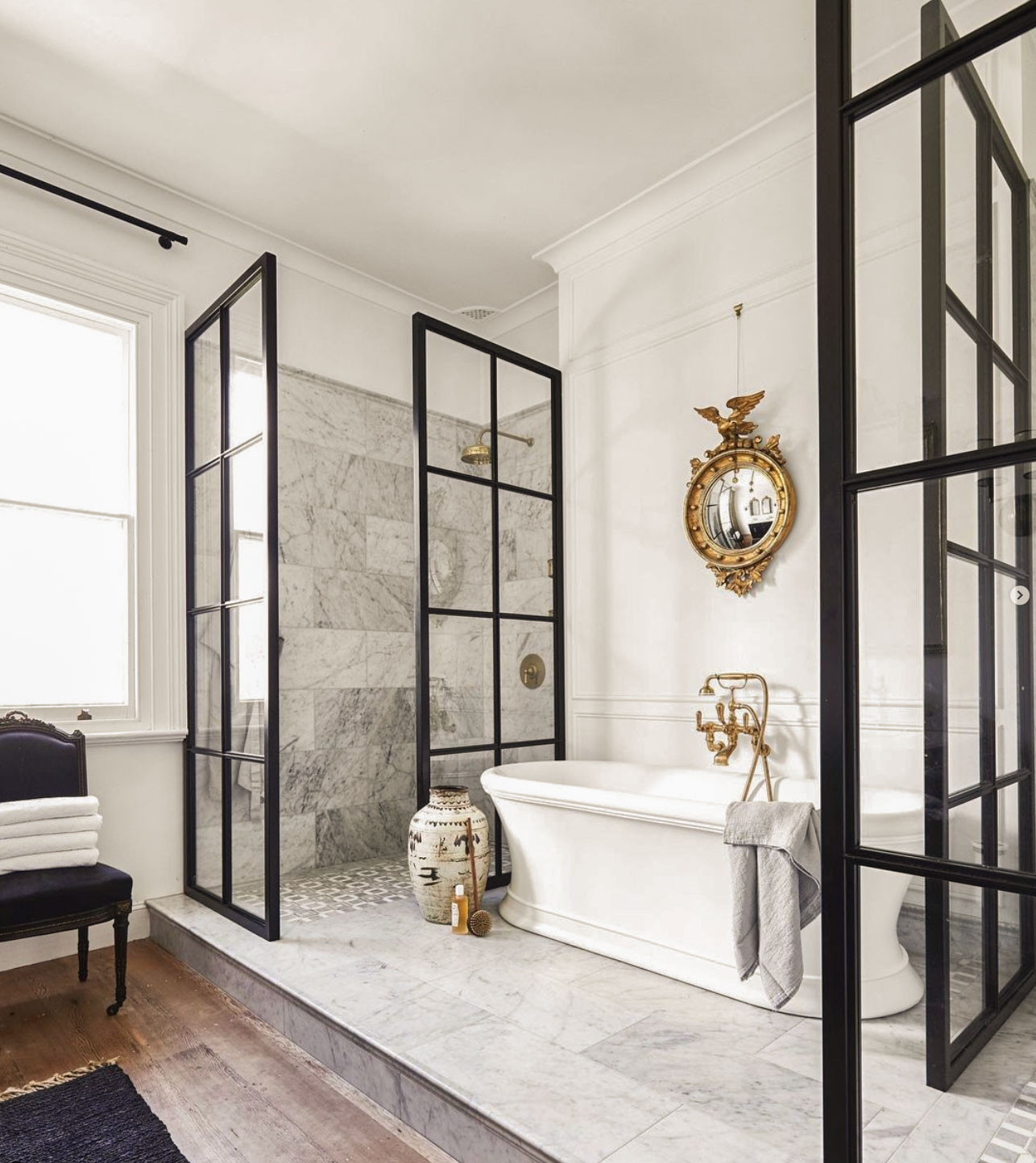
Recently, one of my followers on Instagram sent me this bathroom designed by Steve Cordony from NSW, Australia.
She said, “Maria, this bathroom has accent tile, why does it look so good?”
And my reply?
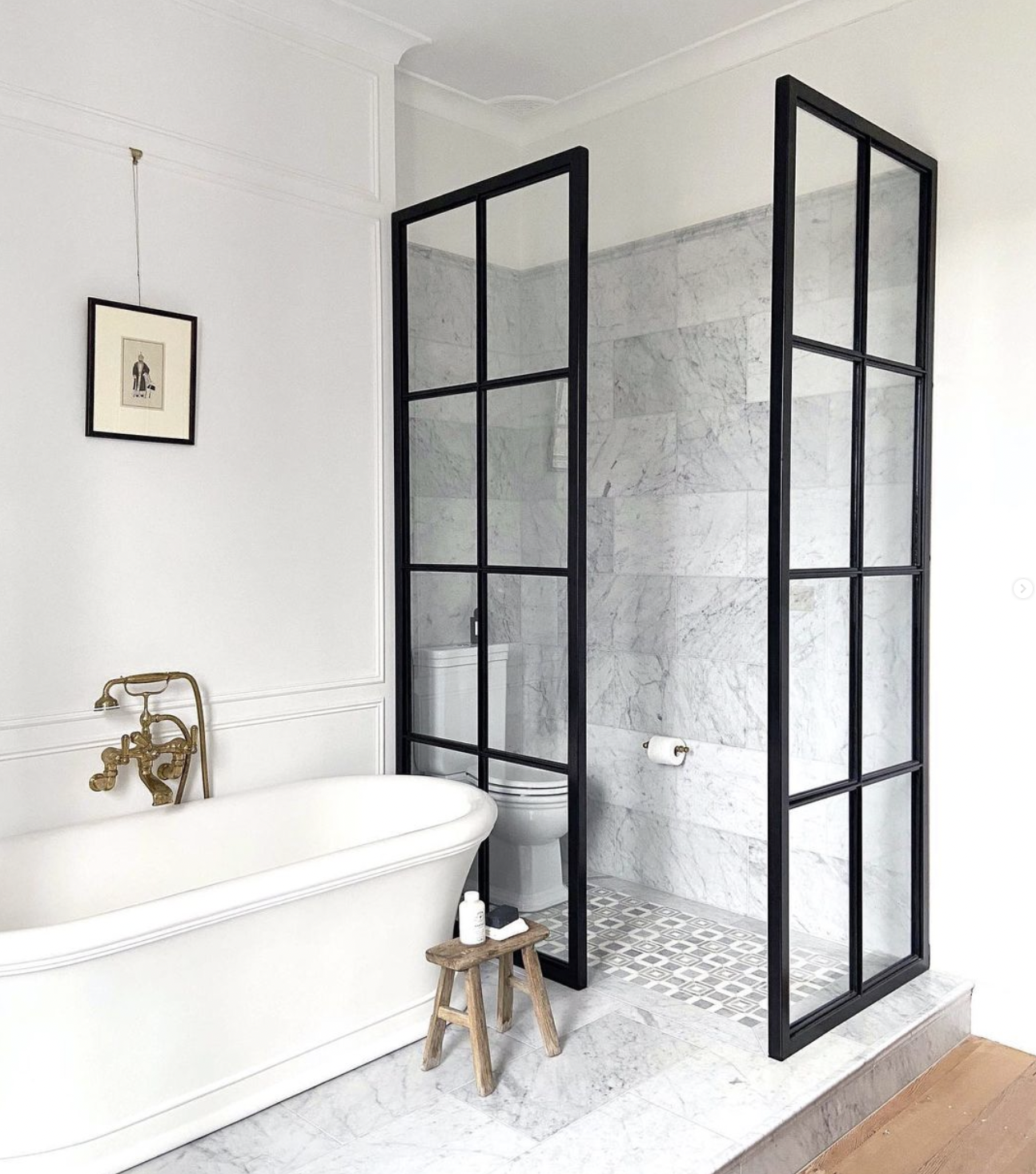
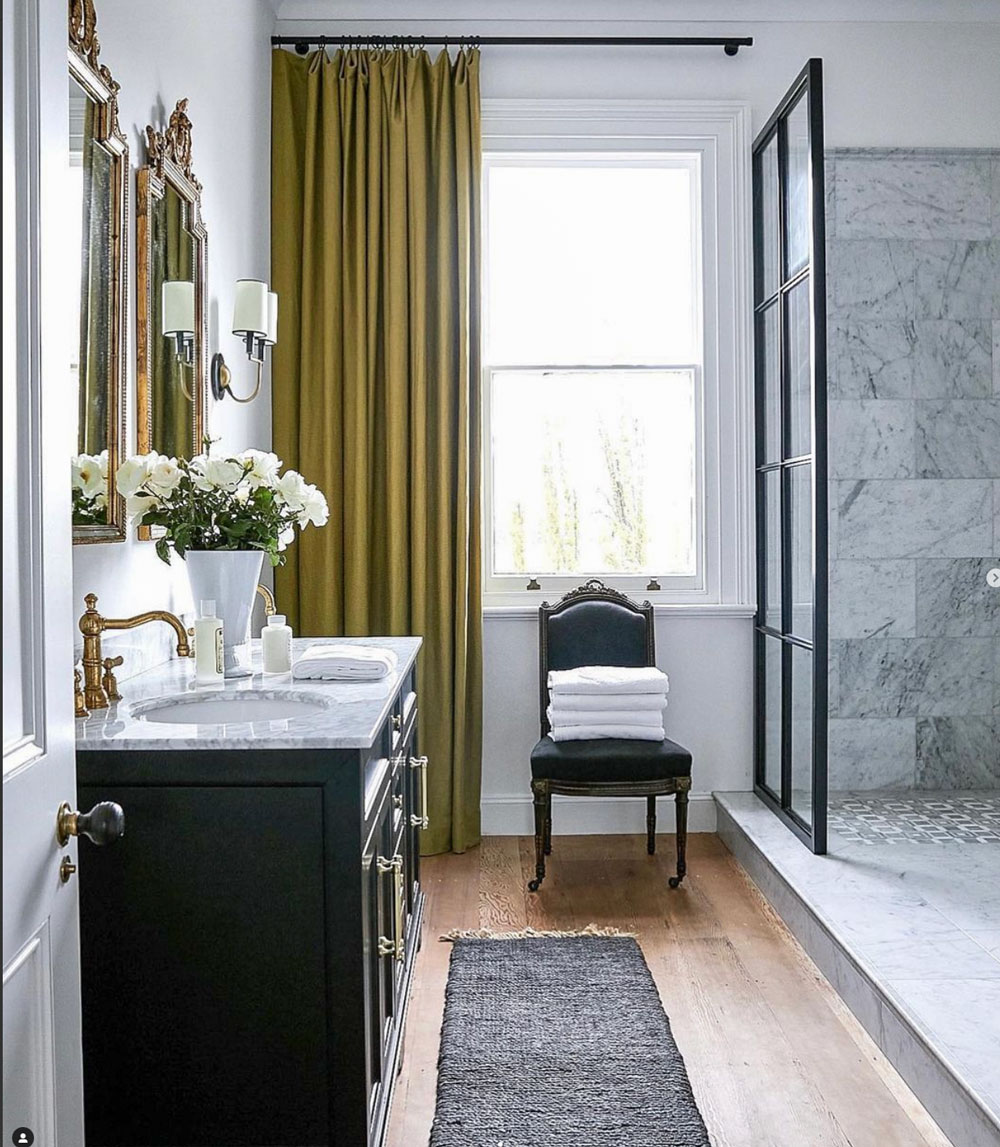
“Well,” I said, “that’s because, it’s just this tasteful rectangle on the shower floor. Everything else is the marble field tile. Then there’s a strong hit of black, the grid shower doors, that’s repeated once on this side of the large bathroom. And then the black vanity is directly opposite of the bath, BUT everything else in this bathroom is white and brass.”
And that, my friends, is what makes this bathroom perfect.
The black and white bathroom that’s just perfectly nice
I’m here in West Palm Beach for one more day and I picked up a Traditional Home magazine at the grocery.
I opened it up to see this bathroom with a very similar combination of tile installed a little differently:
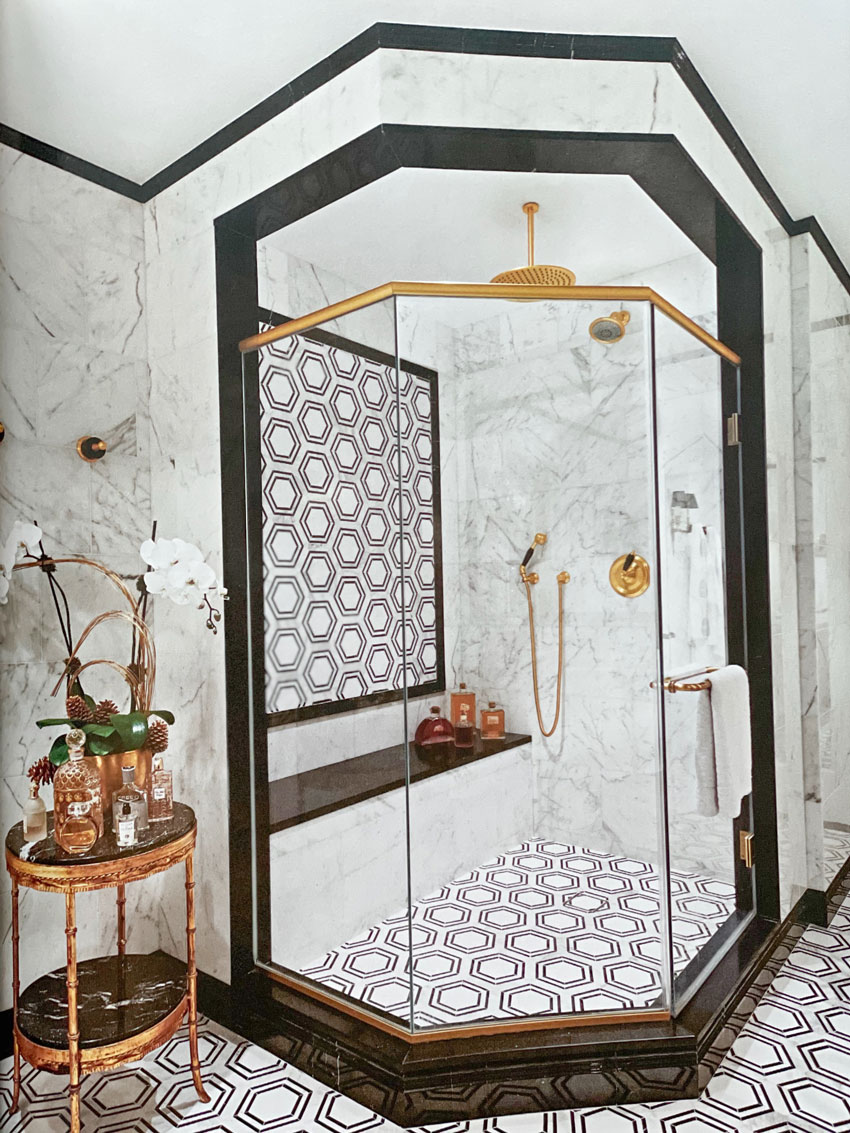
Sure, it’s perfectly nice. But, it’s not perfect.
There’s a lot of extra black in this bathroom that places it squarely inside the black and white trend. And if you read the article, it does say ‘maximalist home’ and there’s nothing wrong with that.
However, if you’re asking me what takes a bathroom from timeless to trendy? This is it – too much black. Leaving this bathroom just perfectly nice.
But, the Steve Cordony bathroom at the top of this article? It’s decorated with a small hit of black that’s repeated, but also surrounded by gobs of white and brass accents – Perfect.
If you want to create a bathroom that’s perfect, buy my Create a Timeless Bathroom package here.
To navigate the world of whites, download my White is Complicated; A Decorators Guide to Choosing the Right White ebook here.
Which bath do you prefer? Are you planning a bathroom design that includes black?
Related post:
Is Your Bath Perfect, or Just Perfectly Nice?
Are Black Shower Doors the Best Choice for Your New Bathroom?

Wow, Steve Cardony’s bathroom design is lovely. It’s the first black-and-white room I’ve liked. Most, as you say, are overkill with way too much black, which is not only trendy but depressing.
And black with water spots—ugh on keeping that clean. Small point on the flooring in the shower. It looks like dark gray marble to me rather than black.
Beautiful example, Maria, and at the perfect time! We’re in the final stages of our remodel that includes a revamped and refreshed bathroom and I’ve been careful not to date my home in the black and white trend which has not been easy. Black beckons me, and it is EVERYWHERE, making it worse when you go shopping not to overdo it.
We replaced all our almond bath fixtures with white, are installing a white shaker vanity with a black quartz sink top and will have a black round mirror over it to repeat the black once. That’s it for the black. My bathroom faucet, knobs and sconces will be chrome. Chrome to me in a bathroom is like peanut butter and jelly. They just go together. I contemplated doing black knobs on my vanity doors but wondered if that would be too much. Still deciding… I painted the walls Benjamin Moore Glass Slipper and we have medium brown Oak LVT installed throughout that run seamlessly into the bathrooms as well.
I say go for the black knobs as that will help balance the mirror
Buy some black felt or black construction paper, cut to the size shape of the knobs and tape it up before you commit. An easy way for you to visualize the final product before wasting time/money.
Thats a great idea for people who can’t visualize. Cheap and fast way to make a decision. I’ve seen some real estate pictures with black hinges and black hardware where the high contrast looks bad in my opinion, and this tip, even using black electrical tape, would have been easier than fixing all the hinges.
Don’t stress too much on your knobs/pulls. One of the easiest things to switch if you change your mind.
Thank you! 🙂
I agree. The first bathroom is really nice. The tile in the second one would give more a headache.
Love the first bathroom. I had the same reaction when I opened up Traditional home magazine on that bathroom! Too much heavy black tile molding around the shower. We have a powder room with black and white checkered marble floors, and then a double crown molding on the ceiling with black on the lid, White on the crown. Walls are a light neutral, Vanity is a 1945 mahogany buffet, gold mirror and lighting. We love it!
I totally agree with this blog and what a teachable moment, Maria. I also love the brass fixtures used. From time to time we hear that brass and bronze have had their moment and are going out, but I keep seeing them used and they are beautiful.
I don’t see any black tile in the first bathroom, all looks shades of gray to me. At first glance I thought beautiful, but The toilet enclosed in glass walls is weird.
In the typical Australian home, up until last 30 years, had toilets in a separate little room. Just the toilet by itself. The sink and bath had their own room. In the early part of 20th century, many toilets were attached to a home but were accessed from outside of the home. Some older homes had toilets at the end of the garden, not attached to house at all. That toilet being in traditional older home, would have a door and walls.
The symmetry of the shower walls and toilet walls is one of the elements that make the design in my opinion.
Shelley, I agree with your comment about the symmetry of the room but I also agree with M that the total see through glass wall is bizarre. Having a toilet ‘room’ without privacy seems pointless to me even if it creates symmetry. I would have etched the glass of the bottom 4 squares on the side and front for privacy.
Other than that, it’s a beautiful bathroom.
I have to comment on this thread going downhill about the toilet room. It’s a master bathroom. . . if someone really needs to go number 2 they can lock the door from their spouse 🙂 Just sayin.
This is cracking me up! But I wanted to comment to you Maria that I hope your family is ok right now in Chilliwack. I was reading a news article that talked about roads around the community being washed out. Sending good thoughts out to them.
True Maria, but to me it’s more an issue that the design just draws attention to the toilet like it’s in a display case.
I get it was for symmetry, but the “ta da here’s my toilet Throne Room” is bizarre to me.
I love hearing varying opinions and what catches other people’s eye and don’t consider it a downhill thread. 🙂
The very black and white bathroom with the brass fixtures is reminiscent of an Art Deco bathroom – my grandmother had something similar in feeling in her house and many of the older luxury hotels have (or had) the same Deco look. Maybe it’s a modern interpretation of an era whose time is coming back…?
Your observation about the first bathroom is excellent –
My pet peeve is a shower floor that is not related or repeated anywhere else… always seems jarring visually…
I prefer the second for that reason – it has an art deco look, or a ’50s retro look, or a hollywood regency look. It totally reads as timeless to me – that style has been repeated in so many eras.
The first one looks trendier, especially with the combo of wood floor & tile, though I suppose it’s fine for a traditional home.
I love the Steve Cordony bathroom, but agree with another reader that the toilet with the glass walls is strange! I’d prefer that to be dry-walled to the ceiling (maybe with some glass panels or windows up high to let in some light). The second bathroom is striking, but it does feel trendy. I think I’d like it better without the busy tile inset inside the shower. I learn so much from you, Maria! Thanks for the examples.
I agree the first bathroom looks lovely and I can see why the toilet was “enclosed” with glass panels for balance. However, I agree with another comment made here that a glass toilet “enclosure” looks weird and like a whole lot of extra work keeping those panels spotless.
Probably doesn’t worry home owners as they most likely have someone else clean their home.
I think the difference between the first bathroom (stunning) and the second is the use of timeless tile versus trendy. Gold can be tasteful in small doses. Too much as seen in the second bath becomes tacky.
And, yes the toilet in a glass enclosure is weird but obviously done for symmetry.