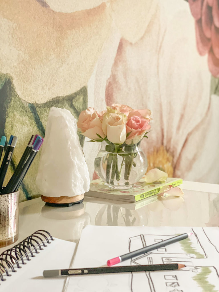
The colour inspiration for my client’s almost-teen-girl bedroom makeover came from this stunning floral wall mural. Here are the before and after photos of the rest of this coordinated bedroom design that will grow beautifully with this young lady.
⭐️ Before we get started… Do you have an interest in interior design combined with a knack for organization and a liking for providing day-to-day support in an administrative role? Let’s work together!! Click here! ⭐️
Magical floral wall mural inspired bedroom
I have decorated two homes for my lovely clients Crystal and Rob. First their summer house here, later their main house next door and recently, we worked on updating her teenager’s bedrooms.
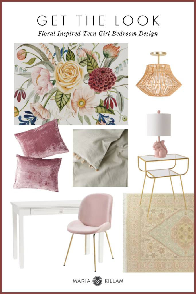
Today I’m showing Bella’s room first. The colour scheme for this room was inspired by this fabulous mural (the inspiration board with links is at the bottom of the post).
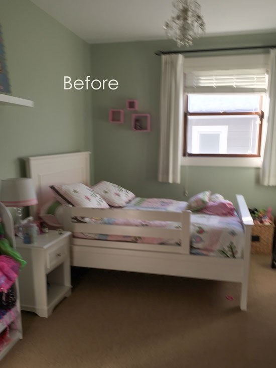
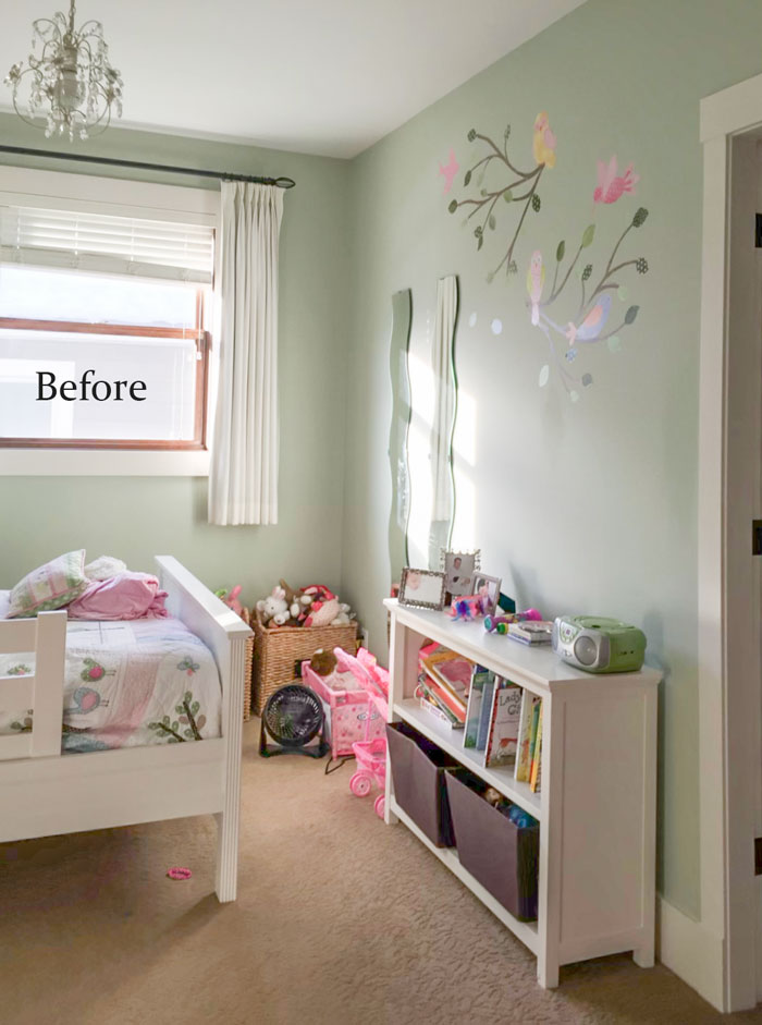
Here’s the before:
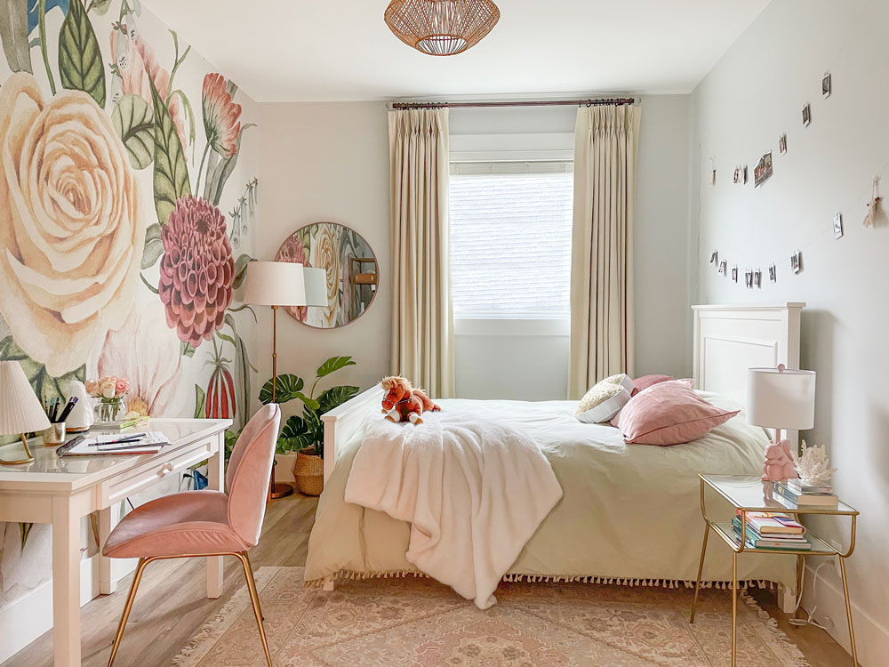
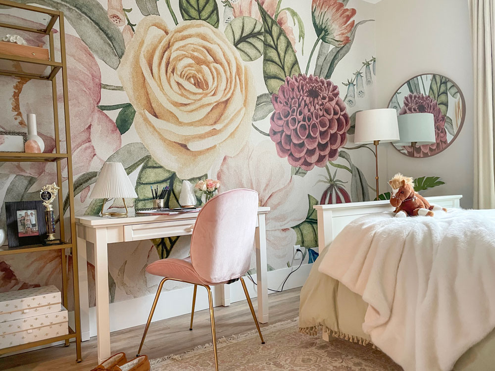
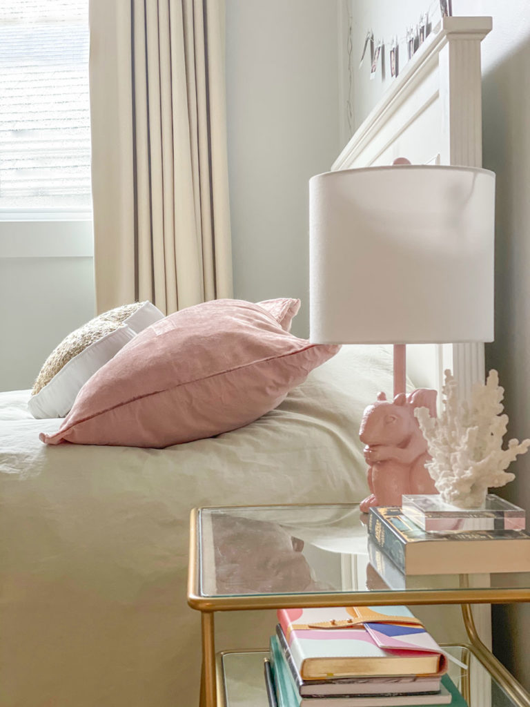
Here’s the after:
You can see that I coordinated everything in the room to match the wallpaper. The area rug mirrors the colours in the paper, and then there’s the yellow beige drapes, green duvet cover and pink velvet chair and shams.
Scarlett Wall Mural | Rattan Ceiling Light | Oriental Area Rug
Tassel Bedding | Velvet Pillow Shams
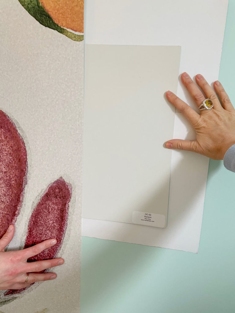
Notice how the wall colour matches the mural absolutely perfect.
Here’s how we did it.
Before the room became next-level fabulous, it had a makeover that happened with the renovation 5 years ago. Then the room became turquoise.
When I was a teenager, I installed wallpaper on one wall in my bedroom and for years it bothered me that I painted the rest of the room white when only the flowers inside the paper were actually white. Laying in bed, I stared at that wallpaper and always thought the rest of the room should have been the background of the paper.
Anyway, I digress, the ONLY way to match it perfectly is with white paper as the background (to make sure the old colour doesn’t influence the new one) and then I just went through the pale neutrals, by undertone in the Killam Colour System® eliminated the ones that didn’t match to end up with this one that looked the best, BM Horizon.
Get Your Large Colour Samples here.
Here’s the other side of the room before:
After
Ahem, check out the corner of the room on the right (below). You can’t see where the wallpaper ends and the paint colour starts.
As it should be.
When you match it this expertly, it looks like it’s been painted directly on the wall.
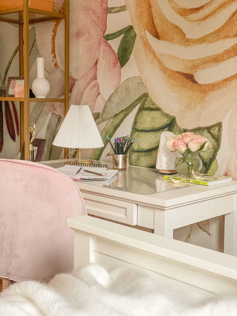
Scarlett Wall Mural | Pink Desk Chair | Beadboard Desk/Vanity
Bella’s choice of this larger-than-life floral wallpaper mirrors her love of nature and the outdoors. She’s a wild child, free spirit, artist, and animal lover.
Pink Squirrel Lamp | Bedside Table
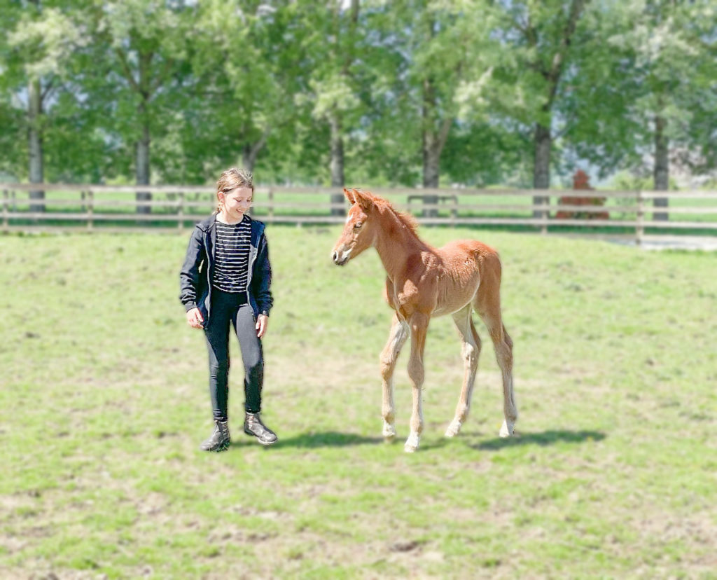
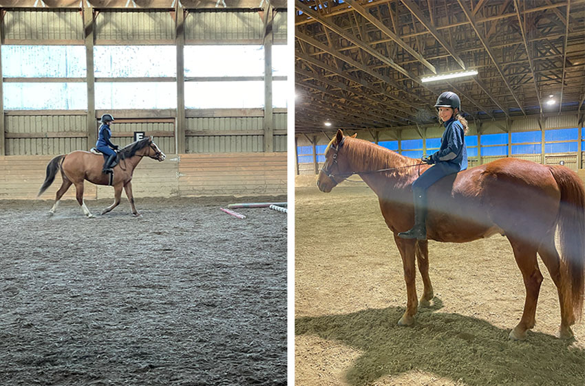
Bella started riding in June 2020, she rides twice a week. Here she is on Tutu (left) and Bruce (right):
Decorating your child’s room is important because it’s their personal space, while the rest of the rooms in the house are yours.
Teen Girl Bedroom Mood Board
Scarlett Wall Mural | Rattan Ceiling Light | Oriental Area Rug | Pink Desk Chair
Bedside Table | Tassel Bedding | Velvet Pillow Shams | Beadboard Desk/Vanity | Pink Squirrel Lamp
Learn EXACTLY how I pulled this room together
Get a closer look at all the details including how we chose the wall colour and shopped for the coordinated decor in my How to Create a Mood Board course. Click here to get immediate access to this self-guided online training.
We chose everything for this room (except the drapes, they were custom) using mood boards which I will teach you how to create in this course. Notice how all the colours in this bedroom work beautifully together. A big piece of shopping online successfully is about knowing how to search for what you’re looking for.
I was once in a consultation looking for blue throw pillows. Nothing I searched made my client happy until I finally realized she was wearing a cornflower blue sweater.
I searched cornflower blue throw pillow and BAM, now she was happy!
Wallpaper has come a long way baby! I’m working on another room right now using a super fun mural with my nephew Markus! It’s a great starting point for decorating any bedroom.
** Remember, TODAY is the last day to register if you want to be in April. If you don’t have the WOW box filled with tile, fabric and paint samples, you won’t be able to do the workshop. Register here.
Related posts:
Turquoise Kids Bathroom; Before & After
5 Budget Friendly Ways to Style a Kids Bedroom; Before & After










Eye candy! Simply beautiful and so surprised with the pricing. I was so sure that was an Anthro chair. . .
Absolutely love that mural wall 💕
Gorgeous Maria! I love the seamless match of the mural and paint color. She’s a lucky girl!
The room looks lopsided. The bed wall needs something for balance IMO.
The right side of the room are lights and I don’t know why they were not on but they should have been for the photos, they are for hanging personal photos etc. However that side of the room is also about to be filled with teenage posters her Mom warned me and said “Come over quick to take photos because it won’t look this pristine for long,” haha! Good question! Maria
What a beautiful and lucky young woman! She will remember this for the rest of her life.
Beautiful!
This is so, so beautiful!! Thank you for sharing and being so very generous with your knowledge and expertise.
Beautiful, tanx for sharing
Fan-Friggin-tastic!! Nice work!
So beautiful! Love it.
Stunning room, I love it! I hate to ask since you provided so much information, but what is the source for the curtains?
Thank you!
Thanks Tanya, The drapes were custom made by my workroom! Maria
Technically” the room may be “lopsided” or “unfinished” but I think this is as it should be. Maria described a “brilliant” young lady: “Bella’s choice of this larger-than-life floral wallpaper mirrors her love of nature and the outdoors. She’s a wild child, free spirit, artist, and animal lover.”
I think Maria, a brilliant designer, purposely left that area over the bed for Bella to choose what was meaningful to her at this time. I can’t read the word which those letters spell out but I suspect Bella will grow out of them before too long and I hope that Maria will give us an update when she makes a change. Other small changes will happen too (that mirror on the window wall will be hung a bit higher as Bella grows taller, etc.) But that gorgeous wall mural (for a “free spirit”) is timeless at today, age 20, 30, 60, 80 and on.
Thanks for a wonderful treat, Maria.
Details! Like that darling squirrel lamp! LOVE!
The wallpaper is definitely the star of the room, but so is the bed. The brass open shelving, desk/chair, and floor lamp chop up the presentation of that wall too much. I would have put the bed on that wall with linens and pillows to bring down those luscious wall colors. Then that area would read as one beautiful cohesive unit. The nightstand, desk/chair, and open bookcase share those “twiggy” legs and make for an obstacle course and takes away from the full impact of bed and wallpaper together. The wall without the wallpaper would then be changed to having the desk opposite the bed with a bookcase flanking each side. The bookcases would be open shelving with sides for showcasing the teen’s stuff. Also, when walking into the room, having bookcases with a wood side hides and controls precious clutter. Over the centered desk would be a large mirror that would reflect the wallpaper from the opposite wall! The small round mirror isn’t necessary. Instead, some wall planters would bring another element to the room on the window wall and reflect the theme of “nature” in the room. The ceiling fixture looks small for the size of the room. There are formulas that are helpful for determining size and wattage for any given room. Don’t see anything else in the room that’s rattan, so it appears out of context for that reason also. Great match on the wall color. The overall color scheme will last for many years.
This room is heavenly! I like that you place the bed across from the accent wall so the teenager can see the gorgeous paper FROM her bed! I would not have thought to do that, but I love the idea.
I agree! The first thing she sees upon awakening is beauty.
My initial reaction was “Wow, that’s kind of awesome.” She must feel so good every time she walks into that room.
Goodness! People are criticizing Maria’s choices and forgetting that it’s Bella’s room. Bella chose the wallpaper and she may have said she wants to wake up to the beautiful sight of it. I would if it were my room. On the empty area on the bed wall, not only will there be teenage posters, but she’s a horsewoman, so there will be ribbons! It’s fun to win them, but they are often garish colors, so having a wall of nature to view from the bed is more serene. I’m betting that Bella also had a say in the future and probably loves the brass and glass shelves and table and all the “twiggy” legs. They’re very popular right now. They are open and lightweight and add to the calm feeling of the room in a way that bulky wooden pieces would not. That may motivate her to keep it uncluttered as she grows and accumulates more. As Maria said, this is Bella’s personal space. I’m sure Maria didn’t just enforce her designer vision but did it in collaboration with this lovely, lucky young lady. I give it best in show.
Oops! I meant to write that Bella had a say in the furniture, not the future…although she will have that, as well. lol!
😘 exactly- Bella’s Mom!
I LOVE THIS !! Talk about a room that brings joy. It’s pretty but not precious, stunning but not overbearing, colourful and still calming. Of course the wallpaper is the initial showstopper but the rest of the details from the furniture choices and placement to the accent colours are what make this a heavenly haven….perfect for any age I think. Bravo Maria!
Maria,
THAT IS PERHAPS THE HAPPIEST ROOM I HAVE EVER SEEN.
Can I say it has to be one of the finest of your accomplishments?
It is.
BRAVO!
Paula
Beautiful bedroom makeover. Perfect paint color. My only question is what is the staying power of the soft gold (brass) accessories? Do you think brass will become a classic?
I love the wallpaper and the furniture placement. Very good paint / wallpaper background match. The room is very beautiful; both wild and tamed at once, a balance not so easy to achieve and one I always love when well done.
I really like this change. The room seems more orderly, more mature. It’s nice to see it 🙂
Really beautiful wallpaper,colours and styling. Bella must be thrilled with this change. I LOVE the nature inspired theme & femininity…oh and the cuddly horse!
BEAUTIFUL! Question….What flooring/color did you use? I really like it.