If you are painting your exterior this season, don’t make these 5 common mistakes with your exterior colour.
eDesign client before and after
1. Don’t choose fixed elements in the current, dark trendy neutral.
Recently I consulted with a couple on their new build. They spent 3 1/2 hours with me in my studio and we chose colours for all their major fixed elements for their interior like hardwood floors, countertops, tile, and then outside.
When we got to the conversation about exterior colour and started looking at stone and brick colours, I informed them that a beautiful combination of stone and brick was almost as rare as a unicorn sighting and I asked them if they had a photograph of an exterior they had seen that they both liked.
They gave me a stunned look and the wife said, “That’s our biggest argument, we can’t agree on an exterior colour combination that we both like.”
“That’s because most of them are bad,” I said. “It’s rare that I drive by an exterior (even in expensive neighbourhoods where designers were clearly involved with colour choices) that I actually like.
In fact there’s a subdivision built on a mountainside not far from where I live that is basically brown. You drive up the mountain and all the homes are varying shades of brown and then the closer you get to the newer homes, they turn into charcoals, greys and black shades.
I don’t know about you but if I was building a house that I expected to live in more than 5-10 years — which is the lifespan of any colour trend — I wouldn’t want it to scream, “We built this house in the grey trend, or the brown trend.”
Before and After from an Exterior Masterclass student
This is the reason why I only specify charcoal for front doors or shutters.
Paint is okay, at least it can be changed, however if you paint your exterior a dark trendy neutral at the end of a 10 year trend, it will instantly make your paint job look 10 years old.
2. When choosing vinyl windows, don’t ignore the colour of your house.
White goes with fresh and crisp colours and cream goes with earthy colours.
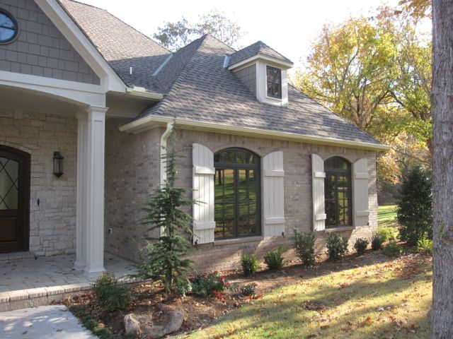
This is the most common mistake. If you are installing earthy stone or brick on the exterior of your house, your windows should be cream NOT bright white. The exception to this if your earth tones are pale, like this home below:
3. Don’t install posts columns that are too skinny.
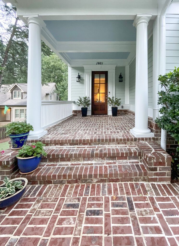
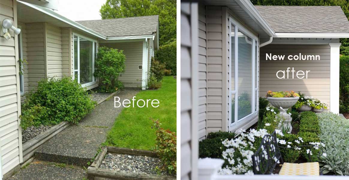
Builders notoriously install fence posts instead of columns. Beef up your skinny posts for an easy way to improve the curb appeal of your house instantly!
My former post looks thicker in the before picture (above) because of the angle it was taken and also because the downspout is attached to it but trust me, it was skinny. MaryAnne White my fabulous landscape designer specified the new, beefed up column. And as you can see in the after picture, I moved the downspout.
4. Don’t be obsessed with installing an asphalt roof that has ‘dimension’
Asphalt roofing companies try really hard to copy the look of a real slate roof or Mediterranean tile that have variation in colour.
If you have a solid colour house like mine (above) then a blotchy, asphalt roof is perfectly fine and might be more interesting than a solid coloured roof.
However, if you are installing brick or stone that will already be multicoloured, a patchy looking asphalt roof will not be ideal and will mostly clash with your fixed elements rather than relate to them nicely.
via Pinterest
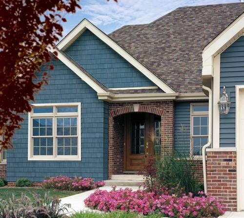
What’s the undertone of the roof in comparison to the brick in this house (above)? If this was your house and you had to do it again, would you choose that roof?
5. Don’t choose too many colours.
It looks cleaner and more sophisticated with less.
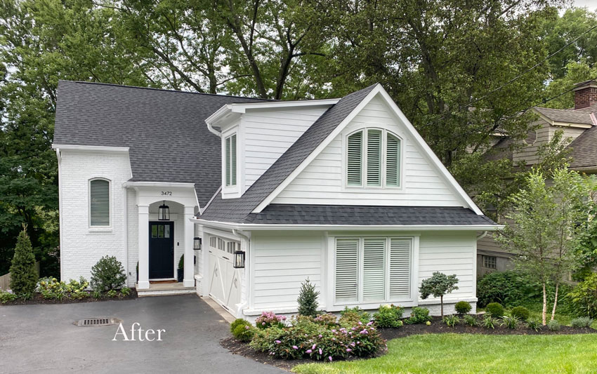
Just because you have more than one siding product on your house, doesn’t mean each one needs to be painted a different colour.
The house above is a pretty use of colour.
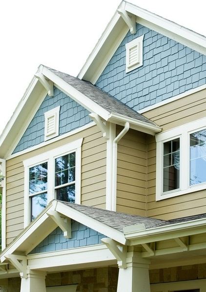
But the colour on this house (above) looks too random and unrelated.
If you are painting your exterior this season, don’t make an expensive mistake. Buy my Exterior Colour Solutions advice here and get the right colours for your exterior via email. You can buy just the advice you need, every purchase whether it’s paint for your trim or new windows is a colour decision first.
Opt for self-paced online learning to guide your exterior decisions!
To get trained on making the best decisions for your home’s exterior, go here to get my no-nonsense, zero fluff. this is how you do it, webinar.
If you would like to transform the way you see colour, become a True Colour Expert.
Related posts:
Should I Paint my House Charcoal?
5 Best Ways to Choose your Roof Colour
Can you Mix Brick and Stone on your Exterior?
If you would like your home to fill you with happiness when you walk in the door email me.




As always you have given GREAT advise. THANK YOU!
Hi Maria,
Sometimes after dinner my husband & I will take a walk around the neighborhood. My husband has commented on how ctitical I’ve become about the houses. I tell him I have you to thank.
Hiring you before we repaint and re-roof our house.
Maria,
You may not be aware (and it might not matter much) that the dimensional shingles you reference are also rated for higher winds. I know I took that into account when we recently had our roof reshingled. I don’t mean to launch into a whole climate change discussion here but, the wind rating was a deciding factor as far as the manufacturers guarantee was concerned. We were lucky in that we have a low pitched roof so overall it tends to look a bit less blotchy and the color suits the stone.
We just built a new home and moved in. I designed and chose every detail. I’ve been soaking up your posts for years and have purchased your books. Honestly, if it wasn’t for your advice that has retrained my brain about color, I wouldn’t have succeeded in my work. Our house tuned out classic and beautiful! Pretty good for a full time mommy and design dabbler.
I will say that my most agonizing moments were spent on the exterior of the home choosing the roof (charcoal), siding color (SW Cityscape), door color (SW Watery) and Nantucket stone for the front porch. Yes, I did go gray on the main color, but I’ve wanted that forever and I live in a small town in Alaska where the gray trend had barely started. I’m not even sure we have real trends here, unless you count fishing, lol!
Now I find myself passing out your advice right and left to help my friends pick finishes and paint colors. Thanks, Maria! I think it’s amazing that your advice could give me the confidence and surety to help others.
While charcoal grey is trendy right now, I wouldn’t hesitate for a minute to install charcoal grey siding on a house. It’s classic. I grew up in a house (I’m 50) that was charcoal grey with white trim and there’s a house in my neighborhood with the same color combination. Just because it’s trendy doesn’t mean it’s not also classic and withstand time. And besides, I think of about a dozen door/shutter combos that would look stunning with it.
Hi Marla, paint is very different from black and charcoal stacked stone. That is what I’m talking about. And the average builder house painted charcoal looks very trendy in my opinion just like the subdivision I mentioned.
Maria
Maria,
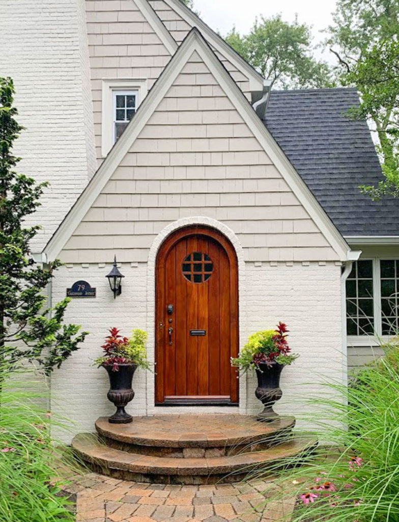
|Great discussion. I’ve often wondered, what is Your favourite house colour-if you had carte blanche? I’m guessing it’s an oatmeal colour, as in the example of the fourth picture.
Our home used to be white and because we live near a busy road, it was so hard to keep clean. We switched to a medium gray green and never missed the white. It hides everything.
New tuck pointing turned a little pink!! Yikes!
All windows are trimmed in taupe as is the roof.
Now what do we do with the board and batten wood?? The undertones are so key here. And door??
Love your site. Have been following you since you came online. I’ve learned so much…but when it comes down to my own colors I am stuck and can’t decide.
Such a great post (again). I was just helping clients with their new windows and I specified cream (instead of white). I basically had to be very FIRM with the window company as they wanted to do white. Thank goodness my clients trust me and know that I am confident in what I am doing.
Cheers,
Sheri
Another thing that makes exterior colors hard is that most fixed elements like vinyl windows and roofs offer little choice of color. At least here in the States. On windows, you are stuck with white, putty or dark brown, for the most part. (Unless you can afford wood windows, which are astronomical.) I find myself advising on the “least objectionable” option instead of the optimal choice.
Another limiting factor is the widespread use of red and pink brick. Builders use it ’cause it’s cheap, but these tones are much harder to work with. When I work on a house from the 20s with blonde brick (or a warm white from the 60s), we have so many more color choices open to us. Sigh.
The pain is real!! I am deciding on white paint for our pink/orange brick house now and which Pella vinyl to go with. What white goes with Pella Fossil?
Is Portobello and white too trendy? Maria, please do a post on colors that coordinate with the basic vinyl window colors we have to choose from. No one has done it!
Well, we haven’t painted yet! That’s the good part. We just put on the blotchy roof recommended by the roofer – probably because he had purchased piles of it at discount. It’s not terrible. House is stucco, now painted soft wheat -y yellow. White windows because, of the 3 color selections for aluminum clad wood, white seemed the most classic. We have buff-y stacked stone entry and patio and one jutted out accent wall close by. European style architecture with many angles. Biggest problem is the 3 car garage doors that only came in sick colors and can’t be painted (though of course we were old they could be). They are almond. Though not facing the street, because of the side they are on, they are a prominent feature on the house. To ‘erase’ them, have decided it is best to do an almond and white trimmed house, similar to your first picture. Reminder to self to be aware of undertones. Seems like the ‘quietest’ choice. Certainly not MY choice in the world of unicorns I’d love to live in!! Sigh… You’ve taught me so much. Thank you.
Great points and photos….Maria, what are Your top 3 picks for exterior paint colour?
sorry for the duplicate post-the first didn’t appear right away so I re-posted a short version…I’ll wait next time!
Maria, Fantastic post as usual. You always give us so much to think about. I will be noticing more roofs now. However in Calif. so many are pinky red tile which makes it a little easier to specify brick or stone colors.
The blue house in the picture above is terrible with the roof and brick color. I would never use that roof because it is too splotchy.
Thanks for all of your wisdom!
Ashley grey for the shutters. The darker one is too green.
I would pick Ashley Green for the shutters.
This post was great and very timely since my husband and I are completely renovating our
“Snowbird retirement” home in Arizona. We looked at 7 window manufacturers to replace our windows and only 2 color options were available, white and an ugly “pink beige” they call Tan. If you want black, off white, ivory or bronze the cost of each window skyrockets 35% more for each window, resulting in thousands of dollars up charge when you are redoing a whole house. I went round and round with my husband, telling him that the tan was pink-beige and would not work and we needed to do white. He finally caved in to the white windows…so now we will choose a stucco color that is not brown, gold, there cotta, butterscotch like every other home out here. I will do a beautiful off-white that will coordinate with the white windows. I’d love a few suggestions from you for favorite off-white neutrals for exteriors..I have both of your E-books and find them so valuable. Keep doing what you do!! I have learned so many valuable tips and information on colors from your blog!
Maybe you’ll say I’m crazy, but I love the pinkish stone. I really do. They’re natural, too. The key is to coordinate the rest of the house WITH them. We’re talking exteriors, not interiors where the tiles are man-made and don’t have to be pinkish but too often are. Outside, I don’t object to pinkish stone. However, if you also have brick to your exterior, then obviously pinkish stone is a bad choice. But the current trend of mixing materials gets tiring–you’ll see brick and stone and siding all on the same house!
I’m working with some clients right now – they are adding a two story addition. It’s a 1930s home – the brick is red and their siding is peacock blue. Right now their door is orange and they asked me what color they should paint it (they don’t want to paint the siding or brick) – I said dark gray – maybe SW Black Fox? I like the idea of a dark gray door with a house that has a lot going on! 🙂
But what does the dark grey door relate to? The roof? A door colour should stand alone as a great accent or it should relate to something, especially when there’s a lot going on. Adding a neutral colour to a busy colour scheme is not always the answer.
Hope that helps,
Maria
I think where a lot of people go wrong in selecting vinyl windows is–they want white inside so white goes with everything outside. I understand that they now make a window that is one color inside and another outside. I have not investigated this –does anyone know?
Yes that window exists but it costs more. However, there is a cream/beige window that works better with earthy stone, that’s what should be used instead of stark white. Maria
We painted the exterior of our vinyl windows about five years ago and it looks just as it did the day it was painted. You don’t have to accept white or beige if it truly does not add to the color scheme of the house.
Maria, I’m about to choose a front door color and am considering black. I’m curious if you think a black door ever becomes dated? Am also considering charcoal but think black is better with my house. Thank you!
Well if the house has black stone on it, is painted charcoal and the door is black too, then yes it will feel dated, otherwise I think it’s a classic choice in the right context 🙂
Our neighborhood was built in the mid 90s, and the homes are mostly light-red brick (not classic dark red) with beige windows, trim, and siding (in the back), and brown asphalt roofs. Definitely the brown trend.
Vinyl replacement windows are available in stark white or green-beige, and the homes done in white look terrible. Thanks to you I know why – white isn’t for earthy colors, so green-beige is the better choice. Do the other beiges on the home need to be re-painted to coordinate with the new windows?
(I’m afraid I’m rocking yellow-beige siding, a pink beige garage door, and soon-to-be green beige windows!)
The window sash was almost never white or cream prior to world war two. For the many classic new houses being built these days, black, very dark green, or another very deep color is the most appropriate. Trim is then painted a lighter color.
Vinyl replacement windows should be avoided on classic style houses for many reasons, including inappropriate color.
Actually, I have seen brick, stone, stucco w/ half timbers & cedar shingle sidings on the same house and it looked very nice! BUT it was a Tudor Style home!!! You can mix the 2 different sidings and more, if you do it right and IF it is a Tudor or Craftsman style home… Just saying… it can be done.
I have a home that has a red brick front. The windows and trim are cream and shutters black. I am wanting to switch from cream windows to black. What is your opinion on changing over to a dark color like this?
I would have to see photos to give you the correct advice, you can purchase the consult for that decision here: https://mariakillam.com/product/trim-accent/
Warm regards, Maria
You didn’t mention if windows should be creamy or white if the brick is white. Matching sounds dull- maybe a color like Pella’s Fossil or Tan for a little contrast? I love a dark window but it’s the rest-of-your-life permanent! And windows like ours with no shutters doesn’t give us another source of color.
Nothing wrong with that idea, if you’d like help to make sure your very permanent choices is just right, you can purchase that eDesign consultation here: https://mariakillam.com/product/trim-accent/
I can’t give you accurate advice without photos! Thanks for your comment! Maria
“Notice however that the stone (above) does not relate at all to the shutters. They are a blue grey while the dark colour in this stone is more of a pinky taupe. The best colour for these shutters is more of a pinky taupe, which one would you choose?”
I disagree. I think the blue grey is a very nice choice. There are subtle greys in the stone which the pale blue grey compliments beautifully. “Pinky taupe” would blend in so well, that the character of the shutters would be lost and the whole color scheme would look too “matchy matchy”.
My windows are cream inside and out. I want to paint some of my walls light gray and some of them white with white trim. Can I do that with the cream vinyl windows?
Yes, ignore your windows, there’s way more trim work in a house with baseboards and crown, etc. Just pretend they are not there, it’s all you can do if the windows are not the right colour. Hope that helps, Maria
Choosing a color for a mountainside house isnt the same process u use for a non mountainside house, at least in PHX AZ. Mountainside homes should blend in WITH the mountain, remember someone else not on the mountain with a view of the mountain doesnt want to see your big red house. That is why the mountainside you spoke of had browns tans & charcoals. A home should NEVER stand out when on a mountain, the mountain should be the focal point NOT your big red house. the price you pay to live on a mountain is having a only a few house paint colors to choose from.
I bumped into your article just in time. I’m adding flagstone and rocks to the landscape of the tiny front porch garden of my property. Because the front siding is painted a deep taupe and the plaster a creamy color I’m rethinking the creamy color since it needs repainting. The trim is white. It is a very small “beach bungalow” in the Inland Empire, Ca., and your article has given me good information to select the right color for the flagstones and rocks, plus the correct choice for the plaster! Thank you!!!!
I have a red roof house and I want to paint my house white.
I have taupe/beige vinyl windows. What color shutters should I paint the shutters?
Do you have any idea of colors used on picture #4 along with window color? It looks creamy but unsure.
The color on the house above is the least of its problems. Here are the structural ones: The siding was installed before the window casing (trim), making the windows appear snapped on. The window casing has too shallow a reveal, lending even more to the snap on effect. The window grilles are set within the glass, making them look flat—2 dimensional. The roof brackets are attached to the siding; they should be attached to a larger frieze. For correct proportions, the frieze might need to be larger and the brackets slightly smaller.
Oh, I almost forgot this re the house above. The window to the right is a big “oops.” It is set too close to the left roof soffit, making it look crammed. This was a mistake by the builder, and it shows. In architecture, “God is in the details.” “But so is the devil.”