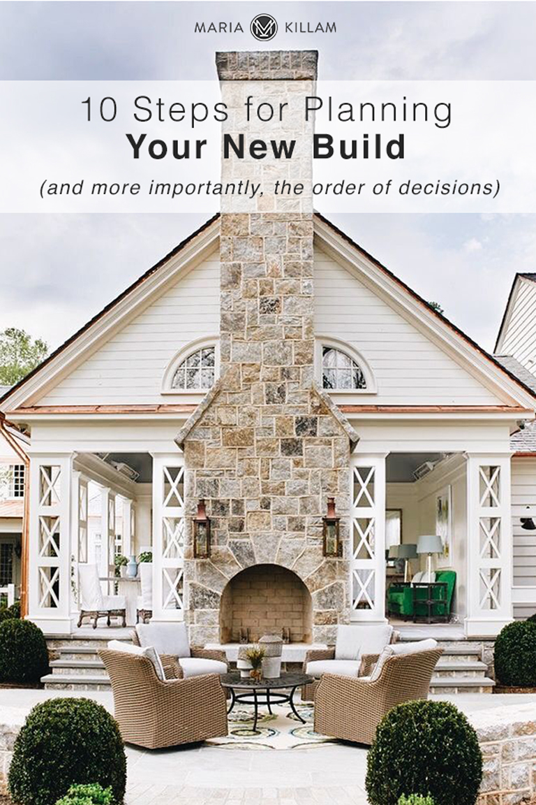
Are you building a new home? There’s a lot of decisions to be made and you may be wondering what you need to choose first. Here are 10 steps (and more importantly, the order of decisions) and so many indispensable tips for planning your new build.
In January and February we’re extra busy in our eDesign department working on New Build packages because this is the time of year when planning begins for renovations or planning your new build.
If you’re planning your new build, you should be aware that colour decisions for the exterior need to be made FIRST. So don’t wait until the last minute (which often happens).
10 Steps To Planning Your New Build
Many people who are building a new home think “I’ve got this” but then when it comes down to the wire and the builder is hounding you for colour decisions, that’s when you start losing sleep, worrying that you’ve made the right decision.
We constantly receive emails with last minute requests for help with exterior colours because you started searching on-line for the right answer and then hit my website and started panicking when you realized you can’t just wing it with colour decisions.
To help you out, we have a new build and the link to the new build exterior package is on the page.
If you have just finished a renovation or you are currently planning your new build and just found my website? Don’t read this post. It’s not fun when you realize you’ve made mistakes, as I’ve said in the past, ignorance is bliss. Read this post instead.
Just enjoy your new house and if all else fails and you really are cranky with the choices you’ve made, decorate to distract the eye!
The Order of the Decisions when Building a New Home
The order of the decisions that need to be made when building a new home is very important! Once you make a few key colour and design choices in the beginning, the conversation about what comes next is less about ‘What you love’ and more about ‘What will look good with what you’ve already chosen’.
If you feel like you have to fall in love with every hard finish choice you make, you might end up with a bathroom that looks like this one (below) with a thought process that probably went like this:
“Hmmm, I love black, I’m going to love it forever, so let me grab this pattern. Oh, I really love this black and white marble, I need that right? Oh, and I most definitely need a black tub with a black faucet.” Check, check and check.
And then in the end, the walls end it ends up an overdose of too much black.
Plus, this bathroom is so trendy it will forever say “I built my house inside the black trend”.
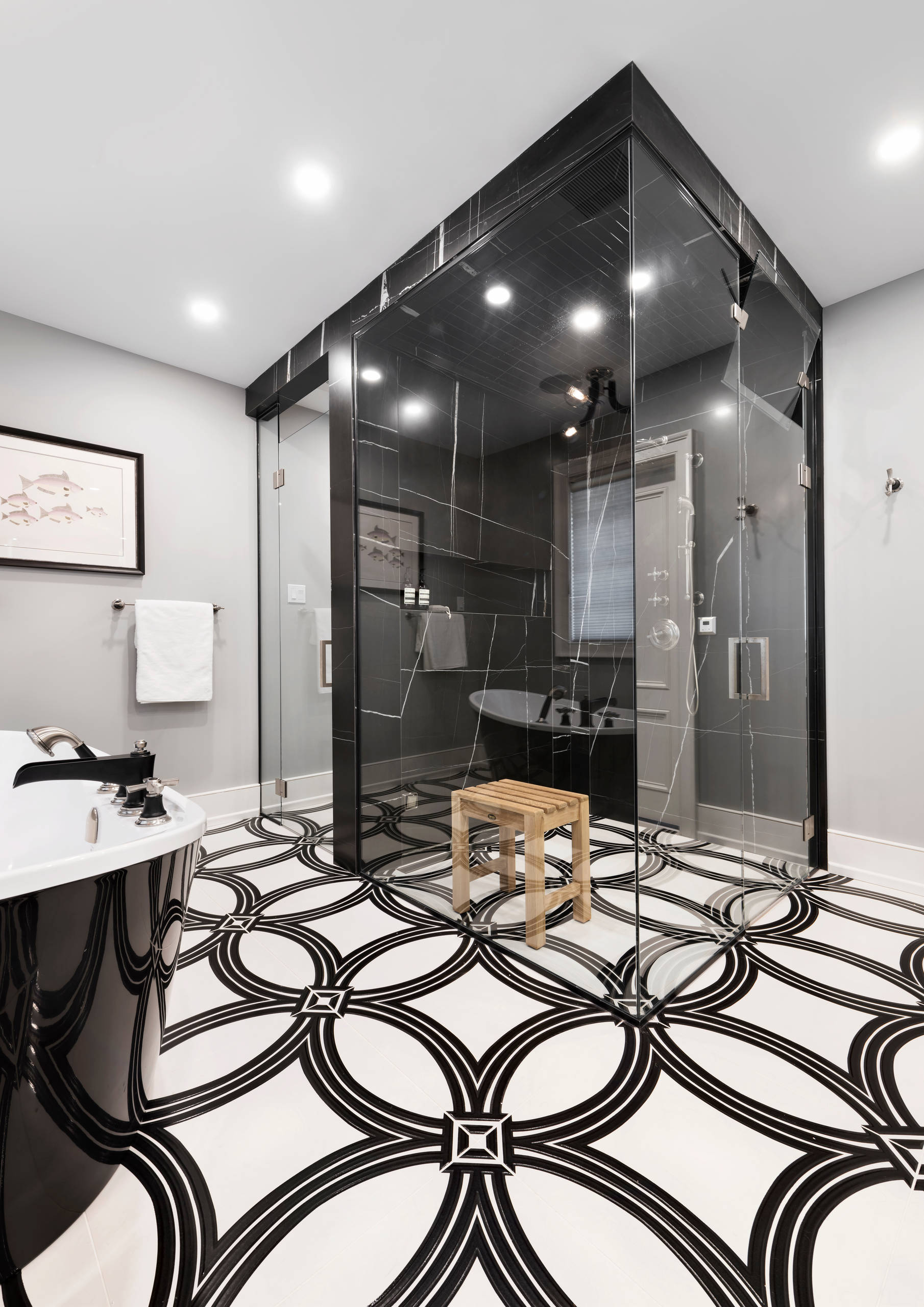 Trendy not timeless
So, if you are at the beginning of a project and you have not enlisted the help of a designer, here are the steps you need to follow:
1 | Choose your floors first
You have two options. Pale natural looking maple or white oak floors (or LVP that looks like that), or medium brown. The end.
Notice there is not a stitch of grey in these images. Plenty of people are still installing grey weathered or ashy looking wood floors that are vestiges of the grey trend. You can still get them at any flooring store. That’s because they have stock piles of them leftover from the grey trend. If you don’t want your house to be dated by at least a decade, don’t install grey or taupe floors.
If you do have grey or taupe wood look floors, don’t worry, there are easy ways to warm up the look. Read this post.
These are the pale laminate floors I had in my last house (left) and the medium brown oak floors in my current home (right)
If you want tile on your kitchen floors–despite the thousands of apparent options in the showroom–good options are more limited than you think, AND then it needs to relate well to your countertops. So if you don’t want a muddy, blotchy looking mess, this is when the rule of only one pattern in each room should be implemented, which is:
After you’ve chosen one pattern in your hard finishes for the kitchen or bathroom, that’s it. Your pattern quota is done.
It RARELY works to have two patterns in the same room.
And since most homes have traditional kitchens, a solid white floor tile will look too modern, so consider something like the this instead:
 Holly Bell Design
If you are installing a stained wood kitchen read this post for the most timeless countertop.
2 |What will your fireplace look like?
This is not obvious to everyone, but your kitchen should coordinate with your fireplace.
Unless you are building a beach house or a house in the country, I would stay away from stone. Natural stone (from the earth) is not white and that means the colours are generally earthy and will boss around your colour scheme just like a busy granite countertop or blotchy floor tile.
The options for the most versatile stone whether cultured or natural are very limited. And the neutral undertone/s in the stone will need to be repeated in your kitchen for sure. It doesn’t work to install a timeless white kitchen in the same space as an earthy stone fireplace.
Related post: Should Your Great Room Fireplace Relate to the Kitchen?
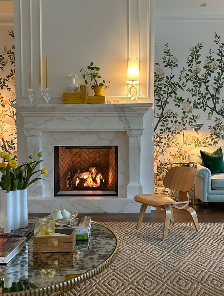 Here’s how I made our new fireplace relate perfectly to our kitchen.
A timeless white millwork fireplace with a classic square firebox is going to be the most timeless choice in most cases.
Definitely, unless you are building a modern contemporary home, avoid the trendy linear fireplace.
I don’t know about you, but I would much prefer to have options when decorating my living room rather than having to consider the fireplace colour and add whatever that colour is to my colour scheme.
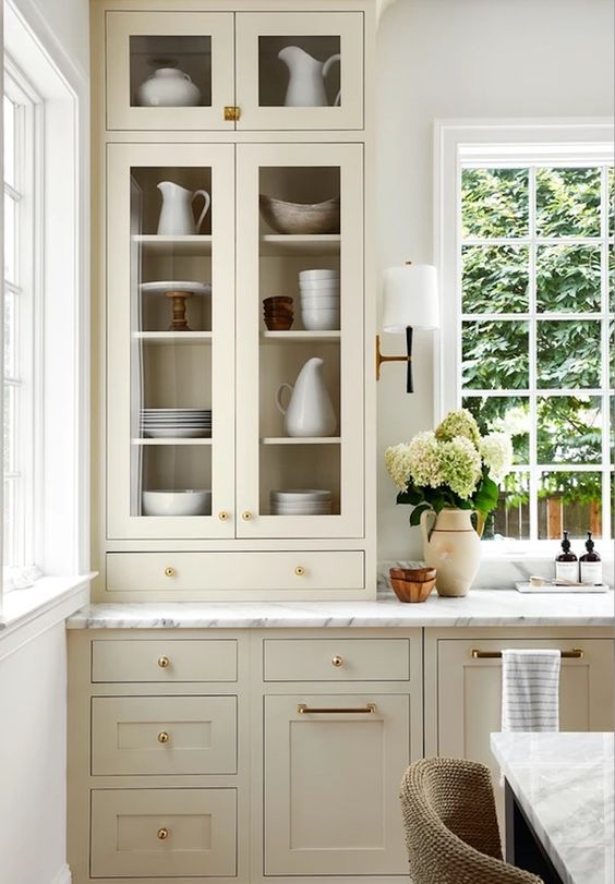
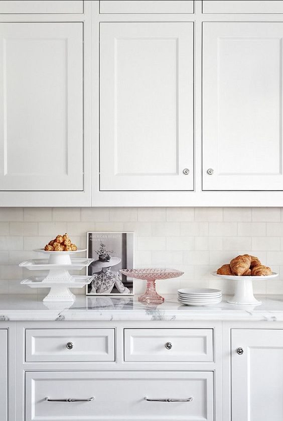
3| Choose Your Countertop Next
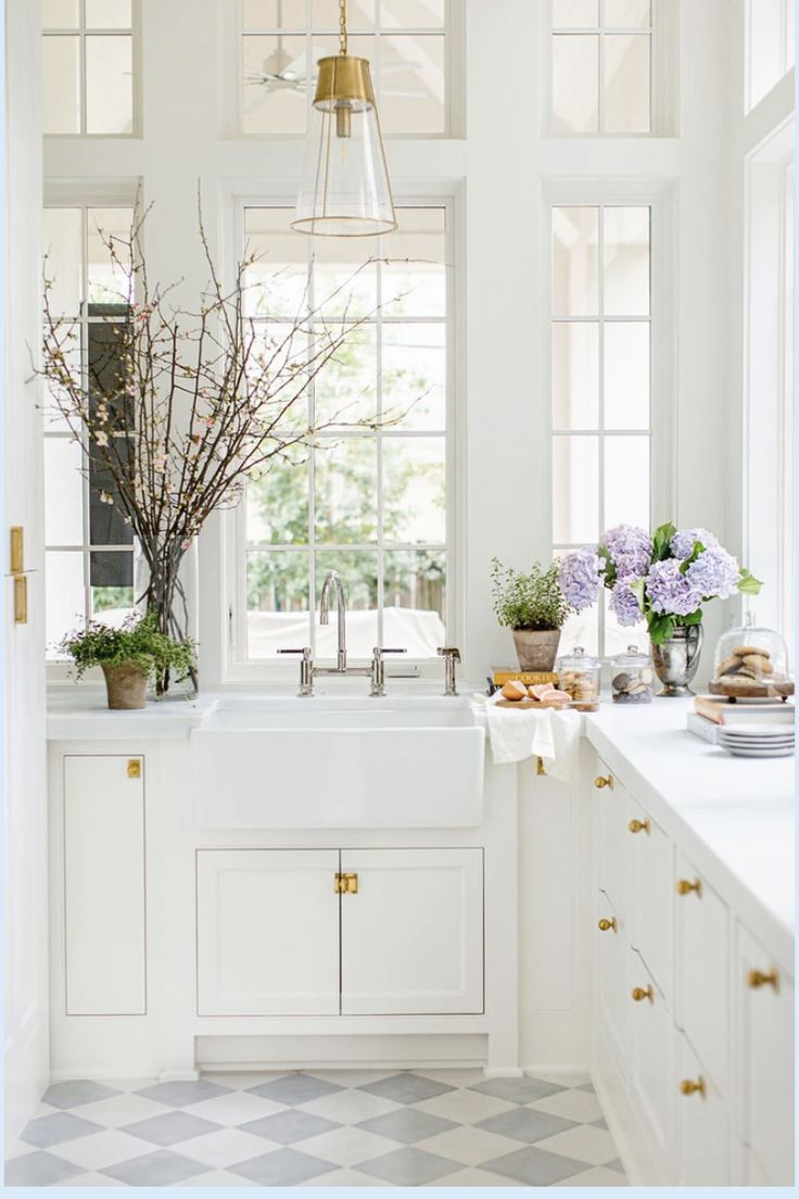
Will your countertops be a true-white, off-white, or cream? Some kind of white is a timeless choice and will will determine the right gradation of white for your cabinets (if you want a white kitchen) and trim. Countertop options are more limited than white paint colours, so that is the next decision.
Note: if you’re going with floor tile in the kitchen, look there first because the countertop should look perfect with it. And if you are installing a stone fireplace, that will determine the options for your countertop and cabinet colour.
I have many clients who say “I don’t want a stark white kitchen”. That is totally fine. No one ever said that you can’t have a timeless house with a cream palette, your favourite colour or the trending warm neutral cabinet. Or even timeless natural looking wood stained cabinets.
Find large samples of the best warm neutrals for cabinets here.
Whether you’re going with white, wood stained or a colour on the cabinets, it’s wise to keep the flooring, countertops and backsplash as simple and timeless as possible. Most often in the realm of white, cream or the palest (almost white) neutrals.
Because the definition of classic and timeless design is “Will I be stuck in a specific colour scheme forever?” If the answer is NO, you’re golden.
With pattern, the question to ask yourself is “Will I get bored of this in 10 minutes?” (below), um yeah.
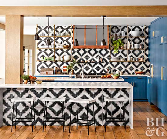
Hilary Duff’s kitchen (And if you have money to burn, you can change it 10 minutes later, no problem)
4 | Choose Your White
In most cases your trim and millwork should be some kind of white. Often, your countertops will dictate whether you should choose a true-white, off-white or cream for your paintable white millwork such as the fireplace millwork, trim and cabinets.
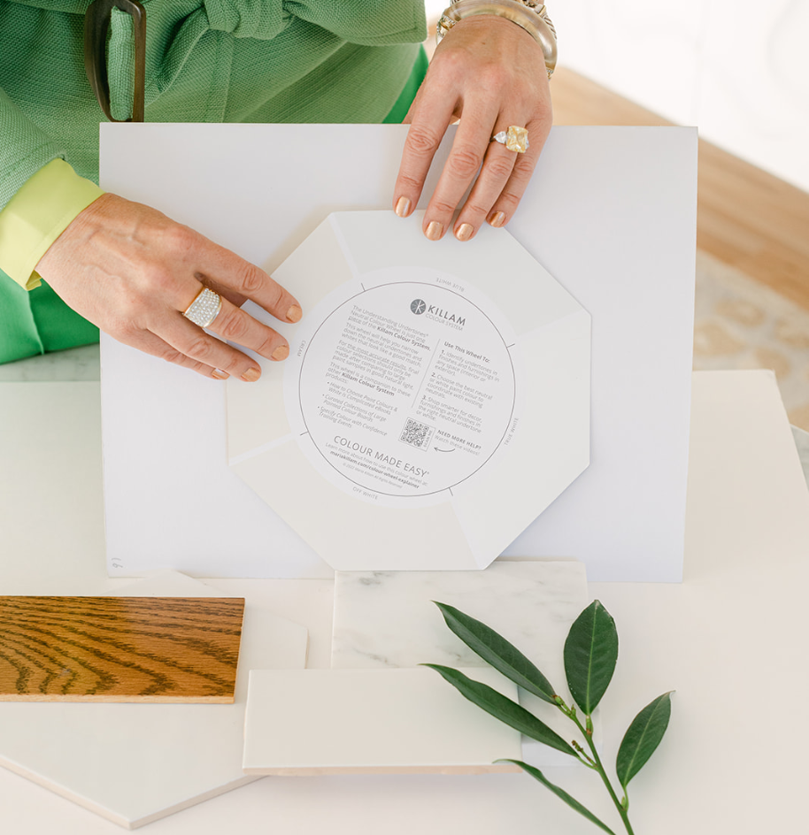
You can find the four gradations of useful whites on the back of my neutral colour wheel.
Unless I specifically state “True white” when I mention WHITE on the blog, assume I’m talking about the white that works for your house.
So when I say white, it could be anything from a blue-white to off-white, true-white, or cream. It should always be custom to YOUR home.
If you are choosing whites for your renovation or planning your new build and you haven’t bought my White is Complicated eBook which will teach you exactly which white you should choose? Download it here.
5 | Backsplash Tile
And this brings me to the backsplash, now that you’ve chosen the floors and the countertop, you can choose the backsplash.
Yes, it will be installed last so it’s not absolutely imperative that you choose it next, however if you are committed to a classic and timeless palette, you easily could.
Keep the backsplash simple, in white or cream because that allows for a wide range of colours for decorating, styling, walls and cabinets.
Here’s a white mosaic cut backsplash (below) that still allows lots of flexibility with colour. The intricate pattern is kept from being too busy with matching white grout. Keep in mind some cuts will be better suited to modern kitchens and others are more traditional (like this one).
Related post: The Best Backsplash Tile For Your Kitchen
If you are ONLY renovating your kitchen, you can get my help with our Create a Classic Kitchen eDesign package here.
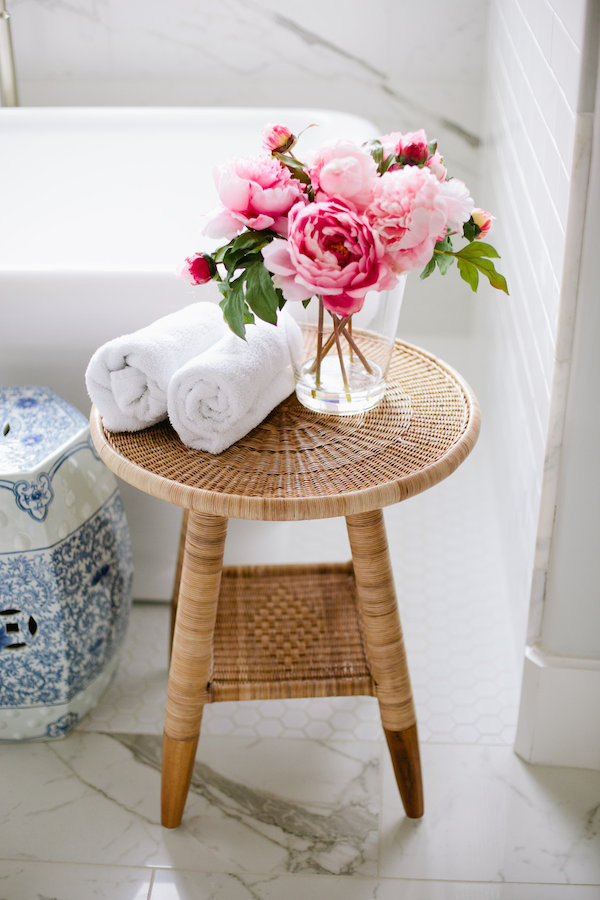
6 | Bathroom Tile & Countertops
After the kitchen and great room, bathroom tile is next. If you’re after a pretty bathroom that’s timeless, stay away from all the busy, blotchy, patterned, trendy tile. Tile pattern fads cycle very quickly. Simple is best.
Here are some guidelines for creating a timeless bathroom you’ll love for years to come:
A traditional white or black and white mosaic is always a classic choice. Why? Because this is what you expect bathroom tile to look like.
Think a timeless white bathroom is too stark? Think again. The paint and decor can be as warm or moody as you like, but you’ll appreciate the option afforded by timeless tile to choose different colours in a decade or two when it comes time to change it up.
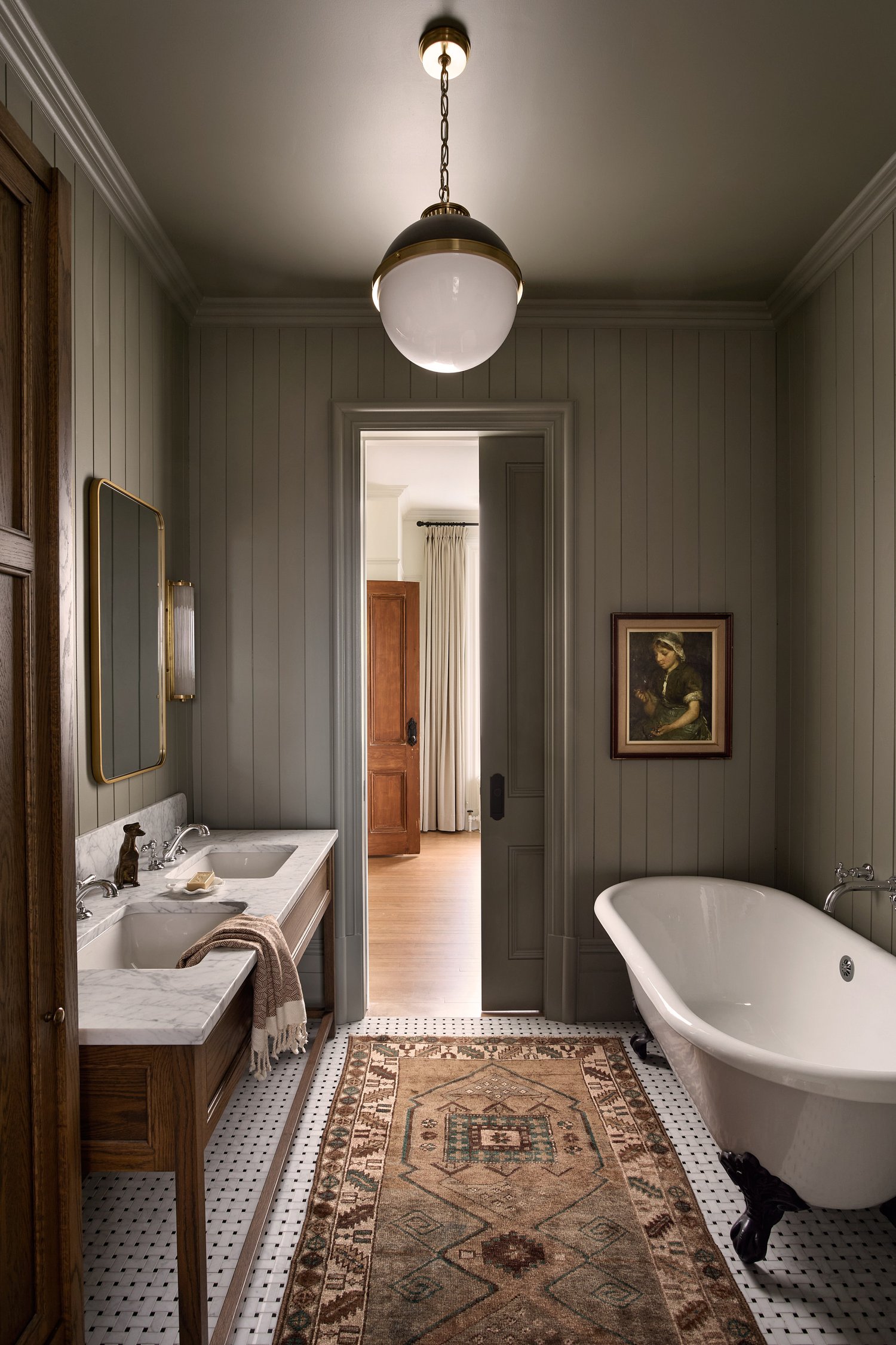
A new area rug and coordinating paint would completely change the look of this beautiful timeless bathroom by Blanc Marine
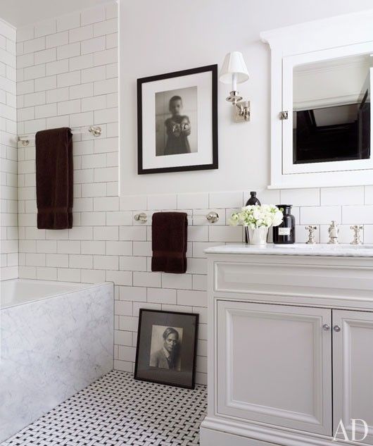
Now that we’ve all seen too much harsh contrast in the fast waning black and white trend, it’s wise to tread lightly with black. Especially in a white bathroom where too much black will look harsh and busy.
This bathroom below repeats the black mostly in decor which is ideal.
Definitely avoid the builder default black plumbing fixtures at all cost. Choose chrome or polished nickel.
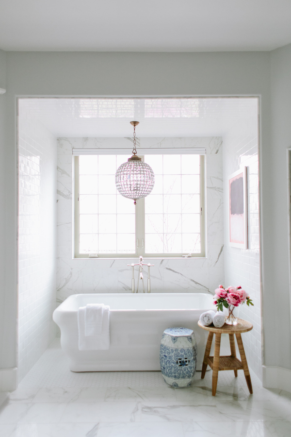
Small scale tile can be expensive to install so if you’re on a budget, choose a faux marble tile (below) and install it everywhere.
For more examples of classic and timeless bathroom tile, shop my Pinterest boards here.
BONUS TIP: How to Coordinate White Bathroom Tile
Those of you who are fixated with getting your whites right (as I am), notice that the 12″ x 24″ faux marble is not as white as the white hex on the floor underneath the tub or the subway tile on the wall. Don’t try to match it, you won’t be able to do it. Better to contrast it instead. This combination works because the true white tile relates to the bright white bathtub (below):
By the way, notice how hard we are working to coordinate whites! Imagine trying to do this with NEUTRAL undertones. It’s no wonder most bathroom tile doesn’t match or just looks plain bad in the end.
Related post: When Should you Rip out Brand New Tile?
If you need help selecting all your bathroom choices, you can purchase our Create a Classic Bathroom here.
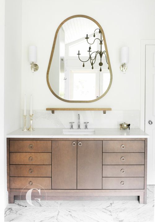
7 | Bathroom Cabinets / Vanity
Consider wood stained cabinets in the bathroom. It adds contrast and looks elegant with any white (or off-white or cream) tile.
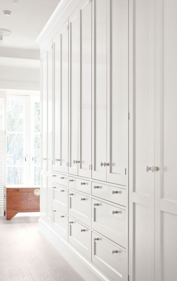
8 | Hardware
Hardware for your cabinet doors looks easy but here’s the guideline to keep in mind.
Choose knobs for your cabinet doors and pulls for the drawers. If you coordinate both, and even go so far as to choose custom lengths for the pulls (depending on how large your drawers are) it will look like a designer was here.
If you are on a budget or you just don’t have time to figure out what goes where, choose knobs instead of pulls (below). Visually, less is more when it comes to hardware. A kitchen full of 4″ long pulls on all the doors and drawers gets busy looking very fast!
9 | Lighting
Choosing lighting is hard. It look me many years of being in the design industry to get good at choosing lighting.
It’s the reason why builder lighting is usually bad and all match-y. Lighting should be chosen to coordinate with the style of the home and each light should coordinate with the other.
View my Pinterest board for classic and timeless lighting ideas.
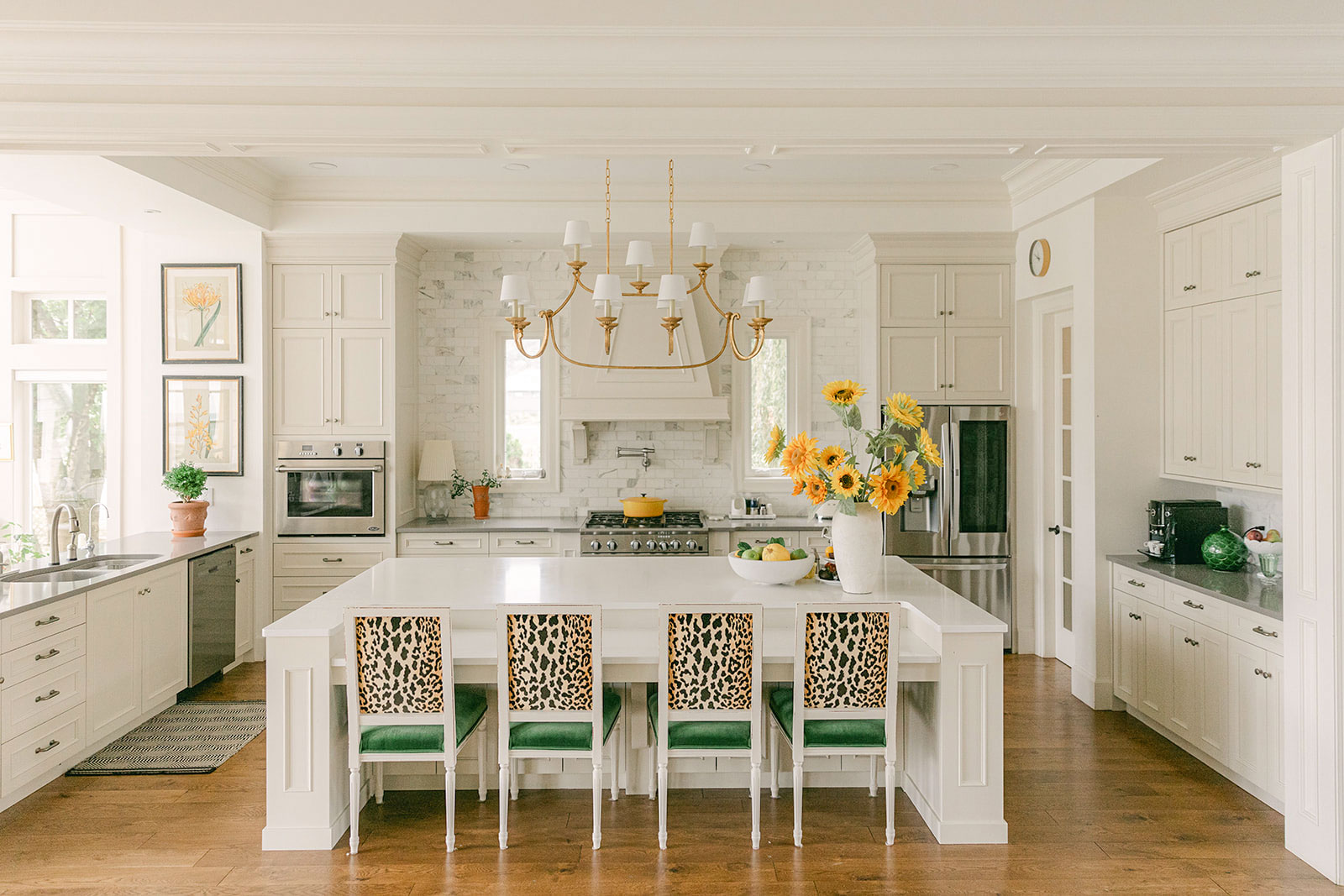
I’m obsessed with my new kitchen chandelier (below) that captures the traditional look of my new kitchen and living room. If you’re stuck with boring builder lighting, make a plan to upgrade your fixtures when you can. It’s such an important detail.
 Hot tip: avoid clear glass or bare bulb fixtures because the light is softer and more flattering to both you and your room when there’s a shade around it.
Lighting is where you get to add some custom and personal details. It’s a detail that can be more trendy rather than strictly timeless because you can switch your fixtures out more easily than replacing tile, for example. When you purchase a New Build Consultation, we include coordinated lighting that takes cues from your personal inspiration.
10 | Paint Colours
Notice that paint colours are dead last!
Why?
Because now we have chosen all the hard finishes.
Related post: Are you Waiting for your Paint Colours to Propose?
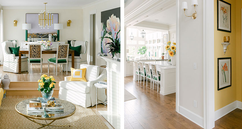
It would be even better if you had a colour scheme for the living or great room at this point but most people can barely keep up with all the above decisions to think about which colour their sofa will be.
A great place to start if you want to choose more custom paint colours right away is by creating some mood boards. Get access to this popular course when you join my community!
We are finally moving out of the stark white walls trend. Throughout, I have been specifying the palest, almost white or cream neutrals instead for a more timeless and custom look. Because most people do not have a house that will look good with true-white or off-white, in other words, art gallery white walls, this statement says it the best:
White is a snob, white walls create an art gallery effect, spotlighting attention on every object so each must be worthy. White walls highlight shape and colour and tolerate no chaotic mess. Each object is part of the composition and so has to be selected and positioned with a curatorial eye for arrangement.
When My Clients Say White
When my clients say white, I automatically hear “almost white neutral” because most homes need SOME colour in order to look finished instead of that the walls have been primed and are still waiting for colour.
We are quickly moving into a warmer look in the trend cycle. Warm neutrals and colour are the antidote to stark white fatigue. And I’m all for it. But now you really need to know how to coordinate colours and neutral undertones to get it right. Start with my eBook, How to Choose Paint Colours and my neutral colour wheel for a handy quick reference!
And then keep learning, connect and find support for your projects in my colourful new True Colour Insider community 💛
Get samples of my curated paint collection delivered to your door with Samplize! Click here to buy the best pale neutrals for walls.
Don’t go it alone
I wrote this post to give you a simple guide to the best order to approach your selections. And to gather several resources I’ve created for you in one place. As you can see, it barely scratches the surface.
You’re probably getting a sense of the complexity of the task at hand. Hundreds of choices – choosing every single finish, colour for your home and making sure they all coordinate beautifully. It’s not easy if this is not what you do all day every day! It’s understandable to feel pressured and overwhelmed.
Honestly, I don’t recommend that you go about spending thousands of dollars building a new home WITHOUT any training or guidance. You would never get hired as a buyer in any company responsible for spending thousands of dollars without training.
It works the same way for your very expensive house. And every day for as long as you live there, you’ll have to live with hasty decisions, made under pressure.
Here’s how I can help.
If you have a home project planned for 2025, definitely sign up for my FREE masterclass, How to Trend Proof your Dream Home. Hurry! It’s only a couple days away!
As I mentioned, you can also HIRE ME to choose a custom colour and finish plan, including details like hardware and lighting, for your project with my eDesign New Build package.
It’s my life’s work to help you create a home that fills you with joy every time you walk through the door 💛
Here’s a lovely testimonial we just received from a happy client:
“It’s been over a year and we are finally in our new construction home! Just wanted to send a heartfelt thank you for your expert advice. I can’t express adequately enough how much the new build and exterior packages helped me with my decision making! It made meeting with all the different subcontractors so easy and pleasant. I was prepared for meetings as I had ordered all the finishing samples recommended and would bring those along with me (including paint samples!) They were always pleasantly surprised at how quickly our meetings were because my choices had already been made. From paint color recommendations to hard finishes. Not going with the trendy choices made some suppliers scratch their heads but even they had to admit the recommended choices were indeed timeless. Your packages gave me the confidence I needed to stick with the plan and I’m so glad I did! Thanks again for taking so much stress out of the building process! Would definitely recommend your packages to anyone building a new home!! Now to decorate with color!!!!!Thanks again for all your help!!!!”
~Amber Weeks
Related posts:
How Maria Saved Me from a Trendy Black Kitchen
5 Dream Kitchen Details you will Regret in 2030


Maria’s mission statement is so true:
“…help you create a home that fills you with joy every time you walk through the door.”
I’ve been an avid reader of Maria’s blog and we purchased the new build package when we built our new home. Thanks to her, we avoided black windows, black hardware, exterior foundation stone, and so many other trends. We are grateful to have a timeless home that brings us joy every day.
Thank you, Maria!
Fantastic article Maria! All the steps one needs to consider when starting a whole house decor. This will save hundreds, if not thousands of dollars, on making one’s home timeless! My daughter’s offer for her home purchase in San Diego just got accepted today. I will be sure to pass on this article!
Wow, what a great post! This sums up the information so well. I’ve been reading for a while now, and the blog is a goldmine, but I think this is the best you’ve articulated your concepts yet.
A really amazing post. So interesting to read. Packed with information. Your insight is so good. When you said, Don’t try to find a white tile that matches the color of marble, make a contrast instead and make the tile relate to something else, I realized that’s why it was so hard for me to choose a kitchen backsplash.
Also, I am continuing to struggle with lighting. I am glad to hear that you took a long time to get a handle on lighting, because I thought I was being too picky. I have so many old fixtures and I can’t decide whether to change them or not and what I would even change them to. Everything online looks too old, poor quality, or too trendy. And good lighting is expensive, so it is hard to take the plunge.
If I had a new build, I would definitely need your help. I can’t believe that some people do it on their own.
is wallpaper that is neutral timeless or go with paint