Today’s post is a guest post from a True Colour Expert and long time dear friend Claire Jefford. She’s sharing her process for creating her stunning colourful kitchen.
Maria’s colour training marks a significant milestone in my design career. Hearing Maria articulate why neutral undertones are an important colour consideration and how not all whites are the same was invaluable for me.
I always tell other designers that becoming a True Colour Expert was one of the best investments I ever made in my business.
Over the last 13 years, I’ve evolved from questioning paint colours to mastering the art of curating projects with bold colour combinations, including my own dream kitchen that is a wonderful reflection of my fun and fearless personality.
Two key points that I want to share about this incredible project with you:
- It was almost a black kitchen, but Maria talked me off the ledge
- The colour scheme was inspired from something I hid in my basement for years
But first my bathroom reno
Before we get too far into the details behind my kitchen design selections, you need to know about my bathroom renovation first. As the story unfolds, you’ll understand why this is important.
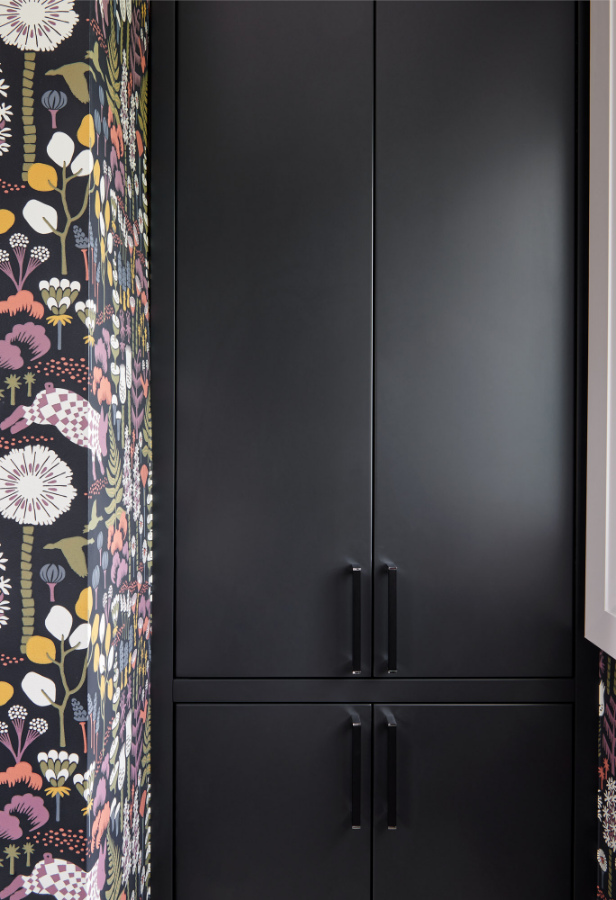
In 2020 we renovated the small main floor bathroom of our quaint three bedroom bungalow. For that project, I was craving a colourful, whimsical wallpaper with a dramatic black background to it.
I love creating contrast in many of my designs. Since I had a clear vision of what I wanted to achieve, I was adamant on using fixed elements that would not dictate the colour scheme.
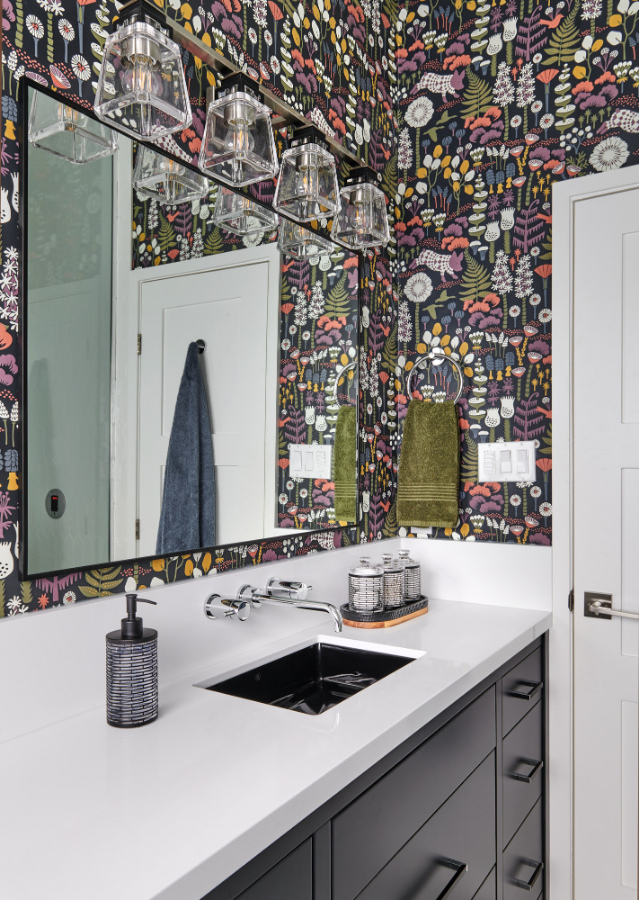
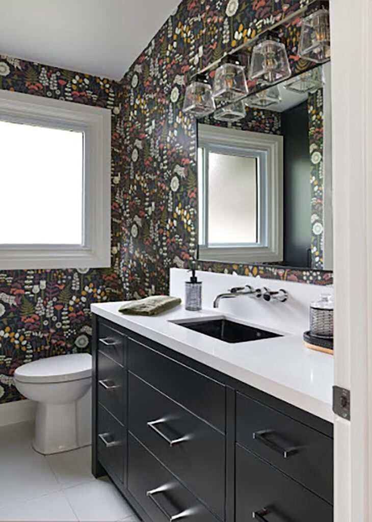
I wanted the flexibility to switch out the colours of my towels, bath mats and other accessories whenever I wanted. So I designed this bathroom with white countertops, floor and shower wall tiles and a black vanity, linen cupboard and sink.
See the before images of my bathroom here
I love my bathroom design so much, that when I started thinking about the plans for my kitchen renovation shortly after, I was leaning towards doing all black cabinetry again.
By the way, for most of us in this industry, designing our own homes is hard! Ask any interior design professional and the majority of them will tell you the same thing.
Some great colour advice
So, it was time for me to talk to a trusted advisor. Ever since reconnecting in Chicago at an interior design event in 2018, Maria and I had become good friends. To this day we speak regularly on the phone and I value her friendship very much.

Maria and Claire, 2019 Expert Colour and Design Training, Long Island NY
I knew how Maria felt about too much black…I think we all know that by now. LOL. But I still needed to talk it out because I was swooning over some of the modern black kitchen designs that were flooding my Instagram feed.
Immediately, Maria said, ‘NO, don’t do it!’. I said, ‘I know, I know!! But tell me why it’s okay in my bathroom and not in my kitchen?’
She continued to say, “okay, your bathroom is a small area of your home. It’s an island onto its own and the perfect place to indulge in a trendy colour palette. Which you did perfectly, by the way, in using black as a wallpaper and paint colour and NOT going overboard with it in your hard finishes.
The bathroom is not in your main living space, meaning, it doesn’t dictate your decorating, you can get away with it. But you will regret doing your kitchen in all black. Once you fall out of love with the black trend it’s doubtful that you will love it forever.”
Your favourite colour is much better than the trending neutral colour
I knew she was right, which is exactly why I went to Maria to help me avoid making that colossal mistake and advise on the best way forward. Then, she asked me this one question:
‘What is your favourite colour?’
My reply, ‘purple.’
‘Well then,’ she said, ‘design a classic purple kitchen that you will love forever.’
So, I did just that and I’ve never looked back since. Thank goodness for Maria.
I tell that same story here in part 6 of my series, ‘Nine Kitchen Design Mistakes You Don’t Want To Make!’.
How I found the jumping off point for my entire kitchen design
See the colourful plates on the wall behind my sweet Australian Labradoodle Cooper? Those wall plates were given to us by my lovely mother in law when we moved back to Canada from the UK in 2004 after 6 years of living in London.
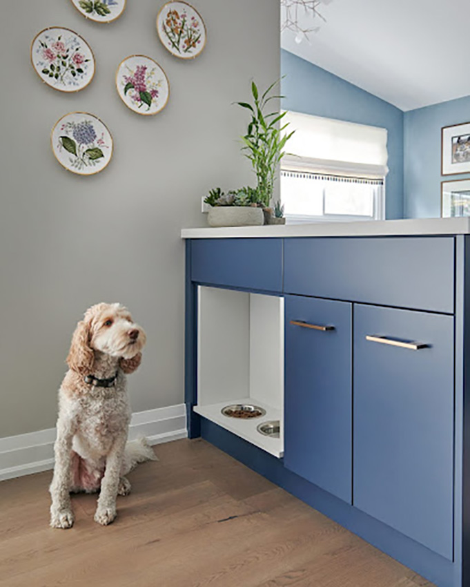
They were totally not my style at the time, but I love my mother in law to bits and appreciated her thoughtfulness. Those brass rimmed, botanical Spode plates went into a storage box under the stairs in our basement and I did not see them again for over 17 years.
Part of great design is including personal pieces when you can and where it makes sense. A house becomes a home when it tells a story. Some of your decor should reveal clues about who you are and where you’ve been. Doing this provides an opportunity to reflect upon fond memories to share with others and make you smile every now and again as you go about your day to day life.
After that conversation with Maria, I thought about those plates. I dug the box out from under the stairs and I couldn’t help but fall in love when I saw them again all these year later! When I noticed that some of the floral designs had purple tones, I knew I had found my jumping off point for the entire colour scheme.
Getting the colours right
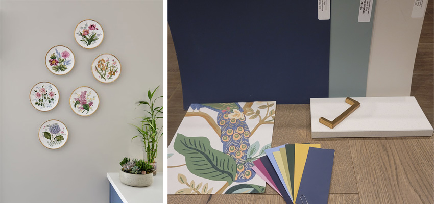
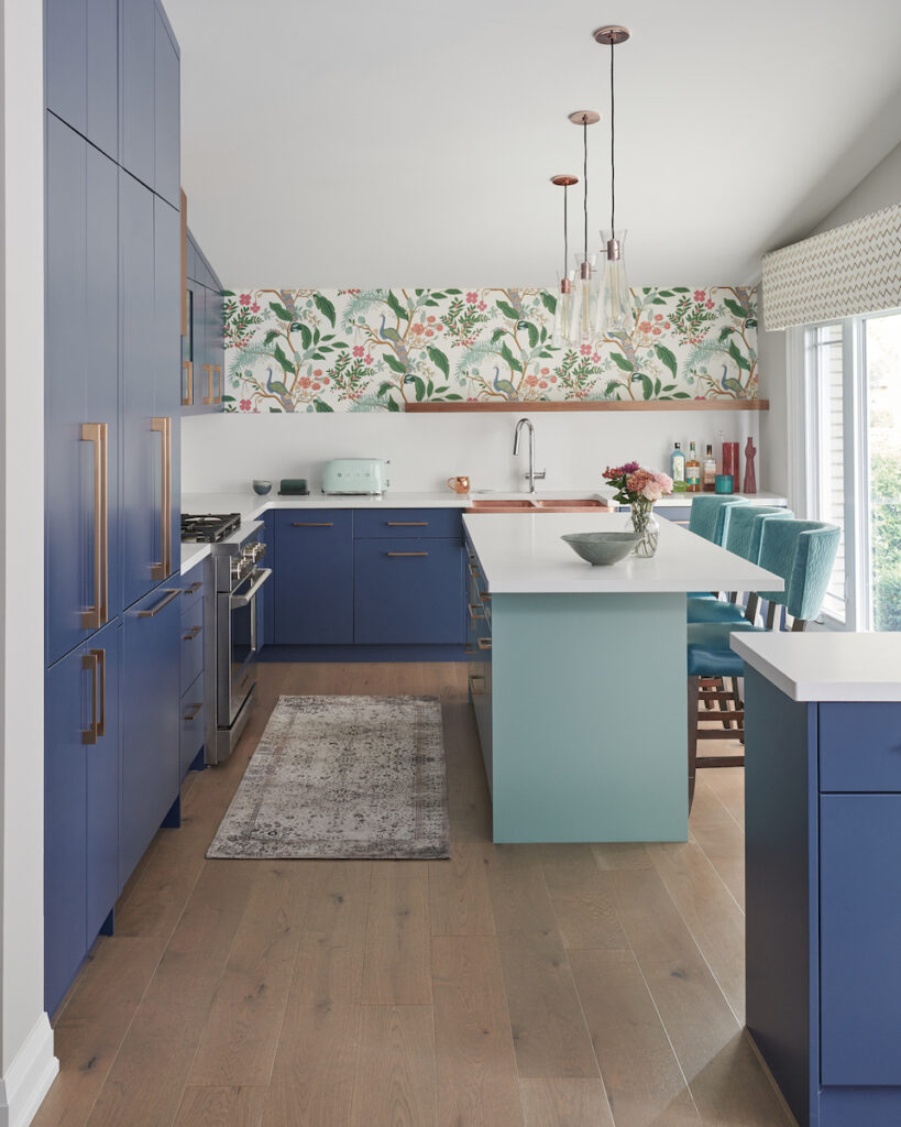
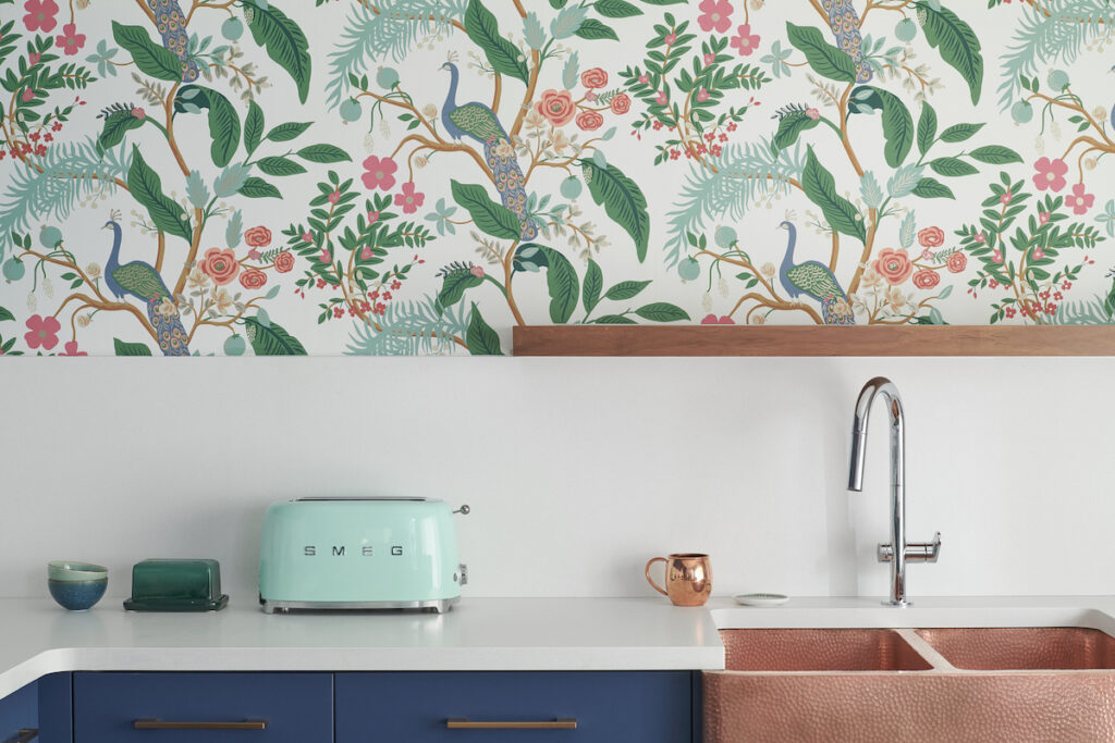
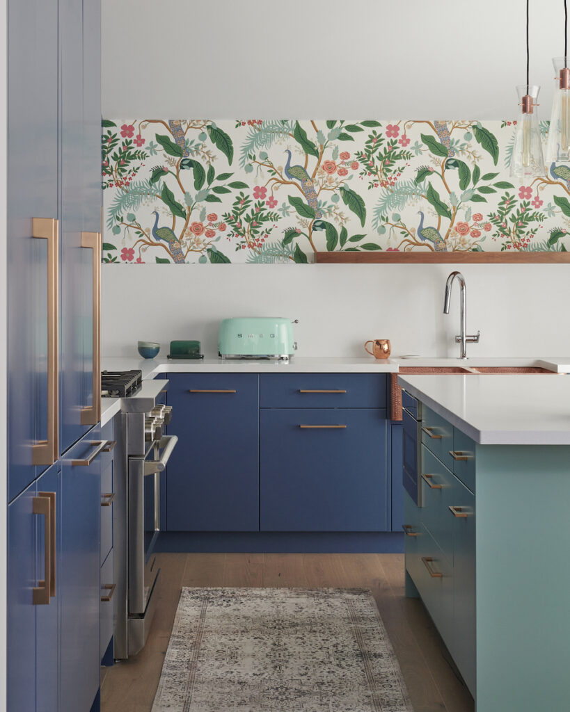
I immediately grabbed my Benjamin Moore fandeck and colour matched every single colour in each plate. From there, I selected the colourful peacock wallpaper that runs along the back wall above my gorgeous copper sink.
Repeated Colour Tones to Create Flow
The satin bronze finish hardware compliments the neutral tones in the wallpaper and various walnut accents in the overall kitchen design. The quartz countertop and backsplash is Intense White by Caesarstone and was intentionally chosen to be ‘quieter’ so not to compete with my other bold selections within the space.
In the image with some of my kitchen finishes, you can also see Maria’s large colour boards which represent the main colours used in my kitchen design:
- Kensington Blue (which leans towards purple) for the perimeter cabinetry
- Stratton Blue for the island colour
- Collingwood for the wall colour (The paint board is Pale Oak, but we landed on Collingwood)
 Kensington Blue Kitchen Cabinets Stratton Blue Island Paint Colour
In case Kensington Blue looks very familiar to you now, that might be because Benjamin Moore’s Colour of the Year 2024, Blue Nova, is very similar. Just remember that I designed my kitchen nearly 2 years before, so they copied me. ;P
Clever Storage details
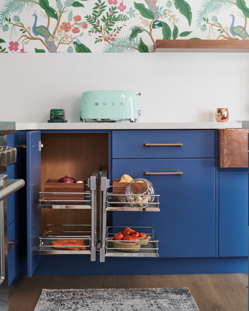 Pull-out corner storage unit
My kitchen also has a ton of hidden organization solutions like this corner pull out, as well as a hidden step stool between my panelled fridge and the pantry. You can see all the smart storage solutions and more on my thought process behind the design, including before and afters, here on my blog.
Creating Flow
For fun, I thought I’d add a couple photos of my living room where you can see how the kitchen peninsula acts a divider between these two main living areas of the house.
I repeated the blue tones from the kitchen cabinets in the swivel chairs and in the linen textured wallpaper, as well as using a walnut wood in the mid-century modern console that also houses a record player.
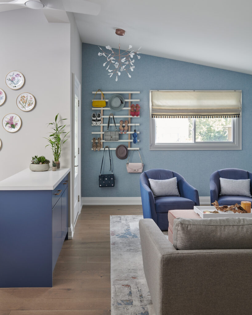
Photo credit for the bulk of the pro images to Stephani Buchman Photography.
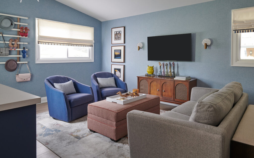
Maria may be upset that there are no lamps, but there are two wall sconces either side of the television which we have on most evenings when relaxing in this cozy space.
My business now as a True Colour Expert
I honestly could not say where I would be in my business today without finding Maria, taking her colour course and having her large painted boards. I love the boards so much that I have two sets! One set goes with me to every client consultation meeting and another set resides permanently on the walls in my interior design studio.
In 2016 I started doing Paint Colour Reviews on my YouTube channel using Maria’s large colour boards. As of spring 2020, those paint review blogs with accompanying video enabled me to monetize my blog and now brings more than 75,000 people to my website each month.
From there I generated another revenue stream in my business. I created my Perfect Colour Palettes, PDF guides of 40 popular paint colours from Benjamin Moore, Sherwin Williams and Farrow & Ball. In each guide I share inspiring palettes that you could use as whole-home colour combinations and 3 options for white paint to use for ceiling, trim or cabinetry.
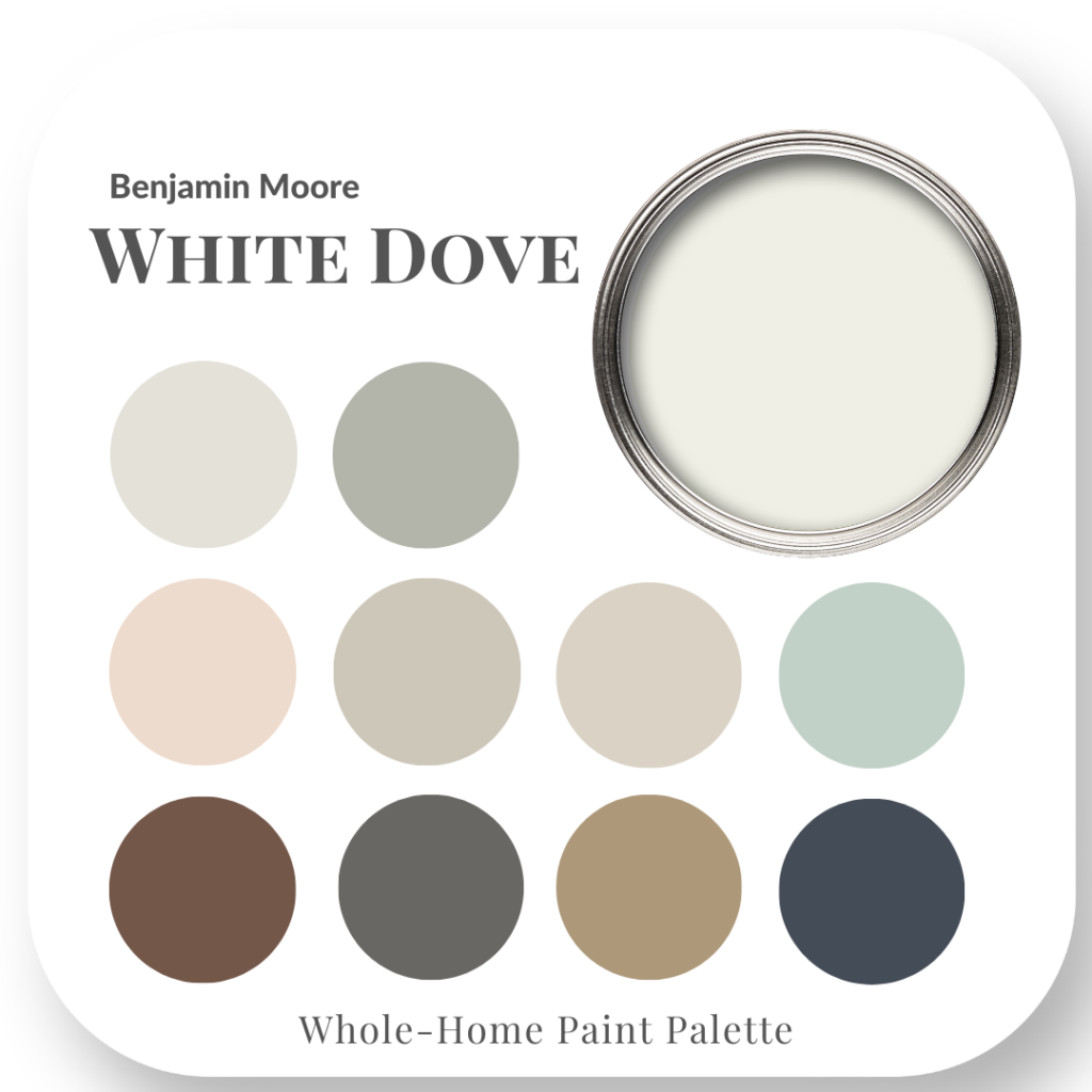 One of my best sellers White Dove
I also include valuable tips to help you avoid making mistakes when selecting paint colours, a section with answers to FAQs and a template to note paint colour details for every room of you house. In our most recent update, we even added a bonus on how to create a gallery wall.
 See all the colour palettes here
These incredible opportunities to build an online business stemmed from me taking Maria’s course and gaining immeasurable confidence in understanding undertones and learning how to confidently choose paint colours.
Coaching for Designers
In addition to helping homeowners create the home of their dreams, I also coach newer interior designers and decorators to structure and streamline their business systems in order to be successful and thrive in this often challenging industry.
If you are running a design business or thinking of starting out on your own, be sure to download my FREE Welcome Packet Template with walk through video.

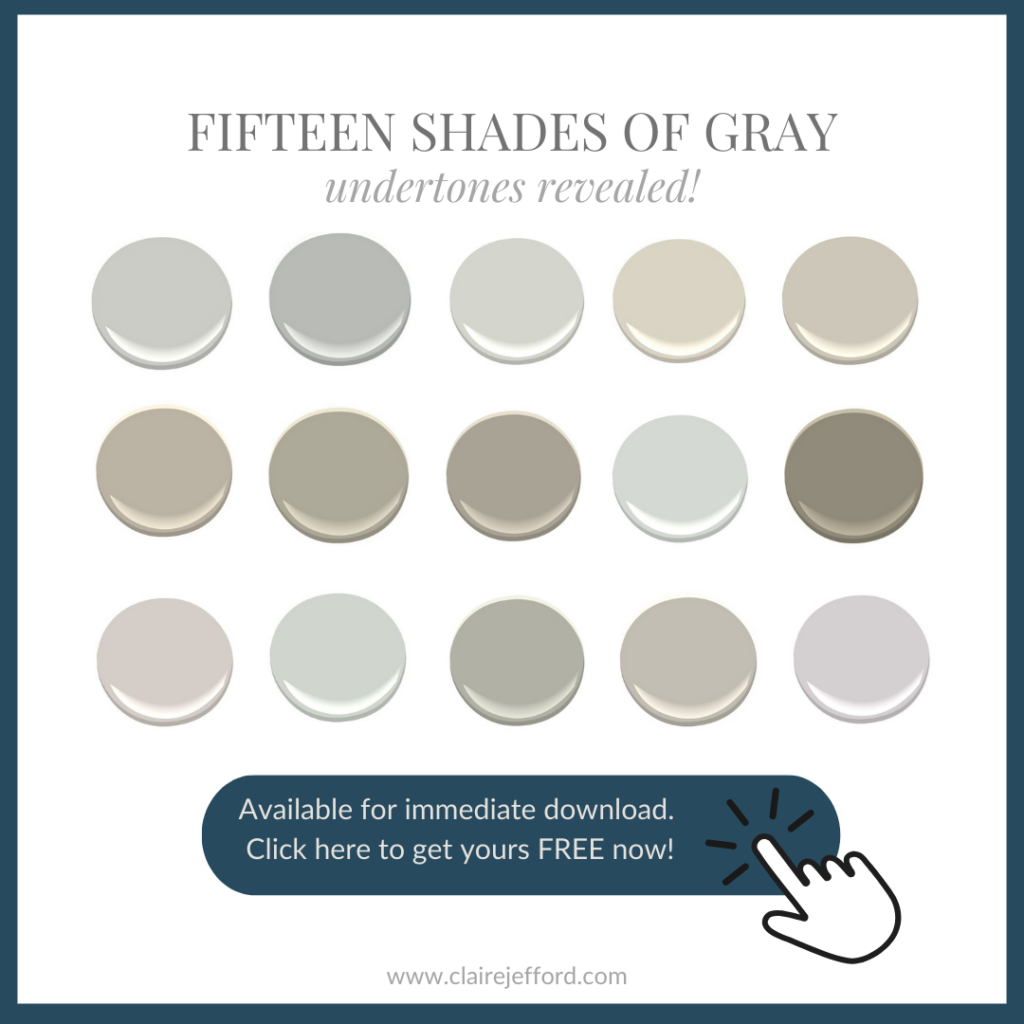
Even if grays are no longer the most popular neutrals, there are still many pretty shades of gray that as a colour enthusiast, you won’t want to miss out on seeing in this free guide.
I hope you enjoyed my guest blog post and found inspiration in some of my design projects. Thank you Maria for asking me to contribute for a third time to your highly successful and binge-worthy blog. I appreciate you so much and look forward more great collabs in the future!
Please stay connected with me by following me here on Instagram. Feel free to direct message me there with any questions about colour, design or running a successful business, I often reply to DM’s with a voice message.
Thanks Claire for sharing your gorgeous renovations!
If you would like to take your professional projects to the next level, sign up for my Expert Colour & Design Training today! The May event for design professionas is filling up fast!
And, if you’re a homeowner who wants to get your home projects right (without regret or expensive mistakes) sign up here for this colour training!
Build + Renovate with Confidence – Free Zoom Event
Navigate your new build or renovation projects in 2024 without regret!
Both events are limited to the first 1000 guests, so add it to you calendar and ARRIVE EARLY!
🗓 Tuesday, Jan. 30 at 3 pm PST / 6 pm EST
🗓 Wednesday, Jan. 31 at 9 am PST / 12 pm EST
I hope to see you there!
Related posts:
How to Avoid the 5 Most Common Kitchen Mistakes
Ask Maria: About Kitchen Uppers & Lowers in Different Colours
Do’s and Don’t’s for Installing a Countersplash


I love that bathroom and the kitchen
Loved it all so creative .
Thanks for sharing .
Thanks Nancy!! My home makes me smile everyday 🙂
Beautiful colors and they work so well together.
My question to you is : did you repaint your kitchen cabinets in that color?
Michele
Hi Michele and thanks for your kind words. My kitchen cabinets were custom made. What is now my kitchen, actually used to be my living room! I switched the two rooms as part of my redesign. It makes way more sense how it is now. Cheers again!
What a beautiful, vibrant kitchen! Love the post and reading about the process is inspiring.
I’m glad you enjoyed my guest post Robin. Cheers.
Love both rooms!
Thanks Ann!
I subscribed on Instagram! I’ve read some of your reviews and your blog and didn’t realize the connection. Now I’m doubly excited to consume more of yor content. Based on what you wrote, you might like this quote from the Queen of Interior Design, Bunny Williams: “If you don’t really embrace your house, it’s never going to have a soul.” I just love that quote and the same applies to embracing what we love, rather than doing everything based on trends!
This is great, thanks Tanya!!
Isn’t it funny how we come across something we “put away” and years later not only re-love it but are able to incorporate it in our home? We remodeled, and most of my stuff was put in this huge “bonus room” upstairs. Left and forgotten. I got inspired to clear it out, after all we had a plan for it originally. Found things that I remember thinking “I’m not using this”. Ended up adding these pieces to my house and they work great. The rest I gave away.
Love your bathroom and love the new kitchen!
I love hearing that you have a similar story Peggy. Thanks for sharing!
I love your colorful aesthetic but doesn’t it actually violate Maria’s recommendation about going more neutral and timeless with something that’s as difficult to change as cabinet color?
Cabinet colours can be changed much easier than hard finishes, in 10 years when we’re ready for a change, it’s still a way better update than having to take out countertops, etc. Great question! Maria
True, and if you love the color you still won’t be sick of it. Because you love it. I was inspired by a paper napkin that was the colors my sister and I picked when she was 8 and I was 5. Smaller hits of her color and bigger hits of mine, and I can change out the colors throughout the year with the decorations of the seasons that are tasteful and work with me using other colors I love. I don’t decorate much for Halloween however. Because my beautiful cats were decorative enough. LOL
My parents house has a different color scheme and I can change it through the seasons. When we redid it, an artist friend saw the exterior and said, “did you do something with the house? It looks fantastic” and all we’d done is fixed the green trim color my mom chose when I was living in Manhattan.
Claire’s home is perfect for her and how she is using her home. We installed a magic corner in mom’s kitchen in 2007. I made sure my kitchen didn’t need any thing more than the roll trays in the base and pantry cabinets when. I did the layout.
I really like the way you embraced your favourite colours and made them work for you. I love the bathroom and I think that the inspirational plates are so pretty!
Cheers Bonnie 🙂
What an excellent guest blog post, Claire! I’m grateful to Maria for featuring it. I adore the colorful bathroom and kitchen. I popped over to Claire’s blog to get more information, and I appreciate how she stepped through the whole process and gave us a lot more details. I love that those beautiful plates were the inspiration for the color palate. Such a gorgeous kitchen transformation! I can see why Claire smiles when she walks in her kitchen; it makes me smile, too 🙂
Awh, thanks so much Sheree!!
My MIL has a purple kitchen as well! It was a galley kitchen in a house she bought,and she not only embraced it but expanded it with custom matching cabinets with beautiful thick glass shelves inside. (I swear I’m doing glass shelves in our eventual remodel so short me can see where everything is!)
What a pretty kitchen! I love the idea that your kitchen tells a story. Our kitchen is dated oak but we’ve added vintage pottery I collected and matching vibrant green walls. I love it.
If your mother-in-law is still with us, I’m curious about her reaction. She must have been so pleased.
I imagine Maria squealing in absolute delight at your use of color. Your home is lovely, but I personally need a less is more environment, by the time I get home in the evening. Any woman that travels with her lamps on vacay would definitely say you need more lighting in your den! lol I must say
while I am not all onboard with a lot of color in my personal space, I do love me some lamps. Claire, I have listened to your color reviews countless times for some color advice. You have to be one of Maria’s most accomplished students! Love both you and Maria! Keep up the great work, ladies.