Tired of wondering why your home is not selling? Here are 5 reasons your paint colour could be turning buyers away. Choosing wall colours to stage your home to sell means understanding which colours and neutrals are current and also make each room look its best! Keep reading to find out how to choose the best colours for staging your home.
For more advice like this on selling your house, check out this post: Sell Your Classic House in 24 Hours Flat!
I recently received such a good list of questions followed by photos that I decided to turn this reader’s entire email into a blog post that I think will help everyone, especially on the heels of my last post about clean vs. dirty colours.
First, here’s the fundamental lesson we learned from the last post I wrote:
Most of the time when we’re blaming the paint colour or the lighting as the reason the room doesn’t work (it’s too muted, it’s too earthy, it’s too clean, it’s too bright) the real reason, in other words, the first place you’d look if you were trying to determine what isn’t working about a room is this:
Does the colour relate to what’s happening in the room?
So, if you have a room that is bothering you. That is the first place to look.
We all want to make it about the lighting, or about the paint colour, why? Because it’s easy to change the paint colour in a room, but as I’ve said many times, paint cannot do all the heavy lifting.
And sure, we can change the lighting for a slight improvement, but will it transform the room and suddenly give it the look and feel that’s missing? Will it magically make the paint colour now relate to the room if it doesn’t already? Not likely.
We have photoshopped the following rooms so you can see first hand that what I’m saying is actually true.
And the other thing that is kind of cool about all these fixes is that most of the time, the correct paint colour can be found in my curated collection of large paint samples.
So if you are a house stager, colour will transform your spaces more than anything else, ESPECIALLY, when the homeowner is NOT prepared to do much else. Then, if you’re stuck, all you have to do is start pulling out my curated collection of large paint samples that practically choose the colour for you.
I am not a stager, so I would appreciate comments from real estate agents or stagers here, but my take on what would be the best neutrals or colours to paint a house to sell would be CURRENT COLOURS.
So, if the majority of buyers right now want LIGHT and close to WHITE, then you should go as light as you can.
If a colour is necessary to bring a space to life an a neutral won’t do it, then choose a colour that is CURRENT.
Okay, here is Jennifer’s email:
First, please know that I have all your ebooks, read your blog and have even created my own paint deck with your recommended colors (divided into the sections, “Pink Beige,” “Yellow Beige,” etc.) I love to learn from you and would so love to take your Specify Colour with Confidence Seminar. Not sure I’ll ever be able to afford it so I thought I’d write you some of my common dilemmas. If they ever fit into a blog you might want to write I would love it!All of my questions would be in regards to home staging (advising my clients who are selling their homes).
And here is the first image she sent me along with this question:
Advising wall paint color – This wall color doesn’t relate to anything in the room. But the yellow tub doesn’t go with the floor either. What would I do here?
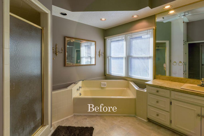
Reason #1 your paint colour is not selling your home.
Yes the biscuit coloured plumbing is not awesome with the white tile and shower insert along with the white cabinetry but if nothing else is changing except the paint, that will still make a big difference.
Since most people are looking for ‘light and fresh’ painting the walls a much paler taupe would immediately transform this bathroom.
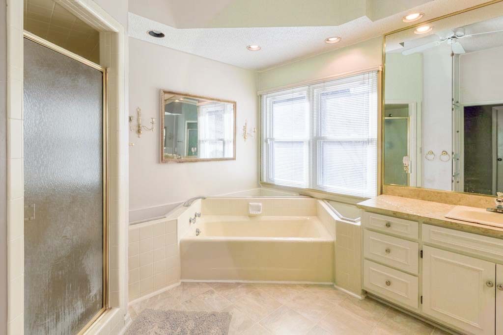
AFTER BM Pale Oak (found in my curated collection of large paint samples)
So we took out the yellow cast that was happening with the lighting to fix the colour in this bathroom, so you’ll notice that the bathtub looks a lot less yellow now. And certainly the yellow in the tub was enhanced by the much darker purple taupe colour, and yellow and purple are complementary colours if you put them together, they will enhance each other and in this case, not in a good way.
Now the bathroom is much fresher and ready to sell.
I feel like this blue is too bright for selling . . . so do I find a beige that has the same undertone as countertop or floor? would that be too blah? If so, guidance on what color I should pick? toned-down blue? green? how do I know?
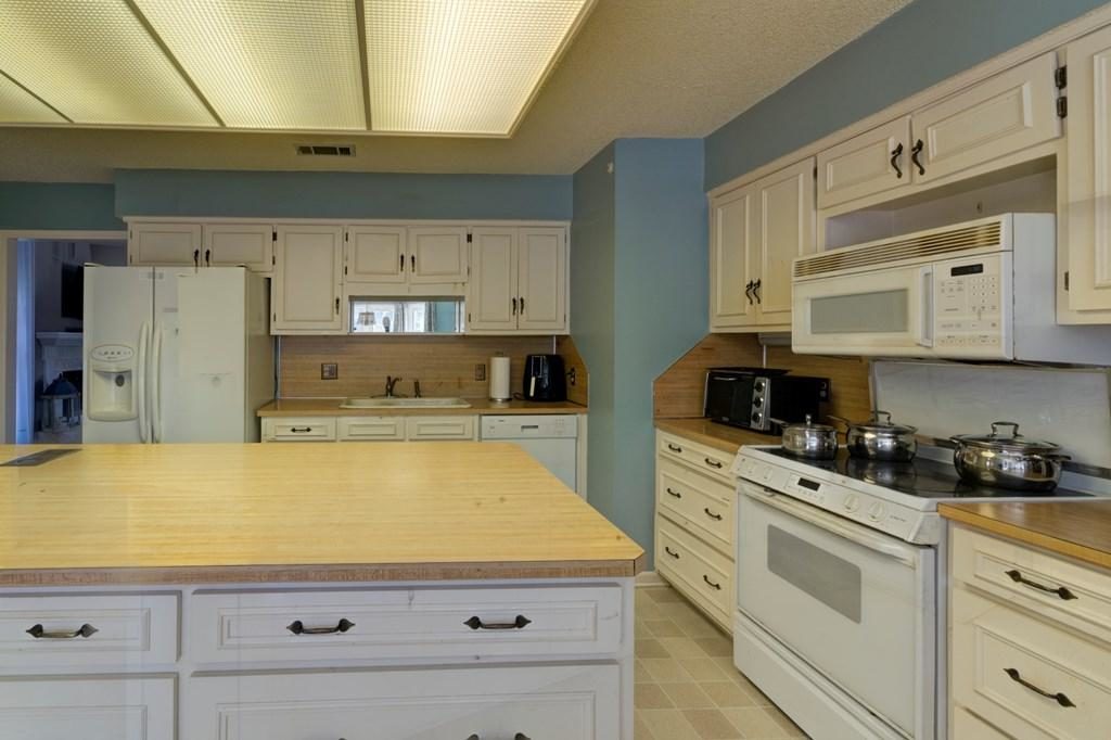
Reason #2 your paint colour is not selling your home.
So first, let’s talk about the undertones here. The linoleum appears to be mostly green beige so the first colours I would pull out of my curated colours would be BM Feather Down and Manchester Tan. Or from the Sherwin Williams collection, Wool Skein.
That should be the new paint colour because after all we are selling and this random blue is definitely not doing anything for this kitchen.
The countertops and backsplash are a fake wood looking laminate and in this kitchen, it just kinda reads ORANGE. Unrelated to the floor and just bad. A laminate that continues onto a backsplash would work better in a more modern kitchen.
I’m guessing this kitchen is in a basement and there isn’t much natural light which explains the bad, and dated 70s sunshine ceiling.
If I was trying to sell this house, I would remove the ceiling light and install some track lighting instead. Then the lighting wouldn’t be sooooo YELLOW.
Okay, back to the colour. To prove that it’s really not a clean/dirty problem but more of a “the colours don’t relate” issue, I had the cabinets photoshopped to approximately the same blue.
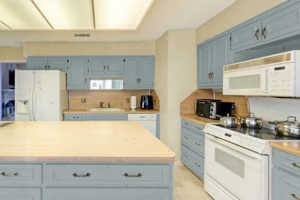
It’s fine, but it’s kind of an uninspiring wedgwood blue that needs to be repeated in the kitchen in order for us to love it. However, the look is more balanced on the cabinets rather than the walls.
I found a blue with more purple in it (see the kitchen on the left, below) and it does look a little more inviting even without styling.
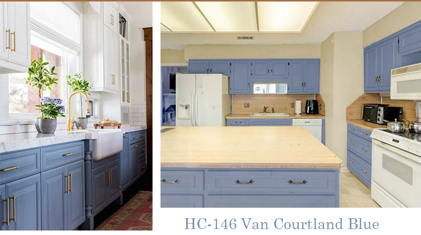
We also photoshopped the room without changing the cabinets, and you can see that there’s not enough contrast between the walls and the cabinets because they appear to be creamy. This is why I decided that painting the cabinets would look much better.
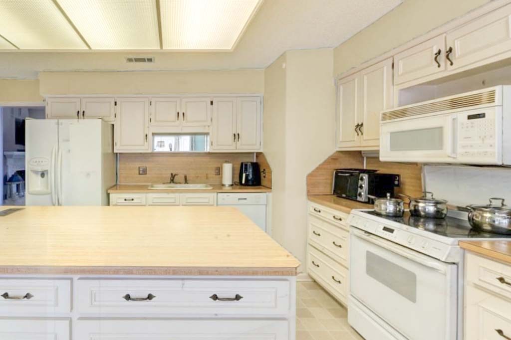
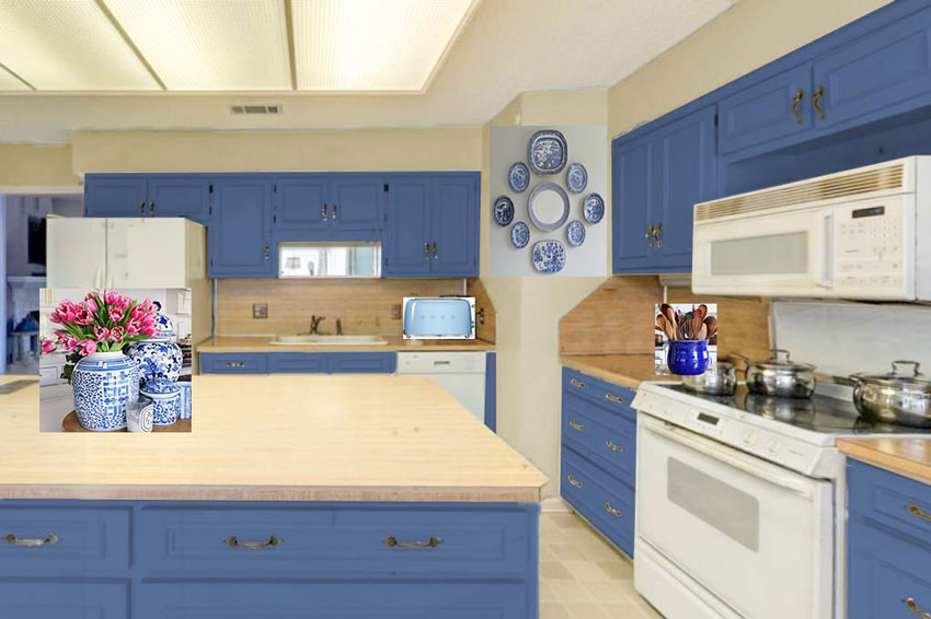
A kitchen this old should just be a fun colour to take the attention off all the dated finishes. This darker indigo blue is my personal choice (below). And might work for re-sale as this is a CURRENT colour.
Now you’re looking at the cabinets and not the mismatched floor and countertops.
Style it up with some blue and white ginger jars, and you’re done!
If you have an island this big, it needs decorative items on it AT ALL TIMES. This way when your kitchen is a mess, you still have something pretty to look at!
Related posts: How Styling Saved This Kitchen
Okay, moving on to the next kitchen:
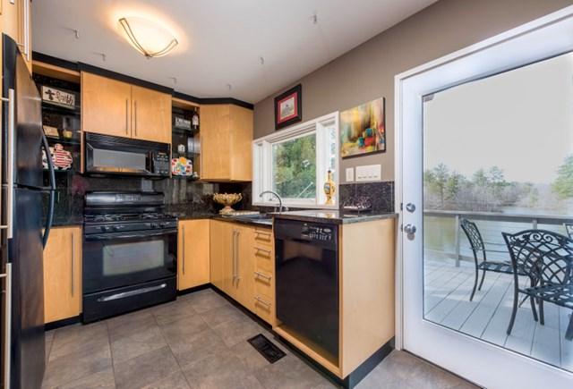
Here they actually did a good job matching wall color to tile floor – but neither go with anything else in the room. If I were to advise wall color (and maybe new floor), what wall color do I recommend? Try to find a beige with similar undertone as cabinets? Go to a color? How do I know when to use one of these vs a beige??
Reason #3 your paint colour is not selling your home.
I would not replace the floor here because it still needs to relate to the kitchen and it would be hard to find something that would improve this kitchen because what bothers me the most is the overuse of black.
I am not a fan of black appliances for this reason. Black gets heavy looking fast and they can look like dark holes, so a black countertop is usually required. Adding the backsplash and other black accents took this kitchen over the edge and made it dark and very ORANGE.
The best fix for this kitchen would be to paint all the cabinets which I would do BEFORE I would start searching for new flooring.
Therefore, a new, lighter and fresher paint colour does improve this kitchen without a major overhaul.
To answer Jennifer’s question, adding more orange to the walls would not be an improvement.
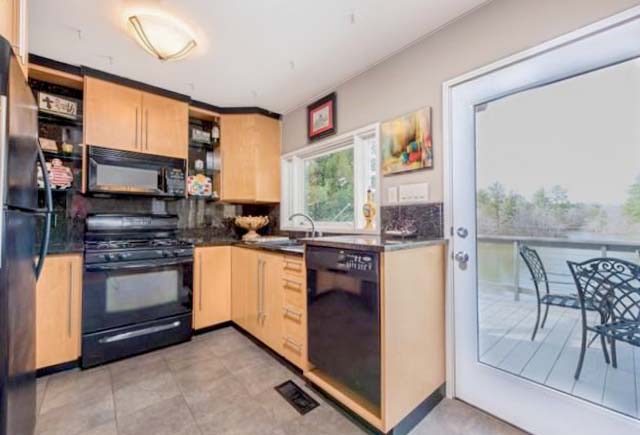
BM Abalone (Found in my curated large paint samples)
I remember you saying that wood floors are like blue jeans – they go with anything. Is that true for floors this light? Something feels off in this space – is it because the gray doesn’t relate to anything in the room or that the gray doesn’t look good with the wood? Or something else?
Reason #4 your paint colour is not selling your home.
I’m so glad she asked this question because I now–for the first time in 20 years–understand why people are so confused about whether a grey paint colour, for example, can go with wood floors that are in the range of yellow and orange.
When anyone asks me, I’m always stumped and I reply with some version of: “Of course, but why do you think it CANNOT be done?”
Well, it’s because they are starting with a blank slate, looking at their yellow or orange floors and thinking that this eliminates any shade of grey period.
When I was a new decorator, I thought that I had to match the wall colour to the hardwood floors too!
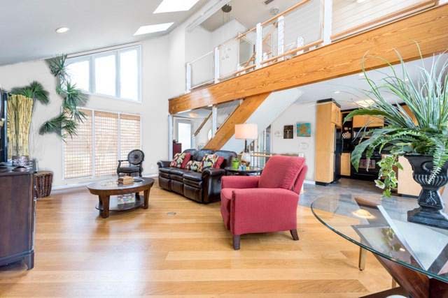
Jennifer is right, the problem here is that the grey only relates to the flooring in the entry which you can see behind the red chair.
Related post: How Important is the Colour of Wood vs. Wall Colour?
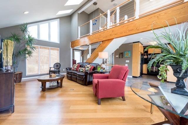
So that’s the first question to ask. Do the grey walls relate to anything in this room? And the answer is no.
This room looks like the realtor or stager (not Jennifer) told the client to paint the walls grey because ‘That is what’s selling’.
However, this room does not have a look and a feel, and that’s what prospective homeowners want right?
The furniture looks like it came from their last residence and is not modern which is what belongs in this contemporary loft.
Here’s a great example of orange wood combined with dark grey and I love how the orange ceiling was not ignored at all, and was repeated in this modern interior (below).
In fact, you can see here that the orange tones bring the grey to life and keep the room from feeling too cold.
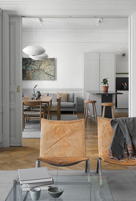
I think these herringbone floors are current but they are also close to a honey oak colour and it looks nice when you repeat the shade in the furnishings (below).
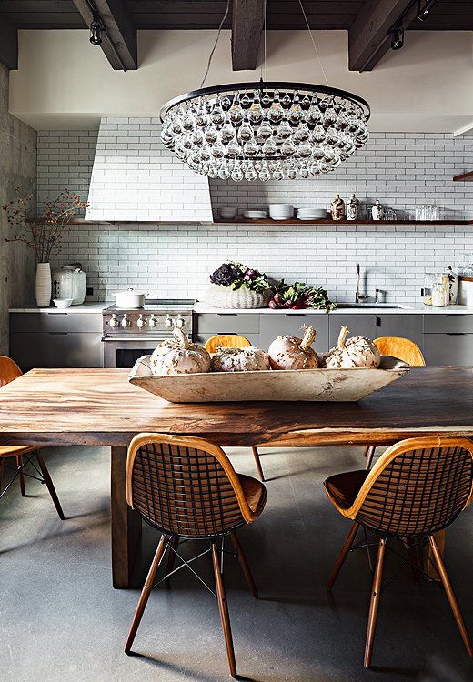
Here we have an orange toned dining table and chairs in a charcoal and black kitchen. In fact the orange does a nice job of warming up this kitchen (below).
Here’s a restaurant in Chicago (below) that is also a good example of warm wood tones used with charcoal.
Related post: The Minimalist Guide to Decorating with Charcoal
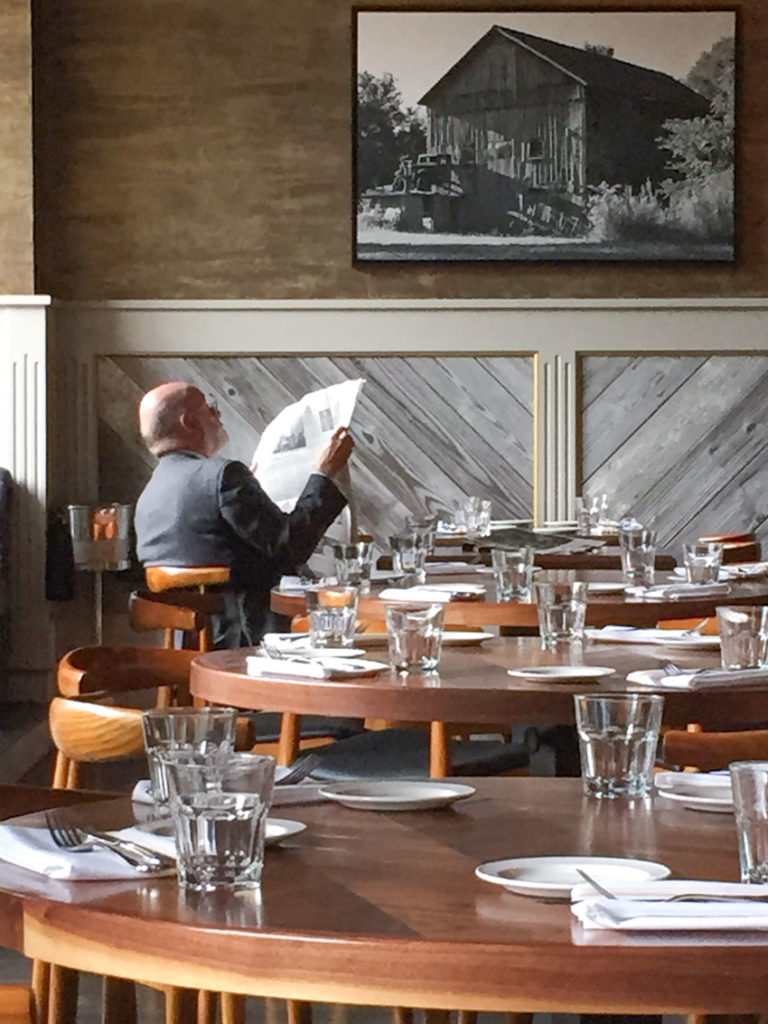
In the end, if we’re selling this loft and I would paint it a really pale greige like Bm Soft Chamois which feels the most neutral in this case. It doesn’t relate to the furniture, but it’s the wrong style for the space anyway.
If you choose a blue grey, you now have blue walls and, well, there’s still no blue in the room. We are obviously not going to paint the walls red to relate to the chairs and a beige in the realm of light brown (which would give us pink beige) is obviously not popular at the moment either.
The greige still relates to the entry flooring and now just becomes a background colour. You could paint the walls a shade of white here to sell as well, white is modern and would also work, however the furniture would of course still look wrong (but it does regardless of what the wall colour is).
Here’s the last question, and I’m so glad she asked this one because I don’t know if I’ve addressed it with such a good example to show:
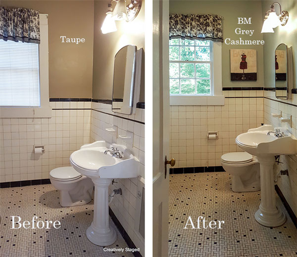
What wall color do you use with black and white bathrooms?? I thought this color looked terrible. So, I recommended “Gray Cashmere“, but I don’t think it looked good either! Is this the clean/dirty issue? What color should I have recommended?
Reason #5 your paint colour is not selling your home.
As I’ve said many times, (and go into in great detail in my White is Complicated ebook), cream goes with earthy and white goes with fresher cleaner colours.
The Taupe walls are very bad in this bathroom and the muted turquoise dies in here as well.
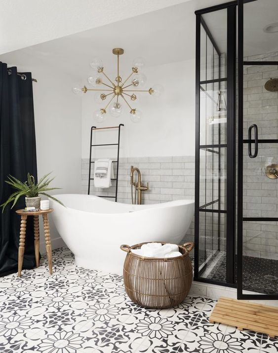
Some good options for a black and white bathroom and maybe the best for staging would be just painting the walls a true white. This gives the new homeowner a blank slate:
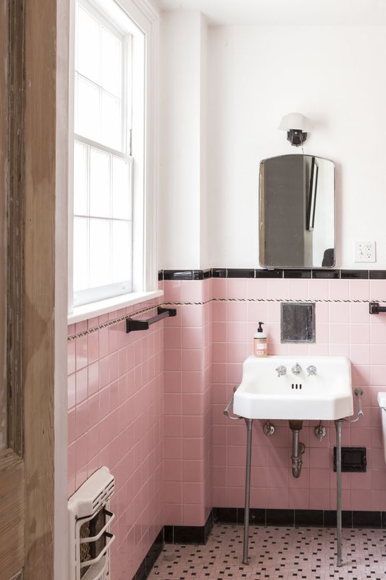
And here’s a similar bathroom with pink tile and of course it could be painted on the walls as well (keep scrolling):
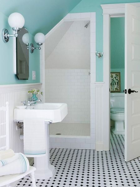
Here’s a really clean turquoise but it certainly looks great with the black and white tile:
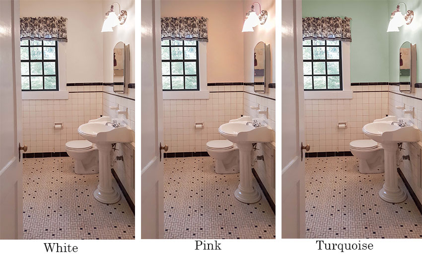
And here is the same bathroom photoshopped (below), and I thought the window mullions would look good in black because of the black tile baseboard and accent tile in the tile wainscotting.
Keep in mind there is a pink cast on the tile because the original photo was taken with the lights on.
As I wrote in this post, if you are a professional, your images will look way better if you take them with the lights off and no flash. The room will be dark but once you photoshop it or put it through an image lightening ap like Pic-tap-go, it’ll look so much better than the hot-spots that lights create in every image.
Okay, we are at the end of the list of Jennifer’s questions which turned into another epic post but I think we learned a lot in the process!
Home stagers and real estate agents, let’s hear from you!
Related posts:
How to Create a Vignette or Tablescape



I love BM 1569 with black and white. Or I use White Dove.
Hi Maria,
Love this post!! And love the idea of for this post with your readers photos!!!! Especially like the idea of the self made color deck with your recommendations!!!
I wonder if in the last example with the black and white bathroom, the aging grout in the wall tile might have been helped originally with the taupe or khaki color (or a lighter) on the wall? Adding a few breaks in the wall color with artwork, and removing the dated valance, might help to make it a classic older bathroom. Perhaps pick out a strong accent color, like red to finish it off???
Wonderful post. Thank you Maria!
I’m a home stager and these issues come up so often! Your course was so VERY helpful and I would recommend it to anyone who works with color like stagers as well as designers. I consider two things a must to anyone who takes their home staging business seriously: Get to RESACON (Real Estate Staging Association Convention) and take Maria’s class.
The photo shop photos are so helpful to see…I’d love to be able to show clients with a tool like that.
Thanks again Maria!
I agree with Deb! While I am no longer in the staging business, ten years of doing that trained me to pull together a “look and feel” starting with what the client already has and then bringing in strategic pieces to bring all the colors together into a cohesive unit, which this blog clearly shows.
Yes to Maria’s course.
Yes to RESACON!
That was great, it worked so well for my show-me-and-I’ll-understand brain. Great photoshop examples and great “good example” photos from the web. Amazing how the muted turquoise did not do as much for the black and white bathroom but I get why thanks to your explanation of clean colors working best with black and white!
I would have loved to see the orange and black kitchen photoshopped out with, say, indigo painted lower cabinets and white uppers & trim, since most of the black was on the lower half with just a small cluster of black at the microwave (unless those upper shelves have backsplash behind them??) I think it would be the best combo of camouflaging the appliances while visually expanding the upper area… but I could *almost* imagine it 🙂
If I had a dollar for EVERYtime a staging client or realtor asked me to select a “grey” paint color….I’D be RICH!!! I am only too happy to quickly respond with “A gray paint color will be GREAT if it enhances the fixed elements in the home AND it does NOT make all of the clients furnishings look horrible!”
I, seriously, receive more accolades when I select a non-gray color! (Amen!!! Maybe people are starting to see life in COLOR and not just in black-white & grey.)
Great post! I see so many photos of homes for sale and they have painted the walls some shade of gray and the room is full of brown furniture–which does not relate well.
Oh, my! That kitchen … I looked at those photos for 15 min before I realized the kitchen / house have a water view! All of those finishes need to calm down and focus on the lake view.
Thank you, Maria. This was so helpful!! I read every post and enjoy learning the “why” behind your answers. Thank you for taking the time to dissect these before and after shots though photoshop. It illustrates it best!
I have been following your blog for 7 years and have learned so much! I am looking forward to meeting you in person this September at the Live Color Workshop. I hope to be well prepared as I am re-reading past blogs topics as a refresher.
Great topic, thank you! As a stager I sometimes have to work with paint colors that are existing. If the home is vacant I can make this work by adding the right furniture artand accessories to pull it all together. The challenge is when the home is occupied, I often refer to your color books when I have to choose a color to work with existing furniture or fixed elements. Depending on the sellers budget all of this gets tricky. I am always learning from your posts and appreciate the info. I too would love to take your color course but for now ira not in my budget.
This was a TREMENDOUS post! Thank you1
Maria,
In the first picture with the taupe bathroom walls, why did you keep the taupe and go lighter? Would another color have worked better? Just trying to learn here. Thanks
Because the linoleum was Taupe, it was just too dark, but it still needed to match the floor. Maria
Oh this is so much fun ! For the black and orange kitchen, I find that the BM Soft Chamois appears to wash out the space with a slight pink undertone. Do you think BM Collingwood with its cooler purple undertone would work better with the black appliances, dark sofa and also bring out some tones of the tile floor ?
Thanks Maria for another wonderful post !
The turquoise colour looks appealing and adds a visual interest to the room…
Great post Maria, I always learn something from your posts!
As a home stager I say “paint is money in a can”…but of course that is only true if it is the right color. I think the main problem in the loft photo is the red chair. If you cover the chair in the photo the darker color looks OK. It goes with the floor and it is an open space so you can see the floor in the photo. Your color is fresher and makes the space look larger (always a good thing) but again your eye is distracted by the red chair.
Love your comment ; DOES THE COLOUR RELATE TO WHAT’S HAPPENING IN THE ROOM? I used to say; the color has to relate to the fixed items in the room ….but saying that it has to relate to ‘what’s happening in the room’ is a better, clearer way to convey the same idea!
Thanks for all the incredible information your share!
Maria, I love this post! I am a Realtor and a Decorator/ Stager and I am constantly challenged with working with the almond tubs of the 80s and lots of brown countertops and brown stained trim. Many homeowners getting ready to sell do not want to go to the trouble of painting all of the trim through-out the house to bring it up to date. To make matters worse, they have put current fresh colors on the walls ( or grays!!) and yuck – it is so ugly!
I think BM OC-20 might be my new go-to color for these situations. At least it is close to the ‘white’ trend and I could probably convince a client to use that color which will look fresh and pretty current for an 80’s house.
I love reading your posts and maybe one day can actually make it out to one of your seminars. I live in the Atlanta area now and am from Canada originally. We just returned from BC – Kelowna ( love, love!) and Vancouver. Keep up the awesome work!
I am going to paint my confused kitchen and downstairs Pale Oak, BM OC-20. I hope it will work with my builder blue-white cabinets that unfortunately were put with new Venetian Gold countertops and a pinky beige backsplash. I am preparing to sell iand do not want to invest in significant kitchen rehab. I am looking for a backsplash that will work with the pale oak walls, builder blue-white cabinets and new Venetian Gold countertops. It’s a challenge! Glad to hear it is a sensible color to use for staging/selling. I appreciate your input.
Maria’s sister Elizabeth replaced her pinky backsplash https://mariakillam.com/my-sisters-fresh-new-backsplash-before-after/
How much longer do you think the “grey” thing is going to last ???
The grey trend is over in my world. But it’ll take a few years for that to trickle down, there’s tons of grey products still. Maria
Maria, I assume what you are seeing now after grey is light & fresh walls & fixed elements. Or are you seeing greige as the post gray trend (or maybe that’s the same as the go light/white trend!) Trends come on fast and furious with social media and what I am seeing all over Instagram is white, white, white (or as close as the house can get) in the home fashion blogging world. I am glad for the comments here along with your valuable post.
I have never specified dark grey walls all throughout the grey trend. Light and white is definitely where it’s at right now and what I have been specifying for a long time. Maria
This was such an informative and helpful post. Thanks Maria!!!
maybe its my computer, but I am not impressed by the after photos at all. Basically went from a neutral to a pastel with a gray undertone or white.
Well the rooms did not change nor were they styled. The colour went lighter yes because that’s what is selling right now! Thanks for your comment! Maria
Aloha Maria,
Do you know the name of turquoise color you said looked good with the black & white tile? It was from Pintrest. I followed the link and didn’t see a color name. Maybe I missed it.
Mahalo,
Ronda
Hi Ronda,
I don’t know what the name of it is, but I would not choose a random turquoise for your house, if turquoise is in your decorating, get it matched at the paint store and use that colour, this way it will flow with the rest of your house! Hope that helps! Maria
There is a grout product out that refreshes the grout. Bought it at lowes. I even changed the original color of grout in my bathroom. If it was used in the black and white bathroom it would look new. I liked the white walls best.
This is a great post. Thanks for sharing. I stage many homes and recommend color all the time. I don’t subscribe to any lists of colors that are perfect for staging. I see so many blogs along those lines. Make me throw up. The reason being, it’s not as simple as that. In my opinion there is no such thing as the best wall color used for staging. It’s a few of them and it all depends and various factors. It’s the fixed elements in the home – like you have pointed out in this blog yet again – and what’s already in the room that should determine the chosen color. I do subscribe to the idea that we should select on-trend color however that’s also in line with the style of the home. That’s the only time when color does wonders and sells homes as it is able to accomplish that look and feel we want to be able to achieve thru staging.
Taking your Specify Color with confidence class has totally transformed how I view color and how I specify color for all my clients, whether it is for the purpose of staging their homes to sell or enjoying it for themselves. Thank you Maria. 🙂
You are a breath of fresh air. When it comes to lighting, I do not like “cool white” bulbs. It looks stark and unwelcoming. Also, it makes your skin look “gray”. Why is that? Is it the blue in the light?
On another note, I look at sites for homes for sale in Baltimore. If I see one more house interior painted gray, I will throw up. Revere pewter by BM turns green and ugly, however, many people paint their entire home this color when selling. Then we have one guy who is coffer crazy. OMGosh, he makes the ceiling look as if it is going to attack you. If ceilings were 12′ tall it would be great but an 8′ or 9′ ceiling can’t handle is. Simple sells better.
I so appreciate reading your blog. I wish I could take your classes, however, right now, not enough funds but, perhaps in the future.
Blessings to you.