When shopping for outdoor furniture, like Adirondack chairs, don’t be afraid of colour. You’ll see plenty of neutral colours in the stores, but that doesn’t mean they go with everything. Here are the best colours for Adirondack or Muskoka chairs.
It’s patio season and this weekend I took my Mom (for a belated Mother’s Day getaway) to a cabin at a resort that shall remain unnamed for this post. 😉
The cabins were brand new and decorated by someone who was, well quite frankly, afraid of colour (most hotels in this world that are either brown or gray right now). These cabins were a mix of the brown, grey AND the black trend.
The bathroom was wrapped in 12″ x 24″ grey tile. The reason most bathrooms have larger format tile is that it costs less to install them. It’s more expensive to install smaller scale tile, which is what belongs in a timeless bathroom.
All the wood stained tongue and groove walls and ceiling were stained brown and the wood stained cabinets were black.
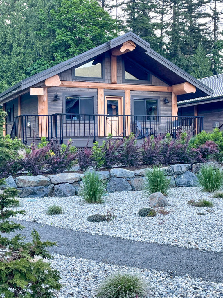
The ONLY reprieve inside and out was the orange wood accents (above).
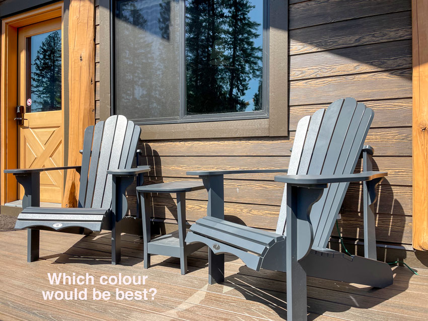
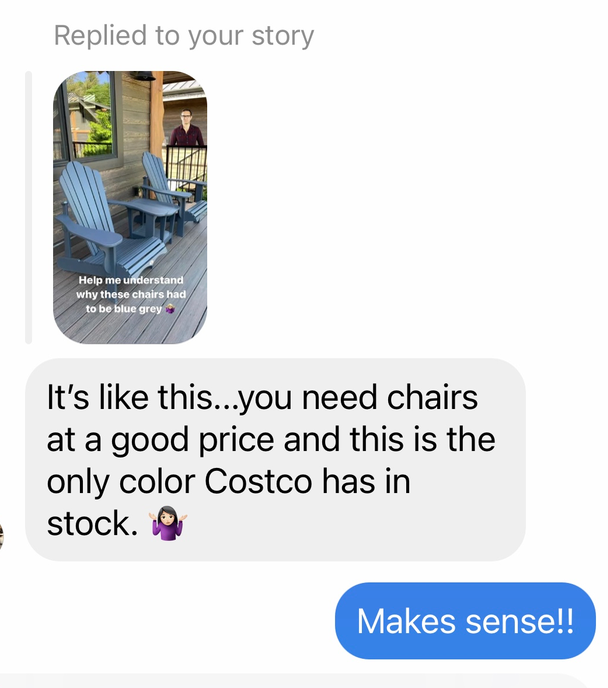
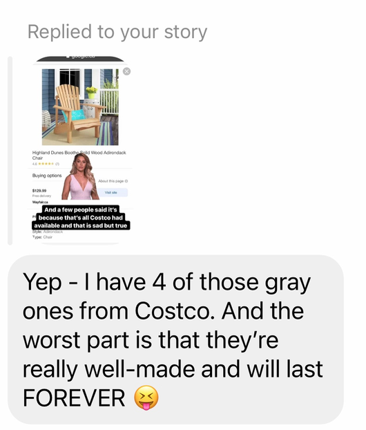
When I saw the Adirondack chairs outside, I asked my Instagram readers to help me understand why they were also a bleak blue-grey colour. That, by the way, in no way relates to the colours on this exterior.
Several people asked me if I didn’t like blue.
When someone asks a colour expert what colour they don’t like, this is usually the answer:
There are no bad colours, only bad colour combinations.
Most said this:
This was the best comment:
Then, inquiring minds wanted to know “What colour would be better?”
The best Adirondack chair colour
In all fairness to the home decorator, when you go out to source furniture off-the-shelf, the furniture that sells the easiest is usually some kind of “neutral.” It’s likely the reason so many of you have a neutral sofa.
The dictionary defines neutral as this:
“having no strongly marked or positive characteristics or features”
“the tone was neutral, devoid of sentiment”“a neutral color or shade, especially light gray or beige.”
So those, unfortunately are the colours that generally tend to be most readily available.
Okay before I tell you what they should have been, go back and look again.
My 11-year-old nephew was just here. I showed him the photo and asked him what he would choose.
He said “beige.” I think neutral and beige perhaps have the same definition when shopping for home decor, and:
Doesn’t neutral go with everything?
No, it does not. As you know, if you’re a longtime follower of this blog.
While you’re thinking about it, here’s how I arranged the furniture once we checked in.
I brought two lamps with me (like I always do) and it’s a good thing I did because there wasn’t a single lamp with a shade in this two-bedroom cabin. However, the ceiling was full of cheese lights (as my sister affectionally calls them), which were not used at all during our stay. They were not even on dimmers and hurt my eyes immediately.
Read more: One More Reason to Skip Recessed Lighting Altogether
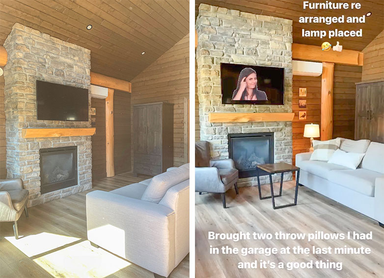
Before => After (as seen on my Instagram stories)
One follower asked why this was a better arrangement. In this case, the answer was not complicated or designer related.
There simply was no place to plug in the lamp with the end table sitting in the middle of the room (no area rug to run it underneath) AND turning it beside the fireplace meant that it faced the view of the mountains (see the photo below).

Airbnb owners take notes
Airbnbs and hotel suites (as this one technically was) are notorious for skimping on furniture.
This cabin sleeps six people but had comfortable seating for three.
At the very least, there should have been a sofa and two chairs. But I guess at least they had a full-sized sofa. A lot of places skimp out and provide love seats, which only comfortably seat one person.
Read More: 5 Simple Ways to Make Your Airbnb Look Better
Okay back to which Adirondack colour is the best.
Do you know? Look one more time. The answer is extremely obvious:
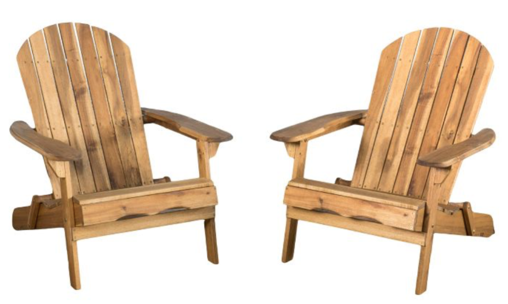
Well, a wood stained one to match the orange wood would be my first choice.
Something like this, although it’s not a perfect match.
However, maybe you want it to be plastic and live forever. So, if you can’t find a faux wood chair then a light green grey like this one would work as well:
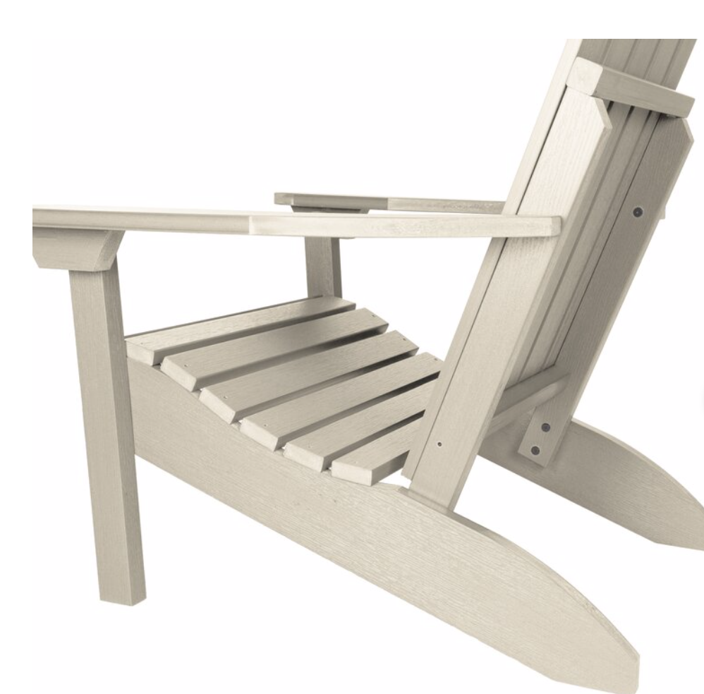
Whitewash | Wayfair
White would definitely NOT work here since there isn’t a stitch of white on the building. Black would work but it would be bleaker since the entire colour scheme could use a lot more life and contrast.
What colour are my Adirondack chairs?
My chairs are white because they match my white outbuildings (below).
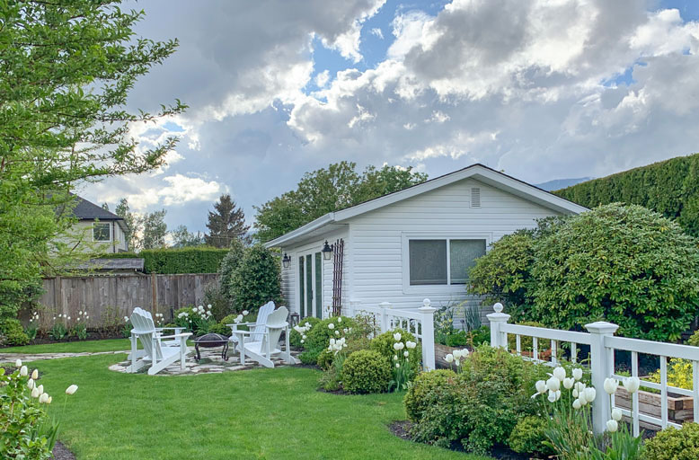
See all 500 of my white tulips here
What if you have a lot of concrete or grey already in your backyard?
Great question! That’s when you can choose a pop of colour instead. My sister did and she loves her beachy blue chairs, which truly help bring her patio to life. Then we repeated the blue in her pillows and accessories.
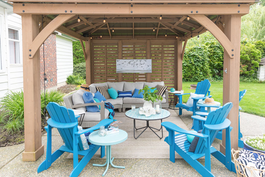
Elizabeth’s beachy blue patio makeover
Here’s my darling Mom and I on the way to dinner both wearing blue:

Any question you have about Adirondack or Muskoka chairs? I’d love to know. Post them below.
If you’d like to learn how to choose the right colours for your exterior, buy my Masterclass here.
Related posts:
Market Umbrellas: Which One is the Right One for You?


We just moved in to our house and I have 4 Adirondack chairs in need of a refinish. The thing is, we have a lovely red brick patio outside and I can’t figure out what color to paint them! I love tropical color schemes, but this is probably not the place. Anyone have opinions?
Hello Lauren, our house in Melbourne Australia is red clunker brick, built 1941. The bricks have grey tones in them so I have grey out door furniture (convenient as it is readily available). If your bricks are a plain red (actually a shade of orange) I would go for a light slightly greyed off turquoise. All my plant pots are terracotta, again quite cheap and available. Regards F
Yes the colour of stone might be nice, here’s a video about it: https://www.youtube.com/watch?v=EH56DZtw4QY
Thanks for the ideas!
I would say Black, since it doesn’t sound like you already have a lot of black in the outside decor. I think (I’m not a designer) that black goes nice with red brick, at least at my parent’s home. 😉
I do not like these chairs at all. I find them extremely uncomfortable. I prefer a comfortable chair that I don’t have to crawl out of. I know they are popular but don’t like the style. I have never seen anyone get out of these chairs in a comfortable manner. Can’t imagine why they have been “in style” fir so long.
I agree!! Love the look, was set to buy some…….until I sat down, slid back, and could hardly get out, they are so low to the ground!!
I feel the same way about Adirondack chairs. They work better for tall people I think, but not for those of us with shorter legs. I’m 5’4″ and either (1) I sit against the back and my legs stick straight out in front like a little kid because my thighs aren’t long enough to reach the chair front, or (2) I slide forward so my knees can reach the chair front but the chair digs into the back of my knees and my back hurts from slouching. There are never enough outdoor pillows around to help.
I think Adirondack chairs are for a very specific purpose, usually sitting on a mountain top or beach to face the view or around a fire pit giving people the ability to lounge and be comfortable. They are not for everyone! But they sure do make them bullet proof these days and with a 40 year GTD (like mine) you want to make sure you choose the right colour! Thanks for your comment, Maria
There is a new design called the “Grandpa Adirondak” which is very easy to get out of and still has the look of the original chair. My husband and I constructed two of these last spring and are in the process of making more this winter. Very, very comfortable and easy to get out of for people of any age.
I wanted to mention that, generally, a large format tile is MUCH harder to install than a smaller scale tile. Large-scale tile requires more prep time, waste is greater, and cuts more challenging. Large-format tiles require very even walls/floors, which rarely happens, resulting in more time preparing the walls for tile and back buttering them so they can be leveled. Since the tiles are so large, cuts become difficult and time-consuming to make perfect. Often, there is significant waste and you need more material. By contrast, small tiles are quick and easy to install because they allow for easier leveling and cutting which can reduce overage needs.
Since this is a brand new cabin, perhaps they haven’t finished furnishing or decorating them? Maybe they have been caught in the same production delays we all have been and are waiting for product to arrive?
When I think of large format tiles, I think of less grout to clean. I think there are some newer grouts that stain less, but still, cleaning grout is a pain, and that’s why I have zero tile in my home. LVT all the way with no grout lines. Showers are solid surface. I like my lower maintenance, easy cleaning home.
Re: your comments on cleaning grout: AMEN! The cleaning/staining issues associated with small tiles are why we go with larger-format tile in our house. We have 6 people in our family and a single bathroom — usage is intense! Of course, we can’t go too large, as our home is 110+ years old, and the words “level” and “square” are unknown to us. Lol!
I agree. I’m loving the white and black trend but I’m near Houston and a black roof or walls just means our AC runs more even though we have a very insulated attic. However, a black roof looks better longer in our humid area with a lot of mature trees. A white house and or windows means I’ll be cleaning more because dirt shows more. But it’s great for the same reason a black roof isn’t.
I totally agree and am really practical as well with tile selection and thinking of how much grout to clean.
I would have chosen green to match the natural greenery of the outdoors. If I chose orange it would have been a light orange with green plants close by. Either way some red and yellow flowers close by also.
My initial guess was orange, so that it would go with the orangy wood (I was obviously thinking plastic Adirondack chairs from the beginning, ha!). If that didn’t work it would have been a green or a purple to go with the greenery that is seen from the picture that includes more of the yard.
I’m a bit shocked that you’re so free with your travel story as BC is asking us to stay home right now and not to travel for recreational purposes. I’m guessing you went somewhere close to home so you didn’t need to leave your health authority?
I’ve enjoyed your blog for a very long time but this has put me off. I’ll be unsubscribing.
It’s good you are mindful of your area’s protocols, but Maria and her family are all in a “pod” together, and are mindful of Covid safety. I will bet that’s why they are vacationing together as a pod. Grocery shopping will probably be their only “outside” activity, and what a lovely way to stay safe and get a change of scene! Cheers!
Still Wendy. Those of us in BC were not supposed to travel at all. It was against the law to move outside your region. But it was against the recommendations to travel to cabins, etc.
If I had done it, I certainly would not have blogged about it.
My Mom and 2 sisters live two minutes away and have been in my bubble since the beginning of the pandemic. And yes, this was in our travel zone. Maria
Maria, you don’t have to answer to people who think they can question you on how you live your life. You’re obviously a mature and responsible woman, and can make your own decisions. Cheers to you for enjoying the outdoors with your family!
Your sister, Elizabeth was right. She instantly enjoyed the view and was grateful to be there. I wish you were able to enjoy nature’s bounty when you check into Airbnb or cabins and not see what’s wrong with the inside. We all enjoy a well styled abode but if your bed is comfortable and the place is clean you should be in your happy place.
These little cabins have so much potential. As a colour expert, maybe you could write them a nice email with ideas for making their cabins a happier place – chairs to accommodate all, lamps for reading, etc.
Some of us, especially in the design business, are hyper-aware of ways to improve lay-out, color, lighting, and beauty of spaces. I have this “disease” too! Gratitude is there too, and also a burning passion to make surroundings more enjoyable or functional…thereby increasing the gratitude.
Well the only way I can teach how to do something right is if I show it done wrong. Thanks for your comment. Maria
Like Wendy, my brain instantly pops into a review of what works (and what doesn’t).
We visited Saltspring Island years ago and stayed at a cabin that was perfect in every way. I was lounging on the comfortable couch and admiring the consideration that went into details, spied the desk with a drawer and thought to myself that perfection would include writing materials in that drawer. And there was!
Hosting means thinking about how to make the guest feel “at home” while they are away. I once had a friend (airline captain) tell me she had never seen the perfect guest bathroom with everything she needed, until mine.
Some of us can easily focus on what we choose, and you are right, nature is the most beautiful of all. Others of us, like me, focus on everything.
I just got rid of my beast of a bbq which I never used. It was this hulk with a dark green cover and has ruined the look of my patio for years. I seldom used it. I decorated the space with white hydrangeas, filled the furniture with bright turquoise cushions, covered my table with a bright handwoven cloth from Guatemala which has every bright color you can think of. Finishing touch was spray painting the old, faded plastic adirondack chairs with a bright matte yellow. I’m in love with my patio again. Tried attaching a photo but couldn’t.
There’s an area in the North Carolina mountains where the vacation rentals are to die for, but that’s because it’s an enclave of the rich. The vacation rental owners know their market requires some magic. They’ve even started buying up hopelessly dated cabins and houses and transforming them.
It’s fun to see.
There is so much for which to be grateful and I’m happy you and your bubble could celebrate with your mother together in a beautiful, location and one I know is close to your home.
But I’m with you on hoping and expecting a welcoming and well planned environment.
Before and after posts and ones like this are the most educational kind. So thank you.
Your longterm faithful followers understand your intention to educate on your blog (and available for free, I might add).
I cannot settle comfortably in (expensive, no doubt) lodgings that are ill-lit and poorly planned so thank you for the tips you offer for making things feel more homey.
Thank you I appreciate your supportive comment! It’s hard to teach without showing what doesn’t work! Maria
Perhaps the right print for outdoor pillows/throws could pull all these tones together and give some life while keeping the current adirondacks.
Unfortunately a pillow will not magically make this chair look good here. Sometimes there is no magic if the wrong colour choice is made, YET AGAIN. Maria
When in doubt the best color is always chartreuse!
I’m not in doubt at my house and I have purple, turquoise and chartreuse which look lovely against my blue-gray house with periwinkle trim. I don’t use them a lot for the reasons others have stated, but they add a lot of fun color to our large deck. We do our serious sitting on wood rockers or zero gravity loungers.
Ooo, I love chartreuse! Your deck sounds lovely and fun!
What is the point of purchasing Adirondack chairs when so few people are comfortable in them? The steep incline and the depth of the seat are what make them so uncomfortable and almost impossible to get out of, time for Adirondack 2.0 – a good business opportunity.
There are many styles of chairs in the market place that would suit this environment. Rather than stylizing the deck, I’d prefer seeing comfortable wooden chairs. Wood is always ‘in style’, especially at cottages. They may not be considered chic, but Adirondack chairs are not chic either.
I am so very happy you had the opportunity to get away with your family. I have to admit that you lost me a bit with bringing with table lamps and throw pillows with you on vacation.
Cheers to you!
We all have our pet peeves. I always take throw blankets, Bath &Body Works foaming hand soap and 24 oz Tervis Tumblers when we travel. To be specific, ha! I understand the need to bring creature comforts on vacation.
Hello Maria, I enjoyed your article. Thank you for insight. I am struggling to decide on a color of 2 Adirondack chairs that would look good on our flagstone area, red roses in background, black front door and linen home siding color. Any thoughts anyone?
Hi Maria, Great blog! We have been looking for the same light blue ones your sister has but can’t find them anywhere. We’d great appreciated if you can let us know where she got them, thank you!