


Today’s Ask Maria question is about lighting changing the paint colour. But is that really the issue?
If you’re looking around at your paint colour throughout the day and not liking what you see, this post’s for you too.

I don’t like my paint colour when there’s a yellow cast in the room
“I am struggling with everything in my house. I have had several decorators come in. . . all have different ideas but none seem to work.
Here are a few pics. My paint is Benjamin Moore Halo and trim is White Dove. Most times of the day it takes on a bit of green but when it takes on yellow I don’t like it. Any ideas would be helpful.”
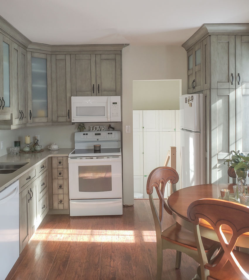
What a lovely kitchen (above).
Should we blame the light?
No. It’s not the lighting. It’s true that colour will look warmer and brighter (often more yellow) in lots of sunlight. And, it also tends to look cooler in the shadows.
You can see that shift in the different lighting on the kitchen wall transitioning to the warmer lit space through the hallway (above). This is not something you can control, especially with light and pale neutrals.
Did you know that a paint colour will only look consistent throughout the day in a North facing room, where the light is relatively flat and indirect?
The thing is, this kind of shift is natural and will only bother you if you’re highly focused on your paint colour because it doesn’t seem right for other reasons.
Or if you just don’t like your paint colour. In which case you have to explore your other options and possibly make some big changes to your space.
That said though, colour preference takes the backseat when choosing a neutral because the neutral needs to relate to something first.
What question should I be asking about my paint colour?
If the paint colour is right to begin with, that means it relates to the finishes and decor perfectly, we tend to forgive how the colour shifts or changes throughout the day, as the sun moves through the room.
So to draw meaningful conclusions about the paint colour, we need to focus on what we CAN control.
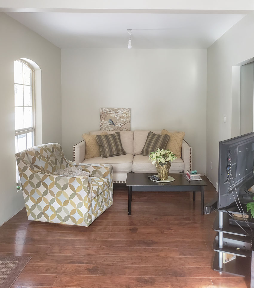
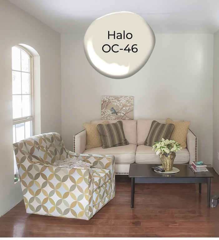
Below is the living area where we can see her wall colour, Benjamin Moore Halo (which is a green grey greige).
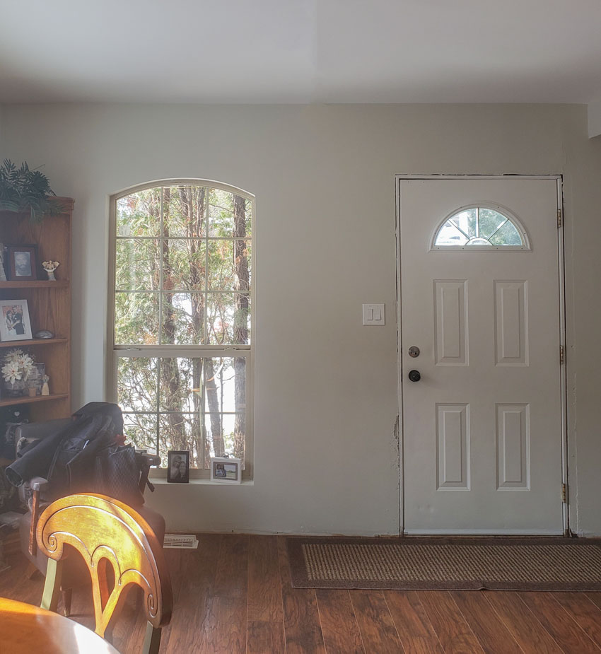
Here’s’ the other side of the room.
Before you start blaming the light on why the paint colour looks bad. The first question you need to ask is: Is this the right paint colour to begin with?
What’s the easiest fix for this room?
And before we even analyze an easy fix, I want to make this very important point. Let’s say you had end tables, lighting, and art on this wall already. Guess what? The pretty decorating would be a pleasant distraction.
And, you would be less invested in the fact that your paint colour isn’t perfect.
POP QUIZ for my True Colour Experts and long time followers:
What’s the undertone of the loveseat? Why is she not happy with the paint colour?
What’s the undertone of the loveseat? Why is she not happy with the paint colour?
Take a look at this image before you scroll further.
There are 5 undertones of beige in my system. They are located on the right side of the neutral colour wheel. Which undertone of beige is the loveseat?
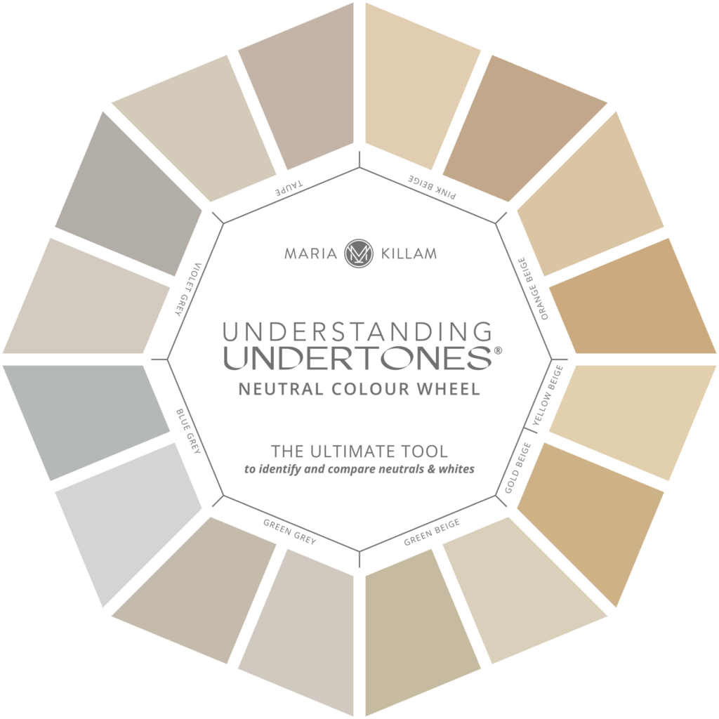
The loveseat is pink beige. Did you get it right? 🙋♀️
The first thing that is bothering my lovely follower is that her chair has gold, green and blue grey but no pink beige. So now it doesn’t look like it belongs with the love seat.
These are all beige undertones from my curated collection of neutrals and whites which you can find in either of my ebooks here. Now, can you see the pink beige in the sofa?
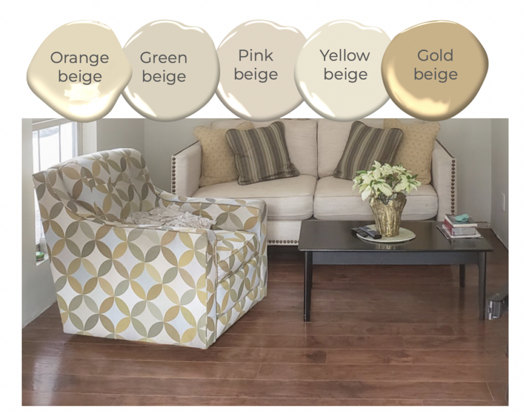
So really, the primary neutral undertone in this room is pink beige, not green grey. But the muted, greyed-olive green accents in the chair and pillows are picking up the green grey wall colour–sort of.
Here’s a good rule of thumb to follow if you have a large upholstered piece in a solid neutral: The solid neutral in your upholstery is likely the best undertone to pull for the wall colour. The eye just wants that connection.
This means if the love seat was sage green, the BM Halo paint colour would have looked just fine with it, because of the green undertone.
And, she would not have been annoyed if it sometimes looked yellow when the light filters through because MOST of the time it would look right. That’s because it relates.
You can’t ignore the undertone of your neutral sofa
When working with white and super pale colours like greiges, you have to remember that they REFLECT. That is the nature of light colours.
Think of it this way. If your pale neutral paint colour is anchored well by relating closely to major finishes like a floor tile that runs throughout your home or the largest upholstered pieces and drapes, for example, it’s going to look right no matter what the lighting conditions are.
But if your pale neutral wall colour doesn’t relate, AND you’re looking at an unfinished room, you’re going to be super critical of the paint colour (and start blaming the light). Because it’s not perfect yet.
Since the loveseat is a pink beige neutral, technically the room would have looked a little better painted a pink beige wall colour.
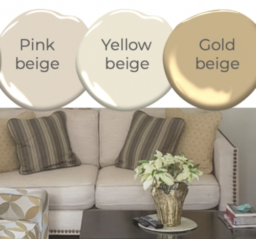
Do you also see the gold beige pillows and how they don’t look amazing with the pink beige sofa above?
Avoiding this undertone combo is part of my guidelines for working with neutrals from Day 1 of my two-day True Colour Expert Training.
So, what’s the easy fix? Bottom line, it’s the pink beige loveseat that isn’t working with this colour scheme.
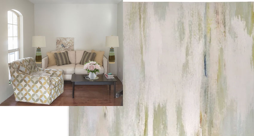
Decorate to distract the eye from the paint colour
Can we distract the eye with some artwork and an area rug? We certainly can (below)! So all is not lost, but if you’re looking at your room and blaming the light for your colour scheme. I encourage you to look again.
If you’d like help with your paint colours? See my edesign paint colour packages here.
There aren’t enough True Colour Experts yet!
Back to what my reader said at the beginning of this post: “I have had several decorators here, no one knows how to fix this”
Wouldn’t you like to become the decorator who can? In your own home and/or your client’s home?
Become the decorator who doesn’t blame the light because you know how to fix the issue (because it’s rarely, if ever a light issue).
Become the decorator who doesn’t need to hedge with pale paint colours. You know, taking that already pale neutral and cutting it by 75% or 50%. You’ll learn that’s completely unnecessary once you know my system.
Become the decorator who can walk into any clients home and know exactly what the paint colour should be.
We just had a course last week and this is what a few new True Colour Experts reported at the end of the course.
Don’t just take my word for it… here’s what recent True Colour Expert grads are saying
“The way that you delivered the course, the actual content itself, countless examples and practical exercises has been priceless. I did some colour training back in 2017, but … I didn’t feel that I came away with the practical colour training that I needed.
I have been wanting to do your colour course for a while now, but was scared about spending more money on colour training, but am so glad that I made this investment. Your training has just brought everything together for me and I am so grateful.” – Belinda L.
—
“I finally got the courage to take the True Colour Expert Training. It was an investment in myself that I’m working to turn into a business to help people like my frustrated self of 6 years ago.
I absolutely LOVED seeing and hearing Maria speak! Learning directly from her is priceless.” – Anne P.
—
“It was an excellent course, very well done! Anyone dabbling in the art of interior design could benefit from this course.
I really liked Maria’s practical advice to save money. She is resourceful and makes good design approachable for all budgets.” – Joanne S.
There is ONLY ONE more course left in my Spring season, June 21 & 22, 2023. We haven’t made any decisions about this fall.
If you’d like to submit a question for an Ask Maria blog post, send your question including photos here. Please note, questions without photos cannot be considered.
Related posts:

“Did you know that a paint colour will only look consistent throughout the day in a North facing room, where the light is relatively flat and indirect?”
Or, in a south-facing room, for those of us in the Southern hemisphere 🙂 Wonderfully useful article, as usual, Maria – many thanks 🙂
But what about the kitchen??
Regardless, in my opinion, the loveseat is secondary to the flooring, which absolutely rules out the wall color. Since that flooring runs into the kitchen, the same paint color can be used throughout.
Agree! Why fight the undertone of the most expensive item in your home? The floors!
Maria, as usual, is correct that the loveseat was making it all look wrong and disjointed. I wonder if the homeowner has a green-grey throw she could place over the loveseat just to get an idea of what the paint would look like without the pink beige upholstery in the room?
Your course in color was invaluable as a designer – I gained so much and in turn, my clients have gained so much. Have you thought about doing a ‘graduate’ course specifically geared to professionals like myself … I can think of many topics of interest and areas where I’d love greater structure and input along with discussion (not informally like the FB groups) but with greater professionalism … about color, web pages, processes, billing, fees …
I wish she had asked for help before purchasing that chair! Scale is way too big for the room! 😞
To my eye, the paint doesn’t go with the cabinets. It’s too green. I love a grey and cream combo – I would lean into that. For the mud room through the kitchen – I would paint the walls a deeper color to coordinate with the cabinets. I would add matching hardware on the mud room cabinets and add a light defusing shade on the window in that room. It’s unfortunate that the appliances are not stainless steel. For the kitchen table – I would paint everything that is green charcoal in a shade that has the same undertones as the cabinets.
I understand her problem with layout in her living room. I like like the cream on cream look for a small area.
For the living room I think if she used some bright white in the room like in the throw pillows and a rug with lots of white in it that it may bring it altogether. I think white cures a lot of ills. I might choose a different coffee table like a round one with gold trim (like in Maria’s house). The kitchen looks okay to me. She has white appliances so it would all cohere in my opinion. I may be way off but that’s how I see it. It’s good to know that a new paint job isn’t going to be needed or at least that was what I concluded.
To me, those cabinets (Other than being too trendy- she’s going to hate them in about 5 years) read green-greige, but that warm, warm, warm toned wood floor that is so dominant is heightening the misfit colors. The floor is beautiful. The real fixes aren’t very budget friendly. New cabinets, new furniture/reupholster and new paint, all to work with the warm tone of the floor. (Plus a rug).
This seems like a fairly small space, getting everything to work together will help make it not seem as small.
We talked about cognac being a good neutral option for a leather sofa. If a cognac sofa is the largest piece of furniture, should the walls be a similar color? Or do we focus on a complementary color?
So many great comments in Maria’s posts. The living room layout doesn’t look like it functions well to me. Would moving the chair to face the loveseat work better? In my mind, I need that coffee table to be centered with the loveseat and that’s the only way I see of doing that. Also, would white subway tile help tie in her white appliances in the kitchen? I thoroughly enjoy these types of posts with all the suggestions.
I think two smaller chairs, arm chairs I prefer, facing the sofa. Space between to look through to room and people beyond
Great post, Maria and very informative. The room would also look better with some art work behind the sofa as you mentioned, plus a nice light shade on the ceiling light.
To me, the only thing that’s out of place is the loveseat. The kitchen is very attractive as-is; I’m fond of white appliances. The dining set and upholstered chair are pretty. The floors are beautiful and I think the Halo color looks nice. So much is right here. Why not just slipcover the loveseat? Then, lamps, rugs and decor and it’ll be a super cute place.
I have taken your course Maria, and more and more it clicks into gear and I see it all so much easier. Hallelujah! Lol. I loved this post and used it as yet another training exercise. It’s a simple enough fix and with your help I’m sure she’s on her way to perfecting her lovely home.
Your posts have been on fire lately lol and I have never enjoyed them more. Thank you.
Hey Maria🤗 I have a real stumper for you. I just bought a log home. The floors are ambered oak, most of the walls are natural wood that show a different color ( trending pink undertone) than the ambered pine wood ceilings. Oh and all the doors are little more brown, but same tone as the walls. We have a large floor to 2 floor ceiling stone fireplace in what I call a dark taupe grey.
We have lots of light.
We are not ready to paint the wood just an occasional bit of Sheetrock and open kitchen cabinets.
Since the fireplace is the “bossy” object in the room and we have South West and West light, should I try a medium taupe grey on the Sheetrock? All the wood is confusing me.
Thank you for considering my dilemma. My neutral color wheel is getting a real workout🤗
I can send photos.
Maria, I appreciate how you go through this step-by-step with us. And that you provide solutions that don’t have to break the bank! I love your idea to bring in art, lamps, a rug, etc to tie the colors together, so your reader doesn’t have to buy new furniture or repaint. I think that new decor will work great! I did wonder what you thought about the kitchen. From the pic that you posted, I can see that it’s a well-thought out and lovely space. I can see that the wall color is not “perfect,” but to my eye it’s not bad at all 🙂 Any decorating advice for that space without repainting?
Where is the rug from that you are suggesting?