For the record, I did not predict this colour. I definitely thought it would be blue. Specifically a brighter, more cornflower blue. And I wasn’t the only one.
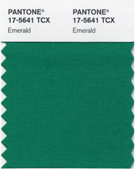
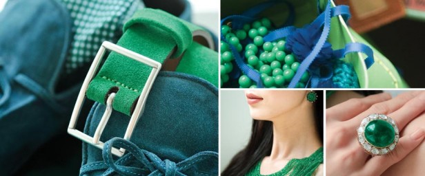
Also, there’s a big difference between Emerald and Kelly Green, yet every image on Pantone’s slideshow announcing this colour shows both, this one being a perfect example (above).
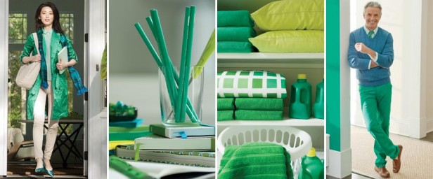
Here’s another publicity image from Pantone showing emerald suede shoes with a Kelly green belt. Yet the individual images of the necklace, dress and ring are Kelly green.
Avocado green has been trendy for much longer than the usual cycle. One of the reasons for this is because of the green movement.
As I mentioned in this post a few months back, I knew green was getting bluer when I arrived at a consultation and upon whipping out my tried and true greens, my client said, “Can I see something mintier?”
Mint green was all the rage this spring in fashion with green getting bluer, so it shouldn’t come as a big surprise that the newest green is a darker version of mint green.
“Emerald is symbolic of growth, renewal and regeneration,” said Leatrice Eiseman, executive director of the Pantone Color Institute, the research division of Pantone Inc, which creates colour standards for the fashion, beauty and home industries.
“That is what the stone implies and has… for many cultures. It celebrates new life, and that, we feel, is a good message because it speaks of optimism for the future.”
Let’s do a review of how accurate Pantone’s colour predictions have been, shall we?
When Mimosa was announced as the colour of the year for 2009 it was way ahead. I had a mimosa coloured sofa (below) custom made in the fall of 2010 and even then, accessories in that colour were few and far between.
Turquoise for 2010 was a totally current colour and it could be found everywhere in fashion and home decor. I have been specifying primarily turquoise and yellow greens for a few years now.
When Pantone announced Honeysuckle for 2011, I already had some of those accents in my living room. Red definitely went pinker and more raspberry.
Tangerine Tango for 2012 was also a colour that could be found everywhere you looked. I have lots of clothes in this exact shade. And my family room is accented in Tangerine.
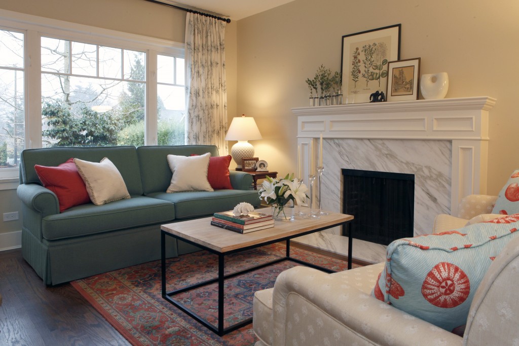
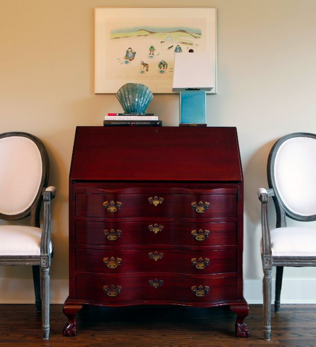
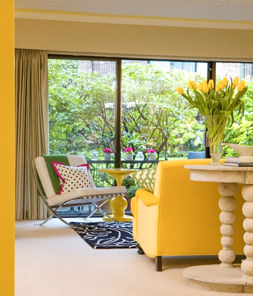
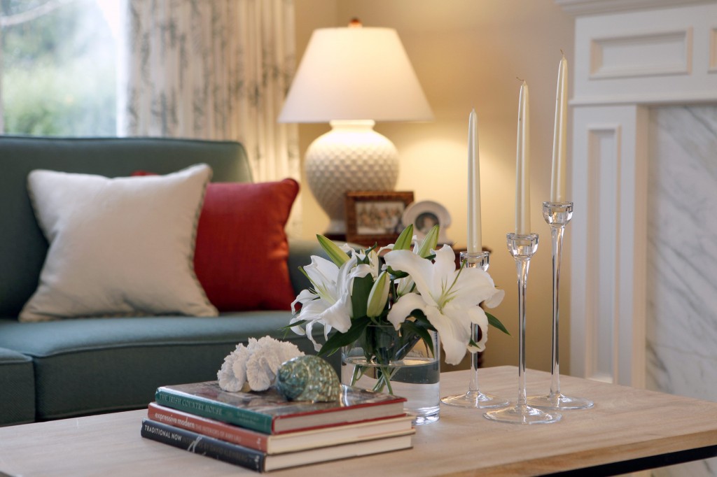
My clients are right on trend for the 2013 colour of the year. I recently decorated this living room for a client and last week I had it photographed.
Will this be a colour we’re suddenly going to see everywhere? I think it’s a matter of how fast the consumer embraces the colour.
I’m always surprised by how rarely my clients ask for yellow even though it’s definitely here. Will emerald be the same? Is my client (above) a couple years ahead of the trend? 2013 will be the judge.
How do you feel about the colour of 2013?
Related posts:
Here’s How Colour Trend Forecasting Works
Bright Colour Needs a Healthy Dose of White
What Everyone Should Know about Blue
If you would like your home to fill you with happiness every time you walk in, contact me.




I think it is pretty, but I look better in the olive greens, or even kelly green than in the blue-greens. I understand why trends change, but it is always hard when the colours that are in are ones that you don’t personally find flattering.
I do love that living room! The blue-green is so soft there – very relaxing.
My favorite color is teal so I just love emerald and have been requesting it this second half of the year. I’m very excited that it is the 2013 color and that I’ll be seeing it a lot more!
Maria, thanks for the post…been wondering when I’d see some images for this one. I think Ginger hit on why you don’t see so much of the “color of the year” some years. I suspect it has to do with the subconscious feeling that certain colors just don’t look good on us. Or that a color that we do like is just ‘too much’. Yellow, for example is a tricky color for many people…it needs to be the right shade…and in the right dose. You need confidence to wear a lot of yellow or you end up feeling like you resemble a banana…lol. This is subjective, of course. And I think that we tend to gravitate to colors in our homes that we feel ‘look good on us’.
Emerald? Yuck. That still feels like a tired 80s color to me. So many houses haven’t been redecorated since then, so I don’t think emerald’s time has come again. I doubt it will last.
I think of Emerald as a more somber cousin of Turquoise…still friendly, but not as light-hearted. A bit more sedate. Interesting how Pantone colors of the year switch so strongly between HOT and COLD colors.
A couple of months ago I went shopping for a Kelly Green pashmina to perk up a black pantsuit however, I couldn’t find Kelly Green anywhere! What did I find instead? Emerald Green. This was a sign that the trend had shifted. Having said this, I don’t think Emerald Green is mainstream… yet. There were very few Emerald Green articles for sale, but the sales associate told me that whatever they did have in Emerald Green was flying off the racks! I definitely think we are going to see more of this colour. It’s only a matter of time and it’s no surprise it’s here. The 80’s are back with a vengeance, but with a twist. Instead of Forest Green, we have Emerald.
I’ll be darned. I have been noticing that color and thinking of it as teal green. I love it as an accessory color. What do you think would be the best complimentary colour?
I can see a cranberry red, which reminds me of the hunter green from the eighties!
What about a rich pineapple yellow?
Personally I rarely am influenced by a “color of the year” because if I (or my clients) don’t like it or cannot relate comfortably to it, why would/should it be used? I tell them to pick color(s) they love and forget about trends. Now if they happen to like/love the trendy color of the year, that’s fine too. Trends in any fashion industry are ‘created’ so new things can be designed and sold. Get on board if you like it; if not stick with colors/trends you love.
Great post, Maria – love the shots of your new project with the green sofa!
I’m confused ! The belt, necklace, dress and ring look exactly like the Pantone emerald swatch to me and the suede shoes appear blue. Is it my monitor (or my brain)?
I think there’s a lot of confusion on the exact shade. Everyone that is reporting about it are showing both kelly green and a bluer green like the one I’m talking about in this post. On my screen their swatch matched the more teal blue shade. Maria
I agree Sharon, the blue green looks teal to me and the “kelly” bang on. I love all greens so I’m in!
I agree with Lizh–not a fan of emerald green. There are so many pretty colors why go with this old, low energy color?
It’s great for fashion and accents but really stops there.
Connie…you are my kind of decorator 🙂
Color is such a personal thing. Whether it’s in clothing or in decorating, what’s “in” really has no bearing on anything. I am always amazed to go to so many houses to see cookie-cutter Pottery Barn black, gray, brown, white decorating. Come on people….there are hundreds of wonderful color choices and those choices should be colors that make you enormously happy not what someone tells you is the “in” color for this year. I laugh when I watch HGTV and these young couples who only know how to say “hardwood floors; cherry cabinets and granite countertops”! It’s like they are programmed to all want the same thing. And really ladies…have you seen some of these horrendous combinations of a busy granite countertop and a headache-inducing backsplash? I always think of “The Emperor’s New Clothes”! Who is going to tell these decorators that some of this stuff is just plain God awful ugly!!!
Color is so subjective. Maybe it’s my monitor but Pantone’s version of emerald is too blue to be emerald.
I should say their version of “emerald on the coffee mug” looks too blue….
sorry.
Peer into a beautiful high quality emerald stone…and it is a gorgeous color that is full of life and promise. For me, in this natural form, it does have energy. Now, I think the trick to this new color becoming a real trend will be how well the paints, fabrics, and all accessories are able to copy the color of emerald as it is given to us in the natural stone itself.
How often can people redecorate? If you went with the turquoise trend or the mimosa trend, you probably can’t afford to do it all again this year with the emerald. I can only redecorate with all new colors about three times, maybe four, in my lifetime, and I’m serious. I know I’m influenced by trends, but I am surrounded by colors I love, and they will just have to do!
This is a good observation….about the complexity of duplicating a gem tone. Makes me want to experiment with an irradescent glaze over emerald & see what would happen.
I do like greens of all kinds, but find this particular one difficult to incorporate in our rustic, mountain enviornment.
I’m an emerald green fan. It works well with my colouring 🙂 Also, I love the living room Maria. Lovely room. I gravitate to restful living rooms and most shades of green and blues. Hope everyone is enjoying the season!
Maria, I love the way you worked your magic and brought in some new colors into that living room with the terracotta/navy Oriental rug. Really gives it all such a fresh and updated look. Hope you’re having a good Christmas season!
I always look forward to the new Pantone color and enjoy watching others apply it to their homes. There will be no green in mine, however. The closest to green I have is BM Camouflage in my foyer and upstairs hall which, now that I have your wonderful color boards Maria, looks muddy to me. Time for a change however it won’t be this, last, or the prior year’s Pantone selections!
I’ve become a “green” gal but most definitely not this shade – I like light and bright, and this color is too much shade. I’ll take the two sort of granny snith apple pillows top right in the linen cabinet over the bluer greens every time. And, Connie, I love your attitude as a decorator – you’re very practical and down to earth, and I suspect your clients experience Maria’s philosphy to “fill (your rooms) with happiness every time you walk in”. It will be interesting, Maria, to see not only whether this color “takes” but how long it takes to get to various parts of the country – I remember your Sept 2012 post on bossy color trends.
Well I love that living room you decorated and would really like to know the paint colour on the walls. I have almost the same colour chairs and I think the contrast with the wall colour is right on:)
Emerald looks trendiest when paired with a mid blue like cornflower or Pantone’s Monaco Blue, instead of an other-side-of-the-color-wheel contrast. Seen with a blue, emerald does look more intense and “kelly.” The above pics of the pencils and the linen closet have more yellow greens added in; reminds me of the colors of a peacock.
I am rarely on trend. I am not a fan of brights and prefer my colours muddy-brown or gray undertones. I love most greens but mint green is one colour I cannot stand. Emerald, being as you say, a darker version of it, is more tolerable. I agree with you that there seems to be some confusion or no distinction being made between emerald and kelly green. I often find that with colours though. Just as some people don’t see undertones well, they don’t know how to name colours. I frequently see people on pinterest confusing teal, aqua and turquoise.
I like my greens mossy with quite a bit of yellow and brown, or very blue and heading to the dark teal part of the spectrum.
As I said, I am never on trend, or at least not on purpose and if I like a colour that is trendy chances are I don’t like the popular tone of it. Yellow? I prefer ochre, mustard or pale butter yellows. Orange (or pardon me, Tangerine Tango)? I like my oranges rusty or pale like a
creamsicle.
And the obsession with pink found all over the blogs that do bohemian chic….well I just say yuck to that. Enough of this excessively girly pink and white stuff. And this greige obsession! Enough of that too.
Okay, I’m sure you really don’t want to know everything there is to know about what colours I like and which ones I don’t. But it’s a safe bet that whatever the colour of the year is, I don’t like it.
I think they missed on the name. That does not look emerald green to me at all. When I think of an emerald, I think of something much greener, that’s too blue. Like someone else said, it immediately made me think of the ’80s when teal-blue and mauve were all the rage. Needless to say, I’m not a fan of this year’s color of the year.
Hi Maria..some of the ’emerald greens’ in the pictures look very blue to me. I have seen quite a few emerald greens in fashion lately and it is a welcome relief in Christmas clothing especially this year. There is a real freshness in adding an emerald green top or cardi to multicoloured florals.
Maria, can you tell me the wall color of the room you redecorated with the emerald couch? I love how creamy and soothing it is and that marble fireplace surround is stunning.
It’s HC-81 Manchester Tan. Maria
For 2012 I was expecting Pantone’s color to be a shade of green. It will be interesting to see how people will use emerald– it’s nowhere in my home (I like my green with less blue). I enjoy the color trends going to clean colors- it’s a lot easier for me to find fabric/accents I like.
Of all the greens and blues I have, everywhere, in my home, there is no emerald to be found.
It is a little too dark and bold for me.
I have never thought about it before, but now I realize that it doesn’t have the freshness and brightness I like.
I know in theory it seems like it would be bright, but in the context I am thinking about it is more bold and heavy and not light and bright.
I find myself using aqua blue, peacock shades, etc. in every room of the house…really, it “goes with everything!” franki