The news is out, Honeysuckle is Pantone’s colour of 2011. Since I’ve been talking about Pink for a while now (and it’s the accent colour in my living room) it’s kind of cool that it’s officially a ‘colour of the year’.
“In times of stress, we need something to lift our spirits. Honeysuckle is a captivating, stimulating color that gets the adrenaline going – perfect to ward off the blues,” explains Leatrice Eiseman, executive director of the Pantone Color Institute®. “Honeysuckle derives its positive qualities from a powerful bond to its mother color red, the most physical, viscerally alive hue in the spectrum.”
How hot is this colour?
Well I found some pink pots in exactly this shade at IKEA this week. I took two of them home and decided I didn’t like them because they would only look good with green and white daisies in them. They are too hot as a plant pot, I much prefer white. IKEA has toss cushions that match as well! I would have liked to find this kind of ‘big box’ support in YELLOW, but alas, it is not yet to be.
2010 the colour of the year was Turquoise and it was definitely everywhere. In fact right now, it’s hard to find blue in ‘off the shelf’ drapery panels, toss cushions and accessories, everything is turquoise. I seem to be right on trend in my house with this colour as well, my office and master bedroom is decorated in shades of turquoise. However in 2009 when Pantone introduced Mimosa (flowers below) as the colour of the year, I would have to say that they were a little ahead because that shade of yellow was no-where to be found, because if it was I would find accessories for my living room in that colour but trust me, they are few and far between!!
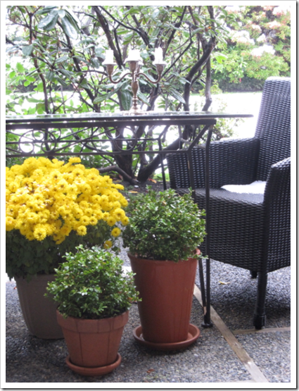
This is my patio with some boxwood and yellow (Mimosa coloured) mums (that were frozen solid in this photo you can see the snow on the chair). When my black and white upholstered chairs were put away for the winter the table (which is right in front of the living room) was now staring back at me, so I decorated underneath it!
Anyway, that’s my take on the colours of 2009, 2010 and 2011. How do you feel about ‘Honeysuckle’ are you feeling it?
If you would like your home to fill you with happiness every time you walk in, contact me for on-line or in-person consultations.
I have been eagerly awaiting the announcement of the colour of the year and I have to say I LOVE this colour. Fresh, bright, feminine… and looks great with 2010's turquoise.
I am not feeling it. Gray has taken hold of me in the neutral palette and the last thing I want emotionally is to pair it with pink and have the pink/gray combo of the late 70's and 80's living again! I would much prefer the yellow/gray or orange/gray combinations which I am finding new and exciting. Aqua I am tiring just a little of.
I have never seen PINK honeysuckle. Around here the color is a gorgeous yellow… But, I do like the "new" shade. I may even incorporate some in my home… Jane (Artfully graced)
I am ahead on this one. I have always had a throw and a couple of pillows in this pink. My daughter's room has always been pink and something. It is a perfect pop for me with my neutral palette. I don't know if I would want a large piece of furniture covered in pink, but I love to see it in the homes of others. I LOVE bright colors, but not in MY home. My two cents, haha. Have a nice weekend, Maria. Teresa
This shade of pink doesn't do it for me. If the idea was to present something "bright" and uplifting, I think this one comes off as thick and flat. Had the powers that be chosen one of the other honeysuckle varieties I would have been happier.
I am not a fan of pink – it's funny that the hair color post was recommended as a related post at the bottom of this post, because my dislike of pink (and red) stems from the fact that my hair is red, and these colors look awful on me!
I painted the bottom half of my dining room this exact color and about a month later I put beadboard over it. I just couldn't live with this strong of a color in a large dose. It is nice in a pillow, but not on a wall…and this is coming from someone who LOVES pink!
I'm not and never will be a trend follower, but i do love "honeysuckle" as a colour as much as I love any other colour. In the right room with the correct application it would be stinning.
I love how saturated this color is. I have been searching for deep raspberry for over a year for my living room (some of which is going to my bedroom for a master-makeover) and the color was tough to find. Now, I'm hoping it will be a lot easier! I will love this color in a bedroom — strong and lucious but not necessarily "girly"
I am kind of excited for the pink…I think it is fun. I also think it goes well with the trend of neutral grays and creams for background and then the pop of bright color. I do like it juxtaposed with this year's turquoise and as you showed in your photo I like it with mimosa as well! And I do love the pillow. I am thinking I will use it more for pops of color and accents but you will have to check out my post today for some pretty bright honeysuckle images that are using it as a main color! Sherri http://sherricassaradesigns.blogspot.com/2010/12/its-official-pantones-color-of-2011-is.html
Only in bits and pieces like you've done in your house. I can't imagine a wall in that bright colour. It's beautiful and a definite 'come play with me!' colour.
I'm not a big fan of honeysuckle but would certainly would us it as an accent color. I did a post on how to 'man-up' this lady-like hue because men like it too! Pretty post Maria.
The honeysuckle isn't a natural choice for me, but there's a piece of tissue paper in exactly that color sitting on my work table surrounded by Christmas ornaments. And I hate to move the whole vignette because I love how the pink works with the greens, golds, and naturals that surround it.
I was thinking about how I could incorporate the color into a room for Christmas without putting off my husband and three boys.
For som inexplicable reason I like this color but not sure how I would use it in my neutral and serene home. I will probably add a bit of it in the springtime via some pillows, a vase etc. It would be beautiful with gray, with brown, with black, with yellow and with turquoise so it does appear to go with everything and will certainly add a "happy spot" to a room. Maybe that was what Pantone had in mind.
Well…I love the Yellow from 2009..and it is going on my couch cushions when I sew the covers in January..but that pink–I would say it's probably not for me. It wouldn't go anywhere in my house that I know of. My first two children's weddings were using a hotter pink than that and I got a full dose of it. I tend to avoid it now. I don't like turquoise either. I love yellow, lime green, and orange though. Actually, I love flowers in that shade of pink, I just can't imagine decorating with it. Who knows..if I see it enough..I might grow to like it. It's so interesting hearing from you what the 'in' colors are.
I ordered an area rug online once. It worked out fine. But I checked it out on my husband's MAC. They have the best graphics and are the most likely to have the true colors. We have five or six computers (husband repairs the older ones and tests them also). I can tell you that a computer screen's shading or tint can completely obscure the true color of anything. I buy all my fabric at the store. I wouldn't recommend buying a rug online normally.
I was already starting to gravitate toward this colour….. I did the same with last years colour, and the year before, which got me curious. How early do designers know of the colour of the year so they can slowly introduce it to us? ……..anyway, with two young girls; I should be all pinked out but I LOVE this colour. Will have to get those pots! Thankyou!:)
Not a huge fan of pink except in small doses or in very pale shades. I painted pink and white stripes (vertical) in our bedroom in the last house; the stripes were wide (8") and the pink was more of a white with pink tone — it was called seashell. With floor to ceiling white sheers on the windows and all the furniture, not a lot of wall ended up showing anyway but it made a nice backdrop for the mostly green and white with a little pink bedding and wall art I used. When I first painted it, my son said it felt like he was in a giant candy box 🙂 I liked it well enough but couldn't make a change for the almost 10 years we lived there because of our humongous water bed that my husband REFUSED to move so that I could re-paint. Thankfully we got rid of the water bed so now I can re-paint our bedroom to my heart's content 🙂 But I assure you it will not have pink in it at all. Been there, done that. I'm happy for all the pink lovers out there but I won't be using this year's Pantone Color of the Year.
Yeh!!!!! I love love love pink. I love pink with white and black, with gray, with chocolate brown. with spring green, with red and orange, mango, and yellow. Its feminine its romantic, men always look great in a pink shirt, and they use it in prisons to calm the inmates down. How versatile can a colour be!
The color isn't my favorite one, BUT I LOVE in this space! It feels warm, cozy and stylish.
You're so good! Gee!! 🙂
By the way, I posted today my 1st Christmas post… it has lots of very unique & crafty ideas, if you can go take a look and let me know what you think. Thank you!
Maria, When I saw the color of the year I immediately thought of your living room and how on trend you were (I love you LR by the way).
I think it is a bright and fun color, but, I don't think I will be using the brighter pink, maybe a pale pink. I was much happier seeing turquoise last year (I am a blue girl at heart).
I used shades of pink to add a feeling of happiness & romance to a sleek black & silver palette. I applied this to my own wedding! Here are the shots. A few pops of the right color can completely transform a space. Notice ho the pink lighting in the banquet room. http://fisilis.wordpress.com/2010/12/08/going-to-the-chapel/ xo Mindy@FindingSilverLinings


I have been eagerly awaiting the announcement of the colour of the year and I have to say I LOVE this colour. Fresh, bright, feminine… and looks great with 2010's turquoise.
I love the honeysuckle for pops of colour, it will be interesting to see how it unfolds in 2011.
Your yellow blooms would have looked amazing in a honeysuckle pot!
Felicity x
hmmm, I wonder what will be next? I love a pop of pink honeysuckle…a pillow, a scarf, ….
pve
I am not feeling it. Gray has taken hold of me in the neutral palette and the last thing I want emotionally is to pair it with pink and have the pink/gray combo of the late 70's and 80's living again! I would much prefer the yellow/gray or orange/gray combinations which I am finding new and exciting. Aqua I am tiring just a little of.
I have never seen PINK honeysuckle. Around here the color is a gorgeous yellow… But, I do like the "new" shade. I may even incorporate some in my home…
Jane (Artfully graced)
I am ahead on this one. I have always had a throw and a couple of pillows in this pink. My daughter's room has always been pink and something. It is a perfect pop for me with my neutral palette. I don't know if I would want a large piece of furniture covered in pink, but I love to see it in the homes of others. I LOVE bright colors, but not in MY home.
My two cents, haha.
Have a nice weekend, Maria.
Teresa
How timely is your post, I didn't know it was going to be the colour of the year.
I just posted on my master bedroom… pops of pink.
Nice post totally loving pink these days.
cheers
Susan
This shade of pink doesn't do it for me. If the idea was to present something "bright" and uplifting, I think this one comes off as thick and flat. Had the powers that be chosen one of the other honeysuckle varieties I would have been happier.
Maria,
I really love it!It really is a luscious color that has been used a lot this year…when I go through my inspiration sheets, etc.
Come by and enter my Giveaway from Fifi Flowers!
xoxo
Karena
Art by Karena
I am not a fan of pink – it's funny that the hair color post was recommended as a related post at the bottom of this post, because my dislike of pink (and red) stems from the fact that my hair is red, and these colors look awful on me!
I painted the bottom half of my dining room this exact color and about a month later I put beadboard over it. I just couldn't live with this strong of a color in a large dose. It is nice in a pillow, but not on a wall…and this is coming from someone who LOVES pink!
I'm not and never will be a trend follower, but i do love "honeysuckle" as a colour as much as I love any other colour. In the right room with the correct application it would be stinning.
I love how saturated this color is. I have been searching for deep raspberry for over a year for my living room (some of which is going to my bedroom for a master-makeover) and the color was tough to find. Now, I'm hoping it will be a lot easier! I will love this color in a bedroom — strong and lucious but not necessarily "girly"
Yay! That's one of my wedding colors! Glad to know I will be "in".
I am kind of excited for the pink…I think it is fun. I also think it goes well with the trend of neutral grays and creams for background and then the pop of bright color. I do like it juxtaposed with this year's turquoise and as you showed in your photo I like it with mimosa as well! And I do love the pillow. I am thinking I will use it more for pops of color and accents but you will have to check out my post today for some pretty bright honeysuckle images that are using it as a main color!
Sherri
http://sherricassaradesigns.blogspot.com/2010/12/its-official-pantones-color-of-2011-is.html
Only in bits and pieces like you've done in your house. I can't imagine a wall in that bright colour. It's beautiful and a definite 'come play with me!' colour.
I'm not a big fan of honeysuckle but would certainly would us it as an accent color. I did a post on how to 'man-up' this lady-like hue because men like it too! Pretty post Maria.
The honeysuckle isn't a natural choice for me, but there's a piece of tissue paper in exactly that color sitting on my work table surrounded by Christmas ornaments. And I hate to move the whole vignette because I love how the pink works with the greens, golds, and naturals that surround it.
I was thinking about how I could incorporate the color into a room for Christmas without putting off my husband and three boys.
As I said on my post "Use it with wisdom".
For som inexplicable reason I like this color but not sure how I would use it in my neutral and serene home. I will probably add a bit of it in the springtime via some pillows, a vase etc. It would be beautiful with gray, with brown, with black, with yellow and with turquoise so it does appear to go with everything and will certainly add a "happy spot" to a room. Maybe that was what Pantone had in mind.
Well…I love the Yellow from 2009..and it is going on my couch cushions when I sew the covers in January..but that pink–I would say it's probably not for me. It wouldn't go anywhere in my house that I know of. My first two children's weddings were using a hotter pink than that and I got a full dose of it. I tend to avoid it now. I don't like turquoise either. I love yellow, lime green, and orange though. Actually, I love flowers in that shade of pink, I just can't imagine decorating with it. Who knows..if I see it enough..I might grow to like it. It's so interesting hearing from you what the 'in' colors are.
I ordered an area rug online once. It worked out fine. But I checked it out on my husband's MAC. They have the best graphics and are the most likely to have the true colors. We have five or six computers (husband repairs the older ones and tests them also). I can tell you that a computer screen's shading or tint can completely obscure the true color of anything. I buy all my fabric at the store. I wouldn't recommend buying a rug online normally.
I was already starting to gravitate toward this colour….. I did the same with last years colour, and the year before, which got me curious. How early do designers know of the colour of the year so they can slowly introduce it to us? ……..anyway, with two young girls; I should be all pinked out but I LOVE this colour. Will have to get those pots! Thankyou!:)
Not a huge fan of pink except in small doses or in very pale shades. I painted pink and white stripes (vertical) in our bedroom in the last house; the stripes were wide (8") and the pink was more of a white with pink tone — it was called seashell. With floor to ceiling white sheers on the windows and all the furniture, not a lot of wall ended up showing anyway but it made a nice backdrop for the mostly green and white with a little pink bedding and wall art I used.
When I first painted it, my son said it felt like he was in a giant candy box 🙂
I liked it well enough but couldn't make a change for the almost 10 years we lived there because of our humongous water bed that my husband REFUSED to move so that I could re-paint.
Thankfully we got rid of the water bed so now I can re-paint our bedroom to my heart's content 🙂 But I assure you it will not have pink in it at all. Been there, done that.
I'm happy for all the pink lovers out there but I won't be using this year's Pantone Color of the Year.
It's the very definition of "happy colour" isn't it! Guaranteed to put a smile on any face.
Yeh!!!!! I love love love pink. I love pink with white and black, with gray, with chocolate brown. with spring green, with red and orange, mango, and yellow. Its feminine its romantic, men always look great in a pink shirt, and they use it in prisons to calm the inmates down. How versatile can a colour be!
The color isn't my favorite one, BUT I LOVE in this space! It feels warm, cozy and stylish.
You're so good! Gee!! 🙂
By the way, I posted today my 1st Christmas post… it has lots of very unique & crafty ideas, if you can go take a look and let me know what you think. Thank you!
xo
Luciane at HomeBunch.com
Maria, When I saw the color of the year I immediately thought of your living room and how on trend you were (I love you LR by the way).
I think it is a bright and fun color, but, I don't think I will be using the brighter pink, maybe a pale pink. I was much happier seeing turquoise last year (I am a blue girl at heart).
I always love seeing what the next color is.
I used shades of pink to add a feeling of happiness & romance to a sleek black & silver palette. I applied this to my own wedding! Here are the shots. A few pops of the right color can completely transform a space. Notice ho the pink lighting in the banquet room.
http://fisilis.wordpress.com/2010/12/08/going-to-the-chapel/
xo
Mindy@FindingSilverLinings