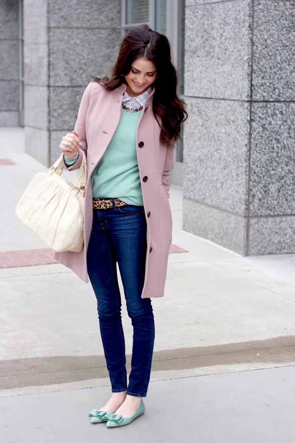
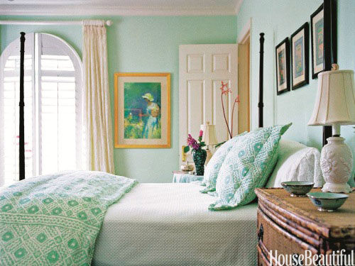
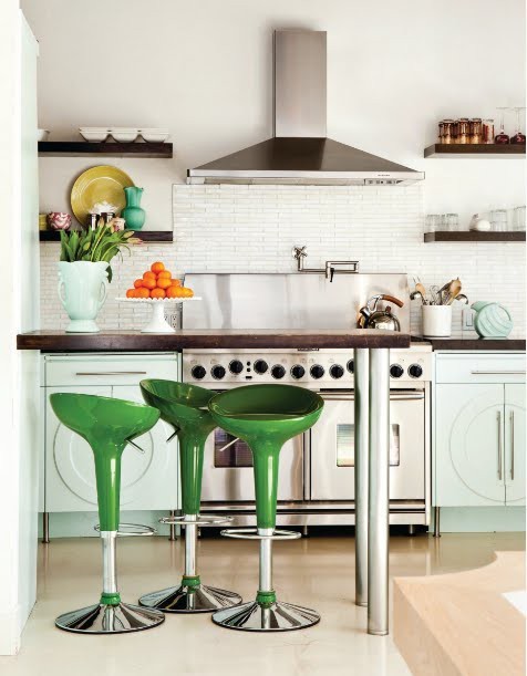
Lately I have been specifying bluer greens. My clients are not as interested in the fresh greens and yellow greens that have been my go-to greens for years.
But this phenomenon really came to a head two weeks ago when I was in a consultation. We were standing in my clients playroom/guest room in the basement. I pulled out my greens because we were just looking for a pretty colour and my client said “Could I see something mintier?”
Mint?
Alert, alert!!!
I’m sorry but no one has said that to me in my entire colour career. So that question to me was like a neon, flashing sign. Attention my lovelies: green is getting bluer.

We’ve certainly seen it in fashion lately! But there are lots of fashion colours that don’t translate to interiors so this tells me that we might be getting tired of the avocado greens, after all it’s more than 10 years old.
Kelly greens have been all over design blogs and magazines for a few years now but it’s still hard to find that colour in anything but high end designer fabrics.
So what do you think? Are you loving bluer greens lately?
And remember, you heard it here first.
Related posts:
The Difference Between Fresh Greens and Yellow Greens
Need help with your colours? Download my eBook, It’s All in the Undertones.
If you would like your home to fill you with happiness every time you walk in, contact me.
To make sure the undertones in your home are right, get some large samples!
If you would like to learn to how choose the right colours for your home or for your clients, become a True Colour Expert. JUNE DATES IN TORONTO!


YES! I don’t know how it happened. Recently,I’ve been attracted to torqouise after shunning anything that wasn’t a warm tone since I can remember. I’ve always thought that I would look healthier (read younger) in a room with those warm colors. Why are the blues and greens more appealing to me now? Have they changed?
Hi Maria, and yes, I’m getting ready to paint a master bath remodel some shade of Mint Green…but I’ve clicked on and searched for your post, “Eeeeek, it’s Mint Green!”, but I can’t get it to come up. Can you help? Thanks!
Hope this works https://mariakillam.com/2009/10/eeeeek-it%E2%80%99s-mint-green.html
I just did a search for mint green and found it plus some others to read!
I love mint green-these last two blog posts have made me start to reconsider what I’d planned for my daughters room when we re do it.
Thanks Missi for posting the link. I re-linked it and it still doesn’t go there so clicking on the above link will work. It’s a glitch that sometimes happens on my blog I don’t know why.
Maria
If you go to ‘labels’ and click on ‘green’ then scroll on down you will find it there.
Mint? not for me…brings thoughts of pastels and the 70’s…too geriatric for me!
Ha! We are in the market for a new house and I am leaning towards using these “new” colors in our new space. My almost 7 yr old daughter even asked for a teal bedroom.
I was just looking at SW Aquarium to repaint the avocado parts of my kitchen.
I have two favorite blue greens…Farrow & Ball “Pale Powder” which looks a bit minty, but with a touch of blue to warm it up. I did my north facing living room in it, changes color with the light. Would also look great in a Master Bedroom.
For a deeper color, BM “AF Tranquility”, looks fantastic with lots of white trim…did my Guest Room in it…very classic, but cozy.
I just painted my dining room BM 619 Copper Patina. I pulled this color from my dinnerware pattern to compliment the natural chestnut Craftsman woodwork, yet be cheerier than traditional Craftsman greens.
I’ll choose blue greens over yellow greens no matter what’s current trend.
I just LOVE to hear anyone say that they choose what they “like” over whatever the current trend is.
Good for you! Doesn’t it make more sense to live in a color choice that you absolutely love than to be a slave to what Pottery Barn says is the “in” look?
I agree completely. I even found myself, for the first time, refraining from describing the old, ugly color in our LR/DR when we moved in as “mint,” because I think there is definitely a mint trend on the horizon. It makes sense, after the kelly/emerald green and turquoise trends, but, like those, it seems to be a slightly fresher, brighter version of the ’80’s colors. Or, am I wrong? Am I just looking at it differently now that it’s coming “in” again? I’m definitely being drawn to more blues and different greens…thinking of painting part of my master bedroom navy…
I decorate with colors that I love, and knew that I had to use Donald Kaufman #29 somewhere in the house – it is a beautiful sea glass like tone that looks light blue-green in some lights, light green blue in others. I did the opposite of what you are supposed to do – started with the wall color! But there are so many fabrics in this tone (often called mineral) that it has been easy to pull the room together. The biggest challenge has been my strong willed daughter (it is on the walls of her room).
Every classroom was painted ‘institional green’– a similar minty green shade when was growning up. Gotta take a pass on that shade!
Too funny. Everytime I see mint green I think “50’s bathroom green.” But my blues have been getting greener. The last bathroom my trusty go-to-blue paint was too blue in the confined space, so I dumped in some yellow craft paint. It came out the perfect wedgewood blue with a barely detectible undertone of (hmmm, mint) green and everyone asks for it. Uh, custom color will probably be unable to duplicate it down the road.
I am a painter and paperhanger,the majority of my jobs are with an interior design business. Definitely am seeing the seafoam and mint colors coming back again. They go so nicely with the gray shades that are now popular.
Mint green is in this spring. I commented on another blog about how much I hate it. For me, it is in the category of pinky beige. In fact it might even be worse, since I cannot think of any combinations in which I like mint green, whereas pinky beige sometimes has a place. I never seem to like the colours that are trendy, although someone recently blogged about wedgewood blue or what I might call French blue. I do love blues that have a touch of grey. I like my greens mossy.
Minty green really? It’s just the opposite here in Charlotte, NC. My clients avoid the minty green like the plaque. I think the yellow greens are fantastic and loved them for years. The green trend here in NC is either the yellow greens or still the soft coastal green. Minty green is just for the Mint Juleps 🙂
Did you notice that the background colour of your blog is exactly that tone of colour? Or am I late to notice this?
Just painted my guest bathroom BM Whythe Blue – a greener blue along the same lines. Never even knew I was on trend.
I have always loved bluer greens and am so glad to hear (here first) that they are coming back. I am going to be redoing our master bedroom and am hoping I can find bedding that will work with the bluer green. Hurrah, I am happy with color.
I’m just the opposite of Bluezette – I’ll choose yellow greens over blue greens no matter what the current trend. I’m absolutely not a “blue” person. And mint green is not only too geriatric (as Marcy says) but that was the color used in every classroom where I attended school and where I taught and in every government-related office I worked in while in public health. No mint green or blue greens for me. Glad in many ways I’m not a desigher so only have to make myself happy. But since I rent now and probably always will, I still get the challenge of making myself happy despite limitations I can’t change (like white walls with a distinct blue grey tint or carpet that seems to alternate between dark beige-cocoa-brown depending on the east-windows light or lack thereof). It’s still yellow greens and warm greys for me with a touch of your wonderful yellow, Maria.
There does seem to be a yearning for sky & sea colors
especially on the verge of spring. As long as it’s not swimming pool turquoise and has some creamy tones (not yellow, just soft.. maybe it’s white?) Keeping the color sophisticated and mixing it with some wood tones, as in the first picture is the trick, to me.
I’m not surprised. The last time I remember it being popular, grey and coral were also in fashion. Since coral has been renamed tangerine, mint – or seafoam as we called it the last time – will need a new name, too.
(I like kelly and olive greens better, but that is because I look better in them.)
Spot on Maria. Mint is IT in Copenhagen now, joined by pastels, light grey and a pop of neon. So much that in my jewelry shop I just sacked all my wrapping, ribbon, silkpaper and shopping bags, to replace them with a mint/creme/gold/black theme – loving it … it feels so much springier 🙂
Mint. Do think it will be paired with peach!
Definitely seeing a lot of mint green these days. I’m still a bit wary, though. Memories of mint green and peach from the 80s.
Oh my,
I have purchased a beachside condo and want to paint the walls an aqua….to match Pier ne adelaide chairs and Heywork Velvet headboard. All the cabinets in Kitchen and bath are new ivory wood, light sand granite (not pinky) and the floor is light sand coloured tile. Windows are white. I have eastern and northern light, how dark an aqua can Ipaint on all my walls?
It depends on how grayed it is. If you go to dark on a grayed turquoise, you will end up with a mans den or a teenage boys room. I would stick to a midtone over a real deep shade. Maria