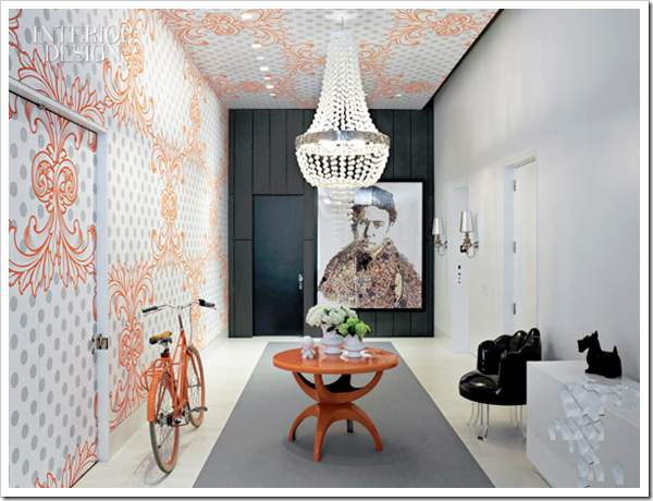
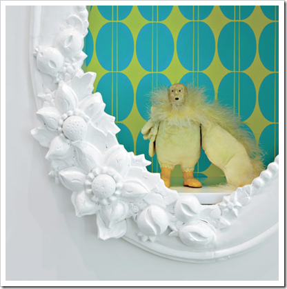
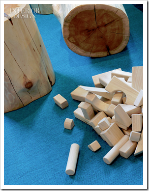
My readers are the best! I have been emailing back and forth with Stu Stiller for a long time now. He was kind enough to send me a quote about men and their love of wood to include in this post on Open Letter to my Lover on Decorating. Yesterday he sent me a link to this amazing townhouse in TriBeCa designed by Ghislaine Vinas. It’s definitely Colour me Happy!
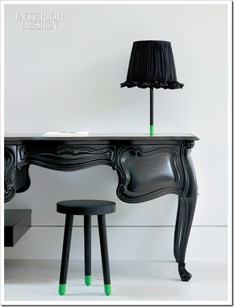
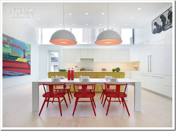
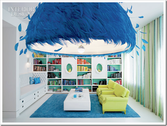
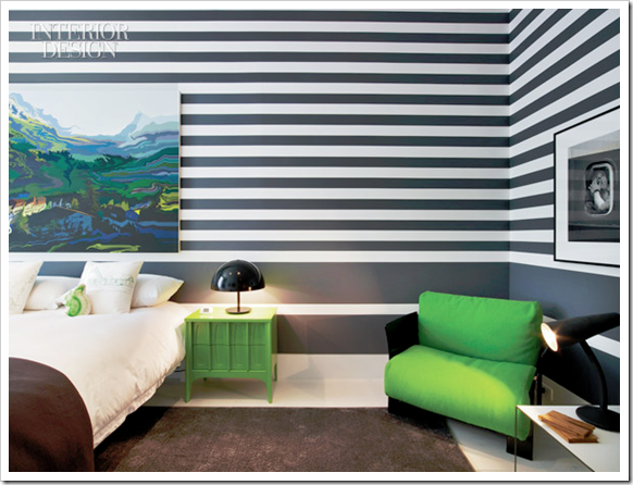
Here’s what I want you to notice when you are looking at these images. I have been talking about fresh, happy colours as the new trend for months now. But this kind of clean colour looks the best with a healthy dose of white (not necessarily all over the walls) as this townhouse shows!

Stu (above) finally had the opportunity to meet in person at the CMG Conference two weeks ago. He is the Director of Design & Merchandising at Mayer Fabrics and he’s always sending me colourful links to read!
Have a Happy Weekend!
If you would like your home to fill you with happiness every time you walk in, contact me for on-line or in-person decorating and colour.
Related posts:
When is White just Right?
White is a Snob
White Floors for Instant Happiness
New to this Blog? Click here ; Subscribe to my free Monthly Newsletter; Become a True Colour Expert <div >While you’re here, subscribe to this feed so you don’t miss out!






Wow, I love these images – they look fresh, hip and livable. I plan on lots of white in our new addition!
pve
Beautiful images. The room with the two baby beds makes me tired just looking at it, but is absolutely beautiful. Can't imagine having twins :). I really love the black console against the beautiful white, and the green office.
Thank you for sharing, Maria.
Teresa
love the wrk of gislaine Vinas. She is always ahead of the trends.These bright primary colors are perfect for a contemporary eclectic interior
With color going fresh and clean, I think I'll be living in the past for a while. I'm more a muted colors person, much like the colors I wear. I'll be living my mantra of "do what you love." I do appreciate fresh color, though, and love to look at it or vacation in it.
This is so beautiful. The striped bedroom is amazing, the painting feels like a window.
I am working on the transition from darker, certainly less strong colors towards a brighter concept. My biggest hurdle is my family who never wants to change anything… They are just happy with the status quo!
What a gorgeous selection of lovely bright colours! I adore them all!!
🙂 Hazel
Hazel Loves Design
Great images. (I especially love the colours in the first one) These photos really prove your point that a room doesn't have to be entirely a bright colour in order to have big impact. Take that photo with the white room and black desk with the stool and lamp with the tiniest amounts of bright green. Your eye is immediately drawn to the green, and all the neutral surrounding it really makes it POP!
OH NOES! This brings back not-so fond memories of a house I was rehabbing. The interior walls were bright blue, green, red, yellow, purple and orange. Two or more colors per room.
Without large doses of white, bright colors turn into Dr. Seuss decor.
It took 15 gallons of high-hide white paint before I could escape from Whoville.
I don't know if I could handle all the stripes in the master bedroom. The feather light looks soo cool and it's in bright blue my favourite colour!
Oh gorgeous…
Love the dining and kitchen…
The rooms have a fresh and lively vibe…cool.
great series of bright and white spaces. the very first one is gorgeous. as i'm totally obsessed with green, the 2nd and 3rd images from the bottom are delightful.
Spectacular photographs. I particularly like the black & white striped wall. It makes the walls disappear, the depth achieved is amazing. Great trick.
Love the photo of you two!!!
Maria,
White has an honorable supporting role in our colorful lives it allows colors to shine yet white has absolute presence on it's own.
Just as perfect as a blank sheet of paper, a white wall, room, and space await our addition of colors to complete what our mind 's eye can see.
When our internal vision matches our external presence results are we're in our happy places and spaces.
Bette
What bright and beautiful spaces! I love the dark gray stripes on the master bedroom walls against the contrast of the green accents!
Great contrast with the brights and the whites. Too 'sterile' for me though!
xx
Oh my goodness Maria. Here I've been working so hard to break myself away from the safety of white walls and then you go and post these fantastic pictures! Too funny! Wow–White as a background to bright colors really is dramatic and fresh at the same time. There's nothing boring about these pictures!
I guess the critical element is that the contrasting colors need to be bright..not subdued. That is something I've never tried.
I do feel like laughing though when I read about white walls after considering them 'bondage' for 20 years. There is certainly nothing limiting or 'ho-hum' about these white walls. These great photos give white a whole new reputation!
xo
Donna @ Comin' Home
I love this!! Thinking outside of the box!!
Instantly happy images. Especially love the first, tangerine-spiced one and the black desk. Yum.
Stu, you have a breathtakingly beautiful home! How fun that you and Maria finally met 🙂
You know, in fashion and style which is my game, a healthy dose of white looks fabulous with bright colours too. White bottoms always make my seasonal "must haves list" for Spring and Summer. There is no substitute for white. I LOVE white!!!
Yay! So glad you and Stu (my wonderful CMG mentor) met! The conference sounds like it was fun! Always a joy reading your blog!!
See, THIS is why I was going to upholster the small sofa and chairs in my screaming-yellow living room WHITE! Missed the chance – maybe in 2011 🙂 Thanks for a great post, Maria!
Do bold colors always need white, or is it just a generally helpful tip? What if there are a range of colors (warm and cool, dark and light) but no white? Is it inevitably going to look like Dr. Seuss was here, or can it still look okay?
My brother suggested I might like this website.
He was totally right. This post truly made my
day. You can not imagine just how much time I
had spent for this information! Thanks!
I think black does the same, but feels a tad more sophisticated. Bright color with white has to be very preppy/Palm Beach or Andy Warhol pop-art, if that makes sense; otherwise it looks like a kids’ room.