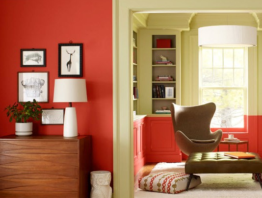
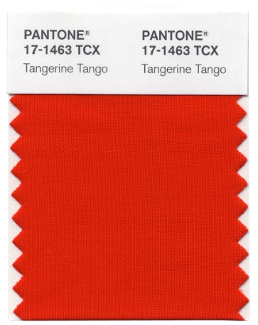
I almost missed posting this story as I’m about to run out to a couple designer parties tonight and I heard about it at The Decorologist first! Then ‘From Caroline’ wrote a post where she also announced the colour of the year but also mentioned that my takeaway from the annual CMG Conference in September was about orange moving to a tangerine shade.

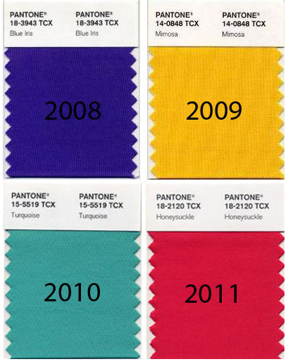
It’s interesting to see the progression of colours from 2008. The gray trend really arrived on the scene in 2009 so it’s no surprise then that yellow, turquoise, honeysuckle and now Tangerine, followed. All clean and crisp colours that work well with gray, black and white.
The LA Times says that Pantone describes the color as a “vivacious, enticing hue,” “a provocative go-getter” that’s “a bit exotic, but in a very friendly, non-threatening way” and “a spirited reddish orange. . . sophisticated but at the same time dramatic and seductive.”
I was relieved to see this fun interpretation of the colour and also to see that there was no reference to it being a “necessary relief from the woe’s of the economy, etc.” as was mentioned in past years.
As I’ve said in prior posts, I don’t think the swing back to colours of the 50s and 60s has anything to do with the economy; it’s just the natural ebb and flow of colour trends moving from dark (brown trend) to light (gray/white trend). After all, we’ve been looking at earth tones for 20 years and we’re done!
I say bring on the happy colours, now you don’t need an excuse!
What do you think? Yay or Nay.
Download my eBook, It’s All in the Undertones. If you have a computer, you can download my book!
If you would like your home to fill you with happiness every time you walk in, contact me.
To make sure the undertones in your home are right, get some large samples!
If you would like to learn to how choose the right colours for your home or for your clients, become a True Colour Expert.
Related posts:
My take on Pantone’s Colour of the Year; Honeysuckle


YAY!!!
You called that one, Maria ! It does kind of remind me of the orange my Mom had in her kitchen when I was little, but I like it !
I’m all about the fun happy colors and what’s not to love about Tangerine?
I love orange and already have this color as an accent in my family room (pillows mostly). Though your nod to the 60s/70s reminded me that this looks a lot like the Brady Bunch kitchen.
http://www.delish.com/cooking-shows/food-tv/favorite-tv-kitchens
I think ‘yay’! It feels like we can exhale and have a bit of fun 🙂
Oh how I love this kind of orange. I’ve been using it in both residential and commercial interiors for a while now. It seems like everyone says “hmmm, really? Not sure…” then when it’s all together it really works beautifully. So fresh. Gorgeous set with navy, greens, turq (my fave) and dare I say magenta!
My own kitchen is a similar
color with creamy trim and cabinets. Very eye-opening in the morning and warm and cozy at night.
Yes, I am all for brighter colors! Being from Holland and living in Canada, I feel that people tend to be more conservative with color here (the earth tones you mentioned). I think it would be great if this encouraged a bit more playfulness in interiors.
Have always loved orange and tangerine! Being from the Caribbean, I always love Colour!
Yay! Happy and bright- love it!
I’m not sure – but then again, I wasn’t sure for the last few years and the colours have grown on me. I’m so off trend because I’m moving away from a very colourful house to a calmer environment. Just painted my living room BM Lambskin and love it’s subtle beigeness.
I love the softness of the new tangerine. It is especially pretty with browns, sage green, and creams, which many of us still have.
I love this vibrant Colour. My first thought was that it is TRUE…not PHONEY!
Yay! I love it! I am seeing a lot of this hue in fashion as well…. love it with dark brown and/or black…so chic!
Yes… I love orange — it is happy!
yay! my FLOORS are “orange”…. teak ( real bangkok teak) parquet…. and while not my choice, they demand orange….. and I love magenta and turq but really think they need white walls. what do you think??
Thanks for the link back to my blogpost, Maria 🙂
I love this orange with gray – not a big fan of it with black because it is a bit too Halloweeny. But my favorite pairing with this orange is a greeny-blue, like Ben Moore’s 2012 Color of the Year Wythe Blue or even Stratton Blue. I posted a couple of photos of that combo in my blogpost yesterday.
Cheers!
I just bought an oval coffee table at the consignment shop–and now I understand that the wood has orange undertones. I have been debating on how to refinish or decoupage it–I’d like industrial chic. Perhaps it can bring in some tangerine. Christmas is aqua and silver–but wouldn’t a Christmas palate of aqua silver and tangerine be delicious?
I say its a yah! Vibrant and fun!
What an exotic description for a color, I say! I’m all for color. My tendency is to use them for accent pieces, which is less threatening and expensive than painting an entire room.
Here’s to a great 2012!
Yay! I loooove this color! We painted our spare bathroom this color in 2008 and have loved it ever since! It’s decorated with items I purchased on trips to Africa and Mexico and everything blends perfectly. Nice pick!
I have to say Yay since I have a tangerine pillow on my fresh green sofa. I love it with turquoise and plan to add a little more turquoise to the mix.
I have been passionate about this particular clear red-orange since 2008, when I fell for two throw pillows in “Tuesday Morning,” and went on to completely redo my bedroom scheme. I was limited by my rental apartment’s vanilla walls, so made gorgeous tangerine curtains in a graphic floral. They still make me happy when I wake up every morning. And orange has snuck out of my bedroom into almost every other room in the house.
This looks just like the color I painted my bedroom when I was in college in 1979! I liked to read and study in bed, and I wanted to stay awake to do so. Loved the color then and still do now.
I think Yay! But I don’t know if I’ll have the guts to use it. 🙂
Just bought a lot of accessories in this shade recently which pairs really well with my teals and turquoises – guess I was ahead of the curve this time!
I don’t see myself painting my walls that color, but I could definitely see myself wearing it!
I so love this colour! Maria, could you recommend a Benjamin Moore paint colour close to Tangerine Tango? Thanks alot!
I am truly hopelessly in love with most shades of orange this one included. I tend toward red ones not yellow ones. I’m still figuring how to work it into my home in the main living areas. Hmmm.
Sorry, NO! I don’t want to decorate with or wear this color. Our kitchen was this color back in the 60’s and I remember being so happy when my parents decided to wallpaper the kitchen! I might accessorize with this color, but it would be brief spots very randomly placed.
Yeah! I have loved ornage since I was a kid and still love wearing it. Now it’s time to do my house, hummm.
It’s time to dress up those neutral grays with some sassy orange! Go for it!
I feel like Goldilocks. The dark, brown tones were too depressing for me and I felt like screaming out, “Where’s the color!” But the shades that are out now are just too vibrant for my home (though some of them make it to my wardrobe). I guess I would say that I prefer colors that are muted than Pantone’s color of the year for the last four years, but that remain colors, not neutrals.
Please forgive the errors of that last post. My brain must still be dead from the past week. Sorry!
I love the color!!
Yes for sure! My dining room is “African Tulip” which is very similar and I love it.
I have a cardigan in that exact colour so I’m taking the colour description as a personal one.
Big Nay! actually HATE it, and I like colour but this one needs sunglasses.
Well, it’ll go with my fiestaware!
The color was called mandarin orange in 1974 when I carpeted our house in a gorgeous plush carpet of that shade. The walls were white, and most furniture was white or camel with navy accents. I remember it as one of my prettiest of our 11 houses.
I love the colour wear it all the time!
This past summer I finally had our open plan living/dining/kitchen/entrance walls painted in a beautiful orange. [Gingerbread 222-6 Pittsburgh paints Voice of Colour series]
I was a bit nervous about the selection, as one wall is 14 feet high and goes across the entire depth of the house, so it is a big splash of colour. Due to the ceiling height I had to hire an expensive painter, I am afraid of ladders, normally I do all my own painting.
But as soon as he had rolled on the first bits I knew I had made the right choice, it is absolutely gorgeous!
I painted one wall of my very first apartment, way back in 1975, a beautiful deep orange. I moved out of there in 1979 and have missed the colour ever since. I did the grey thing in the 1980s ; I didn’t know orange was back in fashion, I was just tired of too light walls.
I say MAYBE…but probably wouldn’t specify this color except in small doses or perhaps in a pool house or outdoor space…IF you are drawn to orange-reds. Trends come and go and tend to lean more classic design and colors and use the new looks in areas that can be changed when one tires of it. Enjoy reading your blog. I also love an all white kitchen. Now to convince clients that white cabinets are a good thing! Patti
Had this very same color on my living room walls when I first got married. Hated the furniture and used the orange to distract anyone visiting. It worked – everyone commented on the walls when they came in the room. Still love the color! Except it is red-orange in my book. Fancy names never did it for me as an artist.