See how decorating with my new botanical artwork made such a difference. And, I’m sharing a video tutorial on creating vignettes.
Similar botanicals here and here.
This year, in between Christmas and New Years, I completely refreshed every single vignette in my home.
After all the Christmas decor comes down, you’re probably looking at your empty tables and mantels and thinking the very same thing.
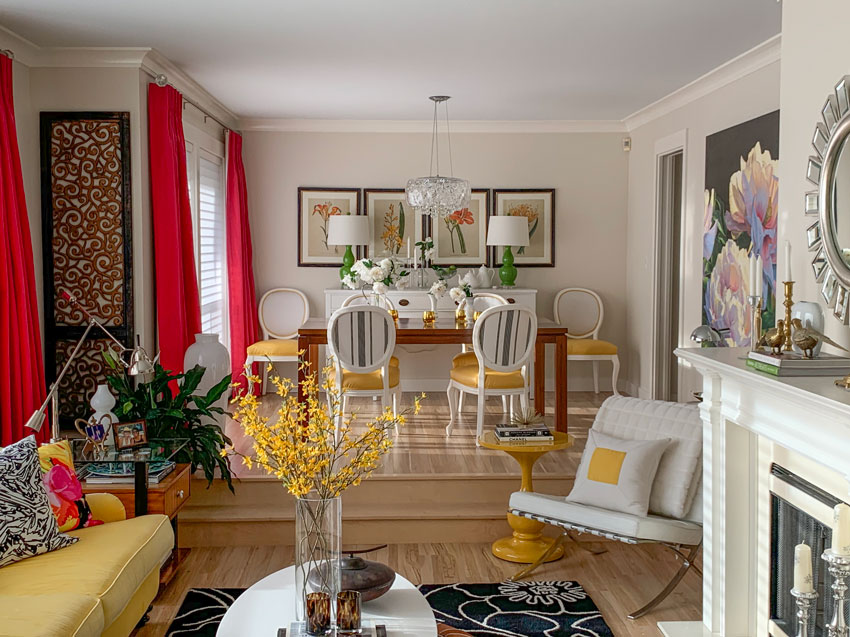
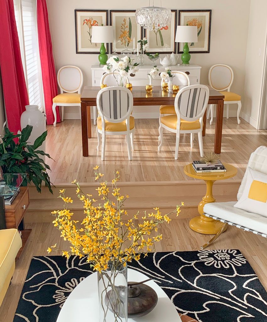
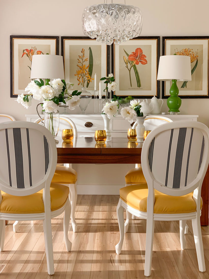
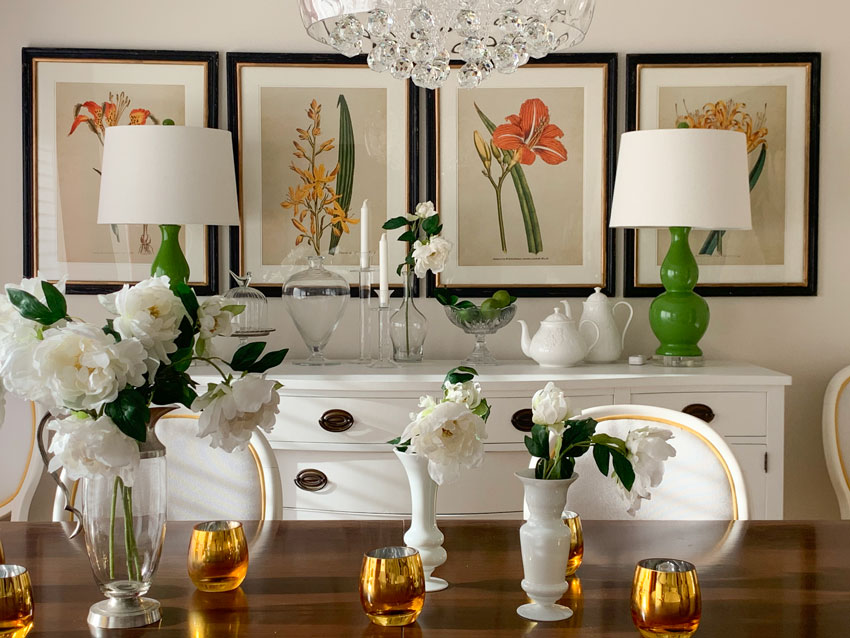
My New Dining Room Botanical Artwork
A few months ago, I randomly found these four botanicals that you now see on the back of my dining room wall. They were stored in my garage until I had the time to see if they would work here.
This is what the back of the dining room used to look like.
And truly, because my sideboard is white, and the mirror is silver, the wall kinda disappeared like it was floating (below).
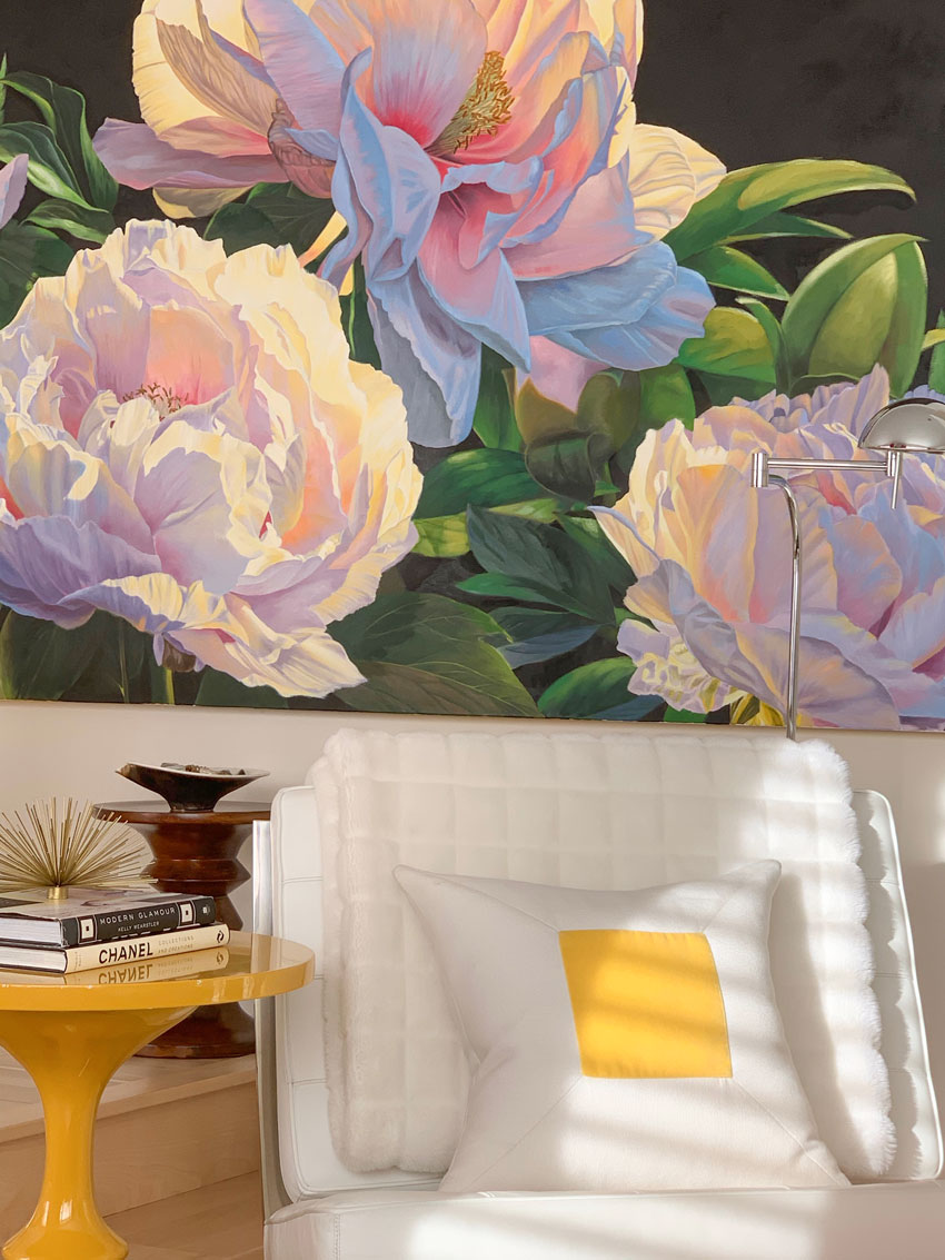
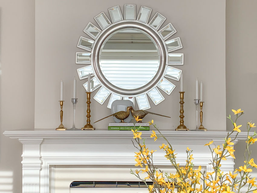
I moved the mirror to the wall above the fireplace in this room.
![]()
I picked up the white peonies from Chintz & Co in Victoria the last time we were there.
Gorgeous! And they look so real (below):
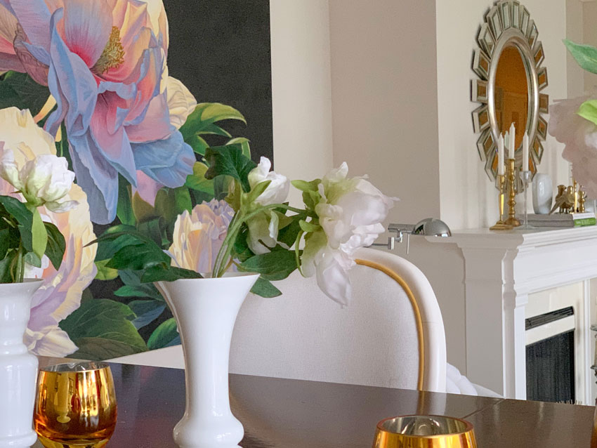
Here’s the simple vignette above my fireplace:
Remember the essentials of a tablescape or vignette are coffee table books in colours to match your decor, candles, they can be glass or crystal votives, candlesticks or a hurricane lantern, and a vase with flowers. You can never have too many different shapes, sizes and colours of vases!
And here’s a little video on how I created the above vignette!
One last thing, bet you didn’t notice my blue ceiling? That’s because blue feels like the sky, it’s rare that ANYONE notices when they are even in my house in person! With all the white walls everyone is doing, a blue ceiling is a great idea! If you need help choosing paint colours, I can help, here.
If you’d like your living room to fill you with joy when you walk in the door, check out our Get me Started eDesign package.
Related posts:
My Living Room Inside Style at Home (Including the Before’s)
The Barbara Barry Guide to Instagram (Through my Living Room)
How to Get the Perfect Piece of Artwork for Your Home (Before & After)


Happy New Year busy girl……The Botanicals are very nice – but then again so was the mirror. It gave a lot of light and sparkle – yet wasn’t busy – didn’t compete with anything. Love the peonies – and I know in the spring you will bring in some of your fresh white flowers. I LOVE real flowers and treat myself to a small bouquet year round.
Love the new dining room wall. Libraries are a great source for styling books. Most libraries have loads to sell and they can be had for only a dollar or two each.
These fabulous pictures balance out the weight of your dining room table which makes the whole room a lot more interesting by pulling the color palette together. The mirror you had there before was beautiful but probably it was too close in tone to your chandelier. Now you can say “C’est magnifique!”
First comment ever … I love your blog – I’m curious why you didn’t space out the pictures (ie, one above each chair and perhaps 2 in the middle of breakfront) … I feel like your lamps block the beautiful picture? Thank you for wonderful reading and the colorful work you do!
Great question. . . the botanicals are not that different that they needed to be seen and there’s nothing wrong with lamps sitting in front of artwork. . . if you start looking for that in other interior design images you’ll notice it happens a lot. A lot of people assume that their lamps are too big when the average lamp should really be around 28″ and especially beside your bed! Hope that helps! Maria
I love reorganizing vignettes! Yoo did a good job and I especially love the mirror over the fireplace with the accessories that balance. When you mentioned your blue ceiling I had to go back to the picture where you could see it. It is so light one would hardly notice! What color did you use? I may suggest it to a client for her breakfast room. Did you only do the ceiling in the living room? Good job Maria!
Such fun! You know what makes me happy? Hearing you unabashedly state you tried this 8-9 times! This is inspires we mortals who don’t have your keen eye or talent. We shouldn’t feel discouraged if we don’t immediately know what to do! Thanks Maria! This was a fun, helpful post! PS – I have noticed you don’t have a rug under your dining table. I was considering foregoing mine because it’s not a standard size and other factors. Thoughts?
Loved the video, you are delightful. Thanks for the inspiration.
It’s fun to move things around! The botanicals are beautiful. But to be honest, I liked it better with the mirror and the bright pink potted flowers on the sideboard because they pulled together the drapes and the pink peony painting so well. And the sparkly mirror tied in with the chandelier. The colors of the yellow and orange botanicals seem disconnected to the pinks in that spot and more “earthy” in theme next to the chandelier…to me. But if those neat botanicals make you happy, that’s what counts! 🙂
I agree with Liz in Oregon – to my untrained eye prefers the simplicity of the mirror. I love what I can see of the botanicals though, and would want them where there’s nothing in front of them. Maybe we need a post on layering?
The botanicals are beautiful–I wish the green lamps weren’t blocking them!
I love your re-organizing tips for vignettes. I did a similar thing after I took all the Christmas decorations down and it is nice to look around and see everything spiffed up for the rest of our dreary winter. I am at the point where I don’t really have to shop for new stuff very often because oftentimes it just helps to move things to a different room, or store it for awhile, etc. Essentially, I “shop my house”, which can make me fall in love again with my stuff. Happy New Year to you and your family Maria!
Lovely, but I too find the most charming thing of all this to be the fact that it took you multiple tries to “get it right”. I can now stop hanging my head in shame that it took me ‘3 whole days’ to decorate my mantle and bookshelf after Christmas, haha! Even Maria does that, hooray!!! ????
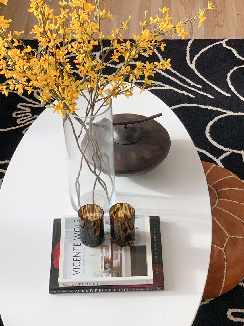
Looks like you also restyled your coffee table. I agree it really makes a difference in the feel of the room. I restyle my vignettes often just to give the room a fresh new feel.
Maria your vignette over the fireplace is nice BUT so colourless. The side board and table have so much stuff on not sure where to look plus the lamps hide 2 pictures and flowers on the left of the table hide the lamp. Fun to see but I much prefer your original that was fresh, happy, reciting and styled nicely. That hot pink is so delightful,
Most important is that you like it. Notice you are moving away from color. Interesting post as I had lots of feelings looking at this. Now to figure out my vignette.
Hi Arlene,
Well those flowers in the original photo were temporary for the photo so in actual fact that end of the room was pretty plain unless I actually had fake flowers on the dining table, etc.
Since botanicals are very similar, I have no issue that the lamps sit in front of them. . . I feel it visually creates a much stronger focal point than it originally had and the white sideboard also created a floating effect which I feel is much improved by the black framed photos! And I appreciate your comment and opinion, it’s valid is well! Maria
I like the botanicals but I think 4 are too many and 3 should have been used instead.
Love the new botanicals and the fireplace vignette. (Also love the way your pretty outfit matches the room!) 🙂
Happy New Year to you, Terreeia and your family!
Maria,
I love how the mirror looks over the fireplace, and I love how you mixed two metals and three styles of candlesticks! BTW, I have one pair that look identical to your taller brass ones! ;-}
My question is about the botanicals. I like how they look (esp. the black frames), and they do, “anchor the wall,” as you say! But I thought the “rule” was for the artwork to be about 2/3 the length of a sideboard or couch that it is over? Not only is the grouping longer than the sideboard, but it also appears to be longer than the DR table. Why does it work so well in this case? I ask because I am currently choosing art pieces for behind a couch and a sideboard. I have turned down things that I liked because I thought they’d be too long. How long is too long?
Hi Valerie, that is a great question. The only ‘rules’ I believe make a difference in the world of art is that most people hang it too high. But I have never even heard that rule about length in all my years of decorating but that could also be because I’m not looking for rules given I have been doing this for so long, mostly when I look online for art inspiration, it’s in the world of gallery walls because if you have a large wall, unless you have a HUGE piece of art, you’ll likely need more than just one or three pieces of art!
I think it works here because that dining room wall is the focal point of this room so the fact that the art extends past the sideboard helps to truly frame the room and make it feel more enclosed, especially BECAUSE the sideboard is white (I bought it that way, I would have loved it in a walnut stain as I’ve often seen that antique sideboard in it’s original condition).
Hope that helps! Love my vintage brass candlesticks! Maria
I love everything you did! The botanicals looks great where you put them, and the mantel is beautiful. Thanks for sharing your process with us. I am now going to go play around with my vignettes!
Hi Maria,
Thank you for this post. I enjoyed the beautiful color you added with the botanicals. Very pretty! I thought perhaps if there is enough room beside the mirror to add maybe 2 on each side with black framed photos to match the fireplace insert and your black and white rug with touches of pink, or yellow from the pillow, black and white colors with touches of gold paint to match the brass candlesticks.
I too find the lamps in front of your botanical prints way too busy and distracting. Also the light fixture interferes with viewing your prints.
I would’ve opted for a mirror with a green frame or something less busy.
Maria thanks for sharing –
I personally love the fireplace area it has the one green book that brings in your color .
It’s simple yet eloquent.
I also love the mixture of your metals .
Your house is fun and such a reflection of you !!!
I love your prints and think they look perfect there. I would move the lamps so they were in between the prints and change the lamp to include some black.
That’s just me, it’s really hard to comment on a photo without being there. I think it’s lovely and helps warm the area.
Thanks Maria!
The botanicals are fantastic.
Your video has inspired me to do my Dining/Kitchen/Family Room vignettes this weekend.
Looking forward to a refresh.
Such a beautiful room! You really are very creative and in fact, I just love everything you have done to this room. The four pictures in the dining area look just great to me and it’s great how you have changed things around. It inspires me to do the same. A wonderful job! Have a great year both of you.
I have been following your blog for years and I can’t believe how much I have learned from you. Your living room is one of my favourite rooms and it still looks as fresh as new! I am finally going to paint my living room a light fresh colour (probably my whole house), and your tips have been very helpful to me. I often wonder if you are still really happy with Rice Paper (paint colour) on your walls. It still looks great!
I still love it yes! Thanks Mo! Maria
Maria, I LOVE the new botanicals with the black frames. It creates more balance in the room to my eye. I personally thought the black rug looked very heavy in the photos (maybe it looked great in person). It was such a large amount of black on the one side of the room and I felt the chair backs were not enough black on the other side of the room to balance the rug. Now I think it looks perfect! The black frames draw your eye to the back of the room.
Hi Maria,
Have you considered a black taper or a black and white striped taper in the candle holders? Just a thought….here is a link to a couple https://www.etsy.com/il-en/listing/608587051/taper-candles-stripes-or-polka-dot?ref=shop_home_active_19&crt=1
I think my room is colourful enough, I’m okay with my mantel vignette looking neutral but I appreciate the suggestion! x Maria
Hi Maria, I like the the idea of creating new vignettes, but—-I don’t like the lamps covering the artwork! Try another arrangement on the botanicals.
So fresh!
Thanks for sharing~
Cynthia
Brenda, I smiled when you mentioned shopping your own house. We recently downsized to a home without a basement and precious little storage. Needless to say, I am forced to store things in any extra space. I spent a LOT of time trying to remember which hidey-hole I had used for any one item. There was some logic – but I felt like I was on a scavenger hunt.
I recently redid my bedroom. I bought some new art that I thought would look nice on either side of the bed, but when I put them up, I didn’t like the look. So, I put the pictures up on another wall on the sides of a window in the room. I left the area on the sides of the bed open. But, this brings me to my question. Which walls should you place art in a room? I am thinking it would be where you want your eye to go. But, I can see how you can get carried away with placing art on every wall in a room.
I have always loved botanical prints. Yours look great!
We have the same brass quails…I just asked my husband where he got them and he said in a thrift shop (in BC) about 18 years ago! I have them next to an antique brass base and stem oil lamp–never burn it because the oil gives me a headache, but it is beautiful. Bought it on our honeymoon in Ireland, 37 years ago.
The Botanicals look great! I like that they are layered with the lamps 🙂
Maria, It all looks beautiful, well done! Would you mind sharing the color of the ceiling? Did you paint all the ceilings on your first floor this color? Would that be something you would recommend for consistency?
Hi Jeannene, I don’t remember anymore, I picked it 8 years ago when we moved in but my advice for choosing a ceiling colour is to choose a clean one. This is the time when choosing a pale ‘baby blue’ looking colour works! You don’t want a greyed blue on the ceiling because the colour always gets darker anyway and then it starts looking like a cloudy day! You really can’t go wrong with which shade of blue as long as it’s the lightest baby blue in the collection of blues you’re looking at! Hope that helps, Maria
Love the change! The eye now travels from the dark frame in the living room to those in the dining room then around to the dark background in the art beside the fireplace. They relate to the table as well, and I think the lamps complement the botanicals nicely.
YAY, a vignette blog with a video!!! Thank you!!!
Love the botanicals! Really anchor the space and adds color and interest! Great idea! Love the tutorial on how accessorizing is a process.
Kimberlie Ann Interiors
I have a very subtle blue ceiling in my dining room, too! SOOOOO subtle! But I love it. My walls are also very light, Lancaster Whitewash. I love the airiness of the space.
Hi Maria,
Hmmm, you surprised me once again .. I just do not have words .. How could it be that you placed my favorite flowers and birds in your decore?? The owls, the peackocks, the peonies, the golden glasses, the copper candle holders, the sun mirror – you read my mind !! ???? I also adore your ice ceiling lamp, it looks sooo natural .. ????????????
And again .. this was my long-held dream to recreate nature in the room, and you did it with the blue sky-ceiling !! Perfect !!
I like the grass or sand carpet idea with this sky ceiling and glass walls, haha ????
Amazing post, sweatheart ????
Thanks Marina for your so sweet comment! Thanks everyone, I love my readers! xo
Hi Maria,
You have so many great ideas. I love reading your blogs and all the beautiful photos you post on Instagram. I too love to restyle often in my living/ dining areas and I too adore botanicals. To my eye they look lovely and fill the wall beautifully not being too long over your buffet because the chairs on each side also anchor them. I’ll have to say that with all your color to me your mantle appears a bit stark however well balanced! Thank you again for all you share!
Love a light blue ceiling too! Also love your botanical prints. What if you hung the 2 pics behind the lamps above the middle 2 , so you can see them and it would move your eye up? You’re amazing, love your bright bold colors! Thank you!
Love the botanicals! Love the peonies! Love the simplicity of the mantelpiece. Perfection.
However, the scrolling bronze piece on the wall gives me pause. I think I’d like to see the green plant elevated as a work of art to give balance, or perhaps green fabric stretched behind it? Its busyness is vying for attention. Is it just me?
Well it’s Asian which is the opposite of glam which is why, in my opinion it works in this room adding warmth and interest. I love how it visually relates to my ‘kelly wearstler’ inspired black and white scrawl pillows as well as the brown Asian vessel on the coffee table! Maria
I love the video and hearing and seeing you explain your thought process! I love reading your blog, but please do more of these videos, too–about any design subjects!! Thanks for sharing!
Hi Maria,
It’s always difficult to comment about a space I’ve only seen in 2-D. Only you know how the space functions and what makes your heart sing. Having said that, I was wondering about a tweak. Could the 4 botanicals be stacked 2 over 2 and fit over the buffet. That would answer the dilemma (for some) of the lamps covering the art. Too, it would add height and be one less horizontal. Or, perhaps that grouping of 4, stacked 2 over 2, could trade with the gorgeous peony print. I’m not sure how large it is but I’d love to see it as a star as I entered from the foyer.
Thanks for all your posts assisting me to make my world reflect me and last a long time – as all things classic do. Cathy
No I like how the artwork anchors the white sideboard and walls and visually wrap the wall so the dining room feels more defined. That big piece of art is huge and would never work in the dining room. I think it’s funny that so many people can’t handle the fact that the some of the art is covered by the lamps 🙂 Layering lamps over artwork is very commonly done but granted, usually by a designer. Thanks for your comment! Maria
I’m curious (nosy) How do you use this room?
I also agree that the prints are great for so many reasons but something feels wrong in the photos- I think it’s not just the pair of lamps hiding the prints, it’s that it feels like everything is squished together in the center of the wall- prints, lamps, ceiling lights, vases and vases of flowers. And then on the sides over the chairs, nothing