The colour for 2018 is yellow. The last time yellow was popular was in the 90s so it’s coming back. I have not been able to sell yellow for years even though it’s obviously my favourite colour.
Yellow
I was really happy to include it in a project I completed last year (below):
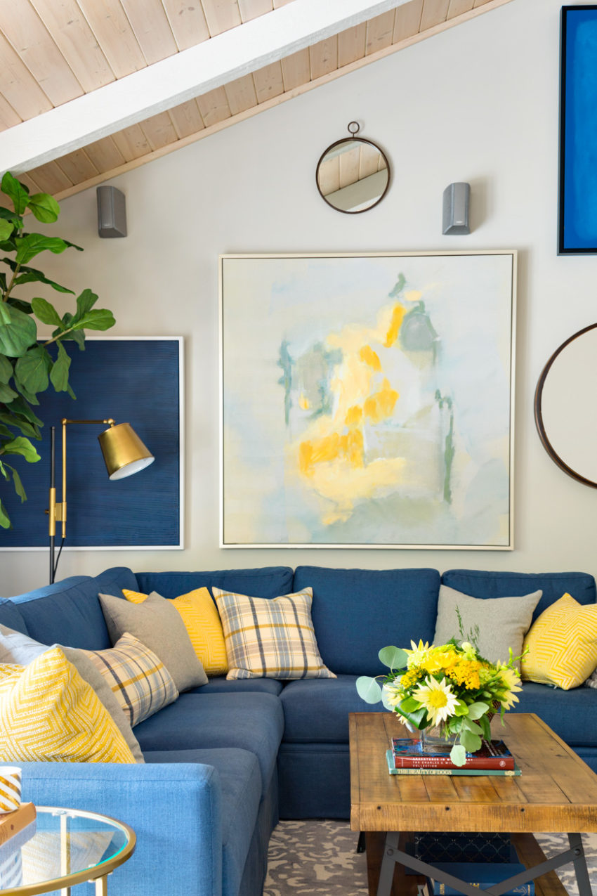
Pantone was really premature back in 2009 when they announced Mimosa as being their colour of the year, that colour was not available anywhere, I know because I looked and looked given I had just ordered a sofa in that exact shade of yellow.
However, if Pantone is choosing colours based on the cultural or economic mood of the masses, rather than what is actually trending in design and products, then it makes more sense as I said in my post about Ultra Violet.
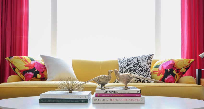
Strong colour is here to stay, especially with black appearing on the horizon as the new grey (or trendy neutral of the moment). I chose lots of yellow for my clients in the late 90s when black was big. It’s taken time for it to come back around but I think it’s coming.
Millwork Hood Fans
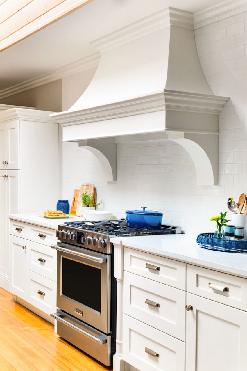
Last summer I replaced my stainless hood fan with a custom millwork fan. It looks so much better on that wall because there’s nothing else on it (photo to come soon).
The stainless hood fan trend has become so popular, it’s almost become standard in every kitchen, and it’s definitely less expensive than millwork, but if you are looking for a timeless, traditional, elegant alternative, millwork is definitely the way to go. I would keep the stainless hood fan in contemporary/modern kitchens.
Here’s the fan my client Deborah installed in her kitchen last year (see the entire kitchen/project here):
Photography by Barry Calhoun
Pearls
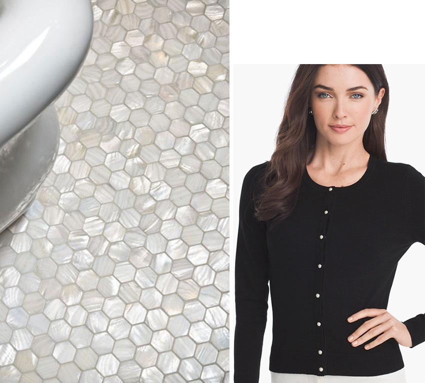
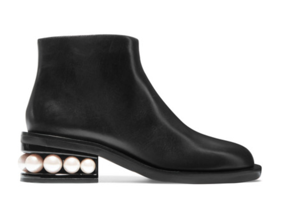
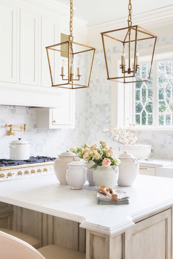
When you start to see pearls sewn onto hats and imbedded into sweaters and shoes, thats how you know it’s a hot, hot trend. I predict it’ll show up in tile more than ever.
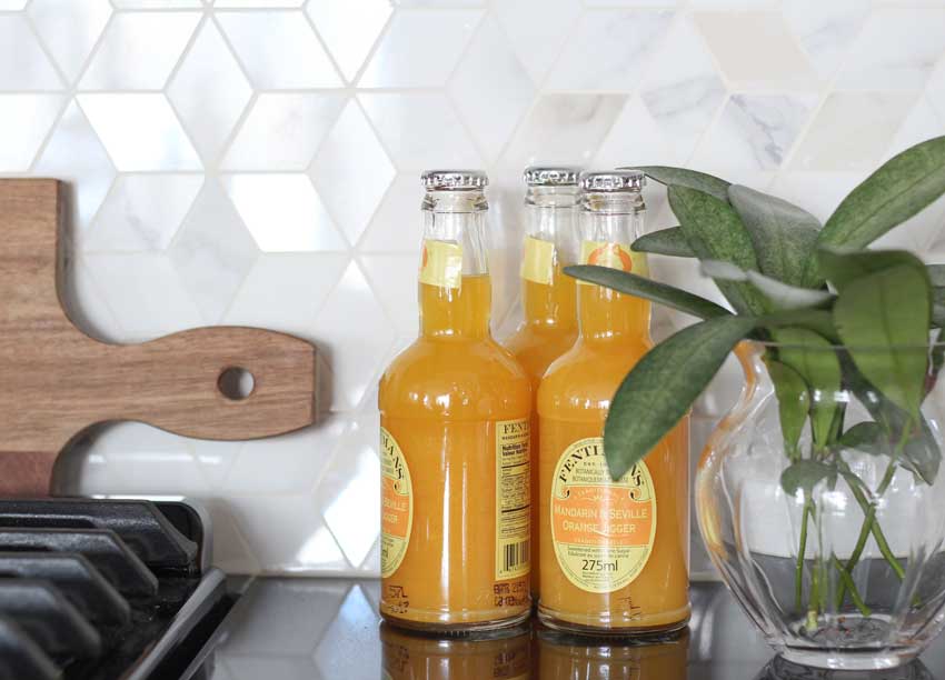
I posted this kitchen designed by my good friend Jan Romanuk last winter and I didn’t call this pearlized tile but that’s what it is. She’s ahead of the trend here. Mother of pearl is a really fun spin on classic white tile. It is still crisp and fresh with a bit of extra glamour.
Black plumbing fixtures
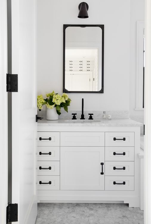
This is where you should definitely mix metals. If you do a search for black hardware and plumbing fixtures on-line you will see that all-black fixtures demand too much attention. The eye bounces around from one fixture to the next and makes it look too busy.
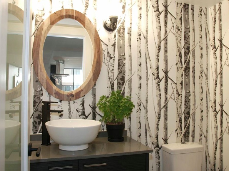
I like the idea of a black faucet, as long as there are other black elements so that it relates. My friend Jan Romanuk installed black faucets in her daughters condo in 2013 before they were even on trend. She had this one powder coated (below).
Notice that the faucet and the lights are enough here, and the natural wood mirror obviously works well with the forest wallpaper and balances the black perfectly.
Black Millwork
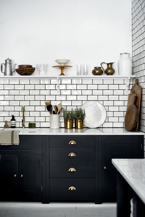
Yes the pendulum is swinging back to darker colours from white kitchens, but this trend should be considered carefully, in the right house.
I recently received an email from a reader who asked if I would have recommendations for a historical-minded, not-concerned-with-fads client? She lives in a 100-yr-old Arts & Crafts American Foursquare and nothing I say would have her part with her shellac-orange pine trim or oak kitchen cabinets.
In case you think I specify white paint for everything, that is not true. It’s just that the average house without any character usually looks better with a classic white kitchen.
So before you install a black kitchen just because it’s trending, make sure you have enough light to pull it off, keep it to lowers (so it looks more like furniture) and keep it light and fresh on the top with upper shelves and a white millwork hood fan.
There are lots of people trying to pronounce white kitchens and subway tile passe in this, the season of trend prediction, but we know better right? A fresh white kitchen or bathroom is not trendy, it’s timeless. It’s just that sometimes something timeless takes off as a major trend. And even if design junkies get tired of seeing it, it’s here to stay people.
More Wood Kitchens
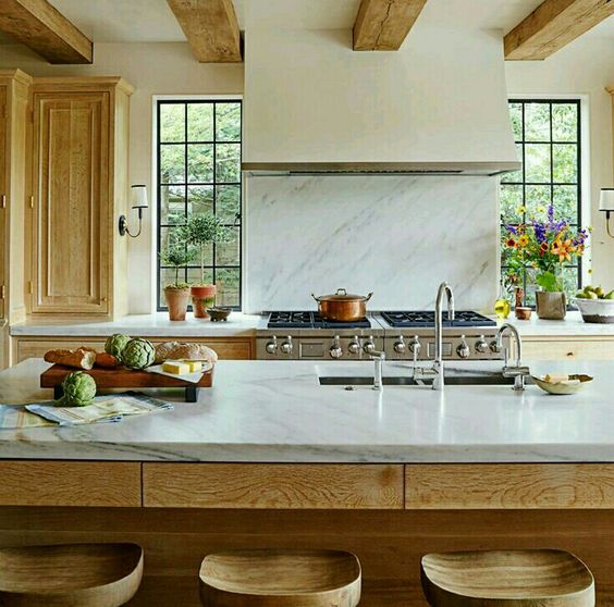
That said, we will see more wood finishes incorporated into pretty kitchens balanced by lots of white. There are some really pretty wood kitchens popping up lately like this one below.
However, a really pretty wood kitchen tends to be a high end affair. For now anyway, the typical available wood stained cabinetry still just mostly looks dated unless you can afford a custom design.
Warmer Colours
And yes, warmer palettes are coming back too. But what makes warmer colours look fresh and current? Lots of white (0r cream) of course.
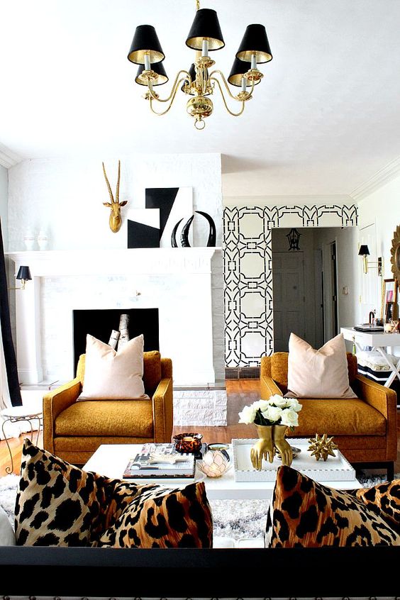
Warm ochre yellow and gold look so glamorous and current with black and lots of white in this room below.
In recent years, cool accent colours in the green and blue range have really dominated, and it’s not surprising because blue and cool colours are statistically favored, and aren’t going anywhere, but I think we will see warm oranges, strong yellows and clear reds come back as accent colours this year.
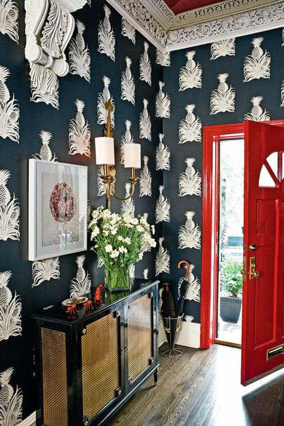
It’s unusual that I like a room with red and black, but this black and white wallpaper and lacquered red door are is just beautiful.
Brass and Blush
And naturally, year to year, there are some continuous trends. A trend cycle doesn’t flip with the calendar year. In 2018, deep blues, jewel tone greens, brass/gold and blush pink will all continue to go strong.
Some designers are declaring ‘Millennial Pink’ or Brass to be OUT, OUT, OUT, however interior design trends don’t just come in one season and go out the next. Pink and brass is not NEWS anymore, however that doesn’t mean they’re out like last seasons ruffles.
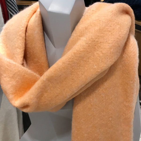
Peach
I was in Nordstrom in Torrance with my Colour workshop in November and couldn’t help snapping this photo of a peach scarf in the accessory department. It’s coming back and it starts with fashion first.
Related post: Trend Alert: How Blue is Your Green?
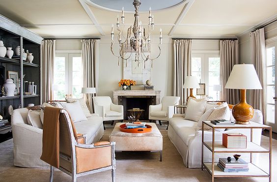
This classic room above by Suzanne Kasler has some warm peachy hues, brass, and tapered lamp shades that give a nod to 80’s glam in a subtle way. I think the Empire shade is set to overtake the contemporary drum shade this year too.
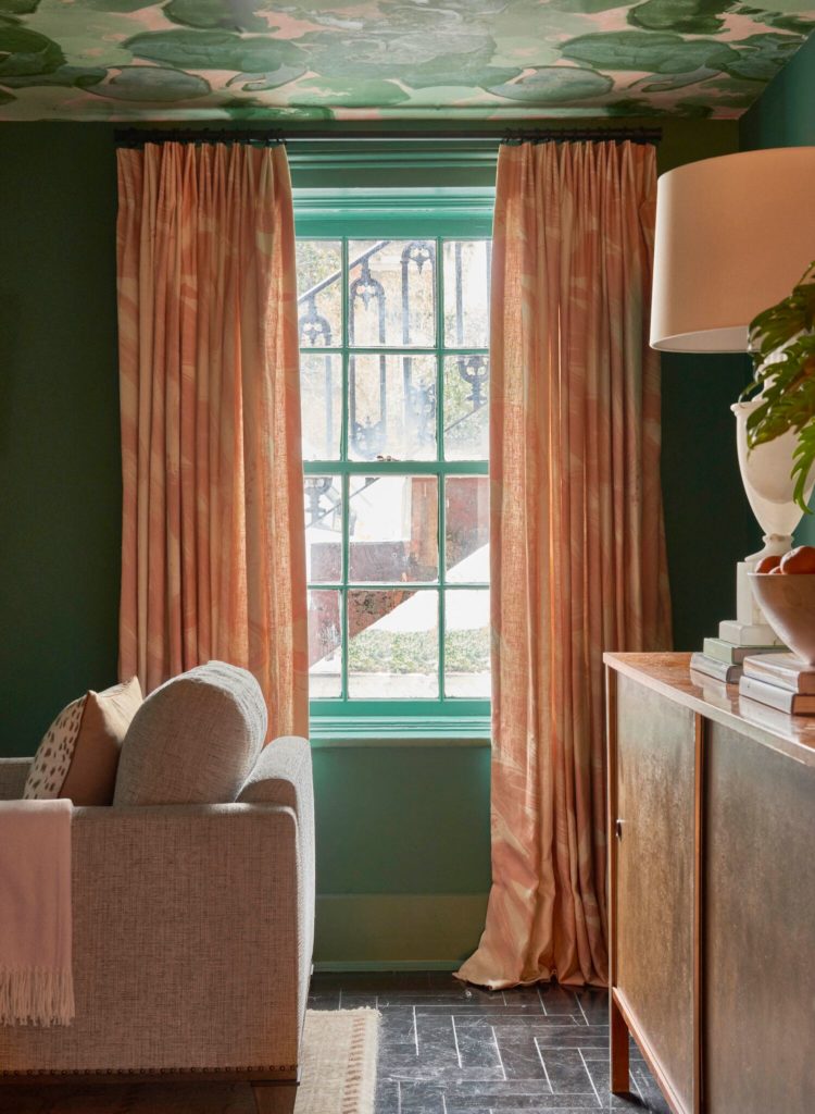
This gorgeous project (above) by Denise McGaha really captures the 80’s glam feel with a rich jewel toned green and warm peachy accents. Peach and salmon are such luxurious colours that really warm up an otherwise cool room and add a luxurious feminine feel without being too flouncy, and I think we will be seeing a lot of them.
Feminine Glam
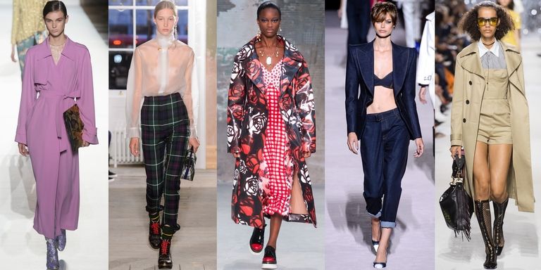
Looking ahead, it’s always fun to look to the runways for what might be coming to interiors since fashion trends tend to move more quickly. The spring 2018 runways have a lot of really feminine soft and silky textures, and layering of colourful bold patterns. And all that visual excitement is grounded with classic trousers and trench coats for a soft yet tailored look. I think these ideas will translate well into interiors as we create rooms that are more layered and luxurious with pretty details and lots of personality.
I think we can see this in the way that rooms are moving towards a more 70’s and 80’s glam and away from more stark and minimal looks like the Mid Century modern trend.
So the guiding theme of the trends I’m looking forward to seeing in 2018 is one of polish and refinement. From warm mixed metals, pretty millwork and pearlized tile, to dramatic black and tailored feminine details, 2018 is all about indulging in a bit of luxury.
But here’s the thing about trends. If you focus too much on incorporating all the new trends in your next renovation or new build, you’ll notice a phenomenon will occur.
And that is, as soon as the next trend comes along, you will want to replace what you have and insert the next newest, latest, greatest thing. And your heart will sink because you likely won’t be able to do it that fast.
If you focus on classic and timeless design, you can watch the trends come and go, secure in the fact that you know you can switch up your decor at anytime, to incorporate something trendy. Using accessories, window coverings or wallpaper. Items much easier to replace than the busy, trendy tile floor that is much more permanent.
Over to you my lovelies, what trends are you loving right now?
Next week, I’m headed to the Kitchen & Bath Industry Show in Orlando with the Modenus DesignHounds. Follow me on Instagram to see all the latest trends.
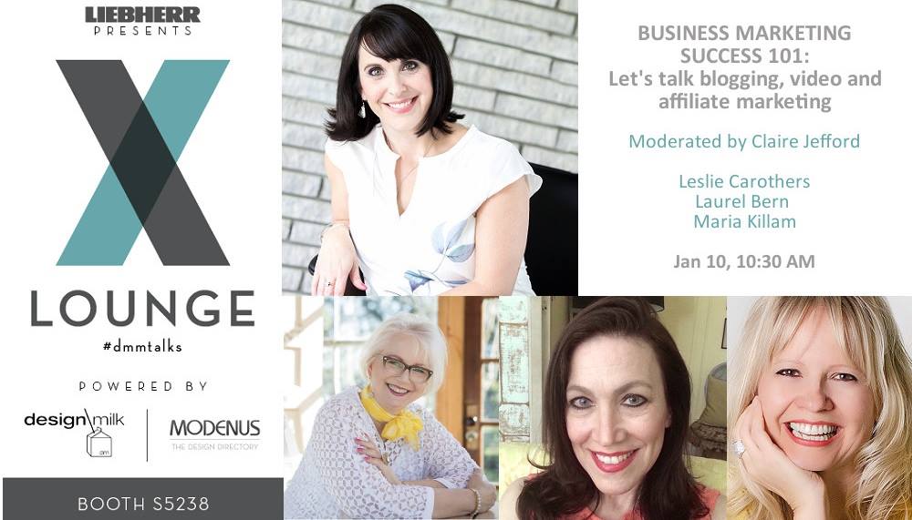
I will also be on a panel hosted by Claire Jefford at the show, if you’re there don’t miss it!
Related posts:
Maria Killam’s Trend Report for 2017 (for 2016) (for 2015)
Trendy or Classic? Ask Yourself These Three Questions



Classic and timeless is what I’m striving for. I want to replace my kitchen countertops from a very busy granite looking quartz (black, gray, cream) to a marble or marble looking quartz. Cabinets are close to Dover White or White Dove and an ebony stained island. Same colored subway tile, off white. So afraid it will clash and look like I tried but failed. It is a dark kitchen facing north and only gets a brief bit of light in the morning, which is really just a glare. What do you recommend for a countertop? I just want to get rid of the busyness and not be limited to three colors! Please help! Looking at Cambria Torquay and LG Viatera Minuet. Marble is Alba Vera or Montclair Danby. Walls are Accessible Beige and the trim is Alabaster. Any suggestions?
Hi Robin, It’s hard to say without seeing a photo and I’m only familiar with the Cambria product you mentioned. That sounds like it would work in your kitchen, if you want to be sure, you can purchase a hard finish edesign consultation here: https://mariakillam.com/shop-landing-page/
Warmly, Maria
Ahhh Maria!! Yes!! I was doing yellow in 2015, glad others are coming to know it’s not “dated”. My own daughter’s bedroom, redone when she was on a Mission trip to Guatemala: http://www.bluestonedecorating.com/project-navy-yellow-teen-bedroom-makeover/
Cute room Crystal!
I love the wood kitchens with white counters and creamy walls. I also love the dark green room with peach curtains. And I love that colour yellow. (Now, are my yellow placemats still in the crawl space or did I give them away?)
Maria
Fist let me say “ Love your house “
All your color / design and decorating is
“Beautiful “.
I have to admit I am afraid to add color to my home .
I love when I see a house like yours .
I just can’t seem to apply it when I decorate .
Another good post with lots of great Advice .
Thank You
Nancy
I hadn’t noticed the pearly trend, but I hope you are right. I really love it! I think the black tapware will disappear reasonably quickly as it is quite hard to live with I think. And only found in high end bathrooms successfully. The rest of us who renovate bathrooms very rarely will stick with long lasting finishes like chrome.
Well. I guess I don’t need to do a trends post because you pretty much preached it all right here! Spot on. ??
How do you feel about encaustic floor tile in an older 1930’s home for the main bathroom floor? It’s both trendy and old school at the same time.
Yes there’s a post on my blog about where encaustic tile is appropriate, you can find it here: https://mariakillam.com/encaustictiles/
If you’d like to be sure, you can purchase a hard finish consultation here: https://mariakillam.com/shop-landing-page/
Warmly, Maria
“If you focus on classic and timeless design, you can watch the trends come and go, secure in the fact that you know you can switch up your decor at anytime, to incorporate something trendy. Using accessories, window coverings or wallpaper. Items much easier to replace than the busy, trendy tile floor that is much more permanent.” <3 Lesson learned and will be implementing this year!
And I think you are right about the 70s coming back : the current Canadian Living magazine has a Beef Stroganoff and a Coq au Riesling recipe. I have the taste of my 70s childhood in my mouth right now.
Interesting!
I love the forest wallpaper and the peach scarf.
I would possibly entertain versions of ‘yellow’ in my personal fashion and home-decor. BUT for me, it would have to be pale, pale yellow, maybe dijon, or perhaps a rich ochre. Psychologically, yellow should not go in a nursery as it’s allegedly not a colour that promotes good sleep for a baby, (my daughter born in 1970 had a yellow nursery and was fussy – maybe that’s why). And, who wants yellow to be reflected onto their skin – so I wouldn’t use it in a bathroom or powder room… same with green (tried F&B Arsenic in a powder room and this proved to be very true). Just my opinion…
I agree. Whereas pure yellow gold walls (no green undertones) make a living area warm and inviting. My sister, who attended Maria’s Boston class, told me that people don’t notice the wall color, which is on the ceiling as well–they just notice how inviting and comfortable the room looks. And blues, reds, greens, blacks, grays, and browns all look great against the yellow. Probably purple too, but I don’t have any.
Happy New Year Maria, Teeria and Helene !
I love love love that bold colors are making a comeback. I thank you Maria for teaching us that adding a color will always be classic and timeless ! Did you happen to visit the Temple Court transformation to a hotel while you were in Manhattan ? An excellent example with the bold jewel colors ! See how romantic everything looks.
https://www.6sqft.com/the-urban-lens-how-temple-court-went-from-an-abandoned-shell-to-a-romantically-restored-landmark/
Maria,
HAPPY NEW YEAR! I always love your insight! I’m a lover of black & white, classic design with colors brought in & out as trends change. I’m excited to see how far the black trend goes. Even in the appliance industry, black stainless steel is making a bigger impact each year. Looking forward to your blogs throughout 2018!!
Go for it, Traci! It’s interesting for us laymen to observe and learn from experts discussing and sharing their unique views.
Good round-up of trends, Maria. There have been some really bad trend articles circulating lately, and they’ve made me wanta scream! I, too, was hoping that yellow would be Pantone’s color this year – I saw a hopeful smattering of it at High Point in the fall, leaning gold. I think we will definitely be seeing more of it. Happy New Year and see you next week at KBIS!
Those articles are click-bait for sure, or people selling tile like this comment in an article someone just sent me:
“Follow your gut. If you really like something, it’s going to work within the rest of the design. Your style will come out in the finished product. There’s a big trend in eclectic decorating. Don’t be afraid to make a statement; just go for it.”
THESE KINDS OF COMMENTS MAKE ME WANT TO SCREAM, cause guess what, your style will NOT come out in the finished project, you’ll just be crying if you just GO FOR IT!
Thanks for your comment Kristie! Maria
Happy New Year! And Happy New Colors!!! Wonderful post as usual!! The peach color in the posts looks dated to me (or am I just remembering a dress I had in the 80’s) but I look forward to seeing how this color is presented in the coming months and years. Maria, you always are centered on the right track!!!
I agree I would like to see fresh updated peach used pleasingly. I still somewhat cringe with it remembering my dad’s late 1980s iving room. Maria, what neutrals do you like with yellow? I assume any pink beige neutrals are out.
It totally depends on the yellow. If you choose a more muted gold, you have more options, the cleaner the yellow the lighter and more grey your neutrals should be. That’s the short version! Maria
As typical, I find myself agreeing with so much of what you say. Your observation about the black trend is spot-on, especially fixtures. I love black and white, but a large bank of white cabinets with a bazillion black knobs can get busy, fast. I’ve also noticed bold yellow creeping into photo shoots as an accent. But I think people should embrace whatever accent color resonates with them, trendy or not. A few throw pillows, a lamp, or a vintage chest you can spray paint yourself – these are easy places to take a chance with color. I never have understood people who can live in all-beige environments!
Lovely to see a millwork hood, so like mine, recently installed. I read somewhere that such hoods are out, but I’m guessing they’re classic, or you wouldn’t have installed one!
I have the same reaction to black handles on white kitchen cupboards–way too busy.
Is there a good resource for current kitchen bath trends? I also would love a great resource for classic, elegant, refined timeless kitchen and bath design to stand the test of time. I appreciate Maria’s posts and frequently review them as needed.
My blog, that’s it really. . . you’ll get too many mixed messages other places because most designers are obsessed with introducing new trends.
I love the first photo. Blue and yellow are my fave colors.
I am so happy to read that there are some pretty wood kitchens popping up. In fact, I’ve been waiting a few years for this sort of trend because I want to refinish my kitchen but wasnt ready to commit to white cabinetry. It does look classy and timeless in the photo.I also noted your recent instagram photo of the wood stained kitchen with black backsplash. It seems to be a similar shade of wood to the one in this blog. I love the light , neutral “but not blonde” wood color. Would that color work on my rustic board and batten oak cabinets? (Currently orangey oak 1990s)? I’d add alot of white with backsplash and quartz countertops.
Refinished oak cabinets from the 80s still looks 80s in my experience. It’s very hard to say without seeing photos though, if you’d like an opinion custom to your situation, you can buy a simple edesign consult here: https://mariakillam.com/product/hard-finish-selection/
Thanks for your comment! Maria
Phenomenal breakdown of the why behind your assessment and what to actually do about it all as a home owner/renter! We just moved last month and did some renos- lots of white paint including painting over the classic styled but very orange kitchen cabinets. I have black steel window frames and a slight 70s vibe with the architecture. I am trying my best to keep a white/black/wood cohesion in my fixed finishes that isn’t too trendy and goes with the homes architecture. Leaving the full on trends for the accessories for the most part. And buying things I really love for themselves, not only because they fit the trend.
Pearl looking tile – trendy or classic & timeless? I like it more than white subway tile for upcoming renovations, but want to create a few classic bathrooms with timeless qualities for resale. I do hope pearls pop up big time! Love them, especially the triple pearl necklace shown on the queen in PBS’ “The Crown”. Feminine yet strong! I like it!
The way to know whether you are looking at something classic and timeless or trendy is “How bossy is it?” “Does this limit my colour scheme forever”. A white pearly backsplash will still leave you with lots of options down the road so I would say timeless. Hope this helps! Maria
PS. I loved her pearls in The Crown and they were so good at dressing her in clothes with just the right neckline to show them off!
This is a great roundup!!! I think you are totally on the mark!!
I’ve experimented & painted with a lot of strong colors over the years in different houses from a terracotta entry way, to a purple bedroom, a green kitchen and a living room with gold yellow walls. Now instead of painting the walls strong colors, I actually prefer neutral walls with smaller pops of colour like yellow and orange accessories. Last summer I painted our front door a sunshine yellow and it makes me smile every time I drive up to the house.
Great post, Maria! Happy New Year to you and Terreeia!
I just love a good design trend report! I’m especially excited about the black cabinets. It’s a refreshing change after seeing all the white cabinets over the last few years.
Trend question for Maria or anyone else who has an opinion about “marble looking” quartz… I know that marble is a “classic,” but what about this faux quartz for island/counter tops in white kitchens? I’m seeing it everywhere and I do think it is pretty (and easy to maintain, which is key), but will it look dated in 10 years? Just wondering if the white kitchen with marble-esque finishes has been overdone? Flip flopping between white and light gray quartz (white cabinets/white subway tile), and afraid that anything that resembles marble will just look fake & trendy. Thanks!
Trust me, your neighbour is busy installing a charcoal kitchen with grey floors. THAT look is overdone and totally trendy. The reason you’re seeing marble everywhere is because it’s beautiful and pinnable. Here’s a post that might help https://mariakillam.com/datedkitchenfloors/
Thanks for your comment! Maria
Thank you! That is reassuring & makes sense. Love your blog. I will reach out for an edesign consult when I’m down to the final choices.
It was great meeting you at KBIS and I enjoyed the panel presentation. I agree that natural wood grains are coming back in a big way. The pendulum is swinging away from paint and dark stains such as Espresso that completely obliterates graining. Simpler door styles also are a great backdrop for interesting graining which becomes the decorative element instead of moldings. Looking forward to your workshop in April!
Hooray, thanks Gloria for your comment! Maria
I’m so happy that I don’t concern myself with trends anymore. I just do what I love. I’m the one that has to look at it everyday.
If I got the chance to re-do my kitchen I would have white uppers & wood lowers. My current lowers are painted & it doesn’t hold up.
My kitchen and breakfast area, as does the rest of my home, reflects an English country style, with dark wood floors. It was absolutely “out” of trend the past few years of millennialism and grey but it has always been classic and timeless. When you decorate classic you’ll not always be on trend but you’ll always be timeless. Currently, I’m considering a new basket weave backsplash- timeless.
Very nice! I love my new custom white kitchen cabinets!