


The look of 2015 is dramatic, modern, and rich.
How was your holiday? I am rested and rejuvinated and excited to see what the New Year has in store! Back to the gym too, it’s fun to eat whatever you want during the holidays but it’s time to stop having a chocolate for desert at breakfast, lunch and dinner, haha.
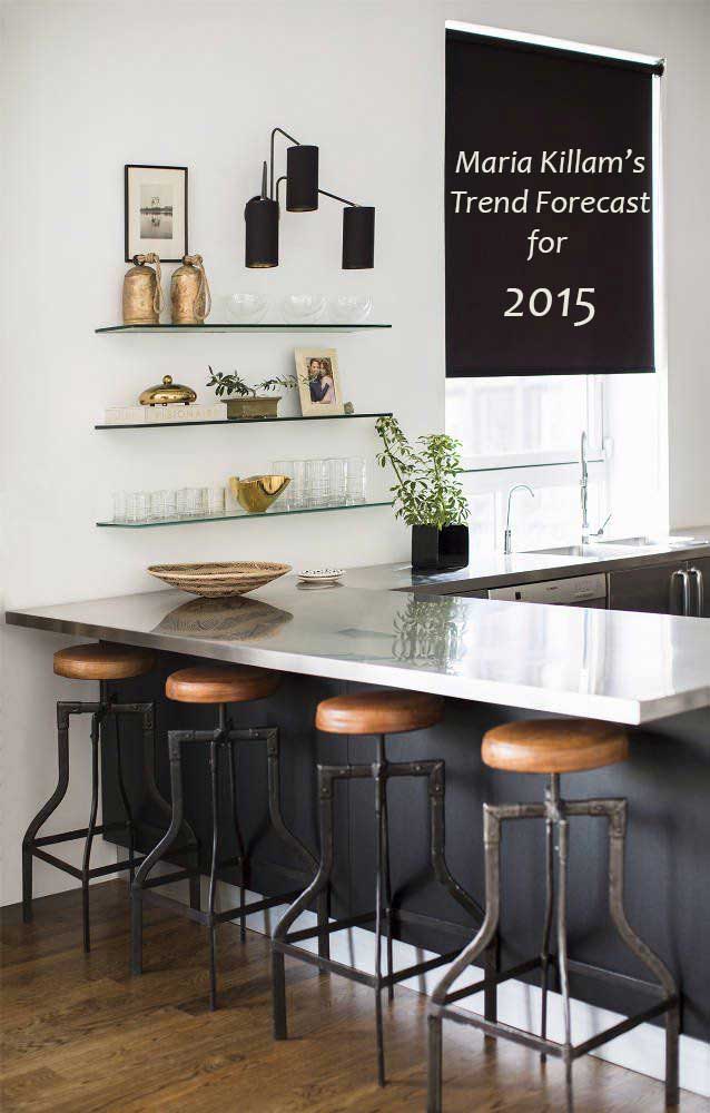
Black
This dramatic shade has moved from being an accent colour in the background to the foreground as a main colour.
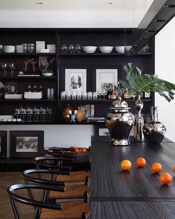
I would recommend you pass on this one unless your kitchen looks like this (above) or this over-the-top-styled-to-perfection kitchen (below).
The average builder house with regular uppers will die in black. If you do choose black make sure your countertops, backsplash and floors–if possible–are white.
Black done wrong is oppressive and depressing.
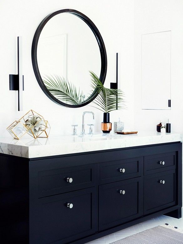
Remember the 80’s black toilets and sinks in powder rooms? If you want to introduce the drama of more black, keep it on the vanity like in this one below.
Keep your tiles, countertops and plumbing fixtures, white!
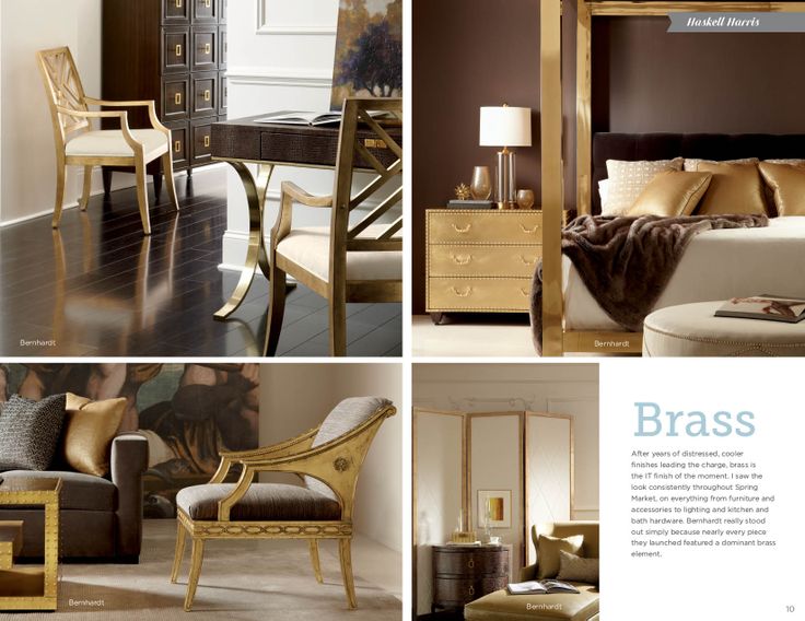
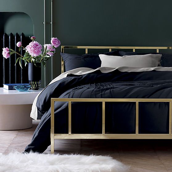
Gold has moved from lighting and hardware to furniture.
{via pinterest}
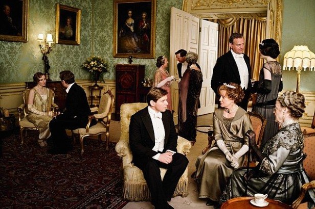
Is it trendy?
For the most part, yes. Unless you have a drawing room that looks like it’s right out of Downton Abby (below).
Just like all that lime washed furniture will eventually be dated, same with the gold. Just don’t fill your house with it from top to bottom and you can enjoy this trend in your home.
I’m loving it probably because it’s in the realm of my favourite colour, yellow.
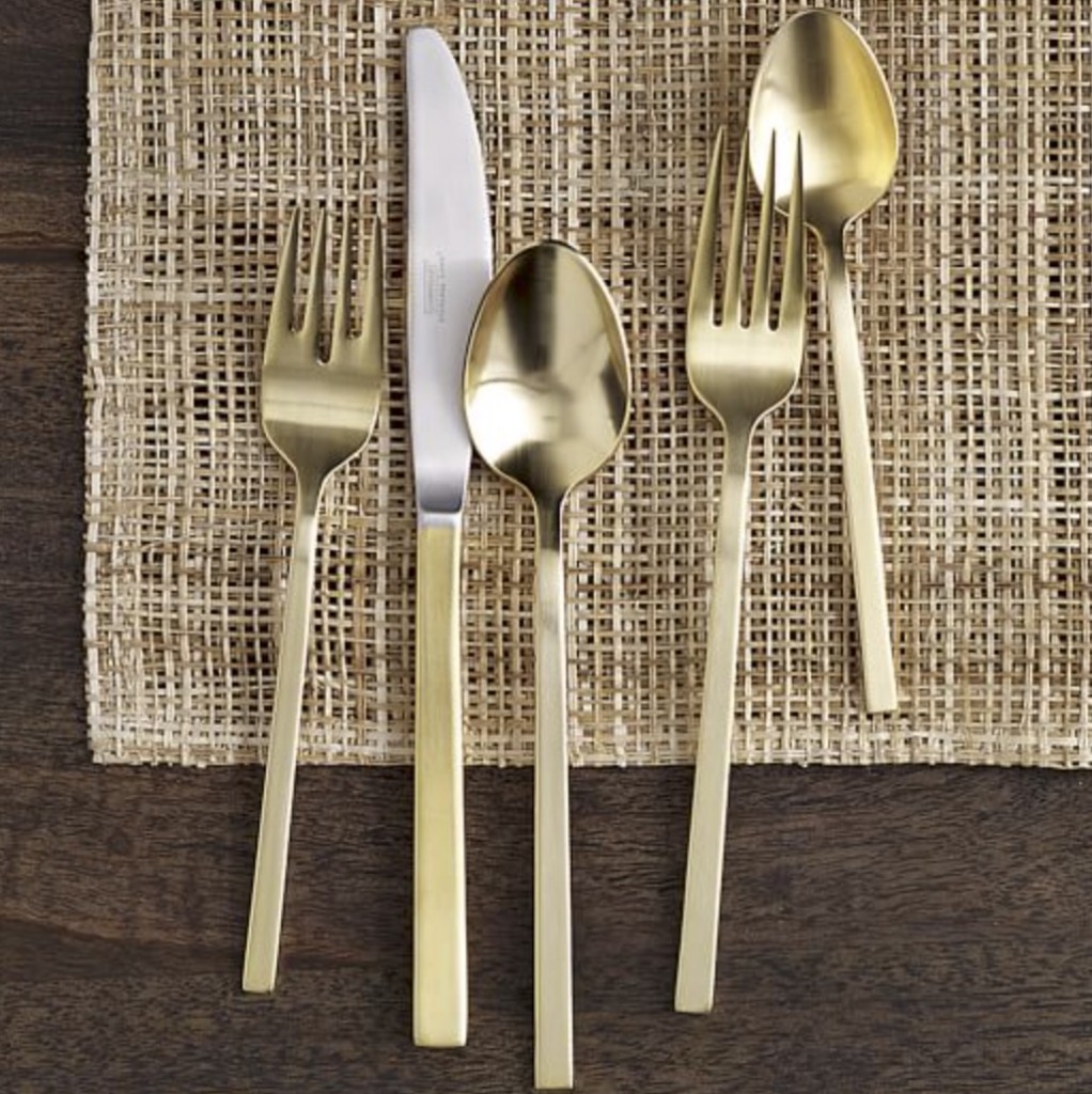
I realized this Christmas that I really need to refresh my linens for entertaining, I did break down and buy this flatware from West Elm.
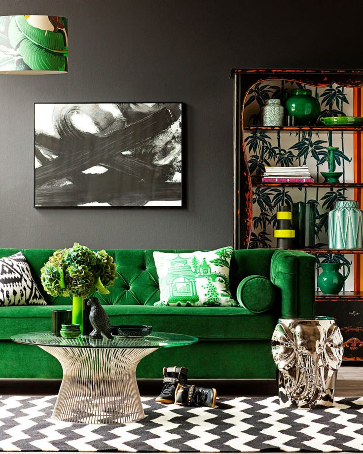
Jewel Tone Shades.
Colour is still bright but it’s getting richer and more dramatic.
4. Kitchens without Uppers (or at least partially)
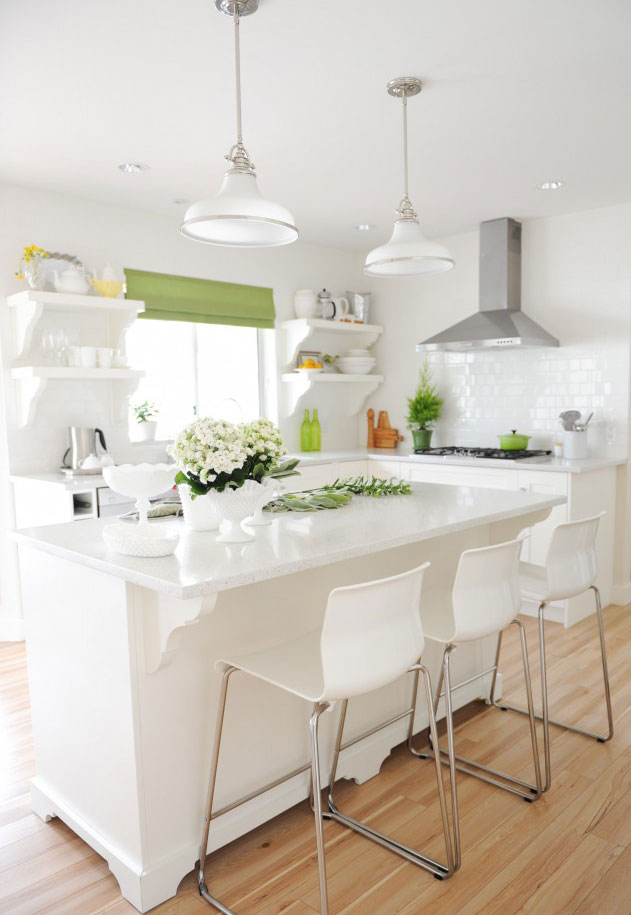
Interior by Maria Killam
This is not a new trend but I’ve been thinking about this a lot and this is one trend I see as a classic. Once you turn one wall into a pantry which takes care of the storage (if you have the room to do that of course) who would ever want to go back to upper cabinetry?
Watercolour Prints
Is watercolour the new chevron? I guess we’ll wait and see.
Tie-dyed Prints
{source}
Or tie-dye, very close to it’s water colour sister.
Strong and vibrant blues are still going strong.
{source}
The Absence of Recessed Lighting
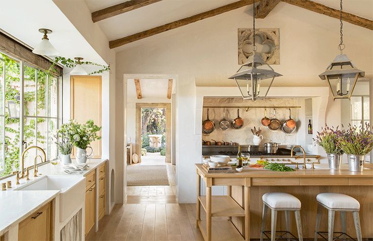
Sconces, surface mounts, pendants and lanterns, anything but recessed lighting.
Have you seen Velvet & Linen’s house in Veranda this month? Made me swoon.
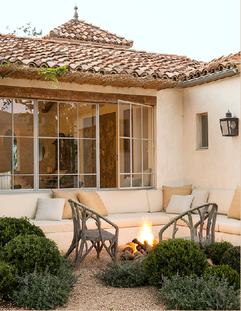
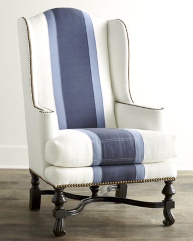
I remember seeing these chairs on the Horchow site in the summer and thinking “Who would ever buy those?”. Well, here they are and aren’t they perfect, visually positioned in front of the solid bench seating to add texture NOT sitting in the middle of a garden.
Notice how the crushed rock is the same colour as the roof? No details were missed here.
Hey, I also have those natural fiber cushions from the Pottery Barn.
And in the world of graphic design: Flat Design vs. Realism
If you are designing a new website this year (like I am) you might be interested in this debate.

Here’s a great infographic that explains what I’m talking about.
Over to you my lovelies, which ones will you be incorporating in your home this year? Any hot trends I did not mention?
Happy New Year – here’s to a great one! xoxo Maria
Related posts:
Maria Killam’s Trend Forecast for 2014
2015 Trend Alert: Olive Green from Highpoint
Am I Trendy If there’s no Grey in my House? (Oh Yeah)
If you would like to learn how to choose the right white for trim, woodwork, cabinets and walls, get my brand new eBook, White is Complicated–A Decorators Guide to Choosing the Right White.

I am seeing a bit more pink in the future and also yellow, in fact the colors that are in your home. Still love love your yellow sofa. I did a post on my color of the year today. I actually chose two colors, one new and one a hold over from my prediction a few years back. Take a look when you have a chance http://goodlifeofdesign.blogspot.com/2015/01/my-color-pick-for-2015.html
I painted my family room on January 1st (new year, new colour!) a deep blue, almost navy above white wainscotting. This was a huge leap for me as I tend to stick to lighter, airy colours. I LOVE the new paint colour!!! The room feels rich and luxurious. I’ve also included a few gold accessories along with black and white and some wood and glass. I never want to leave! Black and white seems to be really strong right now too–adds a lot of energy to a room. Pink seems to be popping up a lot too. Would love more pink in my life!
I think there is still room for recessed lighting. I just had three of them installed with dimmers in my very small kitchen over my countertops. Any other kind of lighting would have been too busy in such a small space. I agree that in most cases, recessed lighting is a no, but there are still instances where it is the best option.
The funny thing is that recessed lighting, hardwood and granite make homes appraise for more here. In Santa Barbara, a woman who sold her condo got 100,000 more because of those things compared to another unit in the same complex. Same floor plan a month earlier. I’ve resisted, but will be putting in 4 on a dimmer in my kitchen this month when the ceiling is redone as part of the remodel of my home. Hardwood flooring is going in as is a quartz counter, too. With a trio of hanging lights over the sink peninsula. So glad this is getting done after a very bumpy last year.
Also, no upper cabs on that side with the sink because I have 2 pantry cabinets, one on either side of the other cabinet run. No open shelves, even though I have nice things I’m “inheriting” from my I’ll sister. Along with many lamps from her, too.
I wish I could get away with no upper cabinets! But my storage space is already at a premium, so the upper cabs stay!
I bet your kitchen will look wonderful when you’re done. I know I love the recessed lighting in my kitchen with a dimmer. It made just a huge difference in how my kitchen functioned.
It will be interesting to see how what happens over time. Inset lights are still very popular in AZ, too. They seem to present a clean look and are exceedingly practical, yet can fade into the background when not in use. I love using dimmers and also layering with lamps, candles, etc. for coziness, but I love being able to turn the lights way up when I’m working on a project or when cooking.
Wait…I have to put my chocolate wrapper in the waste basket….now… I truly love the kitchen designs you’ve shown…and depending on the architectural style of your home I do feel these styles would be beautiful in most of them. Of course, matte gold and “tarnished brass” have always been in “my” decor. Looking forward to your guidance in 2015!! franki
Gee, thanks…now I want chocolate, lol.
Just got back from NYC where I used SW colour of the year, Coral Reef, in a tiny entrance of a typical NYC apt. It was fabulous! No natural light, so it took the place of it. The best compliment – the husband saying it was “elegant and fun!” I think coral is making it’s way back. Used SW Barley yellow for the living space. Where there is no direct sun, this warms & energizes a room. HAPPY 2015 everyone!!
Like always lean toward a mix of lighting whether recessed, hanging pendants or wall sconces in my design work. A room can have different personalities at different times of the day with layered lighting!
The color palette I can’t wait to use in 2015 is
Marine Blue by Dulux & Jubilee by General Paint
On the black trend…Brinjal by Farrow & Ball is a softer black that could be used successfully in a variety of looks!! Happy decorating in 2015!
I loved the tips, of course. The flat vs realism video was cute.
Happy 2015!
I am planning a redo on my kitchen in a few months. Just this morning I decided to paint the walls black. (I have Five doors and two large windows in this room so it’s not as much as you might think and one wall behind the cabinets will be tiled to the ceiling) I have lots of 110 yr. old white woodwork to keep it from seeming too dismal. I also am getting rid of the recessed lights and the overhead cabinets. Looks like you touched on three of the trends that I am liking too.
Tricia, I’d love to see how your kitchen redo ends up. We’ll be completely redoing ours later this year also, and we have 5 doors + 2 windows to deal with as well, and plan to tile one entire wall (white). Your plan interests me, as I’m certainly not averse to black paint if there’s not too much of it (which there wouldn’t be in my small kitchen). Thanks!
Always appreciate each post, Maria, and the thought & time that goes into them. Re: recessed lighting. Any suggestions for what to do when a home has them all over? Over a counter I can see hanging pendants, but what about 4 in a great room?
Another trend that I have noticed over the last year is cheeky sayings and graphics in home decor. Maybe you wrote about this last year, but I’ve really seen it come into the mainstream this year. Funny sayings printed on pillows is a big one and now you see prints on canvas at a lot of the big box stores. Personally I love this trend because it adds a little touch of humour and whimsy to any room and doesn’t have to cost much.
Another trend I feel like may be emerging is graphic design as art – it used to be just in cool offices or lofts in NYC – but now is much more of a mainstream trend. 🙂
Happy New Year Maria!
I just painted a bedroom in a rich charcoal (Knights Armor by Olympic). It makes all of the stained wood look lighter. I’m turning it into a custom made dressing room.
If I can find it in the size I need I would like to have a black bathroom cabinet.
My husband is in the process of installing canned lights in the living room only. It’s such a dark room, set back from a full porch. I already have an assortment of lamps in there but it still needs a little help.
These are great examples of happy rooms.
I feel very ahead of the trends! I just finished grommet curtains for my bedroom in a gorgeous blue print, almost an Indian motif. Very different for me, but with gray carpet, gray walls, it just called for something vibrant. Now for my living room, I’m making navy/white houndstooth curtains. AND the rug I had made for my son’s playroom is navy/cream houndstooth. Even though the blues are different as you go from room to room, it feels very cohesive because there is the same basic color family throughout. My furniture colors vary from one to another so there is variety; for example, there is a bright red armchair in my son’s playroom. And some black accents throughout! However, absolutely no gold here–I hate brass.
My concern about recessed lighting is the same as Judy’s, “…what about 4 in a great room?” Multiplied by an open concept kitchen with 4 more, plus 2 in the small office that serves as our entry area. Just into a brand-new, customized manufactured home. Thought I was ready to address new furniture and purge remains of 80’s oak. Looks like I should revisit lighting first? An aside, any way to incorporate some of my favorite oak pieces with white beadboard kitchen, wall of windows across back, and some new, as yet unchosen, major seating?
I love the dramatic look of dark, rich colours for sure! I still think recessed lighting remains popular overall in design, but I prefer to also include pendants, sconces and ceiling fixtures. I predict people will be more bold and daring in 2015 in using colours and patterns. I have already seen big commitments from a few of my clients in painting rooms bright colours (teal for example) and opting for fun prints for occasional chairs, area rugs and wallpaper. Either way, I am looking forward to 2015 and wish you all the best too! Happy New Year Maria xo
I love number 4 and have been thinking for years about ripping out my upper cabinets. I don’t have a another wall, though, and haven’t convinced other family members everything can find another home.
Hallelujah – no recessed lighting. Had it in our previous home (8 of them over the 4×8″ island plus one over sink) and hated them – way too bright. Current small U-shaped kitchen has one over the corner sink (OK) plus two Texas-sized fluorescents (2’x4′) with a solar tube between them and a nearby 16″ square air vent and a ceiling fan over the breakfast area – quite a busy ceiling. But the one same plan I’ve seen with mostly recessed lighting is quite boring and totally without charm so I’m not going that way. Love the Veranda kitchen all over. Totally love your practical comments about the new trends. You don’t really “diss” any of them but you do point out considerations to think about. Very helpful.
I use black to ‘punctuate’ every room – for balance – to anchor the room in some way. All of my interior doors are F&B ‘Off Black’ which is a charcoal with deep blue undertones.. so dramatic.
I’ve watched Brooke & Steve Gianetti since before they planned Patina Farm and I’ve pinned the pics from Veranda onto my Pinterest boards. I’m with you.. swoon worthy. Did you ever see their Santa Monica cottage that they built to look ‘vintage;? I think there are still photos on their website:http://brookegiannetti.typepad.com AND they have a book: ‘Patina Farm’ that’s to die for, in case you didn’t know about it.
I look forward to your posts Maria and I think my favourite trend here, besides using black, is having a big pantry and no uppers. Thanks for all you do and here’s to a healthy and prosperous 2015!!
I do like the look of the kitchen without upper cabinets, but I cannot imagine having that type of kitchen, unless it was very spacious. A couple of years ago, I saw a picture in a magazine of a beautiful kitchen with a large painting instead of upper cabinets. It was striking and unexpected.
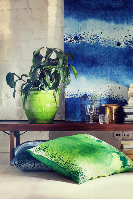
And wow….I love that green velvet sofa! (I also love my blue velvet sofa 🙂
…and Happy 2015, Maria! I just told my niece about your site, as she is remodeling her kitchen with expensive cabinets and with a lot of high end appliances. She is doing black and white, and when she told me that she was having a difficult time deciding on the backsplash, I recommended that she should read what you would have to say about THAT!
Lucky lucky niece, to have your guidance. A friend directed me to Maria’s site before I did my kitchen and for that I will be forever grateful. The space went from being sad and miserable to being the centerpiece of my home — a classic white kitchen with black accents, and a joy to cook in. …Thank you, Maria!
Love those watercolor prints…anything to replace chevron! Also am enjoying a new metal i.e. brass or gold. We all thought oil rubbed bronze was a trend and it is still here so it is nice to see a “newcomer” in brass. Will be fun to check end of year and see how many of your predictions came true. Thanks for the ideas.
I was wondering do you think the sinks that sit on top
of the vanities (bowl shaped etc) are a “trend” or could
they become a classic if they were a simple shape?
Carol
Love the new brushed brass..not as orangey or as shiny as the 1980s version. Also love watercolor prints in small doses of course….like on a pillow. I have always thought that recessed high hats make a ceiling look like Swiss cheese so I’m on board for that trend. But black kitchens!! No like. I went back and read your predictions for 2014 and you were spot on Maria!
Rather than the harshness of black I have seen quite a few kitchens done in deep cobalt, indigo or Navy cabinets with lots of white either on the floor or countertops/backsplash. That is a look I love! I expect the navy trend to continue and yellow to keep getting more popular since it just sings when put with gray. In fact I have wondered if someday you might paint your LR/DR a pretty shade of happy yellow. My BR is yellow w slight orange UT and w mostly white bedding and shots of porcelain blue it warms up those cold winter days!
I enjoy your blog and check it often! I’m getting used to no upper cabinets in the kitchen and I think it is a look that is here to stay as well. Its much less expensive, too. I think gold – especially gold frames, faucets, lighting – is classic and it never went out for me. Brass – much of it is trendy as in the 80’s. There are color trends for sure but its much better to stick to your favorites and ignore most color trends.
My daughter’s town (and her home) was hit by a F4 tornado Nov 2013 so the rebuilding there is massive right now and its interesting to see the home trends. Still so much – to much – GRAY/GREY, inside and outside! Of course, everyone wants wood floors, still a ton of white kitchens, people sticking to chrome in lighting and faucets.
Oh, I think a person likes black or they don’t – I have always, for decades, had black furniture pieces. I agree with the above comment – it just anchors a room for me and brings in a drama, elegance, richness. Both my daughter and daughter-in-law don’t have black and refer to my decorating as “English Country House Goth” which I think is very funny.
Glad to see that bass is making a comeback! Love the antique brass look. . . to me, it is timeless, elegant and warm.
Love that bright green sofa! Like a little black, but not too much. I’ve always loved the antique brass look, to me it’s classic, not trendy. Have had tie-dye on my mind lately, had no idea it was coming around again!
You wrote:
“Scones, surface mounts, pendants and lanterns, anything but recessed lighting.” Scones are a type of sweet biscuit. Sconces are a type of lighting. 😉
Personally I’ve never been a happy camper with chevron print. I’ll be happy to see it go. Tie-dye coming back? A blast from the past for those of use who lived through it the first time in the 70’s. 😉 But at the end of the day, it’s all a matter of choice 🙂
Hi Maria,
Beautiful post and I concur with your choices! I found the Giannettis kitchen so interesting. I LOVE them! I blog about them all the time— that is how much I love their work and the little paradise they built for themselves. However, I must be missing something. This is a big kitchen and two little lanterns and two little down lights can’t possibly be the only lighting, even for what is showing in the shot.
Sometimes I wonder if they photoshop out the recessed lighting? I’m not sure how it’s possible to not have it in a kitchen and believe me, I’m not a fan.
I did have the same thought looking at their kitchen! Maria
I’m doing over my new beach house and I have absolutely no storage. 2 closets in the whole house. My kitchen is tiny and my contractor recommended recessed lights. I wanted a lantern type fixture and he said it will just not give me enough light. So I’ll do a few recessed lights. I also was totally on board with no upper cabinets but I seriously need the storage and everything is not white and pretty. Also my 93 year old mother-in-law said that everything will get full of dust. So upper cabinets it is! She is old and wise!
Pretty right on with those choices! I am all over the black cabinetry trend right now. After seeing the new IKEA cabinetry in black at IDS done by Style at Home I can’t get in out if my mind! It feels so cozy and Parisian. Your right though, it would have to be under the right circumstances. Waiting to do a black and white bathroom so I can try it out on a smaller scale.
I love your decorating tips, bought your book on undertones, and checked out your pinterest pages. However could you loosen up a little on the all white kitchens long enough to give any advice about actual wood kitchens? I mean wouldn’t it be boring if everyone on the planet had a white kitchen. Sure it might be more “timeless” but we we all be bored stiff. In the new year, consider branching out and accepting that sometimes wood cabinets are just right, and giving advice about how to choose the right ones.
Haha, noted! I did go into how to choose the right colour in detail in my on-line training which is no longer available on my site. I will include it in future training! Maria