Thinking about changing careers or taking a leap into design? I’ve been there. Before I discovered my passion for colour and design, I held various positions in the corporate world — but I knew it wasn’t for me.
So, I truly love hearing from others who’ve made similar journeys. This former psychologist-turned-designer attended one of my workshops to help overcome feeling like an imposter.
And now? She’s designing magazine-worthy rooms.
Photographer: Laura Sumrak, Photostylist: Kendra Surface
Today I’m showcasing a gorgeous design project from one of my True Colour Experts! I met Claudia in the spring of 2016 at one of my workshops and the three days she spent with me, learning to specify colour with confidence, launched her second career.
Looking at the photographs from her project and hearing the process Claudia went through to get from the before to the after is such a great validation that the principles I teach in these workshops actually give my students a language for and understanding of how to make the best colour choices that, as Claudia says so well, “..lift[s] your spirits and brighten[s] your moods.”
Meet Claudia from (Claudia Josephine Design) this is her guest post:
I’m honored that Maria asked me to write a guest post on choosing color during the remodeling process for one of my recent projects. However, before I begin, I’d like to thank Maria for her impact on my career.
Starting a 2nd career as a designer
This past April marked the 8-year anniversary of becoming a Maria Killam True Color Expert and the launching of my second career. Prior to registering for Maria’s True Colour Expert workshop, I had a conversation with a former psychologist colleague, during which I bemoaned feeling like an “imposter” in my new profession (a feeling so common when starting a new career that it’s been given a name, “Imposter Syndrome”).
My friend replied, “Of course you feel that way. You’re still starting off. Why don’t you get some additional training to boost your confidence?”
Enter Maria’s course, which gave me the confidence to strike out on my own. Quite a few years and many dozens of projects later, I am no longer a novice but I still credit Maria’s training as one of the keys to my success as a designer.
Magazine-worthy design
Since then, I’ve had my work published several times, including in LUX Lifestyle Magazine, where I also serve as their interior design expert. My most recent remodel was just published in Southpark Magazine, a regional magazine based in Charlotte, NC.
My lovely clients, Randy, an IT executive, and Sheryl, a very busy stay-at-home wife, are both active grandparents to eight grandchildren. They entertain their large family frequently and after 20 years, their home was due for an update. The first-floor remodel featured an exciting transformation. Because my clients love color, we were able to make some bold choices and the results are incredibly joyful and fun.
I’m going to outline my design process room by room and share my tips for creating a beautiful and cohesive home.
Photographer: Laura Sumrak, Photostylist: Kendra Surface
Choosing the right kitchen finishes
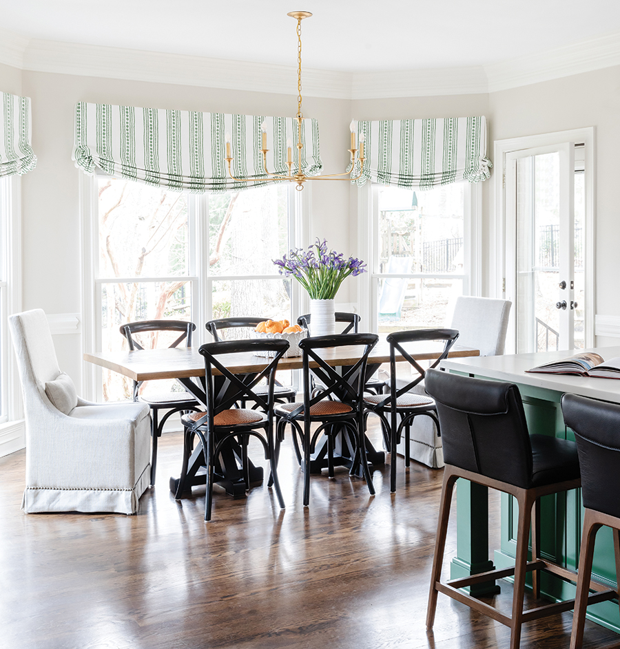
There were a few items that Sheryl wanted to keep, including their pretty dining room and family room draperies. These existing items would determine the palette for the kitchen, dining room, and foyer. Since we reconfigured the kitchen layout and opened it up to the family room, we pulled the green kitchen island color straight from their draperies. That cheerful green spurred the rest of the design.
The next step was to choose our hard finishes (countertops, cabinet colors, and backsplash). Understanding undertones is crucial to this step. When undertones aren’t cohesive, it makes a space feel off, even to the untrained eye.
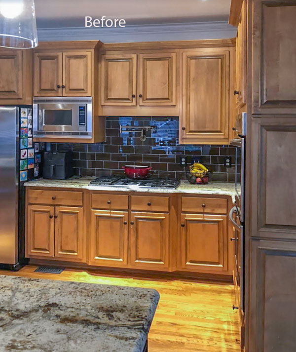
We knew that we wanted to use Zellige tile in Weathered White for the backsplash. So, I made sure that I had my tile sample handy (along with my large Maria Killam color boards) when I chose the countertop slabs, cabinet colors, and wall paint. The iridescent tile has both warm and cool tones and the veining of the quartz is greige.
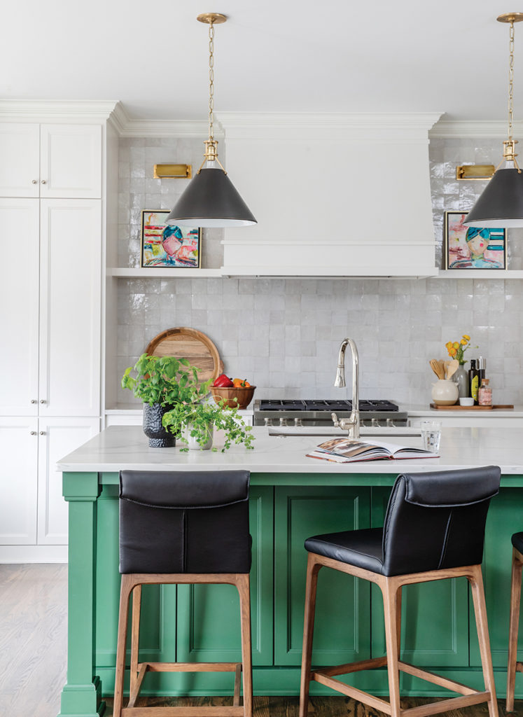
Benjamin Moore (BM) Natural Cream, one of my favorites, turned out to be the perfect choice to unify the hard finishes. The cabinet colors were custom through my cabinet maker; however, the white is similar to BM Decorator’s White.
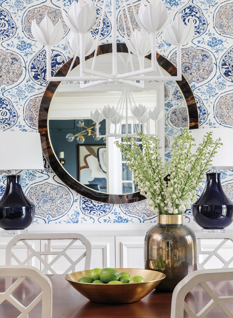
Creating flow with color
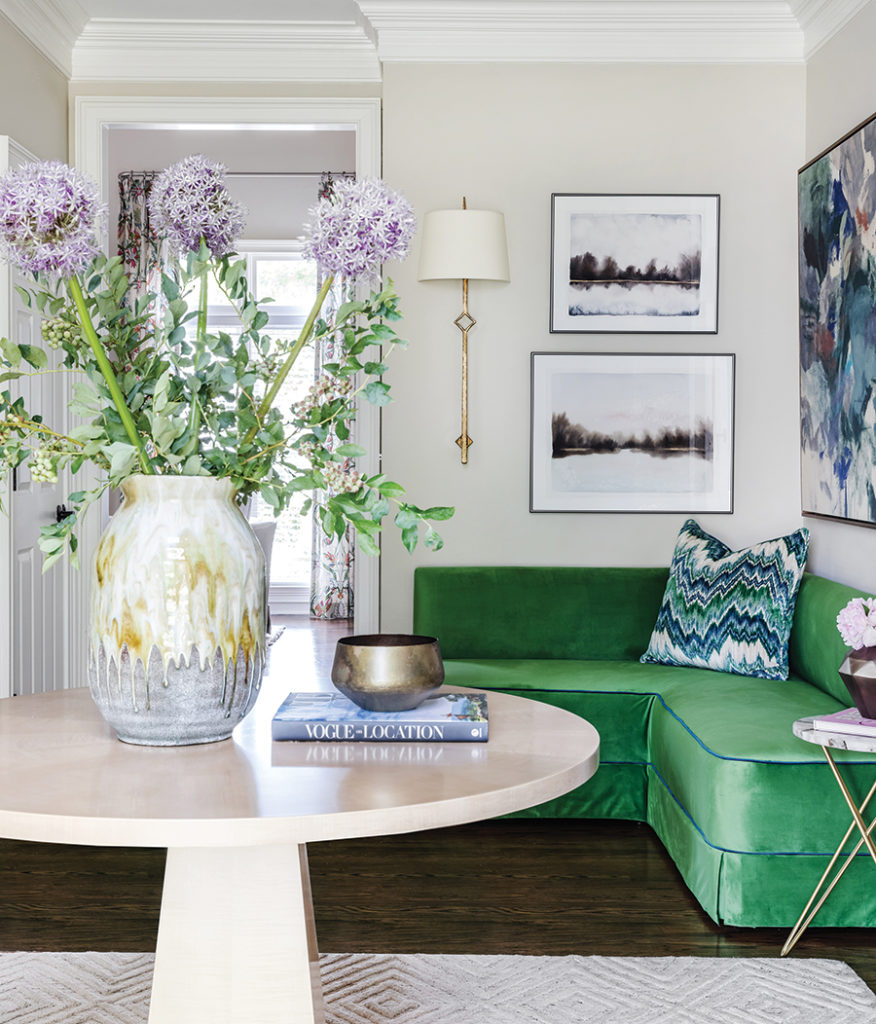
I typically like to choose one color and use it (in varying amounts) throughout a home to unify the palette. I don’t need large doses of the color – just enough to feel intentional. When I began designing the dining room, my initial goal was to find a wallpaper that incorporated green, along with the blue and beige of my client’s draperies.
Read more: 23 Decorating Secrets (only an interior designer will tell you)
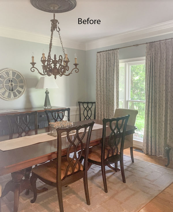
However, when I found the Schumacher wallpaper that we ended up using (below), I knew it was the right one, even though it didn’t contain any green. Since we were redesigning the foyer as well, I decided I would instead use both blue and green in the foyer to unify the palettes of all the other rooms.
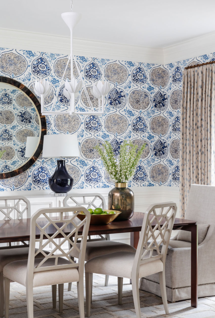
Wallcovering: Schumacher Katsugi
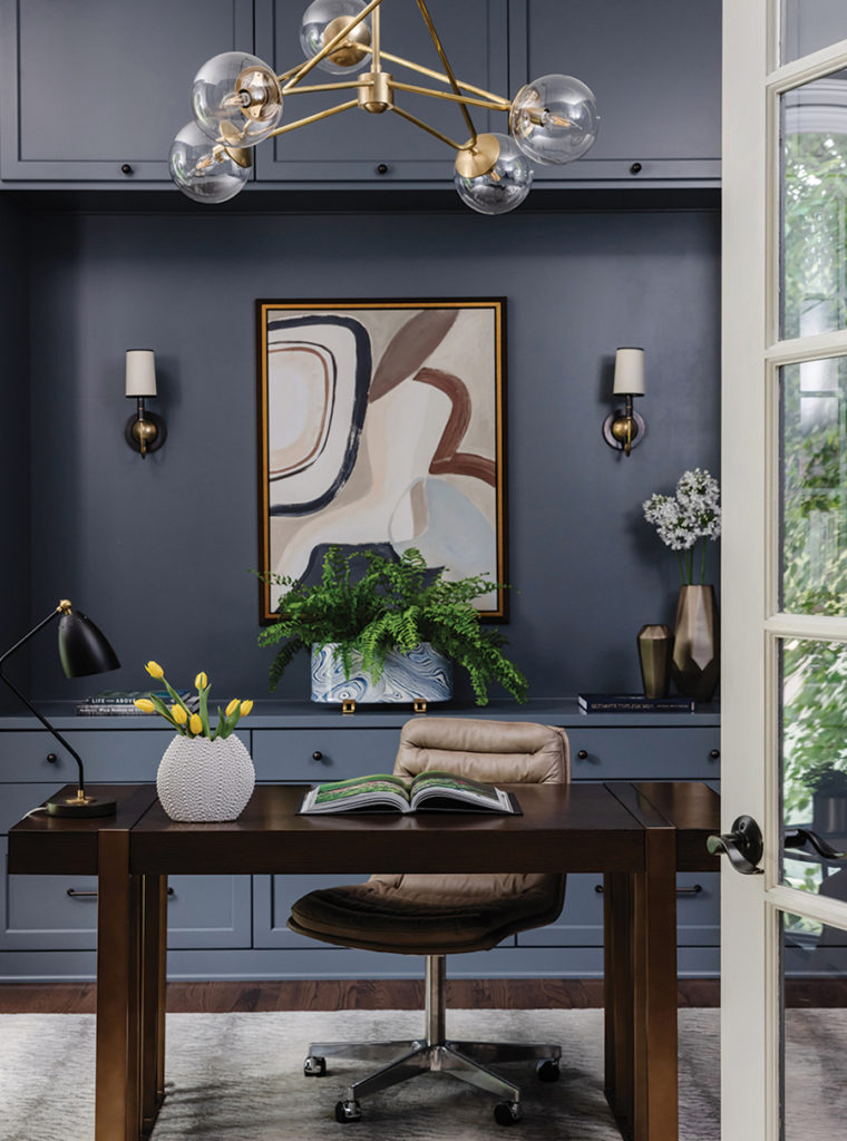
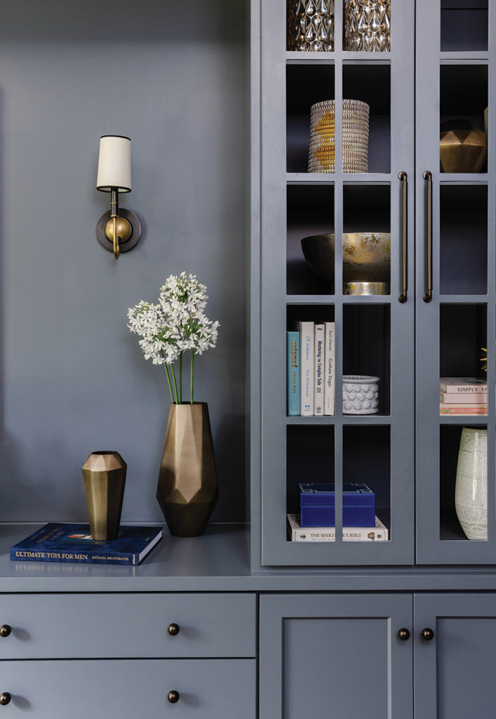
A zoom-worthy home office
Due to the pandemic, Randy began working from home. Unfortunately, his home office wasn’t serving his needs for storage, nor did it provide the fabulous backdrop he desired for his Zoom meetings.
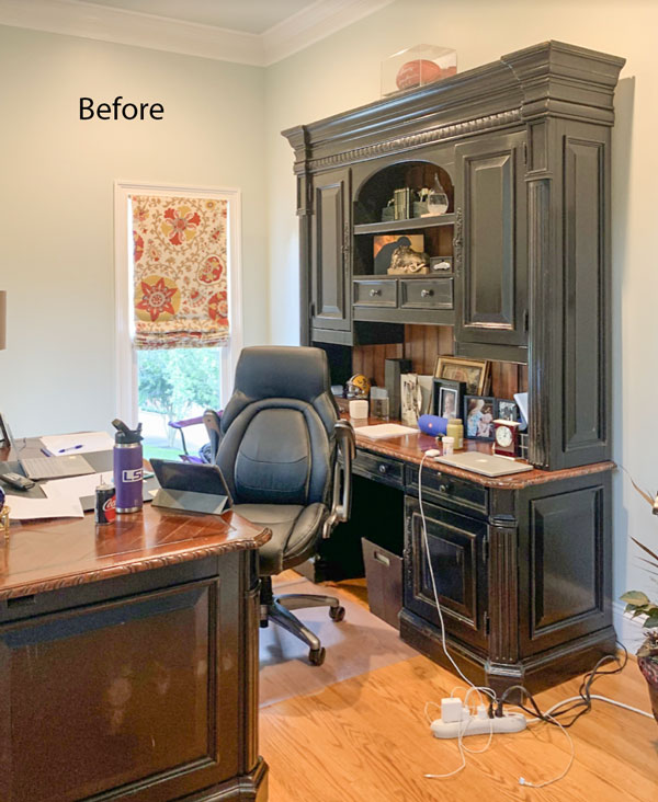
We completely overhauled his home office, adding custom built-in cabinetry and wall moldings. Then we painted everything a deep blue gray (Sherwin-Williams Grays Harbor) that echoes the blue in the dining room draperies.
My goal was to balance the cool tones of the walls by adding rich cognacs, browns, and brass. New furniture, window treatments, art, and décor brought the space to life.
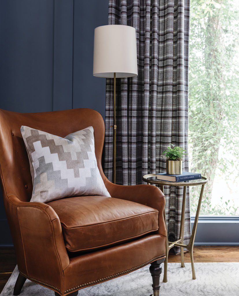
Photographer: Laura Sumrak, Photostylist: Kendra Surface
A neutral family room refresh
Of course, once clients redesign a couple of rooms, they often realize that others need updating as well. My clients decided to add the family room to the redesign.
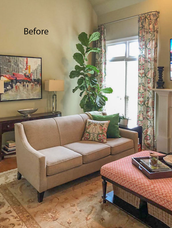
Taking our cue from the colorful drapery pattern, we used small pops of green to add visual interest to our otherwise serene and neutral furnishing choices. As much as I love color, sometimes your eyes need a place to rest, and neutrals can serve that purpose.
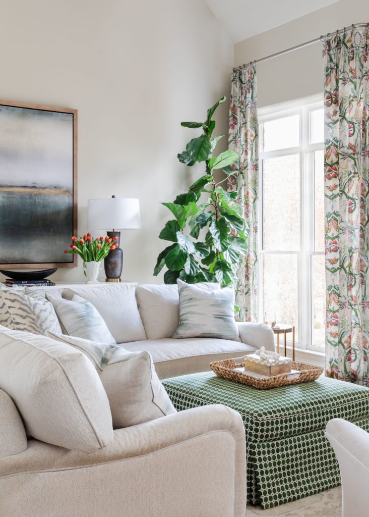
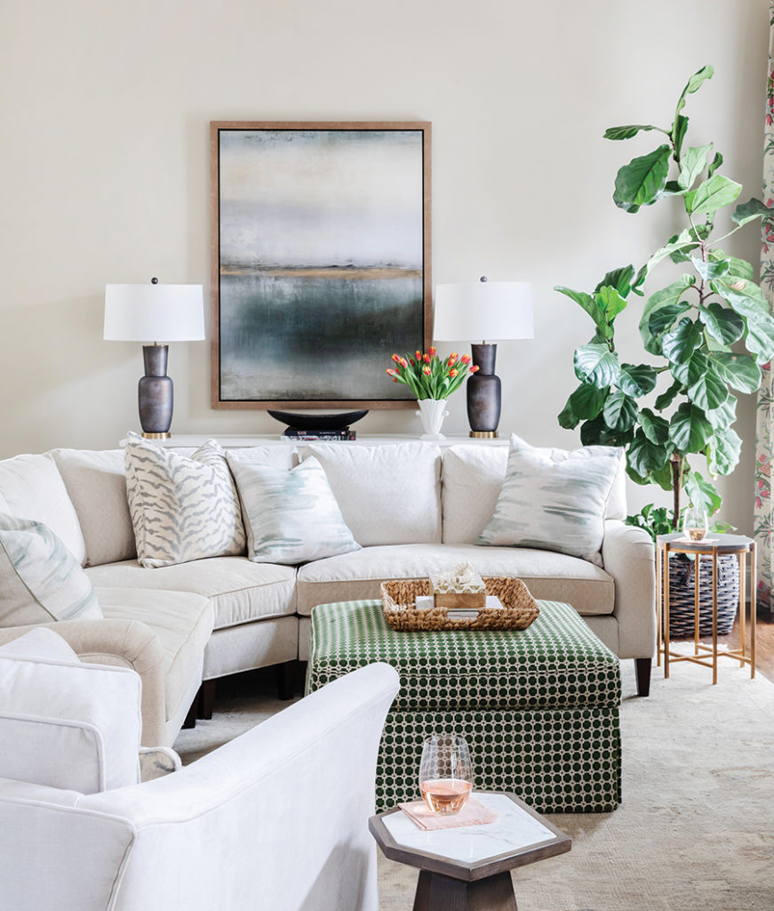
Walls: Benjamin Moore Clay Beige
We used BM Clay Beige (a cool pink beige) as our wall color for the family room and then carried it through to the two-story foyer.
Walls: Benjamin Moore Clay Beige
The power of color
When the project was completed, my clients said that this beautiful remodel exceeded their expectations. And, that it “…was a real bright spot during the pandemic.” That is the power of color! When you make good color and design choices for your home (or hire the right expert to help you), it can lift your spirits and brighten your mood.
A Cure for Imposter Syndrome
Claudia isn’t the first student who came to one of my workshops looking for a cure for their Imposter Syndrome. Nor is she the first professional to trade in her former job for a design career and as a result needed additional training to build their skills and boost their confidence.
As of this year, I’ve helped over 2,000 enthusiasts, aspiring designers and pros to do exactly that.
Are YOU ready to make a change like Claudia?
Perfect! Because I’m doing a FREE 2-Day event to kickstart your colour consulting business!
In just one hour each day I’ll help you make the four most important business decisions:
- What services to provide
- How to charge
- How to attract your customers
- How to grow your skill set quickly
After this live virtual event you will:
- Understand what you can offer as a colour consultant
- Set your prices confidently
- Know where to find your ideal customers
- Have a roadmap to creating one or more new streams of income using your colour skills
Sound good? I can’t wait to help you get started!
Related Posts:
A Budget-Friendly Console Sink Vanity for the Powder Room
This Trending English Countryside Kitchen is Bringing Beige Back
Better than White: My 6 Best Paint Colours for your Living Room


One of the prettiest transformations ever! So thoughtful and daring yet doesn’t look “overdone”. Thanks for sharing!
Claudia, this is such a beautiful transformation of your clients’ home! I love how the color flows from room to room. I think my favorite thing is the upholstered green ottoman in the family room.
What is the paint color on the kitchen island?????????????????? That’s my favorite color of green and I want to use it some day.
Everything looks so great, that I’m sure the “Imposter Syndrome” has died. Right?
It’s occurred to me that one could make a living just redecorating home offices to be “Zoom Worthy”. 😉
This is all so beautiful! I wish there were more pictures of each room, particularly the kitchen.
Becky, click on the link to her website in the blog post, then take a look at Claudia’s portfolio!
Kudos to Claudia! What a stunning transformation!. Claudia took an already lovely home and turned up the WOW! factor 🙂 What a joy it would be to live in such a beautiful space. Thank you for writing this guest post. And thank you to Maria for sharing Claudia’s talents with us.
Thanks, Maria, for this guest article from Claudia. And WOW, what a talented individual she is. Readers, take the time to look at Claudia’s portfolio to see more of her magic. Her tips are well thought out and useful.