Last week I wrote this post outlining all the black moments I have in my home. Because many of you have noticed that I, too, decorate with black in this black and white trend.
Hey, I don’t dislike black. Here’s the thing. Some of us still need to know when to hit PAUSE on choosing yet another black item. This led me to an epiphany recently. And it’s the best yet, I think, on why this black trend got so wildly popular.
Like if there was a popularity contest on which trend in the last three decades was the most prolific one, the black and white trend wins hands down over any other trendy neutral – even grey.
And I figured it out. Once you see it like I do (keep reading) you won’t be able to unsee it again. Plus, I’m sharing a FREE GUIDE ⬇️ to help you make the best black and white decorating choices.
Why we love the black and white trend
If you’re currently choosing finishes for a home renovation or new build project, it’s hard to know where the “You are here” button is. 📍
So it’s smart to be asking yourself if you’re making the right black (or white) choices for your home.
Truly, every neutral can also be timeless.
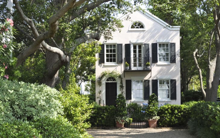
And everyone keeps telling me how timeless the white house on their street–that has been there for 100 years–is and I agree with you!
Wait, go back and read that sentence AGAIN. Yes I agree.
Until now.
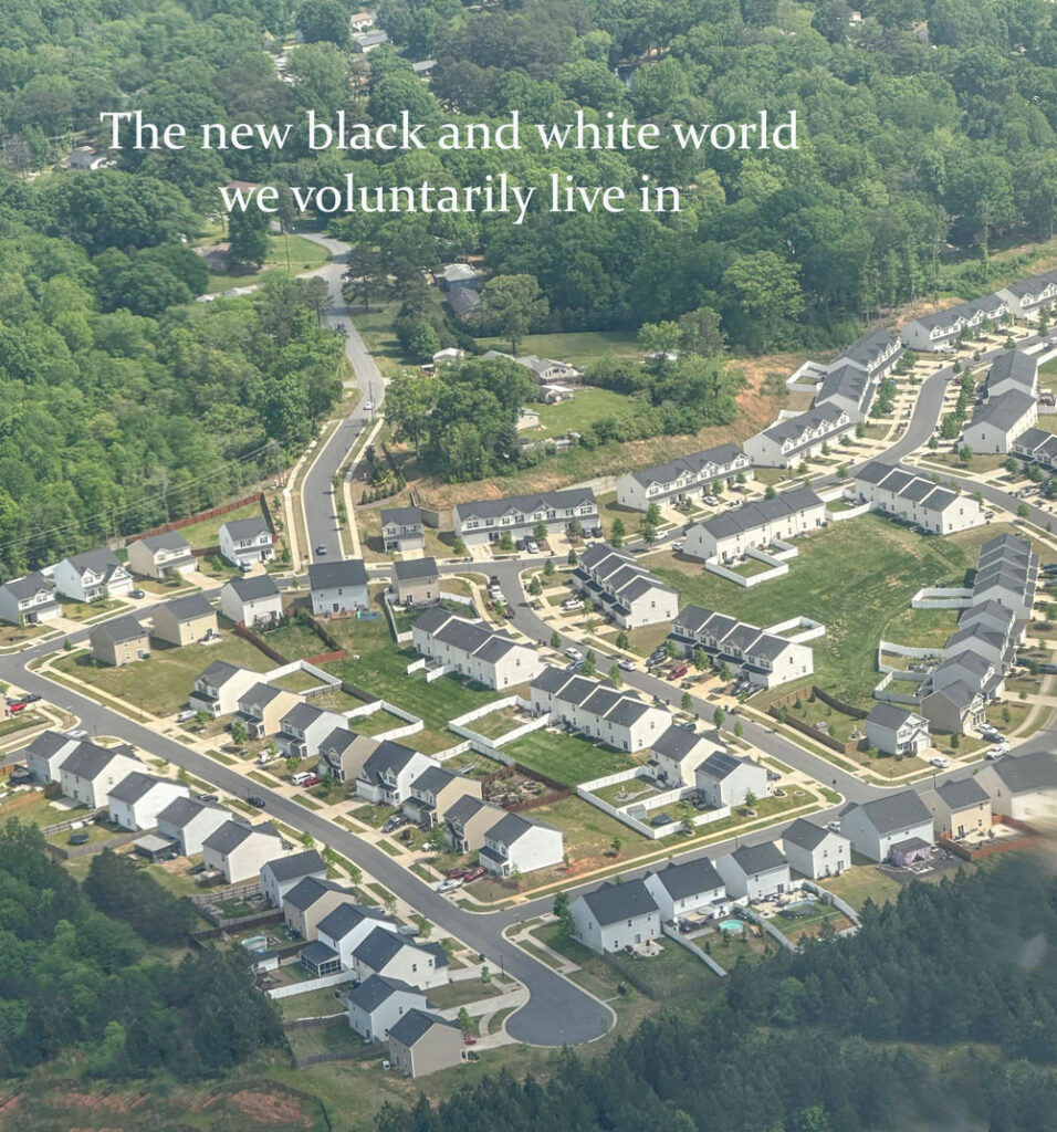
This is what is happening to neighborhoods everywhere
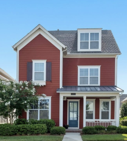
Let me put it this way. If red was the current trending colour, and this was your house, all would be well until. . .
Suddenly because red was trending, not only did every new house or every new paint job on your street go red, but also every single new subdivision, including commercial buildings.
Basically, anytime a new building or new paint job went up, it was red.
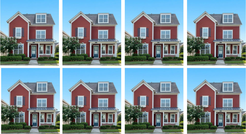
Well, your red house would no longer look timeless.
It would just look like this. Sameness among a sea of sameness.
And I’ll just remind you how we all felt when this trend first started popping up. When the first commercial building in my small town (example below) was painted white along with new and tasteful black lettering with pretty black lighting, I also noted how FRESH it seemed.
Why did the black and white trend look and feel so fresh?
Because it arrived among a sea of bleak, mostly battleship-grey buildings. Since grey was trending in the 2010s, along with the murky, earthy taupes and browns, that also looked bad from the Tuscan trend of the 2000s.
I’m talking about commercial buildings here but the same applies to every house in your neighbourhood, both interior and exterior. The reason I’m talking about commercial buildings is because that’s when I first thought it looked so good and fresh.
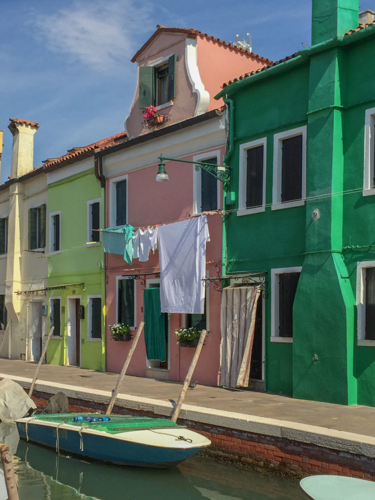
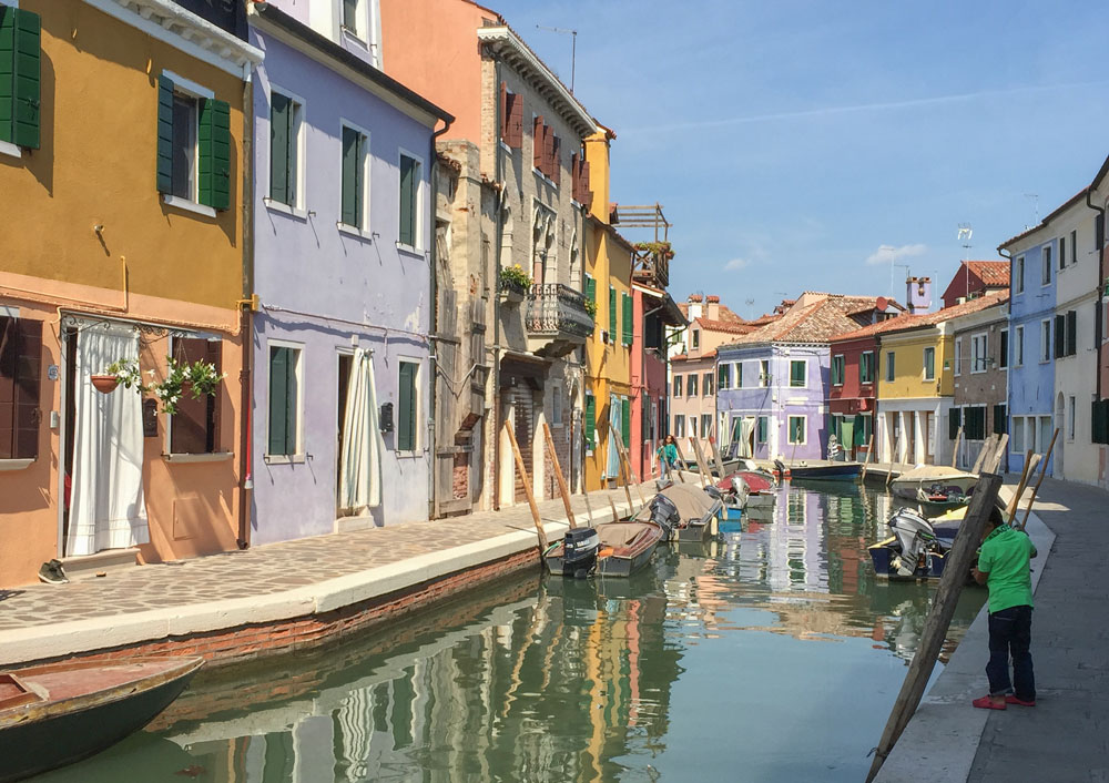
However, if we were in Burano, a major tourist attraction in Italy (below), and suddenly a building was painted white – kinda like that sheet hanging in front of the coral house…
Would we all have stopped in our tracks and screamed, “Oh my gosh that looks amazing!?”
Hey, Mom, Dad, Sis, Bro, friend, Husband, Wife, Spouse, Uncle, Aunt, Cousin, Grandma or Grandpa, and anyone else who will listen!!! I have an AMAZING idea. Let’s paint every single house in this village WHITE (or black)?
No, we wouldn’t have.
Because everywhere we look in this town and in any town where colour is the feature, it’s just pretty.
Timeless and attractive, even.
Exteriors that only ever needs to be painted when the paint is actually chipping.
But in North America, we mostly have one bad, trendy neutral building done wrong after another. Everywhere we look, including the street in YOUR neighbourhood, and most neutral subdivisions we drive through, no one is exclaiming:
“Hey, let’s pick one of these bleak neutrals for our next paint project!!??”
Falling in love with black and white houses
Therefore, among the sea of neutral homes when one of them went white or black (above)–before the pandemic when this trend started–everyone gasped, and instantly fell in love:
Why? Well not only did it stand out like a bright, shiny new penny, the other phenomenon that happened is that white (and/or black) upon first glance, didn’t seem to clash with anything. That made it an easy choice.
It seemed so simple to cross off that paint project we’d put off for years. Didn’t it?
Until it became the only colour anyone reached for.
Remember, to pull off black inside your home you need a lot of this.
So yes, brown (2000s), grey (2010s) black and white (2020s)–and to be clear there is overlap, each trend doesn’t fit neatly into the decades–can all be TIMELESS NEUTRALS when used correctly. And by that, I mean not overused.
Your Free Guide to Navigating the Black and White Trend
So, I’ve curated a collection of all my BEST black and white trend posts. This will help you understand when to embrace this trend and when to hold back for maximum impact!
It’s all my best advice on when black is TRENDY and when it’s TIMELESS in one place!
Because I love you. And I want you to have a timeless home you’ll love forever! You can still embrace this black and white trend. I’ll guide you to the right decisions. 💛
Get the FREE guide here: 52+ Timeless Ideas for Decorating in the Black and White Trend and learn how to make all the right black and white decorating choices for your home!
SALE EXTENDED ONE MORE DAY! Prices go up TONIGHT!
This is your LAST, LAST chance to save up to $200 on the Create your Dream Home virtual training happening April 26 & 27. Register here.
Designers, this is your LAST, LAST chance to save up to $600 AND learn how to add the lucrative world of eDesign to your design services by training with me in Chicago May 15 & 16. Register here.
Related posts:
How Maria Saved Me from a Trendy Black Kitchen













I love black and white and always have and always will, and I’m old. I love to see myself and others in black and white clothes (or all black or all white). The outside of my house is a creamy beige stucco because of the stone work at the bottom and up the front entrance. I have copper roofing over the entrance which has turned green, green shutters, and horrors a brand new green roof. I like it and it is different but really, I would prefer a white with black accents house, but it wouldn’t have gone with the stone. The inside of the house is mostly whites, creams, and some black accents which I love. I do put in some seasonal color. Black and white just always looks professional and classy so I think that it will always be what I like the best.
Sounds lovely!
Have you every been to Greece? An entire island of bright white houses with bright blue trim.
That’s exactly right and that’s the ONLY place where all homes work in white. Exactly this is in my Exterior Masterclass! Maria
Hi Maria
Most of the time I agree with your concepts. But living in the Pacific Northwest, where there are trees all around us, and people even wear a lot of dark neutrals, I have to say that dark earthy neutrals, even battleship grey, fit the casual, often rustic feel of our homes. I live in a planned neighborhood of contemporary craftsman homes with stone and timbers. All of our houses are dark neutrals. Ours is a very deep purple gray with off black gables and roof and off white trim. Others are deep khaki, blue-green, deep taupe. These are timeless colors in the PNW. I say this because I have lived here most of my 63 years, and these dark, rich neutral colors have been “trending” all this time. I do think it’s ridiculous that there are black and white homes have been incorporated into other neighborhoods full of these dark neutrals, and it looks ridiculous.
Maria, I was walking my neighborhood yesterday and noticed that the new build put in a black front door and black farmhouse outdoor lighting. The house is blue. It looked terrible but I don’t know if I am conditioned to react that way or if it really is bad, lol.
Hi Maria!
I just watched your Facebookstory where you said that you used safety pins to lengthen your necklace. I have an idea for you, just use a small bracelet instead(one of course that have a necklace type closure)
Thanks for all of the color insights!
I have a theory. The black and white trend is “easy” for amateur designers/homeowners/business owners to mimic and do on their own. It doesn’t end up looking good or designed, but think about it – it’s so much easier to paint a space white, slap on all black finishes, add some wood touches and greenery and get the “designer” look than it is to layer complex creams or execute maximalism etc. I live in an area where people have no taste or eye and every home, brewery, local gym, shop etc is the same. Because they think it’s on trend and it’s easy to execute… it just doesn’t look good. It’s also the only thing you can find at big box stores. I’m positive this is why the trend blew up in the way it did. I’m so over it :/