Yellow is Back! How to Avoid the Mistake Almost Everyone Makes When Choosing a Yellow
So I’m declaring yellow to be finally coming back, hooray! Tricia, my Senior Colour Designer and I are at High Point Market this weekend, and we’re seeing a lot more yellow than we have seen in previous years.
My High Point trends report will be coming soon!
Rich golds are the perfect compliment to the black trend, and I think we will start to see some softer yellows in interiors too.
You all know that I love yellow, but it’s among the trickiest of colours to choose, especially for walls.
Why? Because all colours get twice as bright when they cover all that square footage. And it is well known in colour theory that yellow is the first colour the eye sees, it’s simply the brightest.
This is why it has to be toned down (or muddied) even more than the other colours, before it becomes a ‘designer’ yellow on the walls.
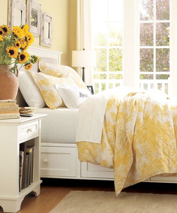
This pretty traditional bedroom looks like BM Waterbury Cream HC 31
A pretty paint chip does not necessarily make a pretty wall colour and it’s also why one client said to me “I am ALWAYS surprised when I see the little 2″ x 2″ chip all over the walls, it’s never what I thought I would be”.
Even now that colours for interiors are cleaner and brighter, if you’re picking a colour for your walls, it shouldn’t be the one that first jumps out at you.
Years ago, when I first did my colour training in San Francisco with the Daystudio, I came home and bought all the colourants so that I could shift the colour on site like I had been trained to do.
In the end though, the only colour I was able to change reliably [on-site] was YELLOW. For example, the way you actually get to a neutral is by adding the ‘compliment’ to the colour you are working with.
So if you want a pink beige you start adding ‘green to red’ (with white of course) and if you want a muted yellow beige, add ‘purple to yellow’. But really, it was not the most convenient way to work with colour.
Learning how colour is mixed and created is a useful way to begin to understand colour, but it’s a bit tedious and not necessary once you become a True Colour Expert.
In my colour workshops, when we’re learning about neutrals, it’s all about the undertones, but with other colours, that’s not the conversation. In my system, I teach the important distinction between ‘clean’ and ‘dirty’ colours which is the most useful way to look at colours other than neutrals.
“The distinction between ‘clean’ and ‘dirty’ is the most useful way to look at colours other than neutrals”
The cleaner the colour, the less of its graying complement is present. But the only way you can see how relatively clean or dirty a colour is, is by comparing it to other colours
Ideally, the colours you combine for your decorating palette are similar on the clean to dirty scale. This way they will be harmonious, and one colour won’t leap forward while another looks comparatively muted and muddy.
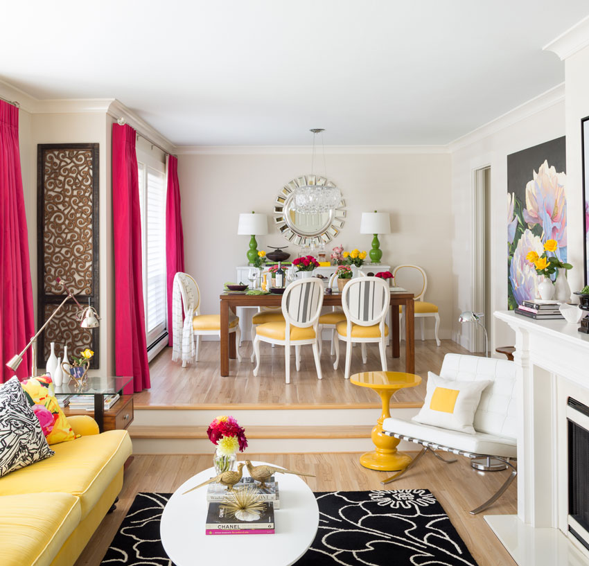
I think we will be seeing a lot of strong yellows as accents. Which works well, as long as the other colours are also clean and vibrant and there is a lot of white to balance it.
My living room is a great example of how to do this (below).
See more pics of the art featured in this room here.
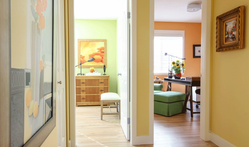
The yellow my hallways are painted in looks really clean but is still muddier on the chip.
Yellow paint colour, Cloverdale 7928
But for most wall colours, when it comes to bright hues like yellow, the super happy clean one on the chip is going to be amplified into an obnoxious neon once it occupies all that real estate.
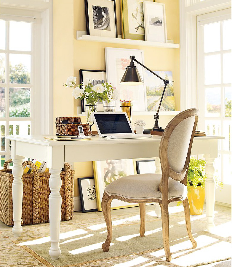
You need to consider the drabber, shyer yellows in the deck. The ones that verge on beige. They will be grayed out with enough of their complement, purple, to be pretty on your walls.
The soft yellow in this charming office above looks like SW 7681 Tea Light
Bad wall colours, especially yellows, often look clean and happy on a two inch chip, but dreadful on the walls.
It takes some experience to figure out the sweet spot between clean and dirty, but you can get an idea by plunking the chip down on some of your fabrics and finishes. If it really jumps out at you, it’s probably too saturated and clean. If it sits happily back with the other colours, it’s worth a test.
A current way to use yellow is to go bold, which works well if you have lots of white and some black like this gorgeous kitchen below.
Kitchen by Mick de Guilio via House Beautiful
But even a bold yellow needs to be toned down quite a bit to look good. This kitchen is painted Stuart Gold HC 10 by Benjamin Moore.
If you do make a mistake, and want to tone down a bright screaming ‘laundry room’ yellow, add some purple to it. Or better yet, take your gallon back to the paint store and ask that they ‘tone it down’ for you.
So don’t worry, if you’ve picked a yellow that’s too clean, you can always muddy it or add some orange if it’s too green. It’s going backwards (making it cleaner) that you cannot do without adding a lot of white paint to an existing colour–which I don’t recommend, because who knows what you’ll end up with, at that point, it’s better to start with a fresh gallon of paint.
By the way, a common mistake is to choose a paler version of a too clean colour in an effort to tone it down. Often this ends up looking not only too clean, but also too light and bright, when dirtier would have worked perfectly. You might not to even recognize the right yellow in the deck as being “yellow” at all.
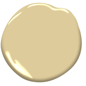
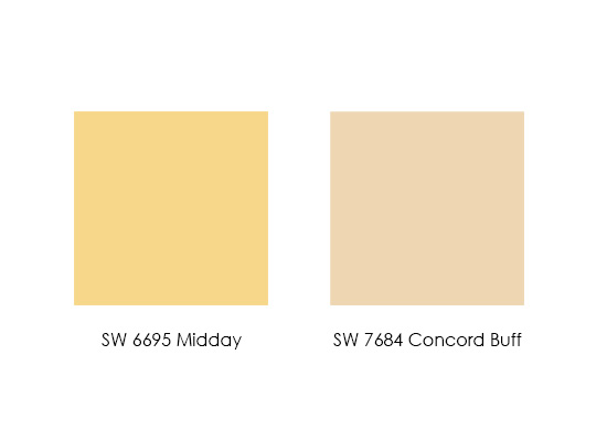
If you are looking for a sunny yellow for your walls, you might be tempted by the clean colour on the left, but what would likely work better is the drabber one on the right. Here it is in a room below.
SW 7684 Concord Buff Room by Pottery Barn
Remember the post I did on colour consulting in a house with a ‘screaming yellow’ bedroom? Well, this is what it looked like (below), sort of like a graphic construction road sign.
Yayoi Kusama for Louis Vuitton
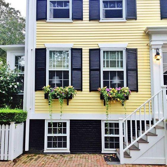
You certainly don’t need the lights on with this kind of yellow. If the yellow above got toned down, then it could work on an exterior like the one below:
It was working with my big samples that saved me from having to learn how to mix paint colour at the job site. An 11″ x 14″ paint sample is a perfect size for you and your client to see that the perfect, toned down yellow you have just specified is exactly right. I have a few current yellows in my VIP collection of large samples boards available here.
Picking a good yellow is like a right of passage for a designer or colour consultant. But you can sail over years of trial and error if you learn my system.
Have you ever regretted picking a screaming yellow?
I’m so excited for all the inspiration to be had at High Point this weekend! What do you think, will we be seeing more yellow in the coming year?
I wore my signature yellow yesterday during my talk at the Alden Parks Showroom “The 5 Mistakes You’re Making Right Now with Your Clients”, to a standing room only crowd! Thanks to all of you who came to hear me speak!
Follow me on Instagram and my Stories to see all the latest trends here this weekend!
Get a head start on learning how to specify colour with my eBooks here.
The only way to choose the right colour every time is to combine my system of understanding undertones with the most indispensable colour tool available. You can purchase your own set of my curated large colour board collections here.
If you would like to transform the way you see colour, become a True Colour Expert.
Here’s my fabulous group of True Colour Experts from Boca Raton last week!
There’s still time to jump into Nashville which starts Wednesday here. See the rest of my Spring dates here.










Most of my ceilings are bright yellow (Laura Ashley Tulip and Daffodil) and I love the brightness it brings with the sun in the morning or even on a dark gloomy morning like today!
I would love to see a picture of your yellow ceilings!! Sounds so pretty. I live in Florida. Love the sun colors.
me too
My favorite yellow is Farrow and Ball ‘Ringwold Ground’ Like you said Maria it looks rather like a beige with a yellow undertone on the deck but on the walls, its a lovely soft yellow, I wake up each morning to a sunny bedroom, which is lovely when one lives in snowy Canada!
Laurel Bern has matched Ringwold Ground to Benjamin Moore Standish White, which is my main house colour. I also live in Canada (west coast rain forest) and love it in all seasons and lights.
I rented a room my in college that was painted yellow to make up for the fact that the window faced east but didnt get much light due to the weird grad student whose apartment it was. His prior room mate had painted it that color. It was too bright and you needed the lights on all day. I’ll never forget that place because of the roommate weirdness plus being in that room before class, waiting to hear that the space shuttle went up then turning off the radio right after and going to school. One of my class mates asked did you hear about the space shuttle? I said yeah, it took off. He then told me it exploded, and I was heartbroken that all those kids watching the teacher saw that live. Weird juxtaposing off that sunny color and such tragedy.
I remember that. I was in a one room country school & our teacher had us all around a tv.
When my husband and I were really young and in our first house, we decided we needed a fresh yellow (east facing) bedroom. I made the mistake of looking at the tiny chip and picking a very cheery yellow that was way too bright once we rolled it on the walls. We were able to have the paint store tone it down to a lovely tint of its former self, a pale “lemonade”. It was a good lesson for me to buy a sample and luckily I’ve never been shocked by a paint color since. We have had yellow walls in most of our houses, but as I’ve aged I am drawn to less chroma, more calm walls.
We painted our large bonus room SW 1360 Paper Lantern, specified by a designer who is pretty good with color. It looks soft and lovely in the day, with the east light shining in, and in the afternoon with no lights on. But at night, with electric lights on, certain parts (the angled walls and stair wells) look like neon banana. Not my favorite look. I’d like to paint the room BM 863 Pearl Gray, which I have downstairs and love (looks mostly like robin egg’s blue) , but it’s such a large and costly room to repaint. My current solution is to leave the overhead lights off and turn on lamps. More cost-effective! 🙂
Thanks for taking time to connect with us! Yes I have made that mistake with going with the wrong yellow.. so bright! What I do find is using yellow beige works for me when in a space that has light. So at times it is yellow in brighter light and dark part of the day it is not. When we moved into our present place I was dreaming of gray walls with red, blue, and yellow together. I still need to layer in yellow and would prefer it in upholstered chairs for the dining room. Mid Century likes mustard or gold so I am thinking along that line..
Yes, I have regrets, but with green. What I was hoping would be a sophisticated acid green for the kitchen of my mid-century middling house, turned into Radioactive green on the walls. (At least that is 1950s-esque, right?).
We’re living with it for now, but when we replace the laminate countertops (that look awful with the green, by the way), and put in a backsplash, the green is going away.
Before I knew better, I picked a yellow for my bedroom that was too bright. I was shocked, and had to start over with a more mellow color. The other thing I think is important: pick more on the orange side. Many yellows go greenish at night with lamp light, and look sickly.
Yes that is a good tip thanks Diane! Maria
What is that yellow color on the exterior of the house, I really like that!
Great information on yellow. Lots of pretty yellow rooms. Can’t wait for your High Point post!! Always curious to know what’s coming around the bend lol. I picked out Pittsfield buff for a custom furniture piece years ago. Had it mad and sprayed at my brother in laws cabinet company. Saw the finished product and near died. Too bright!! After some help from my local BM dealer I decided upon Lighthouse Landing. So pretty and soft. Just what I wanted. It’s an 11 and a 1/2 foot unit so there was no room for error on the second go round lol. Also was looking for a somewhat “neutral” sunny color for my master bath. Chose BM Barbados Sand. So soft and pretty. Yellow is tricky and you gave us awesome tips as usual. Lots of useful info. Thanks Maria.
When my house was brand new 20 years ago, I wanted the guest room to be yellow. Being an amateur at knowing what I liked & how to pick colors I picked a yellow that was too bright. I added some white paint to the bucket & it help immensely. I lived with it for about a year. But then I realized I don’t care for warm colors. So it’s been repainted a blue-green-grey.
In my last home I painted the walls the most beautiful muddy yellow.This was back in the 90’s. It was called Autumn Blonde by Pratt and Lambert. I don’t think they make this color anymore. Glad to see warm tones coming back.
I love my Kelly Moore™ KM3996-2 Ferncliffe. Definitely does not look like the on screen chip.
When we moved into our brand new home four years ago, I decided that painting all the rooms prior to moving in would save a lot of hassle. I thought the colours that worked in our previous home would translate to the new home which was not the case in every room. The room that has bothered me the most is the west-facing kitchen which I had painted BM Ivory Lustre. I realized that I needed an orange undertone to offset all the reflective green from the trees but could not justify painting the kitchen right away. The kitchen has recently been painted BM HC-32 Standish White which is one of your colour boards Maria:) The difference is very evident, at least to my eyes, and I am finally content with my choice of colour. Thanks for the wonderful post on yellow Maria:)
I heard about Standish White from Maria, too. It is my main house colour and I love it.
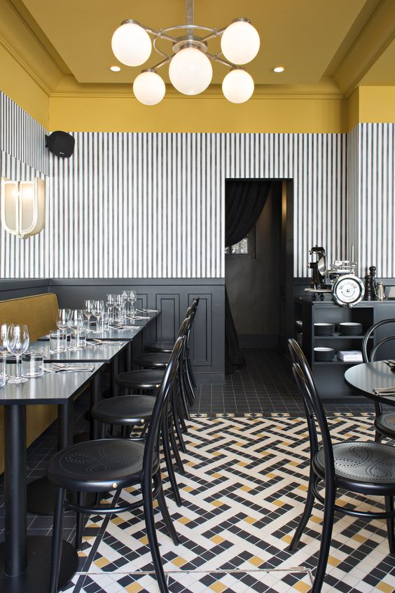
I LOVE the first picture of the restaurant in your post. I would keep going back just because it makes me happy.
Oh – my mother painted the bedroom walls for my sisters and I a bright yellow – I can still see it my mind’s eye – is it 40 years ago already?
I have finally tried some yellow accents in my family room – they are what I would call gold – I actually keep an empty Colman’s powdered mustard container on hand to keep me from being in the Crayola mindset when looking for accents in the yellow spectrum.
And I work in a school – schools have the corner on colors that are just not right on the walls – sad colors.
Thanks so much for the little paint chips in this article. I do not see or understand color well (that’s why I had a consultation with you). I am not looking for a yellow paint, but if I was – I would never have found the recommended colors you showed.
Every one of your posts are an education for home owners like me.
Thanks
The public spaces in my home, with the exception of the dining room, are painted BM Goldtone. It’s far and away one of the most versatile yellows I’ve used. Only problem I’ve encountered with it was trying to use Trend linen in “Maize” for my window treatments…it turned muddy against the wall. Ended up choosing “Oyster” to get enough contrast. It’s a soft and elegant combination.
Long ago I worked in a law firm whose office manager loved yellow. In a new office building, she was asked to choose the paint for the employee lunch room and lounge and chose the most intense yellow I have ever seen on interior walls—ceiling too, as I recall. Then she ordered tables and chairs in the same yellow. The effect was unbelievable, but there was nothing anyone could do.
oh my gosh, haha, thanks for your note! Maria
Have always been a fan of dirty yellow-gold, navy blue and brass. I have been off trend for about 20 years and now my colors are back on trend. Yea! I knew that eventually the colors would come back. So glad that we can mix stainless steel and brass!
So PERFECT !!
My Grandma told me in the 90’s to never get rid of something you really like, it’ll be back in 20 years. She was seriously right. Every time something I sincerely enjoy comes back in style I think of her.
Wow, I’m really surprised how gold those BM colour chips are in real life. You’re so right – I would’ve sworn they were beige on the chip! I can’t believe they look that pretty yellow on the wall.
I had lovely yellow walls back quite some time ago. They were perfect and I’d already seen enough accidentally acid yellow walls to know to pick something much greyer – not as grey as these colours though.
Yellow since high school, and that wasn’t remotely recent.
Beloved loves yellow, also color blind in a few layers. More than a bit demanding for ‘his’ colors inside. Yellow, of course.
With every yellow chosen for our ca. 1900 home, he was ‘guided’. Gave him choices, told him, for each room done, all done over time, choose which ever you want, happy with any choice. Yep, each time, he chose what I wanted for a room. Though, never mentioned this fact, EVAH.
Each time, once painting begun, he became fearful. Whatever. Told him to retain his resolve, people pay for my advice.
Better than clients paying me for garden design advice, including color choices, I know, a man is a man, is a man.
An alpha male guest stayed in our home recently. Very high alpha male. (You know where this is going.) Alpha male calls Beloved a few days after leaving our home and mentions how he loves our home, its comfort, and decorating, and colors.
Can’t make this stuff up. Known it for years. Female clients, finally getting their husbands on board, after their first social gathering. Their husband’s male friends loving all they’ve done.
So. Yellow. I’ve got this !!!
Wish I had a pic of my ‘School Bus’ shoes from high school days. Those ‘School Bus’ shoes were the color of a school bus, wedge platforms with criss-cross straps on top. Loved those shoes. Love all the various yellows in our home. Came in the back door to yellow expertise !!
Since it’s a yellow post. EVERYONE. Plant daffodils. Daffodils are deer proof, drought tolerant, and historic daffodils will last centuries. Brent & Becky’s bulbs best bulb resource, http://www.BrentandBeckysBulbs.com . Even Martha Stewart orders from Brent & Becky’s Bulbs.
Garden & Be Well, XO Tara Dillard
My kitchen used to be a bright golden yellow. It was never right. I should have tried a toned down version! We lived with it for a couple of years and then repainted blue. (That house has changed hands twice now and it’s still the same blue color so I guess that choice was a winner!)
I love your living room! My house has lots of neutrals, but I’ve been yearning for some subtle yellows lately. Glad to hear I’m in style! This post is very helpful. With this info maybe I’ll pick the right paint color the first time.
A little story about paint colors… My parents had a house built years ago. My mother picked out a paint that she though was beige-ish. On the walls it was very, very pink in an empty house! She was so upset, but decided not to change it. After the furniture was in and the pictures on the walls the paint was not so pink after all. It was actually nice. Colors are so, so difficult. Thanks for helping us understand more.
I wish I had read this article about 20 years ago! It would have saved us about three different coats of yellow paint in our living room and dining room before we got it just right, ha, ha! Another factor, that I would love to learn your thoughts on, is how the variation in lighting and in size of the room can affect the apparent intensity of the yellow. The first yellow we tried looked perfect in the dining room ( a soft butter yellow), but it looked totally washed out and like an ugly beige in our larger, darker living room! So we went with “stronger” yellow paint color , and it looked like an explosion in a mustard factory!
Is it just me, or are color trends going in and out much quicker these days then in years past?
Anyway, I love that exterior of the yellow house with the flower boxes! So charming with the black!
Thank you for suggesting Standish White to me a few years ago when Summer Harvest was too clean and bright in my kitchen. Even though it is technically yellow beige, it reads yellow in the sun. Now if you are right about yellow coming back, I will stop wondering if I should try Ivory White, because Standish White goes with everything and is lovely.
Always have loved yellow, particularly on the exterior of a house which to me looks sooooooo clean! As for interior use and in my previous home; often included hits of it in the painted wall murals I did for my children’s bedrooms as felt it was a happy colour whereas one of my favourite rooms was that of my laundry/sewing space which had a wallpaper with a ‘screaming yellow’ background. As for fashion Maria with you being so fond of it; you’ll be happy to learn it is currently is very popular on the Runways as well (whereas millennial pink is on the way out.) To conclude; with its popularity I am hoping we will see more of it in the manufacturing of fabrics as it has always been difficult to find and why I don’t know but suspect it could because it is similar to that of chameleon which can drastically change/read differently depending upon its environment (or amount) like so many of your readers have noted …. :).
-Brenda-
My friend renovated a 1900 farmhouse 20 years ago and carefully chose a historically correct shade of buttery yellow for the exterior. Unfortunately, she and her family had to sell the house about 10 years ago. The new owners repainted the house in the most garish shade of bright yellow and the house lost a lot of it’s charm. Now the house stands empty, lost to foreclosure and makes me sad every time I drive by. I blame the garish yellow paint!
I love yellow- my entire living and dining room are painted a beautiful yellow that makes me happy. The only downside of yellow walls is that they don’t look so great at night with our lamps and overhead lights on. The natural sunlight illuminates the depth and glow of the walls during the day, but at night just falls flat, even though we have tried different variations of warm and cool light bulbs. It’s still worth it though, to keep the color yellow, because of the beautiful glow on the walls in the middle of the afternoon.
I am so glad yellow is coming back because I painted my kitchen yellow (Sherwin Williams ‘Malted’) 16 years ago and even though we are remodeling the kitchen , I want to keep the old color. I think Malted was a Martha Stewart color that has been discontinued but I hope they still have the formula. We first saw the color on walls at a realtor’s open house and the paint cans were still in the garage. BM Waterbury cream is also a great yellow and I think similar to SW Malted.
My screaming yellow looked like Kraft Macaroni and Cheese on the walls of a very small kitchen with very little visible wall space. After the first coat I went to the paint store and said fill the can with white. They said they didn’t know what color it would be. I said I didn’t care. It was less orange and I lived with it until our kitchen remodel. 🙂
Any suggestions to tone down ivory siding that looks yellow-ish now that it is up? The front door is currently dark blue. Would painting it a different color help make the siding less yellow? The trim is a dark khaki color. Garage door is off-white.
What colour did you paint your house? Maria
I have SW Navajo white and SW Ivoire in my sunroom and family room. It looks light brown on the chip but it’s a lovely happy gold color on my walls. I love it!! I wanted to do yellow in my finished basement but the floors have a pink tone and it looks awful. UNLESS there is a color that I’m not familiar with that might work.
I am in LOVE with that exterior yellow 😍😍
Where could I buy that? How do I get that for my farmhouse?
wow.. thanks for this post! i am currently choosing a yellow for my kitchen and i’d been shying away from the ‘muddier’ ones because they seemed to dark and drab, but now i’m going to sample those instead. great, helpful advice!!
I painted my living room BM Hawthorne Yellow, which worked great in my last house… not so great at this house. It looks too bright and bothers me every time sit in the living room. The only time it looks pretty is when the sun shines in through the window in the late afternoon. I wish I would have read this article before I painted! Now I’m thinking of repainting the walls BM Tea Light…so pretty.
I’ve had BM Cream Yellow in 5 different homes. Obviously, I love it.
Hi! I’ve always wanted a yellow house and I’m finally getting my chance! I’m leaning on SW Banana Cream but am struggling with the shutter and door colors. I’m thinking either a blue-black or just black on the shutters. Would a red door (something else I’ve always wanted!) be too much color??
Thanks!
We did our laundry room in BM “Twisted Oak Path”.. love it!
Hi all . especially Maria
What do you think about yellow for a bathroom. Thinking of large gray tiles. Would appreciate feedback
Please don’t install large grey tiles unless they are mostly white with some grey marble veining. Yes yellow would be great with grey tiles but if you haven’t installed them DON’T DO IT. Maria