I go to High Point Furniture Market every spring and fall to source furniture and artwork for my clients, get educated, and (of course) get inspired!
If you are a retailer with a showroom, High Point is THE place to go. You’ll discover unique ways to incorporate current colour trends into your showroom, create gorgeous vignettes, and design a space that your customers and clients want to spend time in and shop in.
When I was there last month, I was so inspired by everything around me that this post practically wrote itself. Grab a snack, everyone, because you’re going to be so inspired at the end of this post that you’ll run straight to your showroom and forget to eat. Homeowners, these tips apply for you, too!
Here are 24 ways that the trendsetters at High Point are setting up their showrooms for 2015 and beyond.
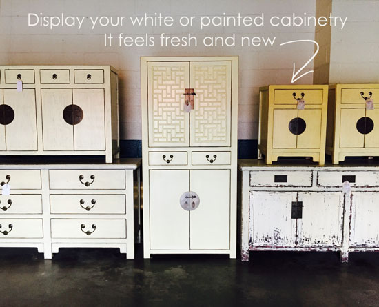
1. Display your White or Painted Cabinets
So many people are looking to incorporate “fresh” into their decorating, and white, cream or colourfully painted cabinets are just the way to do it. Make sure you display them attractively to make it easy for your customers to visualize how they’ll will work in their home.
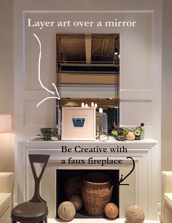
2. Add layers
Thomas O’Brian is a master of vignettes. Check out his work below. Mirrors over fireplaces add sparkle and reflect light, and they’re also great for layering artwork. Maybe you don’t need to hang anything? It’s so much easier to switch things up without adding extra holes in the wall for rotating vignettes.
3. Sneak in some unexpected baskets
A basket in a faux fireplace in a showroom adds colour and texture:
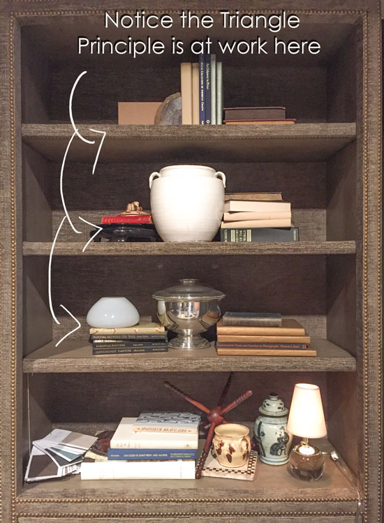
4. Use the Triangle Principle
Recently, one of my True Colour Experts™ wrote a guest post on using the Triangle Principle when creating vignettes. The reason why this bookshelf looks so attractively styled is that this principle has been used expertly:
Century Furniture
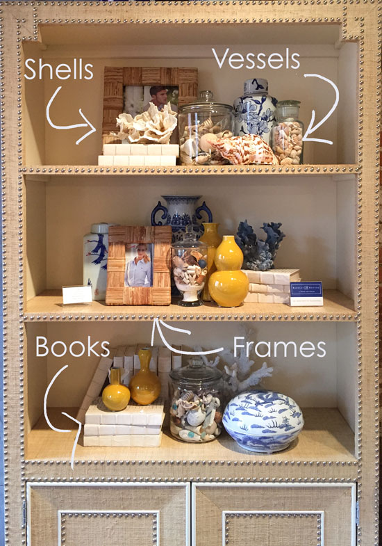
5. Use the styling tools of the trade
– Books, laying horizontally and vertically
– A mixture of different sizes of vessels and vases
– Seashells (here, there are small ones in glass jars, too!)
– Textured frames
The gang’s all here! And look how good it looks all pulled together:
Century Furniture
6. Add lots of cream or white when your room is dominantly neutral.
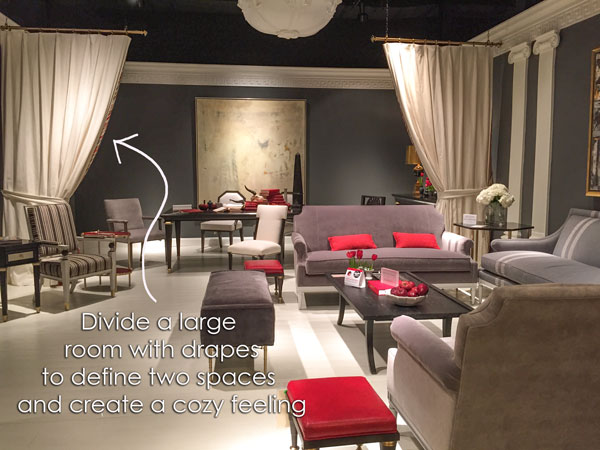
7. Divide a large room with drapes to define two spaces and create a cozy feeling.
Mary McDonald designed this room for Chaddock:
8. Bring in some orange.
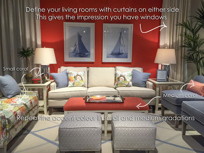
Libby Langdon declared orange to be an accent colour that her clients are embracing. Copy the tips in the photo below to get the gradations of colour correct in your vignettes.
9. Fake a window with drapery.
One thing that makes High Point showrooms so pretty is the abundance of drapery panels everywhere. Sometimes they were simply hung up with tacks, but hey, whatever it takes!
Faux drapery panels are still better than no fabric on the walls at all. Fabric hanging against a wall instantly gives you the feeling of a window:
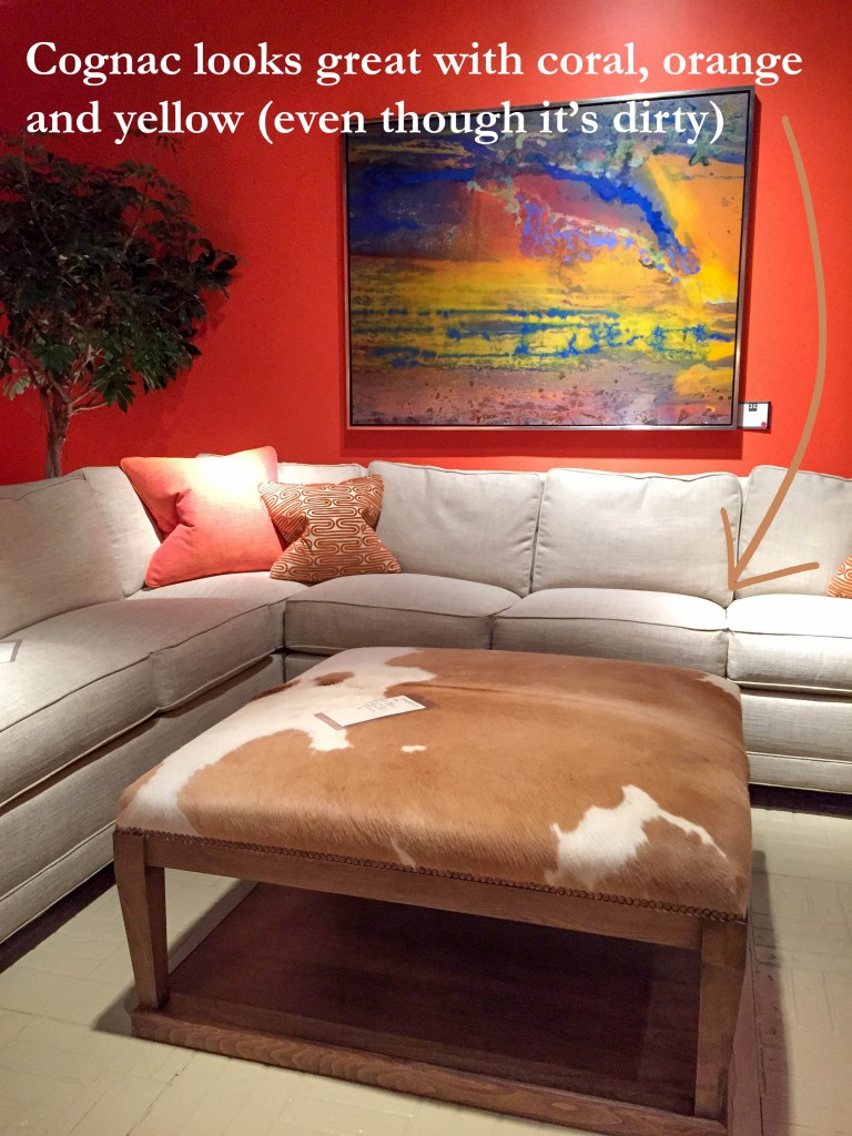
10. Add an animal print
Ever notice animal prints are like jeans? They go with everything. If all else fails, add a cowhide or zebra print to add some interest and texture to your decorating:
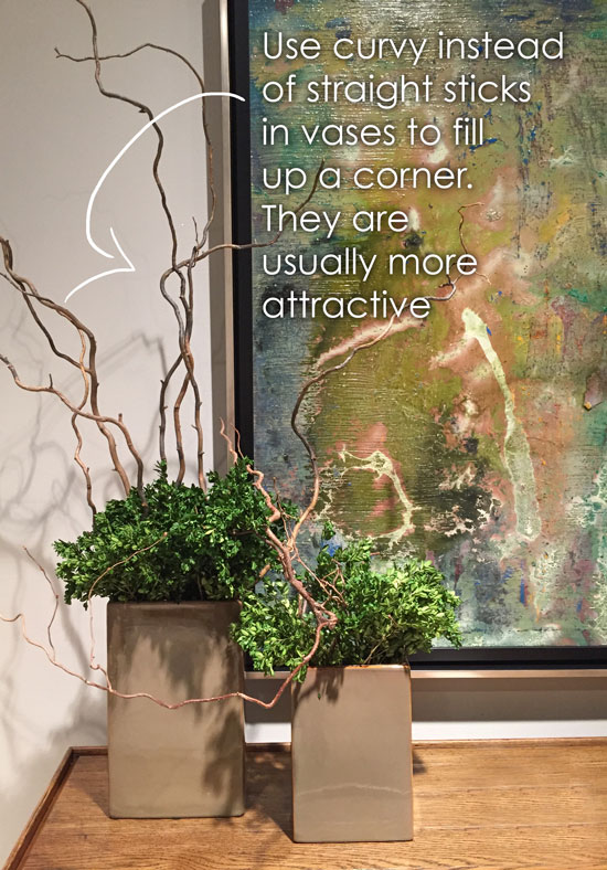
11. Celebrate curves
I’ve never been a big fan of plain sticks in a vase, but if you get the curly willows and mix them with dried boxwood? Gorgeous!
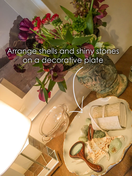
12. Raid the junk drawer
You might have something sitting in a junk drawer that you could display along with shells and stones:
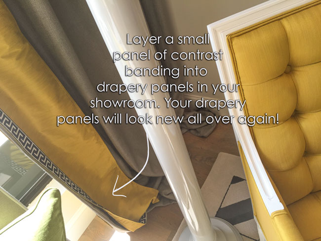
13. Try this affordable drapery hack
For an instant transformation, keep your panels neutral, but introduce contrast banding to pick up the accent colour:
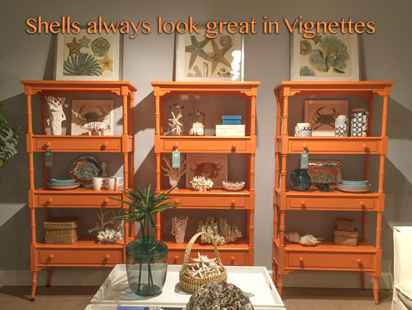
14. Did I mention shells?
All you need are some coffee table books, baskets, and seashells to create interesting and artful vignettes:
15. Try deep turquoise and navy
Below is a glimpse of Tobi Fairley’s new line for CR Laine. The colour combo feels so fresh and new.
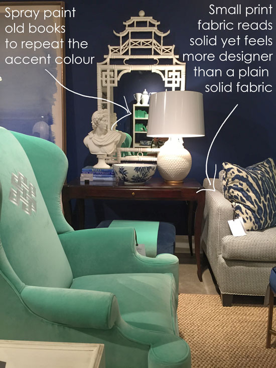
16. Spray paint your books
I was so impressed that each book in a heavily styled bookcase had been individually wrapped in turquoise paper. . . until I walked right up to it and realized they were spray painted! You can catch a glimpse in the mirror below.
So smart! And way faster!
17. Consider small print fabric instead of a plain solid
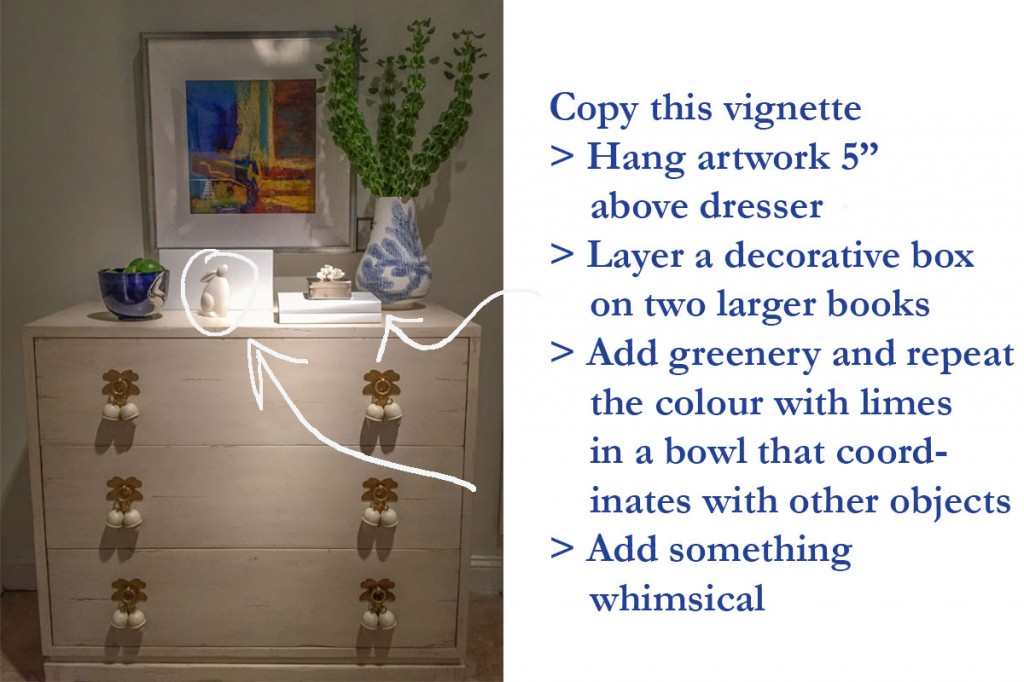
18. Make paint-by-number vignettes
Vignettes are not easy to create for many, but once you understand them, you win. They instantly create a wonderful look and feel. If you’re not sure where to start, copy this one:
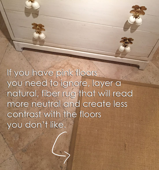
19. Hide an old floor with a neutral rug
What if you have Travertine or dark, busy tile in your showroom, but you want to show a trendy, white, and colourful geometric area rug? Layer it on top of a much larger, natural fiber rug. It will look a lot better and sell better, too.
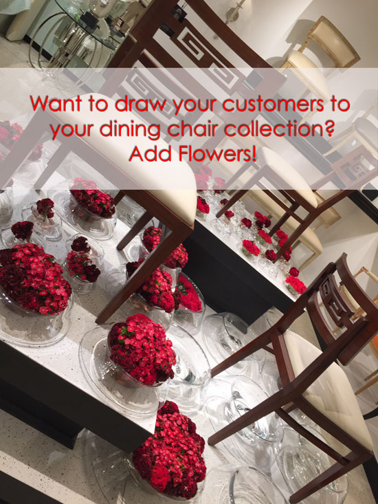
20. Sell your chairs with flowers
Look at this artful display that drew me right over at Arteriors! You could copy this look in your showroom with faux flowers or real greens. Some can last up to a month in a vase.
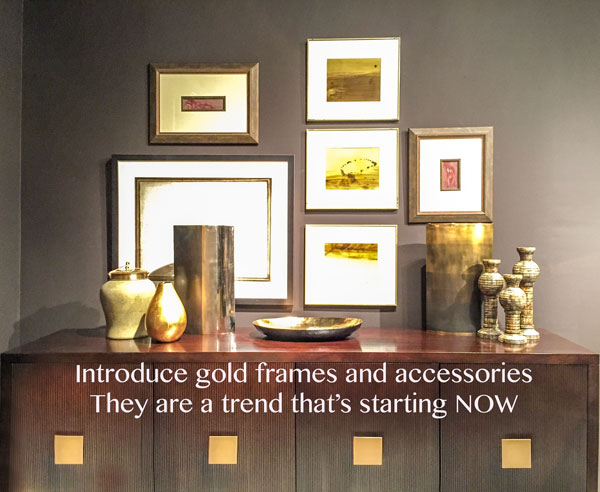
21. Go for the gold
Gold has been on the fringes as a trend for two or three years now. It’s finally hit the mainstream, and it’s here to stay, so don’t be afraid to introduce it in your decorating.
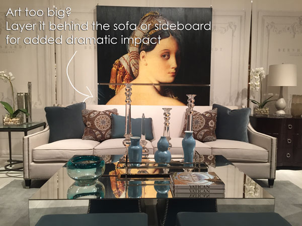
22. Is your art too big? That’s perfect
I was recently in a client’s home where the art we wanted to hang in the dining room was large. Inspired by the styling here at Bernhardt (below), I made it work. . . even though it hung 3 inches below the sideboard.
23. Repeat your accent colour more than twice
Notice the accent colour in this vignette (below) is found in the ottomans (in front of the mirrored coffee table), the throw pillows, and the vases on the table.
24. Add drama with dark walls
A lot of people said that dramatic walls were trendy because we noticed them at High Point, but I believe they are actually required in showrooms that don’t have any natural light. This post I wrote about that very topic includes my favourite quote from Donald Kaufman:
“A light colour will never come to life in a dark room, but a rich, deep colour can make a dim, somber space feel warm and luminous – even though it receives no natural light.”
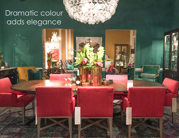
If you have a showroom that is lacking in natural light, break out the dark colours. That’s the big tip to take back to your business from this season’s High Point showrooms.
I’ll be at High Point again this fall. Will I see you there? Mark your calendars now, and make it a priority to attend.
See you there!
Related posts:
The Trends you Need to Know Right Now for 2016






I have been a fan of vintage chinoisere forever. I see so much of the new inspiration is reflected in what’s shown. Loving the ideas for keeping it fresh and styling it in new ways without getting cheesy.
Standout inspirations are the mantle with layering art on mirror. So easy to make a change when the mood strikes. I also like the large art installation. The example is so luminous and shows a beautiful way to add color.
I don’t have a single shell or piece of coral in my home. I always thought it was only appropriate if you lived near the ocean. Thanks for making me see the error of my ways.
It is only appropriate if you live near the ocean.
Thanks for a great post –lots of ideas and I loved all the eye candy!!
Excellent advice. This came at a perfect time. We are designing several booths for a trade show this fall. You’re right – basically the same principles apply to showroom, booth and home. Will be referring back to your post. I’ve never been to High Point. Sounds like it’s really the place to be. Thanks for all the work you do to spread the word.
Lots of these tips are great for home, too!
Thanks so much for the Highpoint tour through your artful, editing eye. Such fun!! xo Leslie
i almost skipped this post thinking it didn’t apply to me. But great tips for styling a home.